Skip to content

Posts tagged ‘Cubism’

Marseille to Marbella, Part IV: L’Estaque

Any art historian or Impressionist aficionado will recognise the name L’Estaque even if they cannot bring a vision of the place immediately to mind. Today, this small fishing village could be easily missed. It is now but one suburb merged involuntarily into the insuperable urban sprawl of Marseille. Yet 100 years ago it was at the centre of an artistic movement. Not only did the port and the surrounding landscapes inspire some of the most preeminent forefathers of Impressionism, but it is also credited as being instrumental to the birth of the Cubist movement.

DSC04256DSC04253DSC04277DSC04288DSC04251DSC04269DSC04312

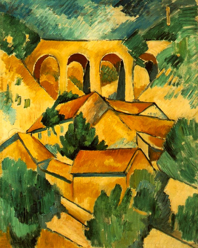
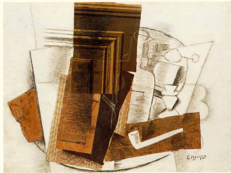
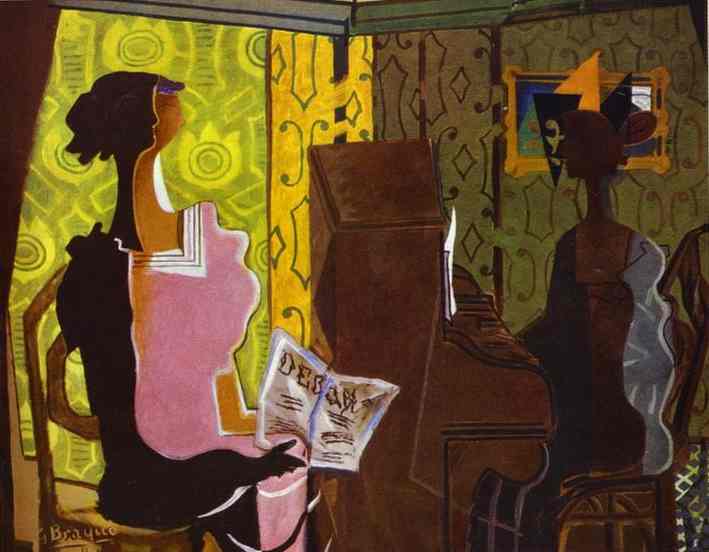
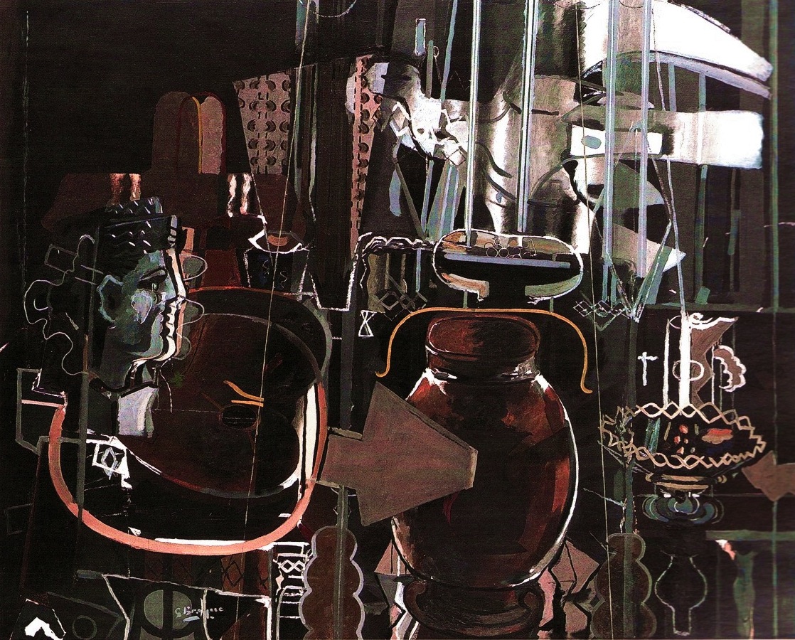
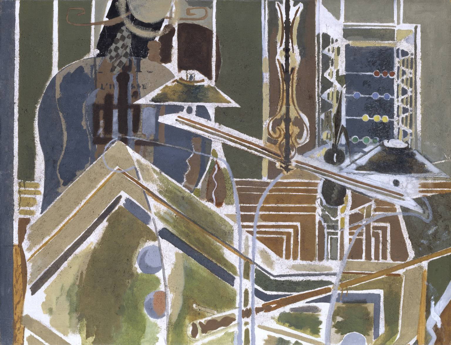
How and why cubism came about here is unclear, but Cezanne, a forerunner of the movement, was evidently as inspired by the geometric volumes of the railway bridges and houses clinging to the hills as he was by the hard-edged stone quarries near his birth city of Aix. But it was perhaps the contributions of Georges Braque which were to be the most significant. While his initial response to the landscape was a fauvist expression in a multi-coloured palette of startling bright tones, it was his decidedly cubist landscapes depicting L’Estaque’s house-filled hillsides which really put the town, and cubism, on the artistic map.

L’Estaque by Braque and Cezanne

largerGeorges Braque - The Port of L'Estaque, 1906 at Summerset House London Englandl-estaque-view-through-the-pines-1883article_image_3_cezanneGeorges_Braque,_1908,_Maisons_et_arbre,_oil_on_canvas,_40.5_x_32.5_cm,_Lille_Métropole_Museum_of_Modern,_Contemporary_and_Outsider_Art

Given its place in art history, I felt that this little former village had to be on our Marseille itinerary, even though for many, it may go unnoticed. Happily we were able to take a boat the 30 minutes along the bay – a far preferable trip to the alternative of a sweaty commuter train out of the Gare St Charles – and this approach gave us  the advantage of seeing the hillsides of L’Estaque from afar, characterised as they are by the arched railway bridges which feature so predominantly in Cezanne and Braque’s landscapes.

I would be lying if I said that we were blown away by the town. It is, in essence, a very simple seaside village with a hand-full of bars and a port packed with fishing boats. It is also somewhat difficult to imagine the quaint village which Braque and Cezanne might have discovered when they arrived years ago, free from the modern industrial structures which sit just outside the town, and the tall wire fencing which closes off much of the port from view. However, once we strolled up into the higher streets, and looked across both the port and the rooftops of the gradually ascending town, suddenly the shapes and volumes which must have inspired that new cubist way of depiction fell into place, and the true artistic significance of L’Estaque gained clarity.

DSC04350DSC04319DSC04313DSC04305DSC04273DSC04301

Satisfied, therefore, by our trip and the insight it provided into the birth of cubism, we grew fonder of L’Estaque, a notion which a few glasses of rosé on the sunny portside promoted. And then, as though reminding us that a contemporary society also lives today in this town of cubist history, a bugle call and a loudspeaker announced the commencement of Le Joute – a form of water based jousting which captured our attention for the remainder of the afternoon. Only then did we head back onto the water, gliding away from L’Estaque in a boat bound for Marseille, watching behind us as the forms of houses and rail bridges grew smaller until they resembled mere cubes on a craggy hillside…

DSC04250DSC04340DSC04267DSC04282DSC04321DSC04295

© Nicholas de Lacy-Brown and The Daily Norm, 2001-2017. Unauthorised use and/or duplication of the material, whether written work, photography or artwork, included within The Daily Norm without express and written permission from The Daily Norm’s author and/or owner is strictly prohibited.

Cubism’s hidden depth: The Crystal in the Flame

Any artist will tell you that paintings flowing from instinct will always work better. Those forced, because of instruction or a self-imposed target, will often miss the mark. When I paint from the heart, it always works better, and the style to which I always find myself returning in those unencumbered, free-flowing moments is a form of cubism.

I have always shied away from over-categorising my work. I rarely find such labels to be helpful, as indeed can be said of pigeonholing people. But I am the first to admit that there is something decidedly cubist about my recent work, especially when I design straight from the heart. This tendency arises, I believe, from my perfectionist attitude when it comes to composition and line, since there is nothing quite like the geometric delineation of cubism to satisfy that inherent need for order within me. However, it is also a tendency which arises directly out of my adoration for the genre in general.

Cubist works have always held an enduring fascination for me. In a gallery of plenty, they are always the works which later I will proclaim to have been my favourites. And last weekend, when I was lucky enough to attend an entire exhibition of cubism at the Picasso Museum in Barcelona, I realised quite how innately inspired I am by the cubist age.

Portrait_of_Josette_1916_Juan_Gris.jpg

Juan Gris, Portrait of Josette, 1916

severini-bottle

Gino Severini, Still-life with Bottle of Marsala, 1917

juan_gris

Juan Gris, La Guitarra, 1918

The museum’s fascinating new exhibition, Cubism and War: the Crystal in the Flame, sets out to explore another face of the artistic masterpieces produced during the time of the First World War. When WW1 broke out, cubism as an artistic genre, was considered to be a fully-established school, with the likes of Picasso and Braque, Diego Rivera and Juan Gris its leading proponents. Rather than break with this new innovation when the war made images of blood-soaked trenches and destroyed landscapes a reality, those same artists and their followers were determined to keep the style alive. However, whether it be as a direct response to the horrors of war or a reflection of the modern, mass-machine, emotionless reality of the age, the time of war did bring about a distinctive sub-class of cubism, and it is this period on which this exciting new exhibition focuses.

juan_gris_jose_victoriano_gonzalez_perez_spanish_-_still_life_before_an_open_window_place_ravignan_-_google_art_project

Juan Gris, Still Life before an Open Window, Place Ravignan, 1915

still-life-with-compote-and-glass

Pablo Picasso, Still-Life with Compote and Glass, 1914-15

Known as “crystal” cubism in reference to the tightening compositions, enhanced clarity and sense of order reflected in the works, this new modification of cubism has been likewise linked to a much broader ideological transformation towards conservatism in both French society and culture (the crystal movement was largely painted out of Paris). It was certainly a purification of the style, moving from a complex analytical form of cubism, in which cubism was used to decompose a particular image or person after study, to a synthetic process whereby the cubist composition was built on the basis of geometric construction without the need for prior study. The “crystal” period took synthetic cubism one step further with works inherently characterised by a strong emphasis on flat surface activity and large overlapping geometric planes controlled by the primacy of the image’s underlying geometric structure, rooted in the abstract.

pierrot-1919

Juan Gris, Pierrot, 1919

1024px-juan_gris_-_still_life_with_newspaper_-_google_art_project

Juan Gris, Still Life with Newspaper, 1916

The exhibition brings together an incredible away of works from the crystal period, and such was the perfection of the works on display that the show got my little perfectionist heart all in a flutter. Moving between a kind of infatuated admiration of the works and a despair at my own failure to produce masterpieces of the kind, I left the exhibition full of inspiration and a determination to continue along my own road of crystallised composition. I have already started work on my own painting inspired by the show. But in the meantime I am happy to recommend the exhibition to you all and to share some of its masterpieces on this post (most of which are Juan Gris, by far my favourite of the lot!).

Cubism and War. The Crystal in the Flame, runs at the Picasso Museum, Barcelona, until 29 January 2017.

Las Meninas: Second Interpretative Exercise

There are some art exhibitions that you go to that simply have the capacity to strike deep. Many shows are pleasing, others interesting, but then there are those which you remember for ever. I’ll never forget for example Frida Kahlo or Henri Rousseau at Tate Modern, Tamara de Lempicka at the Royal Academy, Dali at the Centre Pompidou or Da Vinci at the National Gallery London. Now to that list I add the Kandinsky retrospective at CentroCentro in Madrid, not because it was any better than the Kandinsky I saw many years before at Tate, but simply because the combination of time and energy and who know’s what combined to leave me utterly inspired.

When, the next day, I walked into the Prado and saw Velázquez’s Las Meninas once again, something shifted in my head, and I left an artist converted.

I started my reinterpretations of Las Meninas shortly after the whirl of the Christmas season was over, and my first, Las Meninas (In Our Time) I shared with you a few weeks ago. But my new project was far from over, and this painting, shared today, was the one which leapt into life before my eyes that day in the Prado Gallery when Kandinsky was still very much on my mind.

Las Meninas 2 FINAL

Las Meninas: Second Interpretative Exercise (2016 ©Nicholas de Lacy-Brown, acrylic on canvas)

Las Meninas: Second Interpretative Exercise borrows from Velázquez’s composition, but otherwise radically simplifies the forms of his dramatic personæ, and swaps the dark browns and neutral shades of his painting with a vibrant almost pop-art palette. The result is an image which pleases me incredibly. It is at once abstract but recognisable, tidy but surreal. I had great fun in reimagining each piece of the painting – for example painting the dog’s stretched out arm as a bone, and the nun’s head like a piece of sushi – and best of all, I know that this is only the beginning. Abstraction and simplified forms are spinning around my head. Ideas are overflowing, and I can’t sit still for a need to paint.

It’s why I’ll always remember that Kandinsky show, because it switched on a light in my head which has long remained dormant.

© Nicholas de Lacy-Brown and The Daily Norm, 2001-2016. Unauthorized use and/or duplication of the material, whether written work, photography or artwork, included within The Daily Norm without express and written permission from The Daily Norm’s author and/or owner is strictly prohibited. For more information on the work of Nicholas de Lacy-Brown, head to his art website at www.delacybrown.com

Paris | Art tour 2013 – Braque

Lovers of 20th century art will all have heard of French-born artist Georges Braque. Of course I’ve heard of him too, renowned as he is for being co-founder of cubism along with the artist with whom he was thick and thieves in early 20th century Paris, Pablo Picasso. But my acquaintance with Braque has all too often occurred because, seeing a cubist masterpiece hanging in a modern art gallery, I have confused it with a Picasso, only to discover that the work was by Braque. It’s an easy mistake to make – the two artists were practically indecipherable from one another when they started out on the cubism road, a likeness of style which must be put down to the fact that they would discuss one another’s work endlessly day after day, night after night. And Braque was, purportedly, inspired into cubism by his glimpse of Picasso’s now world-famous Les Demoiselles d’Avignon, which few understood at the time, Braque being the exception.

So while Braque has, for me, existed solely in the shadows of the far glossier art historical existence of Picasso, I have never had the chance to discover how truly consistently brilliant he was as an artist. That is until this autumn, thanks to the latest blockbuster exhibition of Paris’ Grand Palais, which dedicates two floors of its palatial surrounds in retrospective homage to this French artistic great. I say consistently brilliant, because this show was one of those rare exhibitions where I literally loved almost every single piece, finding myself almost breathless with admiration as I strolled from painting to painting literally in love with what was on the walls before me.\

Early fauvism

The Port at La Ciotat (1907)

The Port at La Ciotat (1907)

Landscape in L'Estaque (1906)

Landscape in L’Estaque (1906)

The show starts with early Braque, whereupon he dabbled largely in the fauvist epoque, with the result that his sunny landscapes of Southern France are imbued with scintillating bright colour which can not help but make the viewer yearn for the summer. But soon enough, after this initial embrace of colour, Braque discovers the more subdued shades of cubism, finding his own when fragmenting a scene into colourless, cubist dimensions. Seminal in cubism’s development was a chance visit to a wallpaper shop when Braque saw a reproduction wood-pattern paper in the window. Purchasing the wallpaper by impulse, it soon inspired Braque to set about creating a series of paper collages, which included, as well as the wallpaper, cardboard, newspaper cuttings – anything he could get his hands on. The effect of this geometric fragmentation was to create the cubist look, and soon enough Picasso was doing the same.

Into cubism, collage and then back to paint

Mandora (1909)

Mandora (1909)

The Viaduct at L'Estaque (1908)

The Viaduct at L’Estaque (1908)

Little Harbour in Normandy (1909)

Little Harbour in Normandy (1909)

Still life with pipe (1913)

Still life with pipe (1913)

Still life on a table with Gillette (1914)

Still life on a table with Gillette (1914)

Violin and Pipe (Le Quotidien) (1913)

Violin and Pipe (Le Quotidien) (1913)

back to painting.... Still Life with Fruit and Ace of Clubs (1913)

back to painting…. Still Life with Fruit and Ace of Clubs (1913)

After several years of collage experimentation, Braque returned to paint, but using the medium to create what were almost pastiches of the collage look – still fragmented, full of geometric shapes, but differing in their progressive return to the bolder colours of his fauvist age, a return which was no doubt eased along by the weakening of his relationship with Picasso, and his strengthening bond with spirited Spanish artist, Juan Gris.

The Table (1928)

The Table (1928)

The Round Table (1929)

The Round Table (1929)

The Duet (1937)

The Duet (1937)

Studio II (1949)

Studio II (1949)

Studio with Skull (1938)

Studio with Skull (1938)

Thus it was that as the 20s and 30s ticked by, Braque’s work moved the cubist spirit further and further, as the artist pushed the boundaries of the movement he had helped to create, until such a time as his works become progressively more figurative, but all the while maintaining the multi-dimensional expression which was central to cubism. Take his billiard table series for example – seen from various angles, Braque’s bold green billiard table is shown from all kinds of impossible angles, and yet there is no mistaking what Braque was trying to depict.

The Billiard Table (1945)

The Billiard Table (1945)

I would be selling the show short to suggest that it all ended there. From colour-drenched fauvism to colour-collected cubism, Braque’s mastery extended to every avenue of life, as he used his pioneering imagery to depict portraits, artist’s studios, landscapes, still life and even greek mythology. From room to room we see an artist who never failed to be inspired, and to inspire his countless followers in response. Never again will Georges Braque be in Picasso’s shadow as far as I am concerned, but level pegging as a genius of 20th century art.

Georges Braque is showing at the Grand Palais, Paris until 6 January 2014.

Turner Prize winner recalls the quirky originality of the modernist revolution

I adore modernism in art. Just what the genre entails is debatable, but when I think of Modernism, I think of Gaudi’s masterpieces in Barcelona, and the art nouveau of Paris, the rethinking of everyday objects to create masterpieces out of functionality, obliterating corners and straight lines, and emboldening quirky, individual designs over and above the monotonous linear structures inherent of 19th century urban development. The free-thinking spirit of modernism barely visited the shores of England, which was too constrained by the censored expression and elaborate attention to detail embodied by the Victorian era. Then with the two world wars dampening the UK’s embrace of architectural innovation, and the second world war flattening half of the country, the architecture which followed needed to be quick and cheap. Hence the hideous 50s and 60s monsters which now litter the British horizon.

George Shaw

These depressing urban environments, many of which have now fallen into disrepair and face demolition, are the eery subject matter of one nominee of this year’s Turner Prize: George Shaw. His works, such as this one, are painted in enamel paints, akin to those used by model makers, and as a result they exhibit a strange, photorealistic finish which depresses as much as it entices. I’m glad to see that paintings have made it into the Turner prize, and skilfully painted works at that. It’s a far cry from the “readymades” of conceptual art’s previous dictatorship over the prize. But this does not alter the spirit-crushing reaction which this paintings conjure in their audience. I haven’t been to the Prize (it’s location in the far out sticks of Gateshead does not make a visit for a Londoner particularly easy) but from viewing the work online, I am most struck by the photorealistic skill which has been utilised in producing the images. So are they art? Well, there are aspects of artistic composition and balance in these canvases, from the stark tower block background, cut off menancingly mid tower, suggesting the interminable rise of these modern monsters way into the landscape, while in the foreground, light dapples almost elegantly on the stark road surface. This is artistic, and I must say, I like his works. Although I think they’re better suited to a gallery setting: Hang them in your lounge and you’ll be on prozac in no time.

Martin Boyce installation

Martels' Cubist Trees

However it is the winner of this year’s Turner Prize, announced yesterday evening, which most inspires, and for me, Martin Boyce’s take on the urban environment recalls the quirky originality of the modernist revolution. His “installation” is a quietly atmospheric, almost poetic exploration of an autumnal park landscape, a bench like structure dappled with the light which flows through a metal leafy mesh on the ceiling. There are geometic paper leaves on the floor, and further leaves suggested by the mobile structures which appear to reference the whimsical mobiles of Calder. I especially love the slanted wonky litter bin, perfectly completing the urban park environment which has been created, but which also appears, nostalgically, to reflect the spirit of modernism. This reference is concreted (excuse the pun) by the explicit reference to the concrete Modernist garden of the artists Joel and Jan Martel, first shown in the 1925 Exposition des Art Décoratifs et Industriels Modernes in Paris, a picture of which hangs within Boyce’s installation. This Modernist garden included concrete, geometric trees, their angular motifs seemingly reflected in Boyce’s own structures within the installation.

Norm watering a Cubism "Martel" Tree (2011 © Nicholas de Lacy-Brown)

Boyce’s work is no readymade. This has taken skill, and with it he creates undeniable atmosphere and produces a work with all the potential to trigger an emotional response from his audience. How wonderful then that with this year’s Turner Prize, we appear to be moving forward away from conceptual art which, in yesterday’s blog entry, I so bemoaned. As for the other two Turner nominees, in particular Karla Black’s painted bin bags… well, the less said about that, the better…

Karla Black's bin bags