Genius of Geometry: Patrick Caulfield
When I attended the Royal Academy’s Summer Exhibition in 2006, I was completely stunned by an artist to whom the Academy had dedicated a room of its annual summer show: Patrick Caulfield. Born in London in 1936, and died in 2005 (hence the tribute paid to him at the following Summer Exhibition), Patrick Caulfield’s flattened geometric black-lined block coloured works have now become synonymous with the age of British pop-art, although it was a title which Caulfield actually rejected. And he was probably right to. While his works, largely acrylic on canvas, share many of the characteristics of the pop art age (bold colouration, simplified forms, black outlines), pop art promoted and impersonated the commercial world, while Caulfield’s works actually reference art historical notions of representation; from still life to pictorial depth, albeit represented in his characteristic paired down flat colours and simple linear expression.
Early output

Pottery (1969) © The estate of Patrick Caulfield

Foyer (1973) © The estate of Patrick Caulfield

Café Interior: Afternoon (1973) © The estate of Patrick Caulfield

Wine Glasses (1969) © The estate of Patrick Caulfield

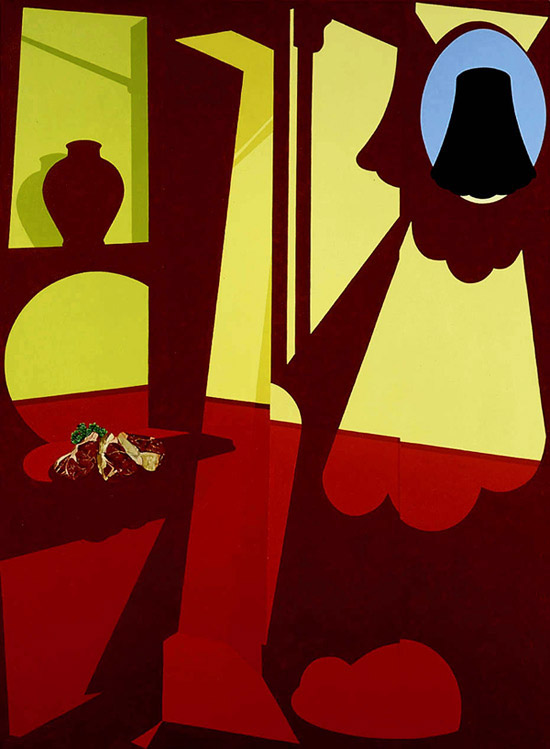
Battlements (1967) © The estate of Patrick Caulfield

Dining/ Kitchen/ LIving (1980) © The estate of Patrick Caulfield
It only took one glance that summer of 2006 at the perfectly painted lines and faultless application of block colours used artfully to depict rooms and places, café scenes and still lifes to know that I was completely in love with Caulfield’s works. While I adored the sparse simple images of his 1960s work, my real admiration was reserved for the knockout creations of the mid 70s, when Caulfield started to play with styles, integrating into his then renowned geometric works hints of trompe l’oeil photorealism. So in works such as Dining/Living/Kitchen for example, Caulfield paints a scene characterised by black outlines, block shadows, dispensed brushwork and anonymous handiwork and inserts into it a casserole dish so perfectly represented that you would swear a photo had been collaged onto the background. This technique is used with spectacular success in After Lunch, where the window (or is it a picture hanging on the wall?) looking onto an Austrian landscape is photorealistic to an awe-inspiring standard, while in Happy Hour, the wine glass at the painting’s centre actually reflects in its sheen a realistic depiction of the bar which, elsewhere in the painting is only represented with paired down flattened forms. Absolutely brilliant.
Tromp L’oeil brilliance

Happy Hour (1986) © The estate of Patrick Caulfield

After Lunch (1975) © The estate of Patrick Caulfield

Still Life Autumn Fashion (1978) © The estate of Patrick Caulfield

Interior with a Picture (1985) © The estate of Patrick Caulfield

Second Glass of Whisky (1992) © The estate of Patrick Caulfield
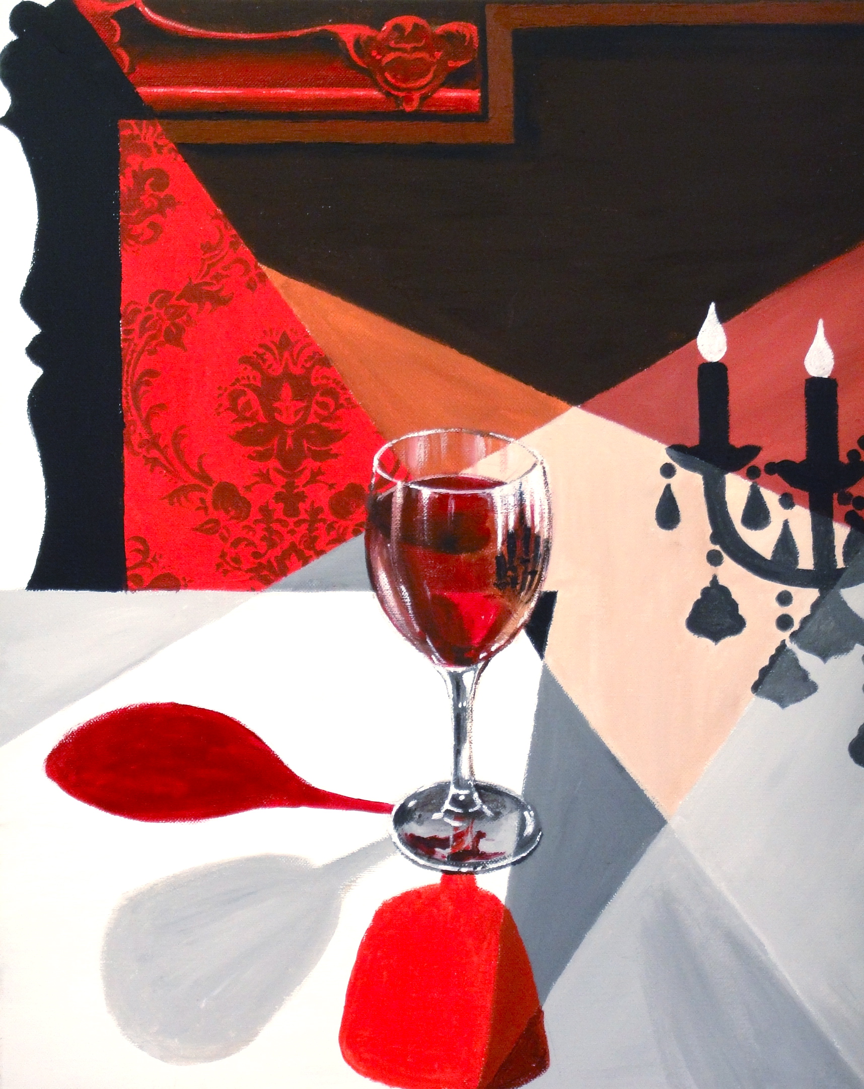
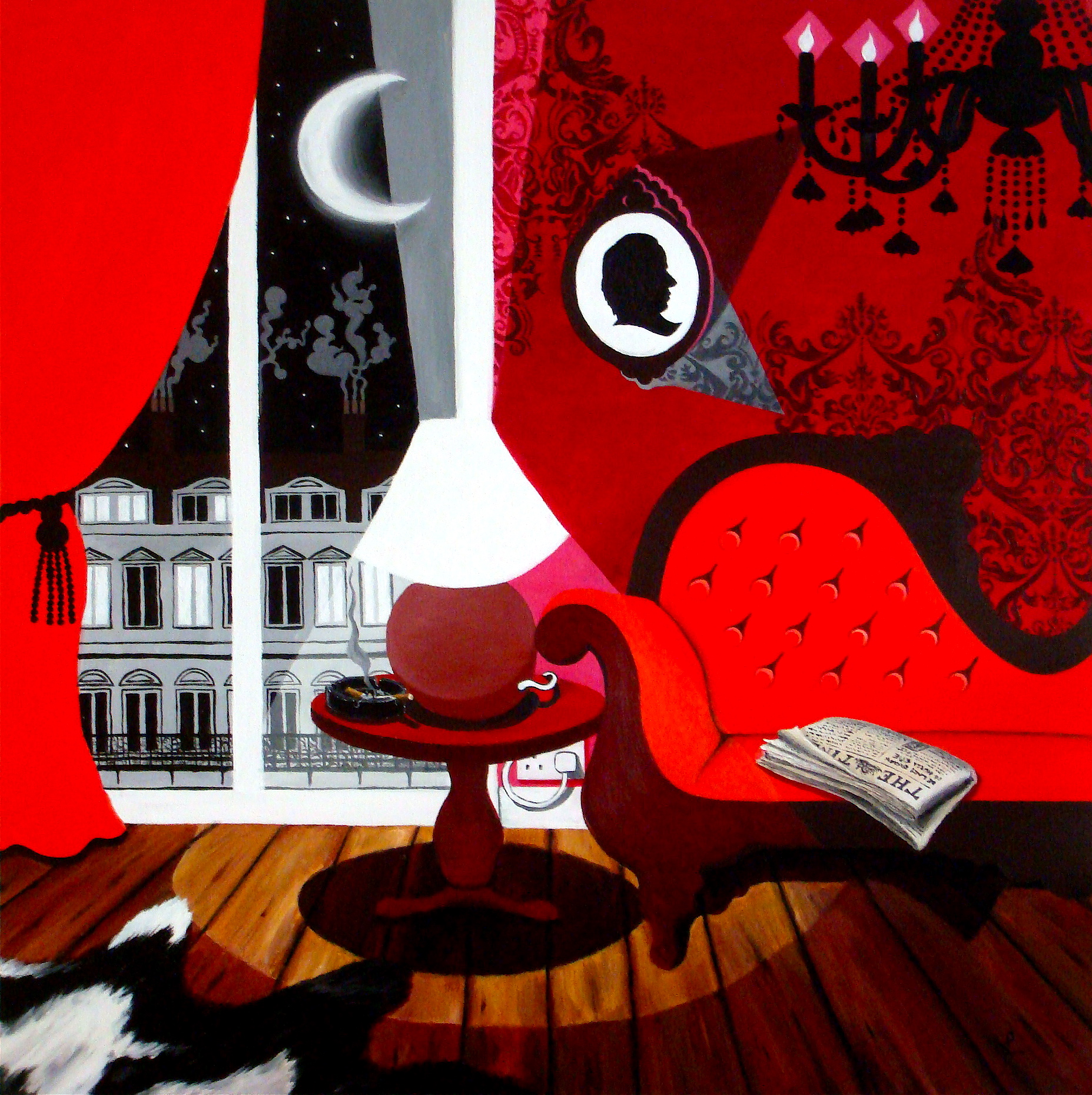
Caulfield’s work not only thrilled me; it also inspired me. I am much indebted to the influence Caulfield had upon my own work – my painting Vintage Q, painted that summer immediately after seeing the RA show, is directly inspired by Caulfield’s technique, while Q4 and Q5, which followed suit, are likewise. Meanwhile, I think much of the interior design I put into place around my apartment flows directly from his mix of contemporary block colours, and interlaced with hints of rich, detailed damask patterns.
Later works: light and shadow

Room 3-95 (1995) © The estate of Patrick Caulfield

Trou Normand (1997) © The estate of Patrick Caulfield

Bishops (2004) © The estate of Patrick Caulfield
Hedone’s (1996) © The estate of Patrick Caulfield

Rust never sleeps (1996) © The estate of Patrick Caulfield

Fruit display (1996) © The estate of Patrick Caulfield
So for that reason alone, Caulfield has always stuck in my mind, but imagine my delight when this summer, a solo show held at Tate Britain afforded me the opportunity to see Caulfield’s works all over again. In 5 exquisite galleries, a comprehensive selection of Caulfield’s works took us from his most simplistic 60s creations (a simple grey well reduced to flattened, even more simplified forms; a bend in the road, some castle battlements (above) and so on), to his brilliantly innovative 70s works, where trompe l’oeil dazzles the senses and shines amongst the flatter planes of the large-scale block colour canvases, and then onto the 80s and beyond, when Caulfield began to experiment more with light and shadow, not focusing so much on the thick outlines of black, but expressing an object with shadows and throwing light, albeit in block-colour form.
My works: inspired by Caulfield
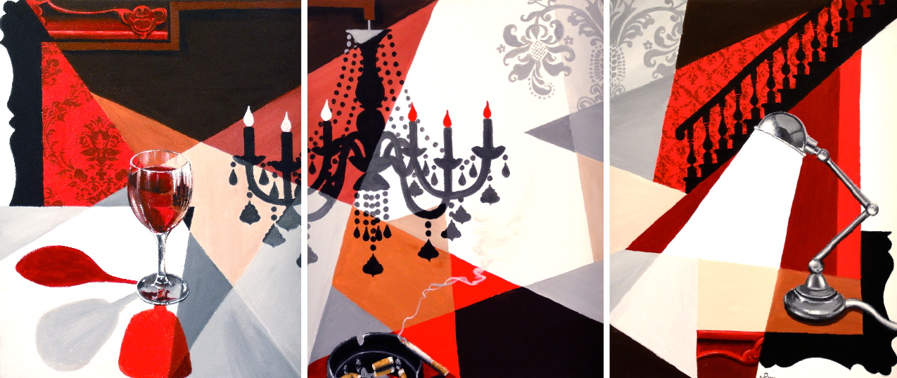
Vintage Q (2006 © Nicholas de Lacy-Brown)

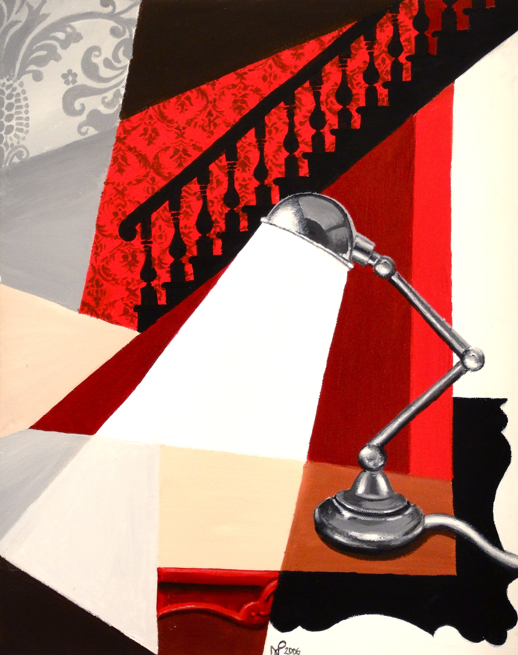
Q4 (2007 © Nicholas de Lacy-Brown)
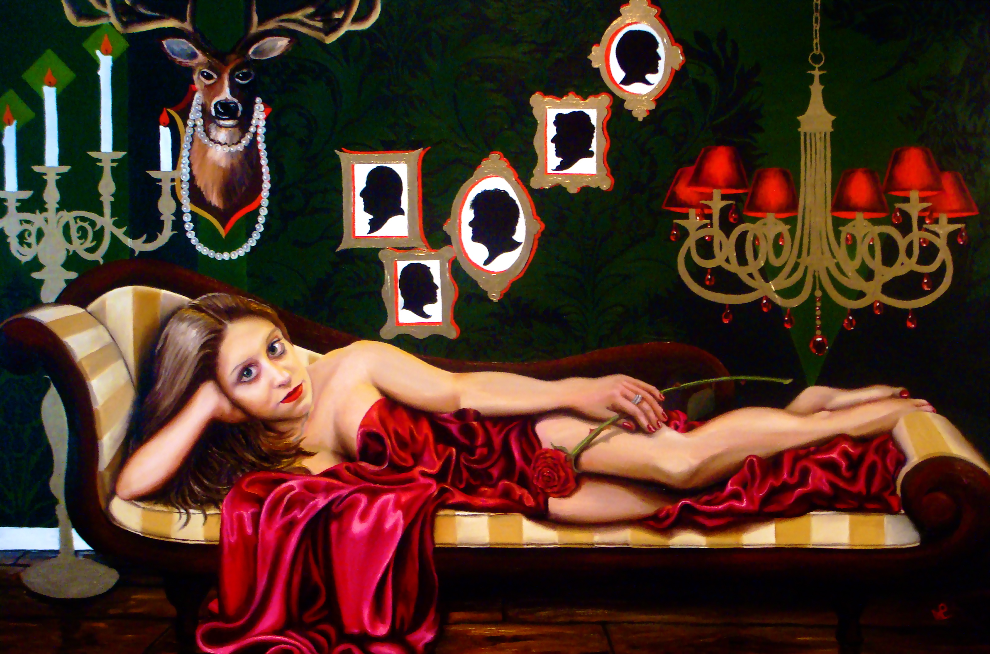
Q5: Chez Helen (2008 © Nicholas de Lacy-Brown)
I realise that in writing this review, I am somewhat missing the boat, seeing as the Caulfield show at Tate ended last weekend. But that is no reason why the genius of this brilliant artist should not be applauded to the full – an artist who took 60s simplification in an altogether more mentally complex direction; whose works have become iconic in the chic interiors of London’s cool hotels and boutiques; and whose images have been fundamental in shaping my own creative output as an artist.
Related articles
- Patrick Caulfield, the quiet revolution (reinesnotebook.com)