Skip to content

Posts from the ‘Review’ Category

BreathNorm – Norms inspired by De Waal

For an artist like myself, whose almost complete inability to paint in anything but the brightest of colours (as followers of this blog, or indeed of my art website may have realised) has made colour something of a trademark of my creative output, I sometimes surprise even myself when I start to find myself drawn towards simple, monochrome, muted colourless creations. It happened for example earlier this year, when I shunned the great pasty-coloured nudes of Lucien Freud in order to give my full attention to the stunning works in black and white that are his etchings. Completely captivated by the simplicity of the medium, yet the extent of intricacy and emotion he was able to capture in simple black lines, I became obsessed by printmaking, and started etching myself – a pursuit which continues to occupy many of my weekends as I dabble further in this new medium.

Now it has happened again, with the pots of De Waal. As I described in my post yesterday, I was delighted when, by sheer coincidence as I am reading my way through the enthralling pages of The Hare with Amber Eyes, I caught a documentary on the BBC’s Imagine show last week, focusing on the book’s author. While I was fully expecting my attention to be held by all references in the programme to the book which has captivated me for the last few weeks of reading, what I wasn’t expecting was to become so completely enamoured by the artworks which this great novelist also creates. I say also – however art is in fact Edmund De Waal‘s primary calling in life, and he was turning his hands to the malleable craft of pottery long before he ever began to trace the heritage of his netsuke whose story formed the basis of the book which has now made him famous around the world.

Breathturn II (2013 © Edmund De Waal)

Breathturn II (2013 © Edmund De Waal)

Breathturn IV (detail) (2013 © Edmund De Waal)

Breathturn IV (detail) (2013 © Edmund De Waal)

First Light (2013 © Edmund De Waal)

First Light (2013 © Edmund De Waal)

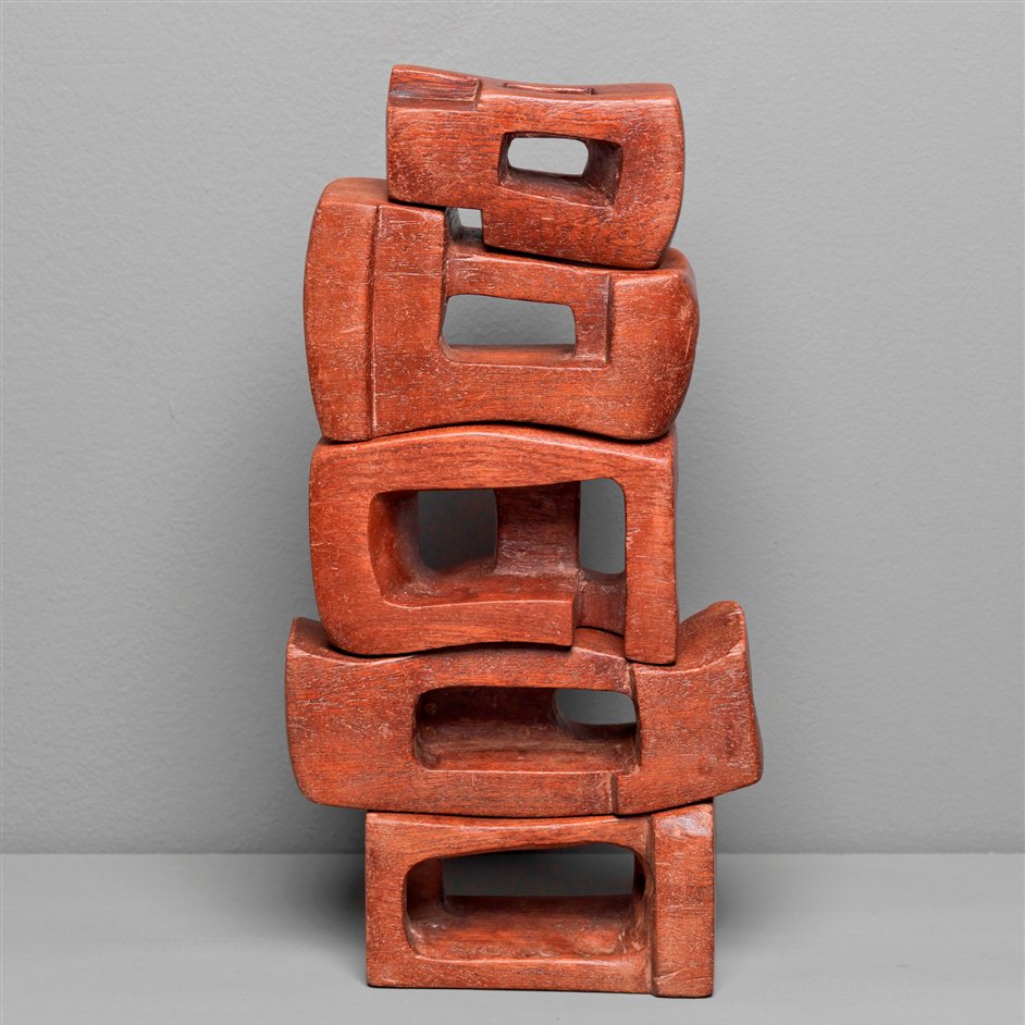
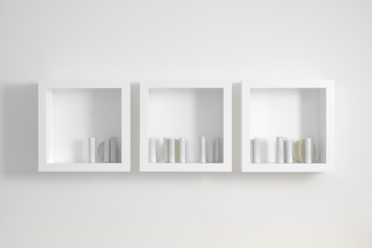
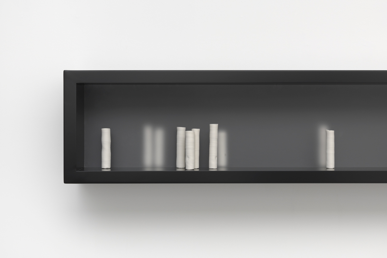
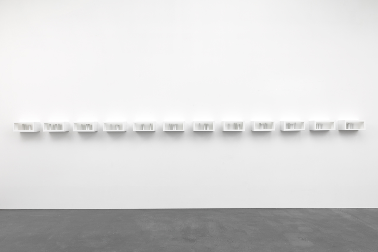
Edmund De Waal’s art is pottery. He makes pots. But pots whose assemblage is so brilliantly pictorial, so evocative of emotions deeply held within the craftsmanship of their creation, and yet so capable of rousing within the viewer deep, reflective emotions, that as installations, these simple pots create artistic masterpieces worthy of the great art collections of his family predecessors.

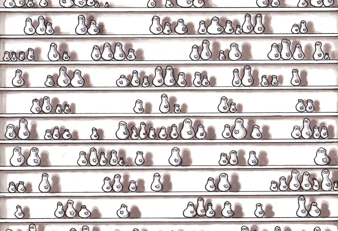
De Waal’s pots are simple – usually either in black or white – but their beauty tends to be about two things. First, the naive effortlessness of their shape; the mismatched almost drunkeness of one lean after another, which tends to give each pot a handmade personality all of its own, rather than the feeling of machine manufacture. Second, their grouping – it is the way in which De Waal groups his pots together which makes them so effective as works of art: Is it just that I am coloured by the contents of his book, or by his Jewish ancestry, or did he intend to create row after row of pots so uniquely human in their uneven appearance, that they seem to evoke to Holocaust itself? For me, when I see these works, such as the quartet of huge almost bookcase structures, Breathturn, displaying shelf after shelf of randomly placed pots, I think of the row after row of destitute Jews, stripped of their livelihood and of their dignity, waiting like cattle for train crates on bleak station platforms, ready to face the certain horrors of their final destination.

Your hands full of hours (2013 © Edmund De Waal) (detail)

Your hands full of hours (2013 © Edmund De Waal) (detail)

I heard it said (for Berg) (2013 © Edmund De Waal

I heard it said (for Berg) (2013 © Edmund De Waal

How did we live here (2013 © Edmund De Waal) (detail)

How did we live here (2013 © Edmund De Waal) (detail)

The White Road III (detail) (2013 © Edmund De Waal

The White Road III (detail) (2013 © Edmund De Waal

And then there are De Waal’s works which show groups of pots separated by a sheet of translucent perspex, so that you can see the pots behind it, but only in blurred outline. This produces the effect of a solemn group shot, perhaps a family, estranged – people taunted by the shadows or perhaps memories of loved ones; their presence there close at hand, and yet not there, untouchable, ungraspable; the frustrating feeling of irreparable separation, when a blasted great wall separates you from where, or with whom you should be.

These interpretations may well not be what De Waal intended when he made his works, but what does it matter? For in creating works that inspire these kinds of reactions in me, he has surely done the job of a great artist: he has moved his audience to an imagination all of their own.

And, as all the great artists have done before him, De Waal not only got my imagination churning when it came to his own works, but also inspired me to create a Norm re-invention of his pottery installations. And so I leave you with my own little Norm group shot; a homage to all those pots and the great variety of emotions their simple poses evoke.

BreathNorms (after De Waal) 2013 © Nicholas de Lacy-Brown, pen and ink on paper

BreathNorms (after De Waal) 2013 © Nicholas de Lacy-Brown, pen and ink on paper

BreathNorm (detail)

BreathNorm (detail)


The photos on this page are the copyright of  © Edmund De Waal, and show the works he prepared for his 2013 exhibition at the Gagosian, New York. Norms are the copyright of me © Nicholas de Lacy-Brown, 2013. The works of Edmund De Waal can be seen on his website, here.

Dürer the Prodigy – at the Courtauld Gallery

It’s always a thrill to turn back the clock on an artist, putting asides the famous masterpieces of their renown, and heading back to their early years. Those formative first works are always so illuminating, not just as an art historical evaluation of the influences which were to be instructive in helping to characterise the artist’s own creations, but also as a demonstration of just how talented an artist truly was. Take Picasso for example : while we are so used to his heavily abstracted, childlike works (some even doubting that he had any talent at all), one look at the exceptional figurative quality of his teenage works demonstrate how truly exceptional he really was, so much so that he famously asserted that he learnt to paint like a master as a child, and then spent the rest of his adult life learning to paint like a child.

London’s exclusive little Courtauld Gallery, whose exceptional collection contains some of the world’s most recognised impressionist and post-impressionst masterpieces including Sr Picasso himself, is the perfect sized gallery to draw such a focus on the formative years of an artist’s life in one of its small but perfectly formed temporary exhibitions. And with its new show, opening to the public yesterday, the Courtauld does just that. With The Young Dürer: Drawing the Figure, the Courtauld examines the very first creative years of this master of the Northern European Renaissance, heading back to the 1490s when, in his late teens and early twenties, Albrecht Dürer set out on his wanderjahre – literally a wandering journey, taking him across Germany and over the Alps into Italy, where the young prodigy was widely influenced and honed his already exceptional drafting skills.

Dürer the great master…

Self Portrait (1500)

Self Portrait (1500)

A Young Hare (1502)

A Young Hare (1502)

Praying Hands (1508)

Praying Hands (1508)

The show, which includes some wonderful works never before seen in the United Kingdom, provides an engaging insight into the early talent of a young Dürer, and for an audience who, like me, loves to study the meticulous details of black and white ink drawings and print works, is a thrilling event. While the few works included in this post from Dürer’s later career demonstrate just how exceptional a draughtsman he was to become, the early works on exhibition at the Courtauld demonstrate how Dürer worked tirelessly to hone those skills which were later to make him one of the most revered draughtsmen of his time.

The show includes, for example, a good many studies in pen and ink – of the perilously difficult folds of drapery, the complex fall of the material captured proficiently no matter the many poses adopted by the sitter;  of hands and feet, and the foreshortening of limbs. Such studies are then utilised to brilliant effect, as Dürer moves into creating his first largescale drawings and printworks. In The Prodigal Son for example, Dürer brilliantly captures the detailed fuzzy coats of a group of pigs, while in the fantastically detailed woodcut depicting The Flagellation of Christ, Dürer shows himself to be adept, not just in his portrayal of a complex group of figures, but in his use of foreshortening, and his depiction of drapery and costume.

Dürer the early prodigy

Man's Bath (1496)

Man’s Bath (1496)

The Prodigal Son (1495)

The Prodigal Son (1495)

Flagellation of Christ (from the Large Passion Series) (1497-1500)

Flagellation of Christ (from the Large Passion Series) (1497-1500)

But perhaps one of the most insightful works of them all is the simple self-portrait drawing he made of himself in 1491. Eyes staring, full of melancholy, straight into those of the viewer, the portrait is one with a psychological intensity which invites the modern day audience to travel straight back into the 15th century mind of this young artist, whose skills, as demonstrated here, need no introduction – just look how his brilliantly drawn hand pushes against the slightly sagging skin of his face, distorting his features perfectly. And all this drawn fluidly and confidently in what appears to have been a single attempt.

Self Portrait (1491)

Self Portrait (1491)

It’s a brilliant protrait and a brilliant collection which make artists like me quake in fear that one day a similar such exhibition of our early works may demonstrate just how little talent we had when compared with prodigies such as this. But hey, there will always be those with more talent, and the new Courtauld show allows us to revel in the early skills of one of the greatest.

The Young Dürer: Drawing the Figure is on at the Courtauld until 12th January 2014. Admission to the exhibition is generally £6 unless a concession applies – and that includes the gallery’s stunning permanent collection to boot. Bargain.

A Weekend in Kraków | The traditions and innovations of Kraków’s food

Poland isn’t exactly known as one of the centres of European gastronomy. For years, that crown, once worn so complacently by the French has been shared intermittently between the likes of Spain, Denmark and the UK. The only Polish food I had really tried before my departure was a packet of shrivelled up long smoked sausages from our local tesco’s (catering for the not insignificant Polish population living down the road in Balham). So I didn’t exactly have high expectations for what I was going to find food-wise when I went to Kraków for the weekend. In fact, I didn’t really have any expectations at all.

But, as with so much about my weekend in the stunning little city of Kraków, I was pleasantly surprised by the array of high quality food on offer. First off, there was the traditional fare –  I say that I went along to Poland without any expectations in respect of food, but that’s something of a lie. Because I was pretty determined to try at least a sausage in its native Polish environment, and of course it was only reasonable that such sausage (of which I found plenty in the bustling markets in and around the Rynek Główny) should be washed down with another export of the country – a glass of ice-cold Polish beer. Both objectives were achieved (the best sausages being the preserve of our hotel breakfast, while an ice cold beer proved to be the perfect accompaniment to watching the world go by in the Rynek Główny).

Oscypek cheese

Oscypek cheese

Pierogi dumplings

Pierogi dumplings

However, my explorations of Polish traditional cuisine went further. Only minutes into the trip, and I was already sampling another of the local specialities (spurred on by my Polish partner I should add). The first was oscypek, a super-salty waxy cheese from the nearby Tatra mountains – it reminded me of greek halloumi, albeit much smokier in flavour; the very taste of the flames licking the sides of the cheese dominating. The second – pierogi – are a kind of traditional dumpling. Rather like ravioli in appearance, they taste more doughy in flavour, and every bit as juicy and flavoursome as a dumpling should be. I’m not sure you’d necessary sample them looking quite so trendy as these all over Poland, but sitting by the side of the Rynek Główny in the café “Vintage”, we were served only food which was consistently well presented and full of flavour – a real surprise for a restaurant located so close to the tourist heart of the town.

But for all its traditions, Kraków is a city which remains young at heart (its large student population keeps it so); a city embracing innovation and cultural dynamism, and so it is perhaps unsurprising that Kraków’s food offerings are both extensive as they are varied, with numerous restaurants presenting food which is both modern in flavour and in presentation. Pretty much all of the food we had was of a consistently high standard (although a rather demented looking piano player supplying diners with “mood-music” somewhat put us off our food experience on the first night). But of all the places we visited, two really stood out.

Studio Qulinarne

DSC07431 DSC07425

The first of the two is Studio Qulinarne, located in a rather grotty backstreet of the Kazimierz (Jewish district) (I assumed my Partner had got us lost) but which, inside, is the height of sophistication, draped in flowing white sheets, complete with loaded bookshelves and a grand piano (happily being played by a less-demented looking pianist on this occasion). Being that the day was fine when we visited for lunch, we opted to sit outside on their back patio, which reflected the industrial mood of the area, but was made chic and cosy through low sofa seating and an abundance of plants.

DSC07417 DSC07419 DSC07428

The real star of the show at Studio Qulinarne however was the food. Dominik opted for a crayfish consommé which was as delicious as it was presentationally excellent. I had fettuccine ribbons with chanterelle mushrooms which were very much in season at that time (and consequently featuring on the specials menu of many a Krakóvian eatery). The pasta was perfectly cooked, the mushrooms earthy and salty, and that edible flower added just the class of touch that makes me swoon over my food. As for dessert, well we had a bit of a quandary there – unable to choose between a white chocolate semi-freddo, a lavender crème brûlée and an earl grey and mint panna cotta, we felt compelled to try them all (when I say “try” I naturally mean wolf down unapologetically…oh well).

Wentzl Restauracja

DSC07642 DSC07643 DSC07635 DSC07667 DSC07666 DSC07646

Second of our restaurant favourites has to be Magda Gessler’s impressively quirky Wentzl restaurant; an elegant high-end affair situated directly above the Rynek Główny (and happily for us, also in our hotel). I have already raved about the richly embroidered, elegantly presented versaille-come-hunting-lodge look of this wonderfully lavish restaurant, since our hotel rather graciously serves its breakfast in the same place. But when I saw those brilliantly eccentric pheasant chandeliers and the completely over the top silk curtains, I just knew that we had to try this place by night. If breakfast had wowed, then dinner was like a firework display of superlatives. Perfect service and our already extolled elegant surroundings accompanied what was a night of consistently delicious food. It was my turn to opt for crayfish this time, which I did by way of a creamy Masurian crayfish stew with cognac, while Dominik opted for his favourite of fish: herring done two ways.

IMG_4641 DSC07629 DSC07632

For mains, I had a smoked duck breast salad with raspberries and orange – the duck was cooked to perfection, and happily the orange based accompaniment in no way resembled the duck a l’orange disaster which was so popularly served up at dinner tables in the 70s and beyond (I know this from the beyond – I wasn’t around in the 70s myself). Dominik in the meantime went for a very Christmasy goose leg with cranberry “bow” – well, we may as well start getting into the spirit of things.  Finally, for dessert I enjoyed a Delicacy of white chocolate with pear mousse favoured with rose – the white chocolate taste was altogether a little too delicate for me, but it was certainly a fragrant and pleasing end to the night which, for Dominik, concluded in a fruit of the forest jelly.

DSC07634 DSC07633

So the restaurants were ticked, some fine wine drunk (though warning for all visitors: wine is not cheap in Kraków – expect to pay at least £40 for a bottle), traditional fare sampled, and both a polish beer and vodka polished off. There was only one thing still to do in this hip arty town: why, head down into one of the dank little cellars for a live jazz show of course. We headed to the U Muniaka jazz club which was small, atmospheric and everything a jazz club should be, and there sat mesmerised by the inherent skill of those jazz musicians long into the night. Kraków, I love you.

IMG_4655 IMG_4648

Ibrahim El-Salahi: A Visionary Modernist

Following hot on the heels of Tate’s superb mini-exhibition of Saloua Raouda Choucair, an artist previously unknown to so many art-buffs in the UK (but whose work completely revolutionised my approach to my work, and got me thinking about how I can use gouache in my paintings) comes another retrospective exhibition of a relative unknown as far as big art names go: Ibrahim El-Salahi, whose significant 7-room solo show has recently opened at Tate Modern in London. And what a success it is.

Coming from Sudan (born 1930), El-Salahi’s retrospective is Tate Modern’s first retrospective dedicated to an African modernist. It will also most likely be the first many visitors to the show will have heard of this Modernist artist. Yet El-Salahi’s work is nothing short of stunning – a visual delight of painting, drawing and calligraphy which comes together in a retrospective which exhibits a level of imaginative expression the likes of which I have not seen since discovering the works of Dali. The complexity of some of his drawn black and white images is nothing short of stunning – a mix of figurative and more expressive forms, but culminating to form a visual assault on the viewer whose eyes simply do not know where to begin in the appreciation of these works.

Reborn Sounds of Childhood Dreams I (1962-3) © Ibrahim El-Salahi

Reborn Sounds of Childhood Dreams I (1962-3) © Ibrahim El-Salahi

Centred on the recent acquisition of Tate Modern, the significant piece entitled Reborn Sounds of Childhood Dreams (1961-5), the exhibition starts off with the artist’s most recent works before delving backing in time to paintings loaded with African earthly brown tones, burnt umbers and yellow ochres representing, as El-Salahi himself says, the African foundations which pervade his work. But asides from the African earthy colours and the occasional tribal mask, El-Salahi’s early work exhibits a complexity of imagery which extends way beyond the continent which has so characterised his work. Islamic imagery, for example, is featured strongly, with Islamic lettering and the crescent moon prominent throughout the show, while perhaps the strongest influence comes from a surprisingly significant immersion in Western culture, an exposure encountered when El-Salahi won a scholarship to London’s Slade School of Art in the 1950s, with particular references to Picasso’s jarred cubist figures showing through from then onwards.

They Always Appear (1966-8) © Ibrahim El-Salahi

They Always Appear (1966-8) © Ibrahim El-Salahi

Al-Kas (1964) © Ibrahim El-Salahi

Al-Kas (1964) © Ibrahim El-Salahi

The Last Sound (1964)  © Ibrahim El-Salahi

The Last Sound (1964) © Ibrahim El-Salahi

Funeral and the Crescent (1963) © Ibrahim El-Salahi

Funeral and the Crescent (1963) © Ibrahim El-Salahi

Vision of the Tomb (1965) © Ibrahim El-Salahi

Vision of the Tomb (1965) © Ibrahim El-Salahi

The exhibition moves to the 1970s, a difficult time for El-Salahi when he was compelled to return from London to Sudan to take up the role of Deputy Undersecretary of Culture at the Sudanese Ministry of Information, under the military dictatorship of General Gaafar Nimeiry. However, his tenure ended abruptly in the mid-70s when, in the aftermath of a failed military coup, El-Salahi was accused of anti-governmental activities and imprisoned for 6 months. The art works which follow are abruptly different from the warm earthy umber works of the previous room. Stripped of colour, these black and white works, generally drawn in ink on paper, appear to reject the warm colours of El-Salahi’s African heritage, but are nevertheless some of the most powerful works in the show, demonstrating incredibly skilled draughtsmanship and imagination which is beyond what most of us are capable of. Apparently El-Salahi would begin these works by drawing a small image, the likes of which would gradually expand outwards as he would add paper to allow the image to spread.

The Inevitable (detail) (1984-4) © Ibrahim El-Salahi

The Inevitable (detail) (1984-4) © Ibrahim El-Salahi

21_reborn_sounds_2_full_1024x362

From Visual Diary of Time-Waste Palace (1996-7) © Ibrahim El-Salahi

From Visual Diary of Time-Waste Palace (1996-7) © Ibrahim El-Salahi

In the 1990s, El Salahi, now in self-imposed exile from Sudan, moved to Oxford, and there, inspired by the verdant British countryside began a series of tree-inspired images. With these, El Salahi injected colour back into his work, and also dappled in more linear, geometric forms. This in turn led to the present, where El Salahi appears to be returning to the earthier browns of his earlier period, but also dapples again in some of the more detailed black and white ink on paper works. But whether brown, black or white, these works, based on a recent trip to Granada in Spain and largely depicting Flamenco (which of course has its routes in Islamic culture, as does Granada itself) are without a doubt the most stunning works of the exhibition. I was held utterly spellbound by one work depicting Granada in those same umbres and ochres, but with a black and white clustered group of flamenco dancers at its centre, their arms thrust upwards in a burst of energy so reminiscent of that point of duende, their figures perfectly arched into the passionate hold of a flamenco dancer in her final crescendoed cry. Dazzling. Spectacular – one of the best works I have ever seen at Tate. Tragically, I can find no image of this work online, which makes it all the more important that you head along to the show to share in these incredible artworks.

exm-main-0012_elsalahi_web_banner_0

Ibrahim El-Salahi: A Visionary Modernist is on at Tate Modern until 22 September 2013

Carl Randall steals the BP Portrait Show

Like so many of these annual open-submission art prizes, the annual BP sponsored National Portrait Gallery BP Portrait Award is very often a bit samey. Each year you get the same collection of oversized hyper-realistic magnified photo-like portraits, showing a person’s every vein and blood vessel, the sparkle in their eye and the grey in their hair. While these works undoubtedly demonstrate an often astonishing skill for painting photographically, the same does not automatically equate to a work’s having any artistic merit. Is it original? Does its composition have the power to move or inspire? Is the sitter’s story told in some original or dynamic way? Give me the coarsely applied brush strokes and unrealistic green-tinted skin of a Van Gogh portrait any day. If a painting looks like a photo, then in my view it should remain a photo.

This year’s BP show has its fair share of these oversized gormless faces filling the walls in all their unappetising detail, as well as a few rather questionable works – the kind which have been executed so badly that the old “my child could have done that” exasperated statement seems a little inadequate. But happily, this year’s BP Award also offers up some truly ground breaking and original work, paintings whose execution is so accomplished that you find yourself staring closely to find a single line of these meticulously detailed works out of place; works which have been composed with such imagination, insight and at times humour, that the entire collection of the National Portrait Gallery should be bypassed before first indulging in these paintings.

Hakone (oil on canvas © Carl Randall. Reproduced with the kind permission of Carl Randall/ www.carlrandall.com)

Hakone (oil on canvas © Carl Randall. Reproduced with the kind permission of Carl Randall)

Amusement Park (oil on canvas © Carl Randall. Reproduced with the kind permission of Carl Randall/ www.carlrandall.com)

Amusement Park (oil on canvas © Carl Randall. Reproduced with the kind permission of Carl Randall)

Sushi (oil on canvas © Carl Randall. Reproduced with the kind permission of Carl Randall/ www.carlrandall.com)

Sushi (oil on canvas © Carl Randall. Reproduced with the kind permission of Carl Randall)

I am talking about the works of Carl Randall, a British born and trained artist, but whose work is so immersed in Japanese culture, that my assumption for at least the first 10 minutes of being mesmerised by his works was that he originated from Japan. For despite his London Slade training, Randall took inspiration when spending time in Japan following his receipt of the prestigious Daiwa Anglo-Japanese Foundation scholarship which he won in 2003. This enabled him to continue his painting career in Tokyo, during which time he was selected to be artist in residence in Hiroshima city (to document survivors of the Atomic Bomb) and he was chosen to represent Japan as artist in residence at the 2007 Formula 1 Races. From there continued what is quite evidently a love affair with modern Japanese culture, which he has since captured in multiple brilliant canvases and sketches which show Japan in all its quirky, colourful and inimitable character.

Shoe Shop (oil on canvas © Carl Randall. Reproduced with the kind permission of Carl Randall/ www.carlrandall.com)

Shoe Shop (oil on canvas © Carl Randall. Reproduced with the kind permission of Carl Randall)

Fireflies (oil on canvas © Carl Randall. Reproduced with the kind permission of Carl Randall/ www.carlrandall.com)

Fireflies (oil on canvas © Carl Randall. Reproduced with the kind permission of Carl Randall)

Electric Tokyo (oil on canvas © Carl Randall. Reproduced with the kind permission of Carl Randall/ www.carlrandall.com)

Electric Tokyo (oil on canvas © Carl Randall. Reproduced with the kind permission of Carl Randall)

I was first acquainted with Randall’s work at last year’s BP Portrait Award, when his black and white painting of some glum-faced melancholic city residents sitting up at a sushi-bar on a commonplace working day (Mr.Kitazawa’s Noodle Bar) won him the BP 2012 Travel Award. This enabled Randall to return to Japan, and undertake a new artistic adventure, painting a new collection entitled ‘In the footsteps of Hiroshige: Portraits of Modern Japan’, which are exhibited at this year’s show.

Mr Kitazawa's Noodle Bar (oil on canvas © Carl Randall)

Mr Kitazawa’s Noodle Bar (oil on canvas © Carl Randall)

I urge all those living in, and passing through London to head to the BP Portrait Award just to look at these brilliant paintings which are both evocative of modern Japan, but also verge on the slightly surreal and idealistic, a sense captured by Randall’s portrayal of slightly deformed head shapes and frequently distorted proportions, as well as his use of vivid colouration and quixotic backdrops. This for me produces the perfect combination of compositional originality and skillful figurative narration. Some, like Randall’s cerulean-coloured Onsen almost remind me of Hockney but with, dare I say it, a more refined execution and altogether superior finish, while his homage to sumo wrestling (Sumo) contains an almost parodied exploration of light and shadow, the likes of which was so central to the atmosphere created in George Bellows’ boxing works, recently shown at the Royal Academy.

This slideshow requires JavaScript.

Photo-realistic, boring, overly magnified these are not – they are true art to my mind – portraiture that tells a real story beyond two eyes, a nose and a mouth. I truly hope that Carl Randall represents the future of British portraiture, and that more works like his will fill the BP Portrait Award in the future.

Shinjuku (oil on canvas © Carl Randall. Reproduced with the kind permission of Carl Randall/ www.carlrandall.com)

Shinjuku (oil on canvas © Carl Randall. Reproduced with the kind permission of Carl Randall)

The BP Portrait Award is showing at London’s National Portrait Gallery and entry is free. It runs until the 15 September 2013 before touring to the Aberdeen Art gallery from 2 November 2013 to 1 February 2014, followed by the Wolverhampton Art Gallery from 3 March to 14 June 2014.

Carl Randall’s website is well worth a visit – also check out the “Japan Portraits” documentary which provides a fascinating insight into the artist in action. You can also find Carl on facebook and twitter. I would finally recommend the superb book Carl Randall: Japan Portraits which is available from the NPG bookshop.

All images are reproduced from http://www.carlrandall.com with the kind permission of Carl Randall

RA Summer Exhibition – Grayson Perry steals the show

Now in its 245th season, the annual Summer Exhibition at London’s Royal Academy is reputed to be the largest open-submission exhibition in the world, and also one of the oldest. Yet while it is billed as being a show which offers all artists, no matter their qualification, notoriety, nationality or skill, the opportunity to submit work and be hung amongst a who’s who of some of Britain’s most prominent contemporary artists, it is more often the case that those prominent artists more than overshadow those lesser knowns who are lucky enough to have their work selected for the show. In previous years, the non ‘Royal Academician” artists have been crammed into the smallest possible spaces, while the larger galleries have been given over to the same old RA clique, whose submissions never appear to differ from one year to the next.

4576 gallery-1-rasi-13-23776

In that respect, this year’s show, just opened at Picadilly’s Burlington House, is very similar. The same old-same old is prominently hung, including works by the likes of Albert Irvine RA, whose florescent acrylic daubs continue to repel me despite my being consistently exposed to them at each annual Summer Exhibition, and Eileen Cooper RA, whose rather simplistic portraits look more craft fair than art show to my mind. Having said that, the RA appears to have learnt from past grumbles, and has not crammed the non-RA artists into a single small room, rather opting for a “Salon-style” floor to ceiling hang in many of the larger galleries, which, while rather bewildering to look at, at least makes for a more pleasant viewing experience when the large crowds of people, attracted no doubt by the smaller price tags, cluster around these works hoping to invest in the lesser known, affordable artists.

An El Anatsui "sculpture" hangs over the facade of the RA for this year's show

An El Anatsui “sculpture” hangs over the facade of the RA for this year’s show

While the Salon-style hang inevitably means that there are way more pictures on show than anyone can possibly take in on one visit, it does at least mean that there are huge rafts of works on show, and undoubtedly something to suit every taste. In keeping with my positive experience of last year (which resulted in my making two purchases), my favourite gallery of this year’s show was no doubt the print room – a gallery full of prints of all mediums, from etching to relief, screen printing to woodcuts, and I was very happy to see the artist Adam Dant on show at least twice, one of whose encyclopaedic works I had bought last year.

Adam Dant, The Mouth of Italy (Venice) hangs at this year's show © Adam Dant

Adam Dant, The Mouth of Italy (Venice) hangs at this year’s show © Adam Dant

Many of the subsequent galleries flew by in a rush of sculptures, architectural models and so-so paintings. Only a few works really stood out enough for me to remember them subsequently, amongst them Julian Opie’s Maria Teresa I, which I adored, and reminded me of a pop-art Velazquez court-painting.

Julien Opie's Maria Teresa I © Julien Opie

Julien Opie’s Maria Teresa I © Julien Opie

But undoubtedly the real star of this show and the work for which a visit to the exhibition is alone worth a visit, is one Grayson Perry, the witty, perceptive, social-commentating, cross-dressing craftsman and artist. I first estolled the virtues of Perry when I took a trip to his British Museum exhibition one year ago. Now, at the Summer Exhibition, a whole gallery (the last in fact) has been given over to a set of 6 tapestries by Perry which, under the combined title The Vanity of Small Differences, tell the story of one Tom Rakewell, whose rise and fall through life is captured insightfully and comically across these brilliantly detailed, multi-coloured and superbly designed Hogarth-inspired tapestries.

Details from The Vanity of Small Differences © Grayson Perry

tumblr_m7kigl2KaI1r2y5buo3_1280 grayson-perry-masaccio 7592829302_be24f23221_z GraysonPerryTheVanityofSmallDifferencesMugs _68000737_68000736

As is so typical of Perry’s work, these tapestries offer a spot-on insight into what some call Britain’s “tribes”, from stay at home frustrated mother and groups of rowdy clubbing slappers, to our aspiration for the “high life”, a tendency to attack those who the masses perceive as “upper class”, and our obsession with money, gadgets and celebrity culture. There’s so much to take in in these brilliantly conceived tapestries, and even as I write, I am itching to go and see the works again so that I can take in more of the feast of details which Perry offers up for our consumption. In the meantime I include images of all six tapestries to tempt your taste buds, as well as some shots of the wonderful details which are literally stitched into the richly weaved layers of this work.

The Adoration of the Cage Fighters © Grayson Perry

The Adoration of the Cage Fighters © Grayson Perry

The Agony in the Car Park  © Grayson Perry

The Agony in the Car Park © Grayson Perry

Expulsion from Number 8 Eden Close  © Grayson Perry

Expulsion from Number 8 Eden Close © Grayson Perry

The Annunciation of the Virgin Deal  © Grayson Perry

The Annunciation of the Virgin Deal © Grayson Perry

The Upper Class at Bay  © Grayson Perry

The Upper Class at Bay © Grayson Perry

Lamentation  © Grayson Perry

Lamentation © Grayson Perry

The Summer Exhibition is now open at the Royal Academy and runs until 18th August 2013.

Weekend Review – Candy floss and tutus

Sometimes when a weekend is so bounteous in treats, both planned and unplanned, it becomes a chore to try and sift through the experiences and feature one or two on my blog. And since the alternative – which is to write about none of them – does not sit well with the spirit of blogging, nor indeed with what is, after all, meant to be an epnoymously daily blog (although admittedly I’m not currently doing all that well on that front…) I thought I’d just tell you about the whole darn lot!

So, on Friday afternoon, as the clock hand clicked past 5 and I started to feel the rush of weekend relief fill my worked-out body, I rushed home to start the weekend. For me this meant three things: First the completion of my new painting, “Composition I”, an entirely new direction of painted expression (which I’ll try to post up on the blog in a few days time) with which I have discovered gouache paint for the first time. It’s a work inspired partly by the Choucair exhibition I attended last weekend and partly by a typical luncheon by the sea in Marbella, with squid, and patatas – the perfect weekend on any view.

But back to Blighty, and with paint brushes put aside and a wooden spoon picked up in their place, I commenced cooking up a risotto feast – the perfect creamy end of week pleasure, and a good one for using up odds and ends of food after a week’s exhaustion of supplies. In this case it was half a packet of palma ham, some rather old chorizo, a few tomatoes, half a bulb of fennel and a little fresh mint which made it into my rather indulgent left-overs risotto. And what a treat to eat it al fresco too, on our warm London balcony, watching commuters aplenty passing by, the majority with a bounce in their step, overjoyed as we were that the weekend had come at last.

My "odds and ends" risotto

My “odds and ends” risotto

Dining al fresco...

Dining al fresco…

But as ever the al fresco air inspired us to go out into the open air in search of dessert, and a walk across the vast expanse of Clapham Common and back towards Northcote Road in the Clapham Junction area brought us to a new entrant on the restaurant-lined street. In place of what had once been a rather chic Austrian eatery is now a cute little Spanish restaurant AND sherry bar, Rosita. Unsurprisingly we headed straight for said sherry bar in search of our dessert. The fact that we then ended up with two glasses of wine and a few savoury tapas dishes was perhaps inevitable, but dessert did eventually follow, in the form of deep friend sweet potato cakes in a honey syrup. Delicious.

Rosita's sherry bar

Rosita’s sherry bar

Rosita-and-the-Sherry-Bar

Now too fat to move, we bemoaned our over indulgence and returned home, exhausted, to bed.

Read more

Saloua Raouda Choucair – Geometric East meets Abstract Expressionist West

I hadn’t heard of Beirut-born artist Saloua Raouda Choucair before I dropped in, unplanned, to a small retrospective of her work at Tate Modern yesterday. In fact, as the literature accompanying the show rather depressingly tells us, “despite ceaselessly producing work for the best part of five decades, Choucair remains relatively little known internationally [and]… has not yet reached her deserved position in art history”. This is undoubtedly the reason then why our paths have not crossed each other before (and, I suppose in part has something to do with the fact that her name does not exactly spring to mind all that easily). Yet the moment I walked into the four room exhibition at Tate, encouraged to do so by the vivid bright colours of her almost fauvist abstract portrait which graces the posters of the show, I was in love.

Choucair poster

I was in love first and foremost with her paintings, largely gouache abstract compositions, with geometric forms criss crossing over each other in a multi layered colour explosion, to her Les Peintres Celebres collection, a wonderful set of group portraits, where the form of the nude has been flattened and abstracted, and the poses reduced to softened linear forms.

Les Peintes Celebres (1948-9) © Saloua Raouda Choucair Foundation

Les Peintes Celebres (1948-9) © Saloua Raouda Choucair Foundation

Untitled (1948-9) © Saloua Raouda Choucair Foundation

Untitled (1948-9) © Saloua Raouda Choucair Foundation

Paris-Beirut (1948) © Saloua Raouda Choucair Foundation

Paris-Beirut (1948) © Saloua Raouda Choucair Foundation

Choucair’s paintings very clearly demonstrate the influential hand of cubist figurative painter Fernand Léger, under whose influence she came in 1940s Paris, and yet as she moves from figure paintings to her abstract composition, you can see equally clear evidence of the extent to which she was inspired by the geometric forms of Islamic art, which had entranced her when she became acquainted with them in Cairo. These “Fractional Modules” as she calls them, were almost certainly my favourite paintings in the show. Simple shapes interwoven and multi-layered resulted in a wonderfully satisfying overall abstract form, an image so complex in its pictorial language (despite the repeated use of a single shape or form) that it reminds me of the same level of aesthetic satisfaction that can be gleaned from those stunning patterned tiles and plaster work in the great Islamic palaces of Southern Spain.

Composition in Blue Module (1947-51) © Saloua Raouda Choucair Foundation

Composition in Blue Module (1947-51) © Saloua Raouda Choucair Foundation

Fractional Module (1947-51) © Saloua Raouda Choucair Foundation

Fractional Module (1947-51) © Saloua Raouda Choucair Foundation

Rhythmical Composition in Yellow (1952-5) © Saloua Raouda Choucair Foundation

Rhythmical Composition in Yellow (1952-5) © Saloua Raouda Choucair Foundation

Composition with Arcs (1962-5) © Saloua Raouda Choucair Foundation

Composition with Arcs (1962-5) © Saloua Raouda Choucair Foundation

However in addition to the paintings, I also loved Choucair’s sculptures, which became her main preoccupation from the 1950s onwards, and into whose multi-dimensional forms the language of abstract expressionism has translated. Her works often reminded me of British greats Moore and Hepworth, particularly her use of strings strung across her metal sculptures to form rounded ephemeral planes. But I loved in particular her “poem” works – like a pile of bricks but each somehow melting under the tender hands of their mother-sculptor, curving into one another in an organic embrace.

Poem (1963-5) © Saloua Raouda Choucair Foundation

Poem (1963-5) © Saloua Raouda Choucair Foundation

Dual (1978-80) © Saloua Raouda Choucair Foundation

Dual (1978-80) © Saloua Raouda Choucair Foundation

The screw (1975-7) © Saloua Raouda Choucair Foundation

The screw (1975-7) © Saloua Raouda Choucair Foundation

But perhaps the most powerful piece in the exhibition is  Two=One (1947-51), one of Choucair’s painted compositions which had been hanging in her Beirut flat when a bombing raid rained down on the city during the Lebanese civil war in the 1980s, resulting in glass from one of her cabinets smashing and piercing the surface of this abstract painting. Thus the painting bears witness not only to that history, but, as Tate puts it, to the “circumstances through which Choucair not only survived, but continued to work with energy and enthusiasm”. Hopefully, with this superb exhibition  hosted at the very heart of the Britain’s art capital, Choucair’s enthusiasm will finally bear fruit as she becomes recognised as an internationally important abstract artist, under whose skilful guise Eastern islamic geometry met with western Expressionism with stunning results.

Two=One (1947-51) (complete with hole at its centre)  © Saloua Raouda Choucair Foundation

Two=One (1947-51) (complete with hole at its centre) © Saloua Raouda Choucair Foundation

Soloua Raouda Choucair is on at Tate Modern until 20th October 2013.


Chelsea Flower Show (ii) A festival of flowers

As the name suggests, Chelsea Flower Show is quite literally a festival of flowers – a splendid, multifaceted, rainbow coloured floral extravaganza of these natural masterpieces, and wow, how many masterpieces were on display in the show’s magnificent floral marquee, where some of the world’s best growers have brought the very best in floral finesse to show the world’s most beautiful species at their very best. From magnificent lush rhododendrons, to sunburst citrus coloured lilies, from lilac and cream tulips to vivd pink cacti, and from delicate mystical orchids to the poker straight, architectural forms of the star-burst allium flowers, I have frankly never seen a collection of floral gems quite like these. And these are just the photographs. Can you imagine the combined perfume of this paradisal bounty? Moving form one stall to the other, I was flushed with memories engendered by the different scents with as great an influx as I was bombarded with the multicoloured, multi-shaped spectacle that was before my eyes. As a floral tribute, it just doesn’t come much better than this. Enjoy!

© Nicholas de Lacy-Brown and The Daily Norm, 2001-2013. Unauthorized use and/or duplication of the material, whether written work, photography or artwork, included within The Daily Norm without express and written permission from The Daily Norm’s author and/or owner is strictly prohibited. Excerpts and links may be used, provided that full and clear credit is given to Nicholas de Lacy-Brown and The Daily Norm with appropriate and specific direction to the original content.

Chelsea Flower Show (i) The grounds and the gardens

Chelsea Flower Show is the high point in the garden lover’s annual calendar, and frankly, is a pretty important date in the diary of every budding London socialite too. Dressed in their best pastel colour frocks and matching hats, sauntering around the grounds of SW1’s Royal Hospital Chelsea with a glass of champagne in one hand, and generally speaking an umbrella in the other (one may as well be realistic), the best of the celeb, upper crust and garden fanatic world come out every last week of May to hail the Summer gardening season open. This celebration, not only of flowers, but of cutting edge garden design and horticultural supremacy, is a scintillating dalliance with beauty, an artistic explosion of natural aesthetics, and a demonstration of the indubitable improvement which a well tended garden, pot plant or bunch of flowers can bring to anyone’s life.

This first of two Chelsea posts shares my experience of the show as I explored the grounds of the vast garden exposition yesterday evening. I was lucky with the weather – had I gone today, most of the gardens would have probably been flattened by the perilous wind and relentless wind which has battered these damp shores all day. But last night, in the yellow light of a low evening sun, I was able to view the show gardens – that is the garden plots pristinely designed by top horticultural masters for competitive purposes – at their very best. From elegant geometric garden spaces, neatly clipped box hedges and satisfyingly swirling water features, to the complete recreation of an almost unwieldy, lush and otherworldly Australian rainforest, the show gardens on offer this year have to qualify for some of the best in the show’s history. And appropriately too – being as this is the show’s centenary year.

DSC01316 DSC01294Crazy water featureSculpture in the Arthritis Research UK GardemThe Homebase Garden

With the aid of a long zoom which was able to traverse the heavy crowds bustling for space around each of the show gardens, I was able to successfully photograph many of the highlights of the show gardens, and here they are!

Read more