Late Turner at Tate: Repetitious repertoire with moments of genius
I think I may be almost alone amongst my British compatriots when I declare that I am not a huge fan of J M W Turner. In fact I’m fully expecting to receive a raft of hate mail when this review goes live on my blog and I conclude that Tate Britian’s latest exploit of this undoubtedly revolutionary British Artist is all a bit insipidly, uninterestingly “pastel”. Now don’t get me wrong, I am well aware that Turner was a master of his times, and likewise that he was crucial in the development of the impressionist, and then expressionist art movements that changed the world of art history. I do not doubt that without him, the whole revolution of modern art may never have seeded in quite the way it did, if at all. And I recognise that in so far as great British artists go (of which there are few), he is almost certainly one of the best. Yet when I am faced with a painting by Turner, I cannot help but feel depressed, and a little uninterested, my attention somewhat wondering away from the smudged colour palette, the greys and the pastels.
Tate Britain’s new Turner exhibition has opened with considerable fanfare. This is insuperably the case when any Turner show is opened in the UK, but the problem is, we’ve seen so much of the work before. Such is the result of an exhibition of Turner being shown at Tate, the very same museum which was bequeathed hundreds of Turner works a short time after his death. Since the exhibition focuses on “Late Turner” (works produced between 1835 and his death in 1851), it almost certainly features the lion’s share of the Turner Bequest, meaning that there is very little new to be seen by we London regulars. Still, one cannot doubt the scale and ambition of the show, which ably demonstrates that Turner was perhaps at his innovative best in this final period of his life. While the artwork is still trenched in the rigid tradition of the prescribed artistic and aesthetic tastes of the time (antiquity, pastoral landscape, naval scenes and the like), Turner was presenting canvases which aimed to capture more of an effect than a historical narrative. Even his history and antiquity paintings (of which there are many) focus more on the breathtaking light of a sunrise or sun set, or the moody effect resulting from a foggy encounter, than the story itself.

Regulus (1828)

Peace – Burial at Sea (1842)

Ancient Rome; Agrippina Landing with the Ashes of Germanicus (1839)
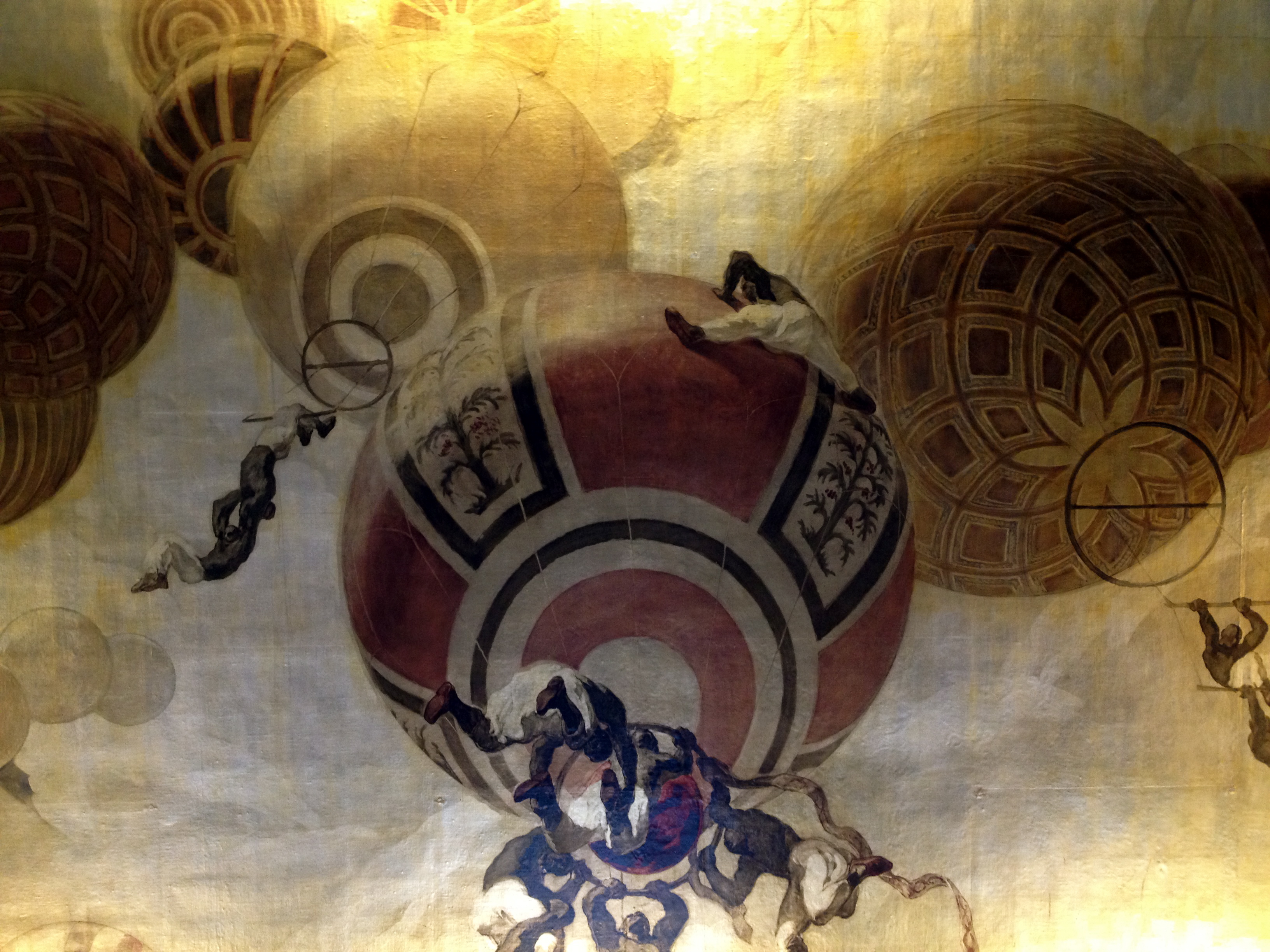
So to give the show its dues and focus in on the “good”, one cannot help but be stirred at times by some of Turner’s more atmospheric works, such as his paintings of stormy seas in Snowstorm (1842), so cyclical like a washing machine drum that you feel as though you are swept out at sea yourself – an effect which just can’t be captured from a postcard reproduction of the work. Mention also has to go to the stunning effects of light achieved by Turner – for example the burning glow of the Fire at the Houses of Parliament, and the incredible blinding light captured in his painting Regulus (1828) – an effect so well captured that I felt compelled to look away from the painting, as though I was staring into the sun itself.

Snowstorm (1842)
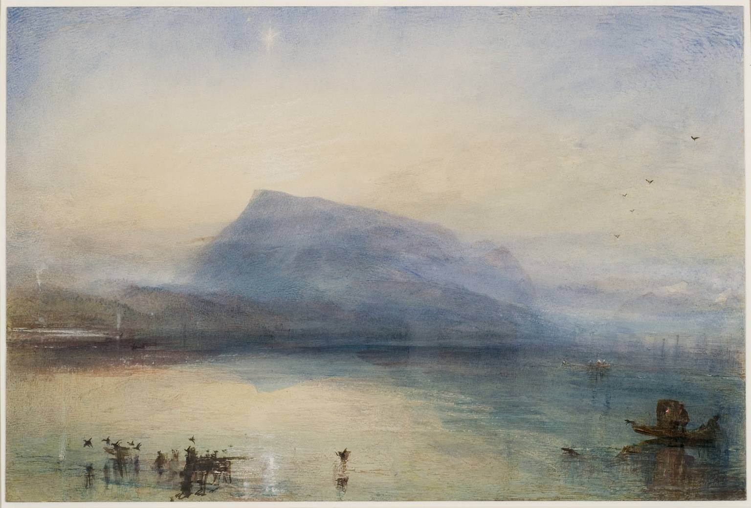
The Blue Rigi Sunrise (1842)

Burning of the Houses of Lords and Commons (1834)
For me though, the success of the show – its scale – was also its downfall, as with so many Turners from the same period exhibited all together, one couldn’t help conclude that it was all a bit samey, and repetitive – a feeling also engendered by the RA’s Monet show a few years back, when one water lily after another began to look like a single mesh of watery wobbly lines so that you could no longer distinguish between them. This feeling is proliferated at Tate’s show by the unfortunate decision to paint the walls in the same predominant colour as the paintings, so that in one room, a gallery full of dull yellow paintings feels even duller and more dated thanks to the same colour having been painted on the wall. If only the whole show had been curated like the middle room, where Turner’s square and round paintings were hung on dark walls and spot-lit to magnificent effect. Under those conditions, the works really came alive.
So coming out of this exhibition, my conclusions were as follows: Turner left me flat, not so much because of his work, but because of the way the show had been put together. Too much, too samey, and horrible decisions regarding wall colours. What Turner was brilliant at was capturing light, and it is this, set against dark backgrounds, that Tate should have concentrated on, to give Turner’s final years the kind of exhibition they perhaps deserve.
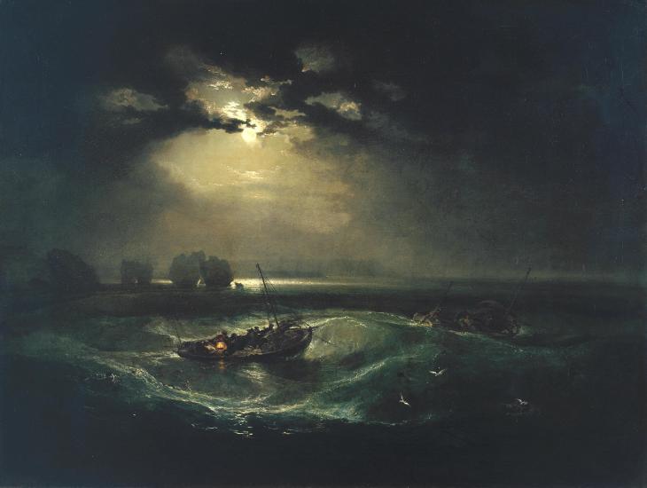
Fishermen at Sea (1796)
Late Turner: Painting Set Free is showing at Tate Britian until 25 January 2015