Paris: la visite d’art – Exhibition 1: Hopper
I don’t need a reason to visit Paris. The beauty of the winding cobbled streets of Montmartre echoing with accordion melodies, the charm of the boutique-filled Marais, the glory of the sweeping River Seine, and the regal grandeur of the Louvre, the Napoleonic boulevards, the sandy parks and the super-sized fountains… I could just walk around the place, breathe in the atmosphere, and munch upon macarons year after year, month after month. I never grow tired of Paris.
 And yet this year, Paris’ artistic offerings provided me not only with an excuse to make my second trip to the city in the space of 12 months, but made it a requirement. For the exhibitions which have graced the Paris art scene this autumn/winter have frankly been second to none – a Hopper retrospective at the Grand Palais, an exhibition focusing on the “bohemians” of 19th century Paris, also at the Grand Palais, a show of the significant artistic productivity, including Picassos aplenty, of occupied Paris during the second world war at the Modern Art Museum and, most significantly of all, a Salvador Dali retrospective at the Pompidou. I have waited all my life for that one. Yet by comparison, what did we have in London in the so called “cultural olympiad” of 2012? A show of Hockney’s “bigger picture”, which was always so crowded that the most you could see of his bigger pictures was his clumsy brushstrokes pushed almost up against your nose, a premature retrospective of the great pretender, Damien Hirst, and a further foray down the well-trodden path of the Pre-Raphaelites for the 5th time in as many years.
So off to Paris I went with my partner, full of anticipation for what lay ahead – 3 days; 3 exhibitions – an anticipation which was fulfilled many times over.
Now it would be an injustice to try and feature the three shows I saw all in one post – the Dali exhibition alone should have a whole blog of its own. So I will take you through the shows one by one, sharing the joy of Paris’ cultural agenda for those of you who cannot make the trip, and making a strong case for the prompt purchase of exhibition tickets for those who can.
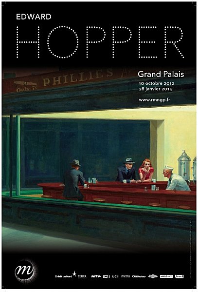
So up first – Edward Hopper at the Grand Palais. Hopper (1882-1967) the all-American painter, best known for his depictions of introspective early 20th century city dwellers, lost in a world of thought in an often artificial unnatural urban space, has long fascinated me, ever since I “accidently” hung on to a catalogue lent to me by my friends, Sarah and Truong, of this artist previously unknown to me. Of course at least two paintings are recognisable to us all – House by the Railroad (1925) – the quite reclusive, slightly sinister victorian house which is said to have inspired Hitchcock’s Psycho house, and a number of haunted house parodies ever since; and Nighthawks (1942), the quintessential Hopper masterpiece, with its four mysterious figures, enigmatic relationships, and strangely unnatural nighttime glare. But asides from those popular references, I did not know Hopper, yet wished to be better acquainted.

House by the Railroad, 1925 (© MOMA, NY)
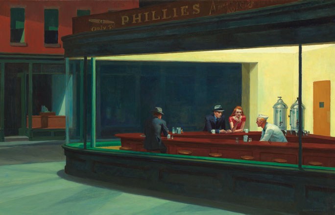
Nighthawks, 1942 (© Art Institute, Chicago)
In staging this significant retrospective (featuring 160 works, that was almost Hopper’s entire life’s output – he was a notoriously fastidious and slow painter), the Grand Palais was providing the ultimate in Hopper shows, allowing not only an acquaintance with this fine artist, but a chronological embrace through each stage of his artistic career.
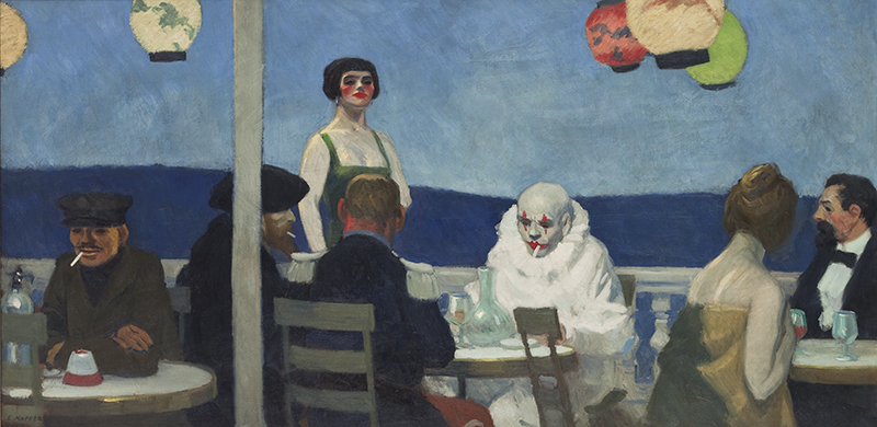
An early work – Soir Bleu, 1914 (© Whitney Museum of American Art)
First up, we were shown his early works – painted around the beginning of the 20th century and suitably inspired by Paris and artists like Degas and Pissarro, Hopper dabbled in his earliest cityscapes – broad brushed meditations on a captivating city, yet rather subdued, although already mastering an effective contrast of sunlight and shadow. But soon enough, Hopper turned to illustration, finding that his paintings were not selling. Here, we see Hopper as the caricaturist and illustrator, both mediums in which he was able to demonstrate great skill as a draftsman and social commentator. It was only in the 20s that he began to paint seriously again, and finding greater success as he did so. From this point in the show onwards, there begins a vast array of Hopper paintings, spoiling the viewer with their breadth and sheer number.

Manhattan Bridge Loop, 1928 (© Addison Gallery of American Art)

The City, 1927 (© University of Arizona Museum of Art)

From Williamsburg Bridge, 1928 (© Met Museum of Art, NY)
The paintings can almost be split, both chronologically and thematically. In the first set, Hopper’s paintings are conspicuous through their absence of people. Hopper had turned to urban scenes in his native America, concentrating on everyday scenes, roads, highways, lonely houses, and managing to capture the spirit of both suburban America and central city spaces, yet with the often noticeable lack of inhabitants. This then is to be contrasted by the later raft of works, in which the person takes centre stage in his paintings, as Hopper becomes almost voyeristic, appearing to intrude into scenes of great personal contemplation and introspection, as the characters he portrays stare, apparently into space, or couples appear together, yet both lost it seems in their own world.
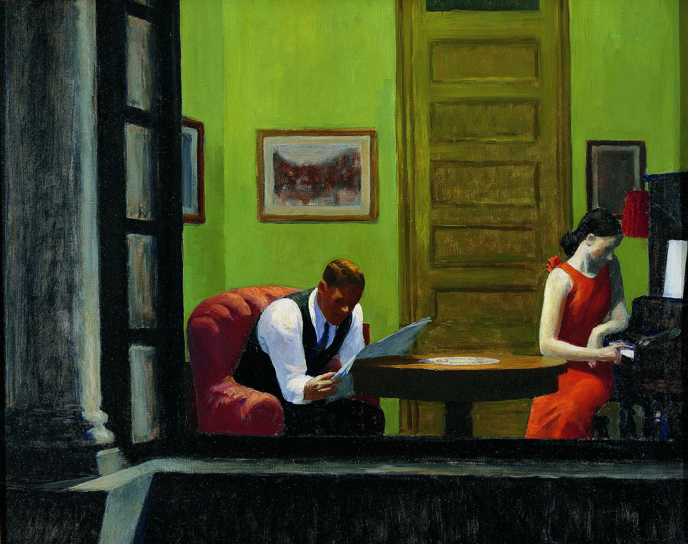
Room in New York, 1932 (© Sheldon Museum of Art, University of Nebraska)

Summertime, 1943 (© Delaware Art Museum)
These are the paintings which really made Hopper’s name – the lonely people – the built up urban scenes which nonetheless leave us with a feeling of emptiness and solitude. They are like a commentary on that time, as though Hopper is making a statement about the commercialisation and urban growth which was happening all around him – the more it grows, the lonelier the people caught up in the growth feel. The smaller the spaces, the inhabitants sink into themselves. In this respect, Hopper perhaps anticipated the pop-art of later years, yet doing so more as a resigned critic than as a celebrant of popular culture.
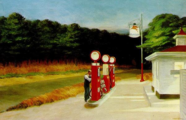
Gas, 1940 (© MOMA, NY)
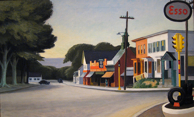
Portrait of Orleans, 1950 (© Fine Arts Museum of San Francisco)
Personally, while I found Hopper’s people fascinating to consider, their stories open to so much interpretation, and Hopper’s intentions likewise, I couldn’t help but feel that too often his figures had something of a cartoony look about them, almost as though Hopper couldn’t quite kick the habit of his earlier days as an caricature artist. Rather, by far my favourite paintings were the solitary landscapes, the soulless cityscapes with not a person to be seen, the forest road interspersed with a jarring petrol station, the rolling landscape of The Camel’s Hump which was, by far, my favourite of his works.

Lighthouse Hill, 1927 (© Dallas Museum of Art)
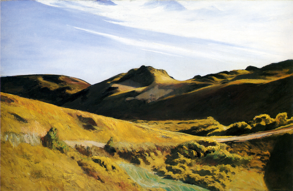
The Camel’s Hump, 1931 (© Utica (NY))
However likewise I loved a small gallery which showed some of Hopper’s etchings. This is quite bizarre, being that I have previously been drawn to Hopper by his great use of colour. Yet for me, Hopper’s etchings were more like a window onto his soul as an artist, whereas with his paintings, so often we look through opaque glass, misunderstanding his intentions and the messages he attempts to portray. Through his etchings we can enjoy his interaction with nature, appreciate the small details of life which fascinated him, and also track something of the thought process which underlay some of his later works. Take Night Shadows for example, which, in all its start Hitchcockian glory, appears to be something of a precursor to the enigmatic mystery which pervades many of his later paintings, especially the Nighthawks.
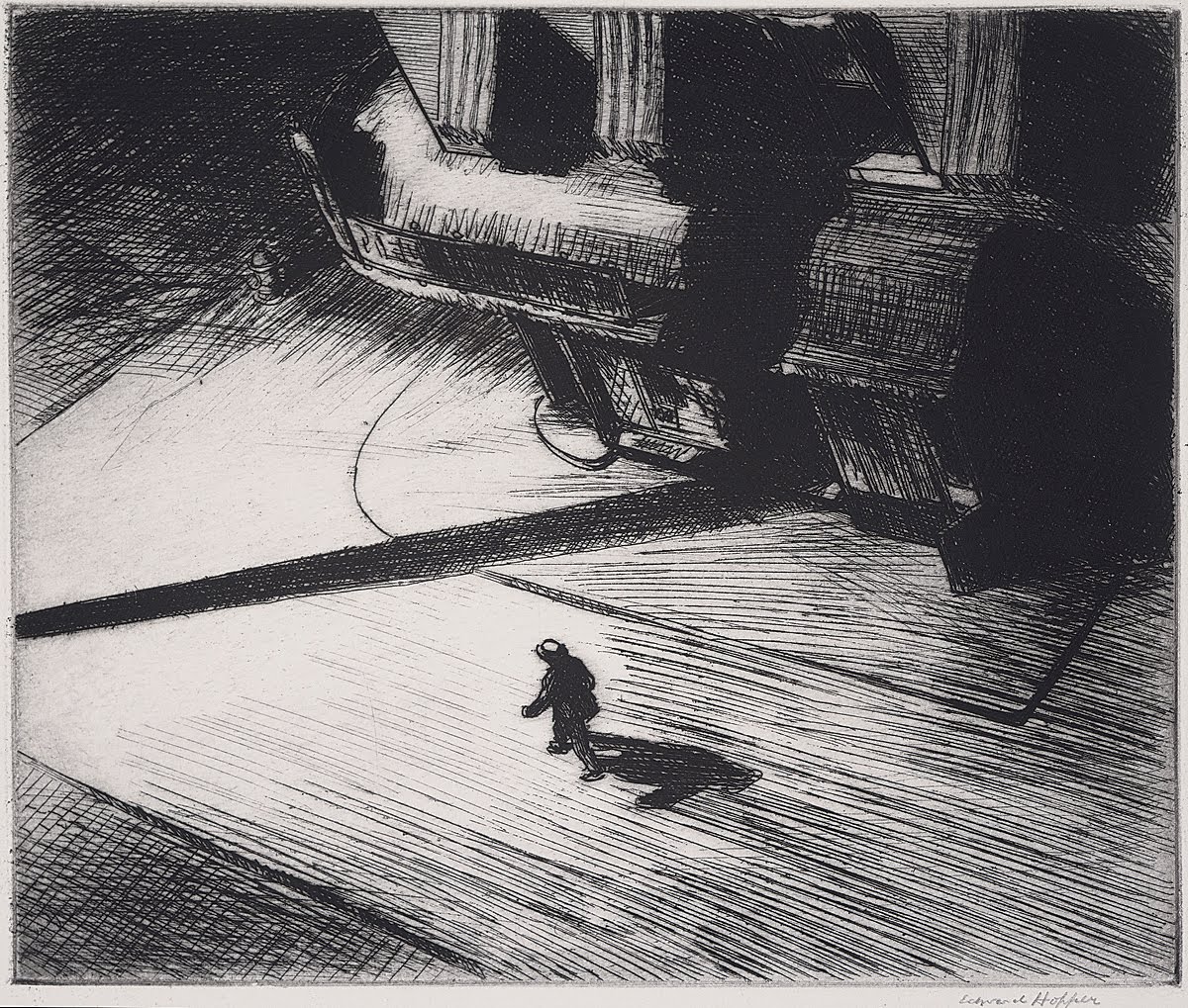
Night Shadows, 1921 (etching, © Philadelphia Museum of Art)
Whether it’s the inscrutable figures or the stark urban landscapes which do it for you, Hopper is a very likeable artist. His works are uncontroversial; they are inherently mysterious yet still very accessible; they beg questions, but provide no answers, and for that reason will continue to enagage audiences for many years to come. Yet so many of these works come from collections across America, and therefore for the European viewer, this is likely to be the best opportunity there will be for some years to engage with Hopper this side of the pond. So I urge you to go along, and make sure you book tickets in advance – did I mention that the show is so popular that we had to queue for almost an hour, just to get in on our pre-booked time slot?
The exhibition runs at Paris’ Grand Palais until 3 February 2013. You can buy your tickets here. Alternatively, if you can’t make it, the exhibition comes with its own mobile App which can be downloaded (at least from the itunes app store) and will guide you around the show with commentary and pictures – so even if you can’t make it to Paris, you’ll feel like you’ve done the show from the comfort and solitude of your very own armchair. Now Hopper would have loved that image.