Skip to content

Posts from the ‘Art’ Category

No detail too small: the intricate spectacle of a Neapolitan Nativity

In a large number of countries the Nativity scene (Belem in Spain, Presepe in Italy) is as big a part of the Christmas festivities as the lights switch-on in London’s Oxford Street or the Christmas tree at the centre of a family home. Having gone to Catholic school as a boy, I still remember the prominence with which the Nativity set was placed in the front entrance, and how perplexed I was (and remain) that the teachers remained insistent that the Jesus figure should not be placed in the manger until Christmas Day: but this is a school I thought – who on earth is going to see it during the holidays?

Despite the fact that the tradition of setting out a nativity is centuries old in many a catholic country, the general belief is that it all began in Italy where St Francis of Assisi is credited with creating the first nativity scene in 1223 at Greccio, Italy. There he is said to have recreated the birth of Christ through placing people dressed in the various nativity roles in a cave. A tradition was born, and perhaps for this reason, it is arguable that Italy has remained the predominant master of the nativity craft. This is not least in Naples where, in the famous Via San Gregorio Armeno, the entire street is given over to the craftsmen who make every intricate detail of the characters and setting of the Neapolitan presepe. 

DSC02526 DSC02529 DSC02532 DSC02548 DSC02545 DSC02560 DSC02558 DSC02535

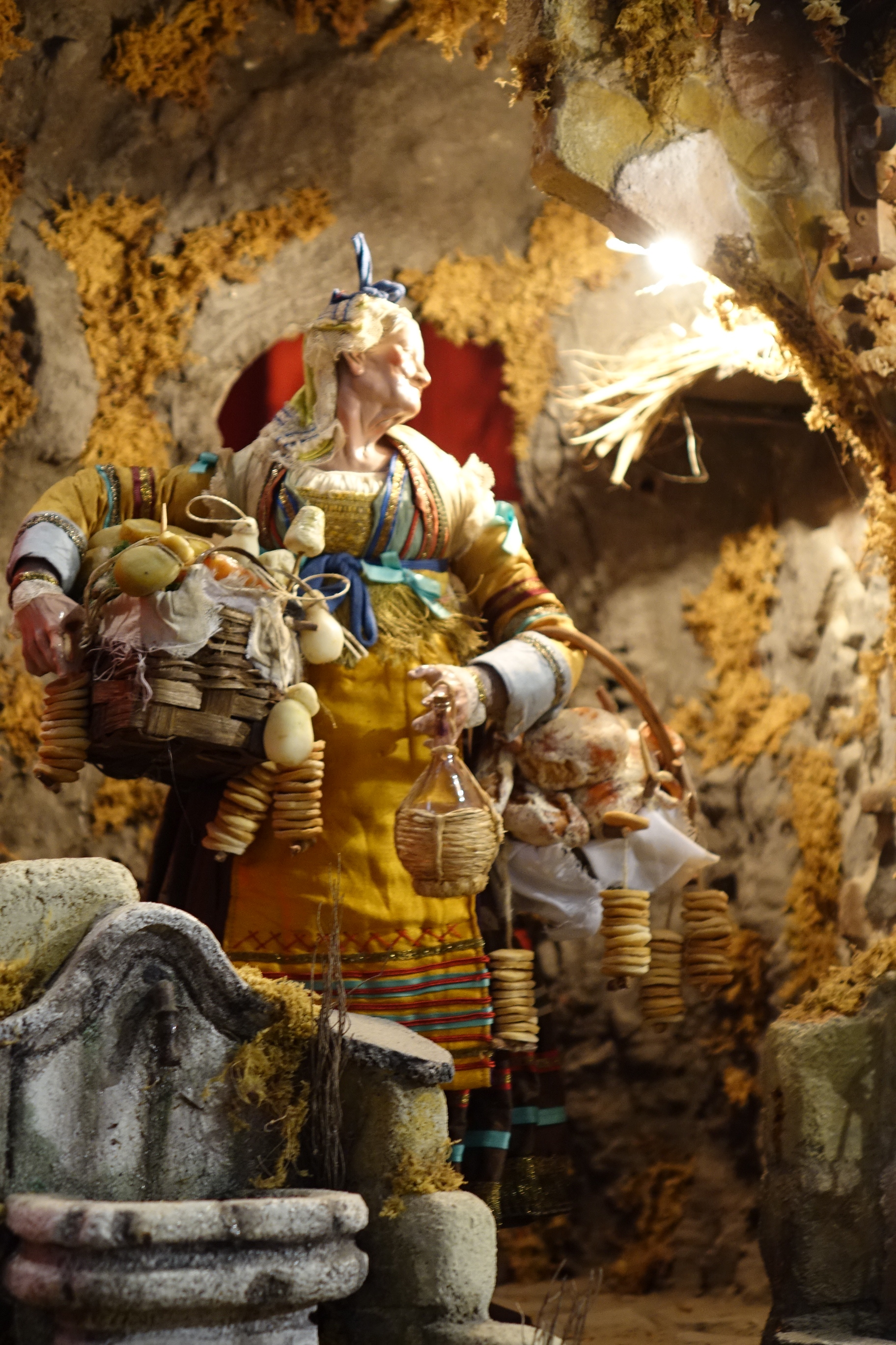
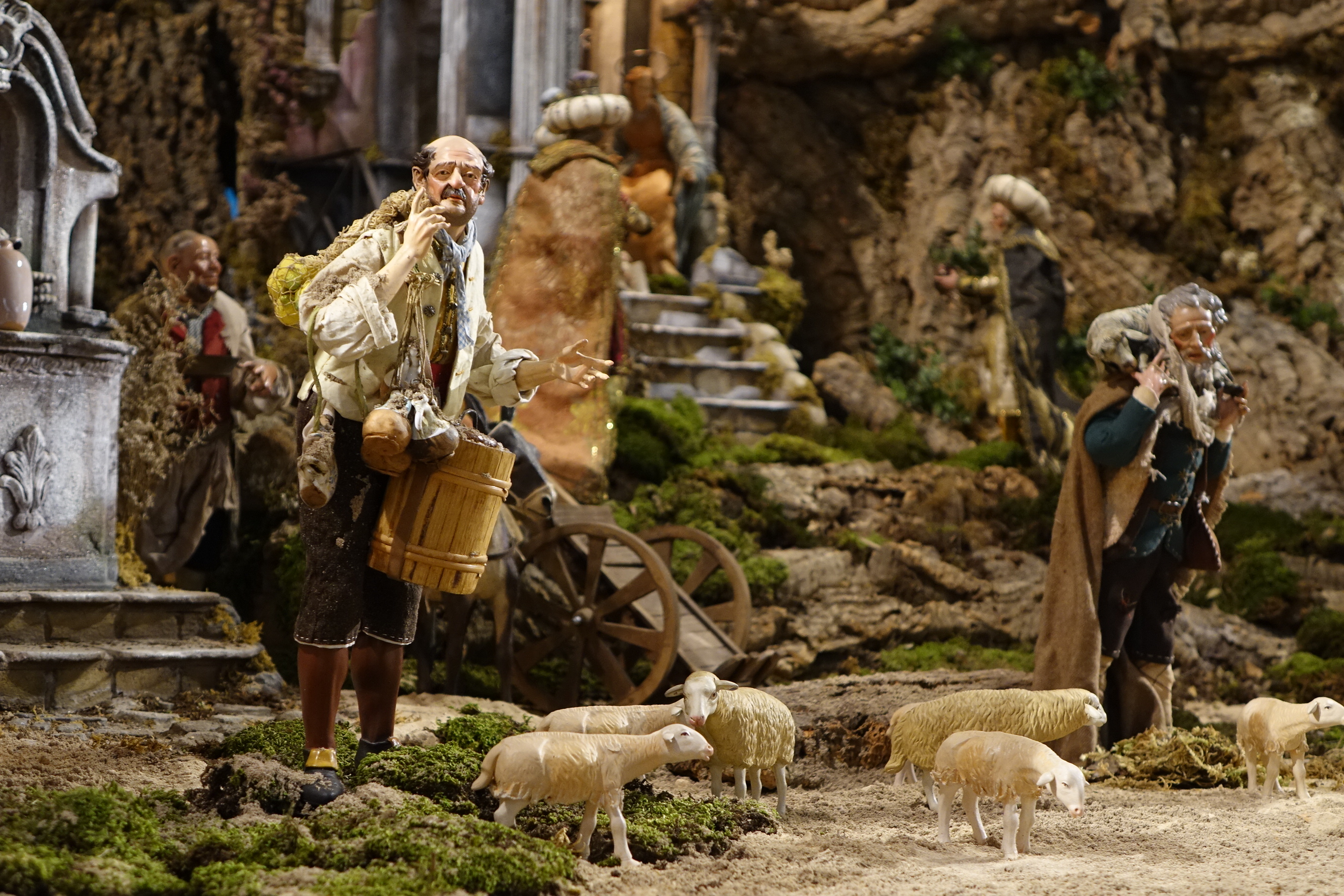
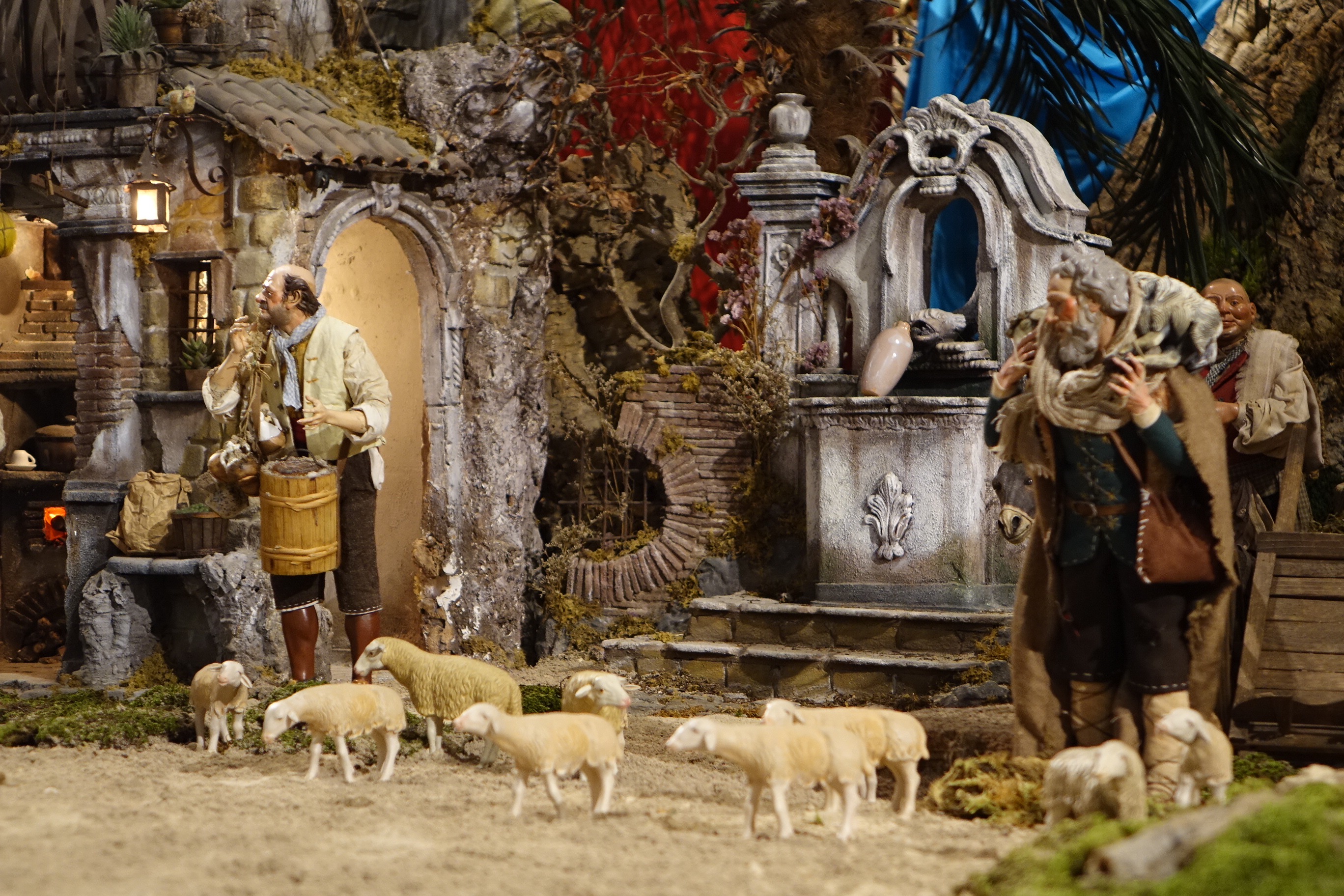
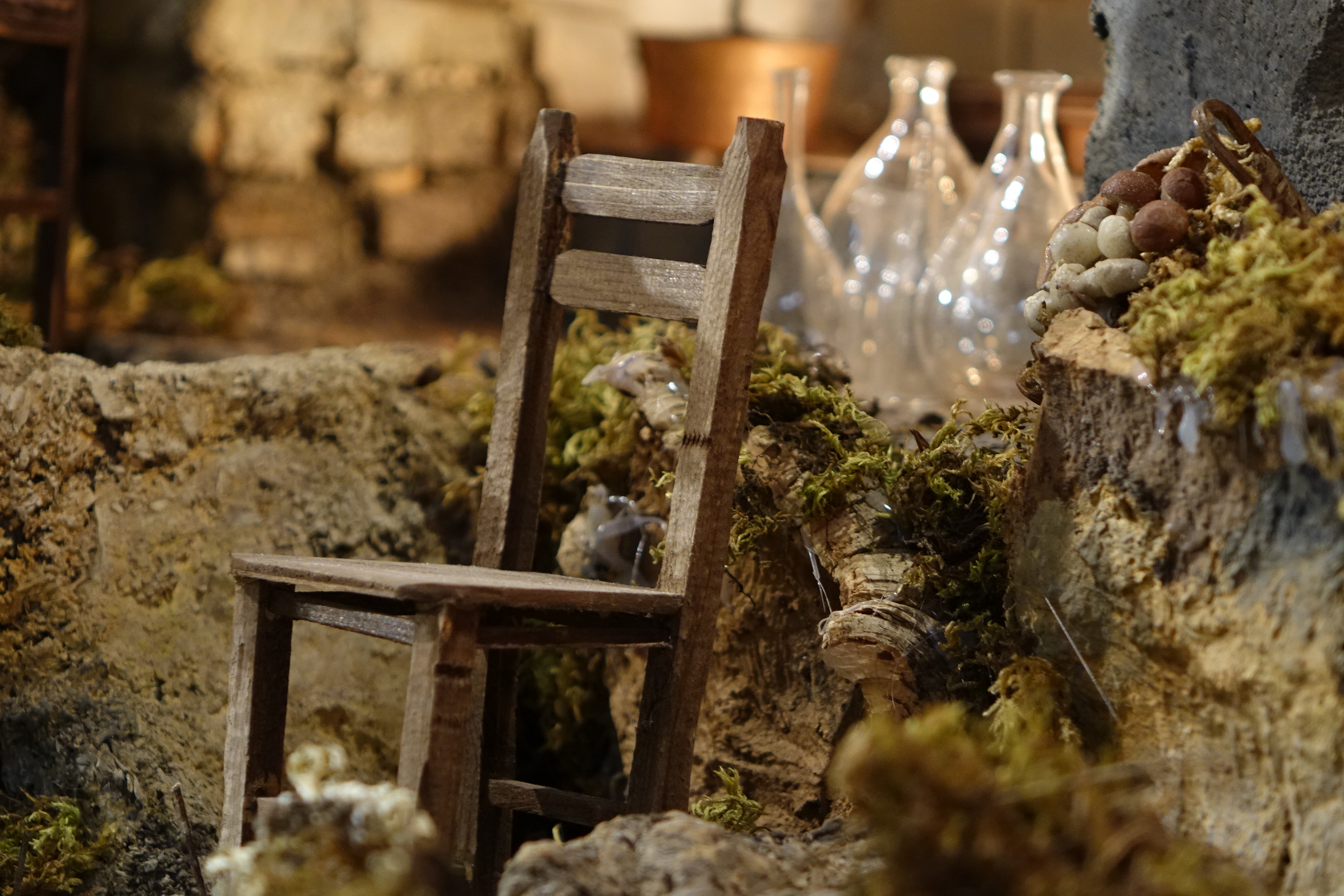
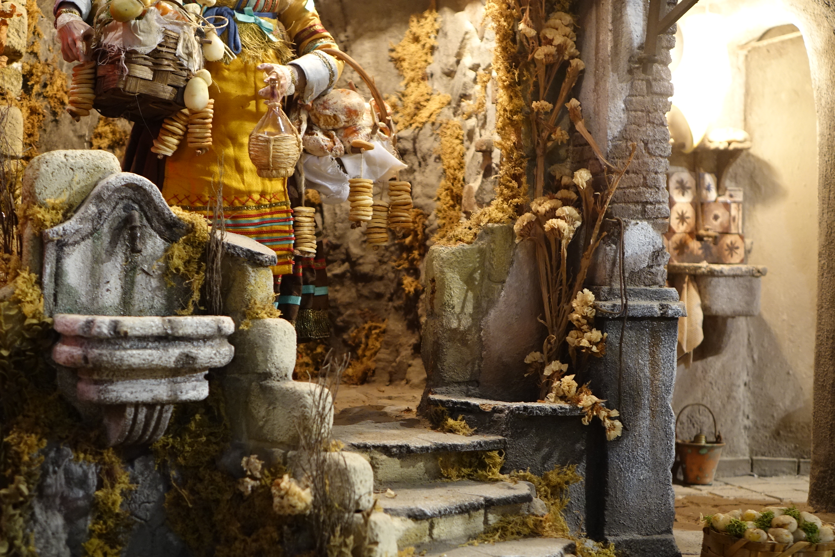
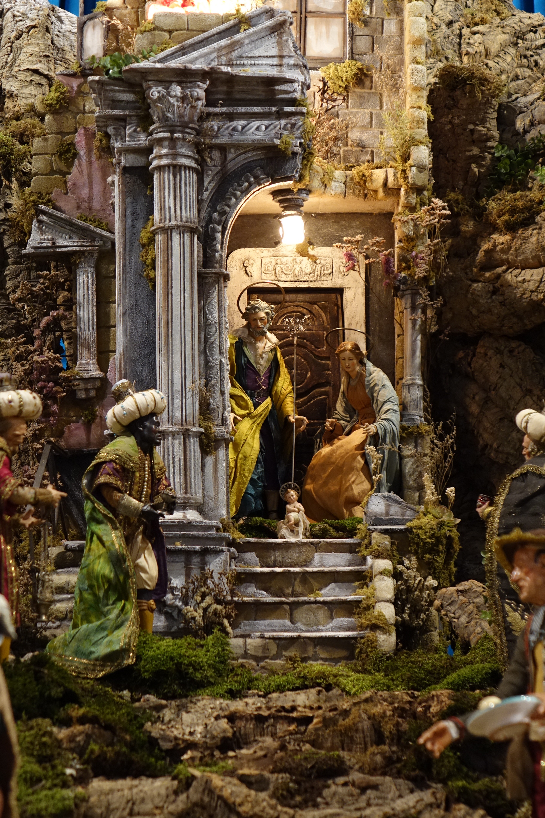
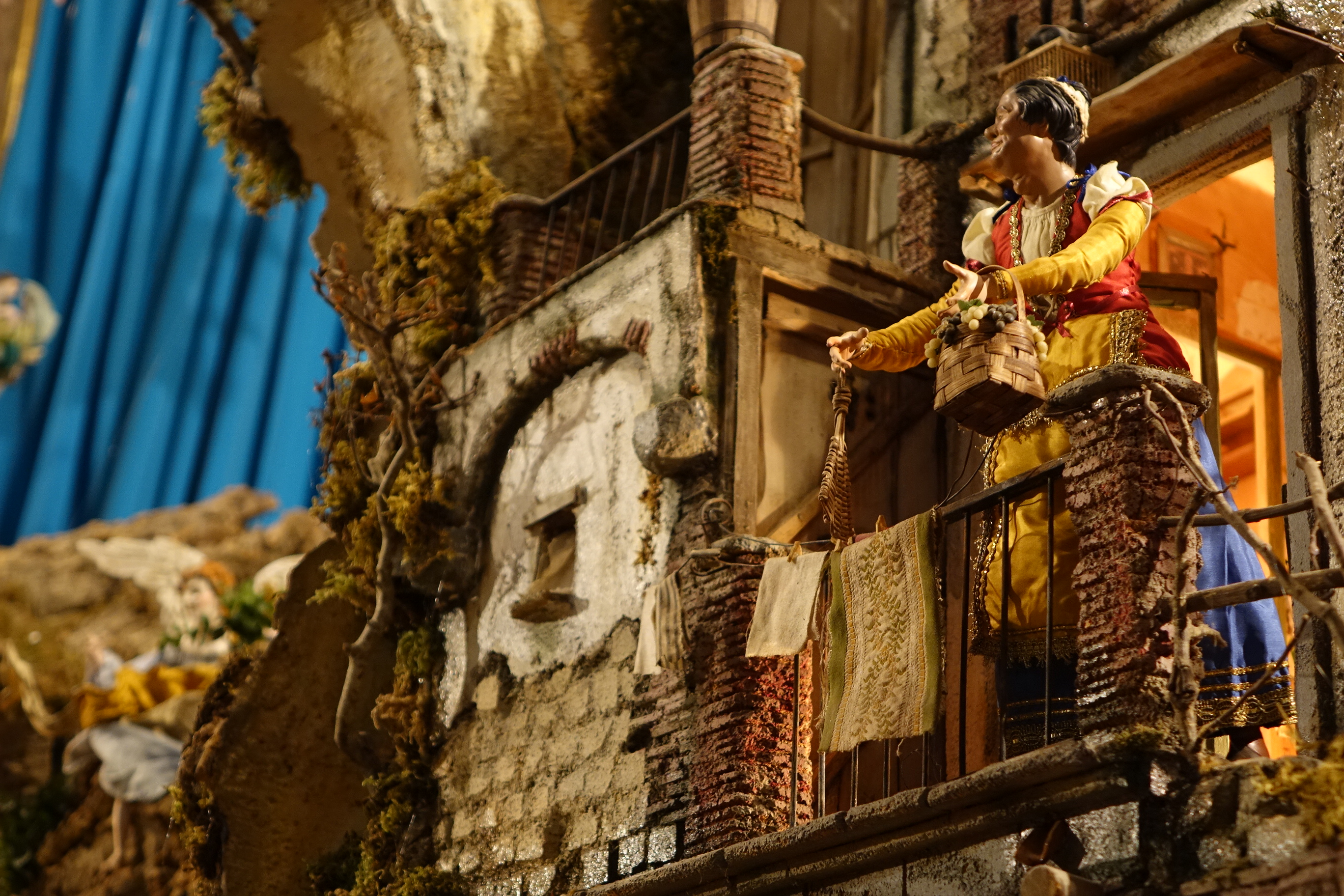
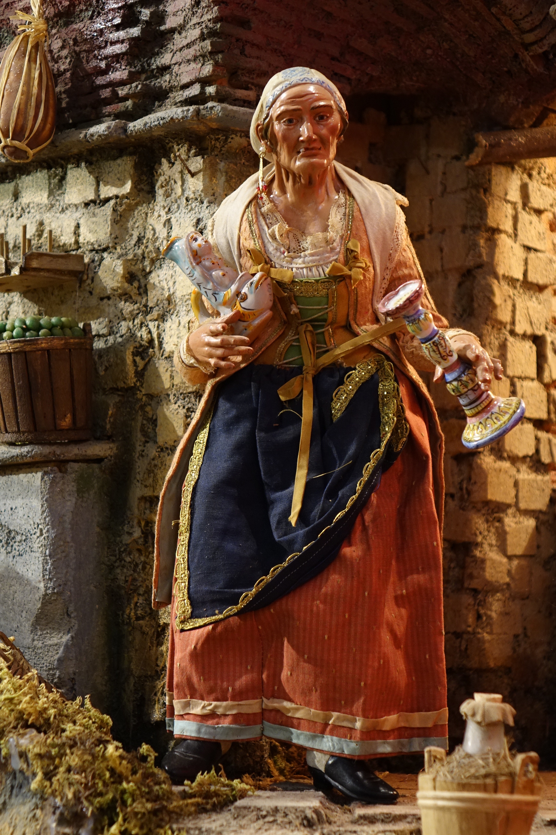
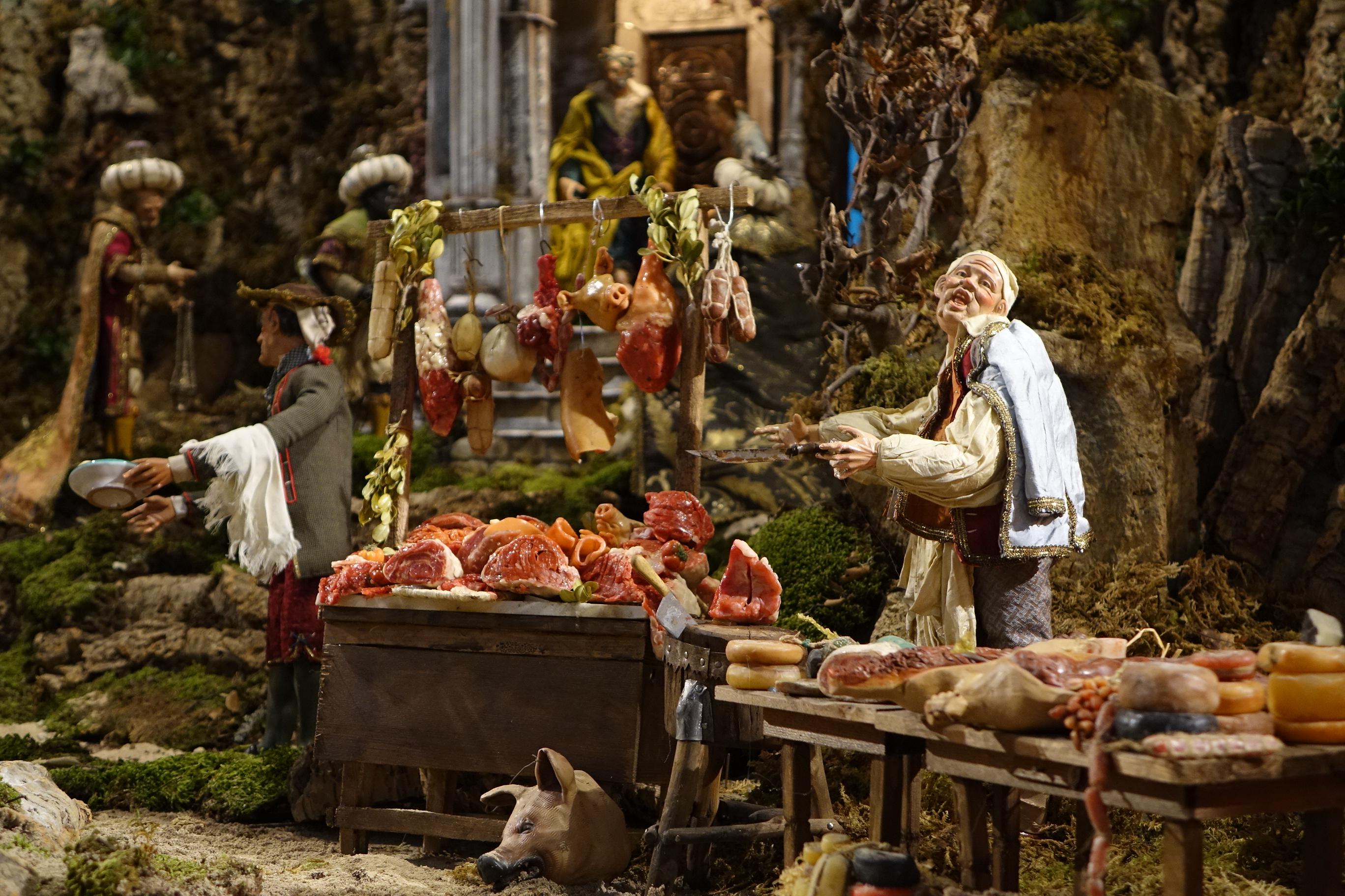
While last Christmas I braved the crowds who had crammed their way up the dark side streets of the Spaccanapoli to get a view of this famous Neapolitan craft, this year I have had the fortune to see their masterpieces at far closer a proximity. For here in Palma de Mallorca, but 2 minutes from my flat in an inconspicuous church on the Carrer de San Miquel, there is a Neapolitan gem of its own. Set out across a mountain plane simulated from the supple bark of a cork tree, and comprising a phenomenal range of architectural features and carefully characterised figures, this Nativity demonstrates why the Neapolitan craft remains so renowned. Not a single detail of street life has been missed, from the slimy pig’s head sold by the Butcher, to the bag of eggs swung by the old housewife. What tickles me are the gruesome details of their lined faces, and their masterful expressions – so full of personality you’d swear they were alive. 

DSC02567 DSC02564 DSC02562 DSC02555 DSC02537 DSC02540 DSC02527

In fact Palma de Mallorca holds the nativity or Belem dear to its heart, with a trail tracing once fantastic Belem to another across the city. But few could deny that the real brilliance of Belem craft has been mastered by the Neapolitans, as the nativity photos above demonstrate so well. 

All photos and written content are strictly the copyright of Nicholas de Lacy-Brown © 2014 and The Daily Norm. All rights are reserved. 

Santa Lucia and the Joy of Rialto Living

To be honest, it didn’t take me much to make up my mind to move from London to Mallorca. After a sustained period of dissatisfaction with the big city in the smoke, the comparative paradise of Palma de Mallorca took little persuasion. And yet I think I can pinpoint the exact moment when my mind was made up as being the moment when my partner and I discovered Rialto Living.

Situated in the Carrer Sant Feliu, a dark cobbled street in the heart of Palma’s old town and lined with the very best of Palma’s old palaces, Rialto Living is a lifestyle concept store which sells the very best in interior design, art, and fashion. Happily for us it also contains one of the cafe hot spots in Mallorca, a blue and white symphony of open space and high couture eating, all set within a stunning renovated palace. In short, Rialto Living is a sumptuous, stunning shop. The kind of place where you could happily while away the hours as though it were your own home (I should be so lucky), and it was upon finding this place that we knew Palma had the kind of mentality which meant that we could make the city our new home.

A paradise of interior design

DSC02121 DSC02154 DSC02159 DSC02153 DSC02123 DSC02126 DSC02641 DSC02138 DSC02125 DSC02152 DSC02135 DSC02150 DSC02116 DSC02131 DSC02129 DSC02119 DSC02122 DSC02134 DSC02164 DSC02141 DSC02162

Harking from Scandinavia, and founded by one of the three founders of Gant, Klas Kall, along with grafic designer Barbara Bergman, it is no wonder that Rialto Living is such a temple of interior chic. Here you will find a magazine shot in every corner, furniture to die for, and quality which bounces and glides and glitters in one’s hands. Its many sections are a delight for the eyes. Its clothes section is so chic and welcoming that it makes you want to discard your old clothes there and then for something delightfully fluffy and new. Its home section is like a paradise of design; my favourite section has to be the Alhambra recreation within whose moorish arches roll after roll of colourful material unfold; I also adore the dining area, where sun floods through the south facing windows to illuminate the multicoloured glassware.

Rialto Living’s fresh blue café

DSC02664 DSC02168 DSC02667

Yet despite its inherent sophistication, Rialto Living is utterly welcoming, as demonstrated last weekend when customers were welcomed to the store on Saturday lunchtime to join in carols and glogg (mulled wine) in a celebration of Santa Lucia’s day. They even had an angelic choir fitted with all of the regalia of Santa Lucia festivities, the likes of which inspired both my Norm sketch yesterday, and brought tears to my eyes.

Rialto’s celebration of Santa Lucia

10678755_10152488794170846_9009388286336939585_n DSC02654 DSC02646 1503912_10152488794435846_8435992689803210401_n DSC02653

So this long overdue post on Rialto Living is both a dedication to the sumptuously sophisticated palacial surrounds of my favourite shop, and a record of last weekend’s very Christmassy affair. Rialto Living: you truly are an inspiration. As long as you are in Palma, I too will remain.

Norms: The Saints Collection | Santa Lucia

At this festive and, for some, religious time of year, the calendar is awash with Saint’s days and festivals which make the whole Christmas period sparkle with something rather magical. Last week, I noted the passing of St Nicholas’ day, a Saint’s day of the utmost import because it is that rotund smiling fellow who will pass out the presents this December 24th, and of course because he happens to share my name. Last Saturday, another festive favourite was celebrated: St Lucy or Santa Lucia as she is perhaps more widely known, and as the bringer of light and patron saint of sight, this Saint is equally important at this sparkling, light infused time of the year.

In fact such is Santa Lucia’s renown as the bringer of light, that her Saint’s day is celebrated with gusto in the Scandinavian lands, where darkness reigns for much of the day at this time of the year, and where locals therefore gather in reverence to the Saint in the hope that St. Lucy will bring them more light to get through the winter. Apparently her connection with light stems from the fact that at the time of her death at the hands of Emperor Diocletian, her eyes were gouged out, either by order of the Emperor, or by herself in order to disuade a potential suitor from pursuing her. Either way, the story has been taken up in popular iconography, and in more recent times, Santa Lucia has been depicted holding her eyes on a platter.

Santa Lucia Norm (2014 © Nicholas de Lacy-Brown, pen and gold paint on paper)

Santa Lucia Norm (2014 © Nicholas de Lacy-Brown, pen and gold paint on paper)

And so, here is Santa Lucia Norm, depicted in all her glory with eyes upon a platter. No gruesome gouging here (it is Christmas after all), but just the suggestion of it. My Santa Lucia is wearing the crown of candles which is worn by celebrants of her festival in the Scandinavian celebrations which are the basis of my depiction. Those celebrations also include choirs of children wearing white gowns, conical hats and carrying candles in homage to the Saint’s light-giving powers – celebrations which are depicted here against a snowy, Christmassy Scandinavian landscape. More about those celebrations tomorrow, but in the meantime – a Merry Christmas to all!

© Nicholas de Lacy-Brown and The Daily Norm, 2001-2014. Unauthorized use and/or duplication of the material, whether written work, photography or artwork, included within The Daily Norm without express and written permission from The Daily Norm’s author and/or owner is strictly prohibited. Excerpts and links may be used, provided that full and clear credit is given to Nicholas de Lacy-Brown and The Daily Norm with appropriate and specific direction to the original content. For more information on the work of Nicholas de Lacy-Brown, head to his art website at www.delacy-brown.com

Norms: The Saints Collection | Saint Nicholas

It’s a public holiday in Spain today, which can’t be bad going this close to Christmas. And the reason for the break? Why jolly old Saint Nicholas of course, a saint with whom I share both a name and no doubt a love of gift giving, and whose feast day on the 6th December is timed perfectly with the arrival of Christmas spirit across the world.

So what better excuse, thought I (as if one were needed), to relaunch a further instalment of my now close to sold-out Norm Saints Collection than to create St Nicholas Norm himself.

St Nicholas Norm (2014 © Nicholas de Lacy-Brown, pen and gold paint on paper)

St Nicholas Norm (2014 © Nicholas de Lacy-Brown, pen and gold paint on paper)

Better known these days as the red-robed, large tummied, jolly old Santa Clause whose name derivates from the Dutch Sinterklaas, itself from a series ofelisions and corruptions of the transliteration of “Saint Nikolaos”, the original Saint Nicholas was far less colourful, but no less generous. The various legends surrounding the saint include his secret payment of the dowries of three daughters of a wretched poor man in order to prevent them from entering into prostitution, as well as the rescue of three boys who were being incarcerated in a tub by an evil butcher who planned to make them into pies in a kind of precursor tale to Sweeney Todd. Thus, in traditional depictions, three boys are often shown in a tub, and St Nicholas is often shown clutching three bags of coins to represent the dowries he generously bestowed upon the three girls. And naturally, true to form, both images appear in my Saint Norm depiction.

But asides from specific legends, St Nicholas is known throughout Christendom as the patron Saint of Children, and indeed of sailors, so references to both appear in this sketch, while his routes in the Orthodox world are reflected in my somewhat festive orthodox skyline. All in all, a Christmassy Norm Saint for the Christmas Season.

© Nicholas de Lacy-Brown and The Daily Norm, 2001-2014. Unauthorized use and/or duplication of the material, whether written work, photography or artwork, included within The Daily Norm without express and written permission from The Daily Norm’s author and/or owner is strictly prohibited. Excerpts and links may be used, provided that full and clear credit is given to Nicholas de Lacy-Brown and The Daily Norm with appropriate and specific direction to the original content. For more information on the work of Nicholas de Lacy-Brown, head to his art website at www.delacy-brown.com

Zeno Brains and Oracle Stones: Jan Fabre at La Llotja

Jan Fabre is a multitalented creator. Having successfully dappled in writing, performance, and screenplays, he has also shown himself to be a prolific artist, skilled in drawings and installations quite asides from his stunning sculpture work. He is also tremendously successful. He was the first contemporary artist to be given a solo exhibition at the Louvre in Paris (“L’ange de la métamorphose”) and has participated several times in the Venice Biennale, and twice in the Kassel Documenta. Yet most importantly of all (for me at least), his incredible thought-provoking works are now on show in Palma, in the haunting lofty space that is La Llotja – the old 15th century maritime exchange, on the city’s waterfront.

His Palma exhibition, Zeno Brains and Oracle Stones, is as enigmatic as it is enticing. After perusing the internet for some time, I have found myself quite unable to find any coherent explanation of what the exhibition is about, nor what the artist intended to represent. And yet the show, which comprises some 9 sculptures revolving around the same theme: the tortoise and the brain, makes for a stunning sight. This is not least because of the space: given over to these simple sculptures in marble and stone, illuminated powerfully in the otherwise dark cavernous space, the whole installation feels almost spiritual as each sculpture sits soulfully in wait, a focused spotlight falling upon its cold stone surface in the darkness. But the sculptures themselves are so enigmatic that they call out for engagement and interpretation.

DSC01305 DSC01309 DSC01321 DSC01315 DSC01302

Fabre gives us tortoises on a brain, tortoises under a brain; a tortoise whose shell is made out of a brain, and another who carries a brain precariously on its shell. There are tortoises lying upside down atop a brain, and others pushing a brain away as though in an attempt to alleviate the world of this unnecessarily complex organism. So why the brain and why the tortoise? Well they are both as old as time, and perhaps both inexplicable as a manifestation of nature’s creativity. They also look pretty similar working in unison – a partnership evidently explored by Fabre in these various sculpted manifestations. But there is almost something sinister and monstrous about the works, and while I am not completely invested with an understanding of how the works reflect Kafka’s Metamorphosis, as is suggested by the brochure accompanying the exhibition, I can see the plight of Gregor Samsa in the upturned tortoises, reminding of how that poor man awoke one fated morning finding himself unable to get up from his back which had metamorphosed into the shell of a hideous beetle.

DSC01330 DSC01319 DSC01318 DSC01311 DSC01325

But as ever, the enigma of this work is integral to its power, and much of the reason why I love it. And if you wish to see it you must be quick, for the exhibition will end on 21 December 2014. Yet another reason to get yourselves to Mallorca before the year is out.

Sorolla: The Colour of the Sea

When I made my life-changing move from London to Mallorca earlier this month, I moved to a place equally as enriched by culture as the city from which I came. In fact comparing the size of Palma de Mallorca to London, you could quite easily declare Palma to be disproportionately abundant in art. Everywhere you walk in amongst the maze of streets in the old town, a flashy new contemporary art gallery or dusty quaint antique shop emerges, and of course the city lays host to Es Baluard, one of Spain’s most significant contemporary art spaces. However Palma is also home to one of the La Caixa Foundation’s finest art galleries, set within the stunning art nouveau setting of the old Gran Hotel building, and its exhibition diary is easily as significant and varied as that of a much larger city. And La Caixa’s current exhibition, Sorolla: The Colour of the Sea is no exception.

Joaquín Sorolla. El balandrito, 1909. © Fundación Museo Sorolla

Joaquín Sorolla. El balandrito, 1909. © Fundación Museo Sorolla

Exploring the oeuvre of Spanish master, Joaquin Sorolla, the exhibition focuses on what the artist, famous for the luminosity of his light and the proficiency of his landscape, painted best: the sea. Sorolla was born in Valencia in 1863 and as such was painting at a time when impressionism was at its height. Often compared to his friend, artist John Singer Sargent, Sorolla painted both people and landscapes with great sensitivity, and captured a startling degree of light. In painting the sea, Sorolla managed to capture a luminosity which I have always found so difficult when working on coastal images myself. Take his 1904 Estudio del Mar for example: This simple painting of waves breaking upon the shore is alive with the current of water, and magnificently captures the many colours hidden within the ordinary blues of the water. Similarly, his 1905 painting simply entitled Mar depicts shallower waters magnificently, with the light glinting over the surface and the dark purples suggesting rocks lurking just beneath.

Joaquín Sorolla. Estudio de mar, Valencia. 1904. © Fundación Museo Sorolla

Joaquín Sorolla. Estudio de mar, Valencia. 1904. © Fundación Museo Sorolla

Joaquín Sorolla. Mar (Jávea). 1905. © Fundación Museo Sorolla

Joaquín Sorolla. Mar (Jávea). 1905. © Fundación Museo Sorolla

No wonder this exhibition is called “the colour of the sea”, and no better example exists of just how rich those colours can be than Sorolla’s depictions of Mallorca itself, such as his painting of the Cove at San Vincente. If you hadn’t been to Mallorca, you might assume that these superb aqua marines and subtle mauves of the surrounding mountainous landscapes were made up, but I can assure you that they are very much representative of reality. Even my lucky November dip in the sea last weekend proved that much.

Joaquín Sorolla. Cala de San Vicente, Mallorca. 1919. © Fundación Museo Sorolla

Joaquín Sorolla. Cala de San Vicente, Mallorca. 1919. © Fundación Museo Sorolla

Joaquín Sorolla. Rocas de Jávea y el bote blanco, 1905.  © Colección Carmen Thyssen-Bornemisza en préstamo gratuito al Museo Carmen Thyssen Málaga

Joaquín Sorolla. Rocas de Jávea y el bote blanco, 1905. © Colección Carmen Thyssen-Bornemisza en préstamo gratuito al Museo Carmen Thyssen Málaga

Joaquín Sorolla. Mar de Zarauz. 1910. © Fundación Museo Sorolla

Joaquín Sorolla. Mar de Zarauz. 1910. © Fundación Museo Sorolla

Awash with mediterranean light, Sorolla’s seascapes are alive with the fresh coastal air and tranquil dance of the waves. Seen as a group, you could almost be excused for feeling as though you were on the beach, watching Sorolla painting (he invariably took his canvases down to the beach, hence why they are probably so imbued with the naturalistic light that one sees in reality). However, it’s not just Sorolla’s landscapes which come alive before your eyes. For as this exhibition shows, Sorolla was also particularly adept at portraying people naturalistically, and this is seen no more so than in works such as Saliendo del baño, where a mother dries her child after a dip in the sea, and Pescadora con su hijo – a brilliantly realistic depiction of a mother masking her eyes from the sinking late afternoon sun.

Joaquín Sorolla. Saliendo del baño. Firmado y fechado. 1915. © Fundación Museo Sorolla

Joaquín Sorolla. Saliendo del baño. Firmado y fechado. 1915. © Fundación Museo Sorolla

Joaquín Sorolla. Pescadora con su hijo, Valencia, 1908 © Fundación Museo Sorolla

Joaquín Sorolla. Pescadora con su hijo, Valencia, 1908 © Fundación Museo Sorolla

Joaquín Sorolla. Nadadores, Jávea. 1905. © Fundación Museo Sorolla

Joaquín Sorolla. Nadadores, Jávea. 1905. © Fundación Museo Sorolla

So even if you come to Mallorca and the weather is not at its best, this superb exhibition has the power to transport you right to a sunny day on the coast. Although let’s face it, with Mallorca’s track record of brilliant sunny record all year around, you should probably be able to do both.

Sorolla: The Colour of the Sea runs at La Caixa Foundation Palma until 8 February 2015.

The Barbican Triptych

It was around 16 months ago when, following a work social function held within the Barbican Estate in the City of London, my colleague, who also lives there, commissioned me to depict the Barbican on canvas. 

It was something of a challenge. Chief amongst the challenges was the scale of the piece – a hefty triptych to feature on a large blank wall – exciting in prospect, but less so when I was already working full time with only evenings and the occasional weekend free to paint. Second was the problem of inspiration. The Barbican does not fall under what one would ordinarily term “beautiful”. Built in the style typical of the 60s and now given the rather unflattering title “brutalist architecture”, the Barbican estate is all grey concrete, sharp jagged edges and high rise. However, the site, built to fill in one of many huge expanses of the City devastated by the Blitz in WW2, is undoubtedly iconic, and as I started to muse upon a possible approach to capturing the architecture on canvas, I noticed how the architecture formed a harmony of shapes, from a variety of circles and semi circles, as well as straight horizontals and the teeth like edges of its famous three towers. And then it came upon me – what other London icon is comprised of simplistic lines and circles? Why the Underground. An idea was born. 

The Barbican Triptych (2013-14 © Nicholas de Lacy-Brown, acrylic on canvas)

The Barbican Triptych (2013-14 © Nicholas de Lacy-Brown, acrylic on canvas)

My Barbican Triptych is both a homage to the architectural shapes of the Barbican and the city in which it is located. Along the horizon of all three canvases, the famous skyline of the City can be seen, while across the piece, another London icon dominates: the famous map of the Underground. Taking the idea further, I chose to paint the work in predominant shades of purple, pink and yellow, these being the likes (Metropolitan, Hammersmith & City and Circle) that pass through the tube station at the Barbican, while occasionally where round sunken flower beds would ordinarily be found in the Barbican’s waterways, these have been replaced with the famous black ringed circle stops of the tube map. 

The painting not only reflects the architecture of the Barbican but channels the plentiful water which can be found at the Estate, starting from the waterfall on the right and flowing up through fountains and past the main cultural centre of the Estate to the fish ponds on the far right. It also includes the plentiful flowers which today make the architecture less brutal, and the plants which flow from the various residential balconies there. 

The Barbican Triptych = Canvas 1 (2013-14 © Nicholas de Lacy-Brown, acrylic on canvas)

The Barbican Triptych – Canvas 1 (2013-14 © Nicholas de Lacy-Brown, acrylic on canvas)

The Barbican Triptych - Canvas 2 (2013-14 © Nicholas de Lacy-Brown, acrylic on canvas)

The Barbican Triptych – Canvas 2 (2013-14 © Nicholas de Lacy-Brown, acrylic on canvas)

The Barbican Triptych - Canvas 3 (2013-14 © Nicholas de Lacy-Brown, acrylic on canvas)

The Barbican Triptych – Canvas 3 (2013-14 © Nicholas de Lacy-Brown, acrylic on canvas)

It may have taken well over a year to complete but I am so proud of the final result. And somewhat appropriately, this painting was the last of many I have completed while living in London. How apt then that rather than the Mediterranean setting which tends to be the staple of my work, this painting should be made in homage to the city which, up until last weekend, was my home of 12 years. My final swan song to London. 

© Nicholas de Lacy-Brown and The Daily Norm, 2001-2014. Unauthorized use and/or duplication of the material, whether written work, photography or artwork, included within The Daily Norm without express and written permission from The Daily Norm’s author and/or owner is strictly prohibited. Excerpts and links may be used, provided that full and clear credit is given to Nicholas de Lacy-Brown and The Daily Norm with appropriate and specific direction to the original content. For more information on the work of Nicholas de Lacy-Brown, head to his art website at www.delacy-brown.com


Intelligent Insight: Grayson Perry – Who Are You?

Following on from his superb show, Tomb of the Unknown Craftsmen at the British Museum in 2010 is the latest collection of brilliantly insightful works by artist and craftsman Grayson Perry. This time fitting seamlessly into the collection of the National Portrait gallery, peppered throughout the museum therefore encouraging visitors on a kind of magical mystery your through the space, Perry’s new exhibition, Who are You? once again shows that Grayson Perry is one of the most intelligent artists of our times. Made in conjunction with a series of channel 4 documentaries reflecting on a series of individuals each struggling with some particular facet of their individuality, these “portraits” are very appropriately located within the hallowed halls of the London’s temple of portraiture. Ranging from etching to tapestry, enamel portrait to glazed pottery, they show Perry at his adroit best. But beyond the skilled execution of these works is the messages they so sensitively and intelligently portray. 

Line of Departure (2014 © Grayson Perry)

Line of Departure (2014 © Grayson Perry)

Jesus Army Money Box (2014 © Grayson Perry)

Jesus Army Money Box (2014 © Grayson Perry)

The Earl of Essex (2014 © Grayson Perry)

The Earl of Essex (2014 © Grayson Perry)

The Huhne Vase (2014 © Grayson Perry)

The Huhne Vase (2014 © Grayson Perry)

In mounting the show, Perry tells how he chose sitters who were each on some kind of identity journey. People who had changed religion or gender, physical or mental facilities, lost status or belonging to a group who are actively trying to change the way others see them. Thus Perry presents a vase representing the fall from grace of politician Chris Huhne, who was imprisoned for perjury after asking his wife to take the blame for a speeding offence he had committed. The vase shows his image and that of his car registration plate repeated over and over like the tire tracks of his car. It was smashed and pieced back together again in gold demonstrating Huhne’s downfall but also the fact that his new fragility in a world dominated by generic status figures will make him a richer more complex individual. There too Perry gives us a miniature enamel portrait hidden away in glass cases with others far older. It portrays XFactor star Rylan Clark as the Earl of Essex because, as Perry says, celebrity is the aristocracy of the day. 

But amongst my favourites was the Ashford Hijab, a brilliantly drafted black, white and red design on a silk scarf (appropriately) illustrating the draw of Islam for young white middle aged women who are sick of consumer culture and sexualised scrutiny of women and seek instead the comparative calm and integral values of Islam. So it shows one woman leading her family towards Mecca, her hijab being the metamorphosis of a road which in turn transforms from the outlet shopping centre of consumer culture from which she flees. Brilliant. 

The Ashford Hijab (2014 © Grayson Perry)

The Ashford Hijab (2014 © Grayson Perry)

Memory Jar (2014 © Grayson Perry)

Memory Jar (2014 © Grayson Perry)

I also loved Memory Jar, the vase sensitively portraying the effects of Alzheimer’s on a couple, as the disease ravages the mind of one man leaving his wife deprived not only of his personality and mental functions, but also destroying their shared memories. As Perry says, two people are the guardians of their shared memories. Once one person goes, so does the poignancy of the memories, and in depicting this he shows a kind of demon cutting up the family photos of the couple also reflected on the vase. It’s a stunning piece. 

And of course mention has to go to Comfort Blanket, a huge banknote tapestry representing everything that is so intrinsic to British culture and which makes the country such a stable, lawful, integral place, drawing people from all over the world. Of course fish and chips looms large, as well as words like “fair play” and “Posh and Becks”. Everything on it was so English I stood in awe at how masterfully Perry had managed to capture the essence of an entire nation in one tapestry. It also felt particularly poignant for me, an Englishman, as I prepare to leave England to move overseas in only a few days time. 

Comfort Blanket (2014 © Grayson Perry)

Comfort Blanket (2014 © Grayson Perry)

Grayson Perry: Who are You? is showing at The National Portrait Gallery until 15 March 2015. Entrance is free.

Comparing Seascapes: Sussex and Spain

Two Seascapes, one England, one Spain. In Sussex in England, the sea is a silvery shade of grey. No surprise there, as it is an inseparable reflection of the cloudy skies above, whose repressive covering is broken only by a single glimmer of hope as a glint of light shines through. The seas are active, but not rough, but the winds are sufficiently energetic to catapult the kite surfer across the waters. At the shore the sand is dank and wet, it’s lightening colour resaturated with each swift revolution of the waves. 

The only thing Marbella in Spain has in common is the sea. But its colour is a startling warm blue, glimmering almost independently from the yellowing evening skies above. Above the beach, a golden paseo maritimo is fringed with regal palms whose large canopy of leaves hang as silently still as the warm balmy calm air around them. Through the leaves, the multiple strata of a mountain layered landscape each deliver a different shade of soft pink, while in front the white harbour wall of Marbella’s port colours gently to cream in the face of the setting sun. 

Seascape III: Silver Surfer (2008 © Nicholas de Lacy-Brown, oil on canvas)

Seascape III: Silver Surfer (2008 © Nicholas de Lacy-Brown, oil on canvas)

Seascape IV: Marbella (2008 © Nicholas de Lacy-Brown, oil on canvas)

Seascape IV: Marbella (2008 © Nicholas de Lacy-Brown, oil on canvas)

I painted these two seascapes in 2008 when I was making a more intentional transition from acrylic into oil. These were part of a series of studies I made as I tried out the medium for the first time. Today, they hang at my parents house in Sussex, and it was when I was there this weekend that I was given the opportunity to reflect upon them, and the marked difference between seaside landscapes.

It comes at a pertinent time: in just a few days I will leave England, including the Sussex seaside town where I grew up for 18 years and which is featured in the seascape above. I will then move to Palma de Mallorca, the archetypal Mediterranean city, fringed with glorious palms and benefitting from sunshine almost the whole year around. Yet despite the very obvious benefits of moving to such a paradise, there will always be a part of me that will miss the English coast – for in its silvery wind swept beauty, the sea in England is just as special as in the Med. It’s just that more often than not, you may need a scarf and some gloves in tow to appreciate it.

© Nicholas de Lacy-Brown and The Daily Norm, 2001-2014. Unauthorized use and/or duplication of the material, whether written work, photography or artwork, included within The Daily Norm without express and written permission from The Daily Norm’s author and/or owner is strictly prohibited. Excerpts and links may be used, provided that full and clear credit is given to Nicholas de Lacy-Brown and The Daily Norm with appropriate and specific direction to the original content. For more information on the work of Nicholas de Lacy-Brown, head to his art website at www.delacy-brown.com

Paths of Glory

As millions gather across the globe today around war memorials and in reflective places holding poppies in remembrance of the horrors and losses of the First World War which began 100 years ago, I have chosen to reflect in the way I know best: through art.

Few bodies of paintings have ever captured with such visceral power and unhindered emotion the horror of war as artwork capturing the Great War. In the past, we have been used to heavily state controlled glory paintings depicting wars as valiant great history paintings full of patriotism and honour; glinting uniforms and massed weaponry; flags flapping in the wind besides stormy seas and atop galloping horses. But depictions of the First World War were always startlingly different. Instead, the emphasis was on the stories of the individuals fighting in the fields; those who had come from small villages and towns across the world without military training to face a monster of conflict never seen on the earth before. The paintings focus on the futility and the waste; the continuous struggle to a pointless end. They show landscapes ravaged and lives likewise; a world torn apart; lives treated as mere playthings.

The reason for the difference is almost certainly down to timing. WW1 came along at a time of great movement in the history of art. The impressionists had been replaced by emotionally vivid expressionism, wildly colourful fauvism, and starkly mechanical vortism. So when the greatest conflict ever known to man came along, it can be no surprise that the artists either commissioned, or inspired to reflect it on canvas or paper did so with an intensely felt emotional reaction which is as roar today as it was 100 years ago.

Christopher Nevinson, Paths of Glory (1917) Oil on canvas (Imperial War Museum, London)

Christopher Nevinson, Paths of Glory (1917) Oil on canvas (Imperial War Museum, London)

Chief amongst them is Paths of Glory by British artist Christopher Nevinson, which for me is the most perfect artistic manifestation of the pointlessness of war. Against a conflict-ravaged landscape devoid of anything but barbed wire and the detritus of war, the bodies of two British soldiers lay face down in the mud, deprived of a proper burial, of the mourning of their families, of any honour. This is a painting depicting life as a mere instrument of war – pawns in a wider political game, laid to waste on fields of human detriment.

There can be no denying the power of the painting. And that power was equally startling at the time of its creation, so much so that it was censored by the British Government who thought it may hinder the war effort, and exhibited in 1918 with censored labels affixed across the dead bodies. Thank goodness that at that time, the Imperial War Museum saw the great value of the painting and incorporated it into their startling collection of war art. For as years go by, and not a single survivor remains alive to remember it, the horrors of war will only ever be truly visible to our generation through art such as this.