
London’s homage to print: Part 1 – Chiaroscuro woodcuts
Printmaking is seriously in vogue right now. Whether it be etchings, lithography, linocut or woodcut, prints have seen a huge upsurge in popularity in recent years. This is partly down to the financial crash, which for so many middle-income art collectors meant that the 3-figure price-tags attached to prints suddenly became a much more attractive method of collecting quality images. But it’s not just about cost. Printmakings’ return to prominence also recognises the unique quality and character which is inherent in each of the print mediums, whether it be the fine lines of etching, or the watery translucence of lithography.
And as if further confirmation of this renewed popularity were needed, London is currently showing two blockbuster exhibitions which explore the medium of print in all its rich and versatile brilliance: David Hockney: Printmaker, at the Dulwich Picture Gallery (review coming soon!) and at the Royal Academy: Renaissance Impressions – Chiaroscuro Woodcuts.

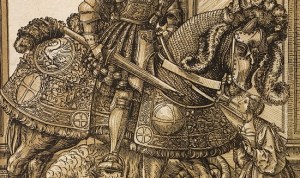
Hans Burgkmair the Elder, St George and the Dragon, c. 1508-10. Chiaroscuro woodcut printed from two blocks, the tone block in beige. Collection Georg Baselitz. Photo Albertina, Vienna.
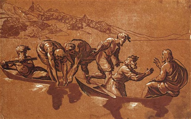
Ugo da Carpi, after Raphael, The Miraculous Draught of Fishes, c. 1523-27. Chiaroscuro woodcut printed from three blocks, the tone blocks in red. Photo: Albertina, Vienna

Ugo da Carpi, after Raphael; Aeneas and Anchises 1518, Chiaroscuro woodcut printed from four tone blocks, in beige and grey. Collection Georg Baselitz. Photo Albertina, Vienna.

Ugo da Carpi – Diogenes (1527)
This exhibition couldn’t be more timely for me. I have only recently started dabbling in woodcutting myself, having been inspired to do so by Felix Vallotton’s exhibition in Paris last year. Likewise, I have been fully immersed in Renaissance art of late, not least in seeking inspiration for my on-going Norm Saints collection which drawn on Renaissance religious imagery for its primary inspiration.
It is that same intense religious flavour, together with the grandiose imagery which was born of the Renaissance, which forms a golden thread through the 150 or so masterful woodcuts which the Royal Academy currently have on exhibition. Formed of the collections of the Albertina in Vienna, and the private haul of contemporary artist, Georg Baselitz (you know, the one who paints upside down portraits), this brilliant show brings together a fine set of prints which explore the birth of the chiaroscuro woodcut, a unique use of wood to express the intensification of light and dark.

Hendrick Goltzius, Hercules Killing Cacus, 1588. Chiaroscuro woodcut printed from three blocks, the tone blocks in yellow and green, 41.1 x 33.3 cm. Collection Georg Baselitz. Photo: Albertina, Vienna
- Andrea Andreani, after Giambologna, Rape of a Sabine Woman, 1584, Collection Georg Baselitz. Photo Albertina, Vienna
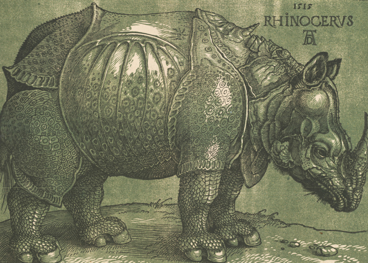
Albrecht Dürer, Rhinoceros (1515 and c.1620 – the highlights)

Albrecht Dürer, Ulrich Varnbühler (1522 and c.1620 – the highlights)
Ugo da Carpi, after Raphael; Aeneas and Anchises 1518, Chiaroscuro woodcut printed from four tone blocks, in beige and grey 51 x 37.4 cm Collection Georg Baselitz. Photo Albertina, Vienna. Organised by the Royal Academy of Arts, London and the Albertina, Vienn
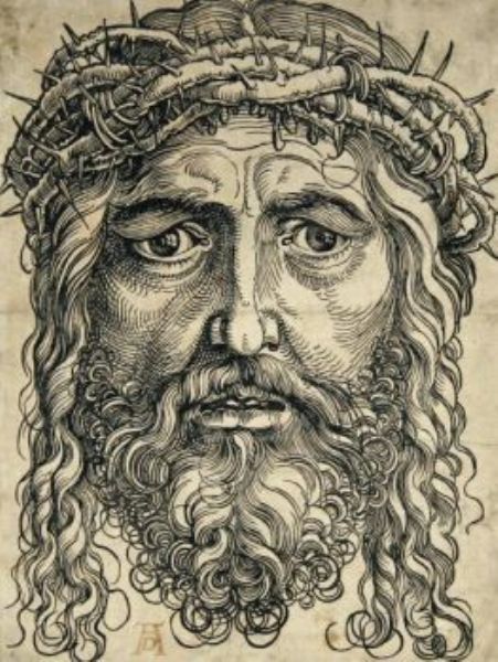
Hans Sebald Beham, Head of Christ Crowned (1520-1) – woodcut from two blocks, tone block in brown.
From the Italian word meaning light-dark, chiaroscuro is better known to describe the dark and brooding masterpieces of Italian painter, Caravaggio. Just as Caravaggio is famed for utilising the stark contrast of light and shadow to create paintings packed full of drama and intensity, this woodcut technique, invented in the 1500s by Lucas Cranach the Elder and Hans Burgkmair the Elder, provides the same thrill of three-dimensional realism by using different wood plates to layer up light and shadows. It generally involves one plate which contains all of the darkest details (usually the most linear plate), while another provides an overall mid-tone with white highlights cut into it. The effect is one of dramatic contrasts and naturalistic brilliance, as each of the many prints on show in this exhibition demonstrate.
From the work of those inventors, to the development of the medium, mainly by Italian printmakrs such as Ugo da Carpi and Dmenico Beccafumi, we are treated to a period of creativity in which the medium is expertly utilised to create images which, at the time, must have stunned audiences for all of their realism and depth. But just as they may have stunned 1500s audiences for their apparently illusionistic manifestation of light and shadow, so too do they retain the ability to stun the audiences of today – because in their sheer detail and brilliantly perfect execution, these works are a breath of fresh air in a contemporary world where art is so often comprised of some untidy sploshes on a canvas.

Renaissance Impressions is on at London’s Royal Academy until 8 June 2014.


Trackbacks & Pingbacks