Skip to content

Amsterdam Part I: Red Lights and the Rijksmuseum

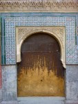
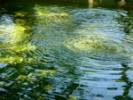
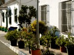
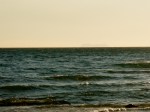
Flying to Amsterdam yesterday afternoon, it dawned on me how close the city is to London. Barely were we up in the air than we began our descent again. Yet as far as the two cities go, Amsterdam is another world. With all the charm of an old Vermeer painting, town houses line the canals side by side like ballroom beauties jostling for attention. Row after row of consistently elegant canals are uninterrupted by the blot of modernity, while in the canals a near perfect reflection provides a mirrored second city interspersed with ducks and houseboats. I love the way some of the houses lean forward (allegedly to hoist objects to the upper floors rather than brave narrow staircases) and others are formed of slanting, crooked windows, doors and roofs… In Amsterdam it’s hard to find a regular angle anywhere.

Vermeer, The Milkmaid (De Melkmeid) c 1658-1661

No wonder it left me feeling dizzy this morning. Or perhaps that dizziness was testament to our first tourist stop last night… The red light district. Now I know, heading straight to the sexy sector borders on the cliche, but as we arrived in the evening, and had time of our hands after dinner, a trip to the red lights seemed the obvious choice. At first we couldn’t find it. Catching sight of a red glow in the distance, we headed towards them only to find they were the neon lights of a pub. Ready almost to give up, we stumbled upon a tiny narrow alleyway also glowing red. Full of anticipation we crept down and suddenly, my heart skipped a beat as we came across a woman, in black laced underwear, leaning against the glass of a doorway, touching herself. Being ever the modest kind of male, I wasn’t sure where to look! It was so surreal to be faced so unapologetically with this display of sexual advancement. This initial alleyway opened up into a labyrinth of scarlet tinted shop fronts. There were countless prostitutes, someone for everyone, fat, thin, big breasts, small breasts, all on show. It became quite intimidating when, walking past a whole row, you’d hear plastic nails tapping on the window, gesticulating that you should approach. At the same time it was a fascinating display. The women each posed differently, some smiled, some scowled “seductively”. Some were coy, others all out sluttish. I felt almost embarrassed that I was treating them as a tourist attraction when they vied so hard for my attention, but they were certainly busy. We saw numerous gentlemen walking in and out, curtains of each window being pulled shut when the lady was busy, open again when a client left with a satisfied smile.

So in the end, after the initial collision course with this advanced outward show of sexual wares, I found the district enriching, adding to the Amsterdam experience. However I felt sorry for some of the ladies who were often faced with aggressive, loutish customers. And it was this element of the area that appalled – groups of men, often english thugs, ogling at the women right up in their faces, throwing insults, banging on the glass, showing outright aggression and a complete lack of respect to these women as human beings. Perhaps, after all, this is a problem with legalising prostitution. In allowing the profession to be advertised so publicly, it encourages men to so easily exploit the situation, to commodify women, to treat them as subhuman.

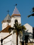
Red lights were superseded by the glow of a bright winter sunshine as we embarked on our first morning in the city today. Leaving our chic boutique base (the wonderful Hotel Estherea) to wander the western canals, we enjoyed coffee by one picturesque canal, and pancakes with banana, bacon and syrup by another. All canals led to the Rijksmuseum, which, despite undergoing major restoration works, has opened it’s most prominent masterpieces to the public in a very polished modern extension to the rear. The collection on show was still vast in breadth and I rather enjoyed the fact that this was a select exhibition – if this is only a small portion, the whole collection must be vast, and exhausting. Instead, we got to see all the important works, while retaining sufficient energy to get back go to the hotel. This included Vermeer’s The Milkmaid, which is romantic in a haze of dreamy light floating through a townhouse window onto the calm woman dressed in rich yellows and blue. The light and shade of Rembrandt’s masterpiece, The Nigh Watch, was even more dramatic, and the vast work was suitably installed as the climax of this impressive show.

Rembrant: The Night Watch (1642)

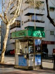
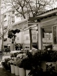
As the sun goes down over a chilly bustling city, the refinement of the city’s cultural offerings will again make way for the emergence of its prominent underworld. Staying open at all hours however are the multitude of souvenir shops, the likes of which we just sampled in their plenty at the Bloemenmarkt (flower market). We weren’t overly impressed with the rows of multicoloured clogs, wooden tulips, ceramic windmills or magnets of whores in windows (not one, I think, for my grandmother’s magnet collection) but not to be left out, I walked away with a pair of soft clog-shaped slippers ready to comfort my feet after a first thorough days navigation of Amsterdam. Sure beats the wooden kind. See you tomorrow!

Sunday Supplement: The Sweet Potato Eaters

I have already referred enthusiastically, earlier in the week, to the socially insightful early masterpiece of Van Gogh – his dowdy, brown-shaded gathering of peasants, The Potato Eaters. So different from his later works, where all the melancholy and subdued tones of his earlier Dutch-based paintings seem to have been discarded, to be replaced with vivid multicoloured rainbow spectrums, flowers, landscapes and characterful people, despite the continuing melancholia escalating in his soul. Yet this painting is no less a masterpiece for its lack of colour, bandaged ears and sunflowers. True, this work would not sit so well on a chocolate box or mouse pad, but it is nevertheless a truly stunning painting to behold, and a truly genuine, authentic insight into the simple life of peasants.

Van Gogh, The Potato Eaters (1885, Van Gogh Museum, Amsterdam)

Many things strike me about the work, and I can’t wait to see the original (hopefully) when I head to Amsterdam this week. I love the strong contrast between light and shade, the concentration of light in the centre of the table, drawing the viewer into this cosy, intimate scene. I like the faces of the peasants – coarse, worn down, but somehow contented with their humble dinner. And I love the surroundings, dark, dingy, but containing small trinkets demonstrative of the familial setting of the painting. All things combined, before even seeing the original, I was inspired to undertake a parody of the work back in 2010. Taking Van Gogh’s composition, I translated the scene into one of my family. In the painting is a self-portrait (far left) along with portraits of my mother, partner, sister and nephew. Instead of potatoes, we enjoy sweet potatoes, perhaps reminiscent of the better, sweeter life that we are lucky enough to have enjoyed compared to the peasants in Van Gogh’s original.

The Sweet Potato Eaters (after Van Gogh) (oil on canvas, 2010 © Nicholas de Lacy-Brown)

In my painting, the room remains basically the same as Van Gogh’s, but I include a number of features pertaining to my family home – the retro 60s lamp which hangs in my parents dining room, the cuckoo clock which hangs in mine. On the wall is one of my paintings (Lighthouse II: Starry Night) the title of which also refers to a Van Gogh work. In the back room, my family piano features, while on the table, Van Gogh’s simple tea cups are replaced with the Arabia mugs which both my mother and I have a huge collection of – featuring illustrations of Tove Jansson’s Moomin stories. On the shelves, onions, garlic and chorizo represent our affinity, as a family, with Spain, while the shiny coffee maker represents my partner’s family living in Italy.

I took the unusual move, because of the size and scale of the project, of photographing my work as it progressed. I therefore have a series of 45 photos which show how I created the work, step by step. Hopefully this will feature (if I’ve got my technology right) as a slideshow below. I think it adds to the effect to speed up the slide show a bit by clicking on the right arrow – that way you really see the progress of the painting in fastfoward mode.

Enjoy the work, enjoy your Sunday and see you in… Amsterdam!!!

This slideshow requires JavaScript.

Dutch Masters Season Part 3: Johannes Vermeer

There can be no doubt about just how famous this Dutch masterpiece is. While very little is known about the woman featured, how the painting came about, or even about the life of the great Dutch artist, Johannes Vermeer, this portrait has so captivated audiences across the world that speculation surrounding the work has inspired novels, films and stage shows. It is of course, Girl with a Pearl Earring (Het Meisje met de Parel). And of course, for every masterpiece, a Norm must stand it its place. Here, as my final instalment of the Dutch Masters Season, is Norm with a Pearl Earring, painted on a little  7″ x 5″ canvas with acrylic.

Norm with a Pearl Earring (acrylic on canvas, 2012 © Nicholas de Lacy-Brown)

And the original

Vermeer, Girl with a Pearl Earring (Mauritshuis gallery, the Hague)

It’s a simple painting at it’s heart, but the intensity of the colour contrast against a black background with the glint of a pearl and the wide open welcoming eyes of the model have no doubt contributed to making this painting one of the best known portraits in the world. It is by no means the best of Vermeer’s work, an artist who is renowned for his mastery of sumptuous domestic scenes, including startling realistic windows, checkerboard floors and decorative furniture, and scenes of ordinary middle class life in the family home. In fact it was Vermeer who made the ordinary king in his work centuries before the impressionists swept aside grand classical themes for a focus on everyday life. As such, almost all of Vermeer’s paintings appear to be set in the same two rooms in his home in Delft where he worked, showing the same furniture in various arrangements. Nonetheless they show exquisite skill and attention to detail, and collectively have made Vermeer the darling of Dutch art.

Scarlett Johansson in the 2003 movie, Girl with a Pearl Earring

I leave you finally with an image of my favourite Vermeer painting, The Art of Painting, a work which has a truly chequered history which requires no fictionalisation. Set in the same room as most of Vermeer’s paintings, it is nonetheless unique because it appears to feature a self-portrait of the artist, and because it never left the artist’s side. It is thought to have been painted as a showpiece by the artist so that he could use the work to advertise his skill to visiting potential patrons. It is unsurprising therefore that the work is lavish in its detailing – just look at the map on the wall full of creases and the detail in the chandelier. But for being well painted, the items in the work also have their own significance. It is widely thought that Vermeer, a Catholic, painted the work as a allegorical stand against the new protestant rule in the Netherlands. As such, the map of the new Netherlands is creased and torn, suggesting divide and unrest in the nation, while the absence of candles in the chandelier, adorned as it is with the double headed eagle – symbolic of the former Catholic Habsburg rulers of Holland – represents the suppression of the Catholic faith and the darkness which had consequently settled over the land. The girl is the Muse of History, Clio, evidenced by her laurel wreath, holding a trumpet (depicting fame) and a book by Thucydides.

Of even greater significance is perhaps what happened after Vermeer’s death. First, the painting was party to an outrageous act of fraud, as the name of Vermeer’s great rival, Pieter de Hooch, was forged onto the work with the result that it was not recognised as a Vermeer work until 19860. Secondly, in the second world war, after the Nazi invasion of Austria, the work attracted the attention of top Nazi officials – Hermann Göring attempted to acquire the painting, but his efforts were blocked by Hitler himself who acquired the work for his own amassed collection of stolen European masterpieces. Shortly thereafter, during the war, the painting undertook numerous perilous journeys as the Nazis moved it from place to place in an attempt to keep it safe, finally ending up, and being discovered in, a salt mine near Munich. It was presented to the Austrian Government by the Allies in 1946, happily still in one piece, where it has remained ever since.

Vermeer, The Art of Painting (c.1666) (Kunsthistorisches Museum, Vienna)

See you in Amsterdam…

© Nicholas de Lacy-Brown and The Daily Norm, 2005-2012. Unauthorized use and/or duplication of the material, whether written work or artwork, included within The Daily Norm without express and written permission from The Daily Norm’s author and/or owner is strictly prohibited. Excerpts and links may be used, provided that full and clear credit is given to Nicholas de Lacy-Brown and The Daily Norm with appropriate and specific direction to the original content.


Dutch Masters Season Part 2: Frans Hals

When I told my mother that I was going to paint a series of Norms based on classical paintings, the first suggestion she made was The Laughing Cavalier by Dutch golden age artist, Frans Hals. I thought she was mad! Having seen the portrait on a trip to The Wallace Collection in London some years ago, my lasting memory is being overawed by the intricacy of the portrait, in particular the extravagant embroidery on the “Cavalier’s” sumptuous outfit, and the skill with which Frans Hals had captured the abundance of lace around his neck and cuff. No way could I paint this in small Norm reproduction I thought. But then, when I painted a Norm based on Velazquez with all its lavish silk clothing, followed by a Doisneau inspired Norm painting with the intricacy of that darned complex Opera Garnier, I realised that the Cavalier may not be such a feat after all.

And so, excited by the challenge I had set myself, and all the more enthusiastic in the knowledge that a Laughing Cavalier Norm would make a suitably ravishing addition to my Dutch Masters collection, I attempted to recreate Frans Hals masterpiece on a mere 8″x10″ canvas. And here is the result.

Laughing Cavalier Norm (after Frans Hals) (acrylic on canvas, 2012 © Nicholas de Lacy-Brown)

The title of the original work was undoubtedly not The Laughing Cavalier, but the portrait became known as such around the time it first arrived in Britain in the 19th Century. It was thought to be unusual for a portrait of its age (1624) to feature a smiling figure – usually formal portraits were more serious and austere. But this gentleman, while not actually laughing, is certainly jolly, if a little haughty, and his curled up moustache pronounces the smiling contours of his expression. Lucky then that the moustache aids in the creation of a smiley disposition, because with no mouth, my Norm would certainly be all the more somber without it.

Frans Halls, The Laughing Cavalier (1624, The Wallace Collection, London)

English: Frans Hals, "The Laughing Cavali...

Image via Wikipedia

It is also doubtful, incidentally, whether the Laughing Cavalier, asides from lacking in laughter, was even a cavalier. It is said he was most likely a wealthy civilian, perhaps also a military man as suggested by a glimpse of the hilt of his sword. His richly embroidered clothing is aptly demonstrative of his wealth. There are many emblems in the embroidery, allegedly signifying “the pleasures and pains of love” through bees, arrows, flaming cornucopiae, lover’s knots and tongues of fire, while an obelisk-like shape is meant to signify strength and Mercury’s cap and caduceus signifiers of fortune. Meanwhile the turning pose and low viewpoint are shared by a number of similar portraits by Frans Hals.

Whoever this jocular gentleman was doesn’t really matter. There is certainly a power in his expression, through the sparkle of his eyes and confidence of his smile which continues to captivate today. It was often said, when the portrait first rose to fame in Britain, that the Laughing Cavalier’s eyes followed you around the room. They certainly seem to do so – even a digital reproduction on my computer screen seems to come alive, almost bemused at it watches me fussing around the room and clicking away on my computer. No wonder then that this painting has taken its worthy place in the gallery of Dutch masterpieces. It’s a work which breaks the boundaries of formal portraiture, packed with personality, symbolism, and a smiling face which exudes personality to this day.  Tot morgen…Vaarwel.

Dutch Masters Season Part 1: Van Gogh

Its atmospheric canals may be frozen (or perhaps now melting?), its wooden clogs uncomfortable on the feet, and its multi-coloured fields of tulips yet to burst into life, but Holland has so much to offer, especially to art lovers like myself. I’m not overly familiar with the Netherlands – I went once on a geography field trip at school, when we concentrated on the art of land reclamation and urban morphology, but it has always saddened me that I never had time to appreciate the cosmopolitan, thriving city of Amsterdam and all its multifaceted cultural offerings. This weekend, all that will change, as the Daily Norm will head to Amsterdam and hopefully posts bursting with accounts of the great city, its art and its buzzing life will swiftly follow. In anticipation of this exciting event, the Daily Norm is happy to launch the Dutch Masters Season, a three-part series looking at masters of Dutch art, as well as Norm reinterpretations of three Dutch masterpieces. This will be followed by a Sunday Supplement examining the influence of a particular Dutch supremo on a family portrait I created in 2010, and then my trip to Amsterdam will explode onto your screens in a (hopefully) spectacular fashion.

So, without further ado, let us begin this brief cultural survey of Dutch artists with this feature on a painter who is without a doubt the most famous Dutch master of them all… the indomitable sunflower-loving, paint-eating, ear-lopping saviour of colour, Vincent Van Gogh.

What can be said about Van Gogh that hasn’t been said before? A couple of years ago we got a huge anthology containing translations of his numerous letters, allowing us an invaluable insight into the artist’s sensitive, insightful mind. Last year, a new biography was published, sensationally claiming that rather than killing himself, as is the fabled (and much romanticised) tale, he was quite probably killed in a tragic accident involving local children playing with a gun. Every year some weighty international art institution holds a retrospective of his work, and chocolate boxes, t-shirts and mouse mats containing starry nights, sunflowers or a green faced portrait with decisive brush strokes and vibrant colours fly off the shelves of souvenir shops all over the world. So of course there isn’t much left to say. But where there is renown, let a Norm refresh. Where Van Gogh bandages his ear, let a Norm bandage his face. Yes, I give you, in the style of Van Gogh, Norm with a bandaged face…

Norm with a bandaged face (after Van Gogh) (acrylic on canvas, 2012 © Nicholas de Lacy-Brown)

And the original…

Vincent Van Gogh, Self-Portrait with Bandaged Ear (1889, Courtauld Institute of Art, London)

So why did this particular Van Gogh work inspire me? (After all, there are countless Van Gogh portraits to chose from, as well as a number of portraits of the local postman, the doctor, Gaughin’s chair and the like). Well to start with, this painting lives close to home for me, part of the wonderful collection of London’s Courtauld Institute, where more often than not, you can get this portrait, as with many of the other impressionist masterpieces in the collection, all to yourself, while Van Gogh’s Sunflowers, kept down the road at the National Gallery, is surrounded by a permanent semi-circle of tourists and school groups. But then there’s the bandaged ear, which is after all emblematic of the legend that is Van Gogh.

Van Gogh: souvenir hell

It happened one dark night in December 1888. Paul Gauguin, the tumultuous Tahiti-loving artist was staying with Van Gogh in the Yellow House in Arles, Provence. They argued savagely and Van Gogh came at Gauguin with a knife. At the last minute he turned on himself, cut a chunk out of his ear, and attempted to gift it to a local prostitute who sensibly alerted the authorities thus probably saving Van Gogh from bleeding to death. This painting, one of two containing the bandage (and therefore suitably amplifying the tale), was painted a month later in the comparable calm of post-cataclysmic reflection, with Gauguin gone, and Van Gogh all alone, once again, staring in the mirror in contemplation.

Vincent Van Gogh, Vase with Twelve Sunflowers (1888, Neue Pinakothek, Munich)

For me, it’s the perfect Van Gogh, because it gives us snippets of everything he represents. Broad, almost vibrating brush strokes expressing the rawness of his emotions, and the vigour and haste with which he sought to express his feelings on the canvas. A colour palette which is bold, unforgiving, almost happy despite the downbeat subject portrayed. On the wall hangs a japanese print, a recognition of the great influence of Japonisme in his work, while to his right, an easel and canvas is in progress – here I have used a bit of good old artistic licence, adding the sunflowers which are so equally emblematic of Van Gogh – just in case you weren’t immediately sure who I was referencing with this painting! In this way, the warmth of Provence contrasts with the coldness of winter portrayed in the artist’s thick coat and strange furry hat, an outfit which appears to isolate Van Gogh from the viewer, enveloping him in a melancholy introspection which is shared with the audience only through the piercing gaze of his sickly green eyes.

Well there you have it – and it looks like I had a lot to say after all. For me, Van Gogh is a master. Sometimes his works are criticised for being overly loose, coarsely painted and unsophisticated. But you only have to look at his early portraits of peasants, such as his saturnine masterpiece, The Potato Eaters, to recognise his skill as a draftsman. Rather his coarse, thick application of paint allowed him to paint fast, and this was crucial in allowing him to express his vigorous and volatile emotions on canvas, as and when they moved him. And it is this living, breathing, unforgiving emotional intensity which remains so evident in his canvases today in every decisive and quivering brush stroke, capturing audiences and inspiring biographers and curators aplenty, whether it be through sunflowers, cypress trees or in the sorrowful eyes of his many self-portraits. This is why, to my mind, Van Gogh is a true Dutch master.

Van Gogh, The Potato Eaters (1885, Van Gogh Museum, Amsterdam)

Come back tomorrow for Dutch Master number 2.

Postscript: In case you were wondering, no, Norms don’t have ears, but that doesn’t mean that this Van Gogh pretender couldn’t have inflicted a grizzly wound on himself in the same general area!

Valentine’s Kisses: Norms do… Klimt

It’s valentine’s day, the day when millions of singletons across the globe shrink in disgust at the notable increase of embracing couples on the streets and inappropriate PDAs (public displays of affection), and when millions more feel the pressure of their partner’s expectation that they out do last year’s offerings with overpriced roses and a box of unwanted chocolates. But none of that here. At the Daily Norm, valentine’s is just an excuse to celebrate the more intimate, emotional side of art, while also using it as an opportunity to present a brand new Norm painting to the world! When I think of love, there is only one painting which comes to mind. It is, perhaps unsurprisingly, the same image which dominates the search results page when you type “The Kiss” into google. It is, of course the world’s must famous and celebrated embrace, The Kiss, by Gustav Klimt. And here, for your viewing pleasure, is the Norm re-inactment along with the original.

The Kiss (after Klimt) (acrylic and gold leaf on canvas, 2012 © Nicholas de Lacy-Brown)

The Kiss by Gustav Klimt (1907-8, Österreichische Galerie Belvedere, Vienna)

It’s a crying shame that like Van Gogh’s sunflowers, or Monet’s bridge/waterlillies, or Degas’ ballerinas, Klimt’s masterful golden embrace has become so commercialised, replicated and reproduced onto every form of tourist tack, from lamps and mousemats to beaded curtains and bed linen, that the automatic reaction of a viewer to the image is to see it through a kind of autopilot. As with all recognition, one fails to actually look, really look at the image. When I embarked upon a Norm version of Klimt’s work, this is exactly what I had to do. Whereas previously I had dismissed the image as cliché, when I started painting my own version, I saw so much more.

The Kiss (after Klimt) (© Nicholas de Lacy-Brown) - detail of male Norm

First of all, the painting is a superb fusion of evocative emotion mixed with art nouveau-inspired flattened design. It makes for an interesting synthesis, and seems to emphasise and centralise the intensity of the embrace all the more, since the power of the emotion charging through the embrace appears to have instigated the creation of a fantasy world around the couple, as they appear to burst out of a planet of flowers, and all around them, a cosmos of golden stars twinkle. The patterns of the clothing are also interesting. With squares and geometric patterning, the man’s clothing appears quite strong and masculine, where as the woman exudes a more feminine softness with round flowery shapes and waves. However, interestingly the fusion between the characters seems to translate into their clothing, as interspersed between the man’s squares are small patches of swirls, while on the woman, round shapes are occasionally interrupted by squares, particularly where her body touches the man’s. Moreover, the aura-like golden space around them is full of swirls which appear like stars or moving, active emotions. Also, at the bottom of the canvas, the abundant flowing golden plants trailing off the couple seem to suggest fertility, not least because of  the prominence of the upturned triangle which hints at female sexual organs.

The Kiss (after Klimt) (© Nicholas de Lacy-Brown) - detail of female Norm

More interesting still is the pose. From the painting’s title, one would draw the inference that this is a happy, loving embrace. However, having studied the work more closely, there is, to my mind, something all the more sinister about the pose. While the man stands tall and rather menacing with his black hair and firm grip of the lady, she appears to be subservient in the embrace, kneeling before the man. She appears to hold the man, not tenderly, but as though trying to loosen his grasp on her. Notably, her right arm appears to be screwed up into a tense fist rather than tenderly resting upon his shoulder. It also seems significant that the kiss is not on her lips but her cheek, as though the lady has turned her face just in time to avoid the man’s approach.

As with most great masterpieces, much is left to the public’s interpretation, but I am at least glad that in Normyfying this work, it has given me the opportunity to study it further and give it the kind of appreciation it deserves. As for my Norm reimagining, I think that the pose lends itself well to the Norms who, in their curved body shapes, fit effortlessly into the art nouveau theme of the original. Here the awkwardness of the embrace could still be interpreted either way, although as Norms only have one arm, my lady Norm is without her right screwed up fist, while the man cannot grip so firmly upon his Norm lover with his second hand. There was a lot of detail which needed painting in order to do Klimt’s original justice, and as the main photograph doesn’t necessarily show this up, I have included close up detail shots of my Norms (above), as well as a photo showing the effect of the gold leaf when a flash is used on my camera below.

The Kiss (after Klimt) (acrylic and gold leaf on canvas, 2012 © Nicholas de Lacy-Brown) - showing effect of a flash on the gold

In the meantime I wish you all a very happy Valentine’s day, hoping that the day is everything you want it to be (if only if it means the effective avoidance of couples!). For those of you more inclined towards all things romantic, I leave you with a gallery of some of my favourite artistic manifestations of kisses, from Rodin’s sculpture to my own Norm version of Robert Doisneau’s Le Bazier de l’Opera.

© Nicholas de Lacy-Brown and The Daily Norm, 2005-2012. Unauthorized use and/or duplication of the material, whether written work or artwork, included within The Daily Norm without express and written permission from The Daily Norm’s author and/or owner is strictly prohibited. Excerpts and links may be used, provided that full and clear credit is given to Nicholas de Lacy-Brown and The Daily Norm with appropriate and specific direction to the original content.

Córdoba: The city which inspired the painting

It’s my last dip into the Iberian peninsular before I go all Valentines on you… Following yesterday’s Sunday Supplement in which I introduced my painting, Córdoba, here are my photos of the city which inspired the work.

Córdoba is a unique little place. It doesn’t share the same thriving spirit as Seville or Granada for example, at least not in the very self-contained old town which looks and feels very much like a living museum given over to the tourists. Asides from La Mezquita at its centre, there are a few quaint art museums and an excellent archeological museum, but otherwise there is not a huge amount to see. Surprisingly, it did make the short list for Spain’s European Capital of Culture in 2016 which scandalously Malaga, home of the great Picasso Museum, a flashy new airport, a thriving city and a contemporary art museum, did not. Having said this, Córdoba is a crucial visit for those with an interest in Spain’s rich cultural heritage, and in particular its Moorish past. Should you go, be sure to sample Berejenas Fritas – deep fried aubergine served with a syrupy sauce – divine.

Below are a selection of the photos I took when in Córdoba. If you saw my post yesterday, you’ll recognise the crumbling facades, elegant wrought-iron lamps, the quenching relief of a hotel swimming pool, and that shameful architectural vandalism which took place in the great mosque after the Christian reconquista. This is a city where history is not only preserved, but the wounds of the past are still uncomfortably evident.

© Nicholas de Lacy-Brown and The Daily Norm, 2005-2012. Unauthorized use and/or duplication of the material, whether written work or artwork, included within The Daily Norm without express and written permission from The Daily Norm’s author and/or owner is strictly prohibited. Excerpts and links may be used, provided that full and clear credit is given to Nicholas de Lacy-Brown and The Daily Norm with appropriate and specific direction to the original content.

Sunday Supplement: Córdoba

Well it’s been quite a week. It started with snow in the UK and hurricane winds where I was in Marbella. Somewhat gleefully escaping the worst of the cold and indulging in plentiful sun drenched coffees at Cappuccino Grand Cafe, I nevertheless came home to London with something of a bump, and I don’t mean on the airplane. Rather, the bump that was troubling me was a rather large lump on my head, and with medical attention required, I had to endure not one, but two operations on said lump/ bump on the back of my head, and therefore ended the week with a sore head and a bandage obscuring half of my face. It is consequently after a couple of days “medical leave” that I return enthusiastically to the Editor’s seat of the Daily Norm to complete my early 2012 Spain Season. This is ahead of a week which promises an almost daily launch of exclusive new Norm paintings which are complete and ready to be shown to all my loyal followers. Starting with a special for Valentine’s day, a whole host of themed Norms will be making their way onto your screens for… Dutch Season! Oh the excitement!

But enough about what is forthcoming. What about today? Well, as the final instalment of my season on Spain, and following in the path of last weekend’s Sunday Supplement on Seville, I thought I would share with you what is perhaps the partner of the Seville Triptych – my work based on another  of Andalucia’s stunning cities – Córdoba . I visited Córdoba in June 2010, just two months after Seville, and as with the latter city,  was instantly inspired to paint. My inspiration, while being sourced from the generalised beauty of a historical Spanish city, was specifically engaged by two characteristic features of the city. First, I was moved by the air of decadence and decay – walls and painted plaster crumbling with such elegance that you would presume it had been perfectly choreographed in an effort to charm visitors with this offering of living history in the streets all around them. Secondly I was scandalised, utterly disgusted, by the architectural maiming of the city’s Great Mosque – otherwise known as La Mezquita – or, controversially, as La Catedral de Córdoba. But a Cathedral this is not.

Roof of La Mezquita, from which the Christian cathedral, plunged through the middle, can be seen.

The mosque, arguably the most emblematic symbol of the City with its famous row upon rows of red and white striped arches, was built at the centre of a thriving Islamic city. In 1236 it was captured by the Catholic King, Ferdinand III as part of the Catholic reconquest (“reconquista”) of the Iberian peninsula after 700 years of Islamic dominance there. Once captured, this stunning mosque was turned into a cathedral. Its minaret was rebuilt as a baroque bell tower, the open arches which encouraged people to wander in from all over the city and pray were bricked in and closed off, and most scandalously of all, the centre of the mosque was literally bulldozed to the ground as a completely jarring, architecturally conflicting baroque cathedral was plonked right in the middle of the mosque. Both the Christian and Islamic buildings are impressive in their own right, but forced together constitute, to my mind, a horribly uncomfortable, deeply shameful act of architectural vandalism. It is said that even Charles V, King of Castile at the time when the cathedral was inflicted upon the mosque, eventually regretted the move when he realised that something special and unique had been destroyed by the Christian architects.

It was these two factors – decay and the mosque which inspired my painting, and to my mind, they are closely linked. For Córdoba was a thriving Islamic city in the time of the reconquista, the capital of Al Andalus, with a huge population which included people of all faiths living in harmony together. After the reconquista, the city lost it’s status and importance, as central rule was moved to Madrid, the multi-faith population was driven out, and Córdoba was left to crumble and decay, a state which has continued to this day. Consequently in the beauty of the cracks and crumbling buildings, there are deep historical wounds, which were almost tangible, and certainly the source of melancholy in a city which is now given over mainly to tourists.

Córdoba (oil on canvas, 2010 © Nicholas de Lacy-Brown)

The reconquista is explicitly illustrated in my painting. The elephant represents the conquistadores. Like the elephant in the room, when today’s catholics name the mosque La Catedral they ignore the fact that this was, and to all intents and purposes still is, a great mosque, albeit with a Christian cathedral plunged through the middle. They ignore this senseless act of vandalism, and they assume that we will accept this as a Christian building without any appreciation of its painful historical context. As the reconquest begins, the elephant smashes the mosque to pieces, looking calm as it does so, an emblem of the conquistadores on its cloth, and a Christian altarpiece on its back. The baroque bell tower is flown in, harnessed to a Vatican helicopter, ready to be built on top of the ruins of the mosque. Meanwhile, all around, cracking walls are held tentatively together with safety pins, while the elegant street furniture of the city – lamps and ceramic street names – are interspersed with the slightly coarse application of electricity wires on the outside of the ageing walls. Finally at the foot of the painting, a swimming-pool-like gelatinous form reflects the clouds above, and is featured solely as a personal reflection of the hotel swimming pool in Córdoba which my partner and I enjoyed so much. Across it, the great roman bridge of Córdoba features, a direct pathway leading from the modern town into the old town, crossing the Guadalquivir as it still does today.

I should point out that despite its religious context, this painting does not attempt to take sides. It criticises history. It does not criticise religions in their contemporary manifestation.

Look out for my photos of Córdoba, featured tomorrow. Until then, have a great, relaxed Sunday.

© Nicholas de Lacy-Brown and The Daily Norm, 2005-2012. Unauthorized use and/or duplication of the material, whether written work or artwork, included within The Daily Norm without express and written permission from The Daily Norm’s author and/or owner is strictly prohibited. Excerpts and links may be used, provided that full and clear credit is given to Nicholas de Lacy-Brown and The Daily Norm with appropriate and specific direction to the original content.

Marbella – Hidden wrinkles beneath the botox

Far beyond the ritzy media archetype of Marbella, with its fake-tanned, label-cluttered, Ferrari-filled Puerto Banus, and its marble clad town centre, complete with grand avenues and mature parks, high street shops and tourist information centres, is a town which resembles none of the glitzy, cosmopolitan manifestations of the media-managed Marbella. It’s a town which is emblematic of historical, culture-rich Spain, where the locals, many forced from their homes by rising house prices, or others packed into small dwellings with three generations of their families, continue living the life they have always lived, while all around them their town of Marbella has enjoyed its ascendency into the darling of the jet set. This is the Marbella which must endure the relentless hardship of the fishing industry to survive, locals who must live far out in the less than salubrious suburbs in order to stay in the town. Yet within these communities is a fun-loving, strong, proud spirit. Rather than being snubbed by a WAG in designer sunglasses, here you are greeted with a pleasant “Buenos Dias”, the locals still sit around outside their homes chatting at all hours, and families flock to the cheaper restaurants whose food is authentic and unpretentious.

As a part-time resident of Marbella for the last ten years, I have become disenfranchised with the town’s superficial identity. I loathe Puerto Banus, the media face of the town, whose geographical beauty is eclipsed by the pretentious tourists, begging for attention with their pursed glossy lips and frozen foreheads. I progressively find myself straying more and more into the Spanish communities, where the essence of Spain is still alive, where Marbella could be any other town in Andalucia, where the smell of garlic pervades the air and flamenco’s anguished cry wafts across the airwaves.

One such place is Cable Beach – it’s East out of Marbella, in the opposite direction from the Golden Mile, where the port is industrial rather than given over to pleasure, and fishermen still work, their cottages still intact having escaped demolition to make way for a hotel, and whose beach, so often deserted, is a wide, beautiful expanse of golden sand. In the photos which follow, I hoped to capture the beauty of this quieter, more authentic side of Marbella, and also include images of the outer suburbs, as well as the town in the aftermath of a recent storm – all views of the hidden, authentic town which thrives still in the shadows of the media glare.

© Nicholas de Lacy-Brown and The Daily Norm, 2005-2012. Unauthorized use and/or duplication of the material, whether written work or artwork, included within The Daily Norm without express and written permission from The Daily Norm’s author and/or owner is strictly prohibited. Excerpts and links may be used, provided that full and clear credit is given to Nicholas de Lacy-Brown and The Daily Norm with appropriate and specific direction to the original content.

Norms do… the Rokeby Venus

You’d excuse the Duchess of Cambridge, aka our adored Kate Middleton, for being a little miffed at the reception to her sister Pippa’s now famous backside when it meandered up the aisle of Westminster Abbey behind the blushing bride in the decade’s most watched wedding last year. Her bottom was a largely unanticipated feature of the wedding, but one which captured almost as much attention as Kate’s dress, particularly amongst the males watching the wedding (causing unanimous consternation amongst their female partners – one, it was reported, even slashed her boyfriend’s car). But should Duchess Kate wish to console herself of this great usurpation of her wedding day, she need only wander next door from the National Portrait Gallery to which she has recently become patron. There, in London’s National Gallery, she will find a backside which easily eclipses Pippa’s behind in terms of notoriety (and, frankly, beauty), a bottom which has been both ogled at and admired in equal measure for centuries, and one which has stirred such strong reactions in its audience that a King of England helped to purchase it for the nation, and prompted one crazed suffragette to slash the painting repeatedly in pursuit of her campaign for women’s rights (in prompting such violent actions then, perhaps the two bottoms are on par). It is, of course, the beautiful bottom of the Venus, painted by Spanish master Diego Velázquez, which has become known as The Rokeby Venus. 

The original Rokeby Venus by Velazquez (courtesy of The National Gallery, London)

The painting, which became known as Rokeby when it was moved to Rokeby Park in Yorkshire in the 19th century, is easily one of the prizes of The National Gallery’s collection. It not only shows a lovely naked body for audiences to admire and, possibly, to become aroused by, as well as an intimate, uninterrupted moment of self-absorbed beauty, it also offers us an innovative way of representing the archetypal duo of classical figures, Cupid and Venus, with Venus’ back to the viewer, and Cupid, without his usual bow and arrows, engaging, assisting Venus in her act of self-appreciation. Painting Venus’ back to the audience was an unusual choice, but it not only adds to the intimacy of the scene, it also allows the nude to be admired from a hitherto unseen perspective. And in order to involve the audience with his portrayal of Venus further, Velázquez uses the mirror as a device to introduce Venus’ face in the scene as well. In this way the composition is not only innovative but highly effective as a tool to seduce and captivate the viewer. As Velázquez goes, this is quite a departure from Las Meninas and his other court portraiture, and would, in fact, have been painted with a degree of secrecy in a society which was prowled by the stricture of the Spanish Inquisition. Its beauty is however equal to, if not greater than these more “official” works, and provides an intimacy and emotional intensity which would never be captured in the stiff pose of a courtier, or even the traditional classical manifestation of Venus.

Damaged sustained by the Rokeby Venus when slashed by suffragette Mary Richardson in 1914

Now the Norms, being as ever, fans of high culture, particularly of a Spanish kind, have adopted the pose of the Rokeby Venus for your pleasure. In this watercolour reimagining of Velázquez’s masterpiece, the composition is pretty faithful to the original, albeit the medium of watercolour provides something of a coarser, more vivid finish than the hazy blended effect which Velázquez has achieved with oils. I also made the face of the Norm in the mirror more prominent that Velázquez’s Venus whose face is inexplicably blurred. Recent National Gallery x-rays have shown that this blurring remains unchanged from the painting’s original finish and was, therefore, always intended by Velázquez. Why he blurred the face no one can be sure, but I like to think that it conformed to the softness of the whole scene, including the gentle finish given to Cupid. In giving Venus a generalised, undefined face, Velázquez emphasises the beauty of her body and the drapery which mirrors its curves so effectively.

The Normby Venus (after Velazquez) (watercolour on paper, 2012 © Nicholas de Lacy-Brown)

Let’s hope that my Norm reimagining remains in one piece and is not slashed to pieces by a protester…

So before leaving you to (hopefully) enjoy my Norm pastiche, just a note on who else has been inspired by the Rokeby Venus. Well the list is fairly long, including Goya, Ingres, and Paul-Jacques-Aimé Baudry with his The Wave and the Pearl. But it is also possible, I think, to attribute Manet’s infamous Olympia to the dare and innovation of Velázquez’s portrayal of the nude. As Velázquez reinvents the female nude with this glance at her behind, so too did Manet reimagine the nude, painting a similarly unembellished nude who stares directly at the viewer, captivating the audience in the same way that the Rokeby Venus pulls the viewer into the intimate scene by way of her reflected stare in the mirror. Notable too is Manet’s drapery, mirroring and enhancing the curvature of his creamy-smooth nude.

Edouard Manet, Olympia (1863) courtesy of the Musée d'Orsay, Paris

Also of note is the 1970s photographic reinaction of the Rokeby Venus by Bergström as well as by contemporary photographer Sam Taylor-Wood. In the latter photograph, Soliloquy III, Taylor-Wood pushes the erotic nature of Velázquez’s work to a new level, capturing what looks like a self-portrait in the Rokeby pose above a freeze which appears to show a group of people indulging in a mass orgy in an office space.

Bergström over Paris (1976)

Soliloquy III (1998) Sam Taylor-Wood

Suddenly Pippa’s small, well-covered bottom loses much of its lustre… Until next time.

© Nicholas de Lacy-Brown and The Daily Norm, 2005-2012. Unauthorized use and/or duplication of the material, whether written work or artwork, included within The Daily Norm without express and written permission from The Daily Norm’s author and/or owner is strictly prohibited. Excerpts and links may be used, provided that full and clear credit is given to Nicholas de Lacy-Brown and The Daily Norm with appropriate and specific direction to the original content.