Printmaking Progress II: Aquatinting
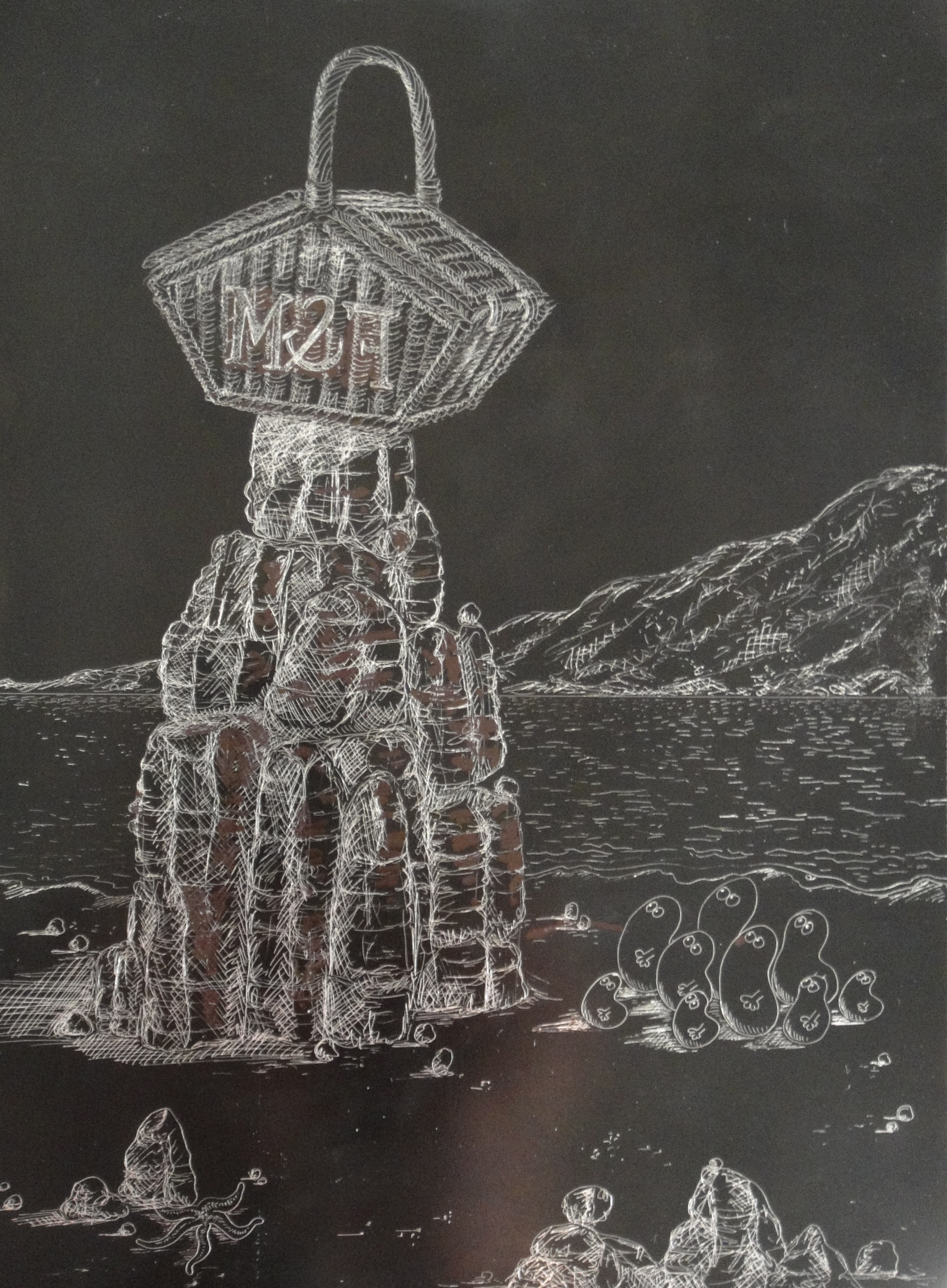
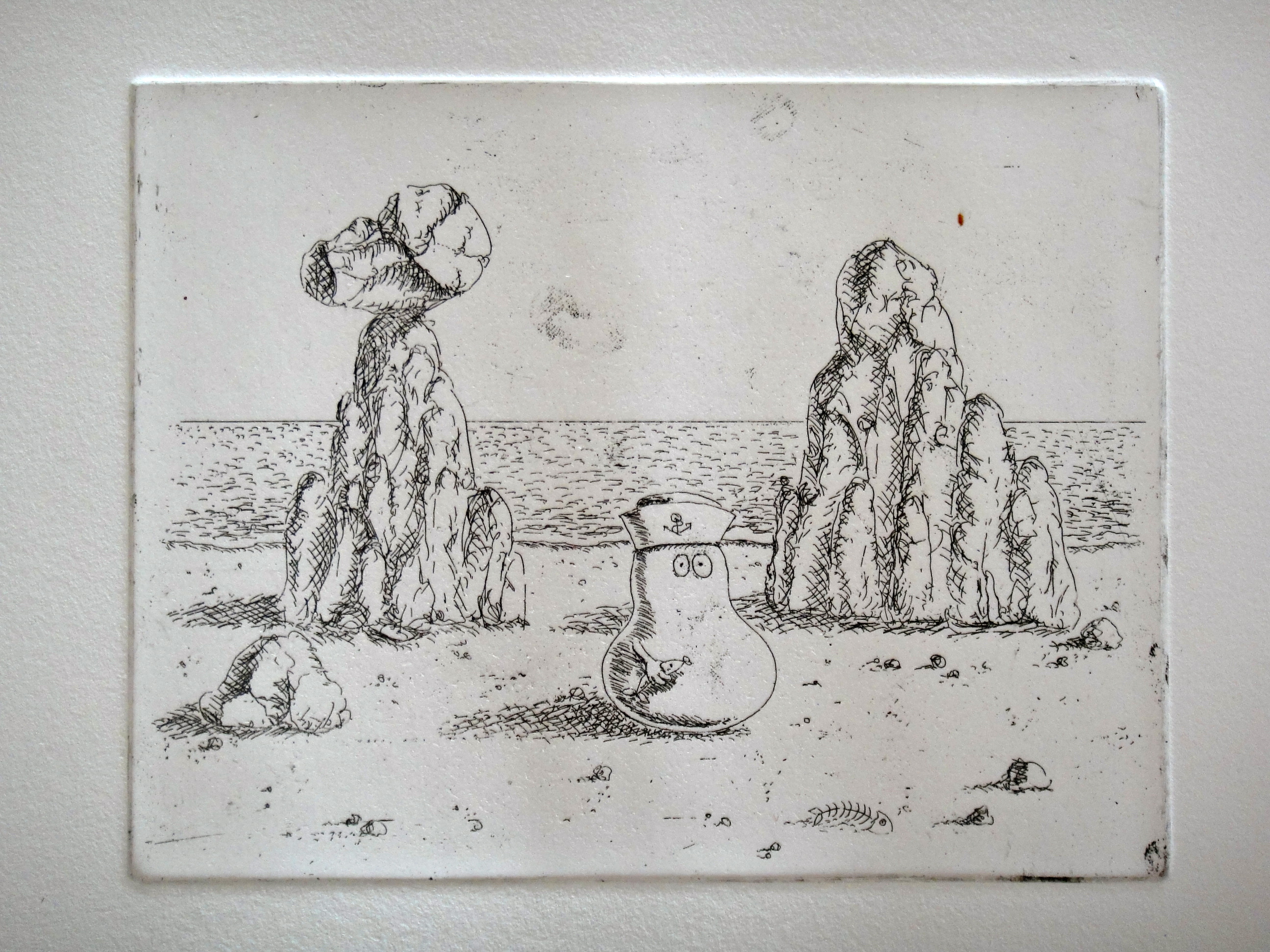
Being a self-trained artist, and so lacking the basic overview which art college provides of the many mediums which an artist has at his or her disposal, I became so entrenched in the world of painting for so many years that my recent discovery of the world of print has come as a complete revelation. Now over midway through an intermediate course in etching, I have taken to the medium like a duck to water. For not only does the medium transfer all of the skills of draughtsmanship which I have been mastering over the years in painting and more recently sketch, but through the sheer narrowness of the needle upon ground it enables me to pack the kind of detail into my etched images that I love. So, in my now advanced second etching, of a Fortnum and Mason’s hamper balanced upon a craggy rock, I have been able to go to town on the detail of the wicker, the rock texture, the little Norms looking up at the rock and the mountain and sea in the background.
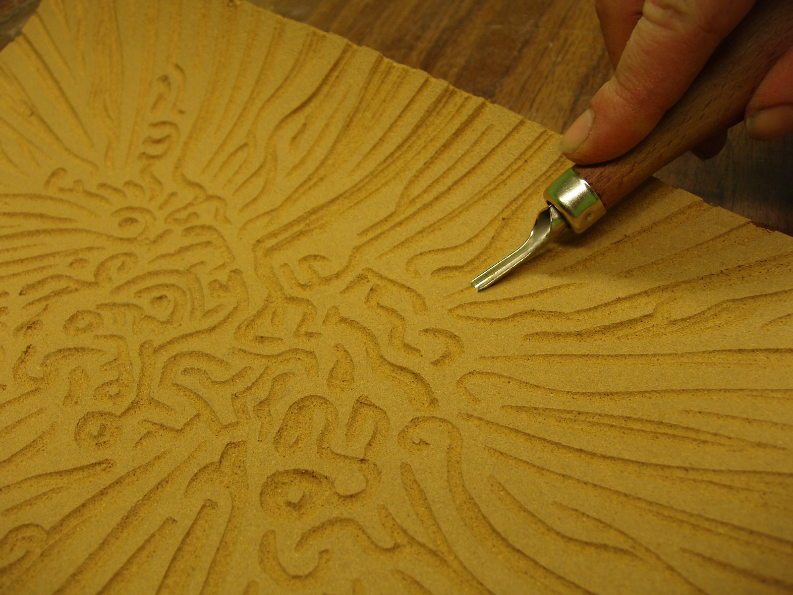
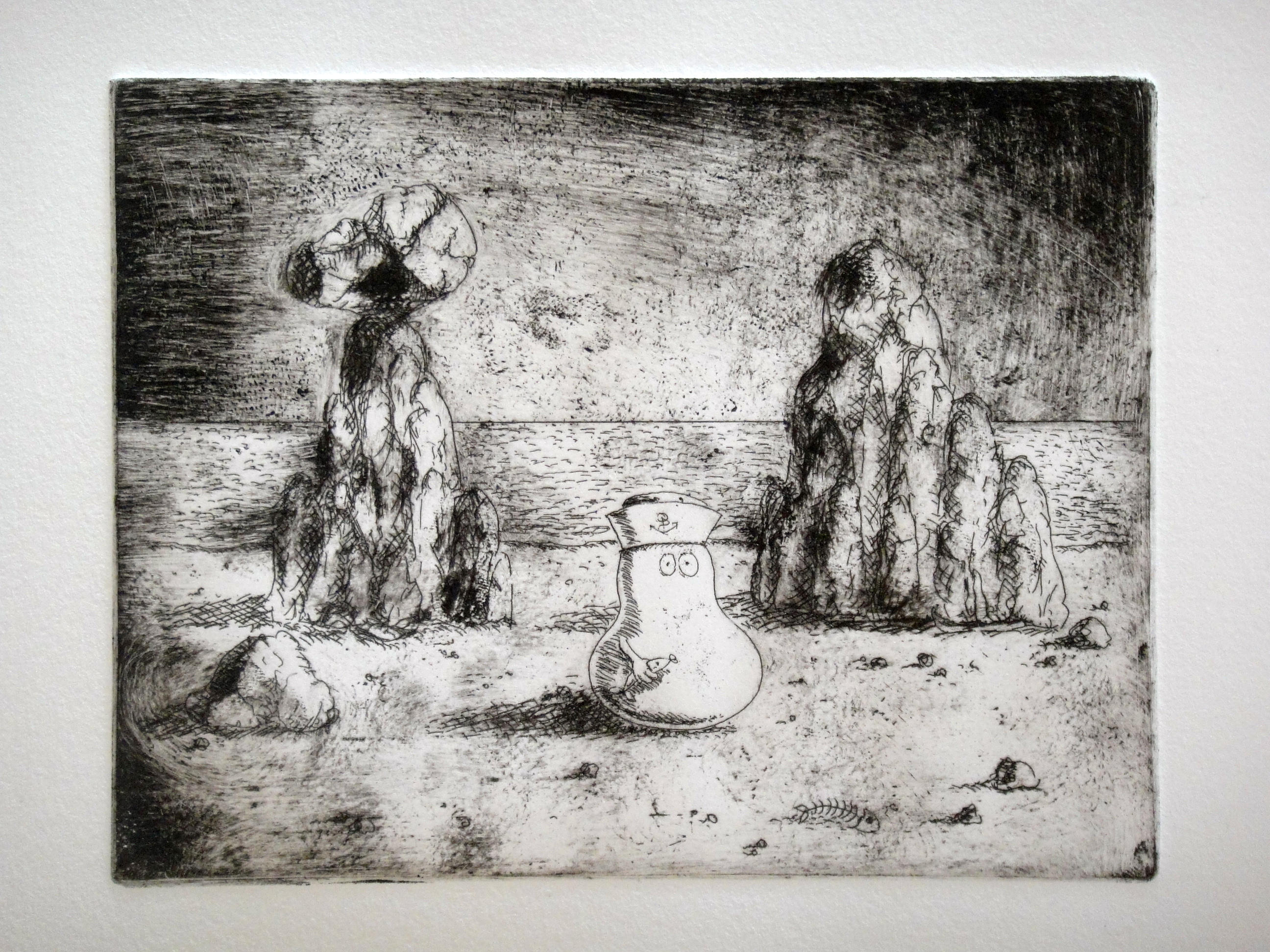
Over the last two weeks, I have developed my etched image from metallic reverse image in black ground, to simple line drawing etched into metal and printed in reverse, to an image now loaded with different tonal variety achieved through the process of aquatinting. I am not sure why the technique has the name it does – I imagined it to involve some sort of watery application, a little like applying watercolours to a finished print. But in fact it involves no water at all. Rather, aquatinting is the process by which tone is added to the etching plate through measured re-exposure to acid. It works a bit like the Benday dots which Lichtenstein made famous – apply thousands of little dots to protect the metal and when exposed to acid, only those areas of the metal not covered by dots will etch and turn darker as a result. Step back and with the light dots and the dark exposed plate combined you get a shade of grey. The longer the exposure to acid, the darker the plate becomes, as the distance between dots increases.
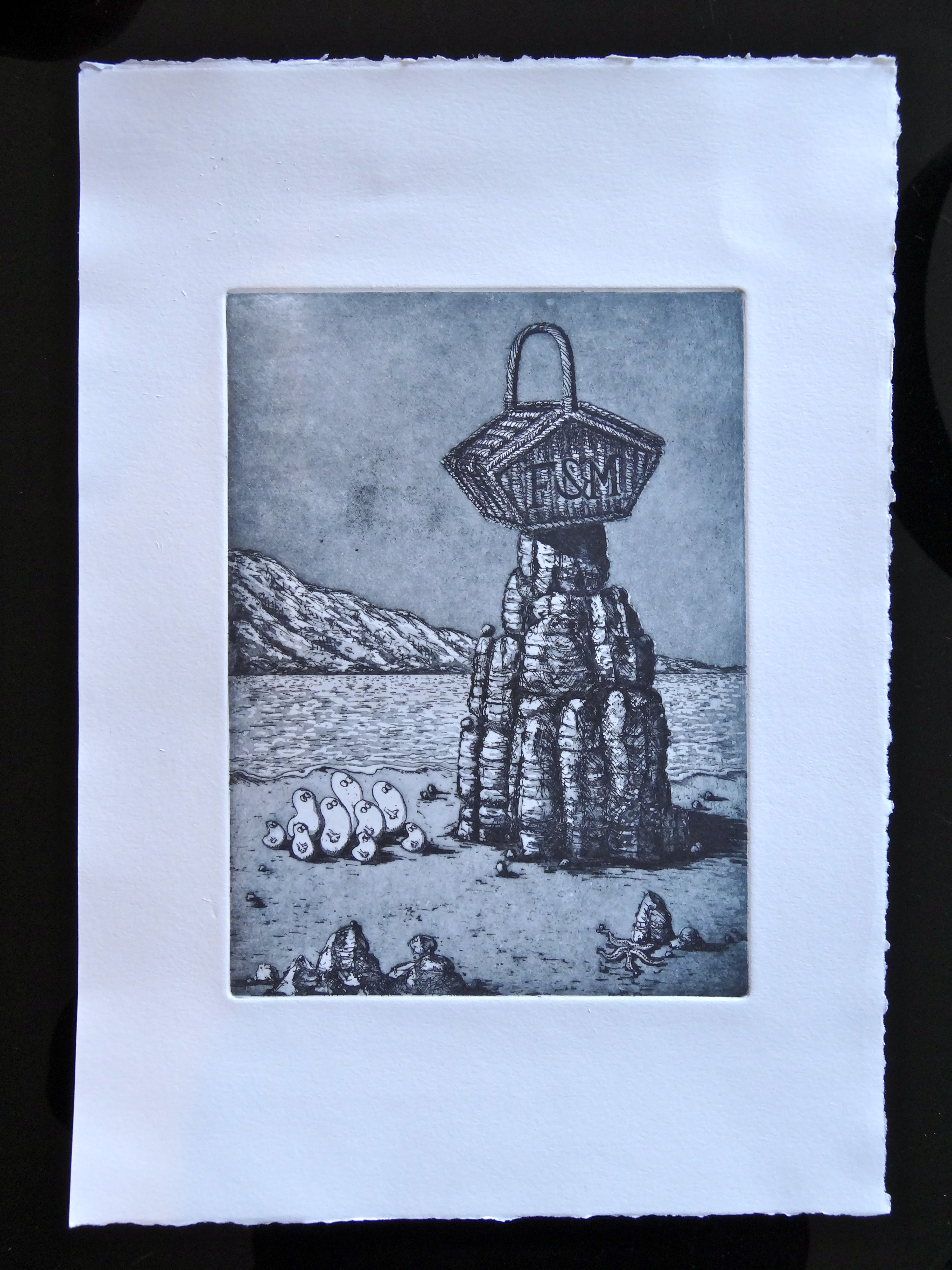
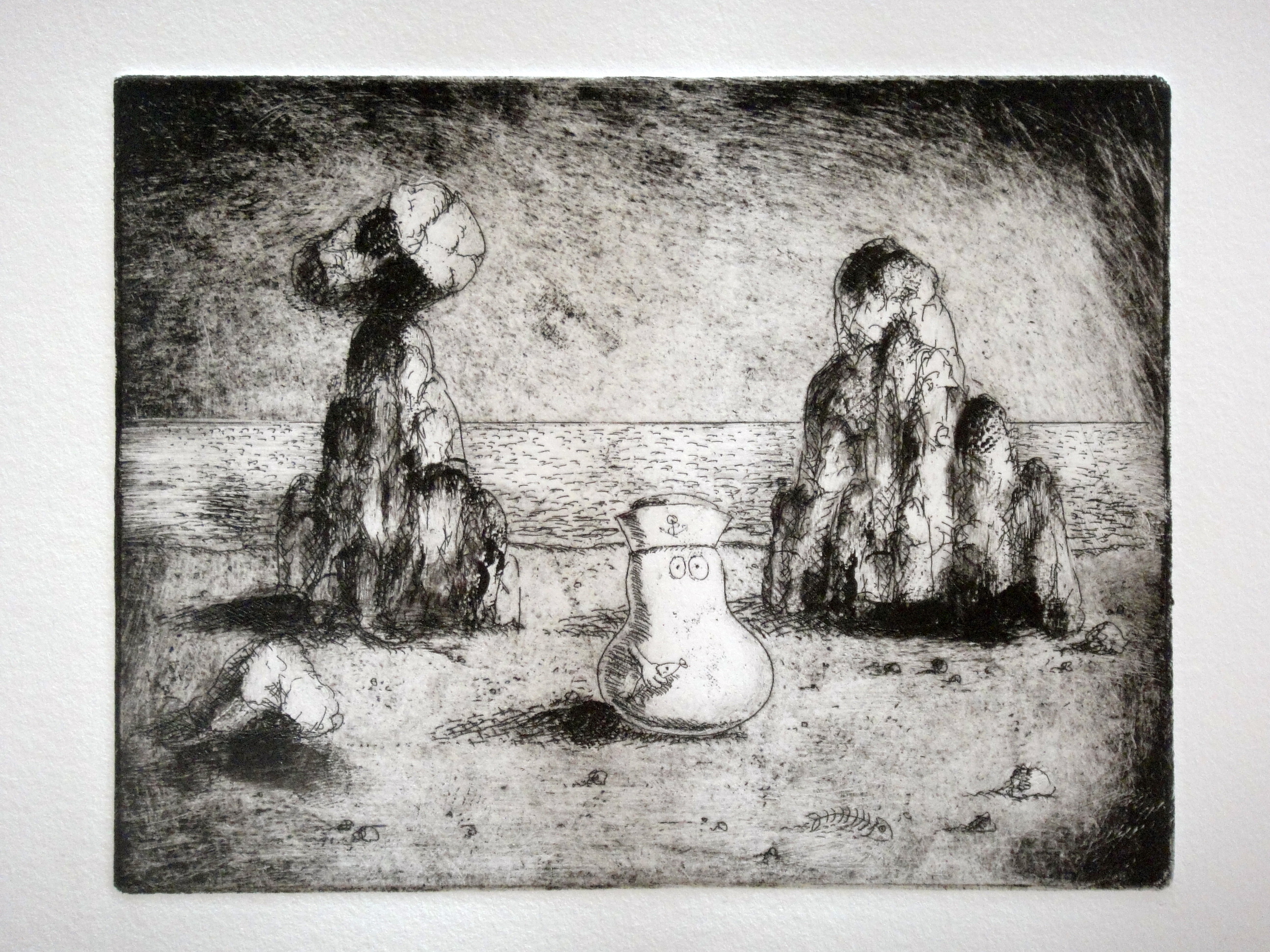
My finished tonal etching after aquatinting
Following this rationale, aquatinting involved first the exposure of the whole plate to a kind of rosin dust which was allowed to settle upon the plate under controlled conditions (it’s very toxic, hence the rather attractive gas mask we were required to wear by way of protection). This was then hardened over a gas fire. Then we had to protect details of the plate which we wanted to remain white, before dipping the plate back in acid, gradually protecting more and more of the plate so that in its final dip into acid, the only part of the plate left exposed was the parts of the image I wanted to print the darkest.
The result is a plate now textured differently depending on the exposure to acid and then, once the ink is reapplied to the plate, an image which comes alive with different tonal shades. Owing to what is a fairly hopeless attempt to explain the aquatinting process above in words, perhaps the process will become clearer by looking at my finished print itself.
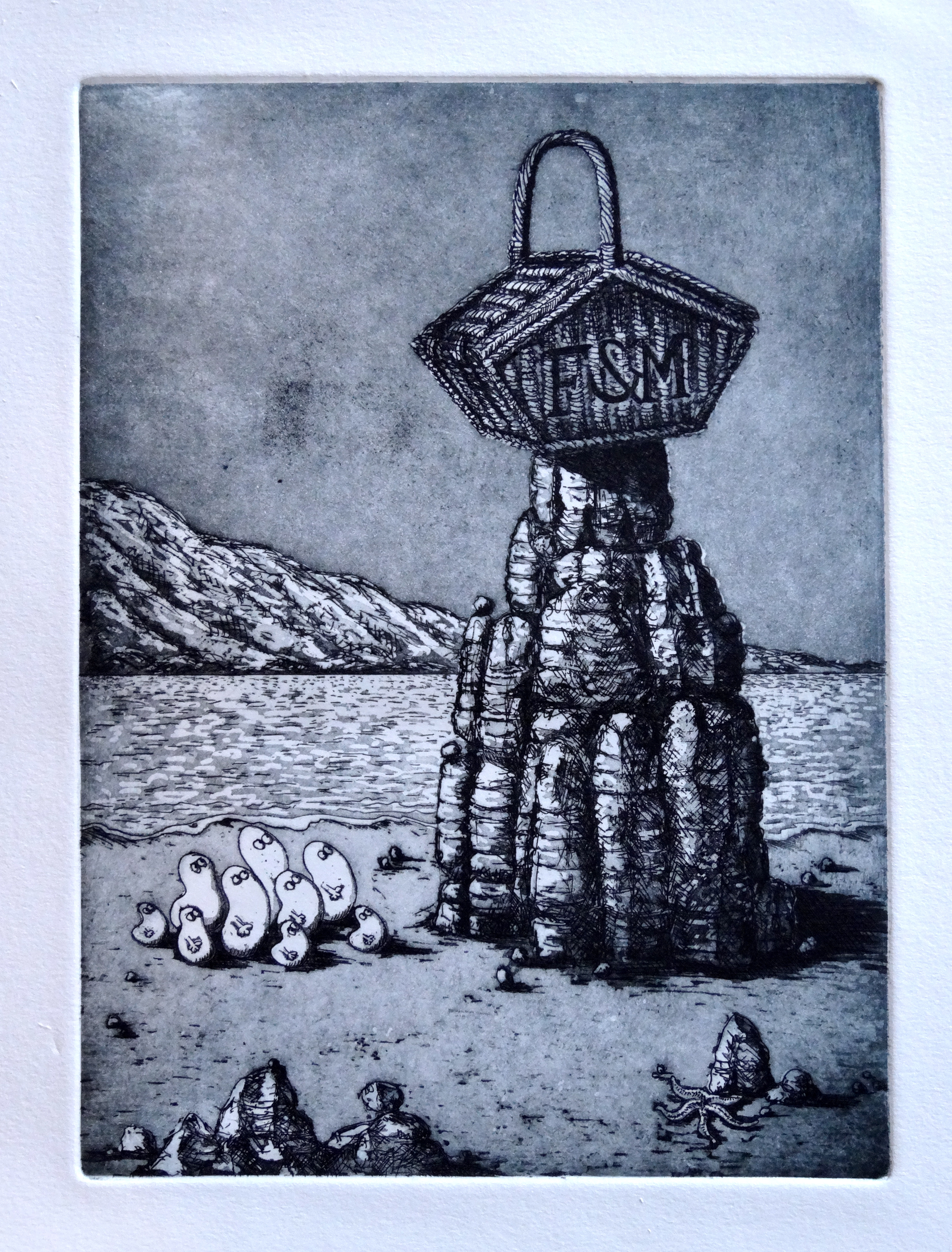
You will see that the Norms and the highlights of the basket and rock have remained white – that’s because I covered those with a black “stop-out” before re-exposing the entire plate to acid. The next lightest shade is the sand – this pale grey results from a quick 15 second dip into acid. This was then covered while I re-exposed the plate, allowing the sky to go darker, followed by the basket, the shadows of the rock and so on.
And there you have it, my first finished etching with aquatint applied – I am so, so delighted with the result and thrilled that I have taken so naturally to the etching medium. I have a feeling that this will not be the last.

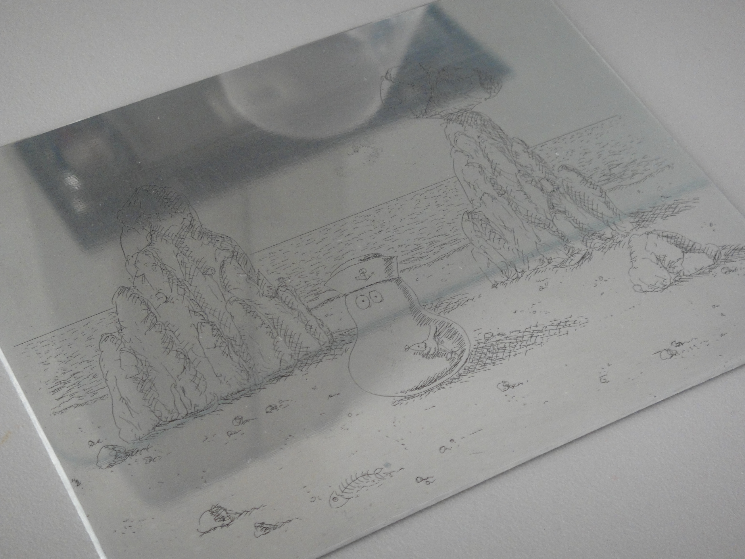
The etching before aquatinting

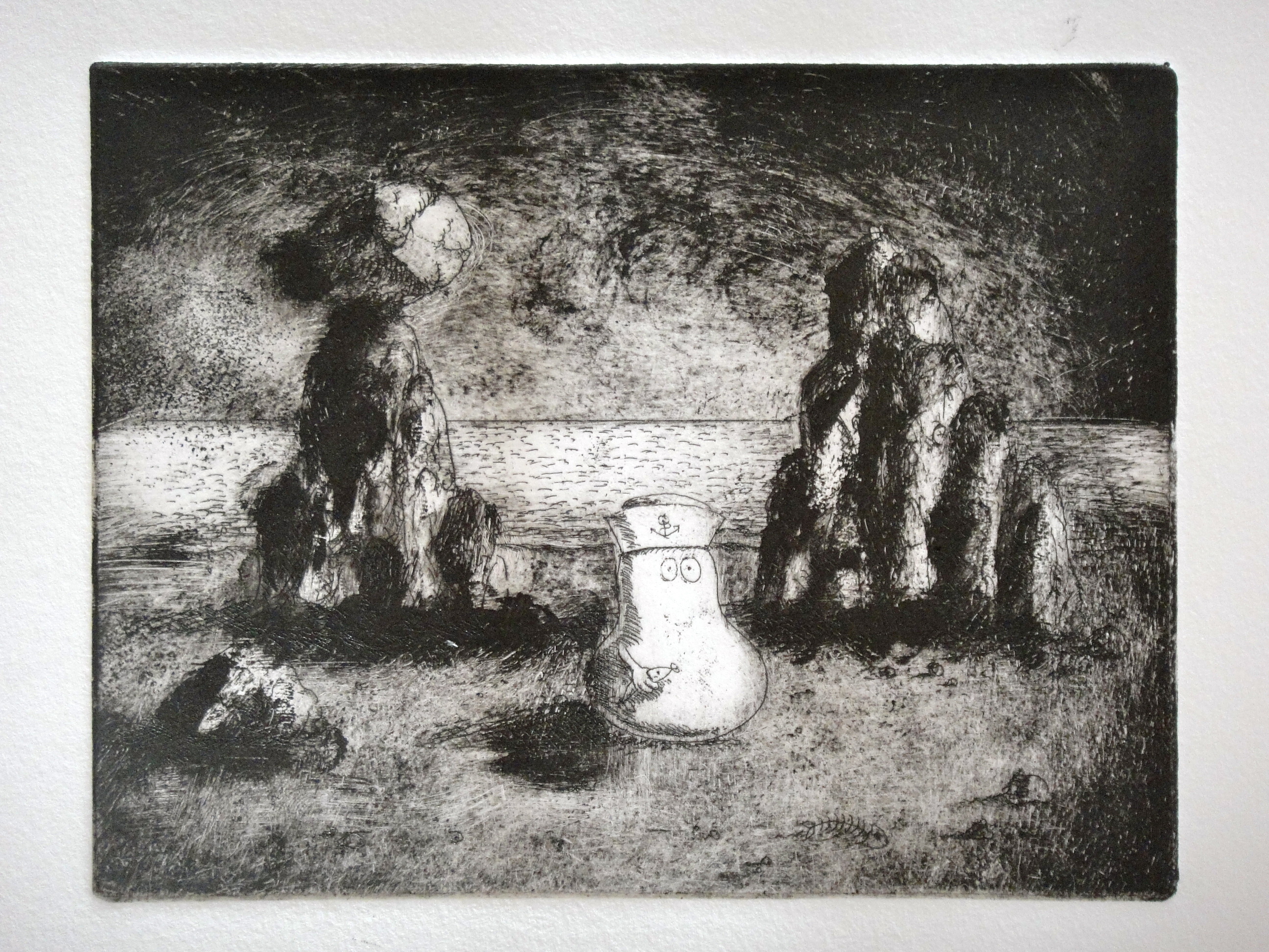
And before that, the initial image drawn into the “ground” layer
Related articles
- Printmaking Progress I (daily-norm.com)
- A Prelude to Printmaking – Part 1: Etching (daily-norm.com)
- A Prelude to Printmaking – Part 2: Linocut (daily-norm.com)