Skip to content

Archive for

Parallelism – Giving Hockney another chance

I’ve just finished reading the new novel, Waiting for Sunrise, by William Boyd. The novel has something of a Tinker Tailor Soldier Spy vibe about it, and is certainly atmospheric of 1900s Vienna and WW1 London although it doesn’t come to an altogether satisfactory ending. Nonetheless, I digress – far from intending to proffer a review of the novel, I wanted to talk about an interesting theory espoused by therein.

The book’s central character, Lysander Rief, has a mental disorder which prevents him from climaxing during sex. At the story’s beginning, we find Lysander in Vienna, seeking the help of an eminent British psychiatrist, Dr Bensimon. Dr Bensimon isolates a particular incident in Lysander’s childhood which he believes is the cause of his sexual problems. He attempts (and is ultimately successful) to cure Lysander through the use of a psychoanalytical theory, Parallelism.

Dr Bensimon describes the theory thus:

“Parallelism” worked approximately along the following lines. Reality was neutral, as he had explained – ‘gaunt’ was a word he used several times to describe it. This world, unperceived by our own senses, lay out there like a skeleton, impoverished and passionless. When we opened our eyes, when we smelled, heard, touched and tasted we added the flesh to these bones according to our natures and how well our imagination functioned. Thus the individual transforms ‘the world’ – a person’s mind weaves its own bright covering over neutral reality. This world is created by us as a ‘fiction’, it is ours alone and is unique and unshareable…

‘Pure common sense,’ Bensimon said. ‘You know how you feel when you wake up in a good mood. The first cup of coffee tastes extra delicious. You go out for a stroll – you notice colours, sounds, the effect of sunlight on an old brick wall. On the other hand, if you wake up gloomy and depressed, you have no appetite. Your cigarette tastes sour and burns your throat. In the streets the clanging of the trams irritates you, the passers-by are ugly and selfish. And so on.

(Waiting for Sunrise by William Boyd, page 62)

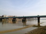
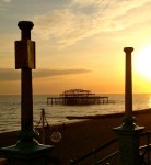
I have no idea whether this theory of “Parallelism” exists beyond the pure fiction of Boyd’s imagination, and certainly a provisional search online seems to suggest that it does not. Nevertheless, the thought process described by the fictional character, Dr Bensimon, immediately resonated with me. Living in London is always a testing place, but there are some days when I love the place; other days when I just hate it. Just as Dr Bensimon describes, on a sunny day when I’m in a good mood, the people on the streets seem to exude a happy community spirit, the music from passing cars makes me feel like dancing, the polluted air smells urban and exciting. Conversely when I am tired or in a bad mood, I conclude that London is a living hell, that music from passing cars is deeply inconsiderate, the people on the streets are taking up the space on the pavement, they walk too slowly, they are ugly and annoying, and the London air is choking at my throat, begging me to escape to the countryside. It may all sound like common sense, but when you think about it, it’s interesting just how much our mood can affect our perception of the world around us. For this reason it is sensible, one might conclude, when making a snap judgment about anything, to step back and consider: was it really that bad or was I just in a bad mood?

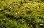
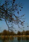
May Blossom on the Roman Road, David Hockney (2009)

I decided to put the theory to the test. As regular readers will know, I was none too impressed with the Royal Academy’s latest Hockney blockbuster exhibit. I found the paintings to be mediocre, the colours alarmingly vivid, the content boring and very repetitive. Yet everywhere I go, there are shining reviews, Hockney’s story is played out all over TV documentaries, and English landscapes are the new vogue. So I decided to give the exhibition another chance.

Hawthorn Blossom, Woldgate (David Hockney, 2009)

Last time I went on a RA Friends’ preview day, it was pure and undiluted bedlam. This time, I booked my Friends’ slot at the earliest opportunity: 10am. Upon arriving a little early, I was dismayed to find queues, even for Friends, and even more dismayed when the doors opened at 10am and scores of advanced ticket holders poured into the exhibition before we Friends. However, when I finally got into the exhibition, I took the decision to skip the first 3 rooms – they are retrospective anyway. And thereafter, ahead of me, were the bulk of the Hockney galleries, completely free from crowds. It was bliss. Suddenly, seeing the canvases from afar, I could begin to appreciate “the bigger picture” which Hockney was trying to create. Without hundreds of packed in heads in front of me, being surrounded by these huge canvases depicting forests and Yorkshire landscapes was like treading a path through that magical forest in all seasons. Without the crowds, the vibrant colours were not gaudy but uplifting. When I could see the complete paintings unhindered, they did not appear repetitious, but necessary, subtle reworkings on a theme.

Hockney’s gallery of watercolours and oils on observation was now airy and bright, and the paintings perfectly reflected the seasonal bucolic treasures of the English countryside. In further galleries, Tunnels and Woldgate Woods, seasonal variations on the same view demonstrated how far a season can serve to differentiate the same spot. And these seasonal changes were given dynamic attention through Hockney’s use of 18 cameras to film the same spot from different angles, in different seasons. These films, being shown in the cinema which, upon this second visit, I was finally able to get into, were mesmeric, calming and beautiful as the cameras glided alongside trees and bushes and country roads in all seasons.

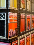
Hawthorn Blossom, Woldgate (2009, David Hockney)

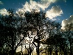
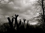
But best of all, in my renewed opinion, were the Hawthorn Blossom paintings (featured in this blog). Yes, the blossom looks like hairy caterpillers devouring a leafy bush, and the vast shadows look like the emergence of a sinister criminal, ready to pounce, but these images are also refreshingly original interpretations of what is really quite boring white blossom. They are colourful, without being shocking, very whimsical, and remind me a lot of the work of Philip Guston. On my first visit, I hardly noticed them. Now, refreshed and reinvigorated by this empty gallery, I loved them.

As if to confirm that this parallelism theory is true, when I attempted to revisit the initially skipped rooms at the end of the exhibition, hell had again descended. Like a tidal wave of sardine packed bodies, without a space between them, huge crowds had now filled the galleries of the Royal Academy and it was again impossible to see beyond the square centimetre of painted canvas directly in front of you. Absurd. I therefore felt very sorry for the vast spiralling queues of visitors snaking through the Royal Academy’s courtyard when we left the exhibition after this refreshingly empty experience. They, alas, will get nonesuch the experience, and if parallelism has it’s way, its highly likely that they won’t like the paintings nearly as much as a result.

Hawthorne Blossom Near Rudston, 2008, David Hockney

The Daily Sketch – Property is puzzling

Property is puzzling – that’s the generally accepted adage about buying or selling a property, obtaining or extending a lease, or dealing with annoying neighbours. And things are about to get all the more puzzling what with the UK Chancellor’s new rises in stamp duty for houses over £2 million, along with penalties for home owners whose home is sealed within a “corporate envelope”. All of this will undoubtedly lead to more and more complex tax avoidance schemes, warped prices, and a mass exodus from the London mansion market. Nonetheless, for the Norms, the most perplexing thing about the property puzzle is where to find the missing piece…


Property Puzzle (2012 © Nicholas de Lacy-Brown, pen on paper)

© Nicholas de Lacy-Brown and The Daily Norm, 2005-2012. Unauthorized use and/or duplication of the material, whether written work or artwork, included within The Daily Norm without express and written permission from The Daily Norm’s author and/or owner is strictly prohibited. Excerpts and links may be used, provided that full and clear credit is given to Nicholas de Lacy-Brown and The Daily Norm with appropriate and specific direction to the original content.

Ravishing Radleys – The picture bags that keep on giving

Now you can never accuse the Daily Norm of neglecting its female audience, nor indeed the best of British. And in todays post, I’m targeting both. On a recent trip to my parents home, I was treated to a display of my mother’s new Radley picture bags. The bags, which are limited edition leather creations by London luxury bag maker, Radley, and which generally retail for around £200 each, are a pictorial delight, so much so that I just had to photograph them and share them on The Daily Norm. My mother now has one bag from each of the respective 2010, 2011 and 2012 collections, but a fair number of equally exceptional designs have gone before them. The bags are unique, playful and colourful – sufficient to brighten anyone’s day. Nonetheless, it is ironically recommended that the bags should be stored away, in their original packaging, and never touched – such is the value which attaches to these limited edition items. Like all things, it is tempting to pack limited edition items away for prosperity, but with whimsical scenes as good as these, surely this protectionist stance somewhat misses the point? At the very least, the bags require a regular outing around the house just so we can gaze at their jolly offerings.

The first bag of my mother’s collection is Beside the Seaside launched in the Spring Summer 2010 collection. Complete with beach huts, a deckchair, a seagull and a seaside promenade, it illustrates the archetypal British seaside resort.

Inside, the picture bags contain a little coin pouch, while the back of the bag has its own accompanying design.

My mother’s next purchase was the 2011 Autumn/ Winter picture bag, Through the Hoop, a wonderful Toulouse Lautrec inspired circus scene.

And here is it’s back and coin pouch.

Finally the 2012 Spring/Summer picture bag, Happy Camper, illustrating a typical camping scene complete with caravan, awning and summer barbeque. It appears that after only a week since its release, the bag has already sold out from the Radley website, but I’m sure overpriced resales are widely available on ebay!

So all this makes me think – I really need to make Norm handbags! Can you imagine the possibilities?! But how to go about it… If anyone knows someone who makes leather goods, please let me know! In the meantime I leave you with a picture of the bags all packed up in the protective drawstring bags ready for bed. Until next time…


The Daily Sketch: Summertime begins in Brighton

Record March temperatures have been recorded in the United Kingdom, and for most of the population, this means for unabashed sun worship whenever the opportunity affords. And with the start of summertime now upon us, we may even get a little time to sun ourselves after work. For the Norms, a quick trip down to Brighton at the weekend was the obvious choice. For worn out Father-Norm, a restful afternoon in a deck-chair on the seafront promenade  was his chief desire, leaving time for the little norms to engorge themselves on ice creams and candy floss. Ahhh Norms do like to be beside the seaside!

Start of Summertime, in Brighton (2012 © Nicholas de Lacy-Brown, pen on paper)

© Nicholas de Lacy-Brown and The Daily Norm, 2005-2012. Unauthorized use and/or duplication of the material, whether written work or artwork, included within The Daily Norm without express and written permission from The Daily Norm’s author and/or owner is strictly prohibited. Excerpts and links may be used, provided that full and clear credit is given to Nicholas de Lacy-Brown and The Daily Norm with appropriate and specific direction to the original content.

Sunday Supplement – Metamorphosis: Pond Life in the Afternoon

Spring is in the air in the UK. In fact, ever since the spring solecist on 21 March, the sun has been beating down, and it has felt more akin to early summer than early spring. OK, it’s true, we are going to be punished with a hosepipe ban come 1 April – as they say, nothing in life is free – but in the meantime, I am happy to bask in these early symptoms of summer and, starting from today, lighter summery evenings too.

In celebration of the onset of the British Summertime, in today’s Sunday Supplement, I focus on a painting which I created in May 2008, Metamorphosis: Pond Life in the Afternoon. The name of the work, and the imagery, were both created in anticipation of a solo retrospective exhibition of my work in Belgravia, London, during which the collection of work on show hoped to demonstrate my evolution as an artist over 10 years – from more naive figurative work to deeper, more thematically sophisticated representations. Thus, in this painting, a number of features make reference to my former body of work.

Metamorphosis: Pond Life in the Afternoon (2008, acrylic on canvas) © Nicholas de Lacy-Brown

At the top of the canvas, naively painted colourful trees are planted amidst simple plants, recollecting paintings such as Orange Square painted in 2002. Next come the Norms, who dominated my work in 2005 and who here are shown enjoying a summer afternoon in a pond. Around them, game symbols of dominoes and a dart board reference my 2005/6 paintings – the Joie de Vivre collection, Tragic Conflict: Sophocles’ Antigone and La Foret des Jeux, in which game symbols dominated. As we travel downwards through the canvas, the work becomes more precise, from simple trees above to more delicately painted peonies and cakes.

In the meantime there are two representations of my life at the time of painting the work – the birth of my nephew, as shown floating around in a large cup of tea, and a group of tabloid newspapers featuring stories about me – I had at this time just appeared in the popular TV show, The Apprentice. 

The over all setting is English garden life on a summer’s afternoon – playful games in water, and afternoon tea complete with Victoria Sponge, pancakes, strawberries, jam tarts and fondant fancies. The title “Pond Life” also refers to the tabloid press however – since pond life in English slang, also means “scum”. And that represented my feelings for the press at the time. Meanwhile “metamorphosis” refers not only to my artistic changes, but also to the changes and growth within nature, hence the tadpoles and bees, representing fertility and rebirth in this garden of delights.

It is ironic perhaps that only days after this painting was completed, I was involved in a life-altering accident which changed my artistic style forever.

Metamorphosis: Pond life in the afternoon (detail) (2008 © Nicholas de Lacy-Brown)

I leave you now to enjoy a hopefully sunny Sunday. See you next week.

© Nicholas de Lacy-Brown and The Daily Norm, 2005-2012. Unauthorized use and/or duplication of the material, whether written work or artwork, included within The Daily Norm without express and written permission from The Daily Norm’s author and/or owner is strictly prohibited. Excerpts and links may be used, provided that full and clear credit is given to Nicholas de Lacy-Brown and The Daily Norm with appropriate and specific direction to the original content.

Out and about with my iPhone

We live in an age of instantaneous photography. Most of us now have a mobile phone complete with camera. I’ve been used to an iPhone 3GS and the results have been ok. But with the new iPhone 4GS camera, the results I can achieve are every bit as good as the photographs I am used to taking with my pocketable Sony cybershot. The upshot of all this is that we can now capture the unexpected sights and sensations which we come across on an ordinary day. Below I am posting a few photographs which I have taken over the last few months, just off the cuff, when I saw something beautiful and unexpected. Some are iphone 3, some are iphone 4, but all of them capture something instantaneously discovered during every day life.

The Daily Sketch: Norm gets attacked by a serious case of Kusama Polka dots

Is it just me, or is this Norm, and his lounge, and the view through his window, and all of his possessions covered with spots? Norm is thinking the same, hence the general look of concern on his face as he falls victim to a hideous case of the dreaded Kusama Polka dot disease. It spreads fast and wild, and is super contagious, or it was at least in the mind of Japanese artist Yayoi Kusama, whose work is currently the subject of a solo retrospective at Tate Modern (as reviewed in my post, yesterday). Relentless were the dots which covered Kusama’s world, and persistent too are the little spotty blighters as they invade the home of Norm. I’d seek to comfort him with the promise of an antidote for this contagion. The problem is, Kusama’s work doesn’t show any signs of becoming spot free, ergo Norm may need to get used to his new look. At least the new Kusama Louis Vuitton collection will fit in well…

A serious case of Kusama Polka-dots (2012, © Nicholas de Lacy-Brown, pen on paper)

© Nicholas de Lacy-Brown and The Daily Norm, 2005-2012. Unauthorized use and/or duplication of the material, whether written work or artwork, included within The Daily Norm without express and written permission from The Daily Norm’s author and/or owner is strictly prohibited. Excerpts and links may be used, provided that full and clear credit is given to Nicholas de Lacy-Brown and The Daily Norm with appropriate and specific direction to the original content.

Yayoi Kusama at Tate Modern – neon-spotted walk through a lady’s troubled mind

Tate Modern has gone all polka dot – and I’m not talking about the impending arrival of Damien Hirst. No, no, another artist, similarly best-selling and awfully contemporary, but perhaps less readymade, and stemming all the way from Japan claims that she made polka dots her artistic trademark long before Hirst made the colourful dots his personal emblem with LSD . And she’s probably right, because for Yayoi Kusama, the eccentric, self-admitted mental-institution resident and world famous artist who is the subject of Tate Modern’s latest retrospective exhibition, the polka dot was not just emblematic of her early and continuing artistic career, but represented the hallucinations looming inside her troubled head.

Welcome to Kusama world, a world where an artist’s output is not the product of imagination, but mental torture. Famous for her immersive installations, phallic representation, neon-bright colours and those all-embracing polka dots, Kusama is acutely successful in being able to welcome the viewer of her art into her slightly disturbed, turbulent world. This is, of course, aided by “immersive” installations, such as her work Aggregation: One thousand boats show, where the viewer becomes participant in the work as we are able to walk into a room covered floor to ceiling with the same repeated image of the phallus-filled boat before us. The effect is the same in I’m here but nothing, where an everyday sitting room is covered, all over, with neon polka dots, and, in the rather striking climax of the show, Infinity Mirrored Room – Filled with the brilliance of life, one walks through a room covered with mirrors and filled with a colour show of different LED filled lights – the effect is an infinity of light which is stunning for the senses. Nevertheless, it does feel more fairground than art gallery, as beautiful as it may be.

Yayoi Kusama, Aggregation: One thousand boats show (1953)

Yayoi Kusama, Infinity Mirrored Room - Filled with the brilliance of life.

Yayoi Kusama, Self-Obliteration by Dots (detail), 1968, performance, documented with black-and-white photographs by Hal Reif.

Allegedly, all of this dottiness (both in mind and matter) began when Kusama was a young girl, when the image of a flower began to repeat itself before her eyes. Yayoi Kusama said about her 1954 painting titled Flower

One day I was looking at the red flower patterns of the tablecloth on a table, and when I looked up I saw the same pattern covering the ceiling, the windows and the walls, and finally all over the room, my body and the universe. I felt as if I had begun to self-obliterate, to revolve in the infinity of endless time and the absoluteness of space, and be reduced to nothingness. As I realized it was actually happening and not just in my imagination, I was frightened. I knew I had to run away lest I should be deprived of my life by the spell of the red flowers. I ran desperately up the stairs. The steps below me began to fall apart and I fell down the stairs straining my ankle.

From this point onwards, Kusama started to cover everything with polka dots: walls, ceilings, floors, furniture, household objects, naked models, and herself, all representing the world as she sees it through repetitive and persistent hallucinations.

Even when the exhibits do not give you cause to “immerse” yourself within Kusama’s way of thinking, the art work on show betrays the extent of her troubled mind. Another installation of household objects, Accumulation sculptures, are presented bursting all over with an eruption of phallic protrusions. I found these works to be quite sickening – the textural surface of the resulting objects made me feel rather queasy, much like I would feel if I was looking at the surface of skin erupting with blisters. It was also possible to feel the magnitude of her repressive repetitiveness in her famous “infinity net” paintings – vast monotone canvases painted repeatedly with a single arc pattern, representing the loops of a net. These works are rather intrustive in their scale and claustrophobic in their illusion to an unrelenting and obsessive mental torture.

Yayoi Kusama, Accumulation sculptures (1950)

Yayoi Kusama, Flame (1992)

Personally my favourite works of the exhibition were probably her early paintings, in a variety of mediums from watercolour and gouache to charcoal and oils. Her 1949 work Lingering Dreams betrays the same sense of traumatic perturbation pervading all of her work, but is nonetheless beautifully painted – like an acutely depressed Van Gogh sunflower, the life and vitality strained and stretched out of it. I also rather enjoyed Kusama’s latest works, large multicoloured acrylic canvases, painted in a studio adjacent to her resident mental institution. The works appear to reflect a period of comparative contentment in Kasama’s latter career, although they continue to betray an element of obsessiveness and their bright colours are frequently harsh and discordant.

Yayoi Kusama, Lingering Dreams (1949)

I left Kusama’s show feeling a little tired. In immersing yourself into Kusama’s mind, you tread a mental journey which is not always comfortable, and often overly stimulating on all the senses. It did not impress upon me in the way that a greatly skilled figurative artist has the power to do. Instead it caused me to reflect upon the cognitive expressions of a high-wired eccentric lady. There is much reason to argue that some of this work, particularly the light installations, are not really art at all – but I’m not going to get into that today. For me, the greatest disappointment came upon entering the Tate shop and discovering no crazy polka dot embellished Louis Vuitton bags for sale – this was, after all, a Vuitton-sponsored exhibition. Having said this, my disappointment may not last long. As I write, I learn that Kusama and Vuitton are joining forces for a collection due out in Summer 2012… so it looks like the madness will continue, even into the finest echelons of Paris couture. Vive le polkadot!

Looking a bit like a snake surrounded by her creations... Yayoi Kusama in the installation Yellow Tree Furniture (2010). Photo : Y.Kusama Studio/Half Reiff


Norms do… Amsterdam’s Red Light District

Before I had even booked my trip to Amsterdam, I couldn’t help but plan a Norm representation of what must be Amsterdam’s most renowned attraction: its red light district. Some people see Norms as being child-friendly. This painting may persuade them otherwise. Here Norms are dressed in sex head to…err…round base, with lacey bras, thongs and other revealing lingerie. On their hands, acrylic nails to tap against the glass windows help them to attract the attention of their shy customers, while heavy makeup and perfectly coiffed hair complete a carefully manicured look. As for the customers, they come from all walks of life. Here is a business man, skulking away from work, hoping for a “quickie” before he goes home to his affluent home, his wife and children. There too is a sailor, desperate after weeks away at sea for a lady’s touch. And finally we have the Norm chav, covered in tattoos and a dirty vest – he can’t afford these classy scarlet women of the night, but he can stare, and wish.

Norms in Amsterdam's Red Light District (2012 © Nicholas de Lacy-Brown, acrylic on canvas)

The canvas is a box canvas, so I have painted around the sides to feature more buildings, and a few more of those lovely ladies. You can see the sides, and some detailed shots of the canvas below. Enjoy!


© Nicholas de Lacy-Brown and The Daily Norm, 2005-2012. Unauthorized use and/or duplication of the material, whether written work or artwork, included within The Daily Norm without express and written permission from The Daily Norm’s author and/or owner is strictly prohibited. Excerpts and links may be used, provided that full and clear credit is given to Nicholas de Lacy-Brown and The Daily Norm with appropriate and specific direction to the original content.

Brit art shunned by dOCUMENTA (13) – time for the UK to face up to our talentless contemporary art?

From June to September this year, the town of Kassel, Germany, will play host to the 13th dOCUMENTA exhibition. Established in 1955 by artist, teacher and curator Arnold Bode, the 5-yearly exhibition, whose first show featured the likes of Picasso and Kandisky, is self-proclaimed as a “key international exhibition of contemporary art worldwide”. Yet  the “worldwide” element seems to have missed out a key player from its compass: At dOCUMENTA (13), the UK is conspicuous by reason of British artists’ total absence from the show. Are they trying to tell us something?

I read an interesting article in yesterday’s Sunday Times written by  resident art critic, Waldemar Januszczak. He blamed dOCUMENTA’s apparent shunning of British artists on curators. He argues: “[t]he chief reason British art is mistrusted and hated abroad is that international curators disapprove of it. It isn’t clever enough for them. It does not espouse enough theory. It has a directness to it that makes their gaseous interpretations redundant. And it likes jokes, which they don’t”.

Damien Hirst - A thousand years

Good on Januszczak for being patriotic. But I can’t help but conclude that the real joke is British art itself. Contemporary art is a sticky wicket, a difficult often inaccessible manifestation of an artist’s attempts to find some new avenue which art has left hitherto unexplored. The trouble is, artists don’t have the luxury which the impressionists or the cubists or the abstractists did – these artists were emerging out of a rigid, regulated era of art, where paintings closely followed convention and artists feared exploring techniques beyond figurative representations of classical and biblical themes. Once artists began to break the mould, there were so many directions where artists could go, and so much they could do with the familiar canvas image, leading to an explosion of creativity and the creation of some of the world’s best loved works – the Picassos, the Van Goghs, the Matisses. Come the 1960s and things started to dry up. Jackson Pollock started to spray his canvases without any perceptible talent and Rothko painted vast works in a single colour. Little by little the need for actual artistic talent fell to the wayside as the singular requirement for “ideas” took hold until finally the hand of the artist was made entirely redundant: the art of the “readymades” reigned triumphant, right up until the monstrosity that was Tracey Emin’s unmade bed.

My bed - © Tracey Emin 1998 (like you'd want to copy it)

This would all be fine – call it a fad – if these artists weren’t taken so damn seriously. Damien Hirst has become a serial industrialist, a commercial tycoon all in the name of “art”. His works – pickled shark, rotting cow and polka dots aplenty (the majority of which he didn’t paint himself because, allegedly, he “couldn’t be ****ing arsed”) – are about to be given a huge solo retrospective at Tate Modern of all places. Meanwhile, Tracey Emin – who can’t draw to save her life – has been made Professor of Drawing at London’s Royal Academy, while her annual contribution to the RA’s Summer Exhibition make me want to weep. Yet still the visitors lap them up, buying each and every print of her childlike scrawl at lightening pace, just because they think, or rather they know, that they are making a good investment.

Damien Hirst - LSD

And herein, in my opinion, lies the problem. Compared to the romantic sentimentalism of countries like France, and the aesthetic-led inclination of countries like Italy, England has always been the boring big brother – the big industrialist placing economic concern at its core. We didn’t give birth to the airy luminescence of  impressionist paintings – but we did bring you gloomy scenes of the industrial North by Lowry. We didn’t give you empassioned El Greco or compassionate Da Vinci, but we did give you Lucien Freud – creator of the most expensive painting every sold by a living artist. We’ve always been led by money, by investment, by industry.

Tracey Emin "I’ve got it all" (2000) - says it all really doesn't it.

We don’t rave about Emin and Hirst because we think they are any good – we know about them because advertising tycoon Charles Saatchi has bought into them. And once Saatchi invests in an artist, they must be good right? Wrong. Saatchi is the man with the money. He isn’t an authority on taste and this is why British art is being shunned by exhibitions like dOCUMENTA. Because our artists make it big because of investment, not talent. All the integrity of our art has flown out of the window, as we gaze in apparent wonder at a whole gallery turned over to a lightbulb switching on and off. And why is Tate modern giving itself over to that Hirst retrospective this summer? – Why, because it’s olympic year, and they can pull in the punters, and the admission fee, of course.

Tracey Emin Tower Drawing 18 (2007) monoprint, paper size: 4 11/16 x 5 11/16 in. (11.9 x 14.4 cm), Photography by Stephen White. Courtesy of White Cube.
© Tracey Emin ("Professor of Drawing")

In conclusion, dOCUMENTA (13)’s shun of Brit art should make collectors and galleries in the UK stand up and think. Art shouldn’t be about money – it should be about talent; about discovering an artistic genius who will place British art on the map for centuries to come, long after the last scrap of that unmade bed has been swept away into the rubbish. But  how likely is that to happen so long as the powers that be stand to make a buck or too? I think you can answer that one for yourself.