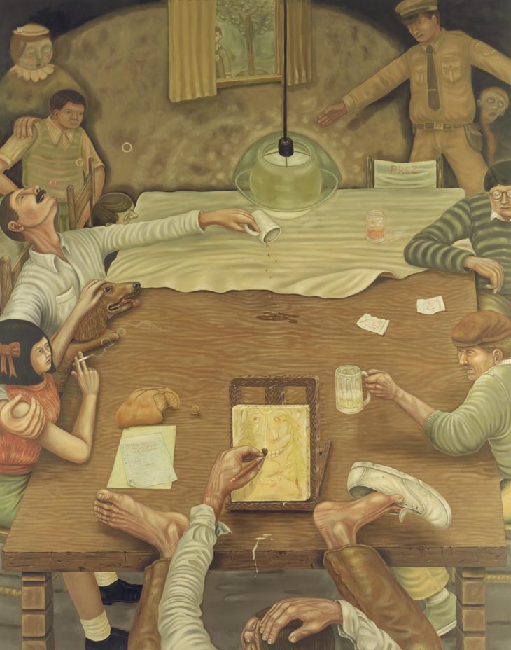
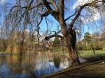
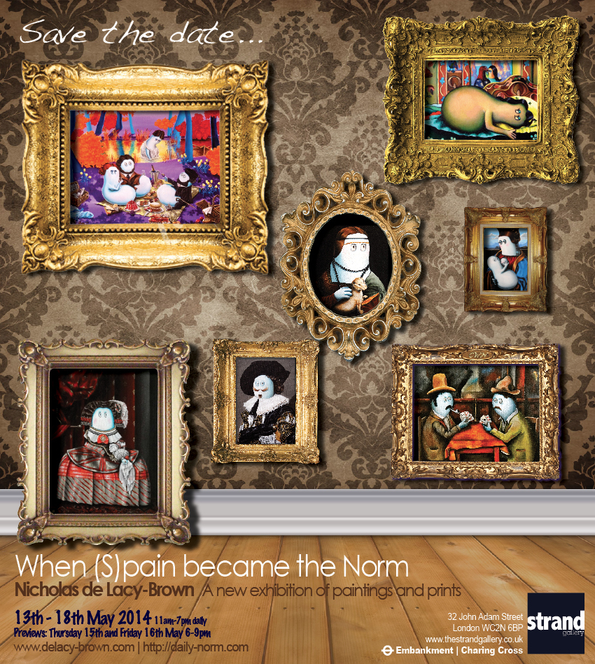
Aix: City of a Thousand Fountains
After a week of “sneak peeks” via my delacybrownart twitter feed, I am delighted to be able to share with you the final and complete image of my major new oil painting on canvas – Aix: City of a Thousand Fountains. Started shortly after I returned from my first visit to the stunning Provençal city last summer, I set out to capture something of the sun drenched joie de vivre which Aix excuses by the bucket in a work which eventually took me 7 months to complete.
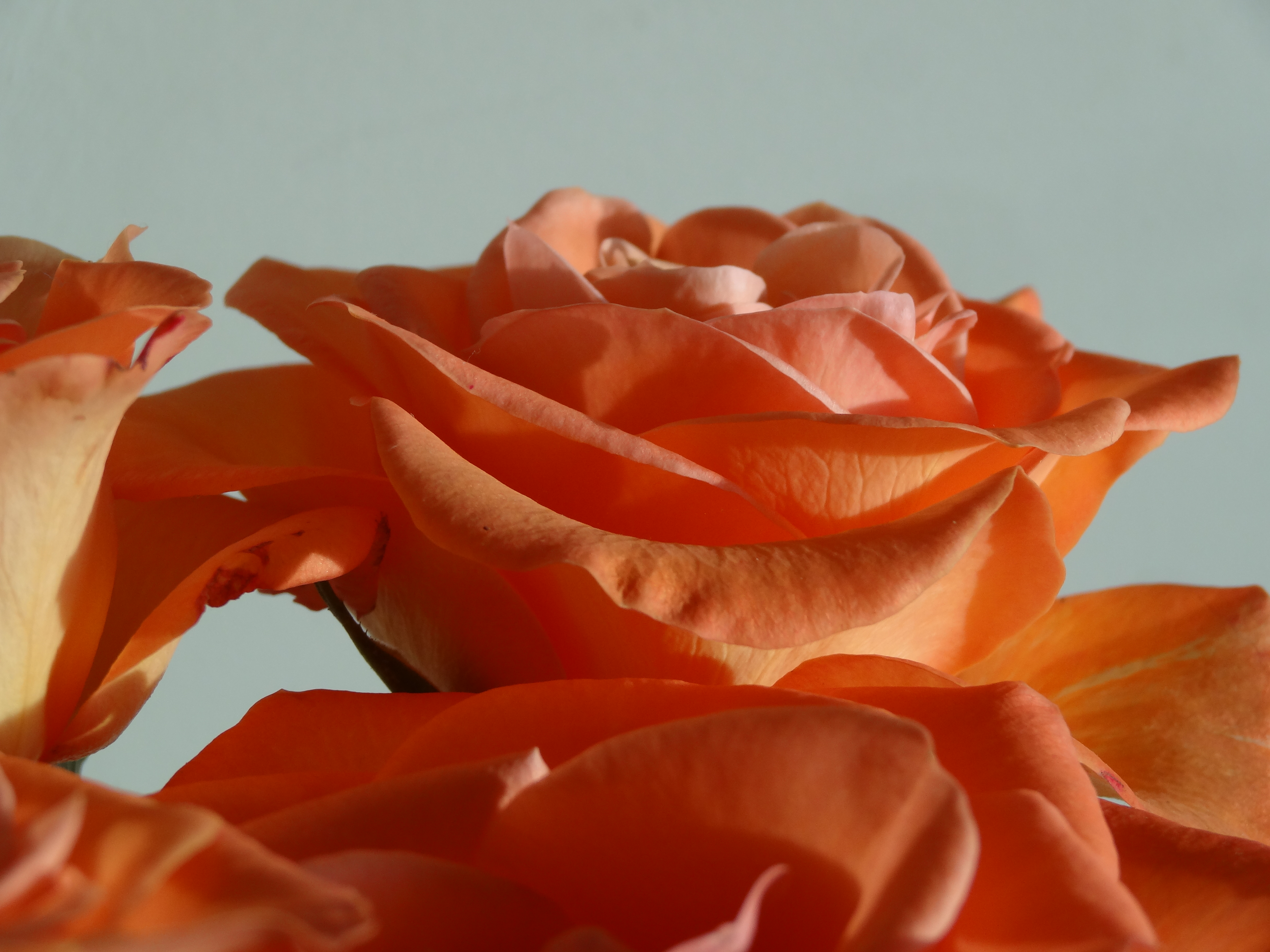
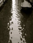
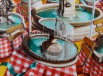
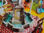
As the painting’s title suggests, the work plays on a well known descriptive adage which notes that the city is one of “a thousand fountains”. While that may be something of an exaggeration, the motivation behind the statement can be well understood – one of the most notable features of the city is indeed its plentiful and elaborate fountains, one situated in what seems to be every square and street, in the middle of junctions and on street corners. It really is a city where water flourishes; where splashing running currents sparkle playfully in the sun.
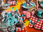
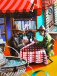
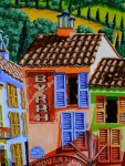
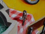
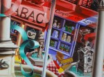
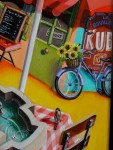
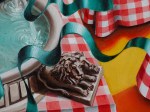
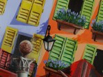
But in choosing to symbolise several of these many fountains, I decided to play with the themes somewhat, combining those fountains with the very predominant cafe culture which is an integral aspect of the city’s character, and which fills it’s many multi-coloured shuttered squares with life. It is in one such square that my work is set, a square which also plays host to a series of Provençal shops and peeling old vintage adverts upon the walls. And there, on the typically dressed chequered tablecloths of cafe tables, my fountains, rather than plates, are the dish of the day.

Aix: City of a Thousand Fountains (2014 © Nicholas de Lacy-Brown, oil on canvas)
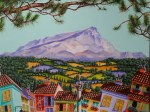
Meanwhile no painting of Aix-en-Provence could be complete without a reference to the magnificent Mont Sainte-Victoire, the mountain which so seduced and fascinated the artist Cézanne for years (resulting in a series of canvases which continue to be his most enduring works) and which features monumentally in my work, dominating the upper half of the canvas. I remember so well that moment when, last summer, my partner and I climbed up the steep hills north of the city to the exact place where Cézanne used to paint the view of the mountain which obsessed him the most – and turning to see that same breathtaking visage which had so captivated this master of modern painting. It was at that moment that I knew I had to make my own homage to that incredible view, and that brilliant artist – and it was at that time when this painting was born.
The keen-eyed amongst you may also notice that I have included a further homage to Cézanne, by featuring his famous card players sat at one of my café tables, as well as a whole host of other details which I now share with you in the gallery of details featured below. Hopefully you will enjoy looking at the individual aspects of this painting as much as I enjoyed painting them. It was, with every brush stroke, like revisiting my holiday to Aix afresh, and for that reason alone, it was surely worth the 7 months slog to complete it.


© Nicholas de Lacy-Brown and The Daily Norm, 2001-2014. Unauthorized use and/or duplication of the material, whether written work, photography or artwork, included within The Daily Norm without express and written permission from The Daily Norm’s author and/or owner is strictly prohibited. Excerpts and links may be used, provided that full and clear credit is given to Nicholas de Lacy-Brown and The Daily Norm with appropriate and specific direction to the original content. For more information on the work of Nicholas de Lacy-Brown, head to his art website at www.delacy-brown.com