
Festival of colour: The Summer Exhibition 2015
There’s nothing quite like the rejuvenating power of bright, unapologetic colour to lift the spirits amidst an atmosphere of grey, and this is no more so than in London where, on a recent visit, the skies were characteristically gloomy and very un-summery. Heading therefore towards this year’s Summer Exhibition at the Royal Academy of Arts therefore brought with it the promise of some element of seasonal rejuvenation, even if it could not improve the weather. But this year’s show, the 247th in the Academy’s history, did not just flush us with the spirit of summer, but with a festival of colour, never before seen at the annual show in such quantities.

The reason for this panoply of colour is surely its chief curator, Michael Craig-Martin RA, whose work is famous for its blocky poster-print colours with exact outlines and pop-art motifs. With such an artist in charge, there was no way this show was going to be boring, and any doubts as to the fact were quickly swept away at the entrance to the RA, whose usually beige monochrome staircase had been transformed into a riot of multicoloured stripes in an installation by Jim Lambie.
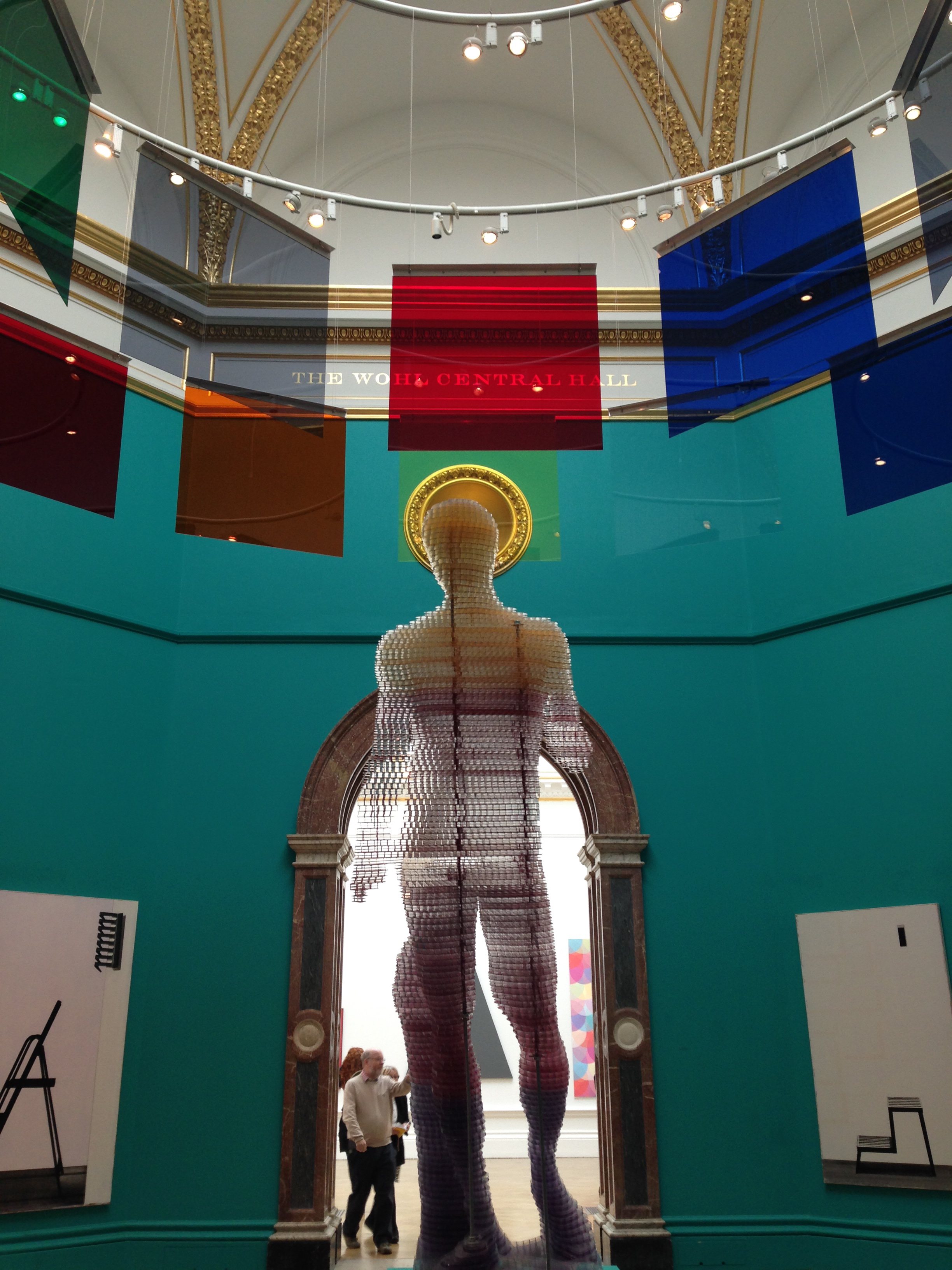
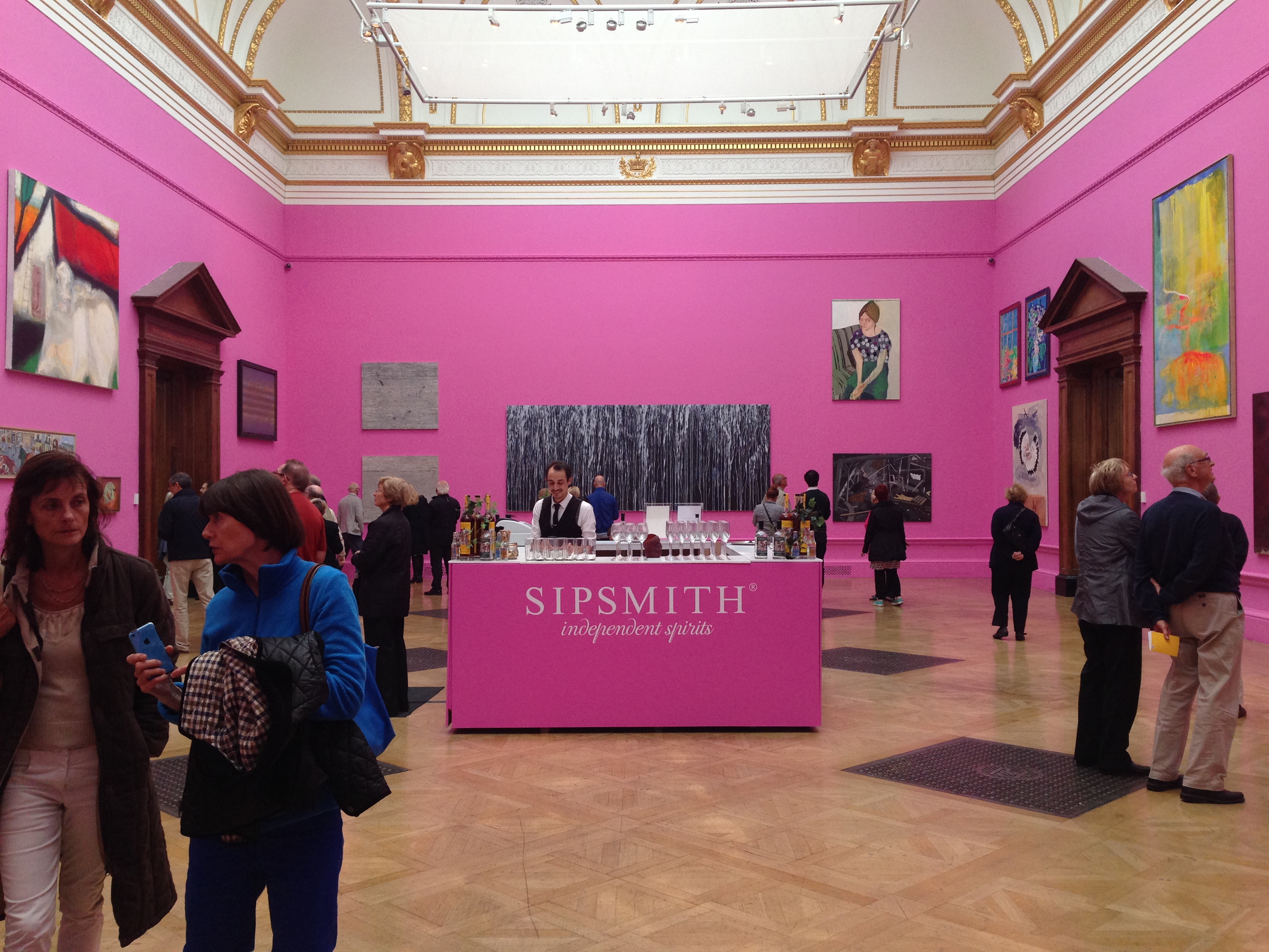
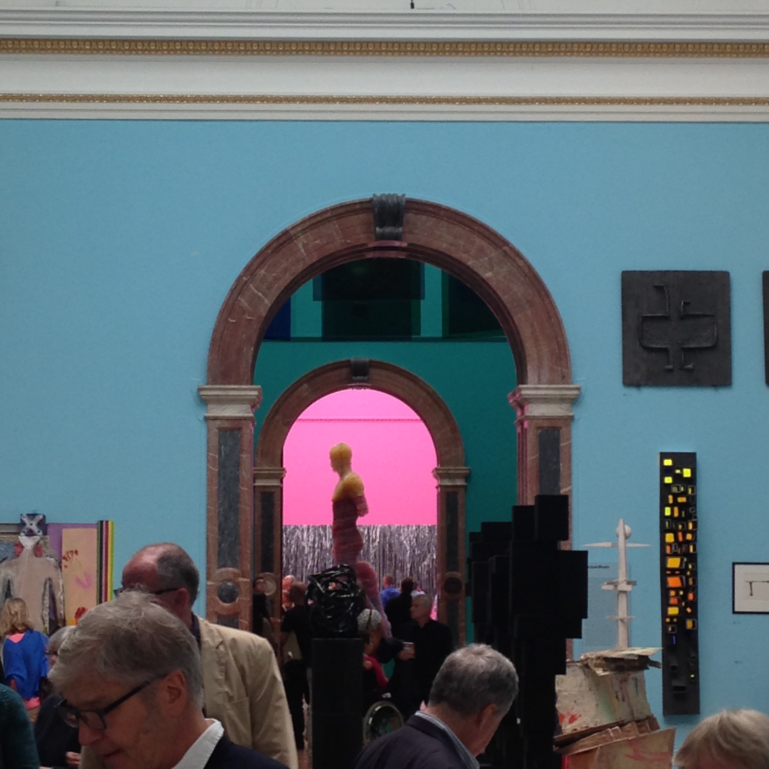
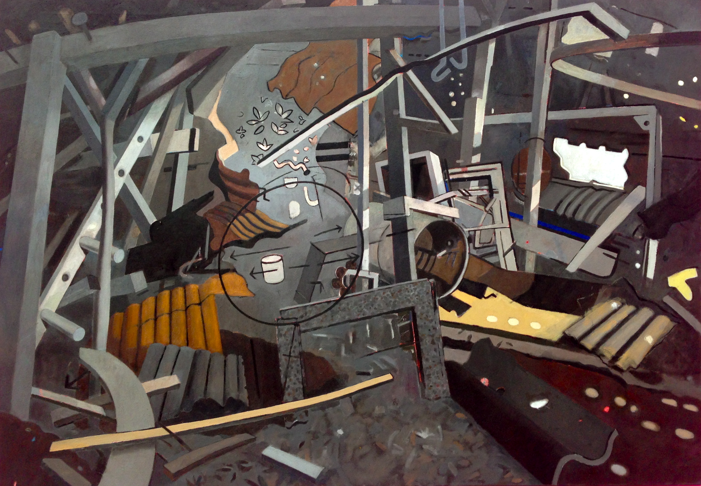
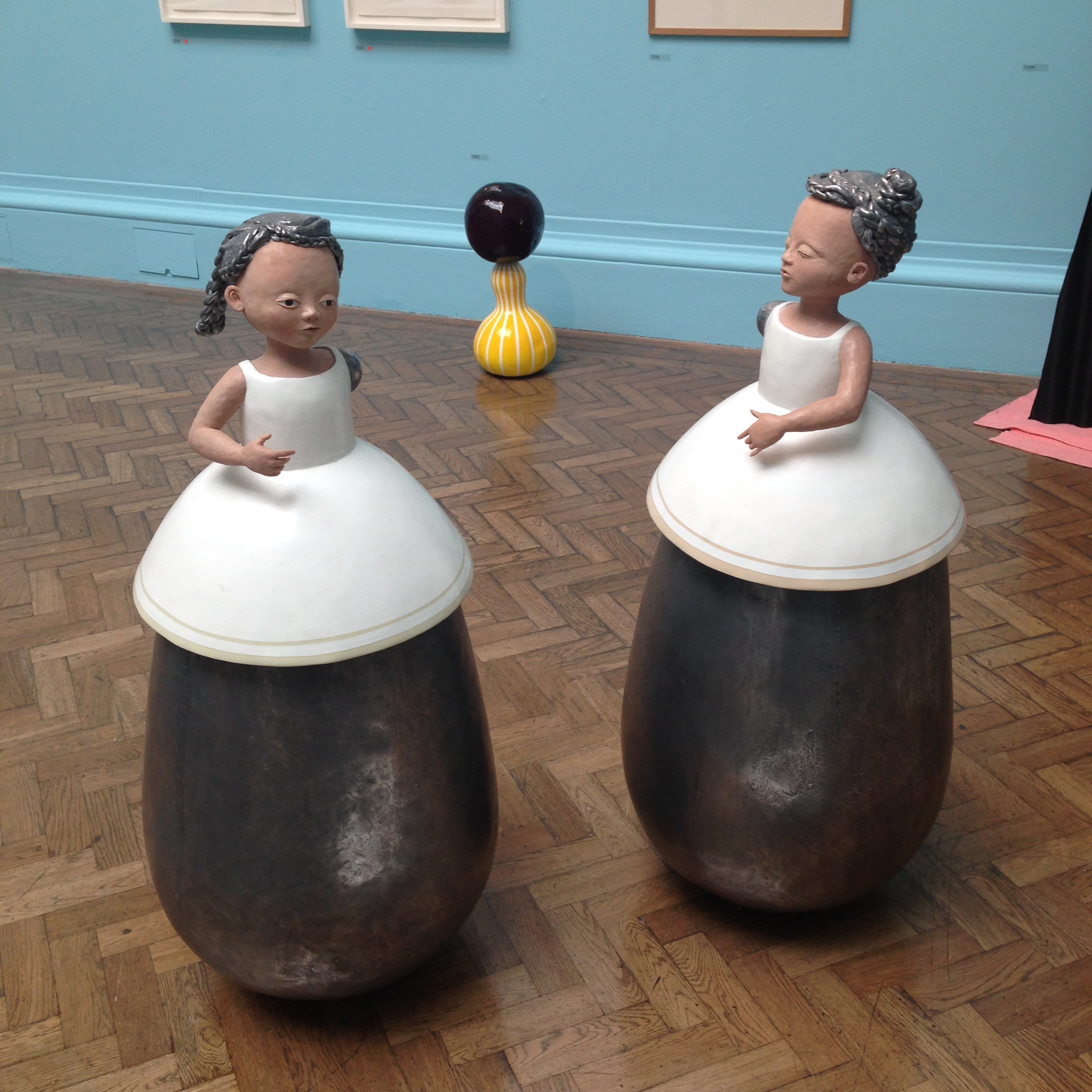
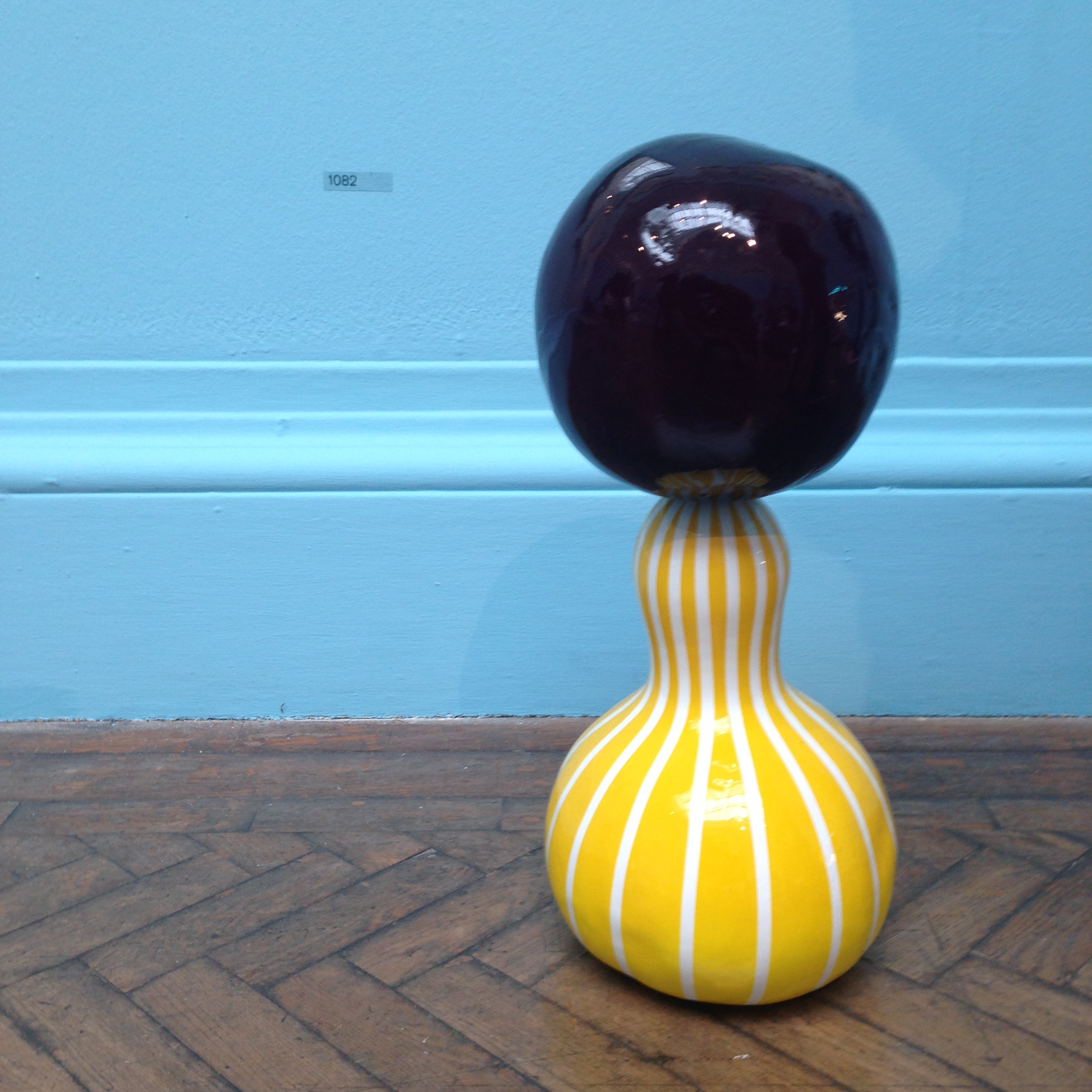
For those who dared climb what felt like a staircase of moving molten colour, a further punch of colour lay in wait in the form of the first three galleries, painted in bold magenta, blue and turquoise as a magnificently energised backdrop to a surprisingly fantastic selection of works. I never saw those lofty galleries look so rejuvenated, nor did I ever enjoy a Summer Exhibition with as much enthusiasm and high praise. For after years of continuous disappointment and what always seemed to be a relentless recycle of the RA cronies, at last we were presented with a show crammed with unapologetically figurative works, with paintings which exhibited actual talent (Tracey Emin’s usual crappy scrawls excepted), where superb print works were given a rightfully more prominent hang, and architectural models were actually interesting.
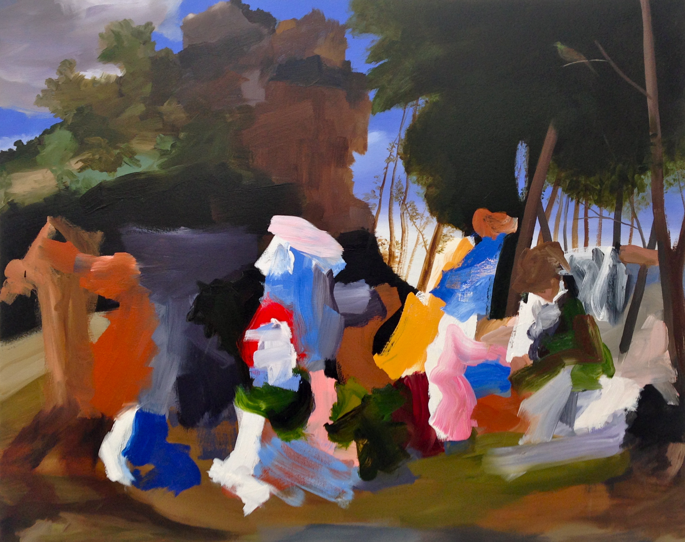


Here we had paintings of places and cities, of streets you could walk in, of portraits you could empathise with, and where there was abstract, it was playful and bold – accessible and expertly conceived. In one room, a superb tapestry portrait by Grayson Perry (Julie and Rob) could have stolen the show, but was well accompanied by a gallery of moving, inspirational works such as Elise Ansel’s brilliant take on Bellini and Titian (Feast of the Gods II) – another riot of colour (above, top).
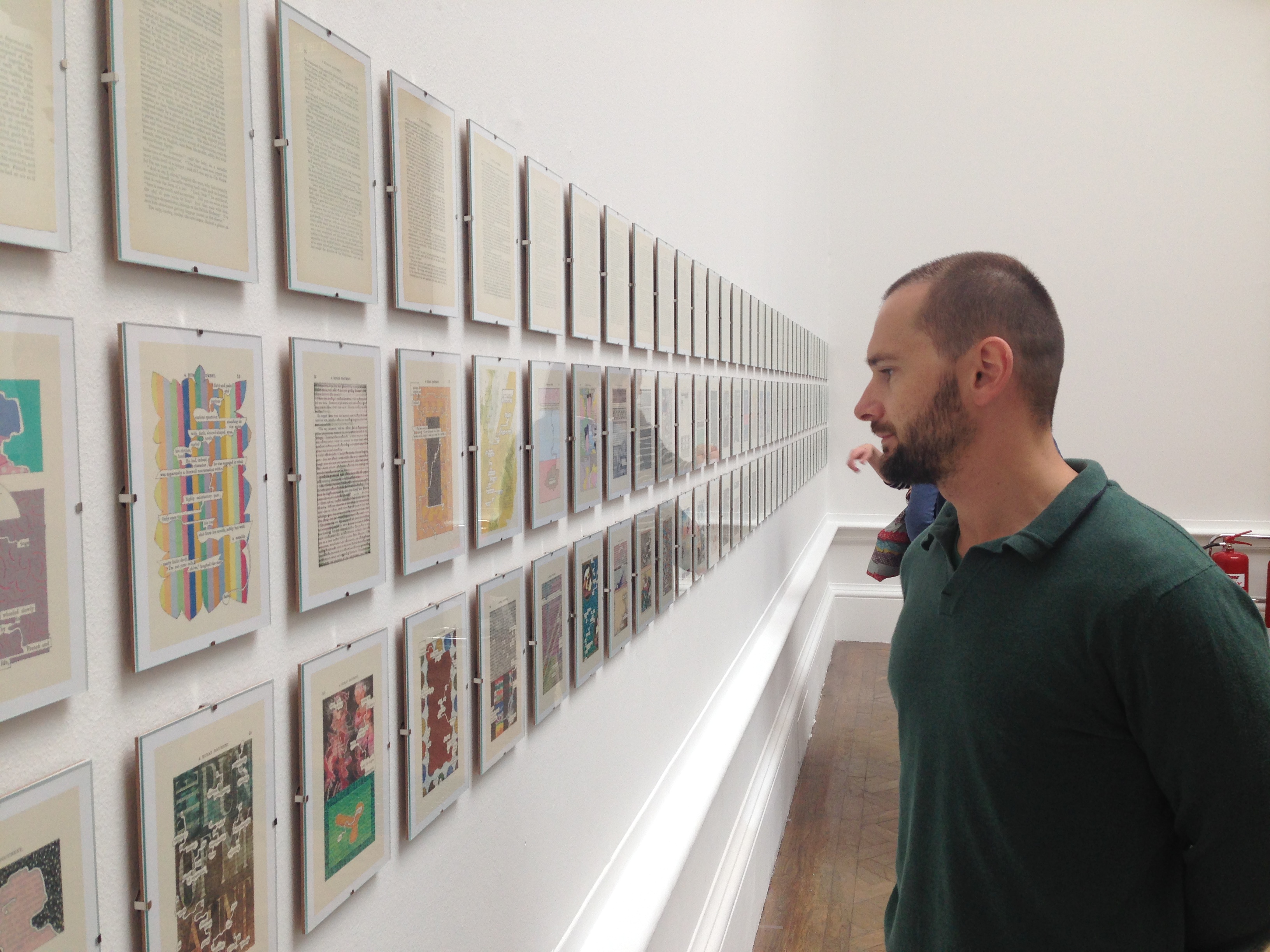
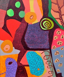
Considering the multiple works in Tom Phillips’ “A Humument”
So many works pronounced that the arrogant age of contemporary art installations and badly conceived “paintings” is dead, from the many offerings of an RA favourite, Stephen Chambers, to the last gallery entirely devoted to the doodles of Tom Phillips, whose work A Humument, involves the almost total recreation of a long lost novel thanks to his reillustration and reinterpretation of every page. And by way of confirmation that this new re-emergence of a classical pictorial style is both correct, and beloved, an already abundant array of red dots was already evident, despite the early days of the exhibition’s season.


For those disappointed by past Summer Exhibitions, this one is not to be missed – it will change your mind for sure. The Summer Exhibition shows at the Royal Academy, London until 16th August 2015.


