Skip to content

Posts tagged ‘Exhibition’

Beyond the apples: Cézanne Portraits

I have never found an artist better able to reflect the earthy, softly glowing light of a landscape as well as Paul Cézanne captured his native Provence. Whether it be his landscapes of L’Estaque or his obsessive interpretations of the Mont St Victoire, Cézanne’s landscapes breathe and quiver with the the warmth and vivacity of Aix. With their strident, vibrating brushstrokes, Cézanne perfectly replicates the quavering undulations of heated air rising from the dusty ground. And in his palette of earthy tones, Cézanne immortalises the ochre glow which characterises the villages and Mediterranean habitat of his homeland. Even Cézanne’s famous still lives of oranges and apples are characterised by the same Provencal light, and his paintings of peasants playing cards are tinged with a sense of poverty but not without the hope which the light of the Mediterranean climate always provides.

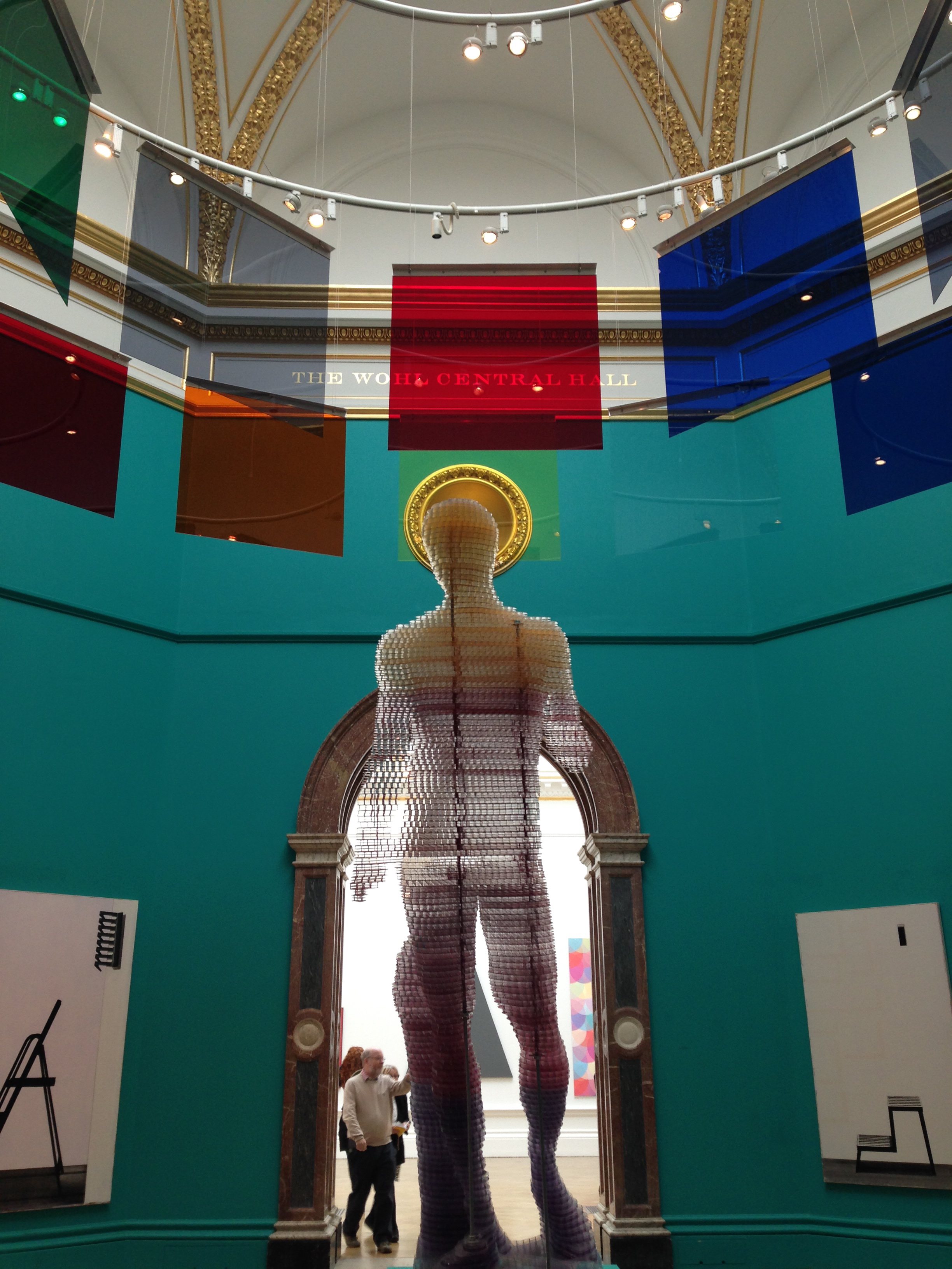
However the one aspect of Cézanne’s oeuvre which often goes overlooked is his portraiture. It’s not a genre which is synonymous with the artist – the man charged with being the father of modern art – who is better known for his first dabbles into cubist forms and semi-abstract expressionism. Yet as the new exhibition just opened at London’s National Portrait Gallery shows to stunning effect, he was truly a master of the portrait.

Madame Cézanne (Hortense Fiquet, 1850–1922) in a Red Dress

Madame Cézanne in a Red Dress, 1888-90

portrait-of-gustave-geffroy

Gustave Geffroy, 1895-6

Self Portrait Rose Ground 1875

Self Portrait Rose Ground, 1875

Madame Cézanne in a Red Armchair 1877

Madame Cézanne in a Red Armchair, 1877

His virtuosity of the medium is manifold. First it is the intensity of character which he captures in often coarsely applied brush strokes and thickly layered paint – the brilliant portraits of his Uncle Dominique painted with only a palette knife being one such example. Through a mastery of light and shadow, and a multi-tonal handling of colour to represent the contours of skin and the movement of fabric, Cézanne’s sitters have a depth not just of tone but personality too, as his portraits emerge from the canvas as wholly realised individuals. Secondly, Cézanne’s skill resides in that same innate understanding of composition which make all of his works – even the most simple still life – such works of brilliance. For in constructing his portraits, Cézanne’s sitter is but one part of a perfectly balanced whole. Every daub of colour, every angle of sitter and background is fantastically conceived to create a harmonious balance. The result is a portrait which is deeply satisfying to behold, and which touches its audience for reasons which many will be quite unaware.

Self Portrait in a white bonnet 1881-2

Self Portrait in a white bonnet, 1881-2

Boy in a Red Waistcoat 1888-9

Boy in a Red Waistcoat, 1888-9

Uncle Dominique in Smock and Blue Cap 1866-7

Uncle Dominique in Smock and Blue Cap,1866-7

Seated Woman in Blue 1904

Seated Woman in Blue, 1904

While my regular strolls into the wonderful Courtauld Gallery (happily located so close to my work) have introduced me to the world of Cézanne portraiture before, I had no idea of the scale and prolific mastery with which Cézanne meddled in the medium. With works spanning his entire career including some 26 portraits which demonstrate the same level of self-examinatory intensity as was previously mastered only by the likes of Rembrandt, the National Portrait Gallery’s exhibition offers fans of Cézanne a truly unique opportunity to understand a crucial aspect of the artist’s genius. His mastery over fruit and landscapes is undisputed and well documented. But now, happily, this impossibly important third genre sees the light of day, and marks a further reason for attributing Cézanne as the true father of all modern art.

Cézanne Portraits is on at the National Portrait Gallery, London until 11 February 2018

Cubism’s hidden depth: The Crystal in the Flame

Any artist will tell you that paintings flowing from instinct will always work better. Those forced, because of instruction or a self-imposed target, will often miss the mark. When I paint from the heart, it always works better, and the style to which I always find myself returning in those unencumbered, free-flowing moments is a form of cubism.

I have always shied away from over-categorising my work. I rarely find such labels to be helpful, as indeed can be said of pigeonholing people. But I am the first to admit that there is something decidedly cubist about my recent work, especially when I design straight from the heart. This tendency arises, I believe, from my perfectionist attitude when it comes to composition and line, since there is nothing quite like the geometric delineation of cubism to satisfy that inherent need for order within me. However, it is also a tendency which arises directly out of my adoration for the genre in general.

Cubist works have always held an enduring fascination for me. In a gallery of plenty, they are always the works which later I will proclaim to have been my favourites. And last weekend, when I was lucky enough to attend an entire exhibition of cubism at the Picasso Museum in Barcelona, I realised quite how innately inspired I am by the cubist age.

Portrait_of_Josette_1916_Juan_Gris.jpg

Juan Gris, Portrait of Josette, 1916

severini-bottle

Gino Severini, Still-life with Bottle of Marsala, 1917

juan_gris

Juan Gris, La Guitarra, 1918

The museum’s fascinating new exhibition, Cubism and War: the Crystal in the Flame, sets out to explore another face of the artistic masterpieces produced during the time of the First World War. When WW1 broke out, cubism as an artistic genre, was considered to be a fully-established school, with the likes of Picasso and Braque, Diego Rivera and Juan Gris its leading proponents. Rather than break with this new innovation when the war made images of blood-soaked trenches and destroyed landscapes a reality, those same artists and their followers were determined to keep the style alive. However, whether it be as a direct response to the horrors of war or a reflection of the modern, mass-machine, emotionless reality of the age, the time of war did bring about a distinctive sub-class of cubism, and it is this period on which this exciting new exhibition focuses.

juan_gris_jose_victoriano_gonzalez_perez_spanish_-_still_life_before_an_open_window_place_ravignan_-_google_art_project

Juan Gris, Still Life before an Open Window, Place Ravignan, 1915

still-life-with-compote-and-glass

Pablo Picasso, Still-Life with Compote and Glass, 1914-15

Known as “crystal” cubism in reference to the tightening compositions, enhanced clarity and sense of order reflected in the works, this new modification of cubism has been likewise linked to a much broader ideological transformation towards conservatism in both French society and culture (the crystal movement was largely painted out of Paris). It was certainly a purification of the style, moving from a complex analytical form of cubism, in which cubism was used to decompose a particular image or person after study, to a synthetic process whereby the cubist composition was built on the basis of geometric construction without the need for prior study. The “crystal” period took synthetic cubism one step further with works inherently characterised by a strong emphasis on flat surface activity and large overlapping geometric planes controlled by the primacy of the image’s underlying geometric structure, rooted in the abstract.

pierrot-1919

Juan Gris, Pierrot, 1919

1024px-juan_gris_-_still_life_with_newspaper_-_google_art_project

Juan Gris, Still Life with Newspaper, 1916

The exhibition brings together an incredible away of works from the crystal period, and such was the perfection of the works on display that the show got my little perfectionist heart all in a flutter. Moving between a kind of infatuated admiration of the works and a despair at my own failure to produce masterpieces of the kind, I left the exhibition full of inspiration and a determination to continue along my own road of crystallised composition. I have already started work on my own painting inspired by the show. But in the meantime I am happy to recommend the exhibition to you all and to share some of its masterpieces on this post (most of which are Juan Gris, by far my favourite of the lot!).

Cubism and War. The Crystal in the Flame, runs at the Picasso Museum, Barcelona, until 29 January 2017.

Art in London (Part 3): Giacometti Pure Presence

Say Alberto Giacometti to most art enthusiasts, and for the majority, an image of his long, spindly totem-pole like human sculptures will come to mind. For it is these famous works which made Giacometti’s name, and which today reach eye-wateringly high prices at auction. But for me, the true genius of this artist was not in his sculptures at all, but in his frenetic, impulsive two-dimensional works.

I first discovered the drawings of Giacometti when I attended a short course in life drawing at the Chelsea College of Art. The teacher was trying to ally the many frustrations spreading amongst the students in the room by the changing positions of the models both during the life drawing session, and after breaks. Yet as he attempted to show us through Giacometti’s work, a portrait does not have to comprise a single well-defined line, but can emerge from a series of lines and positions.

GIACOMETTIGiaco6Giaco10Giaco9

The portraits he showed us by way of example were by Giacometti, and in drawing his sitters, he did not concern himself with the perfect line of the face or body, but instead through a series of energetic lines, he would draw a fragmented impression of the sitter, building up the lines more and more until he got to the face, where the real details were introduced. The result was a drawing which focused so intently on the face that it appeared to be emerging from the paper.

So I was filled with excitement to discover that this autumn, the National Portrait Gallery in London are exhibiting a retrospective focusing on Giacometti’s many portraits. And while the show does this through some of the sculptures which made him famous, it is Giacometti’s two dimensional works on paper and on canvas which turned out to be as thrilling as I had anticipated.

Giaco8Giaco7Giaco5Giaco4

Like drawings and paintings created from wire, or built up through a passionate and continued interaction between pencil (or paintbrush) and paper, Giacometti’s portraits are utterly unique, and, after what appears to be a process of interrogation and exploration of the flesh, result in vivid portraiture full of emotional depth. But while the Goya exhibition at the National Gallery next door tended to bring to life the story of each of Goya’s sitters, in Giacometti’s works, I could sense the passion and intention of the artist himself.

Giacometti: Pure Presence runs at The National Portrait Gallery until 10 January 2016.

Art in London (Part 2): The Goya Portraits

When I first saw the grand lofty gallery in the Prado filled with Goya’s portraits, and indeed upon subsequent visits, I admit that I was not overly won over. It was not so much that the portraits were bad, just that by comparison with the dramatic visions of the 2nd and 3rd May 1808 in the adjacent room, or of the even more terrifying and enthralling Black Paintings alongside that, the portraits of Francisco de Goya y Lucientes (1746-1828) always felt a little…bland. It also occurred to me that they all looked a little samey, with their piercing round black eyes sparkling like the glass eyes of teddy bears, and this led me to the perhaps premature conclusion that Goya had painted his sitters more idealistically, rather than realistically.

But the current Goya exhibition at London’s National Gallery sheds new light on this important epoch of the artist’s work, and seen within a narrative of their rich historical context, and with the ability to compare and contrast a magnificent set of some of Goya’s best, suddenly these portraits seem just as compelling as the magnificent sombre works which followed.

Carlos IV of Spain and His Family, 1800

Carlos IV of Spain and His Family, 1800

Charles IV in Hunting Dress, 1799

Charles IV in Hunting Dress, 1799

Maria Luisa wearing a Mantilla, 1799

Maria Luisa wearing a Mantilla, 1799

The Duke and Duchess of Osuna and their Children, 1788

The Duke and Duchess of Osuna and their Children, 1788

The portraits of Goya cannot be deemed the most technically adept in the world. I could not help but notice that on this head or that, the shading was wrong, or the head-piece look flattened and oddly two-dimensional. And I was interested to read that Goya’s was mostly self-trained, a fact which was to me, a likewise self-taught painter, obvious in the gradual improvement of his portraits from early attempts through to his magnificent depictions of the family of Charles IV of Spain. However, his greatest skill was psychological insight, and this was evident in a series of portraits which seemed to penetrate the sitter through to the core. The result was a series of rooms which felt as though they were occupied by the living shadows of history, almost like the paintings in Harry Potter’s Hogwarts, whose sitter would come alive within the frame.

This all makes for a thoroughly enthralling exhibition whose sitters literally leap off the walls to introduce us to the historical periods which characterise the works; from the more informal portraits of the Spanish royals, painted with a view to pacifying the public in the aftermath of the French Revolution, to the somewhat obsequious depictions of French generals after the Napoleonic invasion of Spain. However of all the works, my favourites were of the aristocratic stars of the time, full of bold gestures and extravagant swagger, each competing with the other to afford the more exquisite portrait, and with it, the greater standing in society.

Portrait of the Duchess of Alba, 1797

Portrait of the Duchess of Alba, 1797

The Dowager Marchioness of Villafranca, 1796

The Dowager Marchioness of Villafranca, 1796

The Marquis of Villafranca and Duke of Alba, 1795

The Marquis of Villafranca and Duke of Alba, 1795

The White Duchess (Duchess of Alba), 1795

The White Duchess (Duchess of Alba), 1795

Goya’s portraits are a window on a long past world of aristocratic dominance, and regal fancy, and of a time caught between the birth of the enlightenment and the trauma of invasion and turbulent changes of power. And while many of the sitters exhibited those same teddy-bear black eyes which had caught my intention at the Prado years before, it is the intensity behind the gaze in those eyes which left a lasting impression on me as I left this superb London show.

Goya: The Portraits is on at The National Gallery in London until 10 January 2016… so get there quick!

Art in London (Part 1): Calder’s Mobiles

London is alive with some truly exciting artist retrospectives at the moment, each of them tending to focus on a particular aspect of their creative output. In the National Gallery, the portraiture of Goya is the focus of a major show, and likewise in the National Portrait Gallery where Giacometti and his drawings are the stars. Meanwhile, over the river in Tate Modern, a retrospective of Alexander Calder focuses on the works which surely made him famous…sculptures which dance, perform and are always on the move: his mobiles. 

It’s strange to imagine a world where the mobile, that innocuous moving collection of animals and stars hanging above every respectable baby cot, did not exist. But it was Calder who actually invented this type of sculpture, long before it ever became a favourite of the child’s bedroom, and in doing so Calder showed himself to be one of the first ever proponents of performance art, something which is now such a staple of contemporary art spaces across the world.

Mobile2

Triple Gong, 1948 (© 2015 Calder Foundation, New York / DACS, London)

Untitled

Untitled, 1963

Mobile3

Gamma, 1947 (© 2015 Calder Foundation, New York / DACS, London)

In creating the mobile, Calder was looking for a work which moved, and evolved. At first his moving sculptures were controlled, either in the form of puppets which would perform in his own Calder Circus Shows (the likes of which were visited in Paris by some of the biggest names of the 20th century art world), or those carefully choreographed by a series of connected motors and pulleys. But the true mobile, the freely moving construction based on a series of shapes, wires and strings, was created in response to Calder’s desire to free abstraction, and for the bold shapes and colours which he had seen in the likes of Mondrian’s tightly structured geometric works to move about without constraint.

And so were born the sculptures for which Calder became synonymous, and which have cropped up in some of the most culturally enriched open public spaces in the world, including here in Palma de Mallorca, and of course that sensational mobile left by Calder himself by the poolside at the Colombe d’Or Hotel in St. Paul de Vence.

Calder5WhiteBrassSpiralalexandercalder12Standing mobile

For me, ever so fascinated by the mobiles of Calder, this was truly an exquisite show. I wandered between the mobiles entranced by the poetry in their movements; by the constant slow flow and turns of the wire arms whose many delicate branches create an ever changing and unpredictable dance. And beyond the mobiles, the secondary most beautiful vision were the shadows created on the walls, themselves moving, creating the most beautiful abstract art, albeit free and transitory as Calder would have wished.

It’s a unique opportunity to see so many of Calder’s greatest works in one place, and to understand the revolutionary journey, from canvas to moving mobiles, which prompted him to create these most oscillatory of sculptures.

calderverticalfoliage

Vertical Foliage 1941(© 2015 Calder Foundation, New York / DACS, London)

Mobile 4

Mobile1

Antennae with Red and Blue Dots, 1953 (© 2015 Calder Foundation, New York / DACS, London)

Alexander Calder, Performing Sculpture is on at Tate Modern, London, until 3 April 2016.

Art on the Riviera: The Fondation Maeght

There can be no doubting the significance of the French Riviera to the history of modern art. Since the time of the Impressionists, the Riviera has been inspiring artists with its incredible light and the potency of its colours. Renoir lived in Cagnes-sur-Mer, Picasso in Antibes, Cezanne in Aix, Fernand Leger in Biot and Matisse in Nice, and surrounding them a seemingly relentless flow of visiting and other artists came to the Riviera in turn. The result is an artistic heritage which is almost unrivalled by other European regions.

Amongst the many artist-museums which consequently pepper the area, the Fondation Maeght is amongst the most important. Located only minutes from La Colombe d’Or, the foundation was entirely conceived and financed by Marguerite and Aimé Maeght to present modern and contemporary art in all its forms. Painters and sculptors collaborated closely in the realisation of this Foundation with Catalan architect Lluís Sert by creating frequently monumental works integrated into the building and gardens: the Giacometti courtyard, one of the world’s most famous ‘in-situ’ works, the Miró labyrinth filled with sculptures and ceramics, the mural mosaics by Chagall and Tal-Coat, and the pool and stained glass window by Braque.

DSC06587 DSC06574 DSC06590DSC06599 DSC06594 DSC06612 DSC06625

When we ventured to the foundation after some hours languishing by the Calder mobile of La Colombe’s pool, we were somewhat disappointed by the extent of the famed collection. Entire galleries were given over to temporary exhibitions, with only one room seemingly devoted to a permanent collection. However, we could not deny being impressed by the gardens, so sumptuously saturated in art, densely packed under the canopy of a pine-tree forest. There amongst the faded light, a labyrinth collated from sculptures by Miro formed unique and startling silhouettes against a stormy sky, and as the earth rumbled with a humid thunderstorm, the atmosphere seemed charged with the almost surreal atmosphere created by these sculpted forms.

More than 200,000 visitors come each year to the Maeght Foundation, which has put on over 100 monographic or thematic exhibitions since its opening. We were perhaps unlucky to visit when only a fraction of the permanent collection was on display, but for the uniquely conceived art of its gardens, it lived up to its fame. The photos in this post show the best of the incredible outside installations permanently on display.

DSC06595 DSC06583DSC06611 DSC06580 DSC06603 DSC06616

Festival of colour: The Summer Exhibition 2015

There’s nothing quite like the rejuvenating power of bright, unapologetic colour to lift the spirits amidst an atmosphere of grey, and this is no more so than in London where, on a recent visit, the skies were characteristically gloomy and very un-summery. Heading therefore towards this year’s Summer Exhibition at the Royal Academy of Arts therefore brought with it the promise of some element of seasonal rejuvenation, even if it could not improve the weather. But this year’s show, the 247th in the Academy’s history, did not just flush us with the spirit of summer, but with a festival of colour, never before seen at the annual show in such quantities.

IMG_3977

The reason for this panoply of colour is surely its chief curator, Michael Craig-Martin RA, whose work is famous for its blocky poster-print colours with exact outlines and pop-art motifs. With such an artist in charge, there was no way this show was going to be boring, and any doubts as to the fact were quickly swept away at the entrance to the RA, whose usually beige monochrome staircase had been transformed into a riot of multicoloured stripes in an installation by Jim Lambie.

IMG_3979 IMG_3982 IMG_3973 IMG_4010

For those who dared climb what felt like a staircase of moving molten colour, a further punch of colour lay in wait in the form of the first three galleries, painted in bold magenta, blue and turquoise as a magnificently energised backdrop to a surprisingly fantastic selection of works. I never saw those lofty galleries look so rejuvenated, nor did I ever enjoy a Summer Exhibition with as much enthusiasm and high praise. For after years of continuous disappointment and what always seemed to be a relentless recycle of the RA cronies, at last we were presented with a show crammed with unapologetically figurative works, with paintings which exhibited actual talent (Tracey Emin’s usual crappy scrawls excepted), where superb print works were given a rightfully more prominent hang, and architectural models were actually interesting.

IMG_3983 IMG_3990IMG_3989IMG_3992

Here we had paintings of places and cities, of streets you could walk in, of portraits you could empathise with, and where there was abstract, it was playful and bold – accessible and expertly conceived. In one room, a superb tapestry portrait by Grayson Perry (Julie and Rob) could have stolen the show, but was well accompanied by a gallery of moving, inspirational works such as Elise Ansel’s brilliant take on Bellini and Titian (Feast of the Gods II) – another riot of colour (above, top).

IMG_4025

Considering the multiple works in Tom Phillips’ “A Humument”

So many works pronounced that the arrogant age of contemporary art installations and badly conceived “paintings” is dead, from the many offerings of an RA favourite, Stephen Chambers, to the last gallery entirely devoted to the doodles of Tom Phillips, whose work A Humument, involves the almost total recreation of a long lost novel thanks to his reillustration and reinterpretation of every page. And by way of confirmation that this new re-emergence of a classical pictorial style is both correct, and beloved, an already abundant array of red dots was already evident, despite the early days of the exhibition’s season.

IMG_4018 IMG_4016 IMG_4011 IMG_4020

For those disappointed by past Summer Exhibitions, this one is not to be missed – it will change your mind for sure. The Summer Exhibition shows at the Royal Academy, London until 16th August 2015.

Sebastiao Salgado Genesis

Being a major artistic proponent of the use of colour, there is nothing I enjoy quite so much as gazing at a gallery full of vibrant paintings, each popping out from the white walls of an exhibition. However there are times in life when there is nothing quite so stunning as the use of black and white to suffuse a work with an atmosphere which could never be obtained through the distractions of colour. And of all the monochrome coloured exhibitions I have seen in my time, none has been quite so successful in black and white as the latest international phenomenon from Brazilian photographer Sebastiao Salgado, Genesis. 

Génesis Sebastiao-Salgado_Genesis_09-2-9940 v Sebastiao-Salgado_Genesis_09-7-12556 Sebastiao-Salgado_Genesis_09-7-19865 Sebastiao-Salgado_Genesis_11-1-15951

Inspired by Salgado’s horror at seeing his own homeland gradually deforested, its naturally lush habitats cleared away in the process of urbanisation, the Genesis project was conceived from an ambition to capture images of some of the most unspoilt and isolated spots on the planet, serving as a reminder of what rare beauty nature alone can create, and what gems of the natural world are continuously threatened by the activity of man. In the course of bringing together such images, Salgado embarked on an inspirational 8 year journey of discovery which took him on some 32 trips to the most remote places where he founds landscapes, marine environments, ecosystems and even indigenous human communities which have remained relatively untouched and unseen by the majority of humankind. 

Chinstrap+penguins+on+an+iceberg,+between+Zavodovski+and+Visokoi+islands.+South+Sandwich+Islands,+2009 Sebastiao-Salgado_Genesis_Picture-9 Sebastiao-Salgado_Genesis_04-3-291-62 Sebastiao-Salgado_Genesis_09-7-10491 These caravans of sledges carry the belongings of the families in the group Sebastiao-Salgado_Genesis_66 Sebastiao-Salgado_Genesis_10-4-493

The result is an exhibition  of some of the most stunning photographic landscapes I have ever witnessed. Scenes which appear so biblical and mammoth in their scale that you would swear they were the result of digital manipulation. But these captures are as far from digital as it is possible to get – the pure genius of nature captured by an equally brilliant photographer. And of course, as the exhibition intended, they are deeply thought provoking too. For these environments must not just be conserved in photos, but also in reality, for the sake of us all.

Sebastiao Salgado, Genesis is currently showing at the Caixa Forum in Palma de Mallorca, and the series is also available in large folios and books from Taschen.

All photographs are the copyright of Sebastiao Salgado and Amazonas Images

February in Paris – Part 3: Sonia Delaunay at MAM

Anyone having a quick peruse of my own personal artwork will know that I am a huge lover of colour. As far as I am concerned, what point is there in having colour available if it is only to be muddied and diminished with blacks and browns? No doubt sharing my opinion were some of the boldest expressionist and modernist painters of the 20th century, whose bold use of colour was at first seen as terribly scandalous but which eventually came to characterise an entire generation of art, when the boundaries of accepted aesthetic values were pushed to new extremes.

Chief amongst them were a tremendous twosome – what today may be termed a “power couple” – two of the greatest proponents of modernist expressionism and of the power and glory of pure colour: Robert and Sonia Delaunay. Together, these two artists, who married in 1910 and in 1912 proclaimed the birth of Simultanism, refocused the attention of the art world on the dynamic power of colour, using the strength and unique characteristics of colours as an end in themselves rather than a means of expressing something else. The paintings and other artworks which resulted are progressively abstract explosions of structured colour which, by virtue of their use of a full panoply of rainbow hues, are full of expressive happiness and boundless energy.

delaunay-11SAMSUNG DIGITAL CAMERAflamenco1Sonia_Delaunay_femme

Of course as is often the case with a power couple, there is often one of the two who history overlooks, and few could argue that it was Sonia who remained in the shadow of her husband for many years during and following their successful careers, a fact which is not ignored by the Museum of Modern Art in Paris (MAM) who were therefore determined to stage a bigger and even more significant Sonia Delaunay retrospective when they opened their Sonia expo a few months ago.

The result is an exhibition which is every bit as full of the Delaunay dynamism and energy as the paintings themselves. It is a show which demonstrates that although it was Robert Delaunay who conceptualised abstraction as a universal language, it was Sonia who experimented with it in all sorts of media, including posters, clothes and objects, and much of the MAM show comprises Sonia’s dapple in fashion, for which she designed countless zany fabrics and original outfits, as well as her determination to include abstraction and colour within the household, and as a backdrop to theatre, parties and other everyday recreational activities.

Screen shot 2015-02-18 at 23.51.50 sonia-delaunay-motifs-tissus sonia-delaunay-robes-940x669 410807408 SoniaDelaunay-maillots-1928800px-Sonia_Delaunay,_Rythme,_1938 "sonia-delaunay-p</p

For me, the main success of the MAM show is its collection of Sonia’s paintings which, when seen as a group, vibrate full of the energy and exhilaration which results from bringing together so many electric colours in one room. I particularly love how her consistent use of coloured circles is occasionally adapted to more figurative imagery, such as her abstract image of flamenco dancers, where the use of circles adds to the feel of fast sweeping dance movement. I was also interested to see how the genesis of her work was so much more figurative than it was abstract, but that even from the very beginning, her use of colour remained strong, so that even the simplest of portraits contain a face or skin tone loaded with a palette full of colour.

And it is for this unyielding uninhibited use of colour that I love the work of both Sonia and Robert Delaunay. But right now Sonia’s work is hogging more of the spotlight, an quite rightly too – every person deserves their place in the sun.

sonia

Sonia Delaunay: The Colours of Abstraction is only open for another few days at the Musée d’Art Modern de la Ville de Paris, closing on 22 February 2015. But worry not, for come April the retrospective will reopen in London’s Tate Modern, running until August.

Conscience and Conflict: Pallant House explores British Artists and the Spanish Civil War

As the year draws to a close, it is only natural to look back on the highs and lows, and to review everything a little. When it comes to exhibitions, I wouldn’t say that 2014 was necessarily the strongest of years in the UK. I was left a little disappointed by a number of exhibitions I attended, especially at the Royal Academy and Tate Britain. However that is not to say that there were not a number of sure hits. My top 5 exhibitions of the year (in no particular order) have to include the Matisse Cut-outs at Tate Modern, Malevich at Tate Modern, Egon Schiele at the Courtauld, and Rembrandt at the National Gallery. But for the final of the 5, one further exhibition has managed to squeeze into my year’s hit-list, just before 2014 expired: Conscience and Conflict: British Artists and the Spanish Civil War at the Pallant House Gallery in Chichester.

As far as modern world history goes, the Spanish Civil War is too often overshadowed by the longer, larger Second World War that followed it. But none can underestimate the significance of this conflict which, in effect, lasted decades beyond the cessation of fighting, and not least because this was one conflict where the Fascists won the war, right on the doorstep of democratic civilisation. And it was this fear – the very real concern that fascism might win at a time when two major fascist dictators were already installed in Germany and Italy, and when a greater world conflict seemed more than likely – that inspired the artistic reaction amongst British Artists that is the focus of this excellent exhibition.

Frank Brangwyn: For the relief of women and children in Spain (1936-7), detail

Frank Brangwyn: For the relief of women and children in Spain (1936-7), detail

Clive Branson, Demonstration in Battersea (1939)

Clive Branson, Demonstration in Battersea (1939)

Merlyn Evans, Distressed Area (1938)

Merlyn Evans, Distressed Area (1938)

Walter Nessler, Premonition (1937)

Walter Nessler, Premonition (1937)

Edward Burra, The Watcher (1937)

Edward Burra, The Watcher (1937)

Stanley William Hayter, Paysage Anthropophage (Man-eating landscape) (1938)

Stanley William Hayter, Paysage Anthropophage (Man-eating landscape) (1938)

For British Artists between 1936-9 were reacting not just to the horrors of the war, often with surreal images (Edward Burra’s brilliant watercolours being a prime example), destroyed landscapes (Merlyn Evans), and distraught victims (Henry Moore and Picasso), but also to the innate frustration that the British Government had adopted a non-interventionist policy. This felt like utter madness when the fascist leaders of Europe were actively intervening in the Fascist cause, and caused artists of Britain to uprise, creating brilliant propaganda posters supporting the Republican Cause and, ultimately, fighting in the war themselves.

Pablo Picasso, Weeping Woman (1937)

Pablo Picasso, Weeping Woman (1937)

John Armstrong, Invocation (1938)

John Armstrong, Invocation (1938)

Alastair Morton, Spanish Civil War (1939)

Alastair Morton, Spanish Civil War (1939)

Joan Miro, Aidez L'Espagne (Help Spain) (1937)

Joan Miro, Aidez L’Espagne (Help Spain) (1937)

Henry Moore, Spanish Prisoner (1939)

Henry Moore, Spanish Prisoner (1939)

So this is an exhibition of posters and of paintings, all sharing the high tensions and morbid premonitions of the time. How apt, for example, was Walter Nessler’s Premonition in 1937, in which he imagined London suffering the same bombardment as had destroyed the Basque town of Guernica only weeks before. How right he was, for only 3 years later, his imagined landscape would become a stark reality for Blitzed London. Those tensions are also brilliantly played out in posters such as Brangwyn’s For the Relief of Women and Children in Spain, which uses the catholic imagery of Mary to emphasise the war’s human plight, especially amongst Spanish Children, and of course in Picasso’s Weeping Woman, painted at the same time as the most famous of all reactions to the war, Guernica, and which makes for a sensational focus of this exhibition.

Conscience and Conflict has only 6 weeks to go, but it’s a truly brilliant exhibition, and if you can’t make it your last favourite of 2014, make it your first of 2015. The exhibition closes on 15th February 2015.