Skip to content

Posts tagged ‘Royal Academy’

Artist in Focus: Grant Wood

Two weeks over the Christmas period in London and Paris provided the perfect opportunity to play catch-up on some of the incredible exhibitions which have been popping up in both cities, and for which I have been pining from afar. Whether it be Picasso Portraits at the National Portrait Gallery in London or Bazille at the d’Orsay in Paris, I have been literally itching to get inside the galleries to discover artists both familiar and new, set within the context of a new curatorial manifestation. Out of these exhibitions, I walked away struck by certain paintings and by certain artists whose work I am keen to share on The Daily Norm. For life is a continuing learning curb, and even behind the most famous work lies an entire portfolio of unknown paintings coming from a relatively un-talked of artist.

grant_wood_-_american_gothic_-_google_art_project

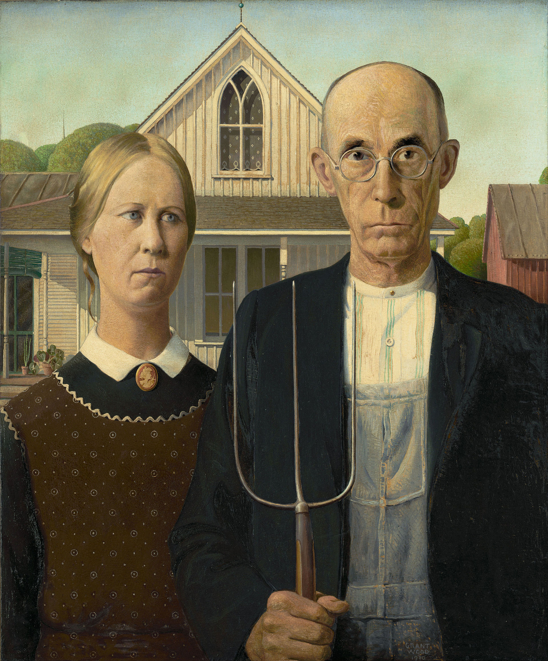
American Gothic, Grant Wood (1930)

This is the case with Grant Wood, who is far more famous for his emblematic 1930 painting, American Gothic, than he is for fame in his own name. Usually housed in the Art Institute of Chicago, which recognised the piece for its iconic depiction of life in the rural American midwest in the pre-Depression age and bought the work, American Gothic is one of the most iconic paintings of the 20th Century, and is currently making its first European visit. For me, it was clearly the highlight of the exhibition currently running at the Musée de l’Orangerie in Paris, American Painting in the 1930s (although I gather that the work, and the show built around it, will soon make its way to London’s Royal Academy too).

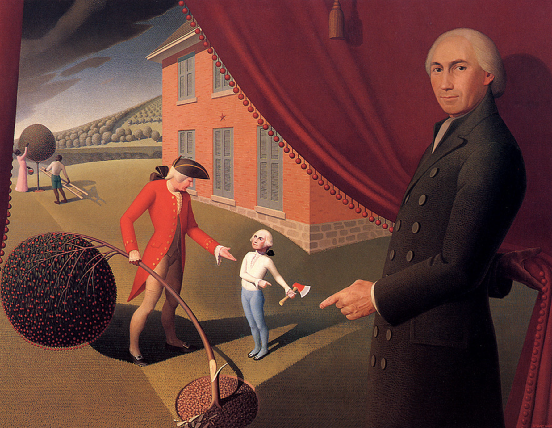
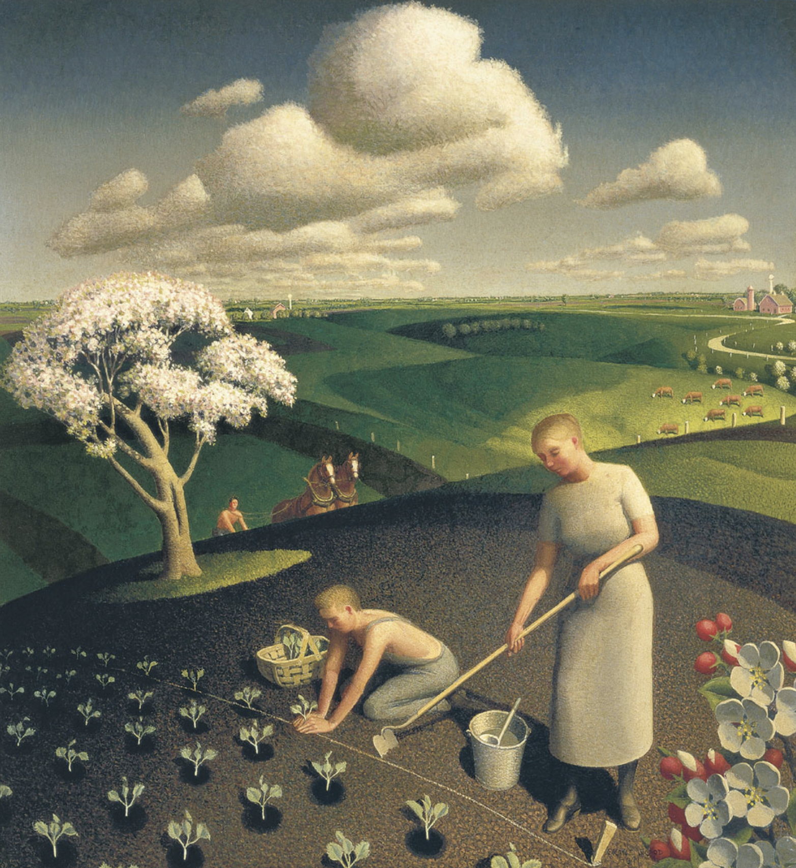
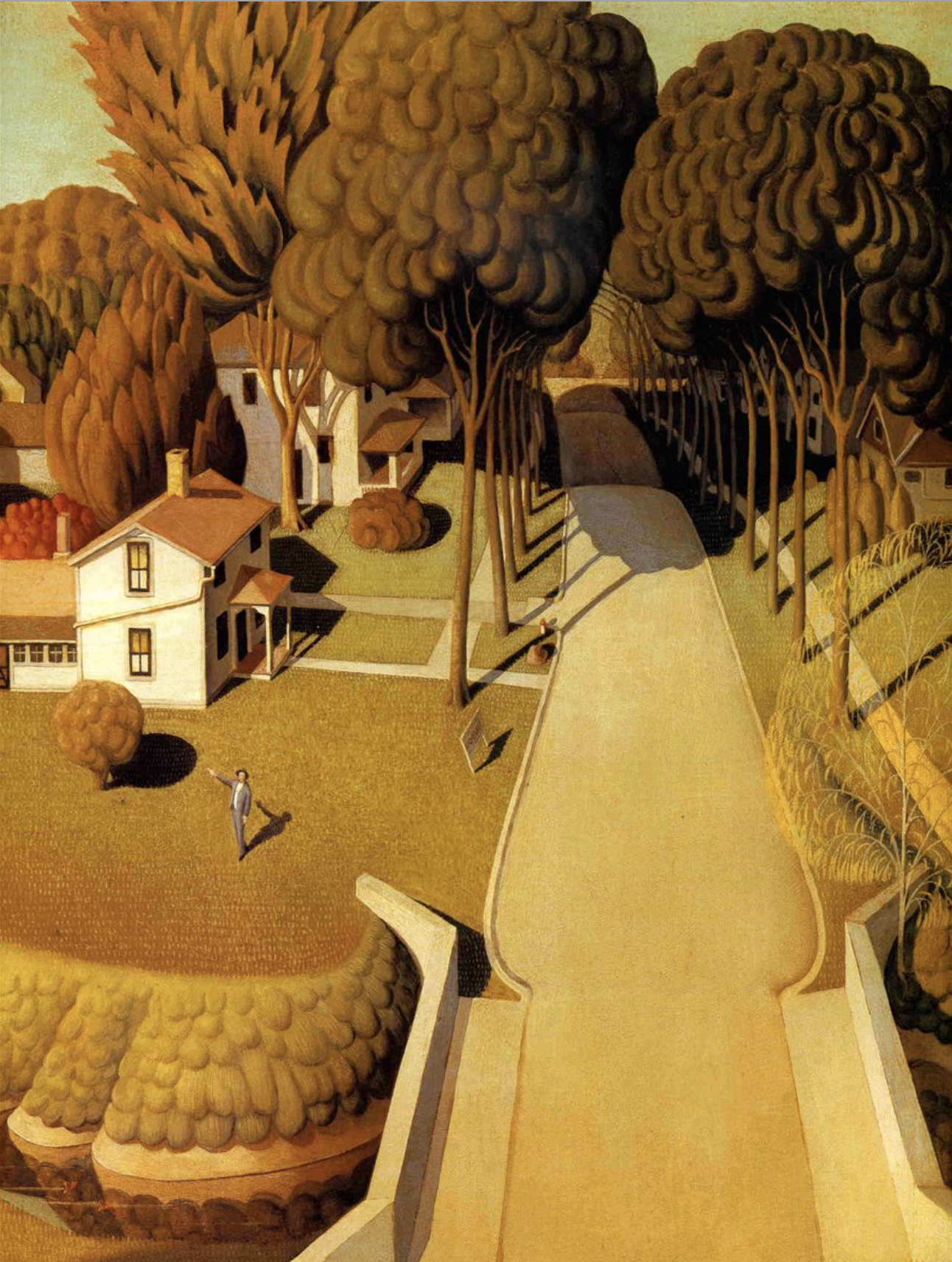
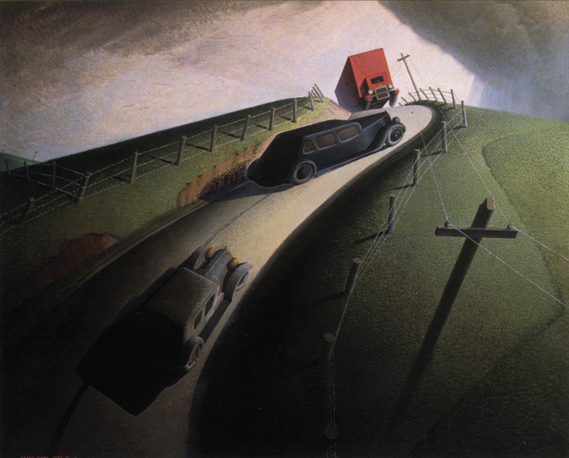
Highlights of Grant Wood’s oeuvre

grant-wood-9

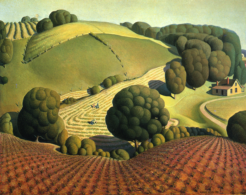
Young Corn (1931)

grant-wood-7

Parson Weem’s Fable (1939)

grant-wood-6

Spring in the Country (1941)

grant-wood-8

The Birthplace of Herbert Hoover (1931)

However, having swooned over my first face-to-face encounter with this iconic work and taken note of the name of its artist, what I wasn’t expecting was to find how prolific an artist lay behind the painting. For as we made our way around the exhibition, exploring its historically captivating theme of art before, during and immediately after the great American Depression, the name Grant Wood kept on popping up under all of the paintings to which I was instantaneously attracted upon entering each exhibition space.

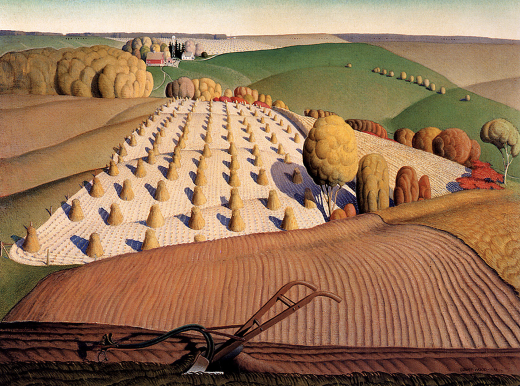
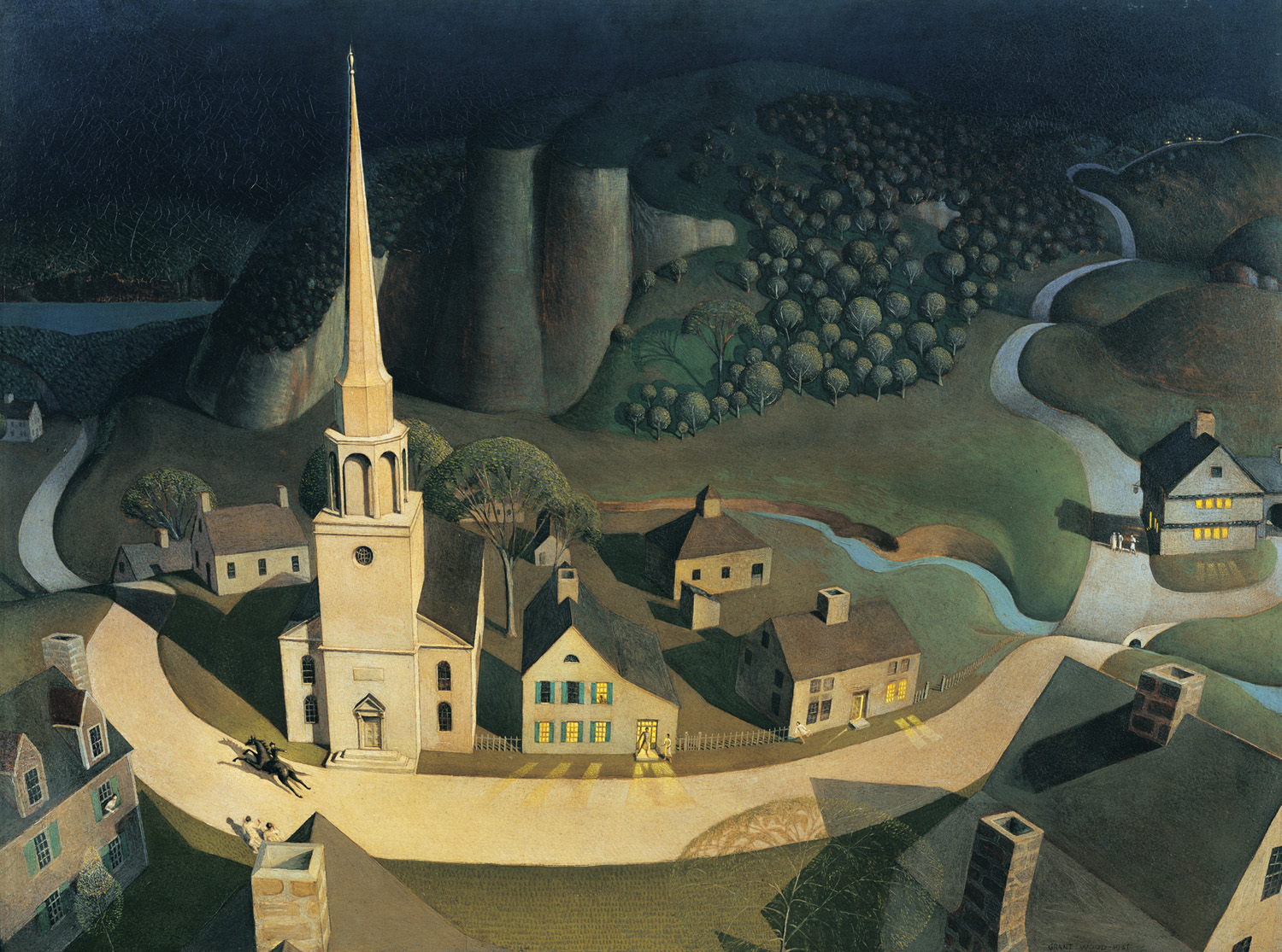
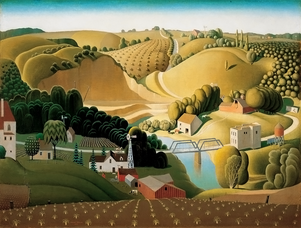
Born in 1891 and painting until his death in the 40s, Wood’s early work shows the clear influence of impressionism and post-impressionism with more hesitant lines and a play on depicting realistic light. However, by the time he reached the 1930s, the artist had fallen upon a truly unique form of naive reality, depicting in beautifully bold colours and sharp, well rounded lines and figurative forms, the rolling rural landscape around his Cedar Rapids home.

grant-wood-5

Death on the Ridge Road (1935)

grant-wood-fall

Fall Plowing (1931)

POSTER_3A

The Midnight Ride of Paul Revere (1931)

stone-city-inbluesky

Stone City Iowa (1930)

Without a doubt, my favourites of his works are his exquisite landscapes, painted so idyllically as to be charged with a kind of fantasy-land quality, albeit recognising in their carefully executed details the depiction of agriculture and industry. Reducing trees into rounded, wooly forms, and using idealised shadow to round-off the land like the  voluptuous flesh of a Rubens nude, these landscapes are pure works of genius, and why the artist Grant Wood will now remain lodged in my artist consciousness for all time.

Festival of colour: The Summer Exhibition 2015

There’s nothing quite like the rejuvenating power of bright, unapologetic colour to lift the spirits amidst an atmosphere of grey, and this is no more so than in London where, on a recent visit, the skies were characteristically gloomy and very un-summery. Heading therefore towards this year’s Summer Exhibition at the Royal Academy of Arts therefore brought with it the promise of some element of seasonal rejuvenation, even if it could not improve the weather. But this year’s show, the 247th in the Academy’s history, did not just flush us with the spirit of summer, but with a festival of colour, never before seen at the annual show in such quantities.

IMG_3977

The reason for this panoply of colour is surely its chief curator, Michael Craig-Martin RA, whose work is famous for its blocky poster-print colours with exact outlines and pop-art motifs. With such an artist in charge, there was no way this show was going to be boring, and any doubts as to the fact were quickly swept away at the entrance to the RA, whose usually beige monochrome staircase had been transformed into a riot of multicoloured stripes in an installation by Jim Lambie.

IMG_3979 IMG_3982 IMG_3973 IMG_4010

For those who dared climb what felt like a staircase of moving molten colour, a further punch of colour lay in wait in the form of the first three galleries, painted in bold magenta, blue and turquoise as a magnificently energised backdrop to a surprisingly fantastic selection of works. I never saw those lofty galleries look so rejuvenated, nor did I ever enjoy a Summer Exhibition with as much enthusiasm and high praise. For after years of continuous disappointment and what always seemed to be a relentless recycle of the RA cronies, at last we were presented with a show crammed with unapologetically figurative works, with paintings which exhibited actual talent (Tracey Emin’s usual crappy scrawls excepted), where superb print works were given a rightfully more prominent hang, and architectural models were actually interesting.

IMG_3983 IMG_3990IMG_3989IMG_3992

Here we had paintings of places and cities, of streets you could walk in, of portraits you could empathise with, and where there was abstract, it was playful and bold – accessible and expertly conceived. In one room, a superb tapestry portrait by Grayson Perry (Julie and Rob) could have stolen the show, but was well accompanied by a gallery of moving, inspirational works such as Elise Ansel’s brilliant take on Bellini and Titian (Feast of the Gods II) – another riot of colour (above, top).

IMG_4025

Considering the multiple works in Tom Phillips’ “A Humument”

So many works pronounced that the arrogant age of contemporary art installations and badly conceived “paintings” is dead, from the many offerings of an RA favourite, Stephen Chambers, to the last gallery entirely devoted to the doodles of Tom Phillips, whose work A Humument, involves the almost total recreation of a long lost novel thanks to his reillustration and reinterpretation of every page. And by way of confirmation that this new re-emergence of a classical pictorial style is both correct, and beloved, an already abundant array of red dots was already evident, despite the early days of the exhibition’s season.

IMG_4018 IMG_4016 IMG_4011 IMG_4020

For those disappointed by past Summer Exhibitions, this one is not to be missed – it will change your mind for sure. The Summer Exhibition shows at the Royal Academy, London until 16th August 2015.

London’s homage to print: Part 1 – Chiaroscuro woodcuts

Printmaking is seriously in vogue right now. Whether it be etchings, lithography, linocut or woodcut, prints have seen a huge upsurge in popularity in recent years. This is partly down to the financial crash, which for so many middle-income art collectors meant that the 3-figure price-tags attached to prints suddenly became a much more attractive method of collecting quality images. But it’s not just about cost. Printmakings’ return to prominence also recognises the unique quality and character which is inherent in each of the print mediums, whether it be the fine lines of etching, or the watery translucence of lithography.

And as if further confirmation of this renewed popularity were needed, London is currently showing two blockbuster exhibitions which explore the medium of print in all its rich and versatile brilliance: David Hockney: Printmaker, at the Dulwich Picture Gallery (review coming soon!) and at the Royal Academy: Renaissance Impressions – Chiaroscuro Woodcuts.

Hans Burgkmair the Elder, 'St George and the Dragon', c. 1508-10." Chiaroscuro woodcut printed from two blocks, the tone block in beige. 31.9 x 22.5 cm. Collection Georg Baselitz. Photo Albertina, Vienna. Organised by the Royal Academy of Arts, London and the Albertina, Vienn

Hans Burgkmair the Elder, St George and the Dragon, c. 1508-10. Chiaroscuro woodcut printed from two blocks, the tone block in beige. Collection Georg Baselitz. Photo Albertina, Vienna.

Ugo da Carpi, after Raphael, The Miraculous Draught of Fishes, c. 1523-27. Chiaroscuro woodcut printed from three blocks, the tone blocks in red, 23.4 x 25.7 cm. Albertina, Vienna. Photo: Albertina, Vienna

Ugo da Carpi, after Raphael, The Miraculous Draught of Fishes, c. 1523-27. Chiaroscuro woodcut printed from three blocks, the tone blocks in red. Photo: Albertina, Vienna

Ugo da Carpi, after Raphael; Aeneas and Anchises 1518, Chiaroscuro woodcut printed from four tone blocks, in beige and grey 51 x 37.4 cm Collection Georg Baselitz. Photo Albertina, Vienna. Organised by the Royal Academy of Arts, London and the Albertina, Vienn

Ugo da Carpi, after Raphael; Aeneas and Anchises 1518, Chiaroscuro woodcut printed from four tone blocks, in beige and grey. Collection Georg Baselitz. Photo Albertina, Vienna.

Ugo da Carpi - Diogenes (1527)

Ugo da Carpi – Diogenes (1527)

This exhibition couldn’t be more timely for me. I have only recently started dabbling in woodcutting myself, having been inspired to do so by Felix Vallotton’s exhibition in Paris last year. Likewise, I have been fully immersed in Renaissance art of late, not least in seeking inspiration for my on-going Norm Saints collection which drawn on Renaissance religious imagery for its primary inspiration.

It is that same intense religious flavour, together with the grandiose imagery which was born of the Renaissance, which forms a golden thread through the 150 or so masterful woodcuts which the Royal Academy currently have on exhibition. Formed of the collections of the Albertina in Vienna, and the private haul of contemporary artist, Georg Baselitz (you know, the one who paints upside down portraits), this brilliant show brings together a fine set of prints which explore the birth of the chiaroscuro woodcut, a unique use of wood to express the intensification of light and dark.

Hendrick Goltzius, Hercules Killing Cacus, 1588. Chiaroscuro woodcut printed from three blocks, the tone blocks in yellow and green, 41.1 x 33.3 cm. Collection Georg Baselitz. Photo: Albertina, Vienna

Hendrick Goltzius, Hercules Killing Cacus, 1588. Chiaroscuro woodcut printed from three blocks, the tone blocks in yellow and green, 41.1 x 33.3 cm. Collection Georg Baselitz. Photo: Albertina, Vienna

Andrea Andreani, after Giambologna, Rape of a Sabine Woman, 1584, Collection Georg Baselitz. Photo Albertina, Vienna
Albrecht Dürer, Rhinoceros (1515 and c.1620 - the highlights)

Albrecht Dürer, Rhinoceros (1515 and c.1620 – the highlights)

Albrecht Dürer, Ulrich Varnbühler (1522 and c.1620 - the highlights)

Albrecht Dürer, Ulrich Varnbühler (1522 and c.1620 – the highlights)

Ugo da Carpi, after Raphael; Aeneas and Anchises 1518, Chiaroscuro woodcut printed from four tone blocks, in beige and grey 51 x 37.4 cm Collection Georg Baselitz. Photo Albertina, Vienna. Organised by the Royal Academy of Arts, London and the Albertina, Vienn

Ugo da Carpi, after Raphael; Aeneas and Anchises 1518, Chiaroscuro woodcut printed from four tone blocks, in beige and grey 51 x 37.4 cm Collection Georg Baselitz. Photo Albertina, Vienna. Organised by the Royal Academy of Arts, London and the Albertina, Vienn

Hans Sebald Beham, Head of Christ Crowned (1520-1) - woodcut from two blocks, tone block in brown.

Hans Sebald Beham, Head of Christ Crowned (1520-1) – woodcut from two blocks, tone block in brown.

From the Italian word meaning light-dark, chiaroscuro is better known to describe the dark and brooding masterpieces of Italian painter, Caravaggio. Just as Caravaggio is famed for utilising the stark contrast of light and shadow to create paintings packed full of drama and intensity, this woodcut technique, invented in the 1500s by Lucas Cranach the Elder and Hans Burgkmair the Elder, provides the same thrill of three-dimensional realism by using different wood plates to layer up light and shadows. It generally involves one plate which contains all of the darkest details (usually the most linear plate), while another provides an overall mid-tone with white highlights cut into it. The effect is one of dramatic contrasts and naturalistic brilliance, as each of the many prints on show in this exhibition demonstrate.

From the work of those inventors, to the development of the medium, mainly by Italian printmakrs such as Ugo da Carpi and Dmenico Beccafumi, we are treated to a period of creativity in which the medium is expertly utilised to create images which, at the time, must have stunned audiences for all of their realism and depth. But just as they may have stunned 1500s audiences for their apparently illusionistic manifestation of light and shadow, so too do they retain the ability to stun the audiences of today – because in their sheer detail and brilliantly perfect execution, these works are a breath of fresh air in a contemporary world where art is so often comprised of some untidy sploshes on a canvas.

Spectator-Royal-Academy

Renaissance Impressions is on at London’s Royal Academy until 8 June 2014.

George Bellows: Modern American Life

Bulging, twisting angry red bodies reminiscent of Francis Bacon’s cannibalistic, melting forms; great muscular bodies gripped in a violent embrace; long horizontal lines capturing the figures within an illuminated, elevated fighting platform; and a blood-thirsty zealous crowd, their faces hideously disfigured as they vie for blood, sweat and mighty great punches on their night out at the boxing ring – these are the captivating images of the 1900s boxing underworld for which the American artist, George Bellows, is renowned, and which form the focus of the Royal Academy’s new exhibition: George Bellows 1882-1925 Modern American LifeYet as the exhibition attempts to point out, Bellows painted much more than the poignant punches of his most famous images.

I wasn’t aware of Bellows before this show – and I excuse this gap in my art historical knowledge by virtue of the fact that this is the first Bellows retrospective to ever come to the UK, and because, to my knowledge, no or few Bellows works are held in the UK national collections. Moreover, while Bellows was a classmate of the much celebrated Edward Hopper, his career was much shorter – he died at a poultry 43, barely before he had ever got going. And yet the works which he did complete in his short life present us with an unparalleled view of turn-of-the-20th century New York, focusing on the many facets of a city in flux; from the gritty and sinister sweaty boxing underworld and the bustling expanse of Times Square, to the elegant perambulations of the richer citizens in out of town parks; from traumatic, emotionally intense depictions of war, to almost fantastical, saccharine scenes of picnics and fishermen in the outer countryside surrounding the city.

Club NIght (1907)

Club NIght (1907)

Stag at Sharkey's (1909)

Stag at Sharkey’s (1909)

It’s perhaps no wonder that Bellows was so undyingly fascinated by New York City. Coming from a comfortable middle-class Ohio background, he would have been unprepared for the extremes of the city when he arrived there at just 22 years of age. Yet falling under the influence of artist Robert Henri, who was his teacher at the New York School of Art and who encouraged his students to eject the idealised and sentimental depictions of life favoured by the art scene at that time, and instead pursue a more unique expression of reality, Bellows soon found himself seeking out the more insalubrious, undesirable quarters of the city, and there depicting some of his most renowned works, from groups of naked immigrants bathing in the city’s dirty rivers, and builders clearing vast blocks of the city to construct a huge new homage to the modern railway, to the great bustling, smokey squares of central New York, full of workers and citizens from every spice of life, and of course those wonderfully intense boxing masterpieces.

New York (1911)

New York (1911)

But Bellows did not limit himself to this harsher side of New York. Following his initial trawl through the unsavoury and illegal hangouts of the city, he soon moved onto depictions of a more civilised, elegant facade, with paintings of strolling couples, of elegant groups laden with white parasols and large sunhats picnicking out in the parks like something straight out of Seurat’s paintings of Paris, and of families walking out amongst snowy hills and landscapes. This is a changed side of Bellows, but no less fascinating to behold, not least because it somehow fits uneasily into the common perception of the New York of these times, and because, by comparison with Bellow’s earlier body of work, this happy, idle lifestyle appears almost reckless in its apparent disregard for the hardship of the real gritty city which lay at the heart of the nearby urban sprawl.

A Day in June (1913)

A Day in June (1913)

Summer Night, Riverside Drive (1909)

Summer Night, Riverside Drive (1909)

Blue Snow the Battery (1910)

Blue Snow the Battery (1910)

Yet for all his insightful depictions of a modern American life, perhaps the most captivating works of Bellow’s career were those which had no connection to America whatsoever: At the centre of the exhibition are Bellow’s depictions of war, works inspired by the horrors of the First World War in Europe which Bellows had read about in the American press. All five resulting paintings, four of which are on show at the Royal Academy, are conspicuously anti-German, showing the Germans in a devastating light as the perpetrators of previously unseen levels of horrific savagery, such as the Massacre at Dinant which depicts the unprovoked, summary execution of Belgian civilians following the sacking of their town which stood in neutral territory, and The Barricade, which shows the Germans using Belgian innocents as a human shield. The paintings are emotive, powerful and really quite breathtaking.

Massacre at Dinant (1918)

Massacre at Dinant (1918)

The Barricade (1918)

The Barricade (1918)

The Germans Arrive (1918)

The Germans Arrive (1918)

Likewise exceptional was the next room showing Bellows lithography – his brilliant printworks which were likewise used to stunning effect in depicting similarly shocking scenes such as The Law is Too Slow which shows an African American being burnt alive at the stake while surrounded by an apparently calm, even entertained crowd of white Americans. In his print works, Bellows shows himself as a master printer – he uses dark and light to maximum effect, while his faultless illustration of flesh tone in the print version of his later boxing scenes easily outstrips the paintings of the same subject.

The law is too slow (1922)

The law is too slow (1922)

Splinter Beach (1912)

Splinter Beach (1912)

Counted Out No.2 (1921)

Counted Out No.2 (1921)

After this highpoint of the show, the exhibition ends on something of a low in a gallery of overly insipid, saccharine fantastical depictions which look almost Chagall-like in style and appear to represent an uncomfortable diversion from Bellows more intense former work – even his later boxing paintings have nothing like the level of intensity as his boxing works painted 15 years before. The gallery is full of twee and sometimes stiff family portraits which resemble the work of Manet but without anything close to his emotional depth, as well as landscapes which are so excessively sentimental with their white horses and picture-perfect symmetrical mountain landscapes that Bellows’ former teacher, Robert Henri must have been turning in his grave – or at least would have done had he not outlived Bellows.

The Picnic (1924)

The Picnic (1924)

The White Horse (1922)

The White Horse (1922)

A Fisherman's Family (1923)

A Fisherman’s Family (1923)

George Dempsey and Firpo (1924)

George Dempsey and Firpo (1924)

For George Bellows died shortly after depicting these more sugary of his works, suffering from a sudden ruptured appendix and peritonitis. His career was one cut short, but perhaps just in time before his later My Little Pony style of painting threatened to overshadow the truly superb achievements of his former body of work; an oeuvre which now stands out, next to the likes of Edward Hopper, as a truly unique collective depiction of modern American life.

George Bellows: Modern American Life is on at the Royal Academy until 9 June 2013. Details and tickets can be found on the RA website.

Manet: Not exhibited in his lifetime

Glancing through the current Manet retrospective, Manet: Portraying Life, at the Royal Academy, there is one consistent feature which is perhaps even more noticeable that the works themselves: How many of the paintings are labelled “Not displayed in his lifetime”. Why the Royal Academy is so insistent on spelling this out with such apparent alacrity is unclear. But what it demonstrates is that the majority of works comprising this so called “first ever retrospective devoted to the portraiture of Edouard Manet” are what I call “filler works” – paintings which are either unfinished or merely preparations for other works, and none of which the artist had ever intended to be exhibited for public consumption.

It is therefore with some unease that I looked upon these works, which the Royal Academy tries to pass off as paintings worthy of the not insignificant £15 entry-price, the cynic inside me recognising that what we have here is merely a means by which a show that, fundamentally, consists of one room’s worth of finished and accomplished works, is padded out to fill a much bigger space. And even that space is not filled particularly well.

Music in the Tuleries Gardens (1862)

Music in the Tuleries Gardens (1862)

In the second large gallery, for example, the Royal Academy make the slightly unfathomable decision to present Music in the Tuleries all on its own, spotlight upon it, surrounded only by blank walls. I could understand this kind of hang for a masterpiece such as Le Dejeuner sur l’Herbe, which almost single handedly changed the history of art (and sadly lacking from this show), but for this painting? Sure enough, it’s a skilled group painting, giving us a very realistic snapshot of modern day life one sunny afternoon, lacking in the previous contrived composition of the grand historical paintings which were favoured in the time Manet painted it. But the Royal Academy do not succeed in making any significant point worthy of this solo hang. And what’s worse, this painting belongs to London’s National Gallery, so visitors can normally walk up and see the painting whenever they like, without the crowds attracted to the RA, and for free.

But this was not the worse of it. The following gallery was hung, not with paintings, but with a chronology of Manet’s life, and a desk on which copies of the exhibition catalogue could be surveyed – why exactly I’m not sure: after all, isn’t it better to look at the paintings themselves when you have them in front of you?

Unfinished: Portrait of Carolus Duran (1876)

Unfinished: Portrait of Carolus Duran (1876)

But asides from the unpalatable cheek with which the RA filled it’s space and passed off the show as a great survey of Manet’s career, I also felt a deep sense of unease, not as a punter, but as an artist – because so many of these works are so clearly unfinished, unprepared for public consumption. I can imagine Manet now, turning in his grave, horrified at the prospect of these unfinished preparations being gazed at and criticised as though they were finished works. And all for the sake of a buck or too.

Portrait of M. Antonin Proust (1880)

Portrait of M. Antonin Proust (1880)

The Luncheon (1868)

The Luncheon (1868)

Madame Manet in the Conservatory (1879)

Madame Manet in the Conservatory (1879)

Emile Zola (1868)

Emile Zola (1868)

All that said, the finished works which are on show are masterful Manet’s, apt demonstrations of the artist’s skill at capturing real life, real characters and a sense of the time in which he painted. You get the portrait of M. Antonin Proust (not to be confused with the acclaimed author) – a dandy about town, a man proud and professional in his polished appearance; then there’s Suzanne Leenhoff (later Madame Manet), sat, happily contented in the garden of Manet’s home, her cheeks rosy and her gaze tranquil.

300px-Edouard_Manet_088Then of course there’s Manet’s most infamous sitter of all: Victorine Meurent, who gets a whole gallery to herself in this show. While sadly, and very obviously lacking the two great masterpieces of Manet’s oeuvre in which she features (Le Dejeuner sur l’Herbe (although the Courtaulds inferior and much smaller copy is here) and Olympia), the paintings which are on show present the model with the confidence and audacity which must have attracted the artist to her – the wiley stare, straight out of the canvas, almost judging, daring the viewer to respond. Then there’s Victorine dressed as a street-seller, an accomplished character portrait in which the cherries held to her mouth appear almost as a provocation, a subliminal message inviting us to read a story into her steely gaze,  as well as the wonderful Railway portrait, in which the railings adjoining the railway appear to take centre stage, and the air of noisy, smoky, modern industry appears oddly juxtaposed with the apparent calm and tranquillity of Victorine and her sleeping puppy.

Street Singer (1862)

Street Singer (1862)

The Railway (1883)

The Railway (1883)

As a Manet lover (need I remind you of my Norm version of both Manet’s Le Dejeuner sur l’herbe and my juxtaposed Manet character Norms sat in Cappuccino Grand Café ?) I was of course familiar with many of the few finished works on show. But one thing that I took out of the show which I had not fully appreciated before was just how influenced Manet had been by Spanish art. Taking a trip to Spain, organised by Zacharie Astruc who’s portrait is also on display, Manet was very quickly inspired by Velazquez, who he saw as a master of painting black in all its surprising variety of shades, as well as other greats such as Goya and Ribera. Following on from this, one can really start to see the Spanish influence infiltrating into Manet’s work. Take the portrait of Rouviere as Hamlet for example, and look how it compares to this portrait by Velazquez. Then of course there’s the portrait of Victorine in the costume of an Espada, again sadly not included in the exhibition, an a portrait of Emilie Ambre as Spain’s favourite operatic diva, Carmen. As an artist much inspired by the Spanish golden age of art, I am well able to understand the effect that Spanish art must have had on Manet, helping him to surge forward as the revolutionary artist he was, in a claustrophobic French art scene which had yet to be struck by the poignancy of Spanish art.

Portrait of Zacharie Astruc (1866)

Portrait of Zacharie Astruc (1866)

Diego Velazquez, The Jester Pablo de Valladoid (1635)

Diego Velazquez, The Jester Pablo de Valladoid (1635)

The Tragic Actor (Rouviere as Hamlet) 1865

The Tragic Actor (Rouviere as Hamlet) 1865

Victorine Meurent in the costume of an Espada (1862)

Victorine Meurent in the costume of an Espada (1862)

Spanish influence: Emilie Ambre as Carmen (1880)

Spanish influence: Emilie Ambre as Carmen (1880)

Of course it is difficult for us, well informed of the contemporary art which followed, to understand just how revolutionary Manet was as an artist, painting in the age when grand history paintings and allegorical images were all the rage. His paintings were so real, so unpretentious a snapshot of the life and the world around him, that many gallery goers took to attacking his paintings with umbrellas. Yet still Manet ploughed on, forging the path which impressionists and expressionists and the whole world of modern art pursued in his wake. This exhibition does not make any statement half so bold as the mighty oeuvre of Manet in itself, but putting asides the unfinished sketches, and concentrating on the completed masterpieces, those works of Manet which are on show are easily strong enough to make an impression all by themselves.

Manet: Portraying Life is on at the Royal Academy until 14 April 2013.

Too twee for me: The Sterling-Clark Impressionism collection at the RA

The problem, in my view, with Impressionism is not the fact that its most renowned images are regularly plastered across every kind of tourist paraphernalia and household object you can possibly imagine – often the most iconic images are icons for a reason – because they broke boundaries, they inspired, they recalled an essence of something past, a nostalgic ambience, a time of great creative fluidity.

Rather, the problem with Impressionism is that having begun as an artistic revolution, breaking new boundaries, taking art from the confines of bourgeois society, the closed-class snobbery of  institutionalised selection committees and the drawing rooms of the aristocracy and using it to celebrate the lives of the ordinary, of the downtrodden, of the true foundations of society, and steering draftsmanship from perfectly executed depictions to looser, more energetic and living impressions, much of Impressionism became the victim of its own success.

Renoir started painting ghastly portraits of rotund, rosy-cheeked women, twee, floral-sweet pictures which would fit nicely onto a chocolate box were they not so likely to induce the viewer to vomit. Monet, meanwhile, became overly obsessed with his damn lillies, to the extent that in trying to capture the subtle pinks and purples of mist over a pond, he ended up painting canvas after canvas which were reminiscent of the kind of floral fabric preferred by members of the WI and other polite conservative society. Van Gogh’s work became clumsier and clumpier, Cezanne’s became repetative, Degas started dabbling in pictures of nude women which were almost sadist, and Manet, poor thing, was confined to painting flowers, although to be fair, he was too ill to work on bigger canvases.

Pierre-August Renoir, Girl with a Fan (1879)

Pierre-August Renoir, A box at the Theatre (1880)

Anyway, the point I am making is that for the most part, having started off as revolutionaries, the Impressionists’ later work all too often conformed to a new form of the conservatism they were trying to escape in the first place – placating their former critics with twee works of flowers, pink-tinged landscapes, and pretty women, nude or in flowing dresses. And it is exactly these works which were the favourites of Sterling and Francine Clark and which, as a result, are the focus of the Royal Academy’s latest show in London, which showcases some major works from the Sterling and Francine Clark Art Institute in Williamstown, Massachusetts (I believe because the Sterling-Clark is undergoing some form of renovation).

Henri de Toulouse Lautrec, Waiting (1888)

Those who have raved about this exhibition tend to have been on the older, more conservative side. And it is easy to see why they are seduced – some of these works may even feel a bit racy for a few of them – just look at Toulouse Lautrec’s Waiting, with a woman leaning despondently over her glass of absinthe. Quite the scandal compared with Renoir’s pleasant smiley female offerings hanging close by. But not to worry, that’s about as lascivious as this show gets. Sadly.

Robert Sterling Clark (1877-1956) came from a wealthy New York Family whose fortune derived from the Singer sewing machine company. He began collecting art after he settled in Paris in 1910 and where he soon became the chum of famous art dealers Knoedler and Durand-Ruel who introduced him to the innovative work of the Impressionists which had finally broken into the mainstream at that time. In fact Renoir, whose works Clark adored (he eventually collected some 39, 21 of which are at the RA) was by that time so popular that looking around at the sales receipts interestingly exhibited by the RA, you can see that Clark was paying astounding sums such as 100,000 dollars for Renoirs, even then. As the collection, added to with the help of his French wife, Francine, grew, Clark had it in mind to open a museum. He did this in 1955, in Massachusetts, providing a permanent home for his many Impressionists works including Monets, Manets, Toulouse Lautrecs as well as various more classical pieces. Disappointingly, his collection is very experimental – he had one Gauguin on show, and even that was a traditional(ish) portrait of a woman.

Claude Monet, The Cliffs at Etretat (1885)

Edouard Manet, Interior at Arcachon (1871)

Claude Monet, Seascape: Storm (1860-67)

In fact Clark obviously had a penchant for paintings of women. After the initial gallery of flowers, onions and various fairly dull landscapes by Pissarro and Monet, the main bulk of the small exhibition are portraits of women. Asides from the insipid offerings of Renoir, there are, mercifully, some far more enticing works by other artists, both big-wig impressionists and less well-known painters. Two incredibly evocative Toulouse-Lautrec works are on show, both offering quite stark views of a woman in the shady quarters of Montmartre, one, Carmen, who confronts the viewer straight on, while the other, nameless, is just waiting – what for, we don’t know. From the hunched over pose and the glass of absinthe before her, are we to assume she is waiting for luck to come her way, or even death to end her suffering?

Of the other portraits of women, my favourite had to be Crossing the Street by Giovanni Boldini. Boldini, an Italian artist who settled in Paris, loved painting the sights and sounds of the salacious neighbourhood of Pigalle on his doorstep, and this beautiful portrait of a woman, raisng the hem of her petticoat as she crosses the cobbled street, is so wonderfully evocative, and brilliantly painted, exhibiting both an impressionistic, roughly painted background, and a precise and focused detailed and sympathetically painted portrait. I also adore the little details – the shop sign, the dog, the Dandy in the carriage – it’s a wonderful turn back in time to a Paris of bohemian romance and delightful decadence mixed with poverty and decay.

Giovanni Boldini, Crossing the Street (1873-75)

James Tissot, Chrysanthemums (1874-76)

Likewise mention has to go to the lesser known artists who nevertheless created two portraits really worth visiting this show to see – James Tissot’s Chrysanthemums, a brilliant depiction of a woman, looking at the audience as though disturbed, surrounded by a great swathe of multicoloured hairy-headed flowers painted with great fantastic technical skill. Also check out Alfred Steven’s Memories and Regrets, in which a woman, as the name suggests, appears to have been sent into a daydream of remembering prompted by the letter in her hand, a personal and private moment interrupted only by the presence of we, the viewer, introduced to the scene thanks to the technical rendering of Steven’s portrayal.

Alfred Stevens, Memories and Regrets (1874)

Like any show, this one has its highlights, and whether it be that the paintings of the lesser known artists exhibit the most skill in their execution, or just because, since they are not tourist fodder like their more well known impressionist colleagues, they represent something of a breath of fresh air, those paintings by the likes of Boldini, Tissot and Steven are definitely, for me, the stars of the show.

As for the other impressionist works on show – well these paintings are all very safe, and for that reason I find them boring. But for lovers of the chocolate box impressionism which is so firmly engrained onto the consciousness of every tourist and gallery visitor around the world, this show gives you impressionist staple which you will undoubtedly enjoy. But don’t forget your Renoir souvenirs on the way out.

Pierre-August Renoir, Onions (1881)

From Paris: A Taste for Impressionism continues in the RA’s Sackler Wing Galleries until 23 September 2012.
Summer Exhibition at the RA: How a private view can make the mediocre marvellous

I’ve said it before, and I’ll say it again: When the viewing conditions are right, even the most mediocre of art can appear wonderful. When your mood is carefully massaged by fortuitous circumstances, your mind will be opened, and you’ll look for the positives in everything. Look what happened a few months back with the huge David Hockney exhibition at London’s Royal Academy: On my first visit, the gallery was so packed I came out spitting blood (almost literally as the hustle in the giftshop between usually restrained “Friends” of the RA to grab as much Hockney merchandise as possible almost ended up in fisticuffs). What was all the fuss about Hockney? He can’t even paint, I thought, bitterly. However, when I went back a few weeks later at the behest of my partner, first thing in the morning, tactically skipping the first couple of rooms and emerging, victoriously from the crowds into an empty exhibition beyond, I began to see what all the fuss was about. The paintings were so atmospheric, airy, colourful, pleasing. It was all about the viewing conditions.

The central Matisse-red gallery complete with sculpture by Leonard McComb RA

The same, now, can be said for my experience of the Royal Academy’s most famous annual offering, the Summer Exhibition, which I attended, with my mother, last night. So used to the unseemly crush of packed-in spectators, all vying for space in the Small Weston Room to see the small paintings squeezed unapologetically onto the wall from floor to ceiling, I would always leave the Summer Exhibition feeling resentful. Why had I just spent good money to go along and see a load of same-old mediocre paintings, small canvases of flowers and ovens and animals, not to mention Tracey Emin’s hideous, crass doodles and the repetitive works of the closed-club Royal Academicians? But not this year. Yes, the same old Royal Academicians still dominate, and yes, the ridiculously crap works of Tracey Emin, now named “Prof. Tracey Emin RA” after her recent ascendancy to the role of RA Professor of Drawing (what a joke) are still conspicuous by their unashamed lack of skill (and because of the hundreds of “sold” dots stuck to the frame because people seem to think scrawled depictions of half-vaginas are valuable), but the difference this year was that I attended on a private view. There were literally 80 of us in the entire venue, and those rooms are big. Once the small gathering had dispersed around the place, we frequently found ourselves quite alone in the huge Royal Academy galleries.

The “wave” hanging of small paintings

It was wonderful! Feeling so airy, ephemeral, and almost important, we glided around the galleries in such a good mood that we actually started to point out details of all the paintings, noticing the colours and the skill involved, complementing, and sometimes even tempted to buy and generally loving the whole affair. We were also treated to a talk by the charming Harry Baxter (an “artist educator” at the RA) whose insight into the exhibition made the whole thing instantly accessible and immediately unpretentious. This year’s show, the 244th in the RA’s history was, he explained, a homage to the small and the beautiful, an intentional contrast to the Hockney “Bigger Picture” exhibition where crowds had crammed into the galleries to see vast paintings made up from multiple small canvases. The focus on “small” can only be a good thing – it meant that rather than squeeze into the tiny rooms with hundreds of others to see all the small works, this year the huge central galleries were given over to countless small paintings (some 1,500 in all) which were hung around the walls like a wave of moving art. It wasn’t quite a Salon floor-to-ceiling hang, but it was an all-embracing journey from one artist’s expression to another’s.

So amidst all this good feeling, what were my favourite works? Top of the list has to be Buffalo Grill by Scottish artist Jock McFadyen, not least because I used to eat in one such of the French chain restaurant bang opposite the Moulin Rouge in Paris. This huge green canvas, with an off-centre, almost hazy image of the American-looking chain restaurant made for quite an impact in a gallery in which it easily dominated. It’s almost like the blur of the restaurant viewed from a fast-moving car, and yet the top of the restaurant is crisp and clear, like an after-image of the place stamped onto your retina.

Buffalo Grill (2004) © Jock McFadyen

Top of my list of sculptures, meanwhile, was the super-shiny bronze creation by Leonard McComb RA, Portrait of a Young Man Standing. Only a shame that it has the very modest price tag of £600,000. Against a red painted central gallery (apparently painted as such in homage to Matisse) and reflecting in its polished surface the paintings hung all around it, the sculpture looked truly remarkable. Second place for sculpture had to be given to Professor David Mach RA, whose cheetah made from coathangers, Spike, is an incredible feat of innovation (as was the brilliant recreation of the head of Michelangelo’s David built from the heads of matches, also by David Mach).

Top half of Leonard McComb’s Portrait of a Young Man Standing

David Mach RA, Spike

The architecture gallery was pretty interesting this year, bordering more on the surreal, not least with CJ Lim’s Dream Isle: London, the Victorian Sponge Cake which was a model imagining just that – a city shaped like a sponge cake! Also amongst the architecture were the predictable inclusions of Olympic stadiums and other Olympic buildings, as well as the new King’s Cross station concourse.

C J Lim, Dream Isle: London, the Victorian Sponge Cake

I also loved this by Graham Crowley…

Red Drift No. 3, © Graham Crowley

And this by one of my favourite Royal Academicians, Stephen Chambers RA

Stephen Chambers RA, I Know Trouble (And She’s My Friend)

While this, by Tracey Emin, appalled me…

Upset, by “Prof” Tracey Emin RA

I could go on, and there is of course plenty to look at, and to mention, but hopefully the photos I have included in this post will provide a hint of the wonders on show (except of course for Tracey Emin’s “Upset” which is included purely for the purposes of demonstrating how a totally talentless media novelty can rob some poor talented unknown of a huge amount of wall-space and all the opportunities that go with it).

The Royal Academy don’t always get it right, but with this year’s Summer Exhibition, they really seem to be progressing. Perhaps it’s because of the new president, Christopher Le Brun, or maybe it’s just because of the space all around me, the exclusivity and of course the complementary wine… It’s a question which remains as yet untested, but if you want to have a punt, go and visit the show – as the name suggests, it’s on all summer, and you can find out all of the details here.

Johan Zoffany: Society Observed

If you’ve read my last few posts, you’ll probably  know that the weather in London is bleak, persistently grey, and wintery cold. Sorry to go on, but to be fair, it has been like this since the beginning of April. So while we all gasped a sign of understandable relief to have a bank holiday weekend with one extra day off work, I for one did not relish the enhanced days of freedom alongside what looked to be a weather forecast stuck somewhere in December. So what to do with a wintery weekend in May save for staying in bed? Why, a good old exhibition of course.

Thomas King as Touchstone in ‘As You Like It’ (1780)

London has been the European capital of exhibitions this year, from David Hockney for which queues formed an hour before opening and extended long past the Royal Academy courtyard until closing, to that Da Vinci spectacular at the National Gallery, for which queues not only spiraled around the whole of the West End, but tickets started reaching astronomical figures in the dark and dangerous world of the black market. We’ve had a bit of Picasso, and a whole show devoted to Lucien Freud, and now we have the master of marketing manipulation himself, Damien Hirst, installed at Tate Modern. But otherwise things are drying up a bit on the exhibition front, with some new shows promised towards the end of the year, but nothing compared to the blockbuster paroxysm which we had at the start (I’m not too sure why they decided to show the best stuff at the beginning of the year before the Olympics start… but owing to the ridiculous crowds experienced when it was just us Brits in tow, it’s probably a good thing that we didn’t have to compete with the rest of the world in the galleries as well).

Henry Knight of Tythegston with his Three Children (1770)

So this weekend I had a choice of Hirst, which I’m trying to put off for as along as possible because he makes me angry, Nicholson/ Mondrian which looks a bit geometric, Turner, which is all very well but a bit samey, and this Zoffany chap at the Royal Academy. I’ve never heard of Zoffany before, but seeing as the Royal Academy is currently in a visitor loll, after the close of Hockney and before the opening of their annual car crash – The Summer Exhibition – I decided to give him a go.

Johan Zoffany (1733-1810) was born in Frankfurt, Germany, but moved to England at the age of 27. A keen socialite and excellent networker, he soon found himself the darling of the rich, influential aristocrats and profligate patrons of the age. Within four years he was enjoying the patronage of King George III and his wife Queen Charlotte, and was also the beloved of the Austrian Royals, being created a Baron by the Archduchess Maria Theresa at the age of 33.

Zoffany was a keen social observer. Through his connections in high society, and through his friendship of leading actor of the  time David Garrick, Zoffany was afforded countless opportunities to paint scenes enriched by the lively portrayals of contemporary society, from lavish theatrical productions of Shakespeare’s As You Like It and Macbeth, to complex portrayals of musician troupes, families in conversation and at play, large social gatherings watching cock fights in India and attending the Uffizi in Florence, and the Royal Family in both formal attire, and playing dress up.

George III (1771)

The distinctive thing about Zoffany’s works is this element of social interaction which he portrays. Unlike many portrait painters of his day, he did not paint head to toe, stiffly posed portraits. Rather he painted his sitters, both singularly, as couples or as large groups, interacting and in the course of “doing”. For this reason, his paintings are both wonderfully natural, and appear to represent a highly realistic snapshot on society of that day. This realism is of course vastly augmented by his meticulous attention to detail and his impeccably intricate fashioning of fabrics, furniture, interiors and objects.

The show starts with a number of mythological and allegorical pieces. One of my favourites was this, David with the Head of Goliath (1756). Some have asserted that the piece is a self-portrait, others disagree, but all comment upon what appears to be the purposeful homoerotic and phallic nature of the piece, as David’s sling hangs close to Goliath’s open mouth, while David stares out provocatively, holding what appears to be the glans of a marble phallus from an antique sculpture in his hand.

David with the Head of Goliath (1756) National Gallery of Victoria, Melbourne.

Of Zoffany’s various Court paintings, my favourite was this one, showing Queen Charlotte with her sons George, Prince of Wales, and Frederick, Duke of York. Asides from the cuteness of the young prices dressing up, one as Telemachus, son of Odysseus from Homer’s Odyssey, and the other in a Turkish costume, the thing that struck me most about this painting was the stunningly executed drapery of Queen Charlotte’s dress, painted with exquisite skill and attention to detail.

Queen Charlotte with her Two Eldest Sons (1764-5), The Royal Collection of HM Queen Elizabeth II

It wasn’t all high society that Zoffany observed. This painting, of an optician with his attendant, exhibits with great sensitivity two ageing craftsmen in a cluttered workshop filled with a plethora of materials each painted with intricacy and realism. For me, it is reminiscent of a an old Dutch interior scene by the likes of Vermeer, but with the added intensity and captivating quality held in the direct gaze of Mr Cuff the optician.

John Cuff and his Assistant (1772), The Royal Collection of HM Queen Elizabeth II

Zoffany’s real skill lay not only in social observation, but in his attention to detail. One of my stand out favourites of the exhibition was this painting, showing the library of Charles Townley complete with a large variety of sculptures from antiquity echoing the grand tour travels which were so fashionable in those days across continental Europe, and in which Zoffany too indulged when he went to Italy for a number of years at the behest of his patron, Queen Charlotte.

Charles Townley’s Library No. 7 Park Street, Westminster (1781-3, 1792, 1798)

Finally I loved this group portrait of the Sharp family, a family of musicians who used to gather together once a fortnight to give performances. In the summer these performances were given by the Sharps on yachts, shallops and barges in what they termed “Water Scheems”, becoming so well known in doing so that they captured the attention of George III himself. This painting shows one such gathering on a barge on the River Thames – you can see Fulham Church in the background.

The Sharp Family (1779-81), National Portrait Gallery

This exhibition just goes to show that sometimes it’s the old masters and past artists, although perhaps lesser known, but whose skill is nonetheless indubitable, that really shine. The Hockneys and the Hirsts of this world may pull the crowds, seduced and manipulated as they are by the media sway, but the real treasures are to be found in the oeuvres of the past masters, painters who worked at a time when skill was King, and an unmade bed was swiftly remade and freshened, not displayed in a gallery or proclaimed a masterpiece of art. We can always live in hope that such days of aesthetic appreciation and just reward will return. In the meantime head along to the Royal Academy. The show is on until 10 June 2012.

Parallelism – Giving Hockney another chance

I’ve just finished reading the new novel, Waiting for Sunrise, by William Boyd. The novel has something of a Tinker Tailor Soldier Spy vibe about it, and is certainly atmospheric of 1900s Vienna and WW1 London although it doesn’t come to an altogether satisfactory ending. Nonetheless, I digress – far from intending to proffer a review of the novel, I wanted to talk about an interesting theory espoused by therein.

The book’s central character, Lysander Rief, has a mental disorder which prevents him from climaxing during sex. At the story’s beginning, we find Lysander in Vienna, seeking the help of an eminent British psychiatrist, Dr Bensimon. Dr Bensimon isolates a particular incident in Lysander’s childhood which he believes is the cause of his sexual problems. He attempts (and is ultimately successful) to cure Lysander through the use of a psychoanalytical theory, Parallelism.

Dr Bensimon describes the theory thus:

“Parallelism” worked approximately along the following lines. Reality was neutral, as he had explained – ‘gaunt’ was a word he used several times to describe it. This world, unperceived by our own senses, lay out there like a skeleton, impoverished and passionless. When we opened our eyes, when we smelled, heard, touched and tasted we added the flesh to these bones according to our natures and how well our imagination functioned. Thus the individual transforms ‘the world’ – a person’s mind weaves its own bright covering over neutral reality. This world is created by us as a ‘fiction’, it is ours alone and is unique and unshareable…

‘Pure common sense,’ Bensimon said. ‘You know how you feel when you wake up in a good mood. The first cup of coffee tastes extra delicious. You go out for a stroll – you notice colours, sounds, the effect of sunlight on an old brick wall. On the other hand, if you wake up gloomy and depressed, you have no appetite. Your cigarette tastes sour and burns your throat. In the streets the clanging of the trams irritates you, the passers-by are ugly and selfish. And so on.

(Waiting for Sunrise by William Boyd, page 62)

I have no idea whether this theory of “Parallelism” exists beyond the pure fiction of Boyd’s imagination, and certainly a provisional search online seems to suggest that it does not. Nevertheless, the thought process described by the fictional character, Dr Bensimon, immediately resonated with me. Living in London is always a testing place, but there are some days when I love the place; other days when I just hate it. Just as Dr Bensimon describes, on a sunny day when I’m in a good mood, the people on the streets seem to exude a happy community spirit, the music from passing cars makes me feel like dancing, the polluted air smells urban and exciting. Conversely when I am tired or in a bad mood, I conclude that London is a living hell, that music from passing cars is deeply inconsiderate, the people on the streets are taking up the space on the pavement, they walk too slowly, they are ugly and annoying, and the London air is choking at my throat, begging me to escape to the countryside. It may all sound like common sense, but when you think about it, it’s interesting just how much our mood can affect our perception of the world around us. For this reason it is sensible, one might conclude, when making a snap judgment about anything, to step back and consider: was it really that bad or was I just in a bad mood?

May Blossom on the Roman Road, David Hockney (2009)

I decided to put the theory to the test. As regular readers will know, I was none too impressed with the Royal Academy’s latest Hockney blockbuster exhibit. I found the paintings to be mediocre, the colours alarmingly vivid, the content boring and very repetitive. Yet everywhere I go, there are shining reviews, Hockney’s story is played out all over TV documentaries, and English landscapes are the new vogue. So I decided to give the exhibition another chance.

Hawthorn Blossom, Woldgate (David Hockney, 2009)

Last time I went on a RA Friends’ preview day, it was pure and undiluted bedlam. This time, I booked my Friends’ slot at the earliest opportunity: 10am. Upon arriving a little early, I was dismayed to find queues, even for Friends, and even more dismayed when the doors opened at 10am and scores of advanced ticket holders poured into the exhibition before we Friends. However, when I finally got into the exhibition, I took the decision to skip the first 3 rooms – they are retrospective anyway. And thereafter, ahead of me, were the bulk of the Hockney galleries, completely free from crowds. It was bliss. Suddenly, seeing the canvases from afar, I could begin to appreciate “the bigger picture” which Hockney was trying to create. Without hundreds of packed in heads in front of me, being surrounded by these huge canvases depicting forests and Yorkshire landscapes was like treading a path through that magical forest in all seasons. Without the crowds, the vibrant colours were not gaudy but uplifting. When I could see the complete paintings unhindered, they did not appear repetitious, but necessary, subtle reworkings on a theme.

Hockney’s gallery of watercolours and oils on observation was now airy and bright, and the paintings perfectly reflected the seasonal bucolic treasures of the English countryside. In further galleries, Tunnels and Woldgate Woods, seasonal variations on the same view demonstrated how far a season can serve to differentiate the same spot. And these seasonal changes were given dynamic attention through Hockney’s use of 18 cameras to film the same spot from different angles, in different seasons. These films, being shown in the cinema which, upon this second visit, I was finally able to get into, were mesmeric, calming and beautiful as the cameras glided alongside trees and bushes and country roads in all seasons.

Hawthorn Blossom, Woldgate (2009, David Hockney)

But best of all, in my renewed opinion, were the Hawthorn Blossom paintings (featured in this blog). Yes, the blossom looks like hairy caterpillers devouring a leafy bush, and the vast shadows look like the emergence of a sinister criminal, ready to pounce, but these images are also refreshingly original interpretations of what is really quite boring white blossom. They are colourful, without being shocking, very whimsical, and remind me a lot of the work of Philip Guston. On my first visit, I hardly noticed them. Now, refreshed and reinvigorated by this empty gallery, I loved them.

As if to confirm that this parallelism theory is true, when I attempted to revisit the initially skipped rooms at the end of the exhibition, hell had again descended. Like a tidal wave of sardine packed bodies, without a space between them, huge crowds had now filled the galleries of the Royal Academy and it was again impossible to see beyond the square centimetre of painted canvas directly in front of you. Absurd. I therefore felt very sorry for the vast spiralling queues of visitors snaking through the Royal Academy’s courtyard when we left the exhibition after this refreshingly empty experience. They, alas, will get nonesuch the experience, and if parallelism has it’s way, its highly likely that they won’t like the paintings nearly as much as a result.

Hawthorne Blossom Near Rudston, 2008, David Hockney

David Hockney at the RA – A stroll through the countryside without any defining moments

The dials of the huge London PR machine have been whirring noisily in anticipation of the David Hockney blockbuster show at the Royal Academy of Arts. Suddenly the charismatic British artist, complete with broad Yorkshire accent, white beret and a cigarette rebelliously hanging out of his mouth, has been on the front of every paper and magazine. For a new show of his work, simplistically titled “A Bigger Picture” has come to town, hailed as a key event of the Olympic year, as the living artist is practically unique in having the whole mass of the Royal Academy’s huge main galleries turned over solely to him. And the incontrovertible fact is, yes, these new paintings are very, very big. But as the wise (or just disappointed) often remind themselves…size isn’t everything. For poor old Hockney, stuck in the frenzied efforts of an ageing artist faced with the Herculean task of filling the RA space with largely new works created in only a handfull of years, this much-lauded artist has fallen foul of yet another well known adage: quality, not quantity.

The Road across the Wolds (Hockney, 1997)

Salts Mill, Saltaire, Yorkshire (Hockney, 1997)

Garrowby Hill (Hockney, 1998)

The exhibition started well. Once we had passed fairly swiftly through a gallery containing four landscapes of the same three trees in Thixendale, each painted in the four respective seasons, we entered a gallery paying retrospective homage to Hockney’s pre-2000 landscapes, starting with his magnificent burning orange rocky illustration of the Grand Canyon, and moving on to his Yorkshire landscapes completed when he moved back to the area from a long spell in LA (see above). I really enjoyed these works. With their bold but reflective colour scheme and rolling hills (which reminded me of my own Tuscany painting) they were pleasing on the eye and original in their composition. From there, we moved into the first of a long line of huge galleries all of which, as it turned out, contained pretty much the same image repeated countless times during different seasonal changes and from slightly altered viewpoints. The first wall was like a tapestry of small oil paintings which, as a set, worked well. They were pleasant to look at – like seeing a slideshow of countryside views all at once. However on closer observation of any specific canvas, it was clear that the works lacked in painterly technique – despite being painted outside, from observation, and at speed, Hockney does not capture the light or the complexity of the landscape in the sensational way that that other great outside painter, Claude Monet, did. In fact, for the most part, Hockney’s brushwork looked decidedly lackluster, even childish.

Three Trees near Tixendale, Spring (Hockney, 2008)

Thereafter we were met with a strange sensation of déjà vu as we walked form painting to painting, from one room to another. They are all paintings of trees. Lots and lots of trees. He hasn’t just painted forests, but with wall to wall forest views he’s managed to create a 3D forest in each of the galleries… perhaps that was the intention. Trees on single canvases, trees on multiple canvases stapled together, trees on film, trees on his iPad. Trees. That is not to say they weren’t pleasant, and scenic, and all the other niceties one can throw at them – but there was nothing striking, nothing remarkable. It was like bring on a stroll or a drive through the countryside. You look around you and think: the scenery is beautiful. And as you move on, you continue to be impressed by the subtle changes in the landscape all around you. But nothing really stands out. It just makes for pleasant surroundings. That was this exhibition – pleasant, samey and oh so repetitive.

Woldgate Woods 21, 23 and 29 November 2006

There was one distinguishing feature of course – but it’s nothing new for Hockney. It’s his fragmentation of all his big paintings into lots and lots of little canvases. In a way it probably makes them easier to paint in smaller spaces, more economical to travel, and more practical when the size of the walls available at the RA demands huge canvases to fill the space. But on so many occasions, Hockney was painting at a scale when a complete one-piece canvas would have done the job. But still he would insist on painting the scene across several canvases, even though they would then be stapled and framed together (thus obviating the benefits of smaller canvases considered above). The effect of this fragmentation of the canvas space was, for me, distracting, not least when Hockney had not even lined up the image over the canvases properly, so one tree trunk would start somewhere else in the adjacent canvas. To me, all these harsh deep edges, grid-like across the painting, felt a little violent as they jarred with the organic, living and breathing landscapes captured in the painting.

The Big Hawthorn (Hockney, 2008)

Nonetheless, the biggest distraction of all had less to do with Hockney’s compositions and much much more to do with the vast multitudes of people all around us. The place was packed – and this was a Friends’ preview day. Overcrowding has been the cause of much grumbling amongst the RA Friends, who after all pay a rather hefty annual subscription for these rare privileges of private views and the odd discount. In an attempt to alleviate the squash, the RA has started allocating Friends entrance times (causing further grumbles) but despite this, the RA clearly over-allocates for the space available, and as a result not only was every room packed tight but there was a vast queue to even enter the show. This cram did not dissipate at any stage, right up until the shop at the end, where people where fighting over postcards, swiping catalogues within an inch of another customer’s nose and losing all semblance of social etiquette in aggressively pushing their way to the till.

The Arrival of Spring in Woldgate (Hockney on his ipad, 2011)

This crush meant that the very point of the exhibition was a flop. For big paintings require a wide berth to be given before each painting so that one can stand back and consider the work from afar. But no such luck for us, pushed almost with our faces against the canvas, so what was visible more than anything was Hockney’s rather coarse brush strokes, rather than the intended over all effect of the whole. This was not, at least, a problem with the much talked about iPad pictures of which there were some 60 or so. These were blown up (and printed) quite substantially, but lost none of their precision in being so inflated – this was great news for the audience who could appreciate the iPad image from both close up and from a distance, all without pixilation disturbing the effect. However, disappointingly, because the works weren’t shown on iPad themselves, the whole point of this new digital medium was lost, since the images lacked the background luminescence which they would have boasted when created in their original form.

The final part of the exhibition did at least introduce some diversity. Hockney’s relentless study of Claude’s Sermon on the Mount resulted in a series of parodies. These made for a refreshing change – like finding a well lit path again after trawling through a dense forest. The biggest reproduction was particularly impressive. Having said that, Hockney has not added much to his reimagining of Claude’s work, only making it a bit lighter and more colourful. It’s a far cry from Picasso’s reworking of Velazquez’s Las Meninas for example, where he not only poked fun at the original, but brought so much of his own original style into the frame.

The Sermon on the Mount II (after Claude) (Hockney, 2010)

The Sermon on the Mount (Claude)

Hockney concludes the exhibition with a series of films of, yes, you’ve guessed it, trees (amongst other things) captured concurrently using 9 or 18 cameras. Such was the cram in the cinema-laid out room where they were being shown that I could get nowhere close, so in fairness to Hockney, I will comment no further.

The Arrival of Spring in Woldgate (Hockney, 2011)

In conclusion then, this show is like a refreshing stroll through the countryside on one of those days when the sun is out, and the first signs of Spring are breaking through after a frosty winter. But like all walks, you get tired quite soon, and the beauty of your surroundings quickly fade as your attention is swallowed up by the aching in your feet and the realisation that upon walking so far, you have the same distance to cover in order to get home again. There’s too many trees and too many people. Moreover, there is an overall feeling that the works have all been a bit rushed  in anticipation and realisation of the scale of the show. Size isn’t everything, but clear away the crowds and you may just be able to appreciate the quality of the wood from the quantity of the trees.

All the images contained on this post are the copyright of David Hockney.

Written content is the copyright of Nicholas de Lacy-Brown © 2012.