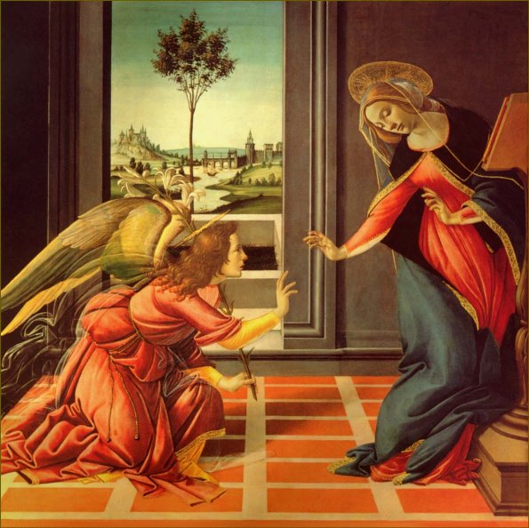
Life is full of coincidences, and for me, this has been no more proved than recently, when I have been beset by a series of overlapping coincidence. The series of greatest significance has been the one leading to this post. It started in the early Autumn, when the fading of summer led me to start feeling my familiar autumn yearnings for a trip to Paris. In part-alleviation of this desire, I started reading the aptly titled Paris Requiem, by Lisa Appignanesi, which is, on its face, a period murder mystery, but set against the historically significant Dreyfus affair. I was already aware of Dreyfus on my periphery, being as the involvement of one of my favourite authors, Emile Zola, had pretty much destroyed his career, forcing him into exile in the UK when he sought to uncover what was one of the greatest conspiracies in French history, and unveiled a disturbingly vehement level of anti-Semitism both at the heart of the French Government and within French society at the end of the 19th Century.

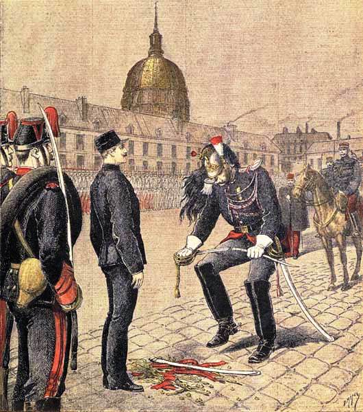
The degradation of Alfred Dreyfus

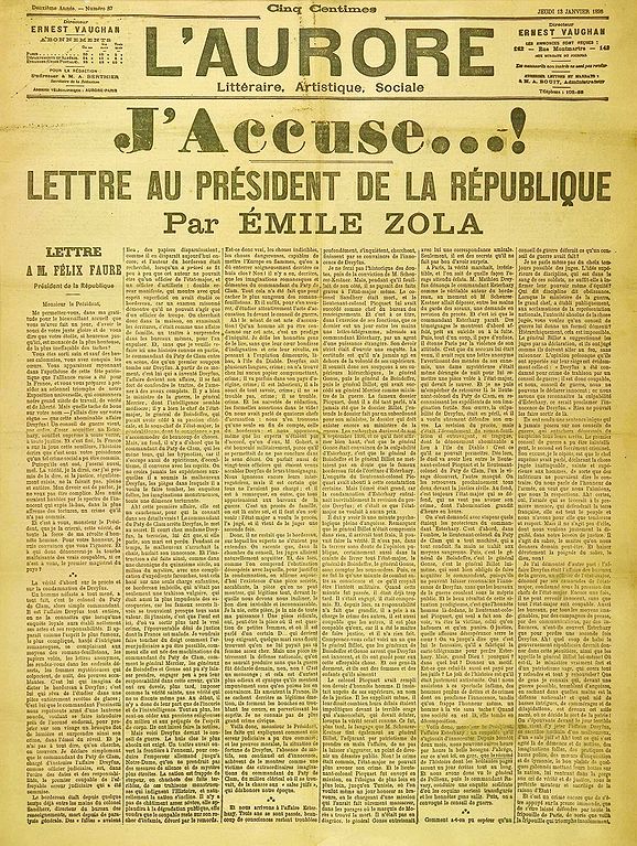
The article which incriminated Emile Zola
Then, just as I was finishing Paris Requiem, the long-awaited new novel of another favourite author, Robert Harris, was published, this book also dealing with the Dreyfus affair from the point of view of the Army Officer who uncovered the scandal and suffered his own career-breaking consequences in the process. Mid-way through the book, a new documentary series started on TV. Telling the story of the Jews, the narrator, Simon Schama, also told of this disturbing period of French History.
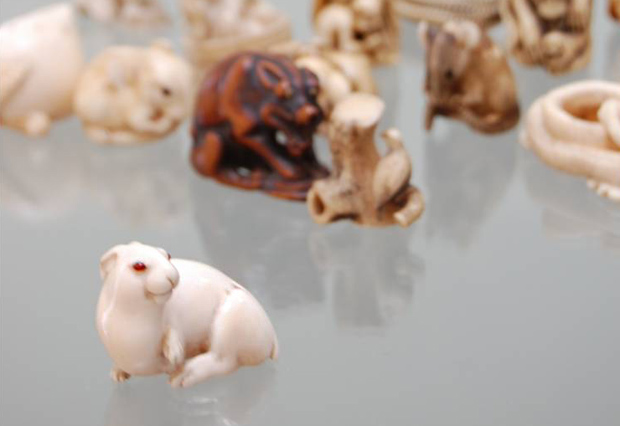
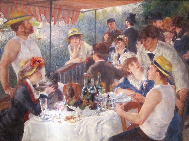
I thought the coincidences had ended there, but when I went to the National Gallery’s excellent new Viennese Portraiture exhibition, Vienna: Facing the Modern, I picked up a copy of Edmund De Waal’s The Hare with Amber Eyes in the gift shop, and thought the time had come to read this much applauded novel. So, with Robert Harris’s sensational novel, An Officer and a Spy finished, I started De Waal’s captivating family history, originally narrated by tracing back the story of the Japanese netsuke which he had inherited from his Great Uncle Iggie. Starting off in 19th Century Paris with the story of the formidable art collector Charles Ephrussi (he can be seen in the top hat at the back of Renoir’s The Luncheon of the Boating Party) who was the family member who first bought the netsuke, it turned out that, guess what, Charles too had got himself involved in the Dreyfus affair – being Jewish, his support of the innocent Dreyfus could hardly be avoided, but, like Emile Zola, Ephrussi suffered social rebuffal as a result.

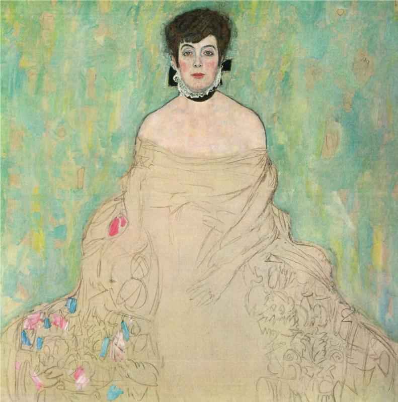
Amalie Zuckerkandl by Klimt – featuring in the National Gallery’s new show on Vienna

The Netsuke

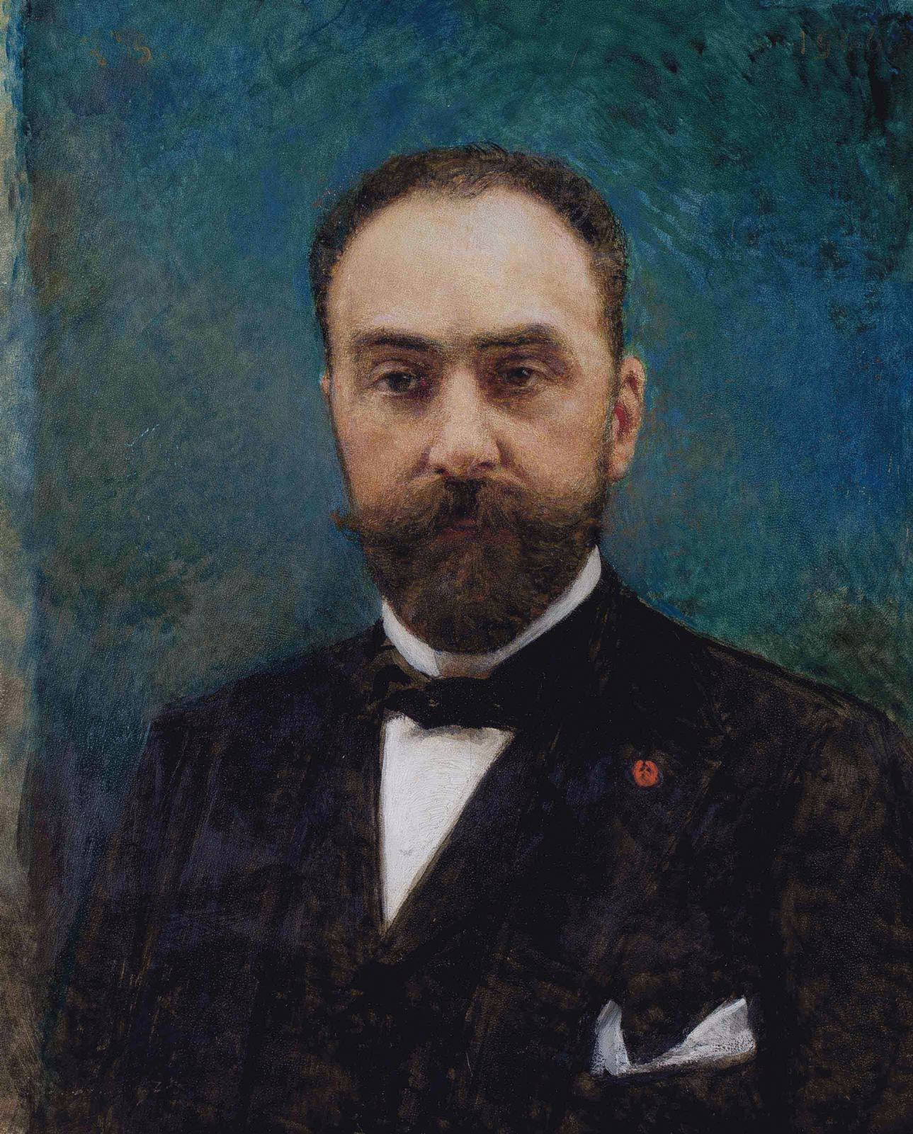
Portrait of Charles Ephrussi by Leon Bonnat

The Luncheon of the Boating Party by Renoir (with Charles Ephrussi in a top hat at the back)

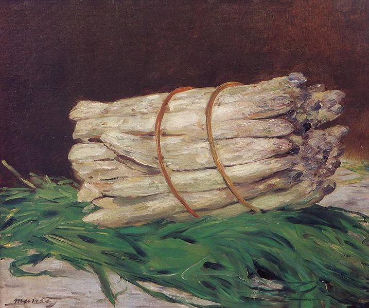
Manet’s Bunch of Asparagus (1880) – part of the significant impressionist collection of Charles Ephrussi
So suddenly, this story of Dreyfus, a Jewish scapegoat and symbol of the underlying currents of European anti-Semitism, had become a major focus, appearing, quite by coincidence, in reference after reference of both television and literary entertainment. But of course the Dreyfus Affair was only the start of the tragic scale of anti-Semitism which was to escalate in Europe, and as De Waal’s stunning book goes on to demonstrate, the horror of Europe’s anti-Semitic manifestation as the 1930s took hold was on a scale that none could have imagined in the persecution of that single man back in 1890s France.
Of course we all know the history of the holocaust and of mass-murder and injustice so unprecedented that words alone are not sufficient to describe it. But where De Waal’s book is so powerful, is that through his captivating narration of his family history, by the time the great Palais Ephrussi is ransacked by the Nazis in 1938, its art collections, along with everything else, stolen in a barefaced lawless destruction of Jewish life and liberties, you feel as though you know the family so well, have lived their history to such a degree, that reading of the exorbitant outrage, the dumfounding horrors suffered during that time actually becomes physically painful. You want to turn back the clock there and then and somehow destroy the Nazi regime singlehandedly; you want to save all of those who suffered, and put all that injustice right.

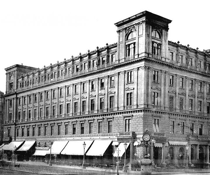
The Palais Ephrussi – ransacked by the Nazis
But history is what history was, although books like De Waal’s do an incredible job in bringing those emotions back to light. And, it is not just books which bring history knocking at the door of the present day. The last set of coincidences in this string was that in the same week as I read about the Nazi ransacking of the family art collections of the Ephrussi palace, I read an article about the biggest discovery of Nazi looted art in Munich for centuries, much of which is believed to have been stolen from some of the biggest Jewish collectors of the time, and then, but hours later, I saw that to my amazement, a TV documentary on Edmund De Waal himself was being shown on TV, a documentary which also dealt with the subject of the restitution of stolen Jewish art.
As to that documentary – that has provided its own source of inspirations which I will discuss tomorrow. But for today, what is my message? Well, not only that coincidences can happen in life, but more so that all of this reminder of the great injustices of war have coincided with today, which also happens to be Remembrance Day, when, in wearing a red poppy and marking the end of World War One, we pay our respects to those who have fought in wars throughout history, and in the present day.
Well, in paying my respects to those people this year, I will also be thinking of those who have suffered in wars, not just as fighters, but as innocent victims, families, Jews and non-Jews – the people to whom injustice was so great that history can never erase it, and words can never truly describe it. At 11am today, I will be thinking of them.


