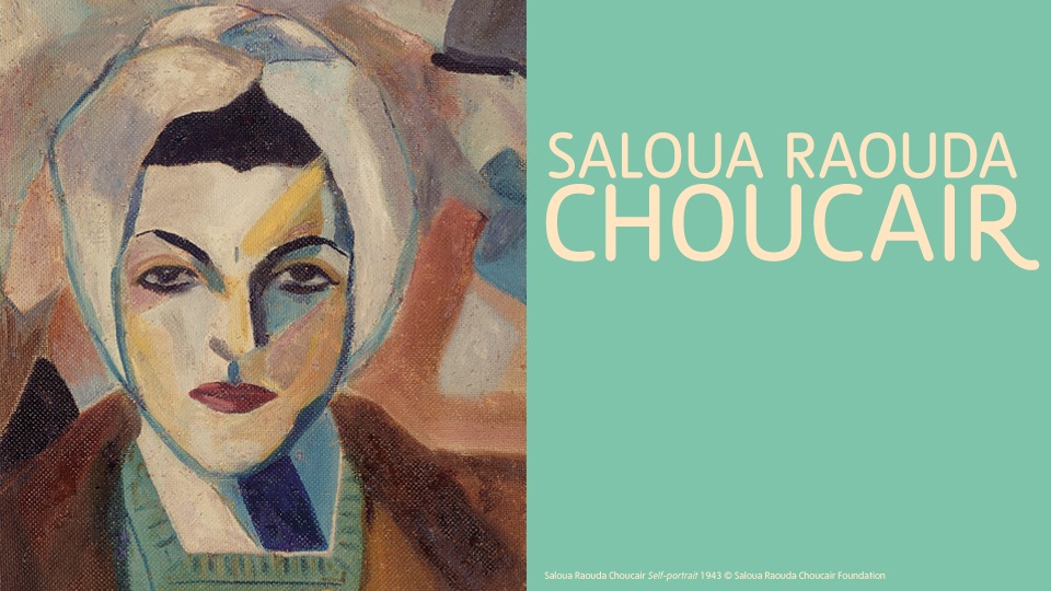
Saloua Raouda Choucair – Geometric East meets Abstract Expressionist West
I hadn’t heard of Beirut-born artist Saloua Raouda Choucair before I dropped in, unplanned, to a small retrospective of her work at Tate Modern yesterday. In fact, as the literature accompanying the show rather depressingly tells us, “despite ceaselessly producing work for the best part of five decades, Choucair remains relatively little known internationally [and]… has not yet reached her deserved position in art history”. This is undoubtedly the reason then why our paths have not crossed each other before (and, I suppose in part has something to do with the fact that her name does not exactly spring to mind all that easily). Yet the moment I walked into the four room exhibition at Tate, encouraged to do so by the vivid bright colours of her almost fauvist abstract portrait which graces the posters of the show, I was in love.
I was in love first and foremost with her paintings, largely gouache abstract compositions, with geometric forms criss crossing over each other in a multi layered colour explosion, to her Les Peintres Celebres collection, a wonderful set of group portraits, where the form of the nude has been flattened and abstracted, and the poses reduced to softened linear forms.
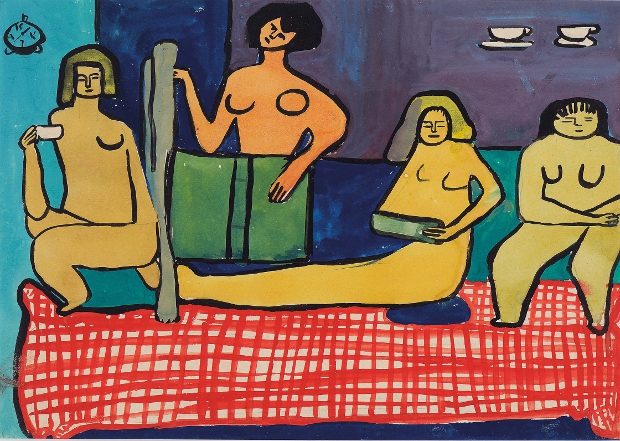
Les Peintes Celebres (1948-9) © Saloua Raouda Choucair Foundation
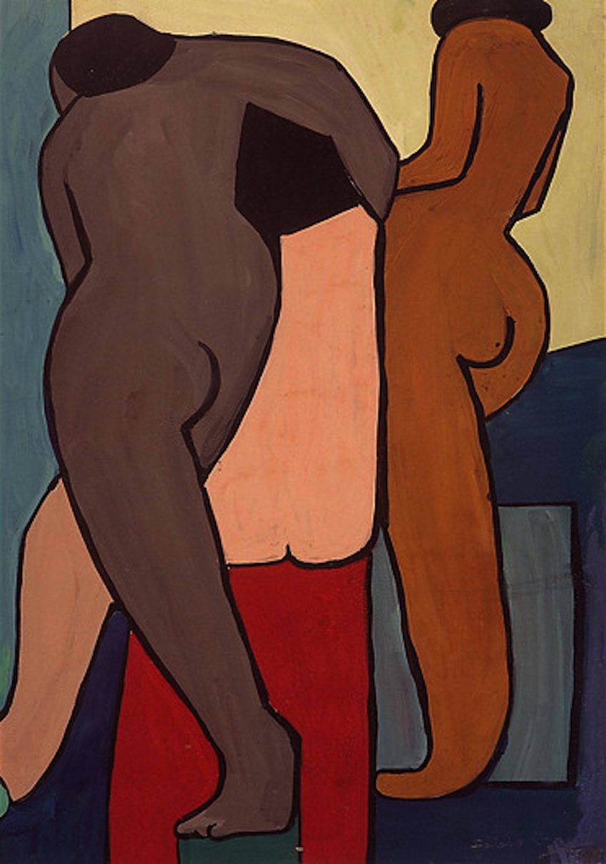
Untitled (1948-9) © Saloua Raouda Choucair Foundation

Paris-Beirut (1948) © Saloua Raouda Choucair Foundation
Choucair’s paintings very clearly demonstrate the influential hand of cubist figurative painter Fernand Léger, under whose influence she came in 1940s Paris, and yet as she moves from figure paintings to her abstract composition, you can see equally clear evidence of the extent to which she was inspired by the geometric forms of Islamic art, which had entranced her when she became acquainted with them in Cairo. These “Fractional Modules” as she calls them, were almost certainly my favourite paintings in the show. Simple shapes interwoven and multi-layered resulted in a wonderfully satisfying overall abstract form, an image so complex in its pictorial language (despite the repeated use of a single shape or form) that it reminds me of the same level of aesthetic satisfaction that can be gleaned from those stunning patterned tiles and plaster work in the great Islamic palaces of Southern Spain.

Composition in Blue Module (1947-51) © Saloua Raouda Choucair Foundation

Fractional Module (1947-51) © Saloua Raouda Choucair Foundation

Rhythmical Composition in Yellow (1952-5) © Saloua Raouda Choucair Foundation

Composition with Arcs (1962-5) © Saloua Raouda Choucair Foundation
However in addition to the paintings, I also loved Choucair’s sculptures, which became her main preoccupation from the 1950s onwards, and into whose multi-dimensional forms the language of abstract expressionism has translated. Her works often reminded me of British greats Moore and Hepworth, particularly her use of strings strung across her metal sculptures to form rounded ephemeral planes. But I loved in particular her “poem” works – like a pile of bricks but each somehow melting under the tender hands of their mother-sculptor, curving into one another in an organic embrace.
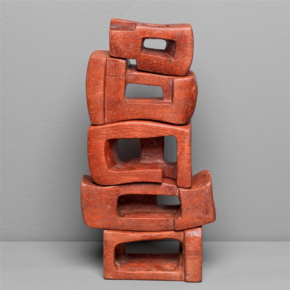
Poem (1963-5) © Saloua Raouda Choucair Foundation
Dual (1978-80) © Saloua Raouda Choucair Foundation

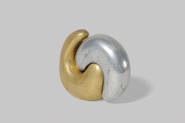
The screw (1975-7) © Saloua Raouda Choucair Foundation
But perhaps the most powerful piece in the exhibition is Two=One (1947-51), one of Choucair’s painted compositions which had been hanging in her Beirut flat when a bombing raid rained down on the city during the Lebanese civil war in the 1980s, resulting in glass from one of her cabinets smashing and piercing the surface of this abstract painting. Thus the painting bears witness not only to that history, but, as Tate puts it, to the “circumstances through which Choucair not only survived, but continued to work with energy and enthusiasm”. Hopefully, with this superb exhibition hosted at the very heart of the Britain’s art capital, Choucair’s enthusiasm will finally bear fruit as she becomes recognised as an internationally important abstract artist, under whose skilful guise Eastern islamic geometry met with western Expressionism with stunning results.

Two=One (1947-51) (complete with hole at its centre) © Saloua Raouda Choucair Foundation
Soloua Raouda Choucair is on at Tate Modern until 20th October 2013.