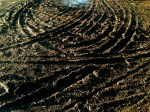
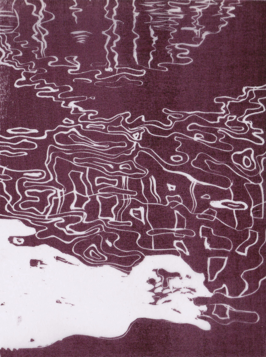
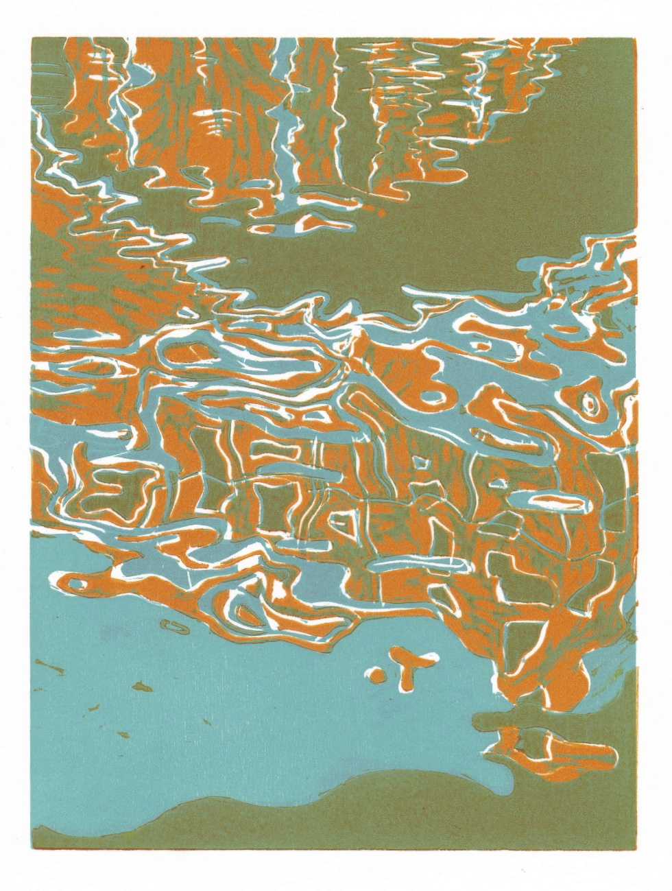
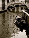
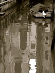
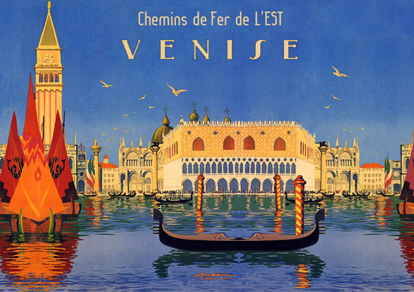
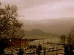
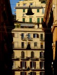
Ripples 2: Venice (Rio della Guerra)
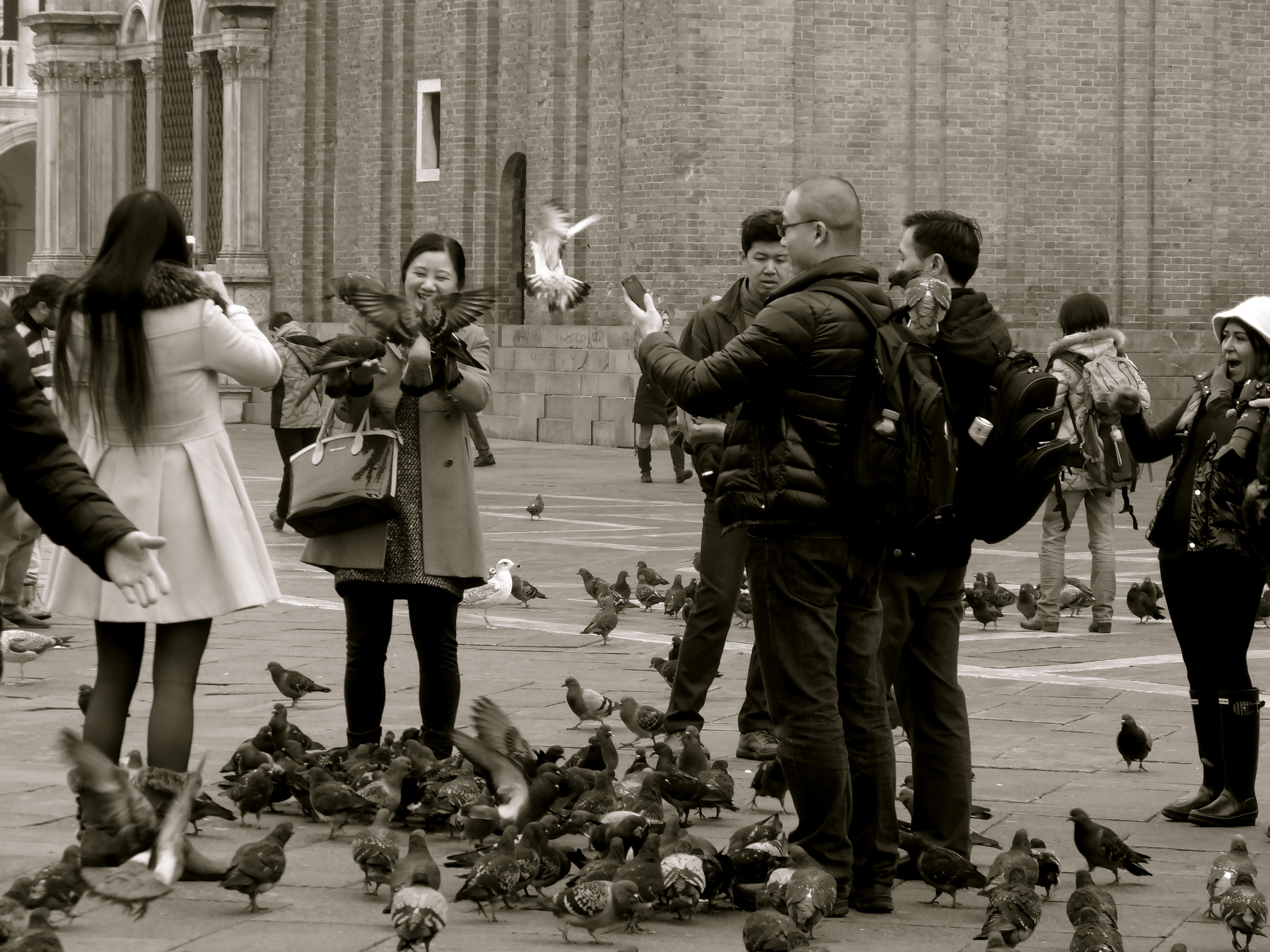
With my solo exhibition fast approaching, I am going full steam ahead in an attempt to get my collection ready for its big unveiling this May. Not only am I working concurrently on three oil and acrylic canvases, but I also have several gouache works, a new woodcut edition, and old woodcut edition, a new etching and several Norm sketches on the go. It’s a daunting task trying to get all of those works completed in less than 3 months (with the fact that I work full time as a lawyer also being something of an issue…), but I am happy to say that the factory process is in full flow, churning out the works at a steady and pleasing pace (factory = me). As if by way of demonstration, this week I will be sharing not one, but two new paintings with you – one which sees the completion of an ambitious canvas which I started way back last summer, and the second, today’s, which I begun only a few weeks ago.
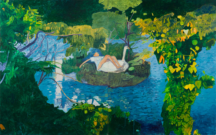
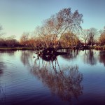
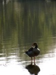
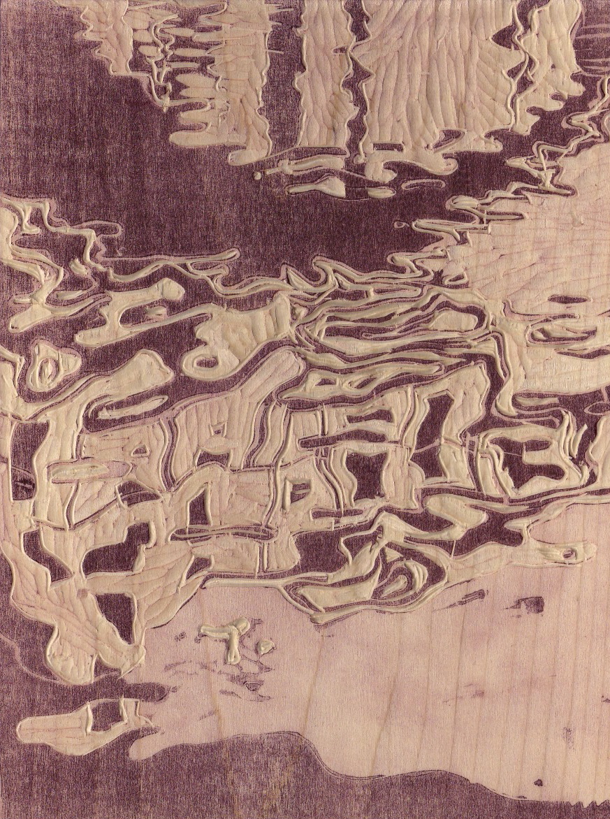
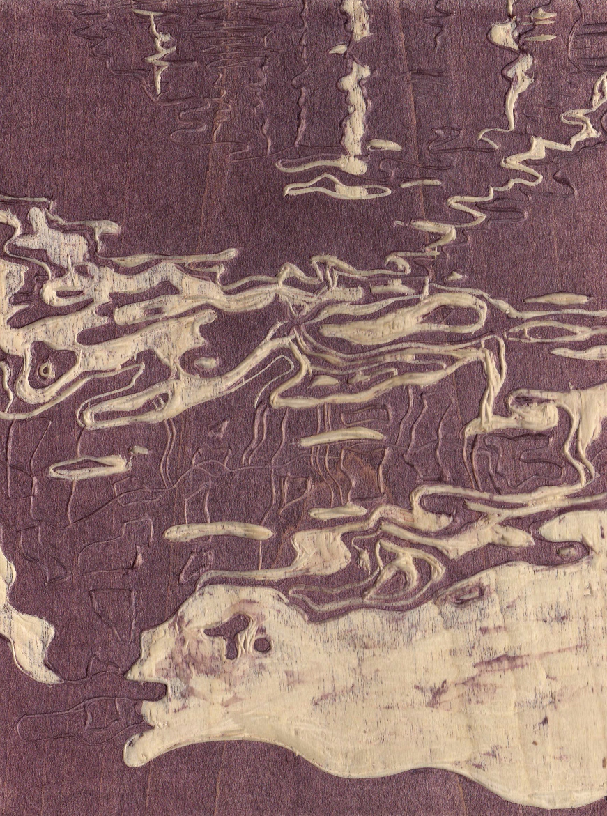
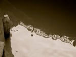
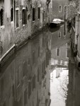
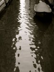
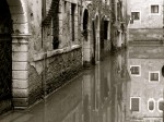
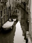
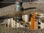
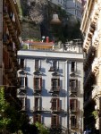
Yes, hot on the heels of my Natale Italiano posts, and my obsession with the abstract forms created by rippled water, as subsequently demonstrated in my posts on ripples photographs, paintings, my recent woodcut, and in the first of my new gouache ripples collection, I now present the second gouache painting of the series: Ripples 2: Venice (Rio della Guerra).

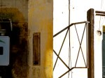
Ripples 2: Venice (Rio della Guerra) 2014 © Nicholas de Lacy-Brown, gouache on paper
As with the first piece, this painting focuses on the rippled reflection, rather than showing both the reflection and the scenery it reflects. Focusing on the ripples rather than on the real world above them means that the viewer is left with the more abstract image which nature creates, causing one to question what is actually being shown in the image when seen at a first glance. Is it just an unplanned abstract image, or something more illustrative? It is only after some time that you then realise that what this painting shows is the underside of a bridge, an iron railing, and a building punctuated by windows behind it, albeit rippled into a charmingly haphazard abstract form.
I’m so excited by the prospect of a world in ripples that I could go on painting them forever. The only trouble is, I don’t think they’ll actually be on show at my solo show in May, which means I should really start concentrating on other works. As to which – come back a little later in the week, to see the work which will be central to my solo exhibition in May.
Until then, have a great week.
© Nicholas de Lacy-Brown and The Daily Norm, 2001-2014. Unauthorized use and/or duplication of the material, whether written work, photography or artwork, included within The Daily Norm without express and written permission from The Daily Norm’s author and/or owner is strictly prohibited. Excerpts and links may be used, provided that full and clear credit is given to Nicholas de Lacy-Brown and The Daily Norm with appropriate and specific direction to the original content. For more information on the work of Nicholas de Lacy-Brown, head to his art website at www.delacy-brown.com