Skip to content

The Daily Sketch ITALIA – Norms in Venice

The Daily Norm’s Italian season has officially kicked off, and as such is just another of the infamous PIIGS (Portugal, Ireland, Italy, Greece and Spain – the woe of the EU) which is getting the whole-hearted support of my blog. And of course, where The Daily Norm goes, so too must the Norms themselves, and this week you can join these little white blobs as they traverse the boot of Italia itself, bouncing from one destination to another, making their own “Grand Tour” through the country’s most famous sights.

It may make sense to go from South up to the North in the hope that as the summer months heat up, the Norms can catch the cooler breezes of Northern Italy as the days of July tick along. But Norms don’t really think logically, and as they don’t have feet, let alone legs, they can hardly be counted upon to understand the best way to navigate Europe’s most famous boot. The Norms therefore have started off in the North of Italy, and where best to commence their tourist trail, than in La Serenissima herself, undoubted Queen of the Adriatic, Venezia.

We join the Norms as they sample, as every well-moneyed tourist should do (I note at this point that I have never been able to afford the great privilege of a gondola ride, although I have used the vaporetto, the London bus equivalent of the stretch limousine), the glory of the Grand Canal by gondola, floating gently along this main watery artery of Venice, under the city’s most famous bridge, the Rialto. Need I say more? Welcome to Venice…

Norms in Venice (2012 © Nicholas de Lacy-Brown, pen and ink on paper)

© Nicholas de Lacy-Brown and The Daily Norm, 2001-2012. Unauthorized use and/or duplication of the material, whether written work, photography or artwork, included within The Daily Norm without express and written permission from The Daily Norm’s author and/or owner is strictly prohibited. Excerpts and links may be used, provided that full and clear credit is given to Nicholas de Lacy-Brown and The Daily Norm with appropriate and specific direction to the original content.

Sunday Supplement ITALIA – Tuscany Wharf: 15km to San Gimignano

It’s ITALIA Season on the Daily Norm, celebrating, for at least two weeks, everything that’s fantastic about Italy. And to kick of the season, here on the Sunday Supplement, the weekly showcase of my art, I am featuring my 2010 painting, Tuscany Wharf: 15 km to San Gimignano. 

I was inspired to paint the scene when my Partner’s family and I were driving through the incredibly beautiful green and golden rolling hills of the Tuscan countryside. The journey, from Donoratico down on the coast up through the hills, past Volterra and on to San Gimignano involved so many curves and bends and meanders through the Tuscan countryside that when we reached a road sign advising us that after around 90 minutes of said meandering, we were finally within 15 km reach of our final destination, my Partner, whose face was very green by that point, breathed a huge sigh of relief, or as much of a sigh as could be mustered after a double dose of very soporific travel sickness tablets.

As we approached San Gimignano, a UNESCO world-heritage protected town, famous for its collection of medieval towers which grew taller with each new construction as rich merchant families sought to compete with one another, the view was better than ever. Approaching the town from some distance, seeing the iconic towers gradually emerging from behind the brow of a set of undulating hills, was quite a sight, and one which I have attempted to capture in my painting, which celebrates all the beauty of the Tuscan countryside from rows of perfectly lined up vineyards and golden fields with rolled up hay, to the curly-wurly road itself, rising and falling over and around the crests of hills, lined by cypress trees and Italian pines.

However what makes this representation of Tuscany different is that sliced through one part of the landscape is a vertical insight into another world. It’s industrial Northern England, a scene with such industrialised toxicity that the smoke bellowing out from the factory chimneys pour into the Tuscan scene, filling turquoise skies with a decided collection of clouds. The English scene, which was inspired by the works of L. S. Lowry, was inserted by way of marked contrast to the beauty of the Tuscan scenery. However both scenes appear to be in sync, as if they represent the same geography in a parallel universe. Where the tuscan hills roll upwards, the english scene follows the same trajectory, with a row of cramped terraced houses following the same incline of the Tuscan hill. Where in tuscany there is a round bail of hay, in the English scene, the bail of hay is replaced with a cylindrical oil container. Similarly the roses, planted next to a vineyard so the grape grower can detect disease early, is replaced by the barbed wire keeping trespassers off the industrial site. Thus it is that the two landscapes appear inescapably conflicting, and yet coexisting in perfect union.

Tuscany Wharf (15km to San Gimignano) (oil on canvas, 2010 © Nicholas de Lacy-Brown)

© Nicholas de Lacy-Brown and The Daily Norm, 2001-2012. Unauthorized use and/or duplication of the material, whether written work, photography or artwork, included within The Daily Norm without express and written permission from The Daily Norm’s author and/or owner is strictly prohibited. Excerpts and links may be used, provided that full and clear credit is given to Nicholas de Lacy-Brown and The Daily Norm with appropriate and specific direction to the original content.


My urban balcony garden

When you live in a city, like I do, here in the big smoke of London, every inch of greenery becomes important. When I travelled down to Glyndebourne the other day, surrounded by all of those lush green hills, and the conspicuous silence interrupted only by the occasional sheep cry, it made me realise just how lucky rural dwellers are to be surrounded by that constant beauty and tranquility. Yet it is only human nature not to appreciate what we have when we’ve got it. For all I know, the residents of those sussex country manners probably envy we Londoners who have the whole cultural world right on our doorstep.

I do like to count my blessings however, and I actually think writing a blog, which encourages one to reflect more on one’s life, making the most of occasions, events and opportunities for the sake of sharing and recollecting interesting and unique snapshots of life, makes us bloggers appreciate life with a renewed vitality and a very sharp focus. And one thing that I have always appreciated, albeit perhaps more so as my time living in London grows longer and my hours of work increase, is the green space around me.

The centre of this flower looks like little dancing aliens

My favourite photo – looks like the ant has cottoned on to my presence

I may only have a balcony to exhaust my green fingers, but that balcony, which runs along the front of my entire flat, is my pride and joy. There is much to be said for the urban balcony. Not only does it help to make urban life more bearable, more colourful, and more sensorily enriched, but also helps to give nature a bit of a kickstart – there have, for example, been reports of huge rises in the numbers of urban dwellers keeping beehives, so many in fact that there are now a surplus of bees for the numbers of suitably pollinating flowers available across the city. I don’t have bees, but what I have created on my balcony is my own piece of tropical paradise. I’ve surrounded my small table and chairs and my all important sun lounger with my own little slice of Spain. There I have a large brugmansia (whose flowers are spectacular bell-shaped blooms which smell glorious at night – they’re not out yet but rest assured, I will share on The Daily Norm once they are), a passion flower, an olive tree, grasses and plenty of geraniums. I’ve also encouraged honeysuckle to grow up the wall, and this year, for the first time, introduced some strawberries into the mix.

Because my urban balcony garden is a natural extension of my lounge which has a very contemporary red, black and white colour scheme, I have attempted to continue that out onto the balcony, with modern galvanised steel planters, and plenty of vivid red geraniums, which mark a wonderful contrast against the building’s crisp white washed walls and the black and grey grasses I have planted intermittently amidst blood-red cala lillies and those red-burst strawberries.

So without further ado, here are some focused shots of the plants which are currently thriving on my urban balcony garden.

Whether you’re a city-dweller or otherwise, I strongly recommend you import some plants into your life – even if it’s only a window box hanging out of the window. The introduction of plants always creates a new geometric mix into any design scheme, bringing curves and floral bursts into often boring square buildings, which are enhanced further as day turns into night, and interesting plant-shaped shadows dance across the surfaces of your home. Whats more, as a plant grows and changes with the seasons, your home too will adapt to the altering cycle of the year, and as the plants rise and fall, you will find a great sense of achievement in tracking their story and progress in your home (just remember to water them, occasionally!)

© Nicholas de Lacy-Brown and The Daily Norm, 2001-2012. Unauthorized use and/or duplication of the material, whether written work, photography or artwork, included within The Daily Norm without express and written permission from The Daily Norm’s author and/or owner is strictly prohibited. Excerpts and links may be used, provided that full and clear credit is given to Nicholas de Lacy-Brown and The Daily Norm with appropriate and specific direction to the original content.

Palmiers for coffee-time – baking doesn’t come easier than this

I’m the first to admit that I am guided throughout the day by sugary treats and a healthy dose of caffeine. In the mornings I look forward to 11am, around which time I make a fresh frothy cappuccino in a vintage cup with a little treat on the side. In the afternoon meanwhile I long for my earl grey tea with a little cake, and a cleansing green tea a little later. In the evenings I go for my favourite: a fresh mint tea, or jasmine, the smell of Spanish summer, and try to resist something a little naughtier on the side.

Ok, weight-watchers this isn’t, but a giver of easy baking tips – I’m your man. The other day, I bought a roll of puff pastry from the supermarket intending to make some crayfish puff pastry treats but then couldn’t get the crayfish or anything remotely similar. So the puff pastry was sitting in the fridge and I suddenly thought to myself – hmm I should make palmiers.

Palmiers get their name from the humble palm leaf (which, somehow, they are meant to resemble) – other people call them elephant ears (probably more accurate). In Spain we call them palmeras, were they are a staple of most patisseries and cafes either glaceada (with icing) or con chocolate. Either way, they are a delicious treat and seductively simple to make.

Simply take some shop-bought buff pastry (no point in making this from scratch – hours of labour will commence for the same results) and in a cup mix up about 100g caster sugar and a heaped teaspoon of ground cinnamon. Roll out your puff pastry if it’s not rolled out already, and sprinkle generously with some of the sugar mix all over. Then fold over, roll out again, and sprinkle with some more sugar. Do this a few times until the sugar is sort of combined (it doesn’t really combine into the pastry all that well, but not to worry – you’ll sprinkle more on at the end). Then roll your pastry into a large rectangle around 12-14 inches in length and 10 inches in width.

To get the palmier shape, role the pastry along the longest side until it reaches the middle of the rectangle and stop. Then do the same with the other side, rolling into the middle until the two halves meet. Place the result in the freezer for about 10 minutes so the pastry can firm up a bit for cutting. Take the pastry out and cut into slices about half an inch thick and lay them on their side (i.e. curly pattern face up) on a baking tray, leaving a little space around each for puffing. Sprinkle them all with a little more sugar (though not too much as I went a bit mad and mine turned out uber-sugary) and bake in an oven at around 200 degrees celsius for around 10-15 minutes until they are puffed up and golden and the sugar has melted on top.

And that’s it! Leave a few minutes to cool down and you have the perfect coffee-morning treat.

PS: I should add, if you don’t like cinnamon, just leave it out. You can also make these without sugar, and dip them in chocolate at the end. You can also make savoury versions by rolling cheese into the puff pastry and then using them as bases for canapes. The world is your oyster.

A night at Glyndebourne Part 2: Damp Grounds; Delicious Dinner

When you attend the opera in most theatres, doors will open half an hour before. No sooner have you arrived that the bell will go and you’ll hurry to your seats. The interval will provide at most, the opportunity for a rushed glass of something bubbly before your brisk return into the theatre again for the second half. Once the curtain goes down, it’s home as quick as your legs can carry you, avoiding the waves of leaving attendees wherever possible.

Going to see an opera at Glyndebourne is very different. It’s an event; it’s practically a day trip. Before the start of a performance, you can stroll around the grounds, walk around the dammed stream and look at the sheep, enjoy a glass of champagne on a bouncy lawn, or take high tea in one of the restaurants. There is even a small art gallery in the basement of the opera house for your entertainment, and walled gardens bursting with multi-coloured blooms. When it’s finally time for the Opera to begin you watch the first half followed by an interval of 80-90 minutes. It’s during this time that the spirit of Glyndebourne really comes alive, as picnics, already set up by opera-goers all over the perfectly maintained grounds are enjoyed, with time to sit back, sup, and discuss the first half of the performance.

A dammed stream in Glyndebourne’s extensive grounds

It’s the picnics that are, for me, emblematic of Glyndebourne, and offer a wonderful insight into a slice of English society. It’s hilarious to see how people subtly compete with one another. Far from picnicking out on a mere blanket, the Glyndebourne picnickers bring practically their whole dining room with them. They’ll be those who bring a fold up table and deck chairs which are fairly easy to carry and unpretentious. Of course they’ll have a Fortnums hamper with them, but then who doesn’t? They’ll be the ones with the plastic plates and food wrapped up in foil. But on the table next door they’ll be no such shortcuts. For those proud picnickers, the presentation of the picnic is a status symbol. So they bring chairs which are sturdy and firm. Their table is covered by a linen tablecloth with matching napkins. They’ll bring china plates and glass champagne flutes. And who could picnic without a crystal vase of flowers to set off the contents of the table? I wouldn’t be surprised if some of these picnickers bring a Butler too. I adore the charming pretention that comes with these picnics, seen equally as guests vie for the best spot on the grounds, marking their claimed territory with grand extensions of blankets and umbrellas, huge picnic baskets and other tokens of home. All done of course with a broad smile and exchanged pleasantries with the picnic table next door.

Flowers in the walled gardens

Sadly, of my four trips to Glyndebourne, I have never once been able to picnic in the grounds. I’m clearly cursed, as on each of my visits, it’s been either raining, perilously windy, or both. Such is the instability of the English summer. On good days it must be amazing in those grounds. Sadly I am yet to find out. On this visit my mother and I had long given up the hope of picnicking. We were travelling from London with minimal time to prepare, so we booked a table at the Middle & Over Wallop restaurant. As the day approached, we did not regret our decision. True, the rain just about held off, but with a keen wind and grey skies, picnicking conditions were not ideal. Yet still the majority of guests braved the conditions and stuck with their picnicking plans – another apt demonstration of Englishness – to stick it out, no matter what.

For we, perhaps more cynical diners, the Middle & Over Wallop restaurant, run during the season by Leiths with chef Albert Roux overseeing operations, provided a delicious mid-Opera feast in opulent surroundings (the restaurant must be hung with about 50 or so separate chandeliers) which was, most importantly, cosy and dry. What with time being on the short side, everything was chosen in advance, so a swift service was guaranteed.

The Middle and Over Wallop Restaurant

We both started with Hure of organic salmon, smoked salmon, crab and quail egg with watercress dressing. That dressing was light and peppery, and the smoked salmon delicate and moist. It was a fairly simple arrangement but full of flavour.

Next up for me was a blanquette of veal with mint, baby onions, Chanteney carrots and basmati rice. It was exquisite. The cheesy crumb on the top of the veal was to die for, while the meat just fell apart under my knife. Meanwhile my Mummy had a loin of Cumbria fell bred lamb wrapped with saffron couscous, and cumin rataouille. She too was aptly impressed, and this once can even be recreated at home – bonus!

Blanquette of Veal

Saffron couscous encrusted lamb

Dessert was a raspberry triple – a millefeuille of Kent raspberry, raspberry mousse and raspberry coulis. It tasted as good as it looked.

The raspberry triple

Luckily the food, while swiftly served, was light with fairly small portions – I was wearing a waist-repressing cummerbund after all!

So you see, Glyndebourne ain’t all about the Opera – it’s very much an occasion, and one which I cannot wait to repeat again. You never know, next time the sun may actually come out, and I might get to enjoy that picnic after all. But just watch me coming fellow picnickers if I get out on that lawn. Competitive is my middle name.

A night at Glyndebourne Part I: The Opera – Puccini’s La bohème

There is nothing quite so wonderful as a summer evening at the opera. Don’t get me wrong, opera can be pretty cosy in the middle of the winter too, but there is something about the combined smells of champagne, Pimm’s and fresh grass, the swish of long luxurious dresses against the green tints of summer, and the descent into long, light evenings at the end of the performance that make summer operas a wholly more enchanting affair. And no where is this more true than at the Glyndebourne Opera House in East Sussex.

Glyndebourne opera house

Ekaterina Scherbachenko as Mimi (Photo: Robert Workman)

Growing up in Sussex, I was always aware of an aura of elegance surrounding Glyndebourne. Most summers, my parents would suddenly emerge from their bedroom exceptionally smartly dressed, my father in black tie, and my mother is taffeta and jewels. They would engage the babysitting services of my grandmother while they headed off to Glyndebourne, with a picnic basket in hand and some fold up furniture to boot. A few years later, when old enough to properly appreciate the occasion (and thus not waste the exorbitant ticket prices) I was lucky enough to make my first trip to Glyndebourne. The place astounded me. It has to be one of the most idyllic settings I have ever set my eyes upon. A lush green landscape of rolling hills, a field echoing with the gentle calls of sheep, a stream surrounded by willows, and in the middle of it all, an architecturally thrilling opera house – part modern, a stylish round red-brick creation, and part old manor house. Even now, with their new ultra-environmental wind turbine installed, the place is a feast for the eyes.

Christmas festivities at the end of Act II (Photo: Robert Workman)

A night at Glyndebourne opera is almost like stepping back in time – as people dress up to nines, with a  strict dress code of black tie and formal dresses being unanimously imposed, and the opera-goers sit out on the lawn with picnics set up, not just on rugs, but with furniture imported (some even bring tablecloths and vases of flowers!) – the whole occasion appears to represent a last bastion of civilised society – utterly polite, completely sophisticated and awfully quite “English”.  There’s much to say about all of this, and in tomorrow’s post I will tell you all about the dining at Glyndebourne. But for today, I’m sticking to the opera which was the pull of our visit in the first place – Glyndebourne’s 2012 performance of Puccini’s La bohème.

Mimi in her last moments (Photo: Robert Workman)

The opera is familiar to many opera-lovers. It doesn’t contain some of Puccini’s most memorable arias, but the score is at all times opulent, dramatic and pretty stirring throughout – at times it was almost stressfully upsetting. The story, based on the book by Henri Murger which was in turn brought to life by librettists Illica and Giacosa, is a simple, and now well-known tale – the story of an impoverished writer in Paris who falls in love with an equally penniless heroine who then dies from tuberculosis leaving said writer devastated right at the moment when the curtain falls. Lovers of Baz Luhrman’s Moulin Rouge will probably recognise the story – it was, after all, based on Murger’s tale. It’s a simple tale of love in a cold climate, where passion provides the only warmth, and attempts to transcends the ravages of poverty only to then fall victim to the destruction of an incurable illness which only poverty, and desperation could have caused. It’s highly tragic, but utterly romantic, and all of this is helped of course by the intended backdrop of the winding-streets of Paris’ idyllic, cobbled Latin Quarter.

Michael Sumuel, David Lomeli, Andrei Bondarenko, Nahuel Di Perro (Photo: Robert Workman)

Move to Glyndebourne’s production however, originally directed by Davud McVicar and now revitalised for the 2012 festival, and the setting has been transported not to the Marais or Montmartre, but to London’s tatty present-day Soho. Thus we have policemen running after thieves, road sweepers, security men, Christmas shoppers adorned with bags from Harrods and Selfridges, and even what looked like the entrance to the underground. It’s a bold move which isn’t overly consistent with the libretto, which continues to talk of the view of Paris rooftops, nor the rousing drama and opulence of the score. However it is at least a novel retelling of the story – it’s just difficult perhaps to get all romantic about the lovers, Rodolfo and Mimi, when Rodolfo is dressed in a hoodie, and Mimi in jeans. But as David Cameron would have it, we should all be “hugging hoodies”- so why not stage them in a opera too?

David Lomeli as Rodolfo and Ekaterina Scherbachenko as Mimi (Photo: Robert Workman)

While the tatty studio flat of Rodolfo and his artist friend, full of rubbish and constructed from what resembles crumbling concrete and steel, isn’t exactly easy on the eye, the sound emanating from the opera singers themselves was certainly easy on the ears. David Lomeli as Rodolfo produced an incredible, rich and rounded sound – his aria in Act 1 (Che Gelida Manina – Your Tiny Hand Is Frozen) was exquisite and immediately had my eyes filling up. Meanwhile, Ekaterina Scherbachenko made an equally credible Mimi, with the earnest demeanor and visible courage expected of the character, but it was a little disconcerting when, upon completing her first aria with Rodolfo, she suddenly trailed off just before the top note – I wonder whether she tripped down a step when heading off stage?! High praise has to be reserved for Irina Iordachescu as Musetta who played the cocky femme fatale with swagger and style, greatly enhanced no doubt by a pair of Louboutin boots and a very sparkly top.

Irina Iordachescu as Musetta and Donald Maxwell as Alcindoro (Photo: Robert Workman)

The orchestra sounded wonderful throughout, although at times the cast struggled to hold their own against the rousing crescendos of the score. We also had the benefit of being able to see the orchestra from our seat on the circle, which greatly enhanced the overall experience – at least when I could see them. For the problem , but also the great attraction of this opera is that it is so bloody sad, with the inevitable result that my eyes were constantly blurring with tears. As if it wasn’t bad enough that the superb resonance of David Lomeli’s aria had me crying in Act 1, the end of the opera just completely devastated me. I found it so utterly traumatic that I struggled to talk for about 5 minutes after the curtain came down. Which just goes to show, London or Paris, top hat or hoodie, when you get a good orchestra, a good conductor and great singers, Puccini’s score has the enduring power to stir up its audience and tap into the rawest of emotions, taking them on a rollercoaster with a power to enthrall, charm, and ultimately, upset. Now that’s true operatic genius, and it is a genius which the Glyndebourne experience helped to enhance to new levels of dramatic intensity, with a dash of pleasing english reserve to boot, naturally.

Mimi: close to death (Photo: Robert Workman)

La bohème is on until 31 July – try to get tickets – if you can. 

Celebrating all things radiant in RED – a photographic homage to Louboutin

It was only yesterday that I was extolling the virtues of all things red. That vibrant, rich colour, instantly attractive to the human eye, seducer of souls, seller of sex, and now the renowned glossy seller of stilettos in the form of Louboutin’s red-soled masterpieces. And it is in homage to that said innovative shoe-maker-to-the-chic that I have taken inspiration from the rosiest, most ravishing reds I could find, scanning through my photos and picking out some of my favourite photos which all have that rich, vibrant colour in common. Welcome to my world of Red…

© Nicholas de Lacy-Brown and The Daily Norm, 2001-2012. Unauthorized use and/or duplication of the material, whether written work, photography or artwork, included within The Daily Norm without express and written permission from The Daily Norm’s author and/or owner is strictly prohibited. Excerpts and links may be used, provided that full and clear credit is given to Nicholas de Lacy-Brown and The Daily Norm with appropriate and specific direction to the original content.

It’s all in the Sole: Christian Louboutin celebrates 25 years at London’s Design Museum

Glossy red lips, emblematic red telephone boxes, and the sumptuous vivid spiraling red of a voluptuous red rose. There is something about red which strikes a devilishly powerful impact. In fact scientists declare that red is the colour most instantaneously attractive to the human eye: and it’s true. Look around a room, survey the rainbow of colours and shades all around you, and the first colour you notice will always be red. No wonder then that throughout the ages, it’s the scarlet woman, the red lights of shady backstreets and the unctuous red-painted lips of Hollywood prima donnas that have become so indubitably emblematic of seduction, attraction and the height of munificent glamour.

No wonder then that when one, previously unknown French Cameroonian son of an ébéniste (ivory wood carver) turned shoe-maker decided to place a seamlessly lacquered vivid red sole on the bottom of his women’s shoes, he became an instant hit. When you see a woman in high polished black stilettos sauntering down the street, and as her shoes lift with each step, you see a hint of glossy red, you know that the woman has taste – instantly glamourous, emblematic of sexy chic and seductive sophistication, that red sole can only mean one thing, and have only one maker – it’s a work of art, and it’s made by Christian Louboutin.

Fetish shoes

Yes, Louboutin, iconic French designer and the man who made red soles his signature, is now celebrating an illustrious 20 years of shoe design, during which time he seized the shoe, and in particular the daringly high stiletto, and lifted it into a new ascendancy of design significance, when, through darlingly innovative designs, and unhindered imaginative genius, he made the shoe the star of the show, as well as the means to make a woman’s legs, and figure, beautiful.  Such is the theatricality of his designs, that it comes as no surprise that in celebrating 20 years of iconic shoe design, London’s Design Museum on the South Bank has put on the show of all shows, like a retreat into the cabaret of 1900s Paris at the Moulin Rouge, as a vast illuminated stage, a playground carrousel, and a garden of delights play host to shoes and only shoes, singled out and exhibited in all their fantastically original glory.

The Dita Von Teese hologram

The exhibition exudes the playfulness of Louboutin. At its centre is a wonderfully raunchy Hologram video of the deliciously sexy Dita Von Teese, herself spectacularly bedazzled in a pair of sparkling diamond-encrusted Louboutin’s, demonstrating just how seductive a woman in these shoes can become. Meanwhile at the back of the show is a den of iniquity, a naughty display of fetish shoes designed to push a woman to the maximum of pain and pleasure and panda to every man (or woman’s) every sexual desire when shoes are their ultimate proclivity. I loved the little garden, when crazy platformed shoes were displayed like fantasy creatures in Alice’s wonderland, and the recreated studio of Louboutin himself, where a vast array of objects, instruments and other paraphernalia provide daily inspirations for his ingenious creations.

But amongst all of this showmanship, let us not forget that the stars of the show are the shoes – and there were so many beautiful designs it’s hard to choose from amongst them. But being something of a magpie, I was instantly attracted to all those which sparkled, while the delicate sophistication of shoes and boots covered in lace held a particular attraction. But amongst all of these design gems, from hugely built-up platform boots, with corset-style laces crisscrossing up to the thigh, to sleek yellow open-toed stilettos bursting with tropical flowers, perhaps one of my favourites was the most understated of all, the simple, sleep shiny black stiletto, albeit with that trademark red sole and a frighteningly high 5 inch heel.

The shoes amazed, the red soles seduced, and the diamonds and studs aplenty dazzled, yet when I left the exhibition, I still came out wondering why and how Louboutin had hit upon the red sole that has become his signature. How did he stumble upon it? What was his inspiration? All of this goes unexplained in the history of Louboutin’s 20 year retrospective, and at £125 a pop, I wasn’t about to put my hands in my pocket and pay for the vast (and admittedly very beautiful) exhibition catalogue to find out. Besides, I was too busy trying to escape from the unnecessarily copious groups of “girly” women, giggling all over the place and drooling over shoes they could barely ever afford, enjoying themselves far too much and occasionally yelping as though on a hen night. This is art darlings, take your window-shopping to Aldo.

So why is Louboutin worthy of my praise? I am after all a man. I’ve never worn a stiletto, let alone owned one, and, unless I undergo some kind of hither unanticipated breakdown in my life, never intend to. Well the answer is simple – it’s because Louboutin has suspended his shoes into a design ascendancy which goes way beyond dress choice. These shoes are art, pure and simple, and best seen encircled by a spot light, up on a little stage or under a glass cloche where they belong, preferably sans foot, sans sweat and definitely sans ground surface to scratch that perfect lacquered red sole.

Christian Louboutin is on at the Design Museum, Shad Thames, London until 9 July.

Summer Exhibition at the RA: How a private view can make the mediocre marvellous

I’ve said it before, and I’ll say it again: When the viewing conditions are right, even the most mediocre of art can appear wonderful. When your mood is carefully massaged by fortuitous circumstances, your mind will be opened, and you’ll look for the positives in everything. Look what happened a few months back with the huge David Hockney exhibition at London’s Royal Academy: On my first visit, the gallery was so packed I came out spitting blood (almost literally as the hustle in the giftshop between usually restrained “Friends” of the RA to grab as much Hockney merchandise as possible almost ended up in fisticuffs). What was all the fuss about Hockney? He can’t even paint, I thought, bitterly. However, when I went back a few weeks later at the behest of my partner, first thing in the morning, tactically skipping the first couple of rooms and emerging, victoriously from the crowds into an empty exhibition beyond, I began to see what all the fuss was about. The paintings were so atmospheric, airy, colourful, pleasing. It was all about the viewing conditions.

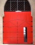
The central Matisse-red gallery complete with sculpture by Leonard McComb RA

The same, now, can be said for my experience of the Royal Academy’s most famous annual offering, the Summer Exhibition, which I attended, with my mother, last night. So used to the unseemly crush of packed-in spectators, all vying for space in the Small Weston Room to see the small paintings squeezed unapologetically onto the wall from floor to ceiling, I would always leave the Summer Exhibition feeling resentful. Why had I just spent good money to go along and see a load of same-old mediocre paintings, small canvases of flowers and ovens and animals, not to mention Tracey Emin’s hideous, crass doodles and the repetitive works of the closed-club Royal Academicians? But not this year. Yes, the same old Royal Academicians still dominate, and yes, the ridiculously crap works of Tracey Emin, now named “Prof. Tracey Emin RA” after her recent ascendancy to the role of RA Professor of Drawing (what a joke) are still conspicuous by their unashamed lack of skill (and because of the hundreds of “sold” dots stuck to the frame because people seem to think scrawled depictions of half-vaginas are valuable), but the difference this year was that I attended on a private view. There were literally 80 of us in the entire venue, and those rooms are big. Once the small gathering had dispersed around the place, we frequently found ourselves quite alone in the huge Royal Academy galleries.

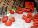
The “wave” hanging of small paintings

It was wonderful! Feeling so airy, ephemeral, and almost important, we glided around the galleries in such a good mood that we actually started to point out details of all the paintings, noticing the colours and the skill involved, complementing, and sometimes even tempted to buy and generally loving the whole affair. We were also treated to a talk by the charming Harry Baxter (an “artist educator” at the RA) whose insight into the exhibition made the whole thing instantly accessible and immediately unpretentious. This year’s show, the 244th in the RA’s history was, he explained, a homage to the small and the beautiful, an intentional contrast to the Hockney “Bigger Picture” exhibition where crowds had crammed into the galleries to see vast paintings made up from multiple small canvases. The focus on “small” can only be a good thing – it meant that rather than squeeze into the tiny rooms with hundreds of others to see all the small works, this year the huge central galleries were given over to countless small paintings (some 1,500 in all) which were hung around the walls like a wave of moving art. It wasn’t quite a Salon floor-to-ceiling hang, but it was an all-embracing journey from one artist’s expression to another’s.

So amidst all this good feeling, what were my favourite works? Top of the list has to be Buffalo Grill by Scottish artist Jock McFadyen, not least because I used to eat in one such of the French chain restaurant bang opposite the Moulin Rouge in Paris. This huge green canvas, with an off-centre, almost hazy image of the American-looking chain restaurant made for quite an impact in a gallery in which it easily dominated. It’s almost like the blur of the restaurant viewed from a fast-moving car, and yet the top of the restaurant is crisp and clear, like an after-image of the place stamped onto your retina.

Buffalo Grill (2004) © Jock McFadyen

Top of my list of sculptures, meanwhile, was the super-shiny bronze creation by Leonard McComb RA, Portrait of a Young Man Standing. Only a shame that it has the very modest price tag of £600,000. Against a red painted central gallery (apparently painted as such in homage to Matisse) and reflecting in its polished surface the paintings hung all around it, the sculpture looked truly remarkable. Second place for sculpture had to be given to Professor David Mach RA, whose cheetah made from coathangers, Spike, is an incredible feat of innovation (as was the brilliant recreation of the head of Michelangelo’s David built from the heads of matches, also by David Mach).

Top half of Leonard McComb’s Portrait of a Young Man Standing

David Mach RA, Spike

The architecture gallery was pretty interesting this year, bordering more on the surreal, not least with CJ Lim’s Dream Isle: London, the Victorian Sponge Cake which was a model imagining just that – a city shaped like a sponge cake! Also amongst the architecture were the predictable inclusions of Olympic stadiums and other Olympic buildings, as well as the new King’s Cross station concourse.

C J Lim, Dream Isle: London, the Victorian Sponge Cake

I also loved this by Graham Crowley…

Red Drift No. 3, © Graham Crowley

And this by one of my favourite Royal Academicians, Stephen Chambers RA

Stephen Chambers RA, I Know Trouble (And She’s My Friend)

While this, by Tracey Emin, appalled me…

Upset, by “Prof” Tracey Emin RA

I could go on, and there is of course plenty to look at, and to mention, but hopefully the photos I have included in this post will provide a hint of the wonders on show (except of course for Tracey Emin’s “Upset” which is included purely for the purposes of demonstrating how a totally talentless media novelty can rob some poor talented unknown of a huge amount of wall-space and all the opportunities that go with it).

The Royal Academy don’t always get it right, but with this year’s Summer Exhibition, they really seem to be progressing. Perhaps it’s because of the new president, Christopher Le Brun, or maybe it’s just because of the space all around me, the exclusivity and of course the complementary wine… It’s a question which remains as yet untested, but if you want to have a punt, go and visit the show – as the name suggests, it’s on all summer, and you can find out all of the details here.

BP Portrait Prize – Hyper-photorealism is all very well, but I want to see the Artist’s soul on the canvas

As something of a postscript to my post on Friday about the Queen’s Portrait exhibition is a short note about another exhibition currently showing at the National Portrait Gallery, the BP Portrait Prize (It’s clever marketing that requires an exhibition’s integral name to be precursored by the name of an international petrol conglomerate, although I’m not too sure how happy I am having to represent said marketing on my own blog just by nature of naming the exhibition). Anyway, I digress. The exhibition, which is now in its thirty-thid year, features some 55 works selected from an open submission of 2,187 international entrants. The sole requirement of entry is that the work is a portrait, painted in the last year.

The height of photorealism – Lindsay Lohan © Ben Ashton (2012)

This year, like most years before it, the Judges of the Prize seem to have been unashamedly seduced by the skills of artists painting photorealistically, rather than with soul. It’s now as predicable an aspect of this show as the British summer is full of rain that when you wander into the exhibition, you double-take, wondering whether you have strolled into a photography exhibition rather than a painting one. The artist paints so fantastically well, and plies his craft with such faultless skill, that one cannot see a single brush stroke and one would swear blind, even upon being 10 centimetres distance from the canvas, that this is a photo before you. This is all very well – there is no denying the skill, and absolute kudos needs to be given to these artists for executing the works with such sophistication – but the problem for me is that, if I wanted to see an exhibition of photos, I would be elsewhere. It is also, to my mind, the inherent problem of the annual offerings of the BP Portrait Prize, and what, for me, makes it all a bit boring.

These paintings do not look like paintings, and as such they do not strike me as bursting with the emotional impact that a very paint-plastered canvas exudes. In the manic multitude of Van Gogh’s plentiful brush strokes, you can identify with the bursts of energy expressed by the artist when he went about executing the work, while in the fragmented, abstracted portraits of Picasso, you can identify with an artist bursting with innovation, with a rebellious streak who wants to give more, to change art as we know it, to pioneer new forms of expression.

Swallow, © Alexandra Gardner 2012

By contrast when you look at the works hung in the BP Portrait prize, first you need to challenge your preconception that the work is actually a photograph, and then you spend your time staring at the work wondering how it is painted. But all of this emphasis somewhat takes away from the story of the sitter. The emotion is somehow lost in the perfection. When you can see no sign of an artist’s presence on the canvas, it becomes craftsmanship, and not art. It loses it’s soul. I compare these works to an exquisitely well crafted table – I would glance at the work and admire the virtuosity of the craftsman, but I would not attempt, nor be able to engage with the work in the same way as I can when an artist’s soul is poured onto a canvas.

The Dialects of Silence (Portrait of Michael Longley) © Colin Davidson 2012

There were some exceptions in this year’s show, and it is therefore unsurprising that these were my standout favourites. In Colin Davidson’s The Dialects of Silence (Portrait of Michael Longley), there is a superbly executed focus on his sitter’s melancholy eyes, which are practically photographic, but then as the work spans outwards, it becomes more and more fragmented, as swathes of paint are hastily applied to the canvas, but with no less effect. This work demonstrates both the soul of the sitter, and the passion of the artist, and that is why, for me, it works incredibly well as a portrait worthy of artistic merit. I also liked Alexandra Gardner’s Swallow which had something of the Gauguin about it. Yes it’s just a portrait, but the insertion of the striking yellow wall paper and the presence of a swallow around the sitter’s neck makes you interact with the work, wondering about the significance of the swallow, and no doubt captivated by the use of bold colour, and realism contrasting with the two dimensional black outline which circumnavigates the figure.

Mr Kitazawa’s Noodle Bar, Tokyo
© Carl Randall

However my favourite work of the show was undoubtedly this one, Carl Randall’s Mr Kitazawa’s Noodle Bar, Tokyo. This “group portrait” is startlingly original for a number of reasons: the viewpoint from above, its composition: customers on the right, servers on the left, the slice of city life seen through the window, and the exclusive use of black, white and shades of grey. I love the apathetic, indifferent stares of the customers, minding their own business, indulging in quick dinner in a hostile urban environment, thinking no doubt about work and the pressures around them. On the left we are met with the equally impassive stares of the workers, tired after cooking all day and bored of the relentless monotony of their work. But in the middle of this we have this almost embrace, the only human contact in the whole work, when the worker gives a bowl of food to a customer, or the other way round – because they both hold the bowl with two hands, it is akin to a loving embrace, a fusion of worker and customer, and composition-wise it provides the work with a horizontal variance to otherwise brash vertical lines. Brilliant.

Is that a photo?: Silent Eyes © Antonios Titakis (2012)

If the BP Portrait Prize included more works like this every year, it would be a startlingly interesting show. But as ever with exhibitions judged and chosen by a group of outdated art professionals and even a representative from BP (who clearly knows so much about art) we will continue to be shunned by a group of high-gloss works which, like any photo, reflect the viewer and push him away, rather than a show of works which, because an artist has bared his soul or painted a scene of such dynamic composition and interest, the viewer is captivated and invited in. For me, it’s this relationship between artist and viewer which is not just integral to the power and purpose of art, but central to the very definition of what “art” really is, whether it be triggered by a portrait, a landscape or an abstract clutter. Remove the soul of the artist, and the painting becomes just one more image to add to the ever changing visual landscape of the fast-moving world around us. A fleeting encounter, without a lasting impact.