Rembrandt’s Late Works: Better seen, and never forgotten
While the works of Rembrandt, Dutch master and one of the most applauded artists in the history of art, are instantly recognisable for their energetic brush strokes, moody lighting, undeniable intensity and rich umber colour palate, there is nothing like seeing his paintings in reality to truly appreciate the virtuosity of his work.
The National Gallery London’s new blockbuster on Rembrandt, The Late Works, provides just the opportunity to do that. In the dark bowels of the Sainsbury Wing of galleries, in rooms purpose-designed with dark walls and sharp focused lighting perfectly offsetting the brilliance of Rembrandt’s mastery over light, one enters the exhibition to come face to face with not one, but a whole room of Rembrandt self-portraits. Each demonstrates a startling honesty in self-examination, as the artist becomes visibly older and more saggy. But in as much as this room shows that a Rembrandt self-portrait is far from a rareity (he made some 80 painted, drawn or etched self portraits in the course of his career), it immediately demonstrated that there is nothing like seeing these famous works in reality: for only then can you appreciate the brilliant layering of the paint, and the masterful use of brushwork to build an aging texture of skin which appears so realistic as it catches the light against a dark mocha background, that it almost feels as though Rembrandt has cast himself in three dimensions, ready to climb out of the frame when the many visitors to the exhibition have gone home.

Self-Portrait (1669)

Self-Portrait (1669)

Self Portrait with Two Circles (1665-9)
Such was the main impression that this excellent new exhibition left on me as I departed. I felt thrilled to have had the opportunity to see so many brilliant works executed at the tail end of Rembrandt’s career, when his personal fortunes were in decline, but when the product of his paintbrush was more fantastic than ever. But so too was I struck by the breadth and significance of the collection on show, testament no doubt to the National Gallery’s partnership in organising the exhibition with the Rijksmuseum in Amsterdam, who either own or have access to much of the works on show. The result is the chance to come face to face with famous works such as the Jewish Bride – a subtly romantic painting which held Van Gogh so spellbound that he declared he would give up 10 years of his life for a few moments before the painting – and the masterful group portrait, The Syndics, a superb work on a huge scale, surely surpassable only by The Night Watchmen, perhaps Rembrandt’s most famous work.

The Syndics (1662)
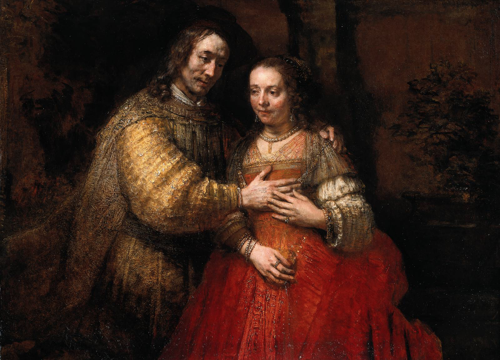
The Jewish Bride (1665)
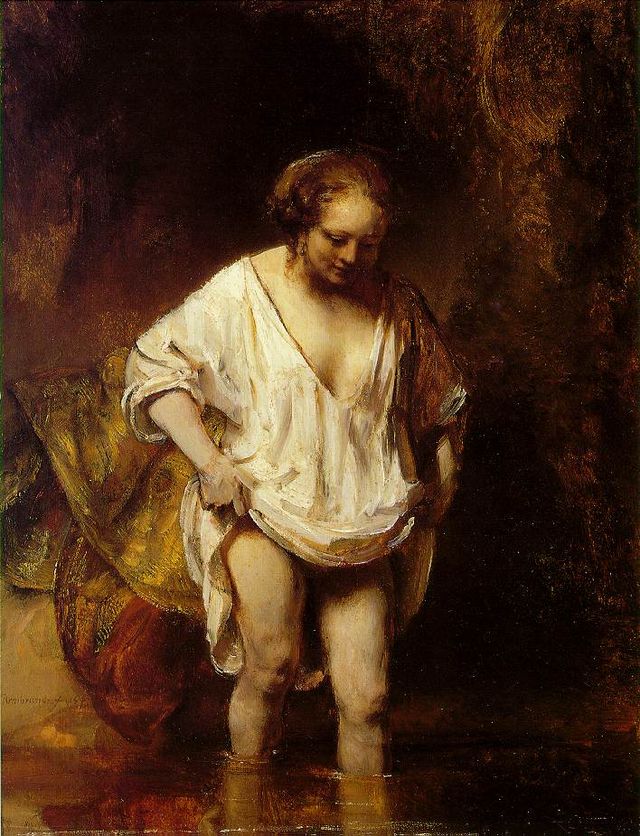
A Woman Bathing in a Stream (1654)

The Consipiracy of the Batavians under Claudius Civilis (1661)
The other thing that struck me was how bloody popular this exhibition is. Even when you have a timed ticket, you need to queue. Admittedly I went along at the weekend, but that does not mean to say that this show will be any quieter during the week, such is the appetite no doubt for a sensational London art show after a year consisting largely of flops and unknowns (I do not include Tate Modern’s brilliant Matisse or Malevich shows in this otherwise scathing review). What this then means is something of a struggle throughout the show, something which is felt less when gazing upon huge works such as the rather questionable Conspiracy of the Batavians under Claudius Civilis, a portion of Rembrandt’s less than successful painting for Amsterdam’s new Town Hall. It is however annoying when trying to study the stunning intricacies of Rembrandt’s print works. I never knew that he was such a skilled printmaker, and his drypoint etchings were, in particular, worth elbowing the odd visitor out of the way.

The Three Crosses (1653)

Christ Presented to the People (1655)

Christ Presented to the People

Christ Preaching (1652)
But what these crowds all go to show is how superb this show is – a final hurrah for 2014, and the first great show to come out of The National Gallery, in my view, since the Da Vinci sensation in 2011/2012. Whether it be the intense forlorn gaze of Lucretia at the point of her honour suicide, the sensationally melancholic Man in Armour thought to be Alexander the Great, or the knowledgeable calm grace of Margaretha de Geer depicted wearing her ginormous lace ruff, there are masterpieces aplenty to keep you hooked to this show, and resilient to the many crowds around you.


Portrait of Margaretha de Geer (1661)

A Man in Armour (Alexander the Great?) 1655
Rembrandt, the Late Works is on at the National Gallery until 18th January 2015.