Autobiographical Mobile: The finished article
C’est fini! At last, my autobiographical mobile is complete! Started in June last year and completed right at the end of April of this year, the maths alone dictates that this has been a long project in the making. While my blog account of the work has been posted in respect of 25 full days of painting, a great number of evenings and hours grabbed in otherwise hectic weeks have been spent working on this piece, one of the most comprehensive projects of my art career so far. Yet the protracted length of the project (augmented by the fact I work full-time and have been undertaking a whole host of other artistic projects in the meantime) has also been one of its benefits – feeling no rush, I managed to achieve a more perfected finish on each of the areas I was working on, and likewise, owing to the passage of time, the painting has become something of a developing story in itself – a true artistic reflection of the changing circumstances of my life.

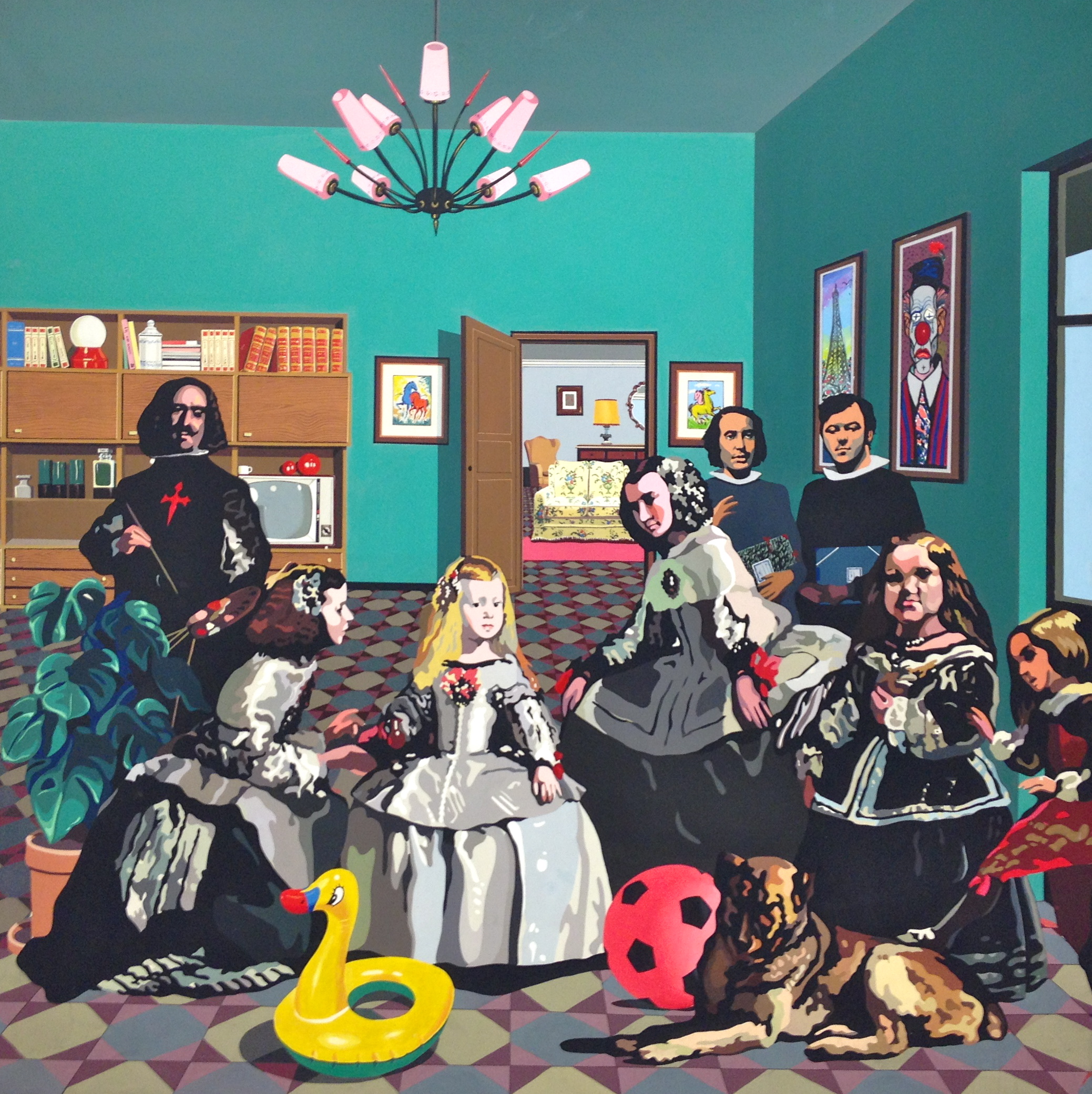
Autorretrato (Autobiographical Mobile) 2013 © Nicholas de Lacy-Brown, oil on canvas
And how it looked on the first day of painting
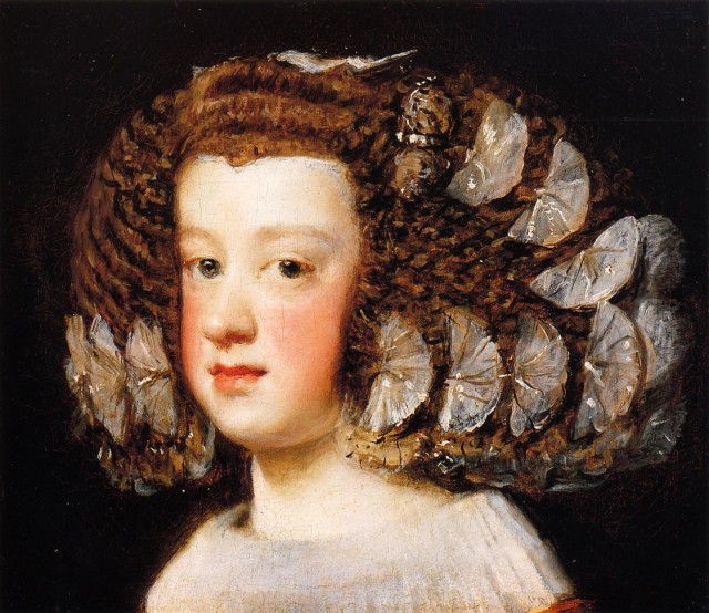
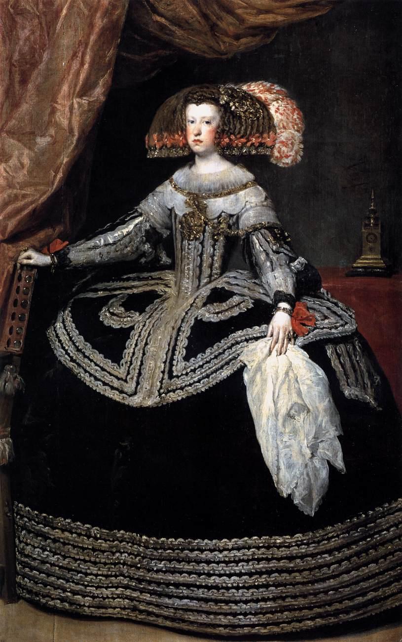
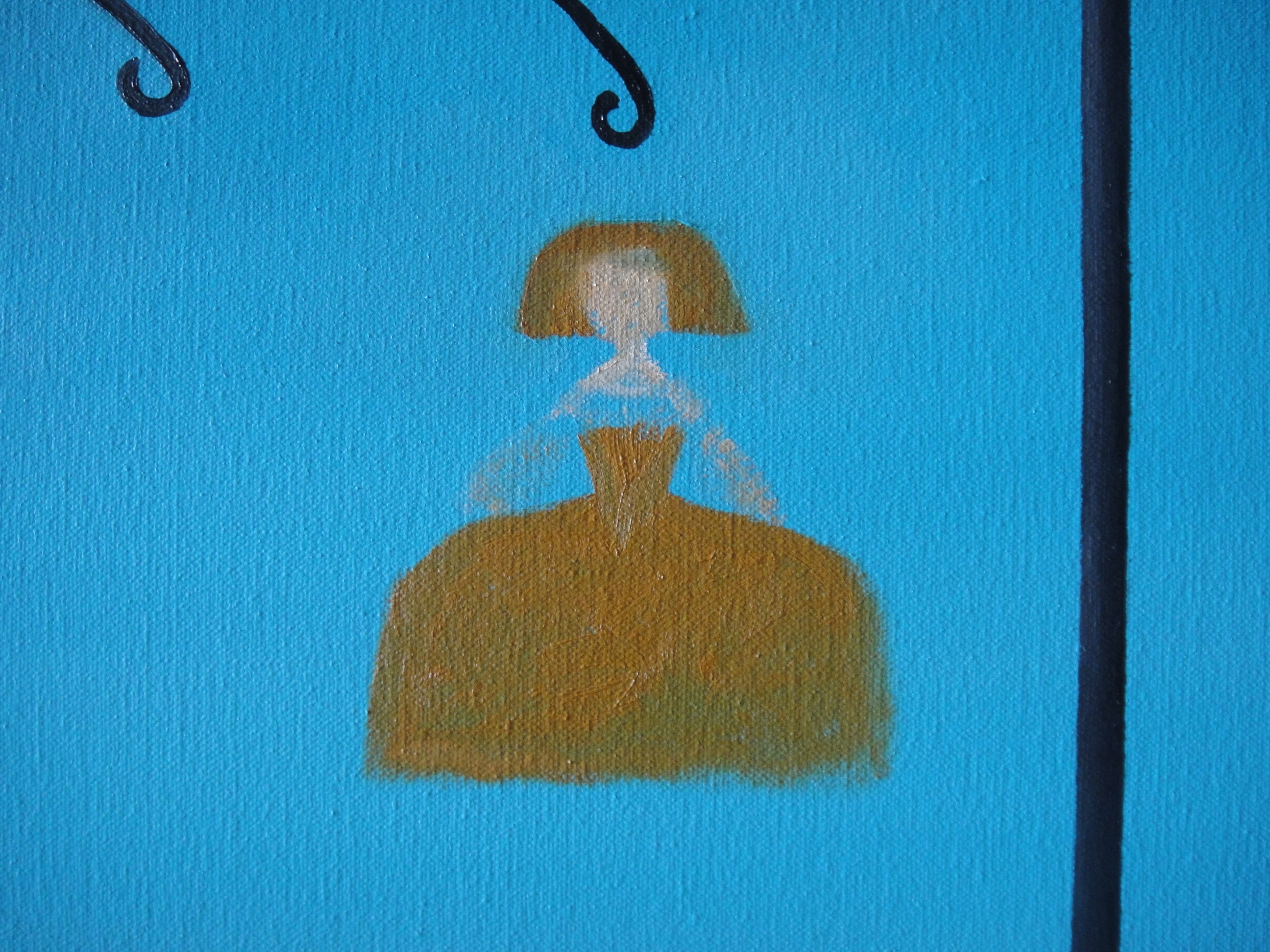
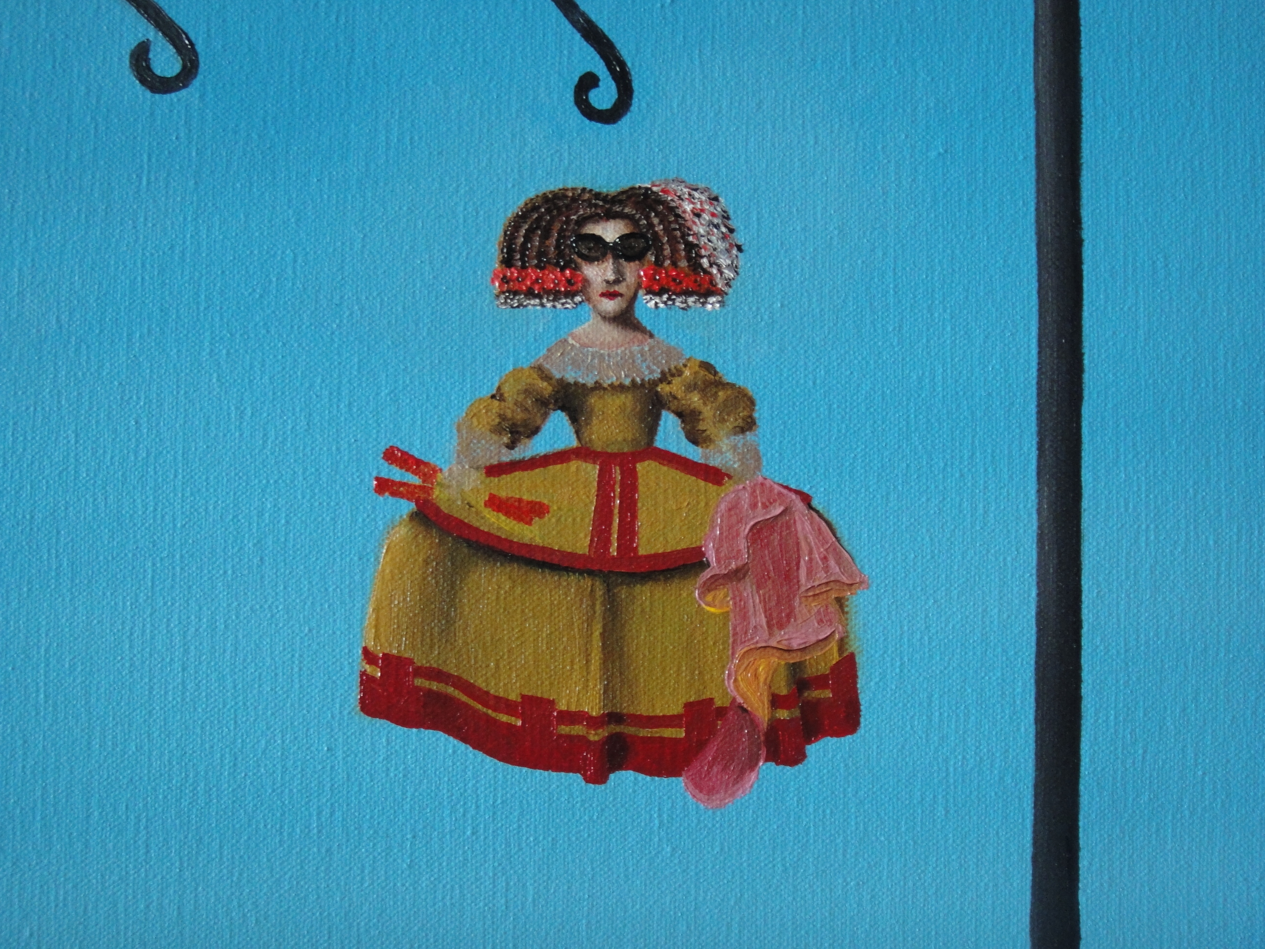
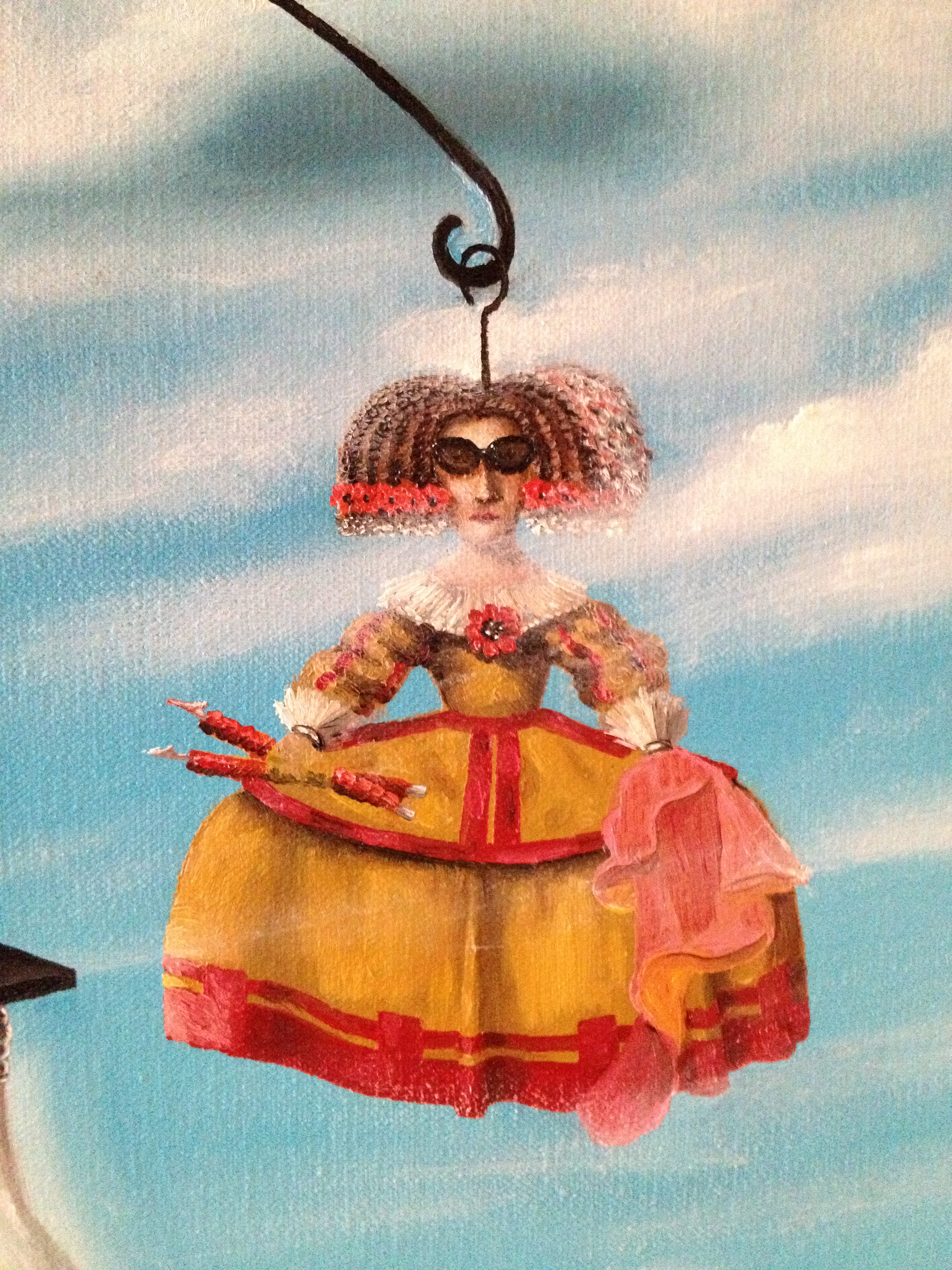
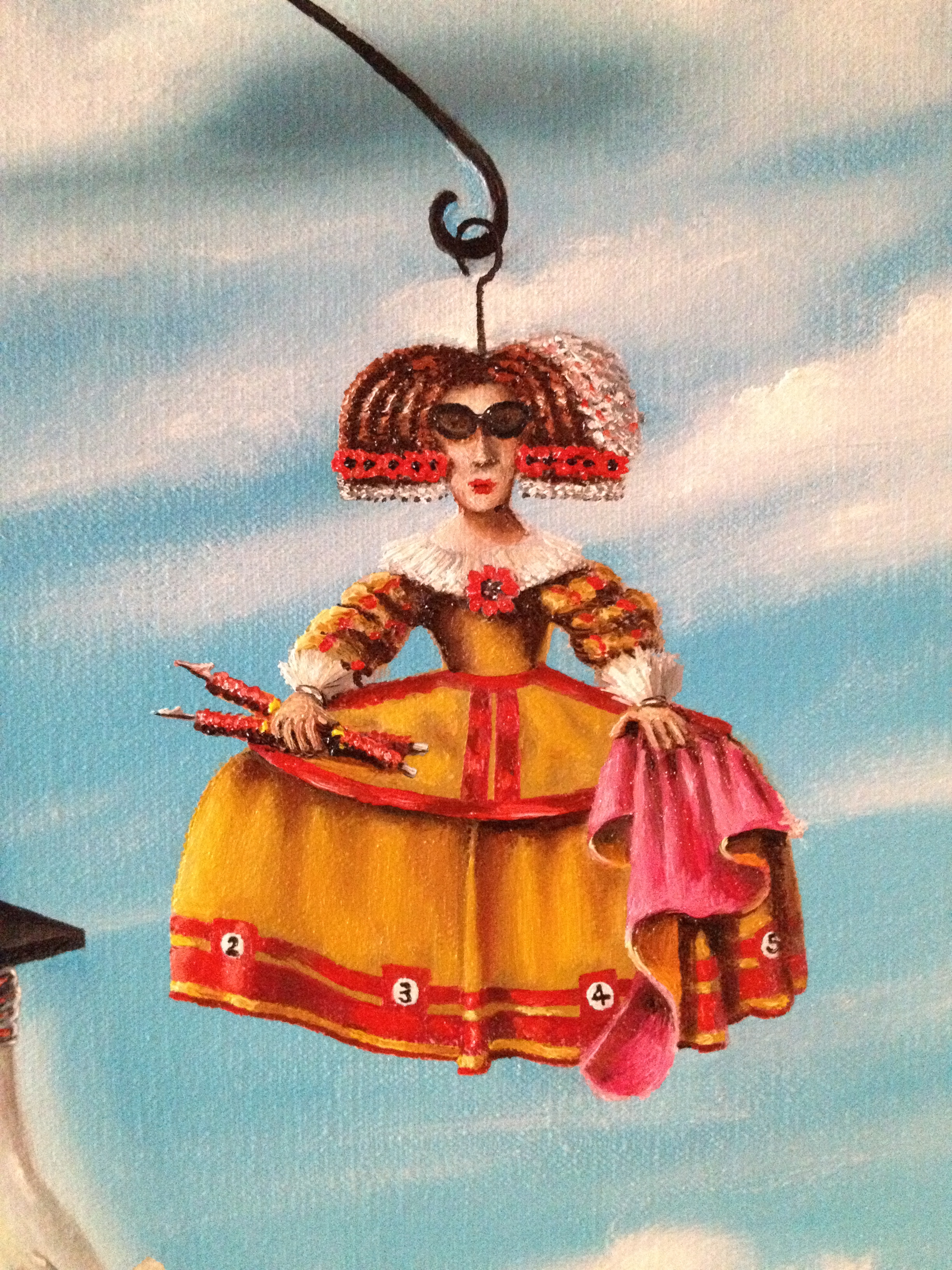
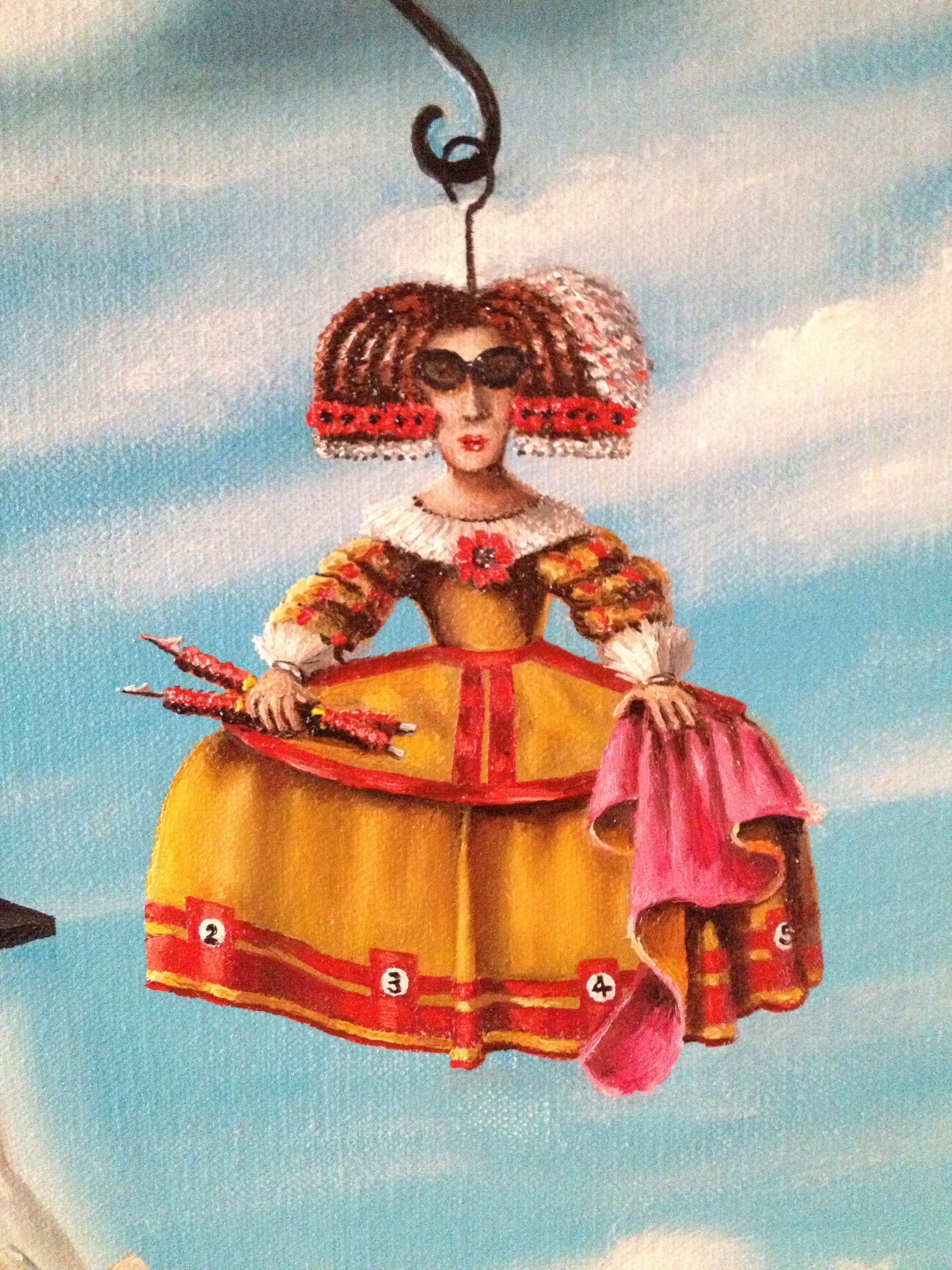
I have extrapolated upon most of the details in the painting in former posts explaining my progress, however in very brief terms, the painting is an autobiographical self-portrait told through symbols and metaphors rather than a head and shoulders portrait. At the centre of the canvas, a large free-standing mobile, in the style of the great mobile-artist Alexander Calder, represents my life. At its base, my constant companions, Fluffy and Bilbao, teddies given by my Partner and me to one another shortly after we first started dating, represent the very consistent, anchoring and significant role of our relationship in my life. Then above, the mobile acts as an autobiography balancing out the various positives and negatives in my life so far.  On the left: the positives – all the stuff I love and which has helped to shape me into the person I am today. First up, Spain and art history, symbolised through the iconic image of one of Span’s master-artist’s Infanta portraits, whose dress is in turn decked out to resemble the sandy colours of a Spanish bull ring, while her sunglasses represent Spanish tourism, the industry which has been so important in bolstering the economy of modern day Spain.
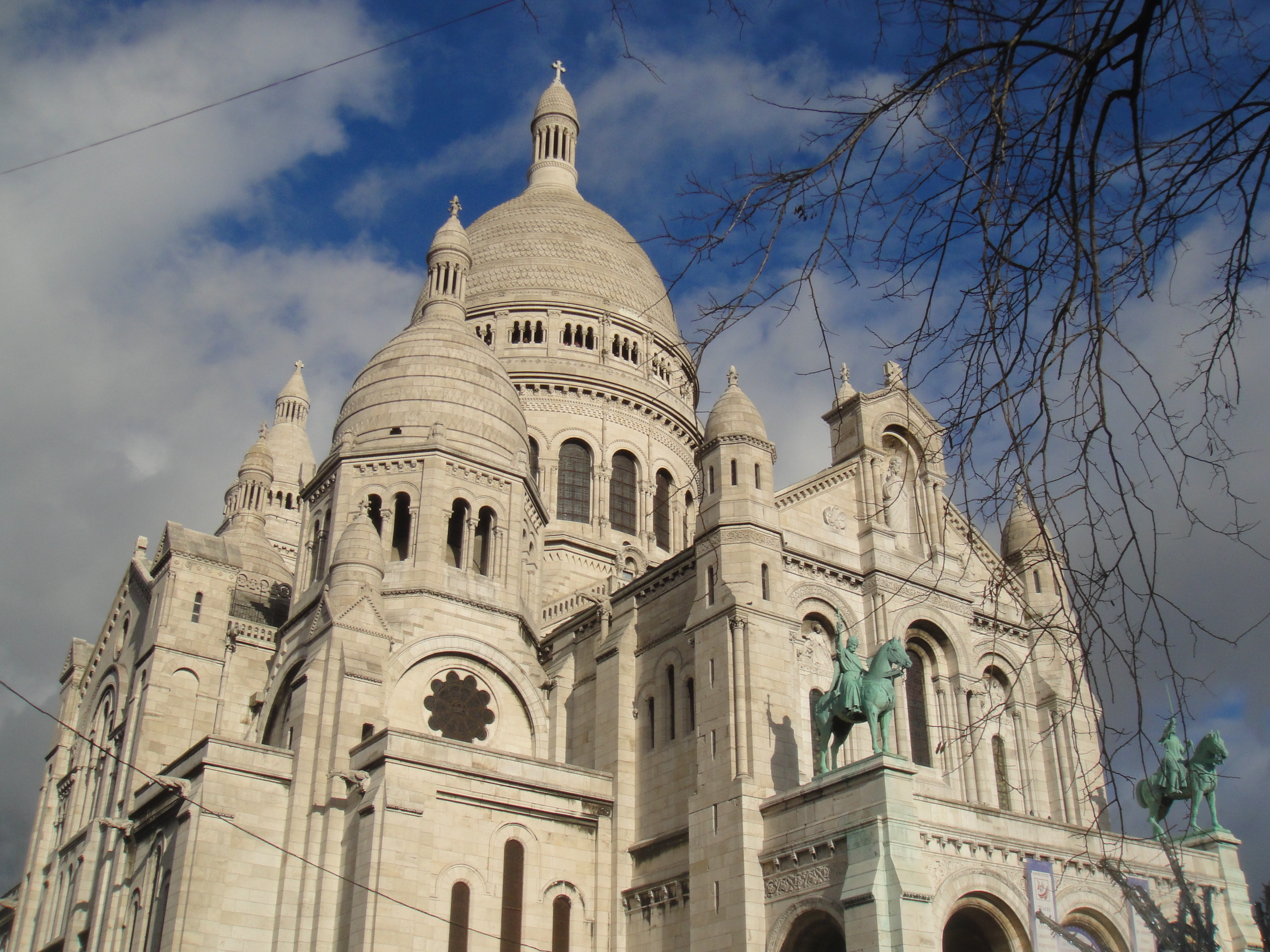
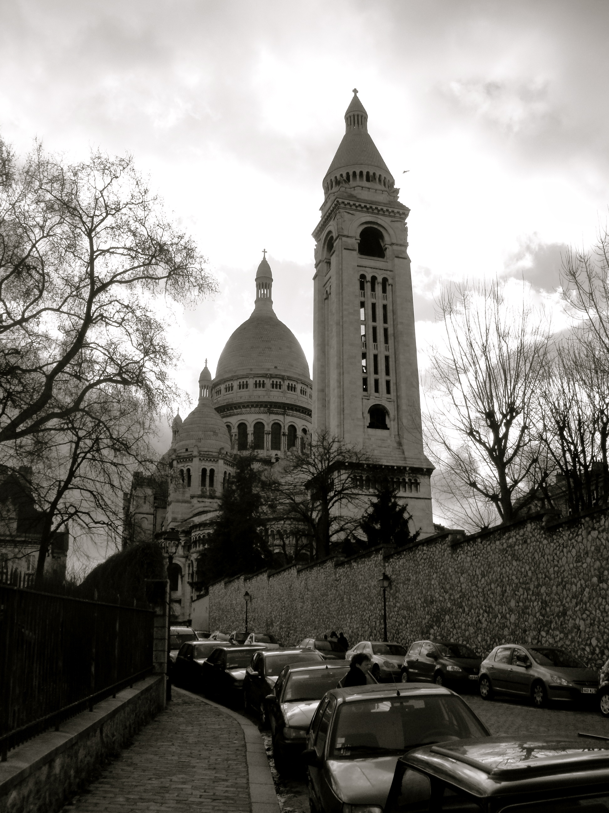
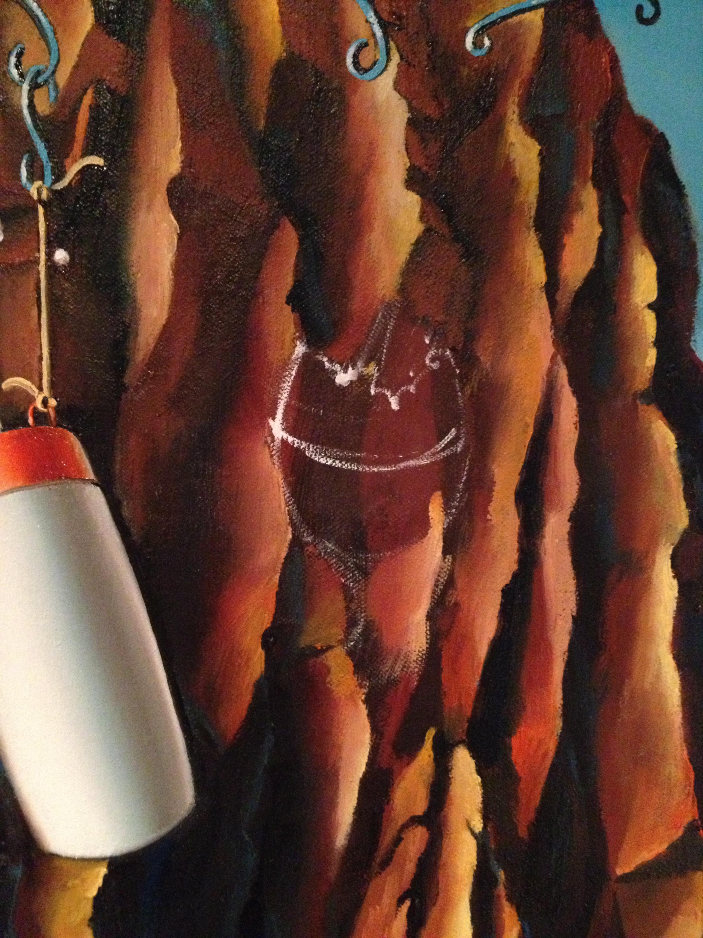
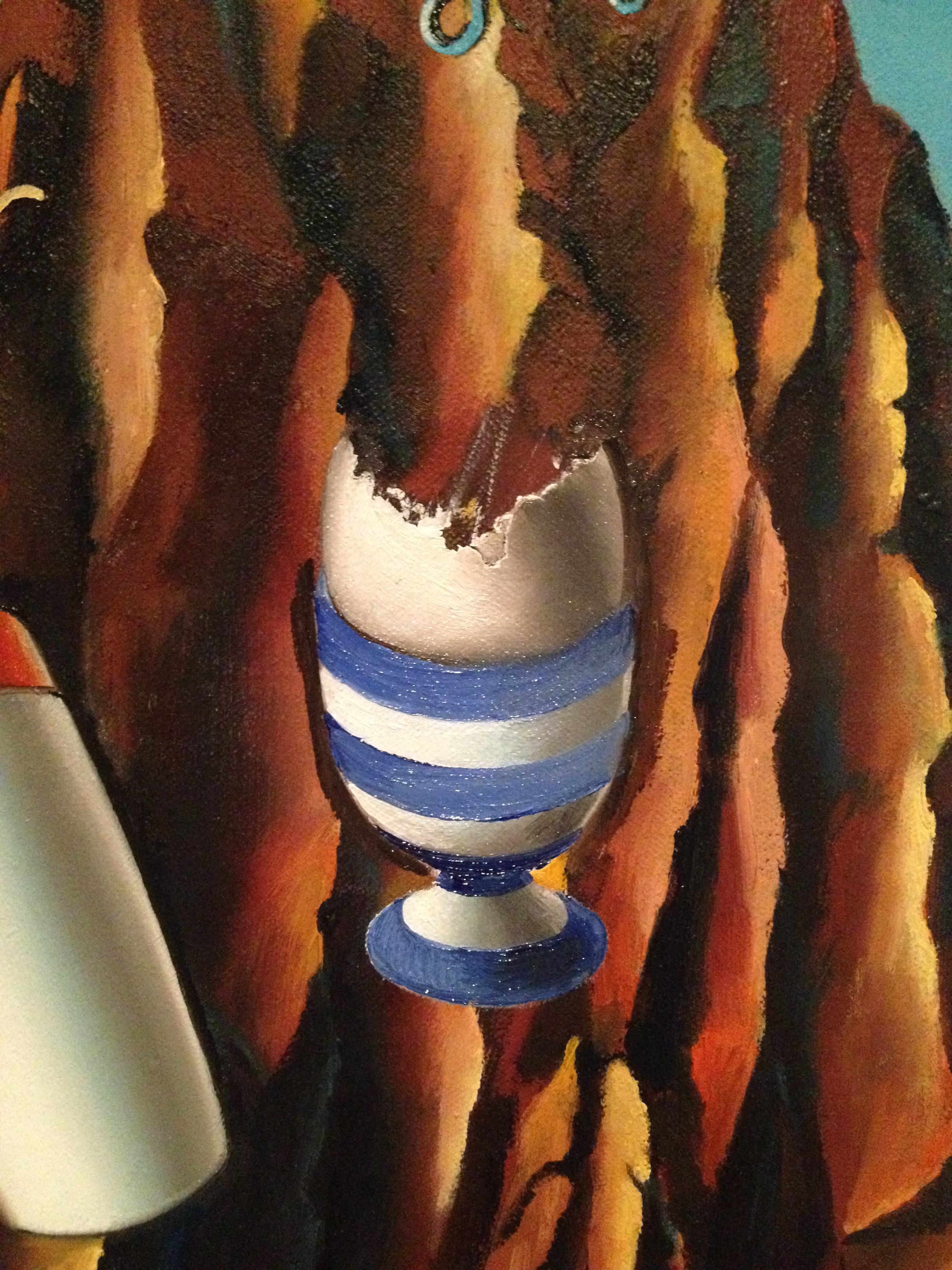
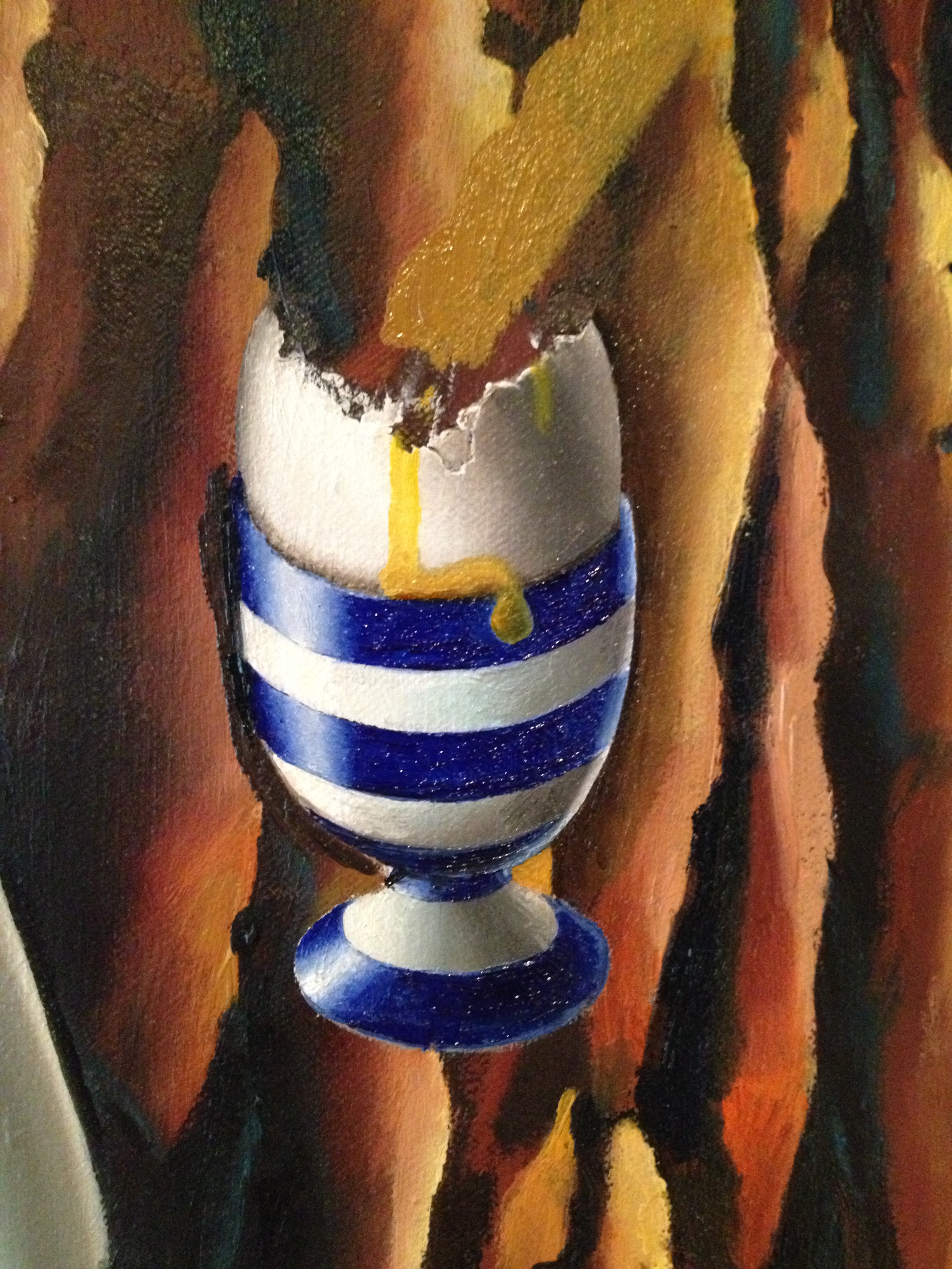
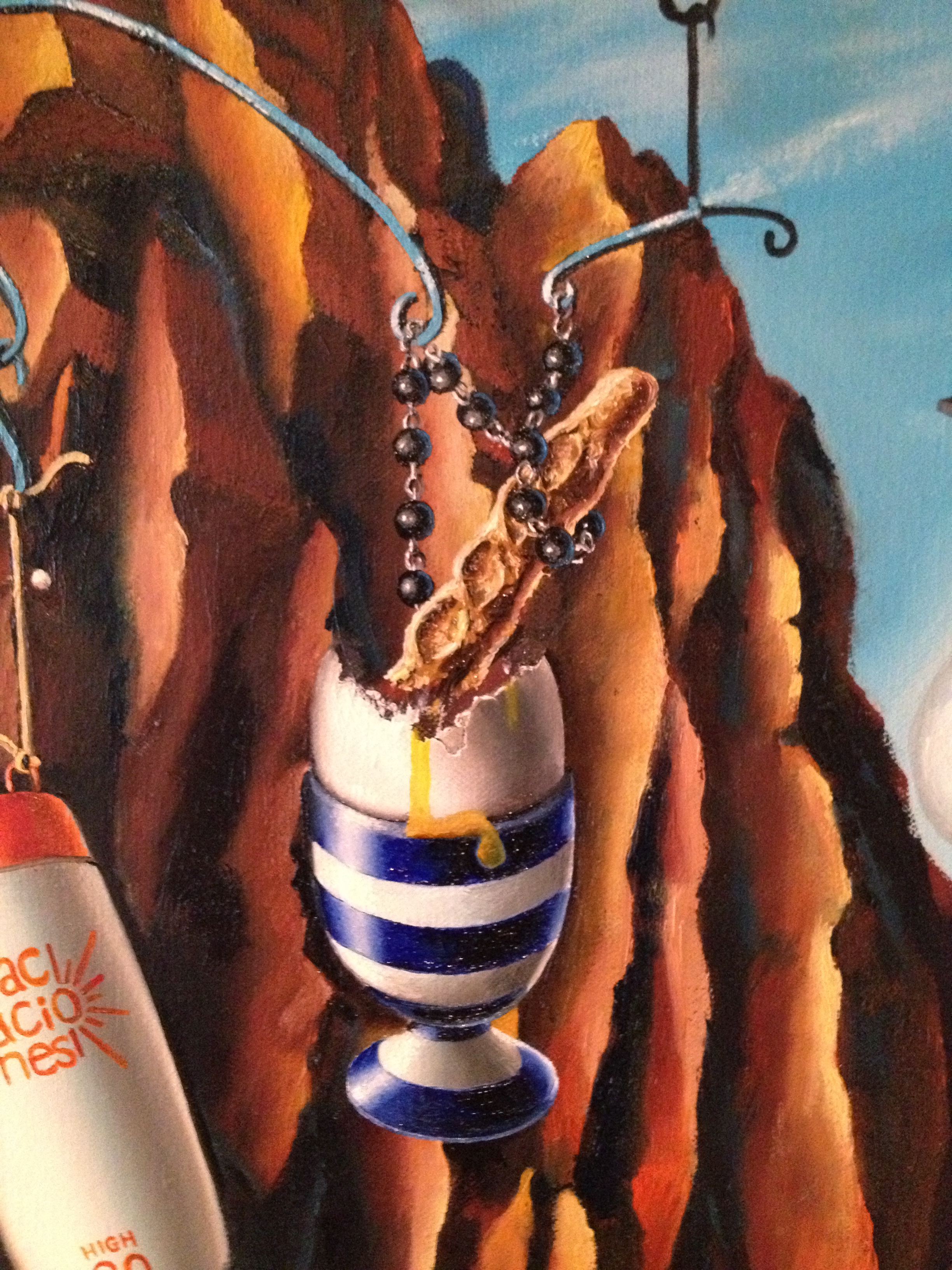
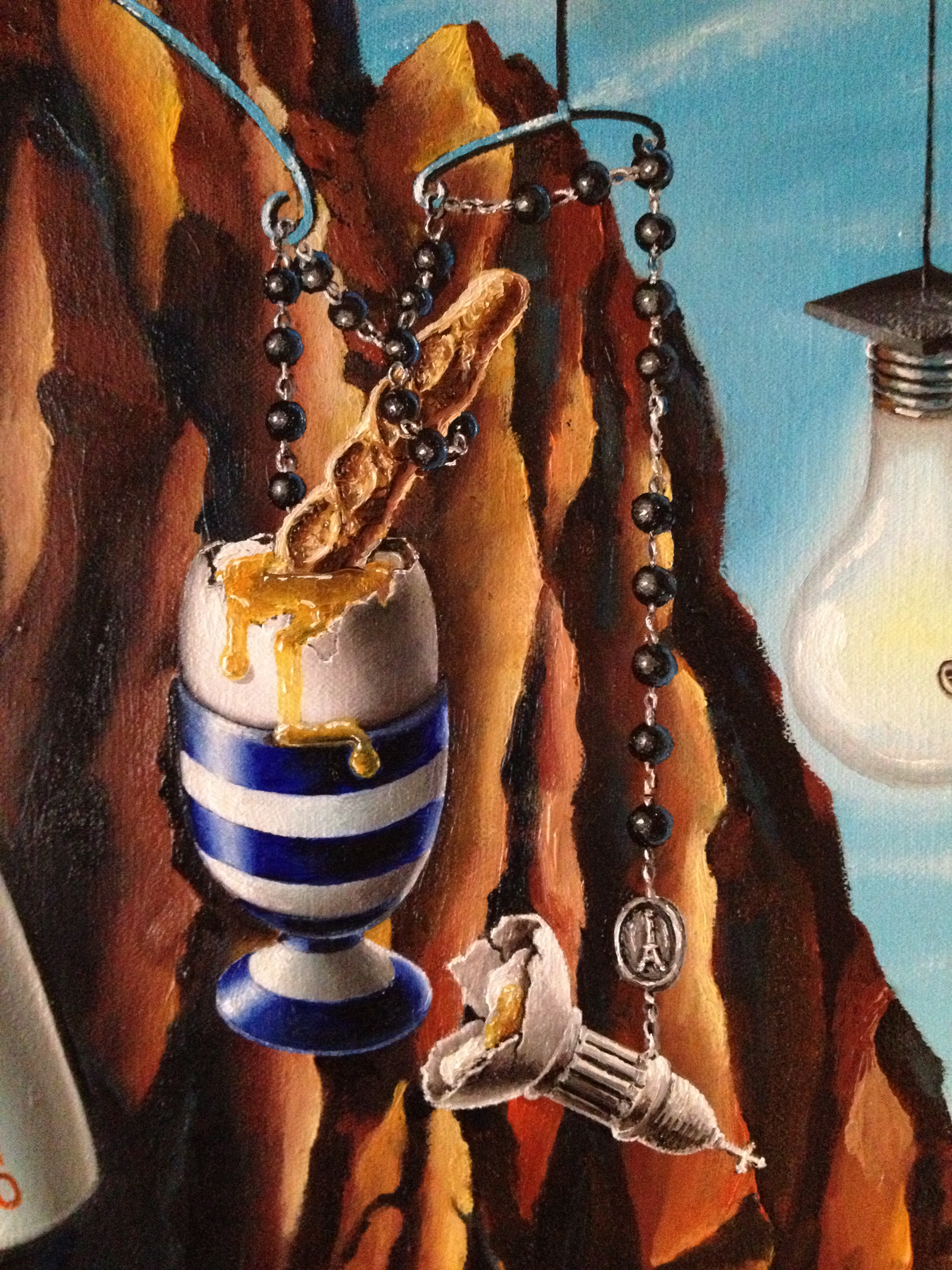
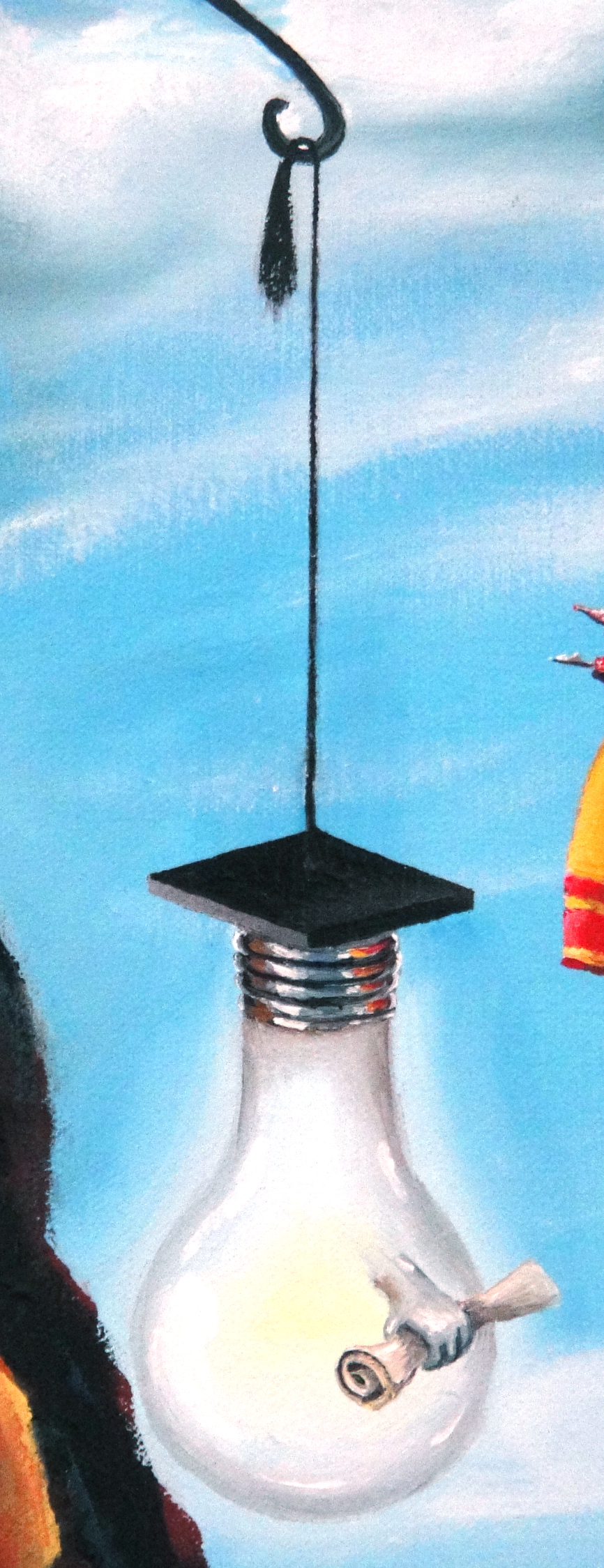 Next, the symbol of enlightenment and creative/ academic success: This is a Norm-shaped lightbulb decked out in a graduation mortar-board and holding a graduation scroll. This hybrid Norm/ bulb character represents my achievements both as an illustrator-blogger and as a lawyer, and stands for the importance of learning and development in my life. Further along, the egg: This is a representation of my art career, and also my love of Paris (where I was engaged and from which I have been inseparable for at least 15 years). Paris was the inspiration for my first major painting, Le Paris Formidable, a creation which I consider to be a milestone in my artistic career and the moment I began to take painting seriously. In that image I painted the Sacre Coeur church as a series of eggs and egg cups (the white domes of the basilica reminding me of eggs), while plunging into the egg, an egg soldier is replaced by a French baguette, held up by a rosary, representing that for me, art is like my religion.
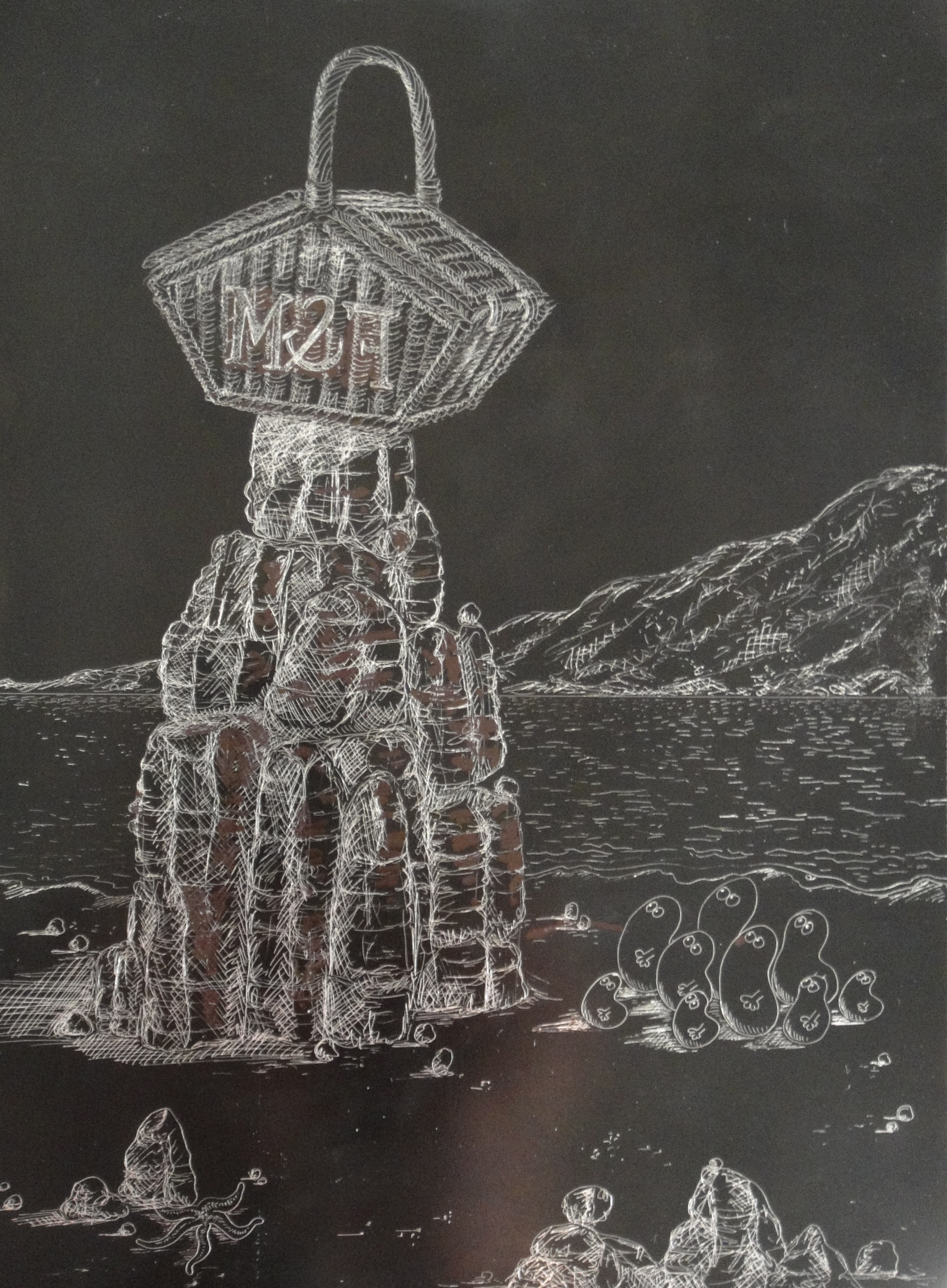
 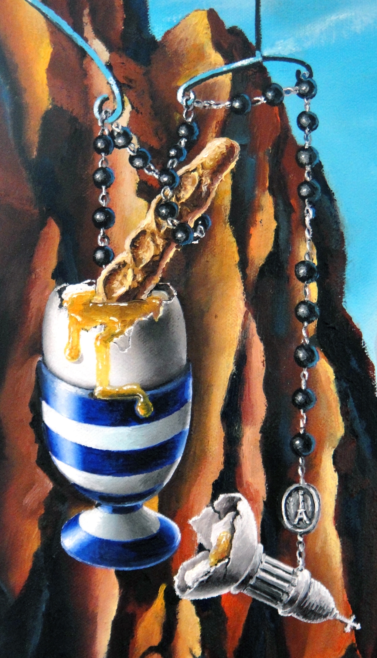 Finally in the positives, a sun cream bottle represents my love of travel, and spurting from it, a representation of my love of gastronomy as shown through a mixed and bounteous flow of prawns, marie rose sauce, chorizo, strawberries and wine, all combined together through a meandering strand of spaghetti which in itself metamorphoses from the Fortnum and Masons hamper sat on a rock below it – the hamper representing my love of the finer things in life.
  Onto the negatives, and up first my 2008 accident – the life-changing event was informed so much of my art and altered my life, both physically and mentally forever.
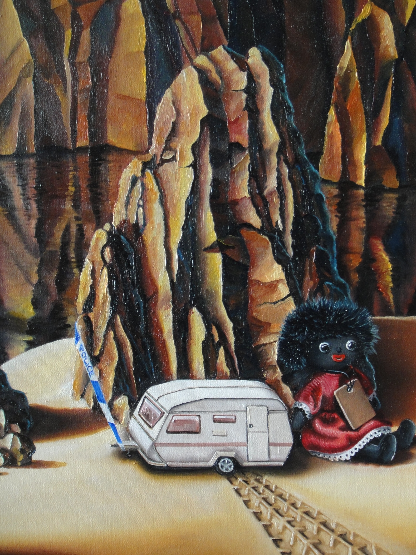
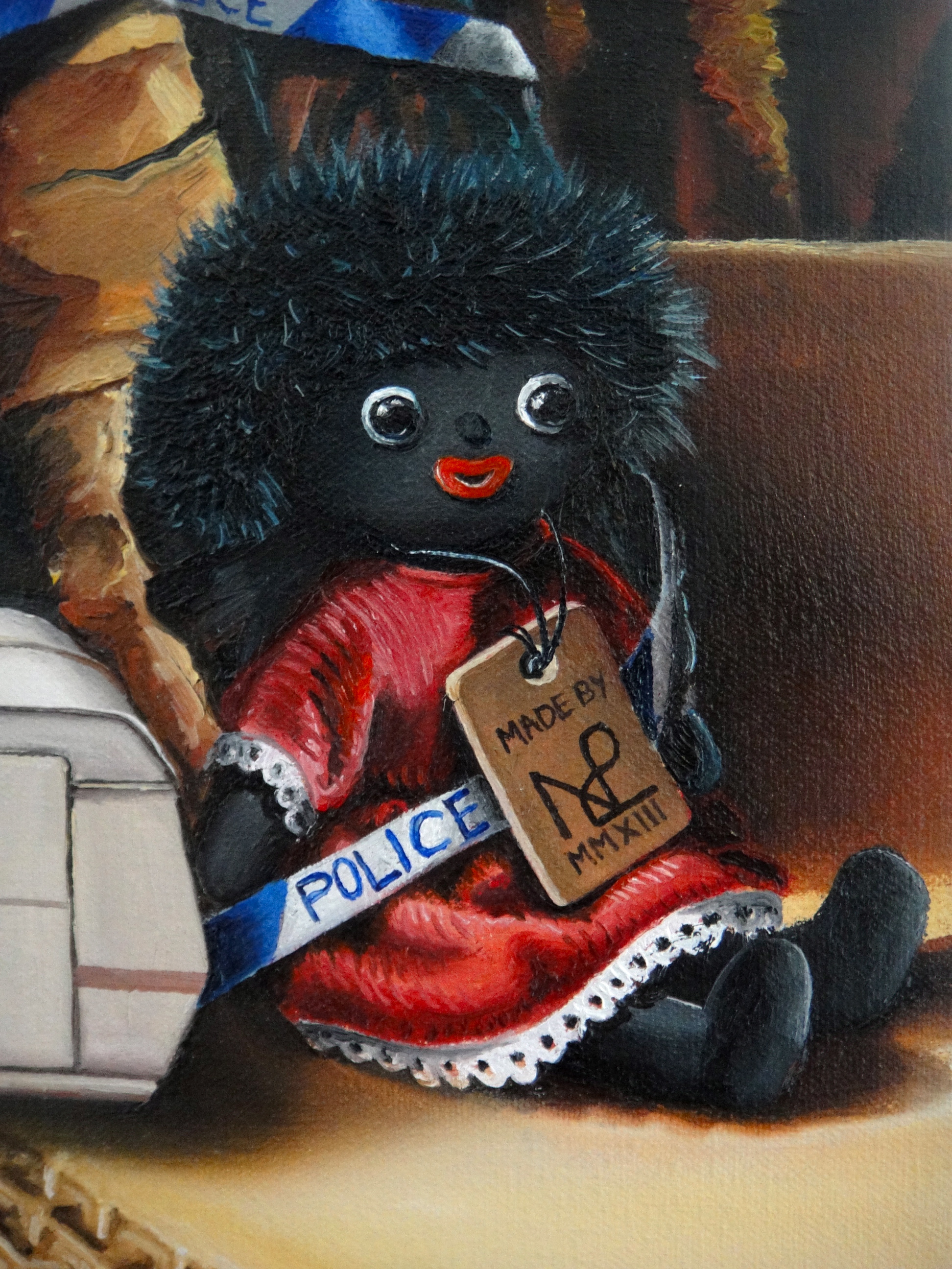
 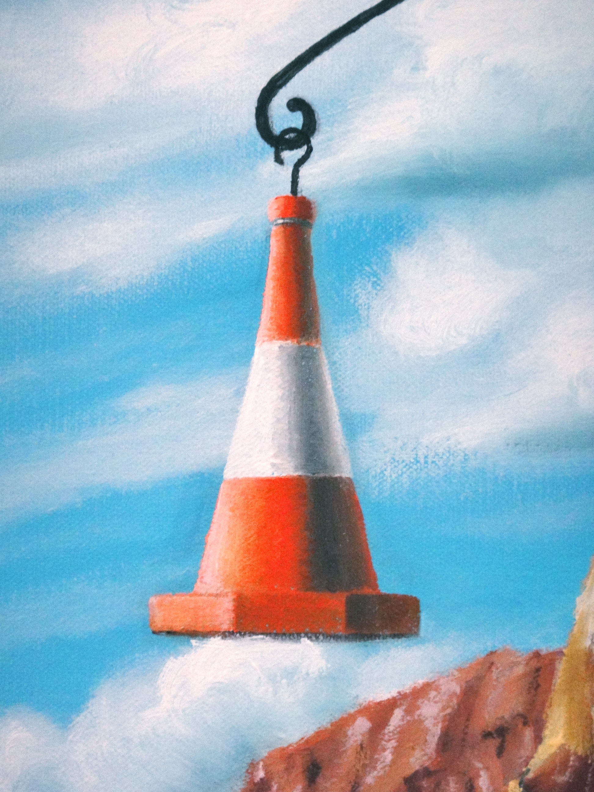 Then the death of my career at the self-employed bar, a hugely difficult time when I suffered stress close to mental breakdown, prejudice, bullying and was effectively cast out of the profession because of the small-minded prejudices which come of a profession in which survival, without fitting into the Oxbridge stereotype (the blue snakes), is all but impossible.
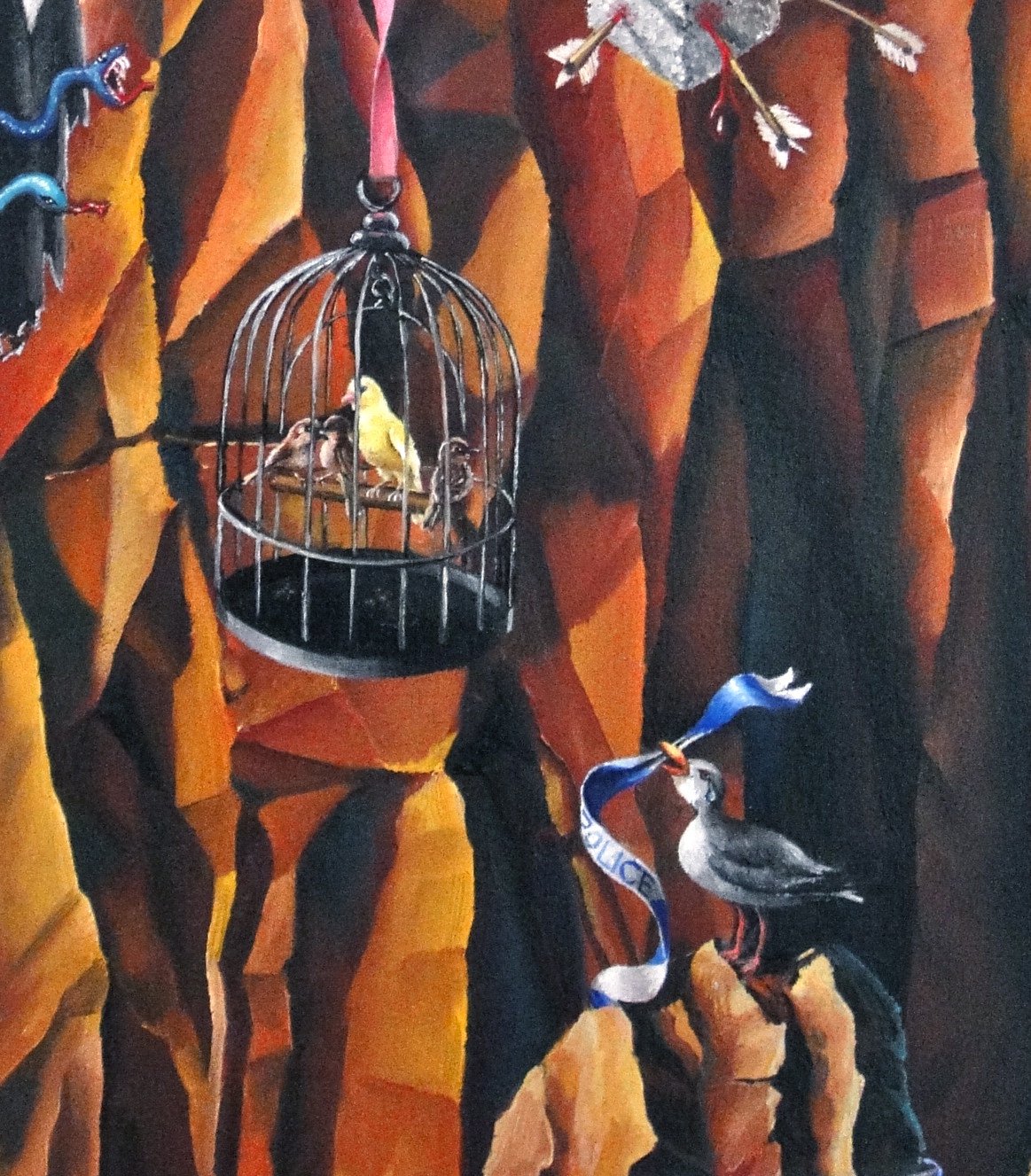
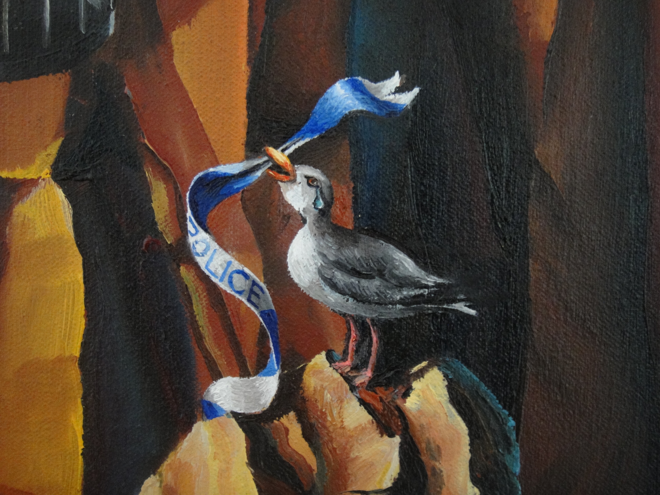
 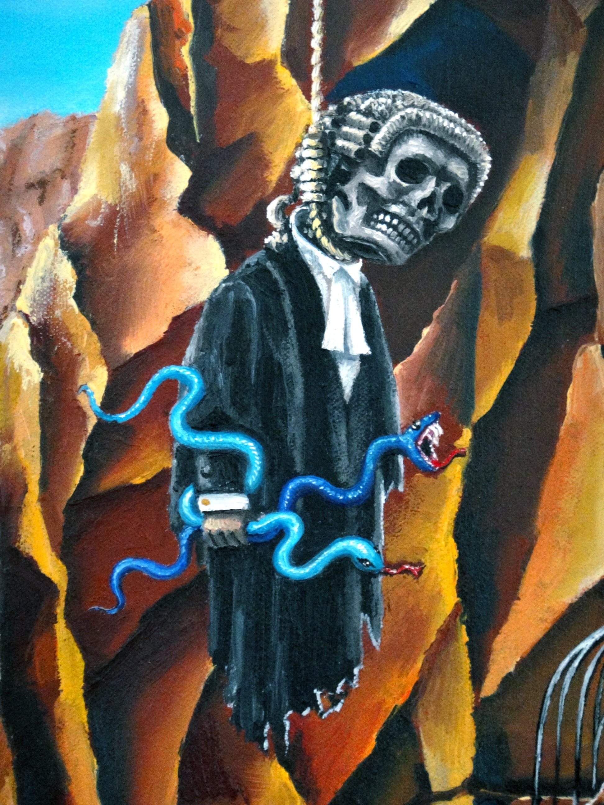 Then the birdcage, a symbol of entrapment, both for my sister trapped by the grave fate which arose upon the death of her husband leaving her to bring up three toddlers alone, and for me in my career.
 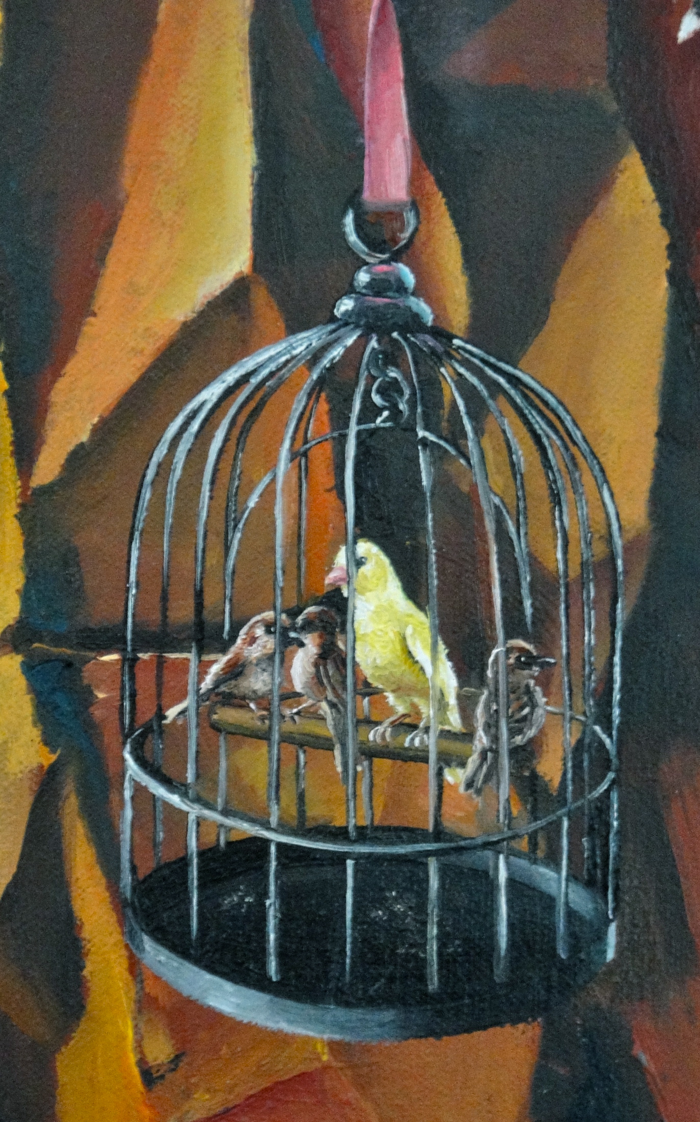 Finally the Apprentice – a direct reference to another of my paintings, Nicholas in the Renaissance, a tongue-in-cheek self-portrait in which I parodied a depiction of Saint Sebastian to represent the injustices I felt I had suffered when I appeared in the acclaimed BBC television series, The Apprentice series 4. The sugar cube of course alludes to Lord Sugar, the famous business man for whom the “Apprentices” seek to work under the television format.
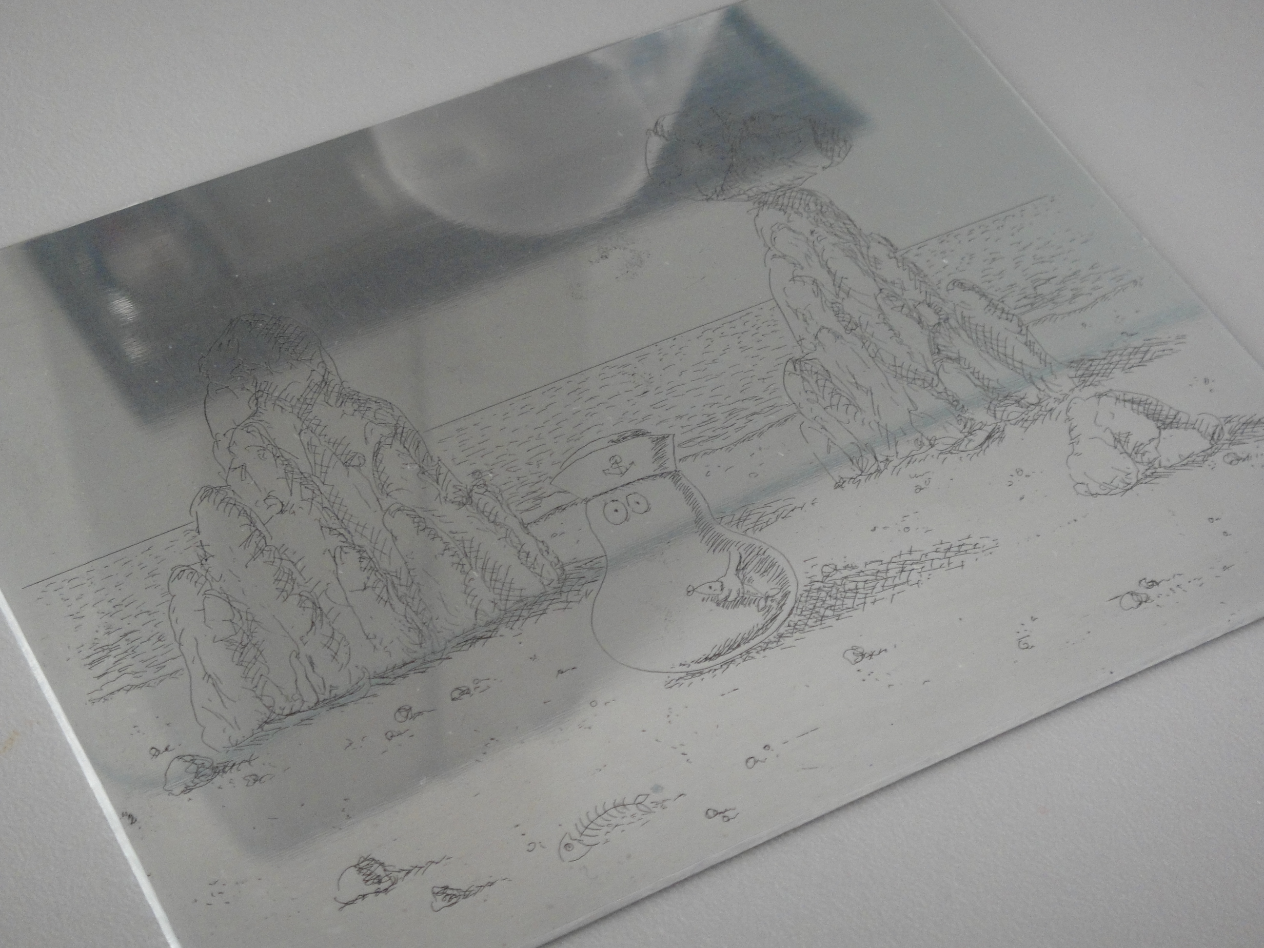
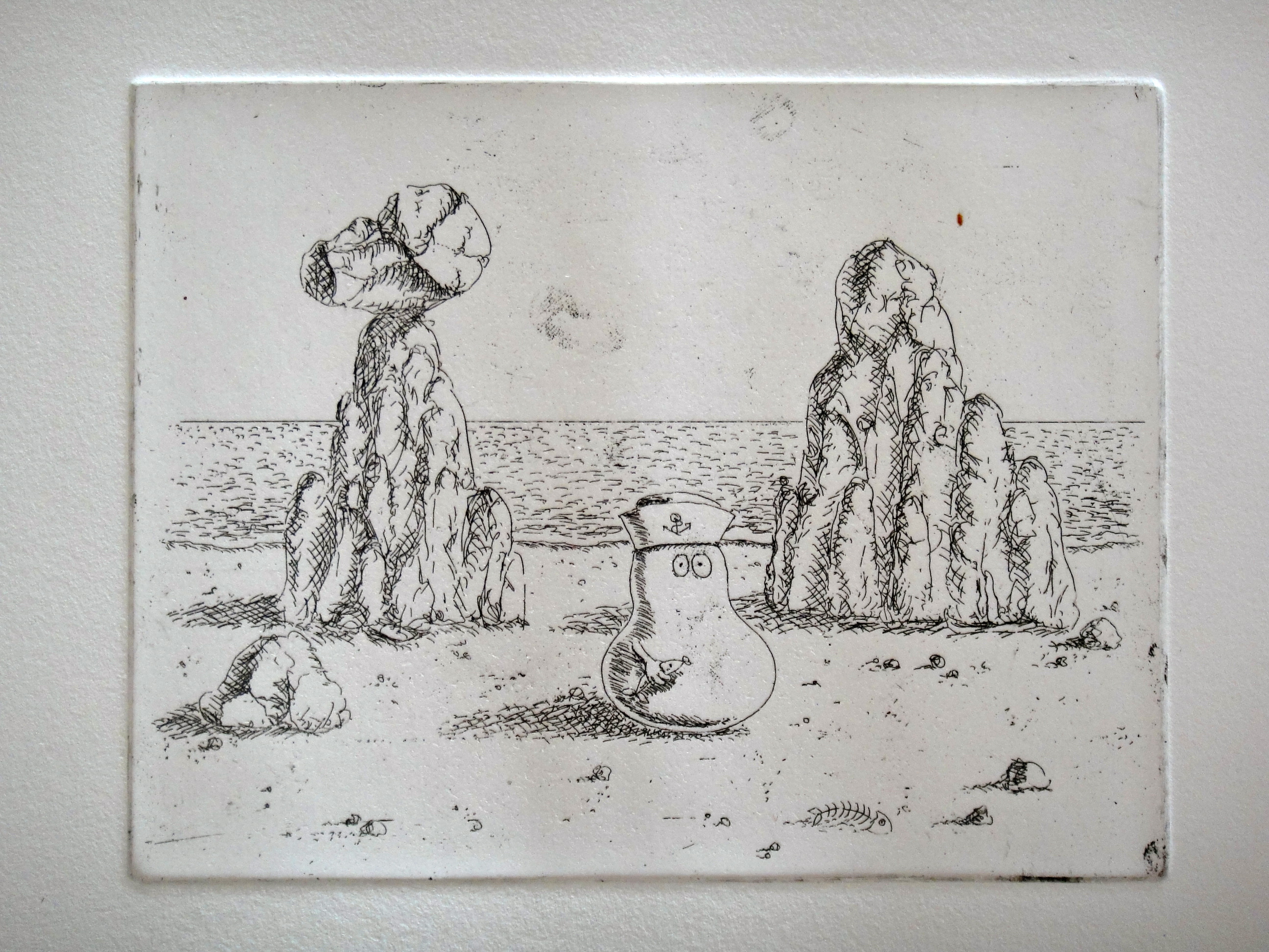
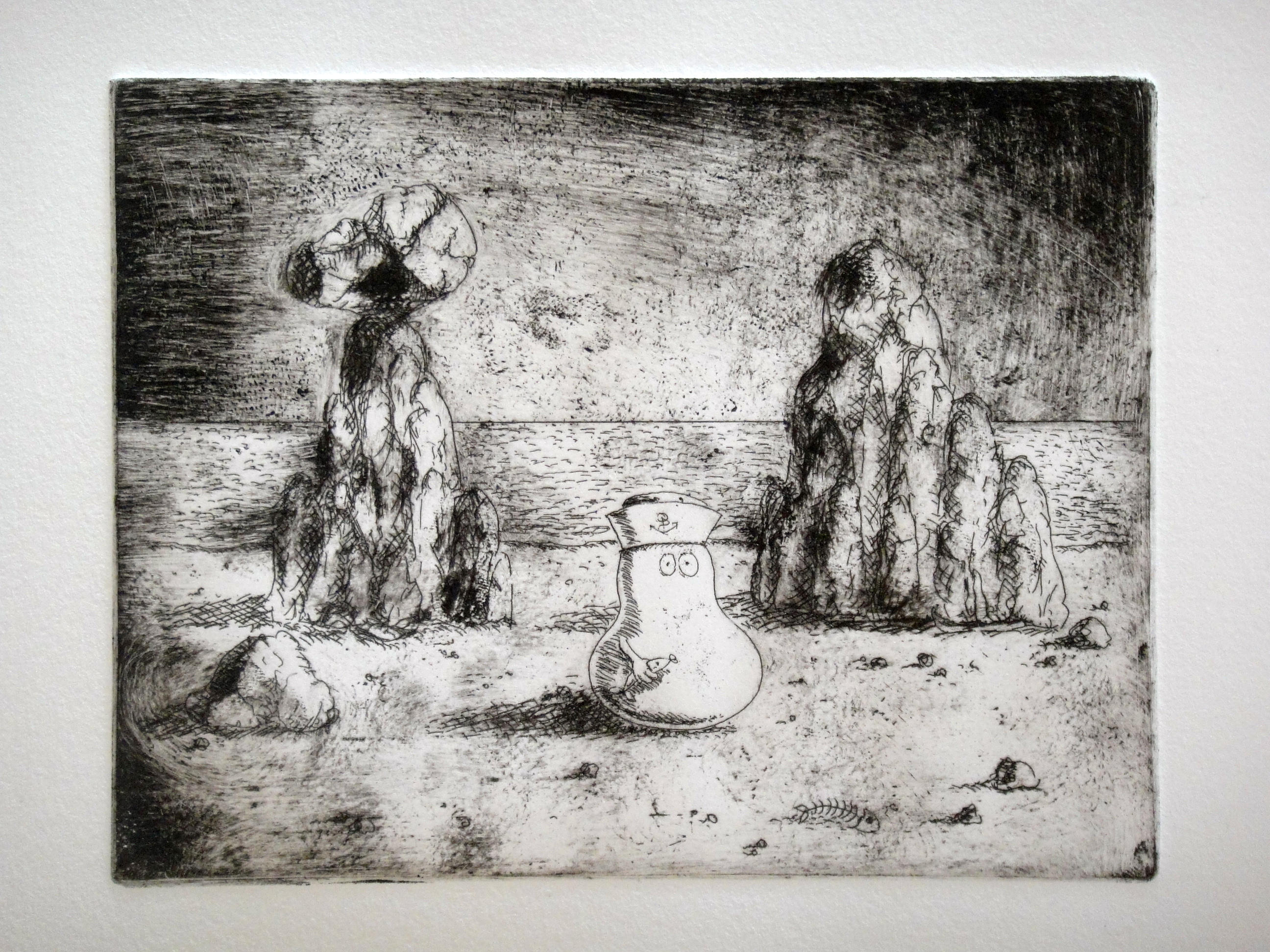
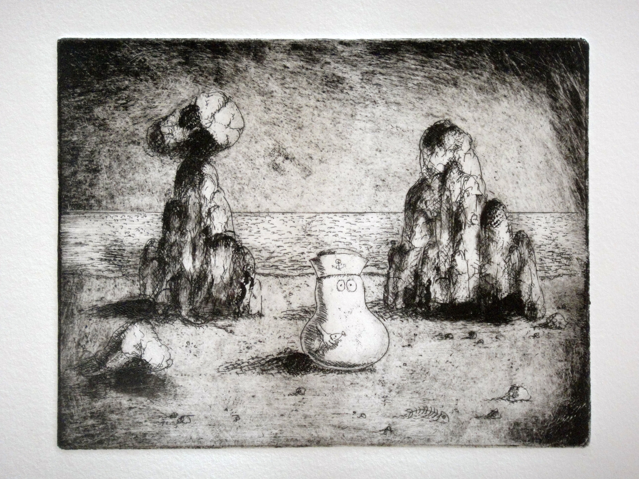
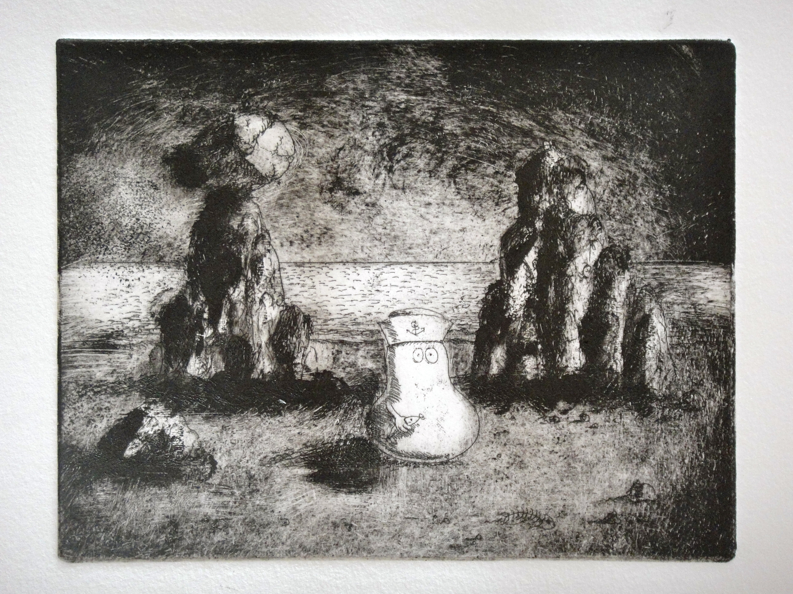
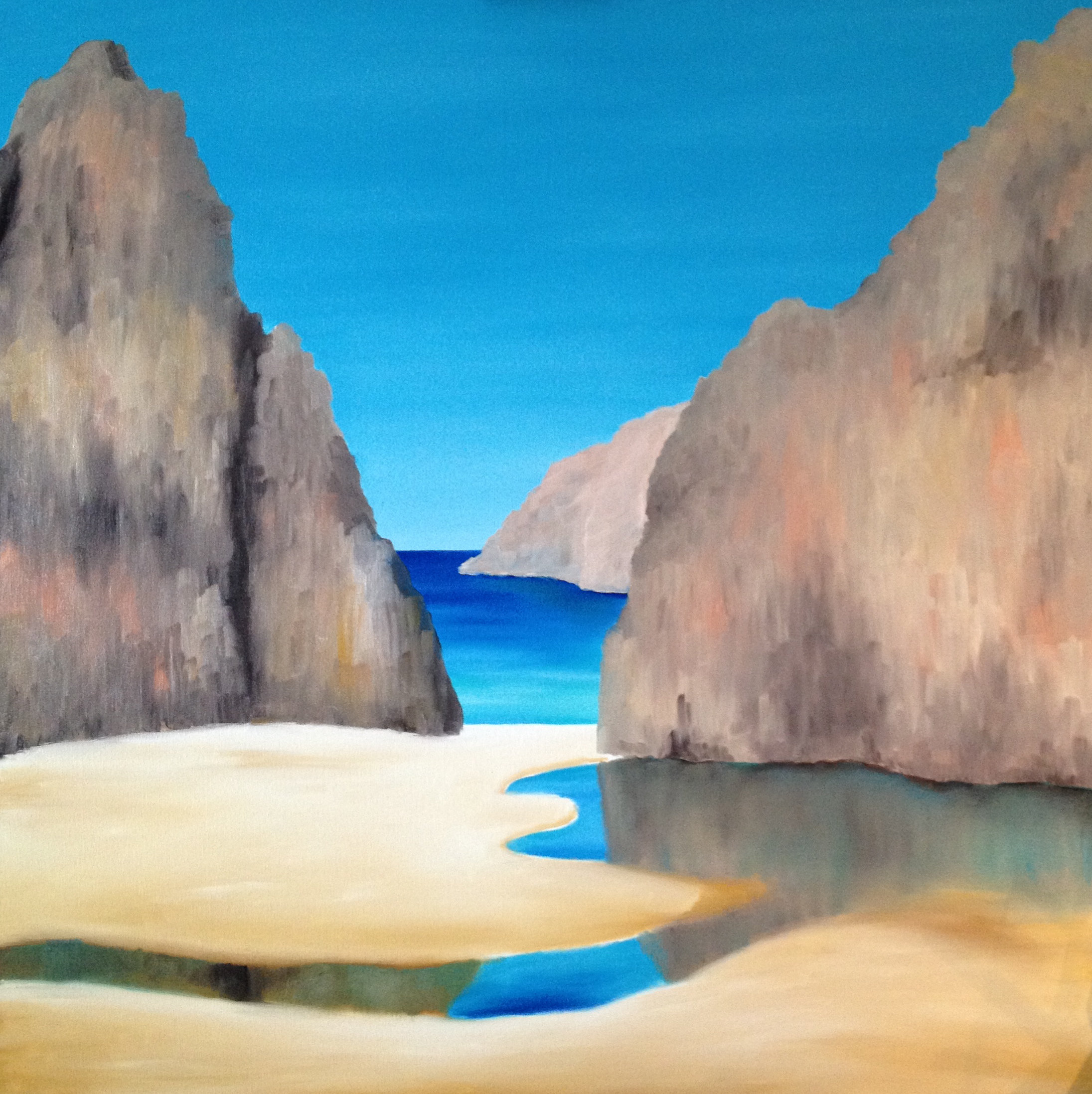
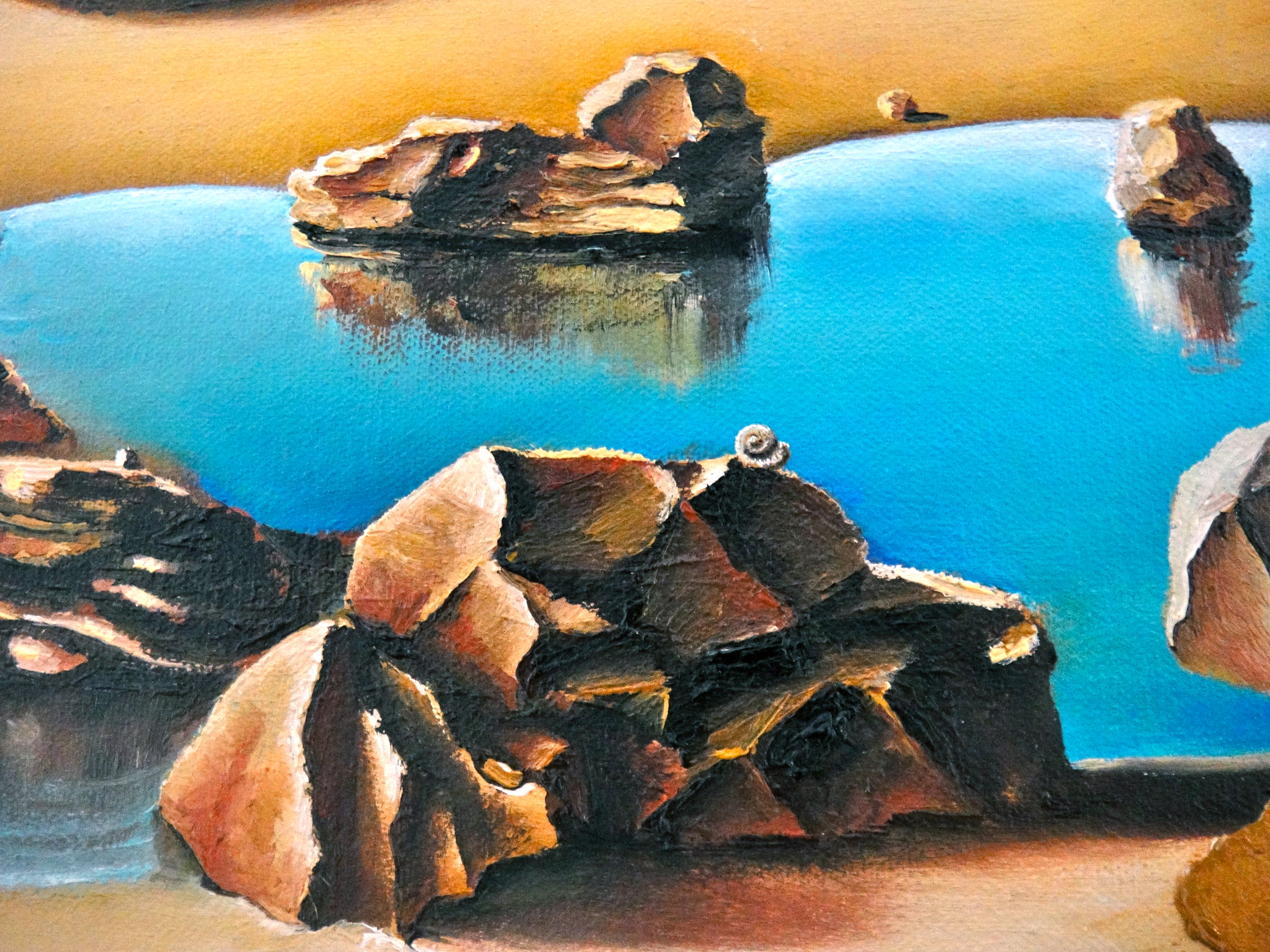
  Meanwhile in the foreground, an expanse of water separates my current life from my childhood, albeit only marginally, and that youth is symbolised my a self-standing rock in the bottom right of the canvas representing my family, a symbol which took on a whole new poignancy when my brother-in-law was killed last December. Meanwhile, in the rock pools to the left, also representative of my childhood, the smallest of shells represents the heady days of my youth when climbing over coastal rocks I would collect shells, affixing them onto little snails I had modelled which I would then sell at local fairs. Some could say it was the start of my art career. They were certainly formative years.
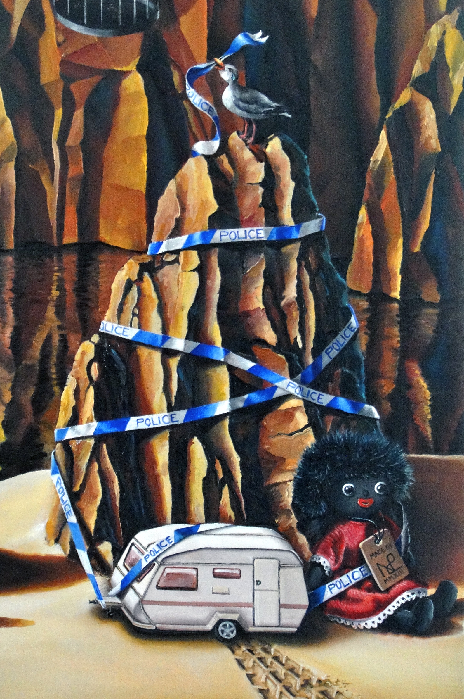
 So there we have it, my life on a large (120cm x 120cm) canvas in oil paint. I’m awfully proud of this painting, and also glad to have persevered over such a protracted period. The result is a truly reflective glimpse of my life as it stands and also acts for me as a kind of closure on all that is past. Now I look forward to a whole new chapter of my life, with all the artistic expression which will inevitably go hand in hand alongside it.
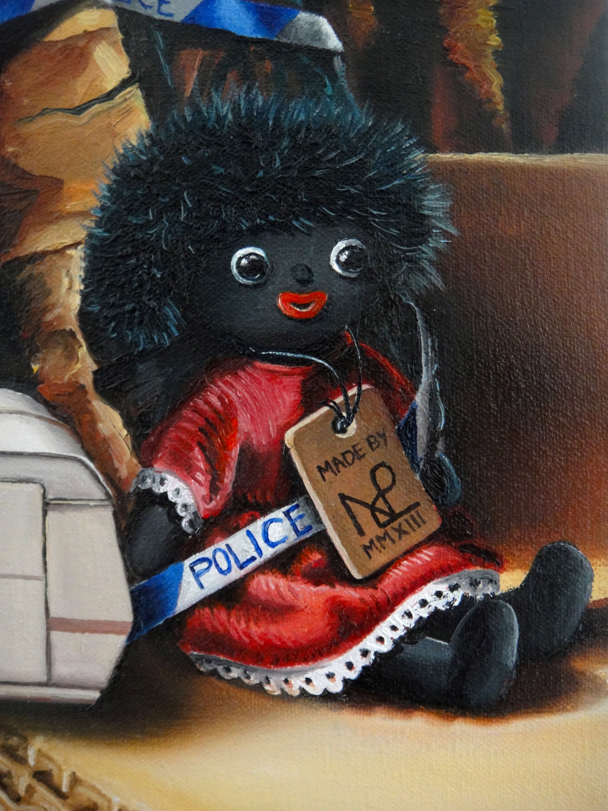 © Nicholas de Lacy-Brown and The Daily Norm, 2001-2013. Unauthorized use and/or duplication of the material, whether written work, photography or artwork, included within The Daily Norm without express and written permission from The Daily Norm’s author and/or owner is strictly prohibited. Excerpts and links may be used, provided that full and clear credit is given to Nicholas de Lacy-Brown and The Daily Norm with appropriate and specific direction to the original content.
Related articles
- Autobiographical Mobile: My painting diary – Day 24: A family tragedy (daily-norm.com)
- Autobiographical Mobile: My painting diary – Day 18: My Art and my Paris (daily-norm.com)
- Autobiographical Mobile: My painting diary – Days 20-23: Rock pools (daily-norm.com)
- Autobiographical Mobile: My painting diary – Day 17: Travel/ Gastronomy (daily-norm.com)
- Autobiographical Mobile: My painting diary – Day 19: Infanta España (daily-norm.com)