2012: the Norms review their year
It’s been one hell of a year for the Norms. One could almost call 2012 the Year of the Norm, except to do so would be to presuppose that no subsequent year would be equally as Normy, something which, the Norms anticipate, will certainly not be the case. 2012 has nevertheless been a year of great Normy prowess and adventure. Why 2012 was the year when the Norms headed to Italy, to Spain, to Portugal, to Holland and to France. They sailed down canals, they took part in Easter Parades, they cycled over Amsterdam’s bridges and boarded Lisbon’s famous trams. In Paris, the Norms explored the sculptures of the Musée Rodin, while back in London, they milled around in the National Gallery, became covered with Yayoi Kusama’s polka dots and ran from a fly attack in Tate’s Damien Hirst exhibition. Oh yes, those Norms are cultured little blobs, but they proved themselves to be great sports-norms too, partaking in London’s hugely successful Olympic and Paralympic games, as well as mustering the energy to stand in crowds waving the flag for Queen Elizabeth Norm’s Diamond Jubilee. So you see 2012 really was the year of the Norm, and although you may have seen them all before, here is a little review of some of the sketches which captured the Norm’s adventures throughout the year.
-
- Norms at the National Gallery
-

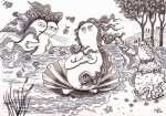
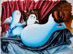
- And on a Winter Beach in Spain
-

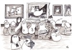
- At the Diamond Julbilee
-

- Covered with Yayoi Kusama Spots
-
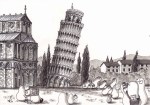
- Norms escape from a falling Tower of Pisa
-
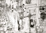
- And enjoy a Semana Santa Parade in Spain
-

- Norm celebrates his half birthday
-
- And again celebrates the easter celebrations in Spain
-

- And here too!
-
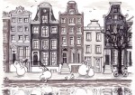
- This is the Norms in Amsterdam
-

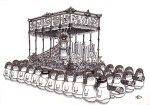
- And here they are on the royal barge Gloriana with the Olympic Flame
-

- This was the first day of the UK Summer
-
- And this was Botticelli’s Spring.
-

- Here the Norms enjoy the British summer
-

- And here they enjoy the Florence scenery.
-

- A Norm street party for the Golden Jubilee
-
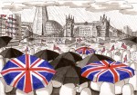
- And that soggy River Thames Pageant.
-

- Back to reality on the London tube
-

- And in the dream world of Venice.
-
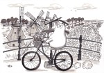
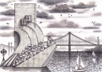
- This Norm is cycling in Amsterdam
-
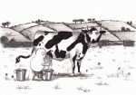
- And this one is milking a cow.
-
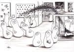
- These Norms have discovered Damien Hirst
-
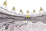
- And these are running at London 2012
-

- Hurrah for the Daily Norm’s First Birthday
-
- And for the Normy adventures across history.
-

- For Lisbon Norms this is a scene from every day life
-

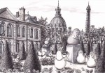
- While for Parisian Norms, it’s not unusual to see Egyptians wondering by.
-

- These Norm nuns have visited the Sacre Coeur in Paris
-
- While these Norm tourists are at the Musée Rodin.
-

- The Norms loved the Olympics…
-

- But adored the Paralympics equally.
-
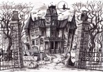
- Be scared at Normaween
-

- But be happy at Christmas – seasons greetings from all the Norms!
But that’s not all. 2012 was also the year when the Norms entered the history books, having themselves repainted in the image of some of the world’s most famous paintings. From Norms in the image of Manet’s Dejeuner sur l’herbe and, minus an ear (not that Norms have ears), in the guise of Van Gogh, to the Norm with a Pearl Earring, and the Norm with an Ermine, the Norms have recreated artistic greats such as Da Vinci, Frans Hals, Valezquez and Goya with their characteristic glowing blue complexion and their wide captivating eyes. What better time then, than at the end of the year of great Normular artistic endeavours, to take a look back at some of those paintings that made the year so artistically fruitful.
-

- Here’s Absinthe Norm (after Degas)
-
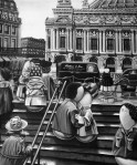
- And Norms kissing on the steps of the Opera (after Doisneau)
-
- This is a watercolour of the Rokeby Venus Norm (after Velazquez)
-
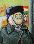
- And this of course is Van Gogh Norm.
-

- Here is the Norm’s take on Manet’s Dejeuner sur l’herbe
-

- And their take on the equally famous kiss by Klimt
-

- Here is a Norm Laughing Cavalier (after Frans Hals)
-

- And a deconstructed Norm (after Henry Moore)
-

- This is a Norm portrayal of Goya’s 3 May 1808
-
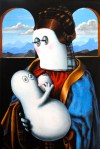
- And another of Da Vinci’s Madonna Litta.
-

- In this work, many Manet characters are combined into a single Normy scene
-

- While in this, the Infanta Norm (after Velazquez) shines.
-
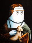
- This is Norm with an Ermine (after Da Vinci)
-
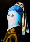
- Norm with a Pearl Earring (after Vermeer)
-

- And finally Nevermore Norm (after Gauguin)
So that’s it – it was a year of fantastic Normic success, both in colour and black and white. Here’s to 2013, for a year of great creativity, activity, and a continuously abundant imagination with the power to carry both me, and the Norms to new and undiscovered heights. Happy New Year!
© Nicholas de Lacy-Brown and The Daily Norm, 2001-2012. Unauthorized use and/or duplication of the material, whether written work, photography or artwork, included within The Daily Norm without express and written permission from The Daily Norm’s author and/or owner is strictly prohibited. Excerpts and links may be used, provided that full and clear credit is given to Nicholas de Lacy-Brown and The Daily Norm with appropriate and specific direction to the original content.