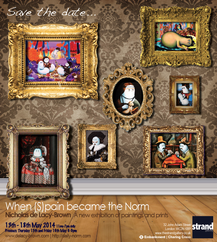
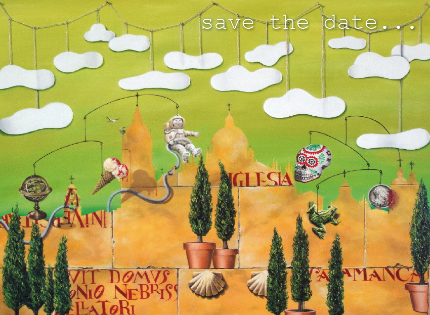
Countdown to my new Solo Exhibition | 3 days – Flamenco Norm
In 2005 when I was studying law at university, I started doodling The Norm. It was a character straight out of my imagination, but inspired by Kelsen’s Theory of Normativity which I was studying in jurisprudence. The inspiration wasn’t so much garnered from topic, which was inherently boring, but more out of the need to distract myself from falling asleep in lectures. With the advent of the Norm came a series of paintings, exhibited in 2006 at my Sussex solo exhibition, Between Me and My Reflection, before the collection dried up.
The next stage of this important Norm story is November 2011. I was on a career break, waiting for a new job to begin, and wondering how to make the most of the time suddenly available to me. It was my friend Cassandra who suggested that I rejuvinate the Norms, some 5 years after I had last painted them. The idea was sewn, and this very blog, The Daily Norm, was the result. I posted my first ever article on 14 November 2011, and from that moment onwards I went into artistic overdrive, drawing, painting and designing Norms for this blog.

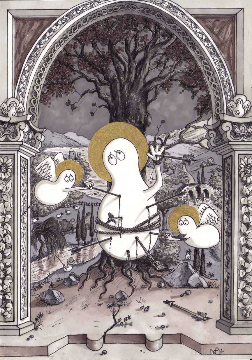
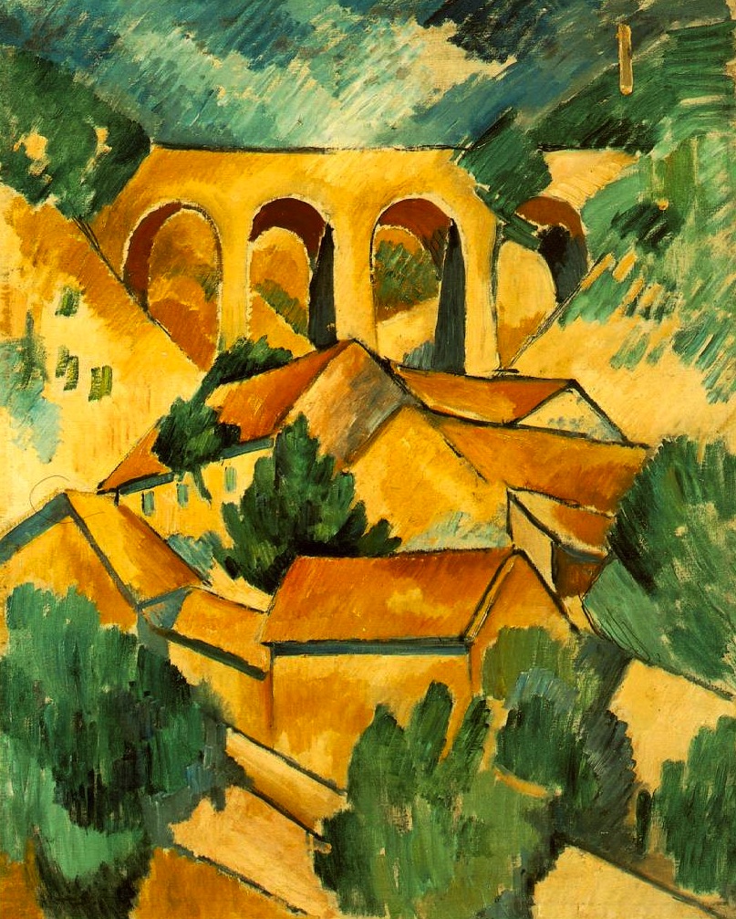
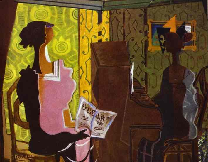
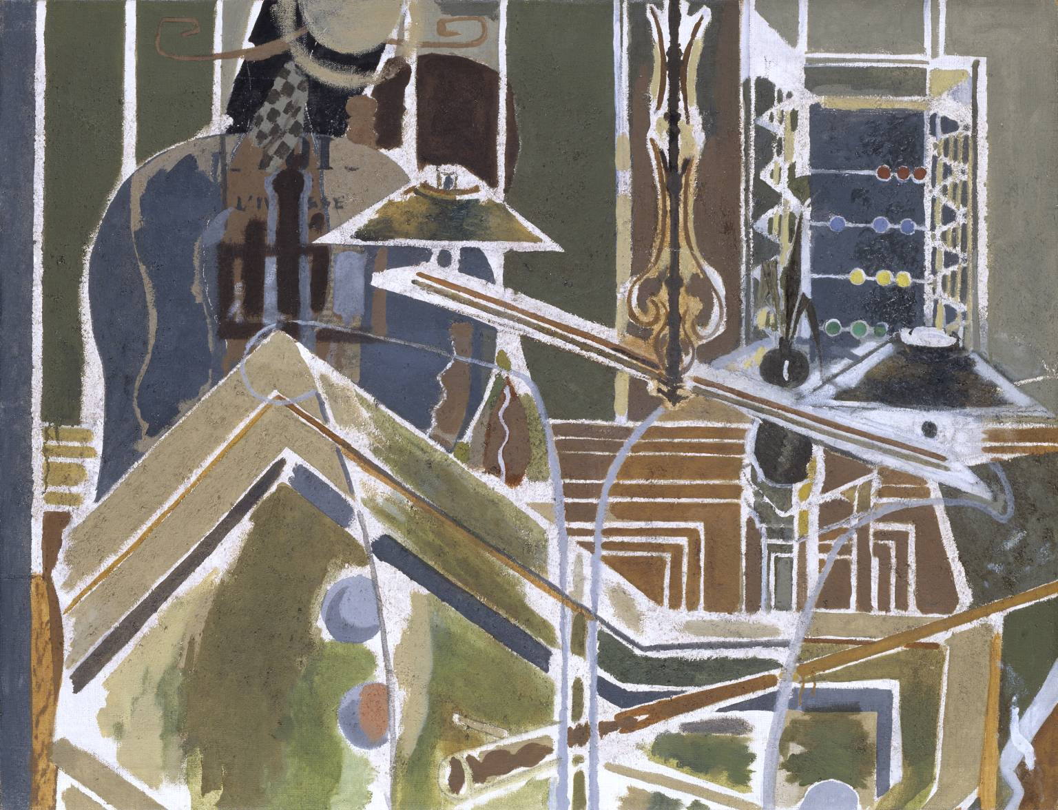
Flamenco Norm (2011 © Nicholas de Lacy-Brown, acrylic on canvas)
One of the first creations of the Norm rebirth was this painting: Flamenco Norm. Painting on the tail-end of my Spanish collection, and in fact created while I was in my house in Marbella, this painting represents the perfect transition between the Spanish section of my new London exhibition (starting in 3 days!) and the most comprehensive section of the whole show: my Norms! With its deep yellow cracking walls covered with flamenco memorabilia, its bare bulb and wooden floor, this to me is the typical Spanish flamenco setting, while the melancholy guitar and the energetic swish of the flamenco dress represents the heart and soul of this vibrant indefatigable dance. It’s still one of my favourite Norm paintings.
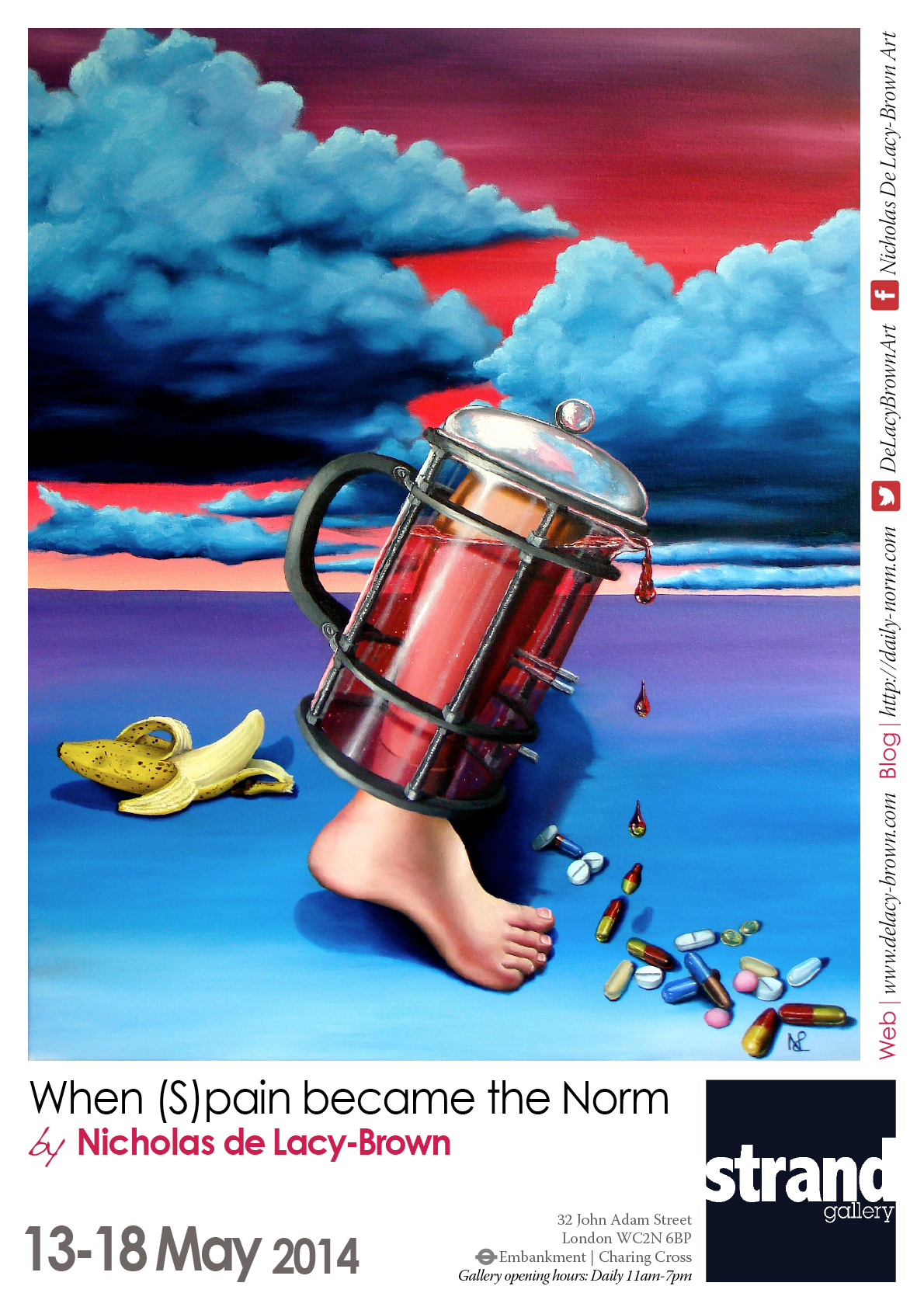
So as the title of my new exhibition, When (S)pain became the Norm, apty represents, this was the period when both pain, and spain transcended into a new era of Norms which has been growing strong ever since. See the entire collection at my new solo show – opening on Tuesday.
© Nicholas de Lacy-Brown and The Daily Norm, 2001-2014. Unauthorized use and/or duplication of the material, whether written work, photography or artwork, included within The Daily Norm without express and written permission from The Daily Norm’s author and/or owner is strictly prohibited. Excerpts and links may be used, provided that full and clear credit is given to Nicholas de Lacy-Brown and The Daily Norm with appropriate and specific direction to the original content. For more information on the work of Nicholas de Lacy-Brown, head to his art website at www.delacy-brown.com
Nicholas de Lacy-Brown’s new solo exhibition, When (S)pain became the Norm, will be at London’s Strand Gallery from 13 – 18 May 2014. For more details, click here.