Skip to content

Posts from the ‘Review’ Category

David Hockney at the RA – A stroll through the countryside without any defining moments

The dials of the huge London PR machine have been whirring noisily in anticipation of the David Hockney blockbuster show at the Royal Academy of Arts. Suddenly the charismatic British artist, complete with broad Yorkshire accent, white beret and a cigarette rebelliously hanging out of his mouth, has been on the front of every paper and magazine. For a new show of his work, simplistically titled “A Bigger Picture” has come to town, hailed as a key event of the Olympic year, as the living artist is practically unique in having the whole mass of the Royal Academy’s huge main galleries turned over solely to him. And the incontrovertible fact is, yes, these new paintings are very, very big. But as the wise (or just disappointed) often remind themselves…size isn’t everything. For poor old Hockney, stuck in the frenzied efforts of an ageing artist faced with the Herculean task of filling the RA space with largely new works created in only a handfull of years, this much-lauded artist has fallen foul of yet another well known adage: quality, not quantity.

The Road across the Wolds (Hockney, 1997)

Salts Mill, Saltaire, Yorkshire (Hockney, 1997)

Garrowby Hill (Hockney, 1998)

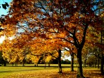
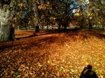
The exhibition started well. Once we had passed fairly swiftly through a gallery containing four landscapes of the same three trees in Thixendale, each painted in the four respective seasons, we entered a gallery paying retrospective homage to Hockney’s pre-2000 landscapes, starting with his magnificent burning orange rocky illustration of the Grand Canyon, and moving on to his Yorkshire landscapes completed when he moved back to the area from a long spell in LA (see above). I really enjoyed these works. With their bold but reflective colour scheme and rolling hills (which reminded me of my own Tuscany painting) they were pleasing on the eye and original in their composition. From there, we moved into the first of a long line of huge galleries all of which, as it turned out, contained pretty much the same image repeated countless times during different seasonal changes and from slightly altered viewpoints. The first wall was like a tapestry of small oil paintings which, as a set, worked well. They were pleasant to look at – like seeing a slideshow of countryside views all at once. However on closer observation of any specific canvas, it was clear that the works lacked in painterly technique – despite being painted outside, from observation, and at speed, Hockney does not capture the light or the complexity of the landscape in the sensational way that that other great outside painter, Claude Monet, did. In fact, for the most part, Hockney’s brushwork looked decidedly lackluster, even childish.

Three Trees near Tixendale, Spring (Hockney, 2008)

Thereafter we were met with a strange sensation of déjà vu as we walked form painting to painting, from one room to another. They are all paintings of trees. Lots and lots of trees. He hasn’t just painted forests, but with wall to wall forest views he’s managed to create a 3D forest in each of the galleries… perhaps that was the intention. Trees on single canvases, trees on multiple canvases stapled together, trees on film, trees on his iPad. Trees. That is not to say they weren’t pleasant, and scenic, and all the other niceties one can throw at them – but there was nothing striking, nothing remarkable. It was like bring on a stroll or a drive through the countryside. You look around you and think: the scenery is beautiful. And as you move on, you continue to be impressed by the subtle changes in the landscape all around you. But nothing really stands out. It just makes for pleasant surroundings. That was this exhibition – pleasant, samey and oh so repetitive.

Woldgate Woods 21, 23 and 29 November 2006

There was one distinguishing feature of course – but it’s nothing new for Hockney. It’s his fragmentation of all his big paintings into lots and lots of little canvases. In a way it probably makes them easier to paint in smaller spaces, more economical to travel, and more practical when the size of the walls available at the RA demands huge canvases to fill the space. But on so many occasions, Hockney was painting at a scale when a complete one-piece canvas would have done the job. But still he would insist on painting the scene across several canvases, even though they would then be stapled and framed together (thus obviating the benefits of smaller canvases considered above). The effect of this fragmentation of the canvas space was, for me, distracting, not least when Hockney had not even lined up the image over the canvases properly, so one tree trunk would start somewhere else in the adjacent canvas. To me, all these harsh deep edges, grid-like across the painting, felt a little violent as they jarred with the organic, living and breathing landscapes captured in the painting.

The Big Hawthorn (Hockney, 2008)

Nonetheless, the biggest distraction of all had less to do with Hockney’s compositions and much much more to do with the vast multitudes of people all around us. The place was packed – and this was a Friends’ preview day. Overcrowding has been the cause of much grumbling amongst the RA Friends, who after all pay a rather hefty annual subscription for these rare privileges of private views and the odd discount. In an attempt to alleviate the squash, the RA has started allocating Friends entrance times (causing further grumbles) but despite this, the RA clearly over-allocates for the space available, and as a result not only was every room packed tight but there was a vast queue to even enter the show. This cram did not dissipate at any stage, right up until the shop at the end, where people where fighting over postcards, swiping catalogues within an inch of another customer’s nose and losing all semblance of social etiquette in aggressively pushing their way to the till.

The Arrival of Spring in Woldgate (Hockney on his ipad, 2011)

This crush meant that the very point of the exhibition was a flop. For big paintings require a wide berth to be given before each painting so that one can stand back and consider the work from afar. But no such luck for us, pushed almost with our faces against the canvas, so what was visible more than anything was Hockney’s rather coarse brush strokes, rather than the intended over all effect of the whole. This was not, at least, a problem with the much talked about iPad pictures of which there were some 60 or so. These were blown up (and printed) quite substantially, but lost none of their precision in being so inflated – this was great news for the audience who could appreciate the iPad image from both close up and from a distance, all without pixilation disturbing the effect. However, disappointingly, because the works weren’t shown on iPad themselves, the whole point of this new digital medium was lost, since the images lacked the background luminescence which they would have boasted when created in their original form.

The final part of the exhibition did at least introduce some diversity. Hockney’s relentless study of Claude’s Sermon on the Mount resulted in a series of parodies. These made for a refreshing change – like finding a well lit path again after trawling through a dense forest. The biggest reproduction was particularly impressive. Having said that, Hockney has not added much to his reimagining of Claude’s work, only making it a bit lighter and more colourful. It’s a far cry from Picasso’s reworking of Velazquez’s Las Meninas for example, where he not only poked fun at the original, but brought so much of his own original style into the frame.

The Sermon on the Mount II (after Claude) (Hockney, 2010)

The Sermon on the Mount (Claude)

Hockney concludes the exhibition with a series of films of, yes, you’ve guessed it, trees (amongst other things) captured concurrently using 9 or 18 cameras. Such was the cram in the cinema-laid out room where they were being shown that I could get nowhere close, so in fairness to Hockney, I will comment no further.

The Arrival of Spring in Woldgate (Hockney, 2011)

In conclusion then, this show is like a refreshing stroll through the countryside on one of those days when the sun is out, and the first signs of Spring are breaking through after a frosty winter. But like all walks, you get tired quite soon, and the beauty of your surroundings quickly fade as your attention is swallowed up by the aching in your feet and the realisation that upon walking so far, you have the same distance to cover in order to get home again. There’s too many trees and too many people. Moreover, there is an overall feeling that the works have all been a bit rushed  in anticipation and realisation of the scale of the show. Size isn’t everything, but clear away the crowds and you may just be able to appreciate the quality of the wood from the quantity of the trees.

All the images contained on this post are the copyright of David Hockney.

Written content is the copyright of Nicholas de Lacy-Brown © 2012.

Elegance overflowing: Ladurée Covent Garden

For those of you who have been reading my blog since its inception, you’ll know that I am unashamedly obsessed with all things Ladurée. Not only is the café/salon/patisserie emblematic of all things Parisienne, it is also the height of elegance wherever it is situated (apart from the rather aberrant gold cave-like cacophony that is the Mayfair branch). There I was in December freezing my you-know-whats off in a huge queue for the Champs-Elysees branch in the heart of Paris, when all the time I had no idea that a spectacular new branch of the macaroon masters had opened up almost on my doorstep in London’s Covent Garden. And what a branch it is – large outdoor terrace on the cobbles made famous by My Fair Lady, a retail shop which glistens like the Hall of Mirrors at Versailles, and an upstairs salon of which Marie Antoinette herself would have been proud. To top it off, there’s even a small roof terrace overlooking Covent Garden’s market and plaza – the perfect view of street entertainers and the continental café culture underneath. All hail Covent Garden’s Ladurée!! It is a joyous thing for all us Londoners, and finally, a well needed injection of elegance has come to CG. And Ladurée is not alone. Joining it are new branches of Ralph Lauren, Burberry and the huge new glitsy Apple store which is for Guggenheim architectural contemporary glitz what Ladurée is for Louis XV glamour.

Ladurée's Covent Garden branch: the elegant retail counter

Ladurée's Covent Garden branch: upstairs salon

Ladurée Covent Garden - roof terrace

I visited this luscious Ladurée a few days ago. I had seen the shop and the outside terrace, but I had no idea what gems lay in store upstairs. There in the little salon, small Parisian-pavement style tables are matched with elegant velvet armchairs, small sofas, and even a chaise longue  topped by a four-postered curtained canopy. Meanwhile on the walls, elegant swept frames surround antique portraits of landed gentry, reminding those supping upon coffee and macaroons that they are in the company of the upper echelons.

Ladurée: Present indulgence in Past elegance (pen on paper, 2012 © Nicholas de Lacy-Brown)

Saint Honoré

So what did I partake of on this auspicious occasion? Well, it was a Saint Honoré pastry for me, although the choice was overwhelming and all-tempting, a rather shoddy iphone picture of which I enclose. This was theatre on a plate. One choux pastry dome surrounded by several miniature renderings, all filled with and surrounded by a delicate cream imbued with the subtle elegant perfume of rose, balanced with deliciously sweet sharp raspberries and an indulgent raspberry icing. It was phenomenally delicious, and while it doesn’t come cheap (£6 for the cake alone), it’s an incentive for any eater to sit up straight, mind their Ps and Qs, and hark back to the sophisticated society of a more dignified past.

Talking of dignified, the staff were fastidious in their approach, refined in their perfect appearance, and charming in their manner. And when they speak French to one another, I could so easily be back in the 1eme Arrondissement in Paris that I would consider moving into the café full time, except it would probably bankrupt me in about a week.

This Ladurée, in fact any Ladurée, is a must for all champions of tasteful pursuits. All that remains now is to recreate the patisseries themselves at home… I have the book, I have the ground almonds, the eggs, and I have the icing bags… I think, with some trepidation, I’m going to try my first macaroons this weekend. I’ll let you know how that goes…

À bientôt!

War on film: War Horse v Pan’s Labyrinth

War is in vogue right now – ok, not literally – but dramatisations of the first world war, or “The Great War” as it became known (with no appreciation of the horrors which were to come with the second) are popping up all over our screens. Here in the UK we had the depiction of the trenches in the now Golden-Globe winning period drama, Downton Abbey, where war even encroached upon the aristocrats’ much prized drawing room as the great stately mansion was turned over into a pop-up hospital – perish the thought. Meanwhile, I am chaffing at the bit with excitement as I anticipate the forthcoming television adaptation of Sebastian Faulkes’ Birdsong – surely one of the best fictional portrayals of war ever written, and the first book (and the last) which has ever made me cry. In the theatres, the West End blockbuster, War Horse, adapted from the children’s book by Michael Morpurgo, has been the talk of town, selling equally well when it moved over to Broadway. And now, finally, the WW1 frenzy has moved to our cinemas, as the very same equestrian sensation of War Horse hits our screens thanks to it’s overhaul and adaptation by the one and only, Steven Spielberg.

So, caught up in the excitement, I trotted along to the cinema to see War Horse on the first day of its general release. This was after the popular press spoke of a masterpiece, a tear jerker – by god, even the Duchess of Cambridge had been crying at the Royal premier in London – Speilberg’s best work for years and so on. And indeed I went along with high expectations. After all, wasn’t it Spielberg who directed that emotive, black and white masterpiece that is Schindler’s List and the equally powerful Saving Private Ryan? Sure, Spielberg has had his tacky moments – I’m thinking E.T. on a bicycle riding off as a silhouette in front of the moon, gigantic dinosaurs doing what ever they do in Jurassic Park (I can’t say I’ve ever watched more than about 10 minutes of this franchise) and the plastic shark in Jaws 1 – but with the likes of Schindler he’s directed some pretty stunning, serious masterpieces. But with War Horse Spielberg does not recreate his previous war-themed genius. He certainly does recall his tendency for directing tacky, sensationalised Hollywood tack which makes you cry indeed – from desperation.

Call me a cynic, but this poster says it all. Horse and man, stood together, hair tussled in the wind, the warm glow of a sunset reflecting on their faces which are absorbed in ambient pouting heroism. And from the cliched blockbuster poster follows a film which is overloaded with contrived, cheesy banality and boring, over-acted scenes which stretch the film to it’s full almost three-hour painstaking duration.

Read more

Film Season 2012: Maggie, Antonio and Adèle Blanc-Sec

Film season is upon us as the vacuum left by the passing of Christmas is swiftly filled with as many trips to the cinema as we can manage in the hope that with the passing of every film, this miserable month of January will pass quicker. It’s also the season of the DVD, what with half of us having received a small stack for Christmas, and the other half having received some sort of tablet computer for Christmas making the innovation of the film download all too easily accessible. Film is of course an art form and does not, therefore, escape the roving eye of the Daily Norm. Thus, in this new year run up to the Oscar and Bafta nominations, followed by the glittering ceremonies themselves, here are my thoughts on a few films I’ve seen recently. One is fresh out on a screen near you (or at least it is in the UK… I can’t make any promises for those of you who are further afield), one is fresh out on DVD and the other has probably been out for at least a year, but is so quirkyliscious that it deserves a mention.

Photo Credit: Alex Bailey / Courtesy of Pathe Productions Ltd.

1. The Iron Lady

Currently out at the cinema, this long awaited, much hyped biopic about the infamous British Prime Minister, Margaret Thatcher, is a must-see, but not a masterpiece. As the Thatcher story goes, it is one which has already been well-adapted onto the TV screen quite recently (The Long Walk to Finchley (2008); Margaret (Lindsay Duncan) 2009) and in terms of its own historical narrative, the film does not provide us with a particularly comprehensive overview of the Thatcher years. From her initial election as MP, to leader of the Party and then PM, the film follows Thatcher’s trajectory to power in a lightening bolt. So too is the Falklands conflict of 1982 and Thatcher’s eventual demise in 1990 shown in the blink of an eye, with very little sense given of what happened in the interim 8 years. Rather, the film spends, in my opinion, an unjustified amount of time focusing on Thatcher as an old woman, struggling to come to terms with the death of her late husband, Dennis Thatcher as well as with symptoms of dementia. What the film becomes then is a study about old age, rather than the chronological biography of a great woman. In this way, the film does what the ordinary TV documentary does not, giving the hard edges a human softness, but it did leave me wanting to know so much more about Thatcher’s time in office, and the first thing I had to do when I got home was look it all up on wikipedia.

Meryl Streep as Margaret Thatcher in THE IRON LADY Photo credit: Alex Bailey

Undoubtedly the triumph of the film, as everyone is saying, is Meryl Streep’s performance, which was an unwaveringly brilliant take on Maggie, sucking the audience into a complete illusion that this was the real Thatcher in front of us, rather than the all-singing, all-dancing Mamma Mia star beneath the makeup (and big wig). The only way in which the illusion was broken was during close ups of the old Thatcher, where the remarkable youthfulness of Streep’s face jarred uncomfortably with the age-making prosthetics of an elderly Thatcher look.

The film is also said to be successful because it exposes a human softness in an otherwise cantankerous and stubborn leader. But frankly, it seems ignorant of people not to have recognised, before seeing the film, that Thatcher, like everyone else, is endowed with a softer, human side. It always annoys me that people, particularly those of the younger generations, stipulate unashamedly that they have been brought up to “hate” Thatcher. It is said that the great majority of the country, particularly in the North of England “loathe” the former Prime Minister. Are these people so utterly lacking in insight that they cannot differentiate between a figurehead who had to make excruciatingly difficult decisions on behalf of a whole cabinet of useless cowards, and the woman who was driven, successful, but also remorseful and self-sacrificing?

2. The Skin I live in (La Piel que Habito)

Fresh out on DVD is the latest offering from Spanish director supremo, Pedro Almodóvar. The film, which is based on  Thierry Jonquet’s Tarantula, is the director’s first collaboration with Antonio Banderas in 21 years. The film is typical Almodóvar. It contains twists, deception, sexual deviance, violence and more than his usual twist of thrills. Without giving anything away, it’s about a plastic surgeon plying his trade to commit a devastating act of revenge with life-changing results. It’s creepy, and the setting in Spain’s Toledo and it’s arid countryside surroundings add to the chill pervading the plot. As always with an Almodóvar spectacular, its really very weird, but it’s this quirkyness which I adore, and which turns all of his films from Hollywood magic to artistic genius. This lavishly set, twisty macabre thriller is a must for any Almodóvar or Spanish-language film fan.

3. The Extraordinary Adventures of Adèle Blanc-Sec

My third film of the moment is this jovial French adventure film, which, as advertised, represents a glorious mix of my favourite film Amélie, with the adventure-style format of Indiana Jones or Tin Tin. The film, which was released in 2010 and probably came out on DVD about a year ago, is loosely based on a series of novels by Jacques Tardi, which have been adapted and directed by Luc Besson. Like much French cinema from the last decade, it is full of quirky details and surreal moments which make the film a delight to watch. Its characters are wonderfully over the top, almost pantomimic, and the setting of 1910 Paris is suitably atmospheric. The film follows the eponymous writer Adèle in a succession of far-fetched incidents in both Paris and a Mummy-filled tomb in Egypt. Seeking help from a mad old scientist in order to bring back to life a mummified doctor and thus help her comatosed sister (inflicted with a head injury caused by a hat pin), Adèle must rescue the scientist from death row while battling to control a recently hatched pterodactyl which is causing havoc all over Paris. It’s a wonderful adventure which both pastiches and subverts the adventure and speculative fiction of the period.

And finally, some films to look out for: War Horse – a massive success on the stage, but how will it adapt to the screen? Coriolanus – the bloodied Shakespearean masterpiece, brought to life by Ralph Fiennes and finally W.E. – Madonna’s take on the Wallace Simpson story. Much to look forward to and, if I see them, I’ll let you know what I think!!


Grayson Perry: Tomb of the Unknown Craftsman

Pilgrimage to the British Museum. Ink and graphite, 2011 © Grayson Perry

There is not praise enough for this superb, unusual and highly original exhibition which is currently being held at the British Museum in London. Combining works from the British Museum’s collection of ancient and historical importance, with the hyper-contemporary artistic musings of infamous cross-dressing artist, Grayson Perry, the British Museum has put on a show which departs radically from its mainstay shows of ancient China, ancient Lebanon, ancient Iran and so on. This utterly inventive exhibition is not only a refreshing change for the British Museum, but also for British contemporary art. For through Grayson Perry we have an artist who does not speak his mind for the sake of being controversial, but who, as a philosopher of our times, makes objective, shrewd and rational observations about the madness of today’s society. And he does so not in a way that is patronising or judgmental, but through works which are accessible, original and imbued with a sophisticated yet unpretentious sense of humour. And thus, amidst the requisite hushed silence of a London gallery, giggles, chuckles and sometimes outright guffaws broke through the air as the attendees of the exhibition relished in the exquisitely imaginative creations of Perry’s show.

Grayson Perry's teddy, Alan Measles

So what is the exhibition all about? Well, it basically gives Grayson Perry free reign to indulge in the unhindered realms of his imagination. Perry’s show thus takes the audience on a “pilgrimage” into his imaginary world, a world which revolves around his childhood teddy bear, Alan Measles, as the central protagonist. As the “god” of this imagined reality, the little teddy bear is expressed in a variety of religious personae, from temple keeper to the enshrined teddy as Perry explores themes connected with notions of craftsmanship in faith and sacred journeys – from shamanism, magic and holy relics to motorbikes, identity and contemporary culture. In fact, Perry and his teddy went on their own pilgrimage as a precursor to the exhibition, taking a trip on a wonderful decorated motorbike, complete with it’s own attached temple for Teddy, to Germany, the country which, in Perry’s youthful fantasies, Alan Measles had been at war with, the brave warrior in his turbulent childhood imagination. As the pilgrimage is transposed from physical journey to metaphorical odyssey through the carefully curated exhibition, we are taken through a winding gallery space, fit to bursting with a tempting display of rich glossy potteries and gems of the British Museum collection, extravagant Perry designed tapestries and plentiful shrines to Alan Measles. At its completion, the pilgrim trail concludes at the foot of a richly decorated cast-iron ship, a memorial to all the anonymous individuals that over the centuries have fashioned the handmade wonders of the world.

Read more

Brit Art is the main focus of the UK’s 2012 exhibition diary

It’s 2012, year of the London Olympics, and to celebrate the fact that this year, the UK will be the focus of the world (hopefully for all good reasons) London entered the New Year with a spectacular firework display like none other. But as the country gears up towards its greatest sporting event for generations, the UK’s major art galleries are embarking on a cultural olympiad all of their own. This is my brief guide of what’s on in the UK’s art diary in 2012.

From the Damien Hirst 2007 butterflies collection

Patriotism is at an all time high in the UK, what with the Royal Wedding last year and the Diamond Jubilee this year, a sense that we should fling ourselves unceremoniously out of the EU and of course those all important Olympics. And it’s a state of national pride which is being more than represented in 2012 by the UK art galleries. Having spent 2011 promoting some of the world’s best artists (Catalan Miró at Tate Modern, Mexican Kahlo and Rivera at Pallant House, Parisian patriarch Degas at the Royal Academy, and of course the Italian master himself, Da Vinci, at the National Gallery), in 2012, the UK is promoting some of its biggest British artistic stars of past and present.

LSD by Damien Hirst

Damien Hirst - LSD - Image via Wikipedia

For sure one of the biggest exhibition events of 2012 will be the Damien Hirst retrospective at Tate Modern from 4 April to 9 September 2012. Love him or loathe him (I tend towards the latter, but not always), he is one of the big stars of our generation, and his works do at least show some longevity, unlike many of his unsavoury, untalented counterparts (unmade bed anyone?). In particular I love some of the butterfly works of his recent oeuvre, but who knows whether they will be included in this show. For sure Mr Hirst’s 1991 Shark in Formaldehyde (“The Physical Impossibility of Death in the Mind of Someone Living”) is bound to feature prominently” – has it not rotted yet?) as well as his pharmaceutical cabinet (“Pharmacy” 1992). Expect big crowds, and a slightly stinking smell of putrefaction lingering in the air at this show.

The Physical Possibility of a Norm in Formaldehyde (after Damien Hirst) (2011, pen on paper © Nicholas de Lacy-Brown)

One of Hockney's ipad works

The second contemporary Brit art blockbuster must be the Royal Academy‘s David Hockney RA: The Bigger Picture solo exhibition from 21 January – 9 April 2012. This is an exhibition of new large scale landscapes rather than a complete retrospective. While it may therefore lack the naked golden-skinned boys jumping into Los Angeles pools of Hockney’s earlier career, his bigger landscapes look to be every bit as colourful and vivacious, as well as… well, massive. Having said that, the exhibition is set to include landscapes spanning his whole career, and will, interestingly, feature some of his new iPad creations for which he is famously enthusiastic. His ipad works have already been exhibited to some acclaim at the Pierre Bergé-Yves Saint Laurent Foundation in Paris in an exhibition appropriately entitled: “Fleurs Fraîches” so I will be intrigued to see how the works are displayed in this London show. There is no doubt about it, the ipad has made for a revolutionary new canvas for Hockney’s works. Just a shame about the financial side of things…

David Hockney, Winter Timber (2009)

Picasso's Weeping Woman (1937)

Meanwhile, at Tate Britain, a new exhibition running from 15 February – 15 July 2012 will explore how Picasso influenced generations of British artists: Picasso and Modern British Art. The British art on show will include some 90 art works by Duncan Grant, Wyndham Lewis, Ben Nicholson, Henry Moore, Francis Bacon, Graham Sutherland and, once again, good old Hockney. However, I’m frankly more excited by the 60 Picasso’s on show, and hope that the works will extend beyond Tate’s own collection of his works. Although having said that, I could spend hours in front of Picasso’s Weeping Woman (1937) – the first ever Picasso I saw and the one I fell in love with.

Ben Nicholson, 1937


Ben Nicholson, the tumultuous ex husband of other British favourite, Barbara Hepworth, will also feature prominently in a forthcoming exhibition held at the Courtauld Institute between 16 February – 20 May 2012, Mondrian || Nicholason: In Parallel. The show will aim to explore the largely untold relationship between Nicholson and Piet Mondrian during the 1930s when both artists were leading forces in abstract art in Europe. Promising to reveal how each artist was driven by a profound belief in the potential of abstract to create new forms of beauty and visual power, it’s something of a diversion from the collection-based norm of the Courtauld’s temporary exhibitions and should be a good one to look out for.

Claude Monet, Poplars on the Epte (1891)

Next, that old British master, Turner, will be given the kind of exposure which Britain does so well when bringing out it’s most celebrated artist for admiration. Both the National Gallery and Tate Liverpool will be paying homage to Turner in 2012, the National Gallery hosting a new show comparing Turner with Claude Gellée with Turner Inspired: In the Light of Claude  from 14 March – 5 June 2012, while at Tate Britain, an ambitious exhibition from 22 June – 28 October 2012 will bring together works by Turner Monet Twombly and explore the similarities between them in style, subject and artistic motivation. It is well known that Monet was suitably inspired by Turner’s superb handling of light and fog, storms and mist when he came to London during the Franco-Prussian war. How Twombly fits in remains to be seen – but I’m always open to suggestion.

Reflection (Self-portrait), 1985 © Lucian Freud

Finally, who better to complete the set of British artist masters than the artist who we sadly lost last year – Lucien Freud. In memory of this great artist, and taking a look back at what he did best – portraiture – the National Portrait Gallery will be taking a closer, comprehensive look at some of his greatest portraits from 9 February – 27 May 2012 in Lucien Freud: Portraits. It’s an exhibition which is sure to be a hit, as Freud paints his sitters with uncompromising honesty and intensity with virtuosity and exceptional skill. The exhibition features over 100 works from museums and private collections, so this will be an opportunity not to be missed.

So there you have it, a selection of the biggest and best shows coming our way in 2012. It’s going to be a busy year! Also worth a quick mention is a Pre-Raphaelites exhibition which will come to Tate Britain at the end of the year and the return of Edvard Munch to the UK – in fact to Tate Modern. It is I believe the same show I have just seen at Paris’ Pompidou Centre. If so, it’s a rather depressing retrospective, and won’t stand up overly well next to the superb retrospectives earlier on in the year.

Talking of Paris, I can’t end this post without mentioning one forthcoming show over in the City of Light which has caused me a great deal of excitement – the Edward Hopper retrospective – at the Grand Palais from 8 October 2012 – 20 January 2013. I cannot wait for this opportunity to see so many of this artist’s soulful, introspective works up close. Yes, it’s not exactly Brit art, but then we can’t expect Paris to promote the spirit of the London 2012 olympics… they were the losers after all.

Hopper, Early Sunday Morning 1930 Whitney Museum of American Art, New York

2011: My year in photos

It’s the last day of 2011, and for my second review of the year that’s almost behind us, I’ve looked back on all the photos I’ve taken this year and selected a few of my favourites. In this way, I can share with you my year. It’s been a pretty good year for me in some ways – trips to Paris, Mallorca, Madrid and Marbella as well as Liverpool and Cornwall in England. All made for some inspirational scenes which begged to be captured on my camera. But so to does home continue to inspire, the autumnal glow of nearby Clapham Common and Richmond Park offering stimulating riches with which the lens so easily engages. So please enjoy the photos I have set out and in the meantime I trust that all the readers of The Daily Norm will enjoy a superb New Year’s Eve and have a very prosperous 2012. My little online paper has only been running a short while, but I am truly appreciative of all the support garnered so far. Please continue to drop in on my Norm-world in 2012 and help to spread all things artistic, aesthetic and beautiful around the globe. Happy New Year!

© Nicholas de Lacy-Brown and The Daily Norm, 2005-2011. Unauthorized use and/or duplication of the material, whether written work, photography or artwork, included within The Daily Norm without express and written permission from The Daily Norm’s author and/or owner is strictly prohibited. Excerpts and links may be used, provided that full and clear credit is given to Nicholas de Lacy-Brown and The Daily Norm with appropriate and specific direction to the original content.

2011 – The Daily Norm’s top five (and floppy five) exhibitions of the year

When looking back on any year, it’s very easy to concentrate on what a rubbish year it’s been. And this year is no exception, what with economic gloom, a projected double-dip recession, euro-zone gloom, riots and unemployment gloom. Lot’s of gloom basically. But for that reason alone, I, ever the optimist, try to look back on the highlights of the year. And these tend to consist of two main categories – holidays (of which, sadly, there are not enough to fill a review such as this) and art exhibitions (of which there have been plenty). I am lucky enough to have attended the lion’s share of the exhibitions which London, and further afield, had to offer in 2011, and therefore, in a season when all the papers seem to be doing “roundups” of the year, I thought I’d share my thoughts on the best (and worst) exhibitions I’ve seen this year.

No.5 | Toulouse-Lautrec and Jane Avril: Beyond the Moulin Rouge – Courtauld Institute of Art, London

Jane Avril in the Entrance to the Moulin Rouge, c.1892 © The Samuel Courtauld Trust, The Courtauld Gallery, London

This small exhibition at London’s superb Courtauld Institute at Somerset House was no less brilliant by virtue of its size. Taking up space in only two of the Courtauld’s many galleries, the show was an intimate but atmospheric examination of the Absinthe-tinted shadowy underworld of the Paris cabaret-scene so emblematically captured in the works of post-impressionist master, Henri de Toulouse-Lautrec. It is thanks to him that seminal movie moments such as Baz Luhrman’s Moulin Rouge have been able to capture the essence of 1890’s debauched Pigalle social scene, filled with wonderful personalities such as La Goulue (the Glutton), Grille d’Egout (Sewer-grate) and Nini les-Pattes-en-l’air (Nini legs-aloft) as well as other characterful prostitutes, drunks and dancers. One such dancer who became synonymous with the Paris dancehall spectacle was Jane Avril, one of the stars of the Moulin Rouge, who undoubtedly played the role of muse to Lautrec’s portrayals of that same infamous nightclub. Such was her prominence in his work that her flame-red hair and exotic dance moves became symbols of the Moulin Rouge spectacle, as her fame was assured by a series of dazzlingly inventive posters in which she was the central attraction. However, her influence on Lautrec went further, and this exhibition features a number of stirring, more emotional portraits of Jane Avril which show the dancer off the stage, in private moments of introspection.

At the Moulin Rouge, 1892-95 © The Art Institute of Chicago

Such was the importance of this artistic coupling between aristocratic Lautrec and courtesan-born Avril (née Jeanne Beaudon) that the Courtauld placed the relationship at the centre of its show, including photographs of both the Artist and the dancer, and examination of the peculiar “St. Vitus’ Dance” disease which gave Avril her unique, disjointed dancing style, and an attempt to explore Avril’s persona, both in public and in private. This core objective was explored effectively by the Courtauld, but for me, the real winner of the show was simply the basic exposure it gave to this wonderful atmospheric Parisian world of the 1890s. Therefore for me, the star of the show has to be this piece leant by the Institute of Chicago, At the Moulin Rouge, a scene which perfectly depicts the atmosphere of the dancehall, complete with a self-portrait of Lautrec himself, the emblematic red hair of Avril, and the looming ghostly green face of May Milton, one of the performers, imbued with even more Absinthe-green hallucinogenic mystery than the melancholic daze induced by the green fairy in Manet’s masterpiece, L’Absinthe.

Read more

Da Vinci Season – Part 2: National Gallery exhibition review

Christmas is fast upon us, people are rushing around shopping like maniacs, there are now gigantic queues for macaroons at Ladurée on Piccadilly (I thought this madness only occurred on the Champs Élysées. We did however queue for 3 boxes…) and people are allegedly selling Waitrose Heston Blumenthal Christmas puddings for millions on ebay. However something else is in the air in London, and now, scattered across my coffee table and desk, where newly arrived Christmas cards should be taking central place, postcards of the masterpieces of Leonardo Da Vinci are fanned all over, renaissance music replacing carols on the CD player, and an open, full scale catalogue of Da Vinci’s works enables lavish Leonardo indulgence at every turn of the glossy pages. Yes, as promised, I have visited the much hyped National Gallery blockbuster, and now I can firmly pronounce myself to be a huge Da Vinci fan.

The Musician (Da Vinci, around 1486-7)

The exhibition, Leonardo Da Vinci: Painter at the Court of Milan, is not, at least to my mind, the exhibition of the decade as some commentators have lauded it. Nothing can quite surpass last year’s The Real Van Gogh at the Royal Academy which displayed a vast collection of mind-bogglingly superb works, nor indeed Tate’s incredibly comprehensive 2005 Frida Kahlo retrospective. It is, however, almost undoubtedly the exhibition of 2011. Unlike the close competitor – Tate’s Miro retrospective – Da Vinci did not go arrogantly off the rails towards the end of his career and start burning canvases or indeed painting them white with a single wiggly black line running somewhere across centre. No, for with the Da Vinci show, we are shown, from one work to another, what an undeniable master draftsman and painter this man was (asides from his various other mathematical, scientific, architectural, and engineering plaudits, to name but a few). Considering, compared to most artists, Da Vinci painted only a handful of works, each and every one is executed to an exceptional standard. Even in their various degrees of preservation, it is possible to see how superbly Da Vinci catches the light on his sitter’s skin, how accurately he has utilised his advanced knowledge of the human anatomy and perfect mathematical ratios to capture the very essence of human expression in his portraits, and how brilliantly, through detailed studies and sheer artistic brilliance, he was able to paint the most perfect drapery, clothing and overall compositional balance.

Da Vinci, Drapery Study for an angel (1495-8)

The paintings on show are far and few between, but we know this before entering. To have displayed 9 of only 15 surviving paintings is a coup for the National, and one can’t really ask for more. Take the Mona Lisa from the Louvre, and it would be like ripping Big Ben away from the Houses of Parliament. However, by reason of their sheer rarity, the sight of one, glowing majestically against a plum painted wall (the lighting is, by the way, very well executed) sends excitement through the audience in the same way that one becomes suddenly star struck when seeing a previous nobody reality TV star in a supermarket (I speak from experience – and no, I am not trying to suggest that Da Vinci’s paintings could ever be considered inconsequential). Then, filling the galleries besides are a great number of preparatory sketches and paintings executed by Da Vinci’s pupils and assistants. However the sketches are far from fillers (much like the use of endless sketches and scientific memorabilia in the recent Royal Academy Degas Ballerina show). Rather, they are crucial to understanding how Da Vinci managed to achieve such polished results, as well as gaining an insight into his thought processes (for example, this wonderful drapery study shows his intention for an altered composition for his painting, The Virgin of the Rocks in its second version, an alteration which, owing to pressure from his patrons, was never actually realised –  the original compositional planning for which can now be seen, using xray, under the paint of the final version). They are also crucial, no doubt, to proving the provenance of the various paintings, all of which seem to have undergone some level of doubt as to whether Da Vinci actually painted them.

The Belle Ferronniere (Da Vinci, around 1493-4)

Having said that, the sketches are small, as, indeed, are the majority of the paintings, and, predictably, one does find oneself becoming ever so slightly aggressive in trying to get within a metre’s distance of a work. While the National Gallery has been quite careful to limit the visitors to the show (and the huge queue for the daily released tickets which spirals outside is testament to the Gallery’s strict policy when it comes to letting in too many people all at once) there are still an awful lot of people all vying to have their fill of each and every detail of this show. Thus, I did find that one became unavoidably sucked into a sort of revolving carousel around the various exhibits, so that, like a slow conveyor belt, you could get your moment before a painting before being politely shoved forward by the belly of the man standing behind as he/it got a little too close for comfort. Break off from the conveyor and you would find it difficult to get close to a painting again for a while. And thus my eyes were not so much veiled by tears, as one commentator predicted I would, but rather by the sight of people’s heads. But then it’s alright for the reviewers isn’t it – they get to see the exhibition among only a handful of other critics. No wonder they were overcome with emotion – at how bloomin lucky they were to get the exhibition to themselves! Still, I’ve experienced worse, and for the National it does provide the added bonus that more people will buy the expensive exhibition catalogue in order to actually get a good look at what was on show.

Admirer looking at Lady with an Ermine as exhibited at the National

So what was on show at the exhibition? Well the exhibition was broadly split into 7 galleries, each room centralised around one or two Da Vinci masterpieces. In the first room, we met The Musician which is allegedly unfinished, but looks pretty good to me. In the next room, the stunning Belle Ferronniere was hung just across from my favourite, Lady with an Ermine, the two ladies almost competing with one another for who would be judged most beautiful as they had probably competed in life, the lady with an ermine being Cecilia Gallerani, mistress of Duke Ludovico Sforza, and the Belle Ferronnere thouht to have been the Duke’s wife. The Belle Ferronniere is a stunning work, her pose so confident, petulant almost, as though challenging Cecilia Gallerani, whose portrait was literally hung in the direction of La Belle’s gaze, to usurp her role as primary lover to the Duke. Both exhibit truly modern, strongly characterised poses, particularly considering the century in which they were painted.

Da Vinci's unfinished Saint Jerome (around 1488-90)

In the next room, the evidently unfinished Saint Jerome takes centre stage, but even in this state of incompletion, the painting demonstrates how accurately Da Vinci painted the human anatomy. It also proves a useful demonstration of Da Vinci’s working techniques and the stages he undertook in building up layers of paint on a canvas. Moving through into the exhibition’s central gallery, two much larger, more complex compositions are hung opposite one another is a fantastic pairing which is a unique achievement of the Gallery’s show: Da Vinci’s original Virgin of the Rocks, usually to be found in the Louvre in Paris, has been hung with the second version of the same composition, which is owned by the National Gallery. This allows for a direct comparison to be made of the two “rocks”. Personally my favourite was the National Gallery’s later version, where the colours were brighter, and the details more refined such as the little flowers in the foreground. Nonetheless, this version has been recently restored, hence the enhanced colours and more obvious details.

Read more

Da Vinci Season – Part 1: Norms do… The Lady with an Ermine

Da Vinci is back in vogue in London. The exhibition Leonardo da Vinci: Painter at the Court of Milan which is currently running at London’s National Gallery has received unprecedented high praise across the board. Critics are calling it a once-in-a-lifetime opportunity to see so comprehensive a collection of Da Vinci’s remaining masterpieces in one show. One art critic’s review was so expressive with superlatives and emotional exasperation that it read as though she had been party to some kind of religious transmogrification. The paintings, she said, were so stunning that one could barely take them in through eyes which were uncontrollably veiled with tears of unrepressed joy. Or something like that. High praise indeed, and with 5 stars across the board, what better way to grasp at some last minute Christmas sparkle than by attending the exhibition itself, a visit upon which I shall embark tomorrow. While you will of course be the first to receive my review of the show for which tickets are allegedly selling for £400 each online (yes, the temptation to sell is there – for these two tickets I could get a 5 star weekend in Milan, let alone see a show about nine paintings and a load of sketches… but naturally I am opting, in good conscience, for the  cultural extravaganza of the year), in the meantime, Part 1 of my seasonal homage to Da Vinci is in the form of the good old Norm parodies which you now know and love. Yes, today, the Norms bring you: Norm Lady with an Ermine.

Norm Lady with an Ermine (after Da Vinci) (acrylic on canvas, 2011 © Nicholas de Lacy-Brown)

And by way of comparison, here is Da Vinci’s stunning original masterpiece…

The Lady with an Ermine (Leonardo Da Vinci)

Da Vinci’s masterpiece was painted in around 1489-1490 and is usually to be found housed in the Czartoryski Museum, Kraków, Poland. It is in fact the central masterpiece of the Museum’s collection, and it’s inclusion in the London show is said to be the greatest coup for London curators of all their achievements in putting the show together. However, her inclusion was not without difficulty, and the Lady with an Ermine’s visit to London  comes only as a result of huge democratic efforts, not just on the part of the National Gallery, but on behalf of the UK Government’s diplomats and foreign office officials.

Read more