
2011 – The Daily Norm’s top five (and floppy five) exhibitions of the year
When looking back on any year, it’s very easy to concentrate on what a rubbish year it’s been. And this year is no exception, what with economic gloom, a projected double-dip recession, euro-zone gloom, riots and unemployment gloom. Lot’s of gloom basically. But for that reason alone, I, ever the optimist, try to look back on the highlights of the year. And these tend to consist of two main categories – holidays (of which, sadly, there are not enough to fill a review such as this) and art exhibitions (of which there have been plenty). I am lucky enough to have attended the lion’s share of the exhibitions which London, and further afield, had to offer in 2011, and therefore, in a season when all the papers seem to be doing “roundups” of the year, I thought I’d share my thoughts on the best (and worst) exhibitions I’ve seen this year.
No.5 | Toulouse-Lautrec and Jane Avril: Beyond the Moulin Rouge – Courtauld Institute of Art, London

Jane Avril in the Entrance to the Moulin Rouge, c.1892 © The Samuel Courtauld Trust, The Courtauld Gallery, London
This small exhibition at London’s superb Courtauld Institute at Somerset House was no less brilliant by virtue of its size. Taking up space in only two of the Courtauld’s many galleries, the show was an intimate but atmospheric examination of the Absinthe-tinted shadowy underworld of the Paris cabaret-scene so emblematically captured in the works of post-impressionist master, Henri de Toulouse-Lautrec. It is thanks to him that seminal movie moments such as Baz Luhrman’s Moulin Rouge have been able to capture the essence of 1890’s debauched Pigalle social scene, filled with wonderful personalities such as La Goulue (the Glutton), Grille d’Egout (Sewer-grate) and Nini les-Pattes-en-l’air (Nini legs-aloft) as well as other characterful prostitutes, drunks and dancers. One such dancer who became synonymous with the Paris dancehall spectacle was Jane Avril, one of the stars of the Moulin Rouge, who undoubtedly played the role of muse to Lautrec’s portrayals of that same infamous nightclub. Such was her prominence in his work that her flame-red hair and exotic dance moves became symbols of the Moulin Rouge spectacle, as her fame was assured by a series of dazzlingly inventive posters in which she was the central attraction. However, her influence on Lautrec went further, and this exhibition features a number of stirring, more emotional portraits of Jane Avril which show the dancer off the stage, in private moments of introspection.

Such was the importance of this artistic coupling between aristocratic Lautrec and courtesan-born Avril (née Jeanne Beaudon) that the Courtauld placed the relationship at the centre of its show, including photographs of both the Artist and the dancer, and examination of the peculiar “St. Vitus’ Dance” disease which gave Avril her unique, disjointed dancing style, and an attempt to explore Avril’s persona, both in public and in private. This core objective was explored effectively by the Courtauld, but for me, the real winner of the show was simply the basic exposure it gave to this wonderful atmospheric Parisian world of the 1890s. Therefore for me, the star of the show has to be this piece leant by the Institute of Chicago, At the Moulin Rouge, a scene which perfectly depicts the atmosphere of the dancehall, complete with a self-portrait of Lautrec himself, the emblematic red hair of Avril, and the looming ghostly green face of May Milton, one of the performers, imbued with even more Absinthe-green hallucinogenic mystery than the melancholic daze induced by the green fairy in Manet’s masterpiece, L’Absinthe.
No.4 | Gerhard Richter: Panorama –Tate Modern, London

Betty (1988 Gerhard Richter)
Tate Modern’s current retrospective spanning some five decades of the work of German artist, Gerhard Richter, presented me with probably the most pleasant surprise of 2011’s exhibition calendar first, because I hadn’t heard of him before and secondly, because I assumed from publicity advertising the exhibition that this was going to be a show consisting of inaccessible, messy, Pollock-esk abstracts. But this exhibition (which is still on… but not for long!) turned out to be one of Tate Modern’s greatest shows this year, not least because it really was a show which had something for everyone. Richter is quite unique in that he indulged in a range of artistic styles consistently, throughout his career. Unlike many artists, who begin in a figurative style which gradually loosens up before becoming completely abstract at the end of their career, Richter demonstrates an ability to master both the genres of photorealism and complete abstract with equal finesse right up until the current day. Take this 1988 painting of his daughter, Betty. It’s utterly photographic but with its haziness and unusual composition showing the sitter looking away from the canvas, it retains the artistic originality which many photorealistic portraits lack. Then by complete contrast, Richter paints a powerful abstract interpretation of the Twin Towers on 9/11. This superb piece is simple, but utterly compelling, the splashes of paint looking eerily like the planes plunging into the towers, ripping them apart.

September (2005, Gerhard Richter)
His work is all the more compelling because of its confrontational historical perspective, from works which show the Artist confronting his family’s Nazi past, to works in which other family members were victims of the very same regime. His 9/11 portrayal demonstrates that in the later years of his career, Richter is still capable of responding to significant moments in history with skill and sensitivity, while his mastery of the photorealistic genre demonstrate that he is a true artist, unafraid of embracing the figurative image as a realisation of true artistic representation. I particularly like his unusual blurring technique, by which he paints a very realistic image and then appears to blur the image with long light strokes across the surface of the paint. This gives the impression of an almost quivering, moving image. Also striking are his very abstract “squeegee” paintings whereby he scrapes a squeegee across the surface of heavily applied oil paint, building up layers, and sometimes scratching through to layers beneath.
No.3 | Miró: The Ladder of Escape – Tate Modern, London

Still life with old shoe (MOMA, New York, 1937)
This much anticipated show was the first major retrospective of Miró’s work in the UK for nearly 50 years and certainly lived up to the hype which preceded it. I found it thrilling to follow Miró’s career chronologically, to see how his first surreal images of his native Catalan landscape, farmhouses and the like, gradually loosened, becoming less figurative, and more symbolic, as 3D landscapes disappeared, and figures were reduced to bare bone line drawings which represented, in the simplest of forms, a snail, a star, a face and so on, all in startlingly bright colours juxtaposed with almost childlike effect. For me, this was an exhibition in three parts. First, the start of Miro’s career: a loosening of figures into the realm of symbolism, but still full of visibly identifiable images culminating in his stunning works presenting a direct reaction to the horrors of the Spanish Civil War in 1936-9. This painting, Still Life with an Old Shoe, is said to be Miró’s Guernica and was, by far, the stand out peice for me. The clever interchangeability between glowing colours against the severe black interspersed patches gives an effect of glowing embers, thus conjuring a sense of the impending and active disaster occurring in Spain, albeit through the basic symbolism of an old shoe, fork, broken bottle and bread.

Le Passage de l'oiseau divin (1941)

Peinture sur fond blanc pour la cellule d'un solitaire III
The second part of the exhibition saw Miró take his linear representations further, and in the Constellations and the Barcelona Series in particular, we see Miró painting what are perhaps some of his most emblematic works, full of the simplistic stars, smily faces, lines and dots, snails and birds which have made his work recognisable all over the world. In his Constellations, the canvas almost explodes with a complex amalgamation of symbols which are nonetheless simplistic representations of an even more complex overall scene. From this point, and following his move to Mallorca, Miró’s work becomes more and more simple, with his lines becoming thicker, less precisely applied outlines of heavy black paint, and with this simplification at its core, the exhibition entered its third phase – the last phase of Miró’s career. This third of the exhibition I did not like. Miró appears to have become slightly arrogant as he paints what appear to be lacklustre works bordering on rubbish. The rooms showing this period of his work are full of paintings which he has vandalised, either by painting over his previous works with vulgar black lines, or painting canvases only to then burn holes through the middle of them, and worse, huge monotone canvases with just a single line painted through them. We are of course instructed that these paintings are loaded with all sorts of significant meaning, and that Miró contemplated that single line for days before applying it to the canvas. He may well have done, but that doesn’t make the line any more worthy of praise, let alone hanging space in a gallery. It’s a shame that Miró ended his career with this perfunctory performance, because for me, it meant that the exhibition, in tandem, left me with a bitter taste in my mouth at it’s end. For me it was an apt demonstration of what happened to art history over the decades. It all started with the impressionists – freedom was ignited into art and a period of superb creativity resulted. But then came the second world war and by this point figurative art seemed to have been stretched to its widest horizons. What follows are works which are no longer aesthetically pleasing, which invariably make little sense, and which demonstrate how really very rubbish the second half of the 20th century was for art.
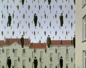
No.2 | René Magritte: The Pleasure Principle – Tate Liverpool

The Empire of Light (1950)
Now here was a man who remained consistently fantastic throughout his artistic career. Réne Magritte, one of the most revered and popular surreal artists of the 20th century, but whose works are often dismissed by the “institution” as being too commercial. Well that’s just rubbish, and this wonderful collection of many of his best surreal masterpieces was close to being my favourite exhibition of the year. The show was held in Tate Liverpool, which I had never visited before. I’m glad I did though – Tate Liverpool is in a fantastic situation within the newly redeveloped Docks (an amazing area with some truly innovative new architecture and glorious grand Victorian architecture alongside it) and its show of Tate’s permanent collection is also well worth a look – I had Picasso’s weeping woman literally all to myself for 5 minutes! Anyway, back to Magritte. His work is only commercial because his images are so damn clever that they have been used, and reinterpreted, and reflected upon by endless advertising companies and marketing agencies and pop stars throughout the decades. But that does not take away from what are truly inspiring pieces. What makes Magritte’s works so accessible is that they usually feature everyday objects and commonplace scenes but with an ultimately original, utterly surreal twist which makes them both amusing and compelling at the same time. Add to this his obvious skill as a painter and draftsman, and what you get is a thoroughly enjoyable work which has the power to engage an audience as much as it uneases them. Particular favourites were the “empire of light” paintings – at first glimpse all appears normal until your realise that daytime has been comfortably juxtaposed with nighttime – and this work, Personal Values, which demonstrates Magritte’s skill as a figurative artist alongside his knack for creating the unreal out of reality.
")
Personal Values (Magritte, 1952)
No.1 | Edward Burra – Pallant House Gallery, Chichester (Sussex)

The Snack Bar (Burra, 1930)
So which exhibition made it to my number one of the year? Well, it’s a surprising one, a small exhibition of a relatively overlooked British artist exhibited out in the small Sussex gem that is Pallant House in Chichester: the retrospective of Edward Burra. This exhibition, which is still on until February 2012, offered me everything I could possibly want from an exhibition. Ever the attuned social observer, Burra’s career started with a number of whimsical paintings capturing the carefree age of the 1920s. The cafes in Paris, 1930s Harlem, wedding parties, snack bars, ports and prostitutes. His draftsmanship is unique and charismatic, complex and colourful, and his scenes are a throwback to an era of self-discovery and indulgence after the constraints of the Victorian age were lifted.

Three sailors at the Bar (Burra, 1930)
From these frolicsome scenes, Burra goes on to explore the darker side of humanity, as the shadow of war covers Europe. There are some truly original depictions of the Spanish Civil War, showing soldiers dressed in costume from the time of the Conquistadores, while Burra’s image of the Blitz across Britain is truly original, a bird of horror flying over the British countryside like a stormcloud of the ultimate doom. From war to pastural tranquility, Burra moves to landscapes of his native Sussex, sensual bucolic depictions of rural life, harvests and fishermen, while in the next gallery, homage is paid to Burra’s more vivacious sideline as set designer for theatres, operas and the influence of the jazz age on his work. This was an everyman show, an engaging and exciting romp through 20th century social history through a set of vivacious striking colours and compositions. What was all the more striking was that these paintings which show such colour depth were all painted in watercolour.
Prior to this exhibition, Burra was not a name that meant anything to me. I had been captivated by his painting, The Snack Bar, earlier in the year when I saw it at Tate Modern. I even bought the postcard. However I didn’t register the name of the artist, nor take any further interest in him until this superb show in Chichester started to gain appropriate accolades in the press. Now I can happily say that he is one of my favourite British artists, and this retrospective was undoubtedly my show of the year, because not only were the paintings great, but the artist was a fantastic discovery too.

The Strawman (Burra 1963)
So there you have it, my top-5 shows of 2011. What about Da Vinci at the National Gallery you may ask? Well, as I said in my review of the exhibition, it clearly is a standout show of the year, but for me personally it’s not my favourite, purely because my tastes lie post 1860 and anything before will always inspire a little less. It’s in the top 10 for sure though!
So, before I leave you with dreams of all the exciting exhibitions we have to come in 2012 (it should be a good one, with galleries promising blockbuster shows to coincide with the London 2012 Olympics) here is just a quick mention of the 5 shows which were more flop, than top.
No. -5 | Degas and the Ballet: Picturing Movement – Royal Academy of Arts, London

This was a show of mixed fortunes. For the spaces which collected together an array of superb Degas pastels and oils depicting the beauty of the Paris ballet, and even a few paintings of Russian dancers, this show was a joy to attend. But that is where the exhibition should have ended. However, rather than place the exhibition in its smaller Sackler Wing galleries and charge a smaller admission show, the Royal Academy sought to make this exhibition into a blockbuster-sized show akin to their previous Van Gogh spectacular, by spanning it out across the main galleries. This meant for about 5 galleries full of fillers – scientific paraphernalia which sought to persuade the audience that Degas’ primary objective in painting the ballerina was to study the science of movement in the same way as his scientific contemporaries, such as Eadweard Muybridge, were doing at the time. I was not convinced.
No. -4 | The Vorticists: Manifesto for a Modern World – Tate Britain, London
 This exhibition was too fussy, badly laid out, and above all things, rather boring. Concentrating on the Vorticist manifesto contained within the magazine, Blast, it made for a wordy exhibition which was rather too much like hard work. The paintings on display included some impressive works by group leader, Wyndham Lewis, and some great sculptures by Sir Jacob Epstein, but for the most part the works were very linear and geometric, and looking at one such painting after another was a bit like staring at the underside of a car and trying to make sense of it all.
No. -3 | Modern British Sculpture – Royal Academy of Arts, London
 This much hyped show started off fairly well. Some fantastic sculptures of almost prehistoric origin were intermingled with some classics from the 20th century British school of sculpture. What followed was equally impressive: Epstein, Moore and Hepworth, as well as some spectacularly intricate and vainglorious works from the Victorian era. But then it all started to go wrong, as the modern installation reared its ugly head across half of the exhibition space. And thus a rancid rotting stench started to pervade the galleries, getting stronger and stronger as you passed from one room to another. This, it transpired, was a Damien Hirst rotting cow head (Let’s Eat Outdoors Today, 1990), which after only two days since the exhibition’s opening had already attracted a multitude of flies and maggots to its decomposing mash. Then there was Anthony Caro’s Early One Morning, which looked like yet-to-be-constructed steel work from a building site (painted red) and the rubbish which is Chalk Line by Richard Long (is he even British?). This all culminated in the biggest waste of space ever to have been hosted by a British gallery – a huge gallery space in which the cover of a tabloid newspaper from every day of the exhibition would be pinned, thus representing some kind of living sculpture. Errr, if you say so Royal Academy.
No. -2 | Building the Revolution: Soviet Art and Architecture 1915-1935 – Royal Academy of Arts, London

This exhibition (still showing if you feel so inclined) is surely one for the Soviet historians exclusively. For anyone else, it is a particularly bleak and rather boring trudge through soviet architecture and the movement of so called Painterly Architectonics. Again, this exhibition is quite fact heavy, and for that reason alone will only really appeal to those with an interest in the era, who I can’t imagine to be numerous. It is at least quiet, which was a welcome relief from Christmas shopping on the streets outside.
No. -1 | Tate St. Ives Summer Exhibition – Tate St Ives, Cornwall
By far the biggest disaster I saw this year was the summer exhibition at Tate St Ives. A gallery full of balloons supposedly representing “space” (Martin Creed, Half the Air in a given space), another full of pictures composed from drift wood stapled together and painted in monotone pastels (Margaret Mellis), and another where the image is formed from people writing their names on the wall where their height measures. Presumably no one is worried about the fact that this will all be painted over for the next exhibition?

So there we have it. Overall, the Royal Academy was the biggest loser this year (and I didn’t even mention how bad the Summer Exhibition was, because I’ve since tried to blot it out of my memory). The winners seem to be Tate Modern/ Liverpool, and Pallant House Gallery, whose earlier exhibition on Frida Kahlo and Diego Rivera earlier in the year was definitely in my top 10. Can’t wait to see what the galleries have for us next year… Until then, please feel free to share your comments on any of the above and in the meantime have a superb New Year.
Related articles
- Jane Avril, French Can-Can Dancer (retrorambling.wordpress.com)
- Toulouse-Lautrec and Jane Avril at the Courtauld Institute (wired.com)
- Norms do… Degas’ L’Absinthe (normsonline.wordpress.com)


Having myself viewed 7 out of these 10 exhibitions I would agree that all in all 2011 was an excellent year for British Art Galleries