2016: My Year in Photos
It’s beyond crazy that a year has passed since I last compiled a photographic review of my photos. I remember exactly where I was sitting when I last did it, the rush I felt at writing the post before jetting off the following day to Venice…I practically remember what I was drinking (gingerbread green tea surely… it comes highly recommended). Short of remembering the clothes I was wearing, it seems so ridiculously proximate in time that I feel almost in a state of dreamlike disorientation as I engage on the annual tradition of writing this post. Even filing through my many thousand of photos does not convince me that enough time can have passed for a year to be up already. And there was I thinking that leap year 2016 had one more day to its number.


And yet my calendar tells me that we are once again here again, coming to the end of another year, and one which for me has been very, very busy but full of light, sunshine and happiness. All of these things have mainly been the result of my location which, for another full year, was based on the paradise island of Mallorca in the Mediterranean sea, a backdrop which provided a daily life rich in sensual pleasures, and from which other fantastic locations such as Barcelona and Granada were only a short plane’s hop away.


Yet asides from the visual riches so inherent in Spain, 2016 was a year which provided us with the opportunity to explore old favourites such as the enduringly attractive city of Rome, and also to embrace the new: the island of Menorca, Split in Croatia and Vienna in Austria were just three of those exciting new destinations which we were lucky enough to discover in 2016. It was also a year of discovery for my young family too…One of my highlights has to be the visit to Mallorca of my sister and young nephews, and experiencing their joy as they dipped into the warm sea for the first time.


When I look back over 2016, I remember a year of stark contrasts. Because for all of the beautiful experiences which manifest in these photos shared today, I cannot deny a feeling of trepidation as I leave a year which presented so many new dangers. As if Brexit in June was not bad enough, the Trump election in the US just 5 months later was like rubbing salt into a still unhealed wound. And in my personal sphere, the news that I will soon be leaving to Mallorca to take up life again in London likewise will come with its share of challenges. Only time will tell how this cocktail of external and personal factors will play out, and the experiences which will result. However I am confident that in 12 months time, another year will have quickly passed. I look forward to sharing with you the photographic gallery which will surely result.
-

- Born Market, Barcelona
-

- Ancient landscape, Mallorca
-
- Gothic grandeur, Vienna
-

- Street scene, Rome
-

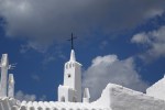
- A temple in Pollensa
-

- Summer solstice in Hvar
-

- Perfect seas, Menorca
-

- Caffe Greco, Rome
-

- St George and the Dragon
-

- Baroque perfection, Roma
-

- Ciutadella, Menorca
-

- The streets of Split
-

- Baroque brilliance, Rome
-
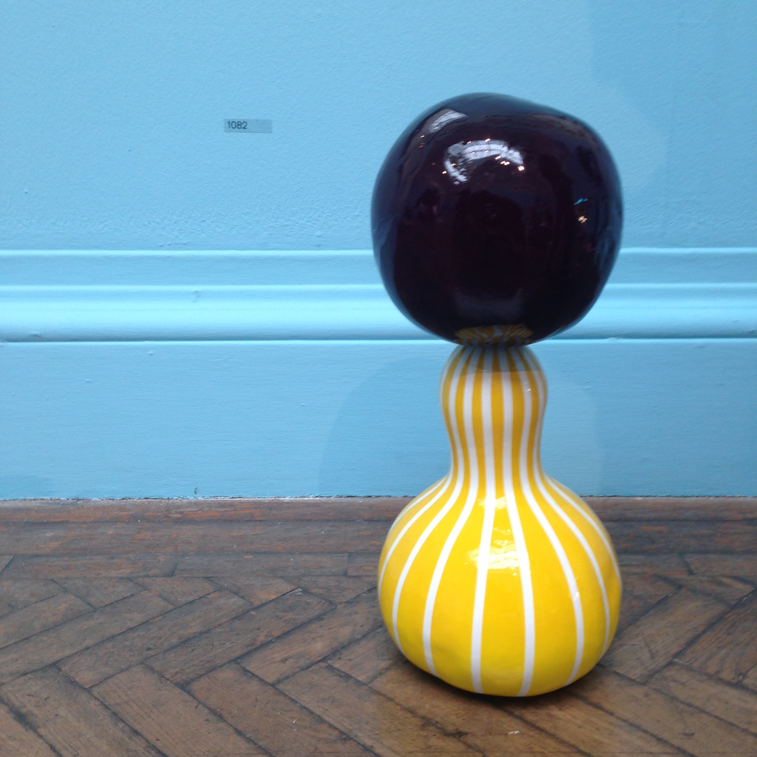
- Glass goods from Venice come home
-
- Passeig de Gracia, Barcelona
-
- Stormy morning, Palmanova
-

- The majestic Alhambra
-

- Hockney kind of life, Menorca
-

- Springtime in Mallorca
-
- Binibeca Vell, Menorca
-

- Ses Salines, Mallorca
-

- Mallorca’s Spring
-
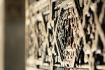
- Incredible intricacy, Alhambra
-

- When in Rome…
-

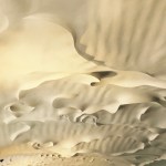
- Cactus landscape
-

- Roman antiquity
-

- Stormy skies, Menorca
-
- Gaudi’s Ceiling, Barcelona
-

- Murals at the Vatican
-

- Vienna rooftops
-

- Roman holiday
-
- Lithica labyrinth, Menorca
-

- Cala San Vicente, Mallorca
-

- The Granada pomegranate
-

- Chain reflection
-
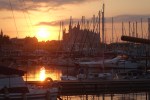
- Sunrise over Palma Cathedral
-
- Floral perfection, Menorca
-

- Sunlight and shadows, Ibiza
-

- Arabic waters, Alhambra
-

- Palma abstract
-
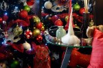
- Christmas comes home
-

- A little friend
-

- Split, Croatia
-

- The rooftops of Hvar
-

- A group from the past
-

- Sun or Moon?
-

- Viennese Silhouette
-

- Croatian sculpture
-

- A Pantheon Moment
-
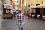
- Dominik where he feels best at home…Rome
-

- Roman facade
-

- The majesty of Vienna
-

- Mimosa, Parc Güell
-
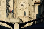
- The ancient clocks of Diocletian’s Palace
-

- A very cosy frog, Granada
-

- Ciutadella cathedral
-

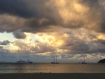
- Sunset in Palma
-
- Mediterranean palette
-
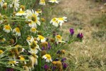
- Spring flowers
-
- Botanical Gardens, Soller
-

- Lambing season begins
-
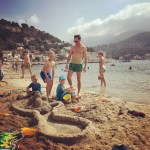
- The nephews come calling…
-

- Views worth climbing for…
-

- Plantlife in Hvar
-
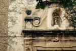
- The ancient heart of Pollensa
-
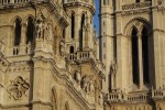
- Parliament, Vienna
-

- Sunset over Palma
-

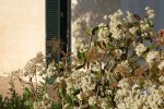
- Floral delight
-

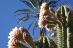
- Cacti Eden
-

- Even a dog needs to eat
-

- Boats and reflections
-

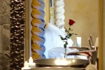
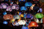
- Rosewater
-

- Pond life
-

- Double trouble
-

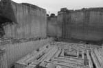
- Ancient stonemasonry, Menorca
-
- A rose for Valentine’s
-
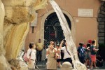
- Tourists in the Piazza Navona
-
- Jewels of Granada
-

- Colours of the Eixample
-

- Skyline, Menorca
-
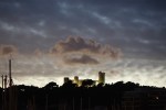
- Bellver Castle in Silhouette
-
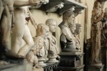
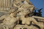
- Vatican marbles
-
- Hvar harbour
-
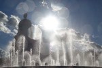
- Dancing fountain, Barcelona
All photos and written content are strictly the copyright of Nicholas de Lacy-Brown © 20136and The Daily Norm. All rights are reserved. Unauthorized use and/or duplication of the material, whether written work, photography or artwork, included within The Daily Norm without express and written permission from The Daily Norm’s author and/or owner is strictly prohibited.