Sorolla: The Colour of the Sea
When I made my life-changing move from London to Mallorca earlier this month, I moved to a place equally as enriched by culture as the city from which I came. In fact comparing the size of Palma de Mallorca to London, you could quite easily declare Palma to be disproportionately abundant in art. Everywhere you walk in amongst the maze of streets in the old town, a flashy new contemporary art gallery or dusty quaint antique shop emerges, and of course the city lays host to Es Baluard, one of Spain’s most significant contemporary art spaces. However Palma is also home to one of the La Caixa Foundation’s finest art galleries, set within the stunning art nouveau setting of the old Gran Hotel building, and its exhibition diary is easily as significant and varied as that of a much larger city. And La Caixa’s current exhibition, Sorolla: The Colour of the Sea is no exception.
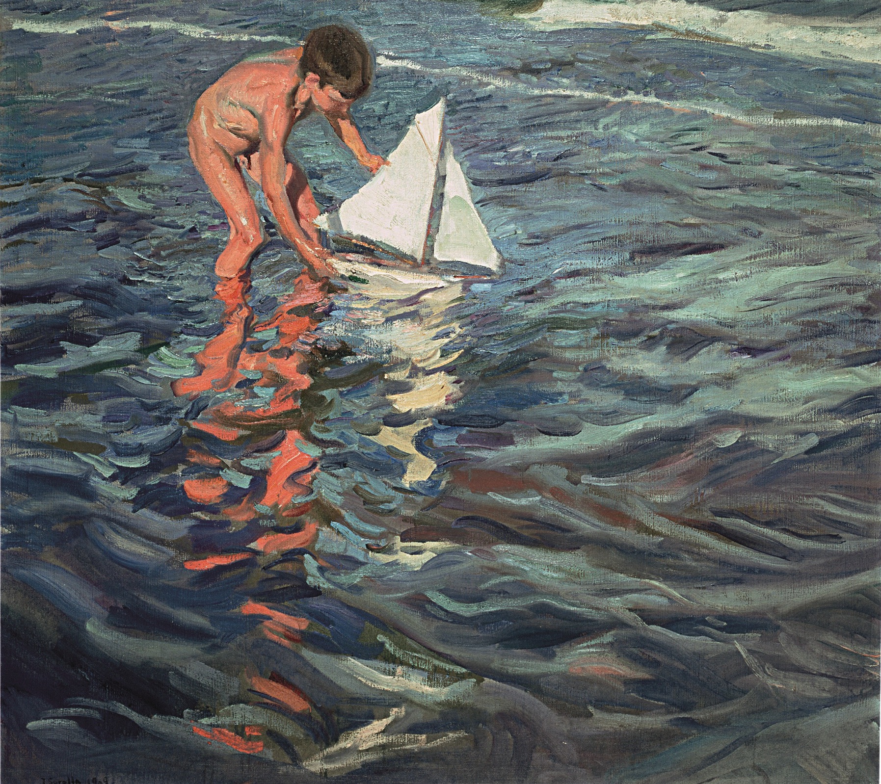
Joaquín Sorolla. El balandrito, 1909. © Fundación Museo Sorolla
Exploring the oeuvre of Spanish master, Joaquin Sorolla, the exhibition focuses on what the artist, famous for the luminosity of his light and the proficiency of his landscape, painted best: the sea. Sorolla was born in Valencia in 1863 and as such was painting at a time when impressionism was at its height. Often compared to his friend, artist John Singer Sargent, Sorolla painted both people and landscapes with great sensitivity, and captured a startling degree of light. In painting the sea, Sorolla managed to capture a luminosity which I have always found so difficult when working on coastal images myself. Take his 1904 Estudio del Mar for example: This simple painting of waves breaking upon the shore is alive with the current of water, and magnificently captures the many colours hidden within the ordinary blues of the water. Similarly, his 1905 painting simply entitled Mar depicts shallower waters magnificently, with the light glinting over the surface and the dark purples suggesting rocks lurking just beneath.

Joaquín Sorolla. Estudio de mar, Valencia. 1904. © Fundación Museo Sorolla

Joaquín Sorolla. Mar (Jávea). 1905. © Fundación Museo Sorolla
No wonder this exhibition is called “the colour of the sea”, and no better example exists of just how rich those colours can be than Sorolla’s depictions of Mallorca itself, such as his painting of the Cove at San Vincente. If you hadn’t been to Mallorca, you might assume that these superb aqua marines and subtle mauves of the surrounding mountainous landscapes were made up, but I can assure you that they are very much representative of reality. Even my lucky November dip in the sea last weekend proved that much.

Joaquín Sorolla. Cala de San Vicente, Mallorca. 1919. © Fundación Museo Sorolla
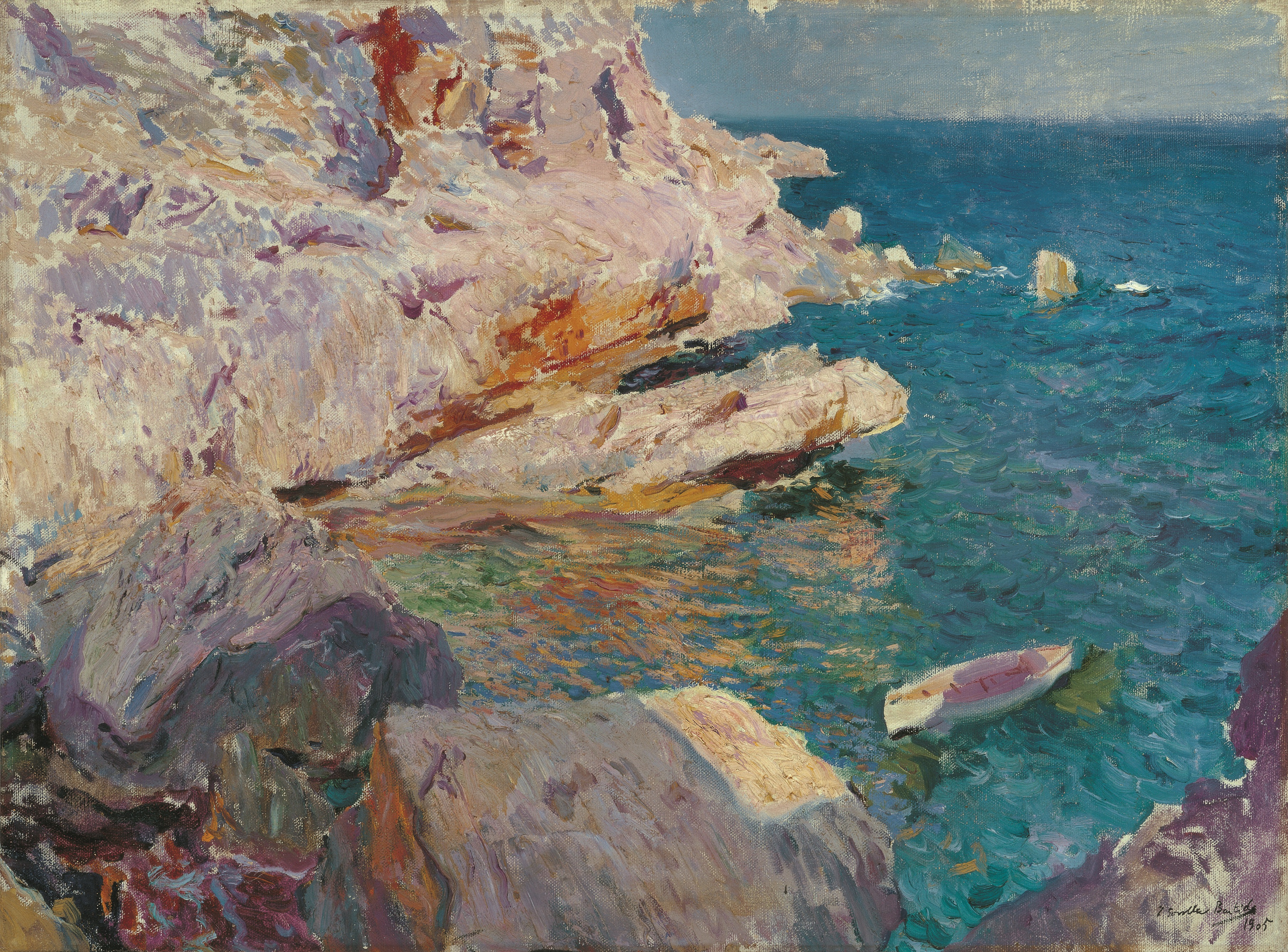
Joaquín Sorolla. Rocas de Jávea y el bote blanco, 1905. © Colección Carmen Thyssen-Bornemisza en préstamo gratuito al Museo Carmen Thyssen Málaga

Joaquín Sorolla. Mar de Zarauz. 1910. © Fundación Museo Sorolla
Awash with mediterranean light, Sorolla’s seascapes are alive with the fresh coastal air and tranquil dance of the waves. Seen as a group, you could almost be excused for feeling as though you were on the beach, watching Sorolla painting (he invariably took his canvases down to the beach, hence why they are probably so imbued with the naturalistic light that one sees in reality). However, it’s not just Sorolla’s landscapes which come alive before your eyes. For as this exhibition shows, Sorolla was also particularly adept at portraying people naturalistically, and this is seen no more so than in works such as Saliendo del baño, where a mother dries her child after a dip in the sea, and Pescadora con su hijo – a brilliantly realistic depiction of a mother masking her eyes from the sinking late afternoon sun.

Joaquín Sorolla. Saliendo del baño. Firmado y fechado. 1915. © Fundación Museo Sorolla

Joaquín Sorolla. Pescadora con su hijo, Valencia, 1908 © Fundación Museo Sorolla

Joaquín Sorolla. Nadadores, Jávea. 1905. © Fundación Museo Sorolla
So even if you come to Mallorca and the weather is not at its best, this superb exhibition has the power to transport you right to a sunny day on the coast. Although let’s face it, with Mallorca’s track record of brilliant sunny record all year around, you should probably be able to do both.
Sorolla: The Colour of the Sea runs at La Caixa Foundation Palma until 8 February 2015.