Skip to content

Posts from the ‘Review’ Category

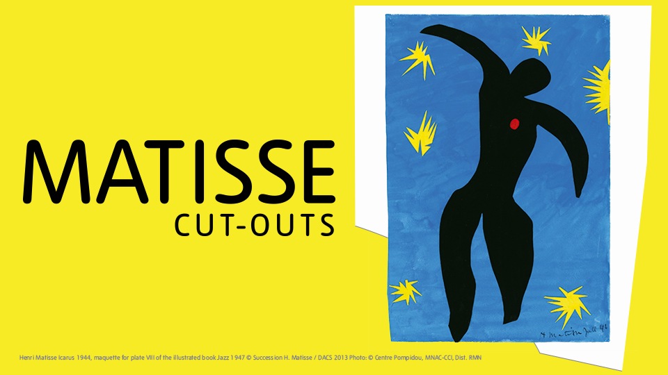
Matisse at Tate: Colour Cut-Out to a Career Climax

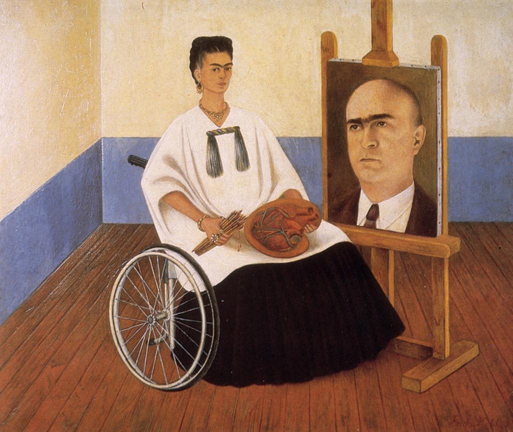
The new Matisse blockbuster at London’s Tate Modern is a show of inexorable joy: of that there can be no doubt. With its whimsical vivid colouration, and playful motifs of sea algae and birds, dancers and blue nudes, it is an exhibition which is full of the happy spirit of the Mediterranean. And yet all of this was created during and immediately after a time when Europe was caught up in the ravaged turmoil of the second world war. How Matisse then managed to create such spirited works, not only during a time of such cataclysm, but also when he was himself frail and confined largely to his bed or to a wheelchair, is one question poised by this exhibition. The answer? Colour was Matisse’s escape from the horrors of war, and cut-outs the vehicle with which he entered the last great hurrah of his groundbreaking career in art.

In bringing together this show of over a hundred of Matisse cut-outs, Tate has managed a real coup. For these works, which dominated the last period of Matisse’s creative output, are merely gouache-painted paper, brought together with paper, sizzors and glue. The result are pictures which retain the same vibrancy that they had when they were first made, but are nevertheless so fragile that few ever leave the national art galleries which they now call home. Yet here they all are, together, many for the first time since they were created.

id_010new_1 cut-outs-3 1394619552732

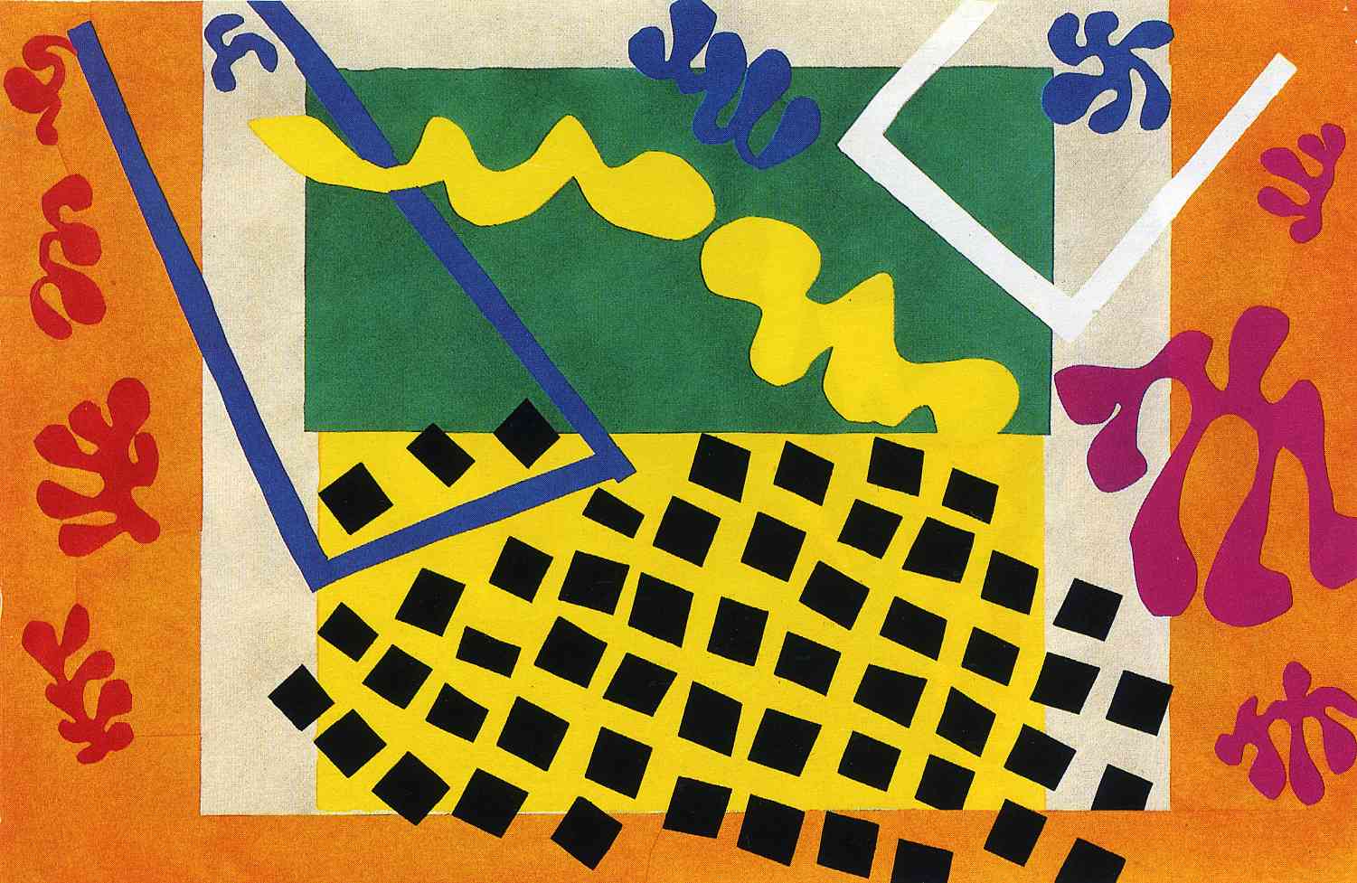
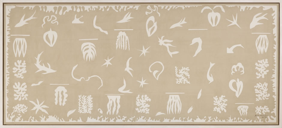
The result is an exhibition which can not fail to please. Starting with the original artwork and resulting first edition of Matisse’s best known artist book, Jazz (which I often paused over in Chelsea’s Taschen store but never purchased before they stopped the reprint, much to my regret), the exhibition moves onto what is essentially the genesis of what is to follow – the Oceana works. With one of the vast works, which originally acted as wall decoration in Matisse’s Paris apartment, featuring figures of the sky, and the other of the sea, these works were inspired by a visit to Tahiti 16 years before. But more importantly, the sea work was pretty much the first time that Matisse used the cut out image of coral, an image which was to become iconic of much of his cut-out works thereafter.

Oceana

matisse_oceanie-la-mer-foto-robert-bayer_l

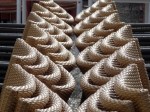
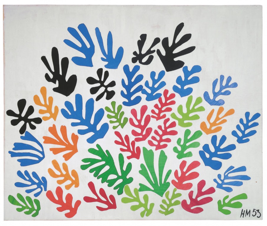
That coral is indeed prevalent in the works that follow, as are the vivd range of colours cut from sheets painted by his dedicated studio assistants. I loved room 5 of the exhibition, which attempts to recreate Matisse’s studio in Vence in Southern France, whose walls were decorated, floor to ceiling, with cut-out works. Seeing the cut-outs grouped together like this makes them come alive as a collection. The variety of colours and shapes and sizes make the corals almost vibrate with the energy emanating from the collected cut-outs, and together the colours sing like an hallelujah chorus.

Coral cut-outs

matissethesheaf1953 kr_matisse_cut_outs_070_071_top_41972_1404021745_id_802580 cut-outs-1

As satisfying as these collected colours undoubtedly are, I could not help but admire Matisse’s famous blue nudes, all four of which are brought together for the first time. Intrinsically simple in both colour, and the seamless way in which they are cut from a single sheet of painted blue-paper, they really are images to be admired – and as a set they never worked better.

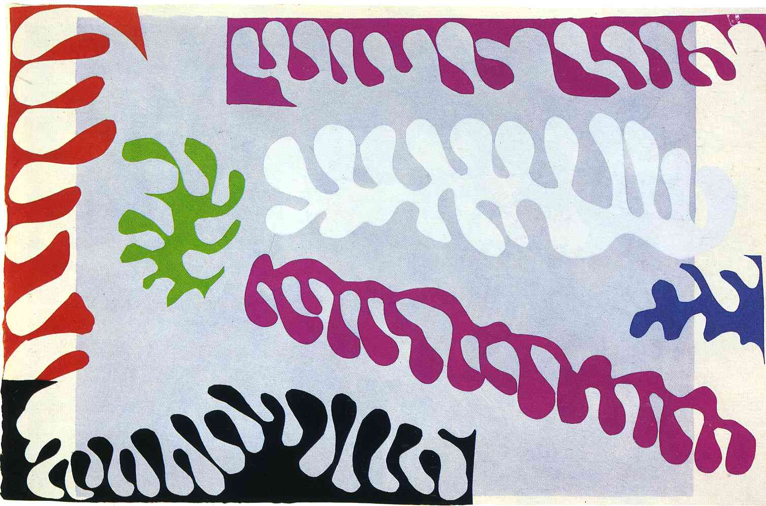
The exhibition ends with Matisse cut-outs on a grand scale, from Tate’s famous Snail (which was the closest Matisse comes to abstract, and in my opinion perhaps the least successful because of it), to The Mermaid in which Matisse intended, through use of bird, coral and fruit motifs, to bring the outside into his studio, something which he surely achieved with all-encompassing effect.

_70288189_masks 6a00e00989a58088330176166fd020970c HMB334 The Snail 1953 by Henri Matisse 1869-1954 20130426-102711

I wasn’t expecting to love this show. I’m not a huge fan of Matisse’s oil paintings which too often appear to me badly executed and fussy. But the simplicity and vibrancy of the cut-outs really appealed to me. It demonstrates the power of composition and the effect which simple colours can have when laid alongside each other. Many have criticised the cut-outs as mere child-play. But that’s a very easy observation to make when the idea has already been generated and all the behind-the-scenes work and planning exhaustibly executed. Masterpieces, perhaps, these works are not. Some may even pass them off as mere wall-coverings. But as a collective they are full of an inherent and enticing energy and joy which fewer more “masterful” artworks will ever be able to generate with such consistency or strength.

6a00d83451e76669e2019affca0e4c970d

Henri Matisse: The Cut-Outs is on at Tate Modern, London until 7 September 2014

Musing on the Magic of a Marbella Morning

I’ve often thought that the true magic of a town happens not in the bustling middle of a day, but first thing in the morning, when the first rays of sunshine hit deserted squares, when workmen and women head quietly into the streets to prepare for the visiting masses, when cafes start to open up for business, and when the squares and fountains and pavements are scrubbed clean in readiness for another day. In Rome I remember savouring the view from my hotel window in the Piazza Della Rotunda at 6am, watching the elegant fountain being scrubbed clean in front of the Pantheon before the tourist masses descended. In Krakow likewise I would be mesmerised watching the cleaners out on the streets first thing in the morning, while from the Mariacki Basilica the Hejnalista trumpeter would play his mournful tune. 

Marbella, one of the gems of Andalucia, is no exception when it comes to the tourist crowds. And while I often find myself becoming vexed at the sheer number of visitors who clutter up the streets of the city’s old town, which I am lucky enough to call my second home, I cannot blame them for wanting to visit. For Marbella’s old white washed streets and cobbled squares are amongst the most beautiful on Spain’s Costa del Sol.  But for me, they never look better than first thing in the morning, empty and in the first sun rays of the day. 

DSC04526 DSC03883 DSC04541

So when I headed out to Marbella this Easter, the first thing I did on my first morning when, accustomed to rising early in London, my body clock got me up early, was to stroll out into the deserted streets of the old town to enjoy these rare quiet moments of having the town almost to myself. The shop shutters were still closed, and the postcard stands hadn’t yet made it out onto the streets; the rising sun was casting long shadows over the cobbled squares; and the only people around were those few taking equal advantage of these quiet moments: to head up a ladder to change a light bulb in a street lamp, to mop the patio in front of a cafe, to quickly walk the dog before work. 

So as Marbella gradually opened up for the day, I took a seat in the Plaza de Naranjos at the heart of the old town, sitting in one of the only spots being hit by the slowly rising sun. And with the square’s cafes only just beginning to open up, with chairs being unstacked and umbrellas gradually opening up around me, I gave the first order of the day to an open cafe’s lone waiter: churros and coffee, to be sampled slowly while watching the world around me awaken. 

IMG_8255

Now that is the magic of a Marbella morning.

All photos and written content are strictly the copyright of Nicholas de Lacy-Brown © 2014 and The Daily Norm. All rights are reserved. Unauthorized use and/or duplication of the material, whether written work, photography or artwork, included within The Daily Norm without express and written permission from The Daily Norm’s author and/or owner is strictly prohibited. 

WW1 Centenary | The Dead Stretcher-Bearer

This year marks the centenary of the start of the First World War, and there will no doubt be a series of events commemorating the start of the Great War as the year goes on, especially towards the end in the months when the actual conflict began. One of the first events to mark the centenary in London is the latest temporary exhibition at the National Portrait Gallery in London. The Great War in Portraits looks at the war, not through the more typical Nash depictions of ravaged landscapes and desolate trenches, but through portraits of the people who began the war, led the armies, fought and, all too often, gave their lives.

The exhibition is a small but perfectly formed homage to this most terrible of conflicts, which ranges chronologically from the period immediately predating the conflict (in which portraits of the relevant royals of Germany, the United Kingdom and Russia are on display, as well as Frans Ferdinand of Austria-Hungary whose murder precipitated the whole war) and continues into the conflict, right through to the end when artists used their skills to depict the horrific injuries inflicted upon soldiers, and struggled to find a way of expressing the true horror of the conflict through creative means.

But one artist who certainly didn’t struggle to depict that horror, and who created what for me was the star painting of the show, is Gilbert Rogers. In 1919, when the general censorship on morale-destroying honest depictions of war had slipped away, and representations of its true horrors began to surface from beneath the censors, Rogers painted this work, The Dead Stretcher-Bearer, which represents the horror and futility of war with unflinching directness. Doing what the title of the work suggests, the painting shows a stretcher-bearer dead on the very stretcher which it was his duty to carry, probably killed in the course of trying to rescue another injured soldier.

Gilbert Rogers, The Dead Stretcher Bearer (1919)

Gilbert Rogers, The Dead Stretcher Bearer (1919)

The paint has been applied coarsely and liberally without too much detail – instead the application of white to mark the shine on the masterfully conceived folds of the tarpaulin covering the soldier’s body attracts all of the viewers attention, focusing our mind at the very heart of this tragedy. Meanwhile the muddied colour palate and the pools of water demonstrate in simple brushstrokes the horrific conditions of trench warfare, while those limited colours are interspersed with dashes of red, the colour which has later become such a hallmark of the conflict.

This painting is but one brilliant canvas in this moving and enthralling show. To see the works yourself head along to the NPG – The Great War in Portraits runs until 15 June. Admission is free.

London’s homage to print: Part 2 – David Hockney Printmaker

Last week I told you all about the first of two high profile celebrations to printmaking currently being held in London. The first, Renaissance Impressions at the Royal Academy charts the development of woodcut to create all of the depth and powerful contrast of chiaroscuro in the 1500s. The second unveils a whole new side to celebrated contemporary artist, David Hockney, best known for his colourful Los Angeles Swimming Pools and large scale multi-piece canvases of the Yorkshire countryside, but here shown to be as skillful a printmaker as he is a painter, or, in my opinion, more so.

In presenting this brilliant little exhibition, Dulwich Picture Gallery shows Hockney as a subtler artist; without the distractions of his trademark bold colours, this is Hockney the skilled draftsman; without the almost theatre-scenery sized canvases, here we see Hockney as a man of detail, capturing intimate scenes with a personal aspect, and delivering sometimes simple still lives but with all of the energy of those familiar swimming pool scenes.

David Hockney, Lithographic Water Made Of Lines And Crayon (Pool II-B) 1978-80 © David Hockney / Tyler Graphics Ltd

David Hockney, Lithographic Water Made Of Lines And Crayon (Pool II-B) 1978-80
© David Hockney / Tyler Graphics Ltd

David Hockney, Self Portrait, 1954 © David Hockney

David Hockney, Self Portrait, 1954
© David Hockney

David Hockney, Two Boys Aged 23 or 24 from Illustrations For Fourteen Poems from C.P. Cavafy, 1966-67

David Hockney, Two Boys Aged 23 or 24 from Illustrations For Fourteen Poems from C.P. Cavafy, 1966-67

It is abundantly clear, from the first room of the chronologically hung exhibition, right through to the last, that printmaking has been an important and consistent accompaniment to Hockney’s creative process throughout his career. From his first etchings, amusingly poking fun at his fine art degree (I like the etching which was created using his actual fine art diploma, The Diploma (1962)) and taking a new spin on Hogarth’s The Rake’s Progress, pictorially describing Hockney’s own move to, and development in the US, right through to his recent and renowned use of the iPad as a new digital tool for creating print works, Hockney embraced print and all of the possibilities it provided for artistic expression. His main printmaking stints appear to have been in etching (which lends beautifully to the simple linear illustrations for Cavafy’s Fourteen Poems) and lithography (his print version of his famous swimming pool series being a particularly good example), although Hockney also extended into less traditional print methods – his use of a coloured photocopier to gradually build up a complex image was, for example, particularly effective.

But asides from Hockney’s excellent handling of the medium of print, the images themselves make this show a clear sell-out success. In his Cavafy series, Hockney’s prints exude a wonderful, but always polite intimacy which seems to be characteristic of his somewhat reserved but slightly cheeky persona. With their common place objects and models staring straight out from the print, these images appear to welcome the audience into the works. As viewers, we don’t feel like voyeurs, but more like welcome participants; friends joining in on the happy-go-lucky lifestyle Hockney portrays. In his later Mexico works; Hockney gives us a vivid, energetic lithography whose varying angles and stilted perspective appear to pulsate and dance to the rhythm of that hot Latin country, and remind me a little of the stunningly colourful Grand Canyon works he painted in the late 90s.

David Hockney, Views of Hotel Well III, 1984-85 © David Hockney / Tyler Graphics Ltd., Photo Credit: Richard Schmidt

David Hockney, Views of Hotel Well III, 1984-85
© David Hockney / Tyler Graphics Ltd., Photo Credit: Richard Schmidt

David Hockney, Rain on the Studio Window, From My Yorkshire Deluxe Edition, 2009

David Hockney, Rain on the Studio Window, From My Yorkshire Deluxe Edition, 2009

David Hockney, Artist and Model, 1973-74 © David Hockney

David Hockney, Artist and Model, 1973-74
© David Hockney

David Hockney, Lillies, 1971 © David Hockney

David Hockney, Lillies, 1971
© David Hockney

I also found that some of the best works were the simple ones – a vase of cala lilies, with an accurate and precise cross-hatched background contrasting with the purity of the white flower; a superb iPad image of raindrops running down a window which exudes the cosiness of looking out at rainfall while benefitting from the dryness and comfort of home; and portraits of friends, simply posed, looking straight out at the viewer, prompting interaction, welcoming us in.

It is, therefore, a show with something for everyone, but with an overriding central devotion to the versatile, unique art of printmaking.

London’s homage to print: Part 1 – Chiaroscuro woodcuts

Printmaking is seriously in vogue right now. Whether it be etchings, lithography, linocut or woodcut, prints have seen a huge upsurge in popularity in recent years. This is partly down to the financial crash, which for so many middle-income art collectors meant that the 3-figure price-tags attached to prints suddenly became a much more attractive method of collecting quality images. But it’s not just about cost. Printmakings’ return to prominence also recognises the unique quality and character which is inherent in each of the print mediums, whether it be the fine lines of etching, or the watery translucence of lithography.

And as if further confirmation of this renewed popularity were needed, London is currently showing two blockbuster exhibitions which explore the medium of print in all its rich and versatile brilliance: David Hockney: Printmaker, at the Dulwich Picture Gallery (review coming soon!) and at the Royal Academy: Renaissance Impressions – Chiaroscuro Woodcuts.

Hans Burgkmair the Elder, 'St George and the Dragon', c. 1508-10." Chiaroscuro woodcut printed from two blocks, the tone block in beige. 31.9 x 22.5 cm. Collection Georg Baselitz. Photo Albertina, Vienna. Organised by the Royal Academy of Arts, London and the Albertina, Vienn

Hans Burgkmair the Elder, St George and the Dragon, c. 1508-10. Chiaroscuro woodcut printed from two blocks, the tone block in beige. Collection Georg Baselitz. Photo Albertina, Vienna.

Ugo da Carpi, after Raphael, The Miraculous Draught of Fishes, c. 1523-27. Chiaroscuro woodcut printed from three blocks, the tone blocks in red, 23.4 x 25.7 cm. Albertina, Vienna. Photo: Albertina, Vienna

Ugo da Carpi, after Raphael, The Miraculous Draught of Fishes, c. 1523-27. Chiaroscuro woodcut printed from three blocks, the tone blocks in red. Photo: Albertina, Vienna

Ugo da Carpi, after Raphael; Aeneas and Anchises 1518, Chiaroscuro woodcut printed from four tone blocks, in beige and grey 51 x 37.4 cm Collection Georg Baselitz. Photo Albertina, Vienna. Organised by the Royal Academy of Arts, London and the Albertina, Vienn

Ugo da Carpi, after Raphael; Aeneas and Anchises 1518, Chiaroscuro woodcut printed from four tone blocks, in beige and grey. Collection Georg Baselitz. Photo Albertina, Vienna.

Ugo da Carpi - Diogenes (1527)

Ugo da Carpi – Diogenes (1527)

This exhibition couldn’t be more timely for me. I have only recently started dabbling in woodcutting myself, having been inspired to do so by Felix Vallotton’s exhibition in Paris last year. Likewise, I have been fully immersed in Renaissance art of late, not least in seeking inspiration for my on-going Norm Saints collection which drawn on Renaissance religious imagery for its primary inspiration.

It is that same intense religious flavour, together with the grandiose imagery which was born of the Renaissance, which forms a golden thread through the 150 or so masterful woodcuts which the Royal Academy currently have on exhibition. Formed of the collections of the Albertina in Vienna, and the private haul of contemporary artist, Georg Baselitz (you know, the one who paints upside down portraits), this brilliant show brings together a fine set of prints which explore the birth of the chiaroscuro woodcut, a unique use of wood to express the intensification of light and dark.

Hendrick Goltzius, Hercules Killing Cacus, 1588. Chiaroscuro woodcut printed from three blocks, the tone blocks in yellow and green, 41.1 x 33.3 cm. Collection Georg Baselitz. Photo: Albertina, Vienna

Hendrick Goltzius, Hercules Killing Cacus, 1588. Chiaroscuro woodcut printed from three blocks, the tone blocks in yellow and green, 41.1 x 33.3 cm. Collection Georg Baselitz. Photo: Albertina, Vienna

Andrea Andreani, after Giambologna, Rape of a Sabine Woman, 1584, Collection Georg Baselitz. Photo Albertina, Vienna
Albrecht Dürer, Rhinoceros (1515 and c.1620 - the highlights)

Albrecht Dürer, Rhinoceros (1515 and c.1620 – the highlights)

Albrecht Dürer, Ulrich Varnbühler (1522 and c.1620 - the highlights)

Albrecht Dürer, Ulrich Varnbühler (1522 and c.1620 – the highlights)

Ugo da Carpi, after Raphael; Aeneas and Anchises 1518, Chiaroscuro woodcut printed from four tone blocks, in beige and grey 51 x 37.4 cm Collection Georg Baselitz. Photo Albertina, Vienna. Organised by the Royal Academy of Arts, London and the Albertina, Vienn

Ugo da Carpi, after Raphael; Aeneas and Anchises 1518, Chiaroscuro woodcut printed from four tone blocks, in beige and grey 51 x 37.4 cm Collection Georg Baselitz. Photo Albertina, Vienna. Organised by the Royal Academy of Arts, London and the Albertina, Vienn

Hans Sebald Beham, Head of Christ Crowned (1520-1) - woodcut from two blocks, tone block in brown.

Hans Sebald Beham, Head of Christ Crowned (1520-1) – woodcut from two blocks, tone block in brown.

From the Italian word meaning light-dark, chiaroscuro is better known to describe the dark and brooding masterpieces of Italian painter, Caravaggio. Just as Caravaggio is famed for utilising the stark contrast of light and shadow to create paintings packed full of drama and intensity, this woodcut technique, invented in the 1500s by Lucas Cranach the Elder and Hans Burgkmair the Elder, provides the same thrill of three-dimensional realism by using different wood plates to layer up light and shadows. It generally involves one plate which contains all of the darkest details (usually the most linear plate), while another provides an overall mid-tone with white highlights cut into it. The effect is one of dramatic contrasts and naturalistic brilliance, as each of the many prints on show in this exhibition demonstrate.

From the work of those inventors, to the development of the medium, mainly by Italian printmakrs such as Ugo da Carpi and Dmenico Beccafumi, we are treated to a period of creativity in which the medium is expertly utilised to create images which, at the time, must have stunned audiences for all of their realism and depth. But just as they may have stunned 1500s audiences for their apparently illusionistic manifestation of light and shadow, so too do they retain the ability to stun the audiences of today – because in their sheer detail and brilliantly perfect execution, these works are a breath of fresh air in a contemporary world where art is so often comprised of some untidy sploshes on a canvas.

Spectator-Royal-Academy

Renaissance Impressions is on at London’s Royal Academy until 8 June 2014.

Barcelona | The Hotel Neri

For years I have walked past the Hotel Neri on C/ Sant Sever, nestled as it is in the atmospheric narrow streets of Barcelona’s gothic quarter, and swooned in admiration: Admiration for a hotel so perfectly situated in between the old gothic Cathedral and the church of Santa Maria del Pi; for the sophistication of its low lit interiors, its large plate glass doors and its stylised furnishings, all of which I had peeked when I passed by its windows; and for the preeminent offerings of its esteemed restaurant, which I first sampled back in 2010. But come 2014,  the opportunity finally arose to upgrade from diner to full-time guest, as I took my place in this wonderful hotel – albeit, sadly, for a mere 3 days and nights.

The striking design of the Hotel Neri, which is a member of Relais and Chateau, and part of the Anima Hotels group, is obvious from the moment you first walk into the ambient reception via the beautifully renovated Sant Sever entrance. The interior designer, Cristina Gabás, has combined the historical aspects of this building, some of which dates back to the 12th century, with the sleek modernity which goes hand in hand with the boutique quality which characterises this hotel. With low hanging lights and heavy dark green velvet curtains; large areas of glass set within rough stone and alongside elegant crystal chandeliers, the reception is the ultimate showcase to the high standard of design chic which is consistent throughout the hotel.

Reception chic

DSC02918 DSC02493 IMG_3893 DSC02452 DSC02917 IMG_3897 IMG_3876

One of our favourite areas was an inner courtyard towards the back of the hotel. Glassed over at the top and plunging through the entire height of the hotel, this open courtyard area lent light and airyness to the hotel, while a large botanical design tapestry hanging down the entire height gave further freshness and dynamism to the design. And if that image represented the jungle, the huge vivid red cushion-come-sculture at the foot of the tapestry must have been the exotic fruit. It was surely comfortable to lie out on!

DSC02433 DSC02467 IMG_4019 DSC02435 IMG_3901

Heading upstairs, past conveniently placed armchairs and cool twig framed mirrors hanging upon the minimalist walls, we were introduced to the room which was to become our own personal piece of Barcelona for the three nights of our stay. Having opted for a junior suite, we were in for a treat. Looking onto the stunning Plaça Sant Felip Neri which featured in my post yesterday, our large spacious room came with its own lounge area, three big windows, and a bathroom which was tiled with rough stone which sparkled in the light – I adored taking a bath in these surroundings, not least amongst all of that rough stone which seemed to have been cut so roughly that I felt as though I was bathing in the middle of a quarry.

Our room

IMG_7700 IMG_7693 DSC02394 IMG_7694

As if further plaudits for the hotel were necessary, there were two further areas which made our stay in the hotel such a memorable pleasure – first, taking a daily breakfast in the hotel’s “library”. For such a small space, breakfast was done in style. With a starting round of cold meats, pastries and fruit brought to the table automatically, this already generous spread was then supplemented by your choice of cooked breakfast from an extensive menu. My particular favourite was the option of fresh pancakes served with syrup and berries – an undoubtedly fine way to start the day, and well timed too – it was, after all, the weekend before Shrove Tuesday.

Breakfast in the library

IMG_3896 DSC02442 IMG_3892 IMG_7731 DSC02446 DSC02439

Our second Hotel Neri highlight had to be the little roof terrace. Set up on the fourth floor of the hotel, with views over the rooftops of nearby gothic quarter properties, and with vistas further afield towards Tibidabo possible, the terrace offered both a unique viewpoint onto Barcelona, as well as a perfectly cosy and intimate open space.  Filled with comfortable furnishings (including two very tempting hammocks) and surrounded by walls bursting with climbing flowering plants hung with little lanterns, it really was the ideal as far as garden terraces go, and made for the perfect location to enjoy an afternoon rest over a cup of tea and a bowl of mouth-wateringly good orange ice cream, as we were to discover.

The terrace

DSC02868 DSC02870 DSC02898 IMG_7738 IMG_7704 DSC02888 IMG_4015 IMG_4013 DSC02884 DSC02913 DSC02906

So as if it weren’t obvious from the above, I cannot sing the praises of the Hotel Neri enough. I’m almost loathe to recommend it, for fear that it will become too popular and I will never get to go back there. But how can I do otherwise? For a Barcelona stay, it’s simply the perfect choice – for an unbeatable location, for the very best of quality service, and for a unique and ultimately pleasurable stay from breakfast until bed.

More information on the Hotel Neri can be found here.

All photos and written content are strictly the copyright of Nicholas de Lacy-Brown © 2014 and The Daily Norm. All rights are reserved. Unauthorized use and/or duplication of the material, whether written work, photography or artwork, included within The Daily Norm without express and written permission from The Daily Norm’s author and/or owner is strictly prohibited. 

Saatchi’s positive Body Language

Whenever I visit the Saatchi gallery in Chelsea, I always do so on the assumption that I am going to hate most of the art on show. This reactionary pattern begun some years back, when Saatchi was still on the south bank, and the works included Tracy Emin’s vile “unmade” tip of a filthy bed, and her even viler photographic self portrait surrounded by money shoved up and around her you-know-what. Then, when Saatchi moved to Chelsea, exhibitions included a show of Russian art, which turned out to be even more depressing in its lack of talent than one would have already guessed, and shows which decided that the car wrecks lifted straight out of a (probably tragic) accident scene would somehow make for an enticing art exhibit.

So, when I dropped into Saatchi’s gallery last weekend, I wasn’t expecting the latest offering, Body Language, to be much better than a convenient toilet stop in the midsts of some Chelsea shopping. But when you enter a gallery a see a sculpted portrait made out of Iberico ham, you pretty much know that you are going to be in for a treat. Oh yes, with his brilliantly innovative creation of Spain’s best leg of meat, Kasper Kovitz’ Carnalitos sculptures single handedly opened my eyes to the positives of Saatci’s ever revolving exhibitions of contemporary art works (eyes which had pretty much been sealed shut in opposition following the recent Nigella cafe strangle scandal…).

Carnalitos (Arana) © Kasper Kovitz, 2010

Carnalitos (Arana) © Kasper Kovitz, 2010

Carnalitos (Unamuno) © Kasper Kovitz, 2010

Carnalitos (Unamuno) © Kasper Kovitz, 2010

Other favourites from a varied show of contemporary artists include the paintings of Michael Cline, whose somewhat parodied figures reminded me of Stanley Spencer’s Sandham Memorial Chapel paintings which were recently on show at Somerset House. I also loved Nicole Eisenman’s energetic oil paintings such as the Beer Garden at Night (2007) which is full of whimsical figures and amusing social shenanigans which can keep an audience entranced for hours, and Makiko Kudo’s fantastical escapist visions which were in part like a Manga cartoon and at the same time like Monet’s pond bursting with lilies.

That's That © Michael Cline, 2008

That’s That © Michael Cline, 2008

Police Line, © Michael Cline, 2007

Police Line, © Michael Cline, 2007

Floating Island © Makiko Kudo, 2012

Floating Island © Makiko Kudo, 2012

Burning Red © Makiko Kudo, 2012

Burning Red © Makiko Kudo, 2012

Beasley Street, © Nicole Eisenman, 2007

Beasley Street, © Nicole Eisenman, 2007

Beasley Street, © Nicole Eisenman, 2007 (detail)

Beasley Street, © Nicole Eisenman, 2007 (detail)

Beer Garden at NIght, ©  Nicole Eisenman, 2007

Beer Garden at NIght, © Nicole Eisenman, 2007

Less convincing were the paintings by Eddie Martinez which were so badly painted as to be derisable. His “Feast” is compared in the gallery brochure to Da Vinci’s historically celebrated Last Supper. I would compare it to the dirty dining table at the end of a meal when my toddler nephews have been to stay. I was equally dismayed by Denis Tarasov’s photographs of tombstones in graveyards in Russia and Ukraine, not because of the photography itself, but because of the hideously tacky gravestone pictures which they captured – huge granite tombs decorated with intricately carved photographic likenesses of the individuals buried beneath them, looking so vulgar that to even place such visions in a freshly painted white gallery in the centre of London’s chelsea felt like dumping a Lidl in the middle of Harrods. That’s not to say they weren’t interesting – one shouldn’t be surprised that this level of vulgarity would come out of a country which has backdated its laws in relation to homosexuality by at least a century of moralistic retardation.

The Feast (detail) © Eddie Martinez, 2010

The Feast (detail) © Eddie Martinez, 2010

Untitled (from the Essence Series)  © Denis Tarasov, 2013

Untitled (from the Essence Series) © Denis Tarasov, 2013

But I digress. From its low points to its very high, Body Language is well worth a visit for its sheer diversity of art – there really is something for everyone, and it’s free too, so what’s to lose? For me, the show demonstrates that painting is very much back in fashion and that the age of nonsense gimmicky installations is largely dead, which can only be good news if the 21st century is ever going to make any kind of decisive mark on art history. Not only that but the Saatchi gallery is, as ever, a brilliant cultural location whose highlights also include a show of emerging British talent, a gallery of limited edition prints which are for sale, a spangly new gift shop which is around 6 times the size of what it used to be (Iberico ham sculptures sadly not for sale – but there’s always Iberica restaurant in Marylebone as a very good consolation prize – and there you even get to eat it).

Body Language is on at the Saatchi Gallery, Chelsea, until the 23 March 2014

Paris | Art tour 2013 – Vallotton

The incredible thing about Paris is not just the quality of the exhibitions it puts on, but how many of those quality shows it manages to host in a single season. The Grand Palais alone has some 4 or more exhibitions showing at any one time, and as Dominik and I took the long walk around the huge neo-classical structure that is the Grand Palais, we noticed that there were queues lining the building on almost all four sides – testament not just to the popularity of its exhibitions, but also to how many exhibitions were showing in the space of a single (admittedly huge) building.

The benefit of these multiple shows (and also the disadvantage if you fatigue easily) is that when you buy one ticket, you can combine your first exhibition with another – or in fact the lot. So having been wowed all morning by the cubist prowess of Georges Braque, and braked for lunch in an excruciatingly expensive brasserie nearby for snails and an ‘amburger (imagine said in a French accent) we returned to the great palace of art to see the second of their major autumn retrospectives: a show devoted to the work of Felix Vallotton.

Vallotton paintings in the “aesthetic sythetism” style

Nuage_à_Romanel 759px-Valloton_Frau_mit_Dienstmagd_beim_Baden woman-being-capped-1900 800px-Vallotton_Das_Bad_Sommerabend_1892 Femmes_nues_aux_chats

I wasn’t familiar with either the name Vallotton or his work before I ventured to Paris this autumn. However, as a quasi-member of the French Nabis movement of art, I was already familiar with a number of Vallotton’s artistic allies – Maurice Denis, Pierre Bonnard and Edouard Vuillard being amongst their number. The Nabis were a group of post-impressionist avant-garde artists who took their name from the word Nabi which means a prophet in Hebrew and Arabic. They were so called because they believed that their art revitalised painting in the same way that the ancient prophets had rejuvenated Israel. At the heart of their movement was another term, or style of art, sythetism, which involved the flattening of colour panes and shadows, a heavier reliance on dark outlines, and a preoccupation with the canvas, as “essentially a flat surface covered with colours assembled in a certain order” (so said Maurice Denis). If I was to describe the style in my own words, it would be a painting without depth and perspective, so that the folds of a dress for example would be reduced to a single colour for the shadow and a single colour for the light, with no variation of tone demarking the shape or texture of the material. 

Whether or not Felix Callotton, born in Switzerland in 1865, came to adopt the style as a result of the influence of his fellow Nabis is less certain. From the exhibition, it would appear as though Vallotton’s distinctive flattened panes flowed naturally from his brilliant virtuosity with woodcut printmaking. After all, the finish of woodcut will invariably involve the flattening of light and shadow, as the synthesis of two colours or tones – generally black and white – combine together to illustrate all of the details of an image – black for shadow and features; white for light. And having spent a good decade or so of his early career woodcutting for the sake of making money, the suppression of depth and shadow made its way seamlessly into Vallotton’s paintings which followed.

Vallotton’s brilliant woodcuts

vallotton4 vallotton-trottoir-roulant-1901 5333808295_a0756d9ea8_b Vallotton-Raison va_anarchico title unknown 6

Being recently enamoured with all things printmaking, it will not surprise the reader of this post to learn that I was struck first and foremost by these brilliant woodcuts, which are so full of detail and humour for so intricate and painstaking a medium. In Vallotton’s Intimacies series, he depicts the mundane and mediocre interiors of intimate home settings, but always his images are full of drama, whether it be because of his captivating use of shadow, or the sense of scandal and emotional anxiety which is suggested. From these prints, Vallotton went on to depict brilliantly the everyday street scenes of his Paris surroundings, doing so with whimsical detailing and a surprising attention to detail, and while Vallotton later abandoned woodcutting when the trade had left him sufficiently well furnished with money, his return to the medium to depict the First World War in his This is War! series in 1916 saw him create prints which were equally brilliant, despite the more serious tone of the subject matter.

As to Vallotton’s paintings, I adored the colourful products of his sythetism era, where the influence of his printmaking and the Nabis resulted in works where the subject matter become secondary to the overall pictorial patterning which was being created across the canvas. Just look at his painting of a theatre box for example (“Box seats at the theatre), a canvas which could quite possibly be a Rothko with its simple horizonal colour planes, and which only becomes more figurative thanks to the simple shapes denoting the two occupants of the box and that masterly glove with its single-coloured mauve shadow, suggesting an emotional dimension to the story being depicted.

box-seats-at-the-theater-the-gentleman-and-the-lady-1909.jpg!HD

Less impressive, sadly, were the works which Vallotton went on to create in his later career, as he abandoned synthetism and the Nabis, and sought to concentrate on depicting primarily the nude, and latterly huge mythological parodies which were more Disney than anything else. Thank goodness that at the end of his career, and at the end of this show, Vallotton chose to return to the medium of woodcut which, despite their depleted tonal palette and reduction of depth and realism, are perhaps the most captivating and visceral works of all.

All a bit “Disney”- Vallotton’s mythological parodies

pic_143-20131024092755 Felix Vallotton, Orpheus und die Maenaden - Valloton / Orpheus and the Maenads - Vallotton, Felix , 1865-1925. Felix-Vallotton-Persee-killing-the-Dragon

Felix Vallotton: The Fire Under the Ice is on at the Grand Palais, Paris until 20th January 2014

Paris | Art tour 2013 – Braque

Lovers of 20th century art will all have heard of French-born artist Georges Braque. Of course I’ve heard of him too, renowned as he is for being co-founder of cubism along with the artist with whom he was thick and thieves in early 20th century Paris, Pablo Picasso. But my acquaintance with Braque has all too often occurred because, seeing a cubist masterpiece hanging in a modern art gallery, I have confused it with a Picasso, only to discover that the work was by Braque. It’s an easy mistake to make – the two artists were practically indecipherable from one another when they started out on the cubism road, a likeness of style which must be put down to the fact that they would discuss one another’s work endlessly day after day, night after night. And Braque was, purportedly, inspired into cubism by his glimpse of Picasso’s now world-famous Les Demoiselles d’Avignon, which few understood at the time, Braque being the exception.

So while Braque has, for me, existed solely in the shadows of the far glossier art historical existence of Picasso, I have never had the chance to discover how truly consistently brilliant he was as an artist. That is until this autumn, thanks to the latest blockbuster exhibition of Paris’ Grand Palais, which dedicates two floors of its palatial surrounds in retrospective homage to this French artistic great. I say consistently brilliant, because this show was one of those rare exhibitions where I literally loved almost every single piece, finding myself almost breathless with admiration as I strolled from painting to painting literally in love with what was on the walls before me.\

Early fauvism

The Port at La Ciotat (1907)

The Port at La Ciotat (1907)

Landscape in L'Estaque (1906)

Landscape in L’Estaque (1906)

The show starts with early Braque, whereupon he dabbled largely in the fauvist epoque, with the result that his sunny landscapes of Southern France are imbued with scintillating bright colour which can not help but make the viewer yearn for the summer. But soon enough, after this initial embrace of colour, Braque discovers the more subdued shades of cubism, finding his own when fragmenting a scene into colourless, cubist dimensions. Seminal in cubism’s development was a chance visit to a wallpaper shop when Braque saw a reproduction wood-pattern paper in the window. Purchasing the wallpaper by impulse, it soon inspired Braque to set about creating a series of paper collages, which included, as well as the wallpaper, cardboard, newspaper cuttings – anything he could get his hands on. The effect of this geometric fragmentation was to create the cubist look, and soon enough Picasso was doing the same.

Into cubism, collage and then back to paint

Mandora (1909)

Mandora (1909)

The Viaduct at L'Estaque (1908)

The Viaduct at L’Estaque (1908)

Little Harbour in Normandy (1909)

Little Harbour in Normandy (1909)

Still life with pipe (1913)

Still life with pipe (1913)

Still life on a table with Gillette (1914)

Still life on a table with Gillette (1914)

Violin and Pipe (Le Quotidien) (1913)

Violin and Pipe (Le Quotidien) (1913)

back to painting.... Still Life with Fruit and Ace of Clubs (1913)

back to painting…. Still Life with Fruit and Ace of Clubs (1913)

After several years of collage experimentation, Braque returned to paint, but using the medium to create what were almost pastiches of the collage look – still fragmented, full of geometric shapes, but differing in their progressive return to the bolder colours of his fauvist age, a return which was no doubt eased along by the weakening of his relationship with Picasso, and his strengthening bond with spirited Spanish artist, Juan Gris.

The Table (1928)

The Table (1928)

The Round Table (1929)

The Round Table (1929)

The Duet (1937)

The Duet (1937)

Studio II (1949)

Studio II (1949)

Studio with Skull (1938)

Studio with Skull (1938)

Thus it was that as the 20s and 30s ticked by, Braque’s work moved the cubist spirit further and further, as the artist pushed the boundaries of the movement he had helped to create, until such a time as his works become progressively more figurative, but all the while maintaining the multi-dimensional expression which was central to cubism. Take his billiard table series for example – seen from various angles, Braque’s bold green billiard table is shown from all kinds of impossible angles, and yet there is no mistaking what Braque was trying to depict.

The Billiard Table (1945)

The Billiard Table (1945)

I would be selling the show short to suggest that it all ended there. From colour-drenched fauvism to colour-collected cubism, Braque’s mastery extended to every avenue of life, as he used his pioneering imagery to depict portraits, artist’s studios, landscapes, still life and even greek mythology. From room to room we see an artist who never failed to be inspired, and to inspire his countless followers in response. Never again will Georges Braque be in Picasso’s shadow as far as I am concerned, but level pegging as a genius of 20th century art.

Georges Braque is showing at the Grand Palais, Paris until 6 January 2014.

Paris | Art tour 2013 – Kahlo and Rivera

I would like to start off my little Paris art series with a moan about London. For all the great events which take place in the city, its exhibitions tend to pale into insignificance when compared with Paris. Take the exhibitions that are on at the moment. At the Royal Academy, the grand galleries of the Burlington Palace are given over to an exhibition surveying the art history of Australia. Well we all know that Australia has no art history, and this exhibition demonstrates as much. Then there’s Tate Modern’s new retrospective on Paul Klee which presents room after room of samey small little Bauhaus explorations – and leaves the visitor as flat as the image so meticulously conceived by Klee on paper. And let us not forget the Royal Academy’s other homage to a nation’s art – its recent Mexico show, whose only inclusion of perhaps the greatest artist ever to come out of Mexico, Frida Kahlo, was a painting so small (and I mean ridiculously small) that you had to squint to see it.

Rivera's cubist period

Rivera’s cubist period

None of this in Paris, whose exhibitions present such a comprehensive survey of the particular artist at hand that you feel not only completely enriched at the end of the show, but also pretty exhausted too. And Paris doesn’t just have one blockbuster exhibition a year – no no, it holds a good three or four massive artistic events each season, hence why I feel the insuperable need to visit the city each year.

Really marking Paris out as the superior of its cross-channel neighbour this year is the Musée de l’Orangerie’s significant survey of the works of one Frida Kahlo, and her equally inspired artist husband, Diego Rivera. Entitled Art in Fusion, it explores what has to be one of the greatest married (and divorced, and then remarried) painterly partnerships of modern art history, with many of the most substantial of each artist’s oeuvres on exhibition, and not a tiny painting in sight.

The couple together

Diego Rivera with Wife Frida Kahlo tumblr_m965goUs9T1rw3fqbo1_1280 frida-kahlo-diego-rivera3

I have always adored the work of Frida Kahlo, resonating so easily with her emotionally raw artistic expression right from the time I first saw her work (ironically in London – those were the good days). For me, Kahlo’s paintings will always trump those of her hubbie’s, which are altogether more political for my taste. Either that or they are too superficial – such as paintings of children tying up lillies or portraits of Mexican natives. His works are altogether too easy to interpret at face value, while faced with a Kahlo masterpiece, you are kept guessing about all of the multi-layered complex meaning with which she imbues her works.

As ever, my favourite of her paintings are those which deal the most viscerally with her experiences of personal trauma – both the bus accident which crippled her for life, and the series of miscarriages which resulted, as well as her painful experience of Rivera’s relentless infidelity. This may make me morose, even morbid in my preferences, but then it was Frida’s works which first inspired me to commit my own life-changing accident to canvas.

Frida’s visceral pain-filled works

Frida-Kahlo-Henry-Ford-Hospital-1932 The-Broken-Column tumblr_lv2v44tlpg1qzse0lo1_1280 Frida-Kahlo_Self-Portrait-with-Dr-Farell kahlo-11

At the risk of being unfair to Rivera, of the canvases on show, a few stand out. I particularly enjoyed his cubist period when, as a young man, he found himself influenced by the early advent of this movement in 1900s Paris. However for the most part, it is Rivera’s murals which are his staggering life’s masterpieces, and sadly, despite some attempt at reproduction in the exhibition, these will require a trip to Mexico to be enjoyed to the full.

Rivera’s murals

diego_rivera_distribution_arms_canvas_print_9a Rivera_AlamedaPark mural(2)

That said, this show, which is a unique opportunity to see both the works of husband and wife displayed alongside each other, is an indisputably unmissable opportunity to see the artistic fusion which these two icons of Mexican art produced during their years together. And, being as it is in the Orangerie, if you find the vitality of colour and the depth of emotional expression a little too much to muster, there’s always Monet’s ultimately calming waterlillies to soothe you upstairs.

Frida Kahlo and Diego Rivera | Art in Fusion is on at the Orangerie until 13 January 2013. If you want to avoid the vast queues which characterise all of the Paris exhibitions, I recommend buying tickets in advance.