George Bellows: Modern American Life
Bulging, twisting angry red bodies reminiscent of Francis Bacon’s cannibalistic, melting forms; great muscular bodies gripped in a violent embrace; long horizontal lines capturing the figures within an illuminated, elevated fighting platform; and a blood-thirsty zealous crowd, their faces hideously disfigured as they vie for blood, sweat and mighty great punches on their night out at the boxing ring – these are the captivating images of the 1900s boxing underworld for which the American artist, George Bellows, is renowned, and which form the focus of the Royal Academy’s new exhibition: George Bellows 1882-1925 Modern American Life. Yet as the exhibition attempts to point out, Bellows painted much more than the poignant punches of his most famous images.
I wasn’t aware of Bellows before this show – and I excuse this gap in my art historical knowledge by virtue of the fact that this is the first Bellows retrospective to ever come to the UK, and because, to my knowledge, no or few Bellows works are held in the UK national collections. Moreover, while Bellows was a classmate of the much celebrated Edward Hopper, his career was much shorter – he died at a poultry 43, barely before he had ever got going. And yet the works which he did complete in his short life present us with an unparalleled view of turn-of-the-20th century New York, focusing on the many facets of a city in flux; from the gritty and sinister sweaty boxing underworld and the bustling expanse of Times Square, to the elegant perambulations of the richer citizens in out of town parks; from traumatic, emotionally intense depictions of war, to almost fantastical, saccharine scenes of picnics and fishermen in the outer countryside surrounding the city.

Club NIght (1907)
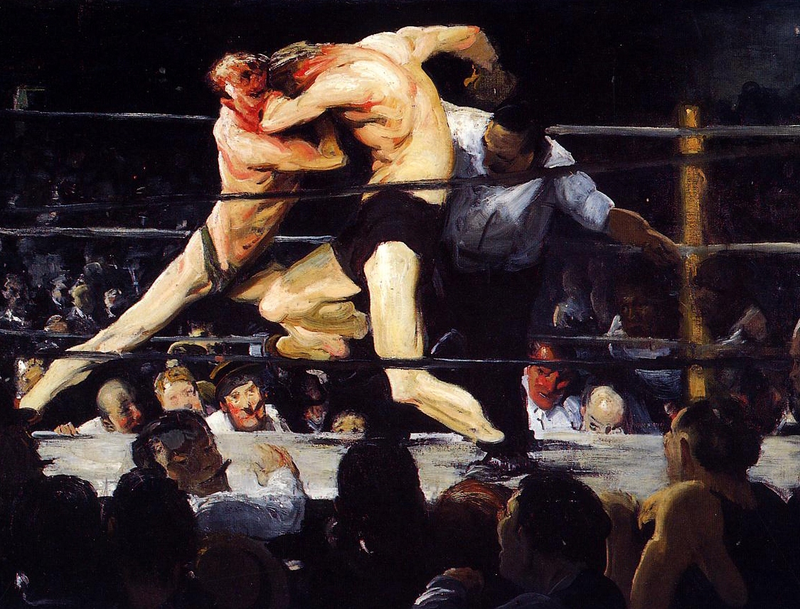
Stag at Sharkey’s (1909)
It’s perhaps no wonder that Bellows was so undyingly fascinated by New York City. Coming from a comfortable middle-class Ohio background, he would have been unprepared for the extremes of the city when he arrived there at just 22 years of age. Yet falling under the influence of artist Robert Henri, who was his teacher at the New York School of Art and who encouraged his students to eject the idealised and sentimental depictions of life favoured by the art scene at that time, and instead pursue a more unique expression of reality, Bellows soon found himself seeking out the more insalubrious, undesirable quarters of the city, and there depicting some of his most renowned works, from groups of naked immigrants bathing in the city’s dirty rivers, and builders clearing vast blocks of the city to construct a huge new homage to the modern railway, to the great bustling, smokey squares of central New York, full of workers and citizens from every spice of life, and of course those wonderfully intense boxing masterpieces.
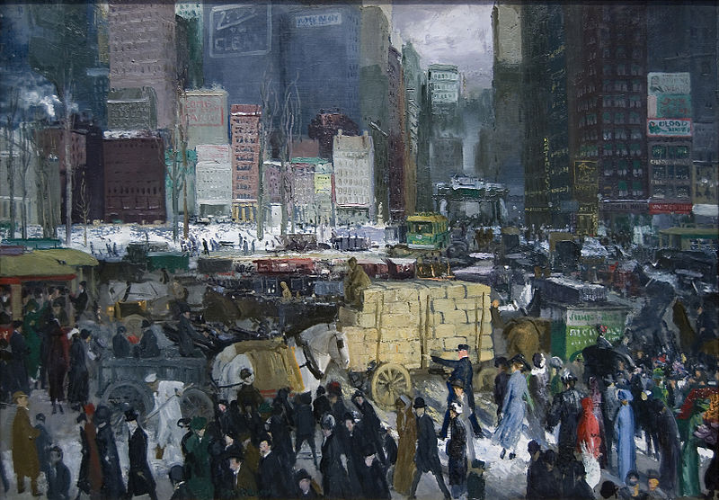
New York (1911)
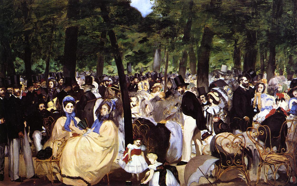
But Bellows did not limit himself to this harsher side of New York. Following his initial trawl through the unsavoury and illegal hangouts of the city, he soon moved onto depictions of a more civilised, elegant facade, with paintings of strolling couples, of elegant groups laden with white parasols and large sunhats picnicking out in the parks like something straight out of Seurat’s paintings of Paris, and of families walking out amongst snowy hills and landscapes. This is a changed side of Bellows, but no less fascinating to behold, not least because it somehow fits uneasily into the common perception of the New York of these times, and because, by comparison with Bellow’s earlier body of work, this happy, idle lifestyle appears almost reckless in its apparent disregard for the hardship of the real gritty city which lay at the heart of the nearby urban sprawl.

A Day in June (1913)

Summer Night, Riverside Drive (1909)
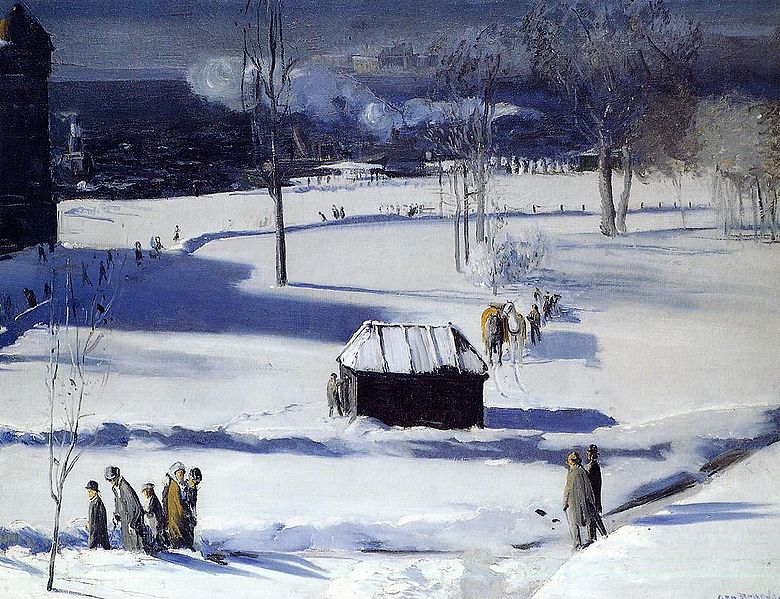
Blue Snow the Battery (1910)
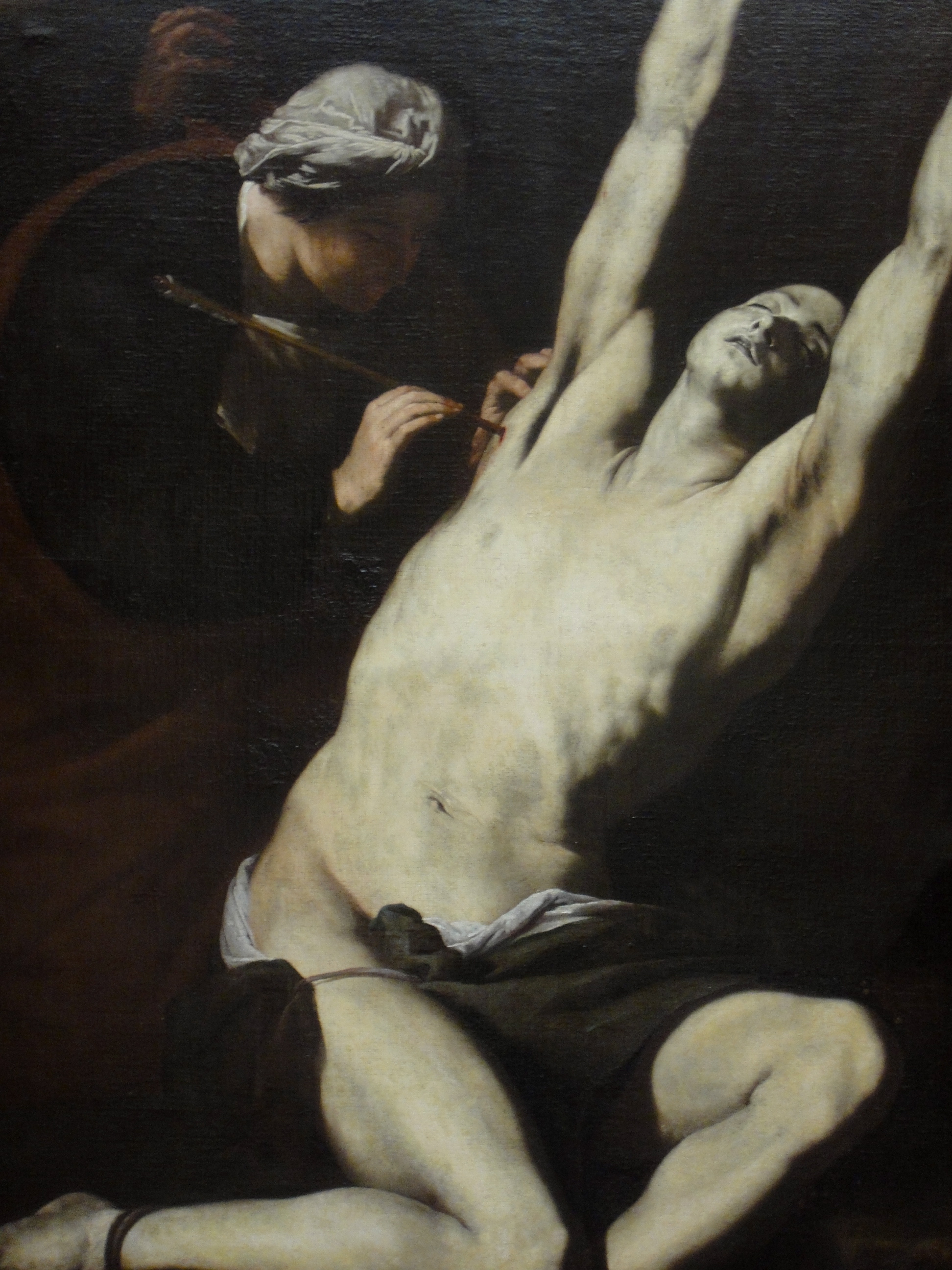
Yet for all his insightful depictions of a modern American life, perhaps the most captivating works of Bellow’s career were those which had no connection to America whatsoever: At the centre of the exhibition are Bellow’s depictions of war, works inspired by the horrors of the First World War in Europe which Bellows had read about in the American press. All five resulting paintings, four of which are on show at the Royal Academy, are conspicuously anti-German, showing the Germans in a devastating light as the perpetrators of previously unseen levels of horrific savagery, such as the Massacre at Dinant which depicts the unprovoked, summary execution of Belgian civilians following the sacking of their town which stood in neutral territory, and The Barricade, which shows the Germans using Belgian innocents as a human shield. The paintings are emotive, powerful and really quite breathtaking.

Massacre at Dinant (1918)
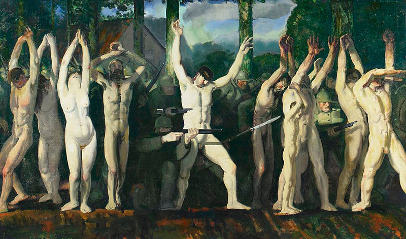
The Barricade (1918)

The Germans Arrive (1918)
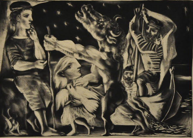
Likewise exceptional was the next room showing Bellows lithography – his brilliant printworks which were likewise used to stunning effect in depicting similarly shocking scenes such as The Law is Too Slow which shows an African American being burnt alive at the stake while surrounded by an apparently calm, even entertained crowd of white Americans. In his print works, Bellows shows himself as a master printer – he uses dark and light to maximum effect, while his faultless illustration of flesh tone in the print version of his later boxing scenes easily outstrips the paintings of the same subject.

The law is too slow (1922)

Splinter Beach (1912)
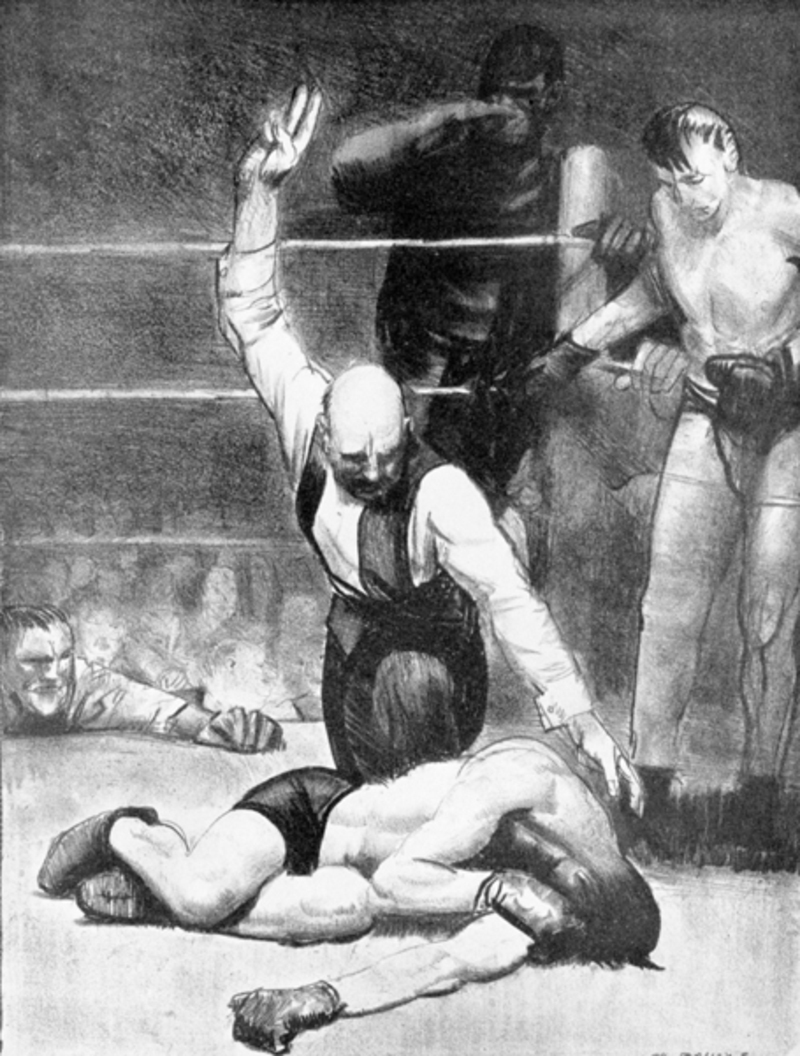
Counted Out No.2 (1921)
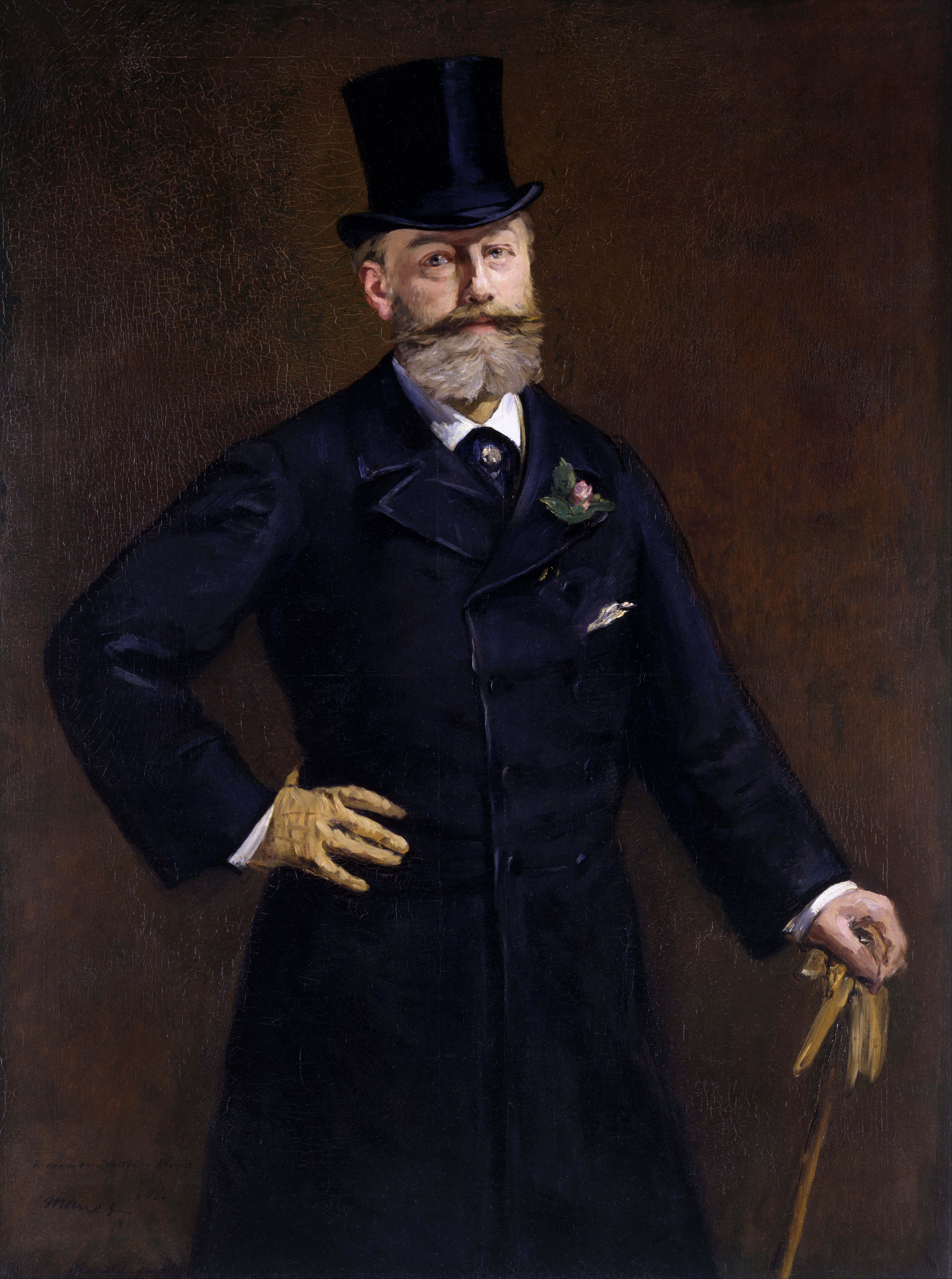
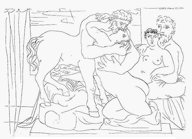
After this highpoint of the show, the exhibition ends on something of a low in a gallery of overly insipid, saccharine fantastical depictions which look almost Chagall-like in style and appear to represent an uncomfortable diversion from Bellows more intense former work – even his later boxing paintings have nothing like the level of intensity as his boxing works painted 15 years before. The gallery is full of twee and sometimes stiff family portraits which resemble the work of Manet but without anything close to his emotional depth, as well as landscapes which are so excessively sentimental with their white horses and picture-perfect symmetrical mountain landscapes that Bellows’ former teacher, Robert Henri must have been turning in his grave – or at least would have done had he not outlived Bellows.

The Picnic (1924)

The White Horse (1922)

A Fisherman’s Family (1923)

George Dempsey and Firpo (1924)
For George Bellows died shortly after depicting these more sugary of his works, suffering from a sudden ruptured appendix and peritonitis. His career was one cut short, but perhaps just in time before his later My Little Pony style of painting threatened to overshadow the truly superb achievements of his former body of work; an oeuvre which now stands out, next to the likes of Edward Hopper, as a truly unique collective depiction of modern American life.
George Bellows: Modern American Life is on at the Royal Academy until 9 June 2013. Details and tickets can be found on the RA website.