Skip to content

War in my Art: Works inspired by Birdsong

Having reflected for the majority of last week’s posts on the subject of war, I made the decision to seek inspiration further by visiting London’s Imperial War Museum. There, tucked away behind the major exhibitions of planes, military instruments, uniforms, the holocaust and even a WW1 trench reproduction, is a collection of war art to rival all of London’s major galleries. There is something about war as a subject matter which loads each and every painting with a heavy significance, because you know that for these images to have been produced, the painter has either lived through the hell portrayed, or at least witnessed it first hand. Consequently the pain which is captured is visceral, the emotions cutting, cynical, raw. Yet these works are undoubtedly beautiful. At the centre of the IWM’s collection is Sargent’s gigantic work, Gassed, an incredible, moving image, which shows soldiers who have been temporarily blinded after a gas attack helping to guide one another with in caterpillar-like line, while all around them, soldiers similarly afflicted fill both the foreground and background. It’s scale is startling, but the small moments of human kindness in desperate times are even more striking.

John Singer Sargent, Gassed (courtesy of Imperial War Museum, London)

This painting is not unique in it’s superb captivation of WW1, and as you stroll around the collection at the Imperial War Museum, paintings which you may never have seen before seem somehow familiar – for it is clear that as the memory of war slips further and further into the past, with survivors now few and far between, and photographic and film accounts being scarce and of poor quality, it is the paintings of war which now take centre stage in helping a modern audience to imagine the apocalypse of trench warfare. It is, for example, immediately clear to me that the cinematography in Spielberg’s new film, Warhorse, is inspired by the haunting trench landscapes of Paul and John Nash.

Yet before I even set eyes on the Imperial War Museum’s collection, I was myself emotionally engaged with the subject of war, and sufficiently inspired to begin painting it as a young artist. The source of my inspiration was the novel Birdsong by Sebastian Faulks. The novel is the only book every to have made me cry. It’s depiction of war is so striking, so accessible, that it is impossible not to be caught up with the plight of its characters and the horror of war. For a 15 year old reading the story, I was unintentionally drawn wholeheartedly into this evocative re-imagining of the First World War, even though so many people in my generation appreciate little about it – for most they think WW1 is all about wearing a poppy every 11/11. And when I finished the novel, one of those rare moments of inspiration flooded into my head – I knew immediately that I wanted to paint a tryptic based on the scenes conjured in my head. And the fact that I then painted war without pictorial reference is, I suppose, testament to what a superbly descriptive writer Sebastian Faulkes is. Having at last got home to my parents’ house in Sussex, I was able to photograph the paintings which resulted from that inspiration. I painted them at the age of 15, before I really appreciated that I might have artistic talent, and certainly before I took it seriously. Nevertheless, I like the paintings to this day probably since their imagery, like their subject matter, has timeless significance.

Screaming Soldier - A Victim of War (acrylic on paper, 1999 © Nicholas de Lacy-Brown)

Trench Rat (acrylic on paper, 1999 © Nicholas de Lacy-Brown)

The Truth Behind the Poppy (acrylic on paper, 1999 © Nicholas de Lacy-Brown)

Following these works, I moved onto another tryptic of war paintings, this time depicting the First and Second World Wars and the Cold War. I donated the collection to the history department of my old school Our Lady of Sion School in Worthing, where I believe they are still hanging to this day. Sadly I don’t have any photos of the works, but before I donated them to my school, the paintings attracted the interest of Worthing Town Hall. As a result, the works were exhibited in a special exhibition marking Remembrance Sunday in November 2000. A photograph of me with the Mayor of Worthing and the pictures hanging on the wall behind us was on the front page of the local Newspaper that month. That paper was then painted into the background of another of my very early works in which I mourned the death of my guinea pigs. So here it is, the only picture I have left of that second war tryptic.

Cinnamon and Nutmeg (acrylic on canvas, 2000 © Nicholas de Lacy-Brown)

The conclusion of this post is, I suppose, the potential of a well-written novel to empower the mind, and to recreate past tragedy in the minds of innocent, often unappreciative generations. That novel, Birdsong, is not only a must-read. It is also now a must-see, a televised adaptation having premiered on BBC television last Sunday which is every bit as beautiful, sensitive and poignant as the novel, and so much more powerful in its portrayal of war than the current cinematic offering, Warhorse. 


David Hockney at the RA – A stroll through the countryside without any defining moments

The dials of the huge London PR machine have been whirring noisily in anticipation of the David Hockney blockbuster show at the Royal Academy of Arts. Suddenly the charismatic British artist, complete with broad Yorkshire accent, white beret and a cigarette rebelliously hanging out of his mouth, has been on the front of every paper and magazine. For a new show of his work, simplistically titled “A Bigger Picture” has come to town, hailed as a key event of the Olympic year, as the living artist is practically unique in having the whole mass of the Royal Academy’s huge main galleries turned over solely to him. And the incontrovertible fact is, yes, these new paintings are very, very big. But as the wise (or just disappointed) often remind themselves…size isn’t everything. For poor old Hockney, stuck in the frenzied efforts of an ageing artist faced with the Herculean task of filling the RA space with largely new works created in only a handfull of years, this much-lauded artist has fallen foul of yet another well known adage: quality, not quantity.

The Road across the Wolds (Hockney, 1997)

Salts Mill, Saltaire, Yorkshire (Hockney, 1997)

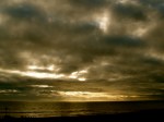
Garrowby Hill (Hockney, 1998)

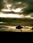
The exhibition started well. Once we had passed fairly swiftly through a gallery containing four landscapes of the same three trees in Thixendale, each painted in the four respective seasons, we entered a gallery paying retrospective homage to Hockney’s pre-2000 landscapes, starting with his magnificent burning orange rocky illustration of the Grand Canyon, and moving on to his Yorkshire landscapes completed when he moved back to the area from a long spell in LA (see above). I really enjoyed these works. With their bold but reflective colour scheme and rolling hills (which reminded me of my own Tuscany painting) they were pleasing on the eye and original in their composition. From there, we moved into the first of a long line of huge galleries all of which, as it turned out, contained pretty much the same image repeated countless times during different seasonal changes and from slightly altered viewpoints. The first wall was like a tapestry of small oil paintings which, as a set, worked well. They were pleasant to look at – like seeing a slideshow of countryside views all at once. However on closer observation of any specific canvas, it was clear that the works lacked in painterly technique – despite being painted outside, from observation, and at speed, Hockney does not capture the light or the complexity of the landscape in the sensational way that that other great outside painter, Claude Monet, did. In fact, for the most part, Hockney’s brushwork looked decidedly lackluster, even childish.

Three Trees near Tixendale, Spring (Hockney, 2008)

Thereafter we were met with a strange sensation of déjà vu as we walked form painting to painting, from one room to another. They are all paintings of trees. Lots and lots of trees. He hasn’t just painted forests, but with wall to wall forest views he’s managed to create a 3D forest in each of the galleries… perhaps that was the intention. Trees on single canvases, trees on multiple canvases stapled together, trees on film, trees on his iPad. Trees. That is not to say they weren’t pleasant, and scenic, and all the other niceties one can throw at them – but there was nothing striking, nothing remarkable. It was like bring on a stroll or a drive through the countryside. You look around you and think: the scenery is beautiful. And as you move on, you continue to be impressed by the subtle changes in the landscape all around you. But nothing really stands out. It just makes for pleasant surroundings. That was this exhibition – pleasant, samey and oh so repetitive.

Woldgate Woods 21, 23 and 29 November 2006

There was one distinguishing feature of course – but it’s nothing new for Hockney. It’s his fragmentation of all his big paintings into lots and lots of little canvases. In a way it probably makes them easier to paint in smaller spaces, more economical to travel, and more practical when the size of the walls available at the RA demands huge canvases to fill the space. But on so many occasions, Hockney was painting at a scale when a complete one-piece canvas would have done the job. But still he would insist on painting the scene across several canvases, even though they would then be stapled and framed together (thus obviating the benefits of smaller canvases considered above). The effect of this fragmentation of the canvas space was, for me, distracting, not least when Hockney had not even lined up the image over the canvases properly, so one tree trunk would start somewhere else in the adjacent canvas. To me, all these harsh deep edges, grid-like across the painting, felt a little violent as they jarred with the organic, living and breathing landscapes captured in the painting.

The Big Hawthorn (Hockney, 2008)

Nonetheless, the biggest distraction of all had less to do with Hockney’s compositions and much much more to do with the vast multitudes of people all around us. The place was packed – and this was a Friends’ preview day. Overcrowding has been the cause of much grumbling amongst the RA Friends, who after all pay a rather hefty annual subscription for these rare privileges of private views and the odd discount. In an attempt to alleviate the squash, the RA has started allocating Friends entrance times (causing further grumbles) but despite this, the RA clearly over-allocates for the space available, and as a result not only was every room packed tight but there was a vast queue to even enter the show. This cram did not dissipate at any stage, right up until the shop at the end, where people where fighting over postcards, swiping catalogues within an inch of another customer’s nose and losing all semblance of social etiquette in aggressively pushing their way to the till.

The Arrival of Spring in Woldgate (Hockney on his ipad, 2011)

This crush meant that the very point of the exhibition was a flop. For big paintings require a wide berth to be given before each painting so that one can stand back and consider the work from afar. But no such luck for us, pushed almost with our faces against the canvas, so what was visible more than anything was Hockney’s rather coarse brush strokes, rather than the intended over all effect of the whole. This was not, at least, a problem with the much talked about iPad pictures of which there were some 60 or so. These were blown up (and printed) quite substantially, but lost none of their precision in being so inflated – this was great news for the audience who could appreciate the iPad image from both close up and from a distance, all without pixilation disturbing the effect. However, disappointingly, because the works weren’t shown on iPad themselves, the whole point of this new digital medium was lost, since the images lacked the background luminescence which they would have boasted when created in their original form.

The final part of the exhibition did at least introduce some diversity. Hockney’s relentless study of Claude’s Sermon on the Mount resulted in a series of parodies. These made for a refreshing change – like finding a well lit path again after trawling through a dense forest. The biggest reproduction was particularly impressive. Having said that, Hockney has not added much to his reimagining of Claude’s work, only making it a bit lighter and more colourful. It’s a far cry from Picasso’s reworking of Velazquez’s Las Meninas for example, where he not only poked fun at the original, but brought so much of his own original style into the frame.

The Sermon on the Mount II (after Claude) (Hockney, 2010)

The Sermon on the Mount (Claude)

Hockney concludes the exhibition with a series of films of, yes, you’ve guessed it, trees (amongst other things) captured concurrently using 9 or 18 cameras. Such was the cram in the cinema-laid out room where they were being shown that I could get nowhere close, so in fairness to Hockney, I will comment no further.

The Arrival of Spring in Woldgate (Hockney, 2011)

In conclusion then, this show is like a refreshing stroll through the countryside on one of those days when the sun is out, and the first signs of Spring are breaking through after a frosty winter. But like all walks, you get tired quite soon, and the beauty of your surroundings quickly fade as your attention is swallowed up by the aching in your feet and the realisation that upon walking so far, you have the same distance to cover in order to get home again. There’s too many trees and too many people. Moreover, there is an overall feeling that the works have all been a bit rushed  in anticipation and realisation of the scale of the show. Size isn’t everything, but clear away the crowds and you may just be able to appreciate the quality of the wood from the quantity of the trees.

All the images contained on this post are the copyright of David Hockney.

Written content is the copyright of Nicholas de Lacy-Brown © 2012.

Elegance overflowing: Ladurée Covent Garden

For those of you who have been reading my blog since its inception, you’ll know that I am unashamedly obsessed with all things Ladurée. Not only is the café/salon/patisserie emblematic of all things Parisienne, it is also the height of elegance wherever it is situated (apart from the rather aberrant gold cave-like cacophony that is the Mayfair branch). There I was in December freezing my you-know-whats off in a huge queue for the Champs-Elysees branch in the heart of Paris, when all the time I had no idea that a spectacular new branch of the macaroon masters had opened up almost on my doorstep in London’s Covent Garden. And what a branch it is – large outdoor terrace on the cobbles made famous by My Fair Lady, a retail shop which glistens like the Hall of Mirrors at Versailles, and an upstairs salon of which Marie Antoinette herself would have been proud. To top it off, there’s even a small roof terrace overlooking Covent Garden’s market and plaza – the perfect view of street entertainers and the continental café culture underneath. All hail Covent Garden’s Ladurée!! It is a joyous thing for all us Londoners, and finally, a well needed injection of elegance has come to CG. And Ladurée is not alone. Joining it are new branches of Ralph Lauren, Burberry and the huge new glitsy Apple store which is for Guggenheim architectural contemporary glitz what Ladurée is for Louis XV glamour.

Ladurée's Covent Garden branch: the elegant retail counter

Ladurée's Covent Garden branch: upstairs salon

Ladurée Covent Garden - roof terrace

I visited this luscious Ladurée a few days ago. I had seen the shop and the outside terrace, but I had no idea what gems lay in store upstairs. There in the little salon, small Parisian-pavement style tables are matched with elegant velvet armchairs, small sofas, and even a chaise longue  topped by a four-postered curtained canopy. Meanwhile on the walls, elegant swept frames surround antique portraits of landed gentry, reminding those supping upon coffee and macaroons that they are in the company of the upper echelons.

Ladurée: Present indulgence in Past elegance (pen on paper, 2012 © Nicholas de Lacy-Brown)

Saint Honoré

So what did I partake of on this auspicious occasion? Well, it was a Saint Honoré pastry for me, although the choice was overwhelming and all-tempting, a rather shoddy iphone picture of which I enclose. This was theatre on a plate. One choux pastry dome surrounded by several miniature renderings, all filled with and surrounded by a delicate cream imbued with the subtle elegant perfume of rose, balanced with deliciously sweet sharp raspberries and an indulgent raspberry icing. It was phenomenally delicious, and while it doesn’t come cheap (£6 for the cake alone), it’s an incentive for any eater to sit up straight, mind their Ps and Qs, and hark back to the sophisticated society of a more dignified past.

Talking of dignified, the staff were fastidious in their approach, refined in their perfect appearance, and charming in their manner. And when they speak French to one another, I could so easily be back in the 1eme Arrondissement in Paris that I would consider moving into the café full time, except it would probably bankrupt me in about a week.

This Ladurée, in fact any Ladurée, is a must for all champions of tasteful pursuits. All that remains now is to recreate the patisseries themselves at home… I have the book, I have the ground almonds, the eggs, and I have the icing bags… I think, with some trepidation, I’m going to try my first macaroons this weekend. I’ll let you know how that goes…

À bientôt!

Norms do… Robert Doisneau

It’s mid January, and with the Christmas stocks cleared away and the January sales dwindling fast, the shops are filling with all things red – roses, truffles, cards adorned with hearts and pink champagne, all in the name of Valentine’s Day. I must confess, while I do find it slightly demeaning to be told I am loved just because a saint’s day says it should be so – and only once a year at that – I am a romantic at heart and do turn into a little softy around mid-February time. In anticipation of this great time of romance, the Daily Norm has looked to the one and only true source of all things amour… the city of Paris. And not only is Paris the undoubted City of Love, in the superbly nostalgic black and white moments captured by the world-renowned photographer, Robert Doisneau (1912-1994), it provides the backcloth to some of the most iconic romantic images ever captured on film. When I think of the ultimate image of love, I think of Robert Doisneau’s most celebrated photograph, Le basier de l’Opera (1950) (The Opera Kiss). Perhaps not quite as famous as his Hotel de Ville kiss, it is nonetheless postcard perfect: 1950s Paris, going about its way, people rushing up and down the stairs at Opera, traffic passing by the grand Opera Garnier, and all the while, the world seems to stop as a couple meet, and kiss, in the middle of the staircase. In fact, here at The Daily Norm, we love this image so much that the Norms have decided to reenact it. And so, voila, for your viewing pleasure, here is the latest Norm creation as the Norms do Doisneau…

Norms Kiss at the Opera (after Doisneau) (acrylic on canvas, 2012 © Nicholas de Lacy-Brown)

And here is Doisneau’s photographic original:

Le baiser de l'Opera (Robert Doisneau, 1950)

“There are days when the technique of an aimless stroll – without timetable or destination – works like a charm, flushing out pictures from the non-stop urban spectacle”

Robert Doisneau

“The “Hôtel de Ville lovers” were part of a series, on which I had already worked for a week and which I had to complete with two or three photos of that kind. But the fact that they were set up never bothered me. After all, nothing is more subjective than l’objectif (the French word for “lens”), we never show things as they “really”are. The world I was trying to present was one where I would feel good, where people would be friendly, where I could find the tenderness I longed for. My photos were like a proof that such a world could exist.”

Robert Doisneau

As you can see, I made a bit more of the Opera House, since it is so beautiful and its details undoubtedly stunning. The fact that my Opera House leans the other way wasn’t exactly intended, but once it started heading that way, there was no stopping it. Painting straight lines is already difficult enough with a hand balancing in mid air, but apparently my steady hand has a tendency to lean to the right.

Le bazier de l’Opera is by no means the only shot taken by Doisneau which is deserving of recgonition. Flicking through any collection of Robert Doisneau photographs is like being transported back down memory lane to a time of idyllic laissez faire. Of course, German-occupied Paris and the post-war city were far from easy times for the Parisians, but there is something about the goodness of human nature which Doisneau manages to capture in his iconic scenes of ordinary life. Plus of course the black and white pallet instantly transforms the image to one having great atmospheric nostalgic effect. In this way, the work of Doisneau has immortalised the magic of Paris, capturing poetry in the commonplace lives of its inhabitants and emphasising the artistic beauty which ripens at every corner of the city. I urge those of you who are not familiar with his work to buy a volume to look through on a sunday afternoon, some Billie Holiday playing in the background, a coffee or glass of wine on standby. You should however be warned that in following my advice, you will probably start hating the modern, inelegant world around you. But like Doisneau, pick up a camera or a paintbrush, and you’ll be surprised what magic you can find in everyday life. In the meantime I leave you with a small gallery of Doisneau shots to muse over. Until next time…

All the photographs are the copyright of Robert Doisneau

War in reflection: Poems from the trenches, photos for peace

In the last of my “War series” posts of this week (though look out for my paintings on war next week – I need to get photos of them first!) I turn to reflect on one of the most poignant records which have come out of World War 1: the poetry. It may seem banal, especially after all my talk of cliches earlier in the week, that I choose to reflect on poems which, in the most part, are already extremely well known. But their notoriety is testament to their pure brilliance, their power to move and take the reader right back into the quagmire hell of trench warfare. They may now be the staple of the English literature national curriculum  all over the UK (and as I know too well, this often causes the student who is agonising over the supposed multifaceted meaning of each line to hate the poem rather than admire it), but these poems are still ripe to be rediscovered, to be reread and savoured as a most moving testament to the suffering of so many during those times.

The reason why these poems work so well is that there are times of such horror that normal prose just won’t do. Through poetry, the soldiers are able to pour out their soul, their recollection of the horror in abstract phrases, bursts of painful memory, shattering like gunfire around them, painfully but beautifully transcribed onto the page.  In the poems I have selected below, hopefully you will be equally touched by every loaded word as I have been. I know this is not the traditional time for remembrance, but do we really need a date in the diary to recollect the sacrifice that was made for us?

In between the poems, I’ve included some of my own photos. Not of war, but photos which seem appropriate when remembering the dead. Those posted between the poetry are taken in the local cemetery in Marbella, Spain. Quite out of the way of the usual tourist track of the glitzy coastal town, it is nonetheless one of my favourite places to go on a summers day, to wander in the shadows of cypress trees amongst tombs and gravestones dappled with silent sunlight. It is a place of great tranquility but not of sadness. In the devotion shown by a single flower placed by one family member tending the grave of their dead, you appreciate the great family love which still retains a place of such central importance in the Spanish home. At the bottom of my post you’ll find a gallery of some of my favourite flower photos which I’ve taken over the years. Much war poetry talks of flowers, and of course the poppy has become a worldwide symbol of remembrance. It’s appropriate that this product of natural beauty has grown from a ground riddled with the ghosts of a tumultuous history. In this way flowers are a symbol of hope and continuing beauty.

Marbella cemetery © Nicholas de Lacy-Brown

Read more

War on canvas: Guernica – history repeating itself

On the 5th February 2003, when the US Secretary of State, Colin Powell, took to the stage at the UN headquarters in New York to present America’s case for war against Iraq, one thing was missing, or at least appeared to be missing from the much-photographed press area outside the Security Council chamber. For concealed beneath a baby-blue banner containing the UN logo erected for the occasion was a tapestry reproduction which had hung proudly in its place for almost 20 years. Appropriate? Maybe, as the masterpiece carefully concealed is easily the most striking, anti-war demonstration ever created, a work which art historian Herbert Read described as “a cry of outrage and horror amplified by a great genius” and by the ‘genius’ himself as “an instrument of war against brutality and darkness”. The artist? Picasso. The masterpiece: Guernica.

Between 4:30 a.m. and 7:45 a.m. on the 26th April 1937, in the midst of Spain’s vicious Civil War, the Basque village of Guernica was brutally attacked by an unprovoked raid of German bombs and gunfire on the orders of the Nationalist leader, General Franco. One third of the population of the village, some 2300 people, were either killed or severely injured, and the old town was utterly destroyed. At 7:39 am on the 11th March 2004, the first of 10 bombs exploded in a train packed with Madrid’s early morning commuters. Almost 200 people were killed in this horrendous massacre, innocent lives destroyed, families ripped apart and Spain, targeted in this ‘second Guernica’ by an unprovoked attack of terrorist means. The similarities are striking. Both the fascist regime of Franco along with his Nazi and Italian fascist support and the terrorist organisation of Al Qaeda sought to intimidate and terrorise and take whatever innocent lives were necessary in pursuance of their iniquitous objectives, while both attacks have rendered Spain the victim of unspeakable horror and its attackers the subject of international abhorrence and outrage. So while Colin Powell and the advocates of the Iraqi war may have felt more comfortable in covering up this phenomenal anti-war masterpiece when they promoted a new war in which similar scenes of horrific slaughter would be an inevitable result, there can be no doubts of the unquestionable relevance which the painting has in today’s violent and nonsensical world.

Guernika – the basque town in ruins after the bombing

Memorial to victims of Madrid 3/11

In this post, I will begin by exploring Picasso’s use of intrinsically nationalistic themes in Guernica, which present such a powerful portrayal of the suffering not just in Guernica, but for the nation of Spain as a whole. Secondly I will go on to illustrate the continuing relevance of these nationalistic sentiments, highlighted most powerfully by the events of the 11th March in Madrid, which inspired my own interpretation of Picasso’s work, ‘Segunda Guernica’ .

Read more

War on film: War Horse v Pan’s Labyrinth

War is in vogue right now – ok, not literally – but dramatisations of the first world war, or “The Great War” as it became known (with no appreciation of the horrors which were to come with the second) are popping up all over our screens. Here in the UK we had the depiction of the trenches in the now Golden-Globe winning period drama, Downton Abbey, where war even encroached upon the aristocrats’ much prized drawing room as the great stately mansion was turned over into a pop-up hospital – perish the thought. Meanwhile, I am chaffing at the bit with excitement as I anticipate the forthcoming television adaptation of Sebastian Faulkes’ Birdsong – surely one of the best fictional portrayals of war ever written, and the first book (and the last) which has ever made me cry. In the theatres, the West End blockbuster, War Horse, adapted from the children’s book by Michael Morpurgo, has been the talk of town, selling equally well when it moved over to Broadway. And now, finally, the WW1 frenzy has moved to our cinemas, as the very same equestrian sensation of War Horse hits our screens thanks to it’s overhaul and adaptation by the one and only, Steven Spielberg.

So, caught up in the excitement, I trotted along to the cinema to see War Horse on the first day of its general release. This was after the popular press spoke of a masterpiece, a tear jerker – by god, even the Duchess of Cambridge had been crying at the Royal premier in London – Speilberg’s best work for years and so on. And indeed I went along with high expectations. After all, wasn’t it Spielberg who directed that emotive, black and white masterpiece that is Schindler’s List and the equally powerful Saving Private Ryan? Sure, Spielberg has had his tacky moments – I’m thinking E.T. on a bicycle riding off as a silhouette in front of the moon, gigantic dinosaurs doing what ever they do in Jurassic Park (I can’t say I’ve ever watched more than about 10 minutes of this franchise) and the plastic shark in Jaws 1 – but with the likes of Schindler he’s directed some pretty stunning, serious masterpieces. But with War Horse Spielberg does not recreate his previous war-themed genius. He certainly does recall his tendency for directing tacky, sensationalised Hollywood tack which makes you cry indeed – from desperation.

Call me a cynic, but this poster says it all. Horse and man, stood together, hair tussled in the wind, the warm glow of a sunset reflecting on their faces which are absorbed in ambient pouting heroism. And from the cliched blockbuster poster follows a film which is overloaded with contrived, cheesy banality and boring, over-acted scenes which stretch the film to it’s full almost three-hour painstaking duration.

Read more

The Versatile Blogger Award

OK so I’m a bit slow on the uptake it seems. Quite a few weeks ago, I was thrilled when one of my favourite bloggers, Becoming Madame, told me that she had nominated me for a Versatile Blogger Award. Assuming that a nomination meant that I would then receive some sort of golden invitation to a red carpet award ceremony at which I would have to nervously await the outcome of the award and have a long speech full of tearful drivel planned, I didn’t actually realise until about 3 days ago that when you are nominated for a VBA, you win one! Superb! So it’s an even bigger thanks to the wonderful Madame of Paris for her nomination, and a big apology that I have been so slow on the uptake! I have subsequently gathered from the VBA wordpress site  that when you receive a VBA nomination, there are various rules to be followed. The first I have already ticked, by thanking the wonderful Becoming Madame for her gracious nomination – all the more appreciated because my blog was still a wee baby when she nominated me.

Secondly I am required to give 7 facts about me. So here goes:

1. Asides from being an artist, I am a qualified barrister of the England and Wales Bar – quite different from my artistic pursuits, but ever an important part of my life nevertheless.

2. If it wasn’t already obvious from the content of my blog, my favourite city in all the world is Paris (luckily accessible from my home city of London), and my favourite country is easily Spain.

3. I had a brush with celebrity when I starred as a candidate of the fourth UK series of the mega-popular The Apprentice in which 16 candidates (including me) compete viciously for a job with entrepreneur Lord Alan Sugar. It was complete madness at the time – front page of the papers, in all the magazines, and weekly audiences of 7 million. Shame I didn’t get very far… (or perhaps not)

4. My favourite artist of all time is Salvador Dali – his surrealist works are all masterpieces with an incredible technical command and endless imagination.

5. If I could go back and do it all again, I’d probably do better at maths so I could become an architect.

6. My favourite local place to hang out is the Dolly Sisters cafe in Selfridges, London… although their prices do come at a premium.

7. My favourite day of the week is Sunday when I play jazz (usually French), cook extravagant sunday roasts and spend the afternoon reading the Sunday Times.

Read more

Norms do…Goya – The Third of May 1808

When people think about paintings of conflict, the first name to pop into their head is generally Guernica. The painting, by Picasso, has become a worldwide antiwar symbol, and as if proving the fact, a large tapestry of the painting hangs outside the UN’s Security Council HQ in  New York (you know, the same one that they covered up with curtains when making the decision to go to war against Iraq). But in actual fact, there was painted, some 120 years earlier, an equally striking image of conflict, sacrifice and war, an image so resonant, in fact, that Picasso  cited it as an inspiration to his Guernica. The painting is The Third of May 1808, by Francisco Goya.

As my regular readers will have twigged, I’m a big fan of Spanish art, and therefore it is no surprise that somewhere in the dark depths of my imagination, a Norm version of Goya’s magnum opus would take its form, emerging as a brief watercolour sketch the other night. Here it is, with Goya’s original masterpiece.

Norms on 3rd May 1808 (after Goya) (Watercolour, 2012 © Nicholas de Lacy-Brown)

The Third of May 1808 by Francisco Goya (1814), courtesy of the Prado, Madrid

To give a brief background, Goya’s work represents an uprising of Madrid residents in response to the French invasion of Spain under Napoleon I. Having tricked the Spanish into an alliance with the French armies with a view to conquering Portugal and splitting it between then, Napoleon entered Spain with his armies in November 1807 under the guise of strengthening Spanish troops. However, having entered Spain, Napoleon’s true intentions were unveiled, and the French troops moved in to take control of the country, facing very little resistance. It was only on 2 May 1808, when the people of Madrid learnt that the Spanish royals were to be exiled to France, that many of them rose up in rebellion against the French troops. The French army ultimately prevailed, but not without great bloodshed, and Marshal Murat, head of the French army in Spain declared: “The population of Madrid, led astray, has given itself to revolt and murder. French blood has flowed. It demands vengeance. All those arrested in the uprising, arms in hand, will be shot.”. Goya’s painting depicts the moment, early the next morning, when hundreds of Spaniards were led from the monastery where they had been imprisoned overnight (probably the buildings shown in the background) to the surrounding barren lands where they faced point-blank execution before a firing-squad.

The Second of May 1808 by Francisco Goya (1814), courtesy of the Prado, Madrid - partner of the Third of May, this painting depicts the uprising itself.

Goya’s painting is a stunning symbol of slaughter and sacrifice. It works so well on so many levels. There is, for example, the haphazard grouping of sacrificial victims on the left, a monk-like figure shown bending to meet his fate, others turning away in despair, the blood of innocents all over the floor, bloody corpses foreshortened as though falling into the space of the audience. The group of victims shows a human, unorganised element which compares effectively with the group of gunmen on the right who are rigid, dark, sinister, grouped together like a killing machine showing no remorse or sway in their murderous resolve. This contrast of dark and light creates a wonderful tension – good versus evil. Of course the most striking character is the central victim, dressed in a glowing white, his colours matching those of the lantern which casts light upon the scene. Shown with his arms outstretched, he is a christ like figure – he even appears to have the marks of stigmata upon his hands – all suggesting that he represents those Spaniards who stood up to the French invaders, sacrificing their lives for the sake of ultimate Spanish victory. It’s a work which portrays bloody human waste – a waste of life, the destruction of the innocents – and this is why it still stands today as such a powerful anti-war symbol.

Unsurprisingly the painting has inspired countless artists since it went on display in a rather pokey corner of the Prado (after it lay in storage for 40 years – the King of the time, Ferdinand VII, didn’t like it as it glorified people rather than him). One of the first interpretations of the image was this one, by Édouard Manet, which depicts the execution of Emperor Maximilian of Mexico.

Édouard Manet's Execution of the Emperor Maximilian (1868-1869)

Maximilian, a member of the Hapsburg family of Austria, had been installed in power in Mexico by Napoleon III of France in an attempt to recover unpaid debts and establish a European presence there. This endeavor failed, ending with the execution of Maximilian and two of his generals by firing squad on 19th June 1867. Here, the emphasis is reversed, as Manet, ever anti-Napoleon, makes the executors the heroes of the piece, dressed in their smart livery, whereas Maximilian and his generals are, by contrast, depicted with dark, undefined, sinister brushstrokes.

The second most significant use of Goya’s composition is Massacre in Korea by Picasso which depicts the Sinchon Massacre, an act of mass killing carried out by the South Korean and/or American forces in 1950.

Pablo Picasso, Massacre in Korea (1951)

Here the firing squad are once again the aggressors, and Picasso has taken the idea of the killing machine to a new level, depicting the squad as a fantastical group of sinister, mechanical automatons, killing without emotion of any kind. By contrast, the victims are as emotive as could be depicted – women and children, one seemingly pregnant, another’s face crippled with despair.

A final, lesser-known depiction, is the pop art homage painted by Irish artist, Robert Ballagh.

The Third of May - After Goya, 1970, by Robert Ballagh

Entitled The Third of May 1970, the painting makes a direct reference to Goya’s work, making no changes to the composition whatsoever, but converting the work into a pop-art creation using black outlines and block colours. The 1970 title of the work is intended to reflect another time of great conflict – this time in Northern Ireland – when British troops entered to enforce some semblance of control.

All three depictions serve demonstrate the continuing relevance of The Third of May 1808 in times of conflict. Like Picasso with his Guernica, Goya created a work for all times, a stark reminder of the brutality and savagery which comes so easily in times of conflict, a brutality which has continued to erupt intermittently around the world, and which, only 120 years after the Third of May, savaged Goya’s homeland, once again.

© Nicholas de Lacy-Brown and The Daily Norm, 2005-2012. Unauthorized use and/or duplication of the material, whether written work or artwork, included within The Daily Norm without express and written permission from The Daily Norm’s author and/or owner is strictly prohibited. Excerpts and links may be used, provided that full and clear credit is given to Nicholas de Lacy-Brown and The Daily Norm with appropriate and specific direction to the original content.

Winter light on the Sussex coast

There’s a lot to love about winter in England. When the sun is out, the winds have calmed and clouds erupt like fluffy candy floss into a peachy sky, the effects can be stunning. The winter light is sublime, not least over the dark seasonal sea which seems so much more menacing and destructive in the winter, like a wild beast, lying in wait, ready to pounce ferociously upon the dormant shore. While the summer may provide fair weather views, the winter is more about contrast, drama and suspense. And as a result, beautiful photographs can be found almost anywhere.

Yesterday I was visiting my family in Sussex. As a Londoner, I miss the smells, the sounds and the sights of the coast where I grew up, and make it a priority to indulge in the seaside whenever I am down. Walking along a short distance from Goring-by-Sea to a small café in Ferring, I captured several enchanting shots on my camera. I’m not a photographer but I am an artist. I love beauty and I pursue it relentlessly. These photos show how an impulsive walk along a familiar path can bear fruit of the most artistically fulfilling kind. Beauty is everywhere, even at home.

© Nicholas de Lacy-Brown and The Daily Norm, 2005-2012. Unauthorized use and/or duplication of the material, whether written work or artwork, included within The Daily Norm without express and written permission from The Daily Norm’s author and/or owner is strictly prohibited. Excerpts and links may be used, provided that full and clear credit is given to Nicholas de Lacy-Brown and The Daily Norm with appropriate and specific direction to the original content.