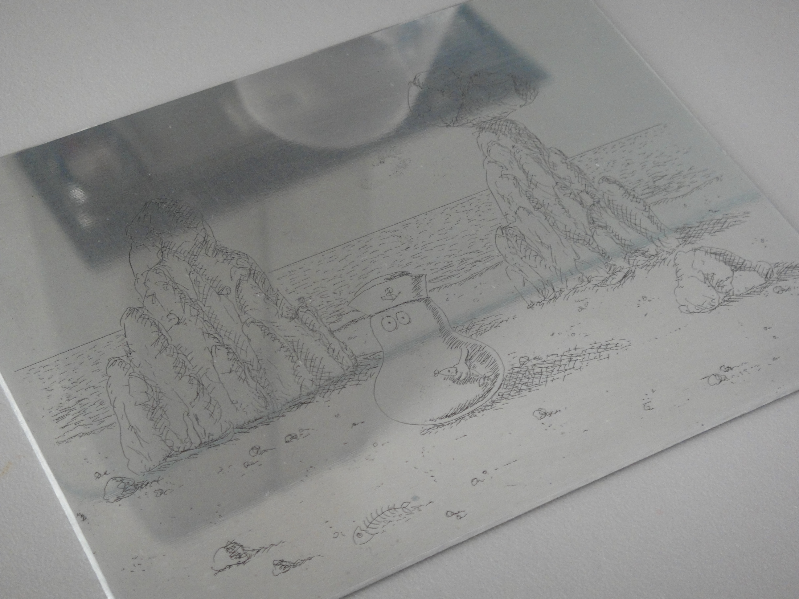
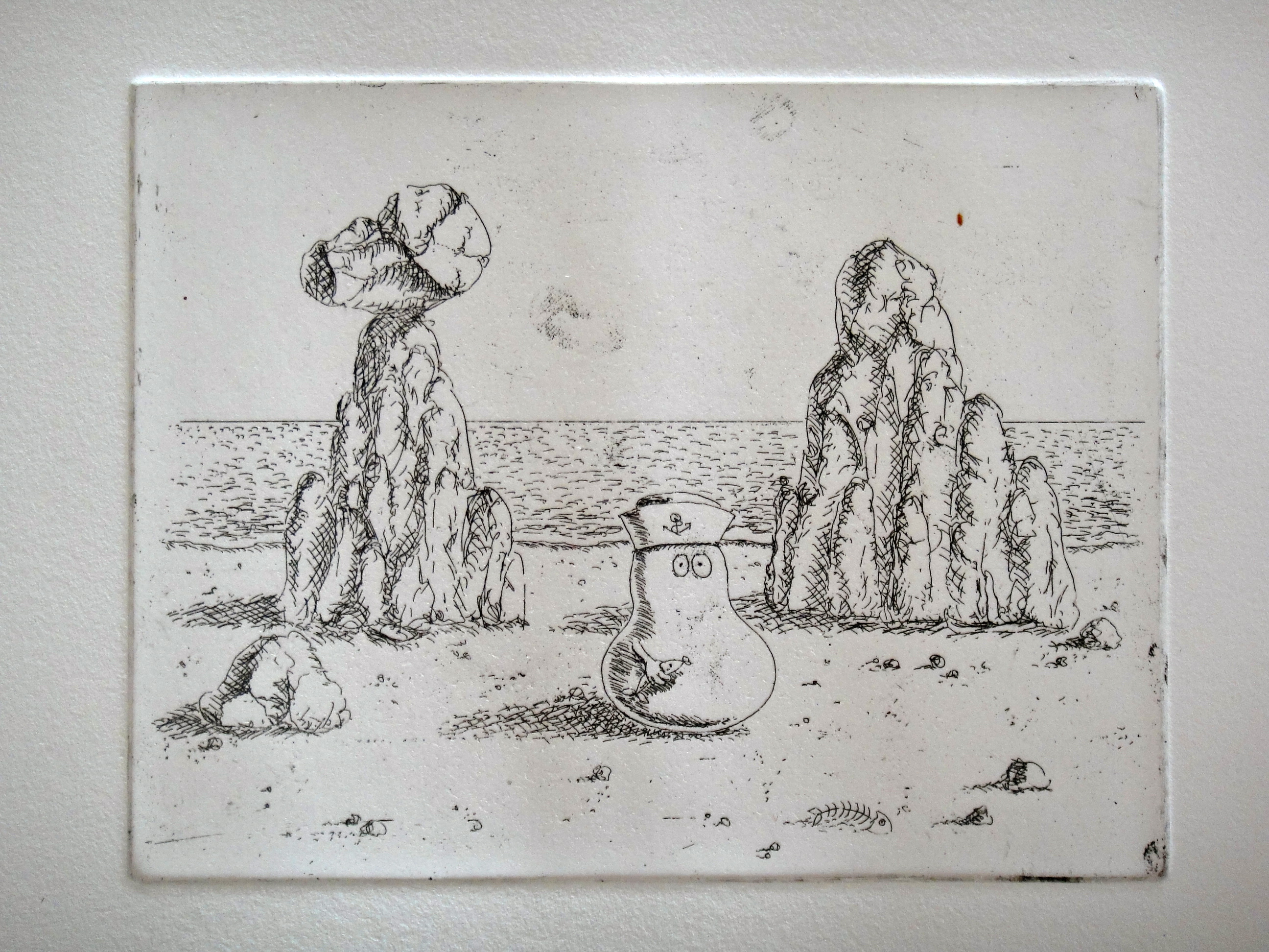
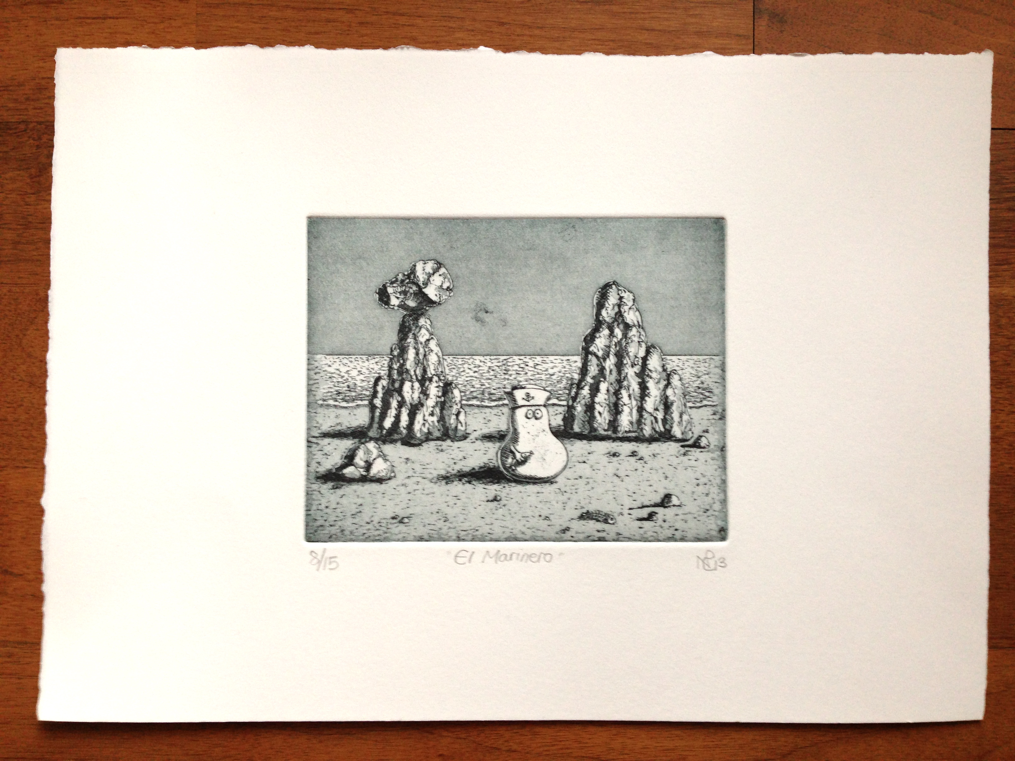
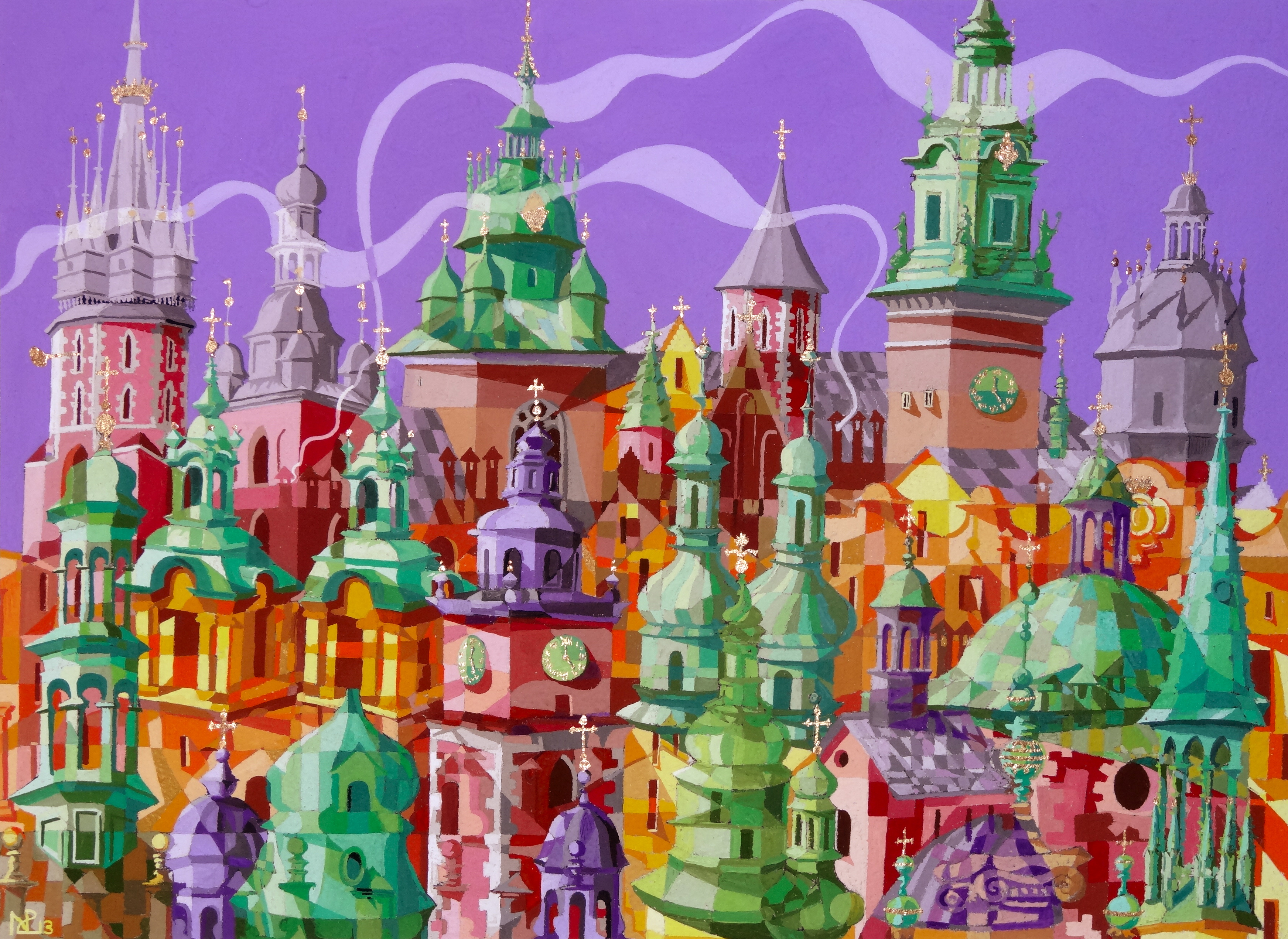
Sunday Supplement – The Heartbreak Diptych
In 2007, I suffered the angst of so many young people in the throws of their first romance: I suffered a horrible heartbreak. At the time, when a short but very intense relationship came to an unceremonious and unexpected end, I thought my world had been torn in two. I spent my days feeling breathless, unable to concentrate and with my stomach in turmoil, as though a little roller coaster ride was traversing the inner contours of my intestines. I would think about the failed romance endlessly, relentlessly engaging in a kind of obsessive postmortem: What went wrong? How could I change things? Was there really no hope for the future? And when, finally, exhausted by the onset of morning depressions and days spent in deep contemplation, I turned to my canvases and represented what I felt in paint.
What had started off as a portrait of my ex, in the bright colours of a Parisian bistro, soon became a tale of my own woe, as I completed the painting in shades of black, white and grey, with a portrait of myself sat melancholy and lonely on a Parisian bench. Appropriately, that self-portrait is represented in stark contrast to the colourful tones of the main portrait of my ex; an illustration of how, in this period of heartbreak, all of the colour and vitality of life had been drained out of me.

Heartbreak II: Paris in Hues of Gray (acrylic on canvas, 2007 © Nicholas de Lacy-Brown)
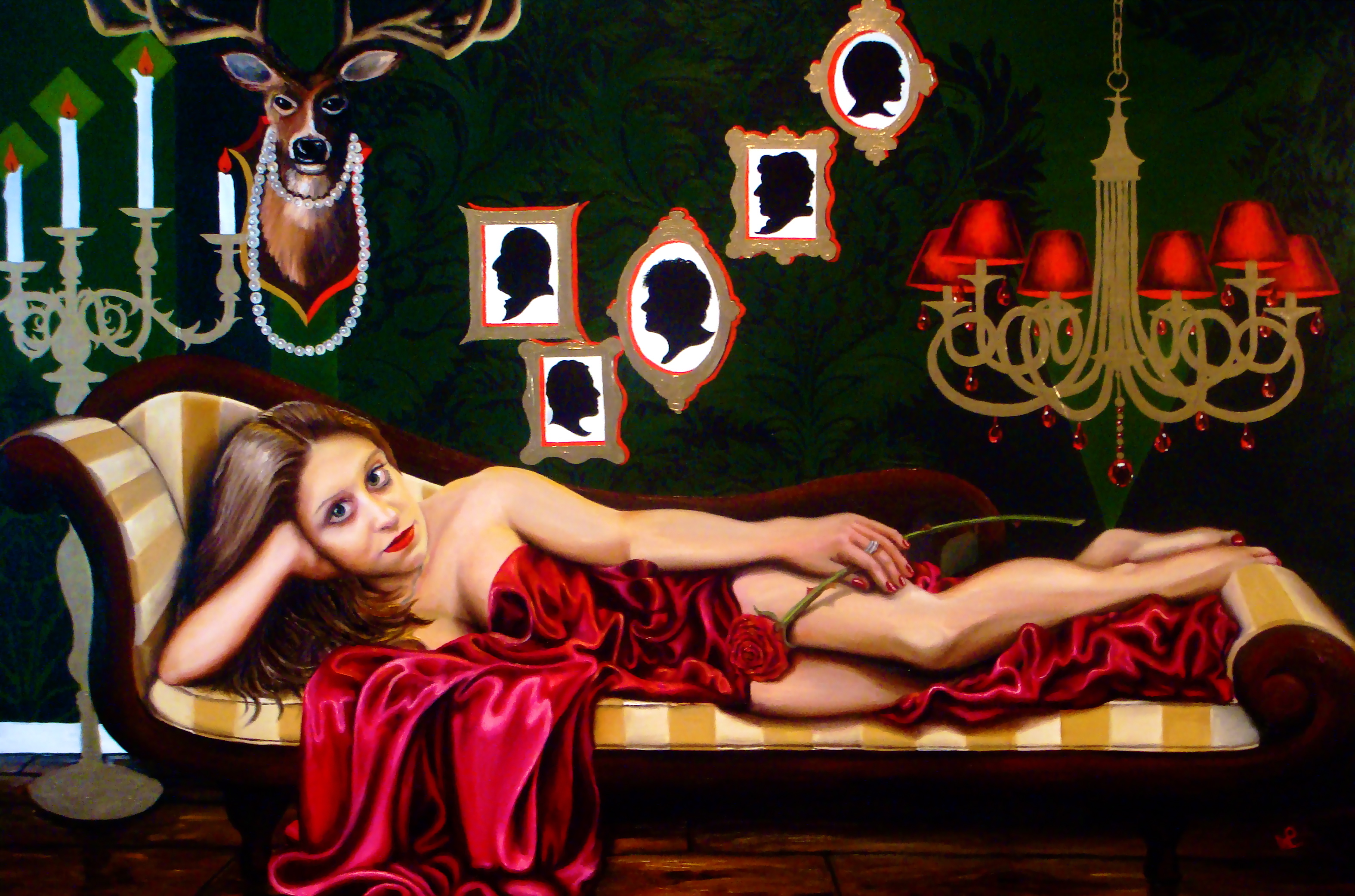
By coincidence, at the time I painted my tale heartbreak, my flatmate was also going through a heartbreak of her own. Almost torn apart emotionally by the strain of her failed romance with longterm South African sweetheart, my portrait of her illustrates, through surreal imagery and references to a dark and brooding South African landscape, the pain and torment she was feeling as she reflected on what the relationship had been, and the hole its passing had left in her very core.
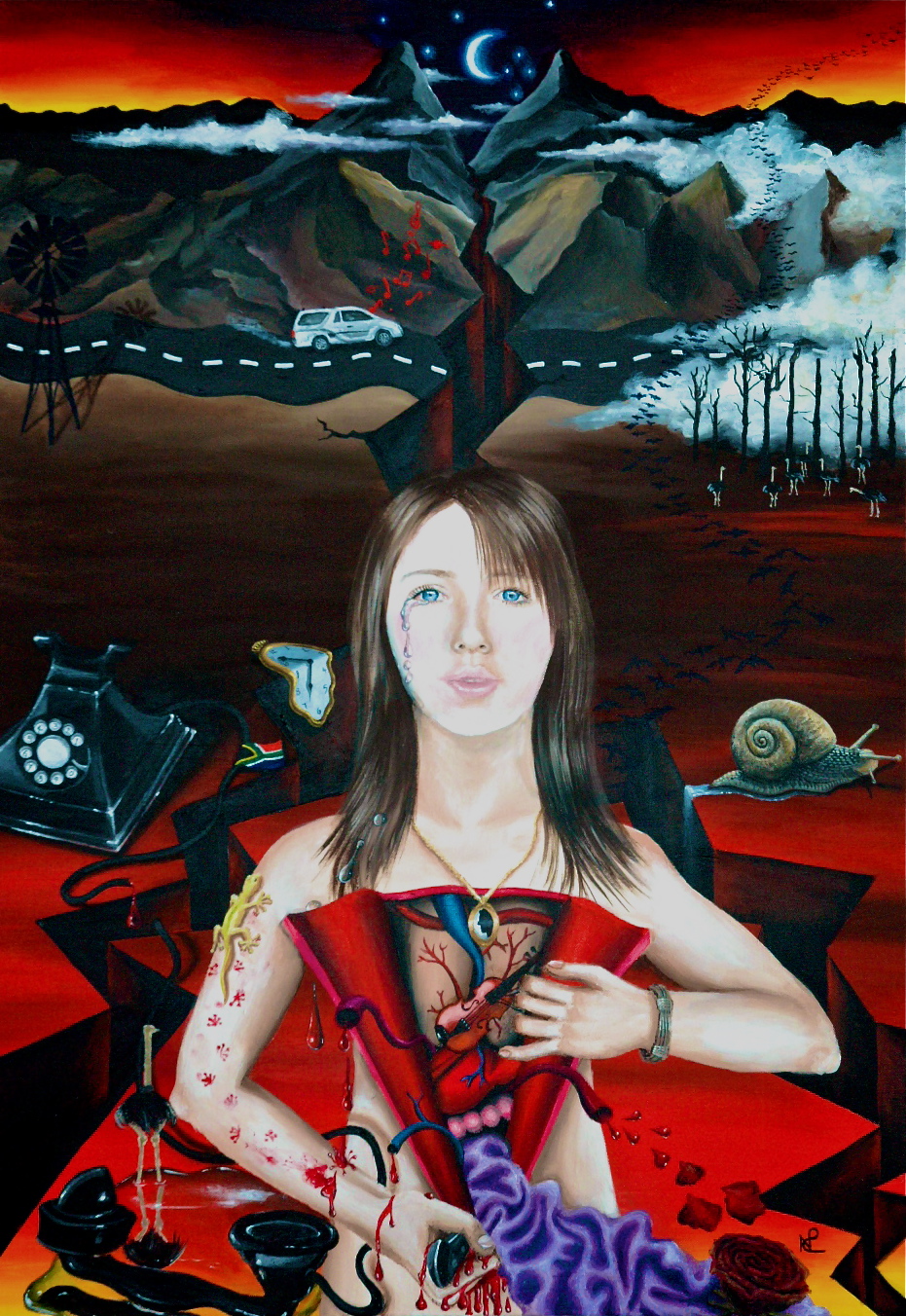
Heartbreak I (2007 © Nicholas de Lacy-Brown, acrylic on canvas)
Of course looking back on these two paintings now, it is hard to re-engage with those feelings which, at the time, seemed so deep; so central to all existence. With age and maturity, I am able to reflect on what was a mere romantic folly, and recognise that the despair I was feeling wasn’t at the loss of “love”, but at the shock of personal rejection. Yet at the time, the process of painting those emotions was extremely cathartic, and the canvases which resulted are probably two of my most interesting portraits painted to date.
Enjoy your Sunday.
© Nicholas de Lacy-Brown and The Daily Norm, 2001-2012. Unauthorized use and/or duplication of the material, whether written work, photography or artwork, included within The Daily Norm without express and written permission from The Daily Norm’s author and/or owner is strictly prohibited. Excerpts and links may be used, provided that full and clear credit is given to Nicholas de Lacy-Brown and The Daily Norm with appropriate and specific direction to the original content.