Skip to content

Posts tagged ‘Art’

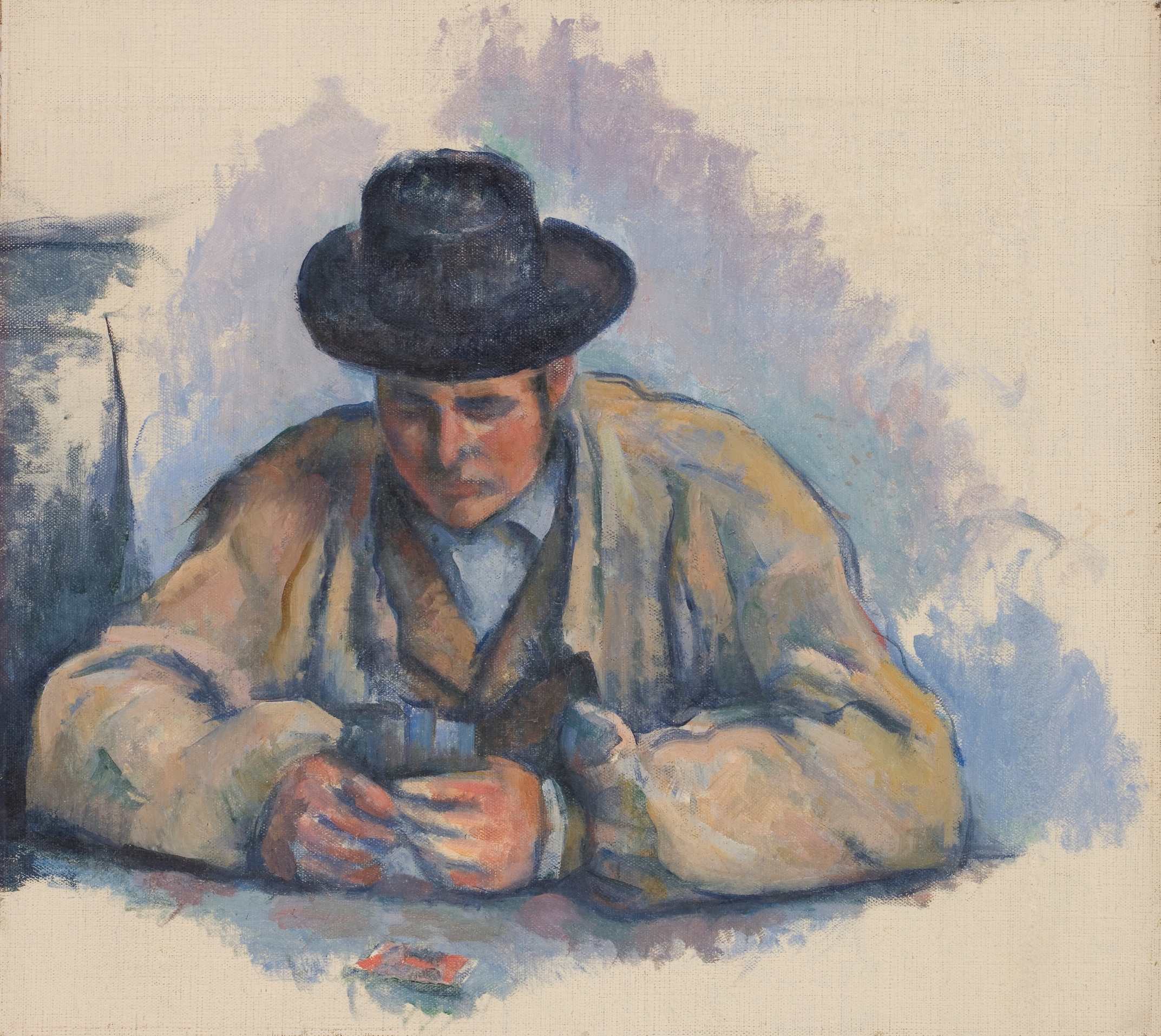
Provence Odyssey | My Journey in Paintings: From Avignon to Arles (avec le petit dejeuner)

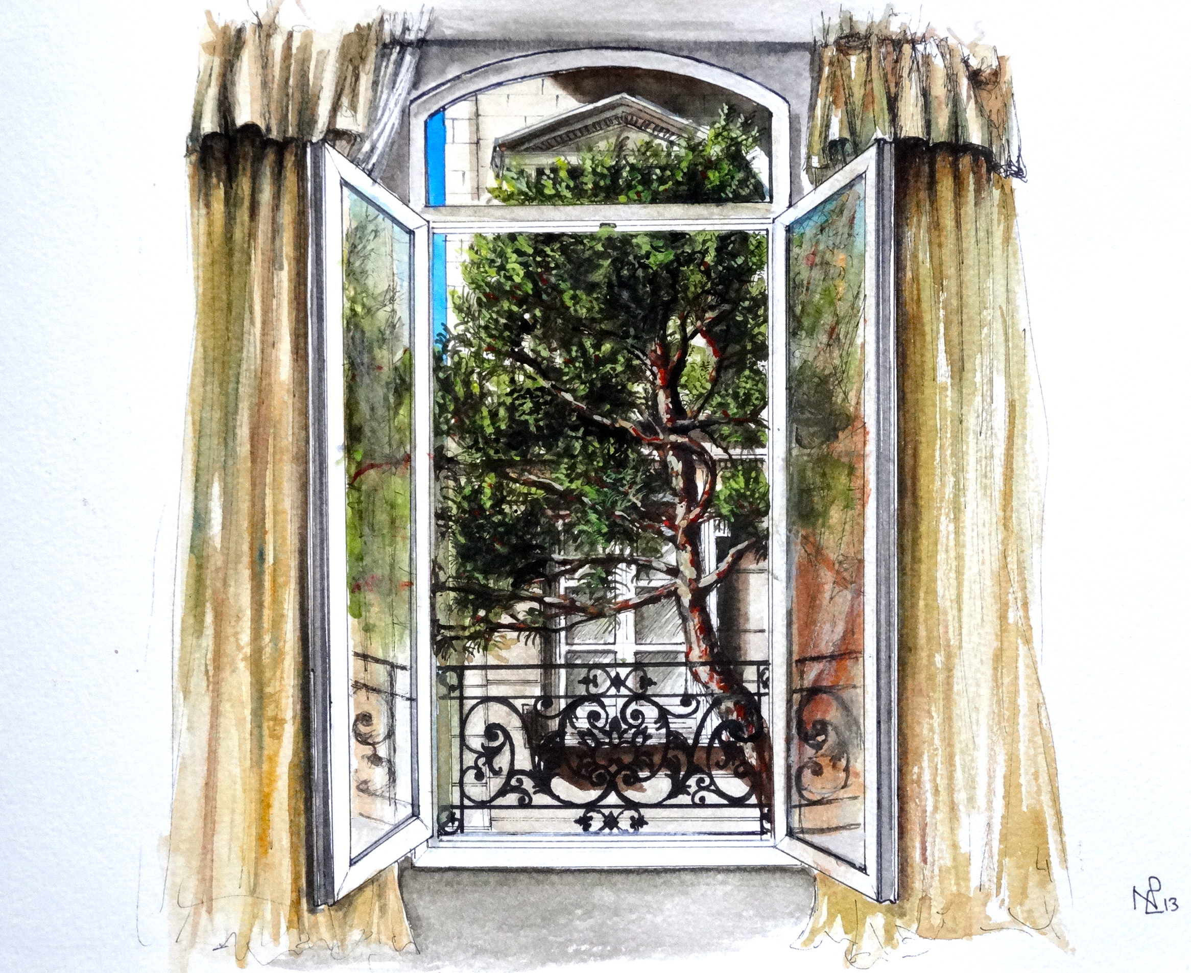
After three days in the Provence heartland, surrounded by verdant rolling landscapes of cypresses and pine trees, olives and lavender, and with one hotel view watercolour already under my belt, I moved onto Arles considerably inspired, artistic images floating through my head with each new adventure taken across this artist’s paradise. After two days in the midst of the medieval magic of Avignon, our journey south to Arles provided a refreshing glimpse of the rich pastoral landscape which surrounds Provence’s cities, but also of the little farmhouses which are dotted across the scenery, with their iconic terracotta tiled roofs and pastel-painted walls, their pale blue shutters and window-sill plant pots.

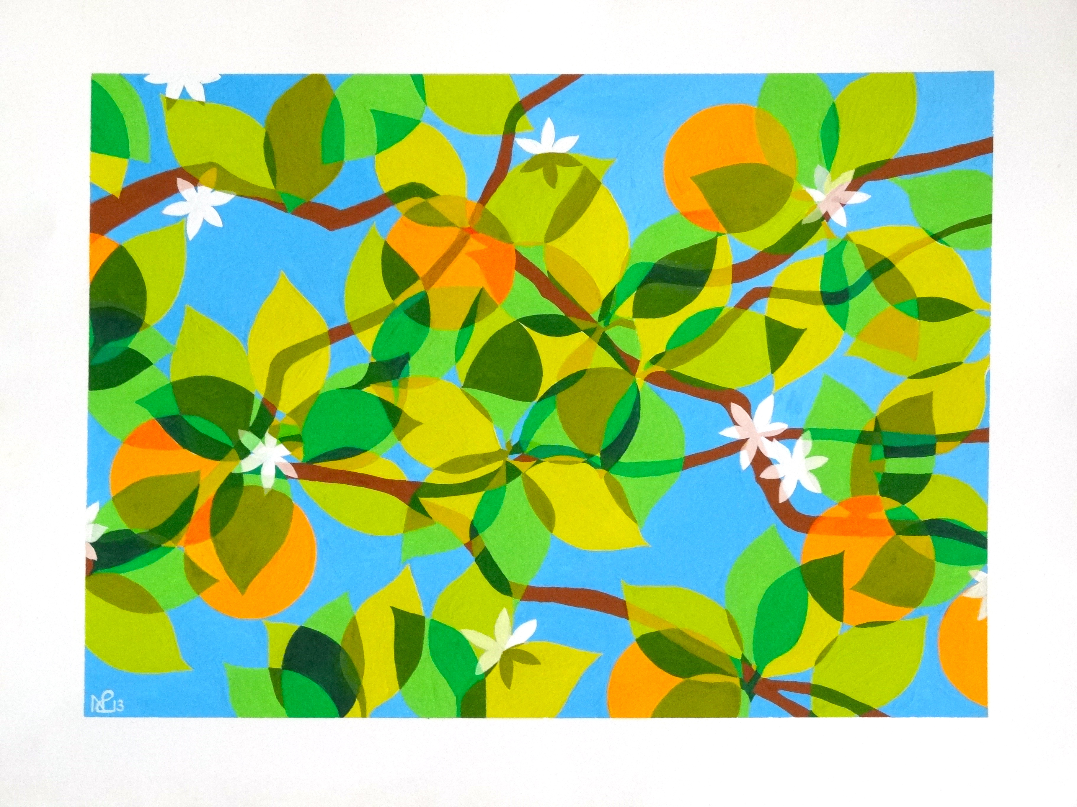
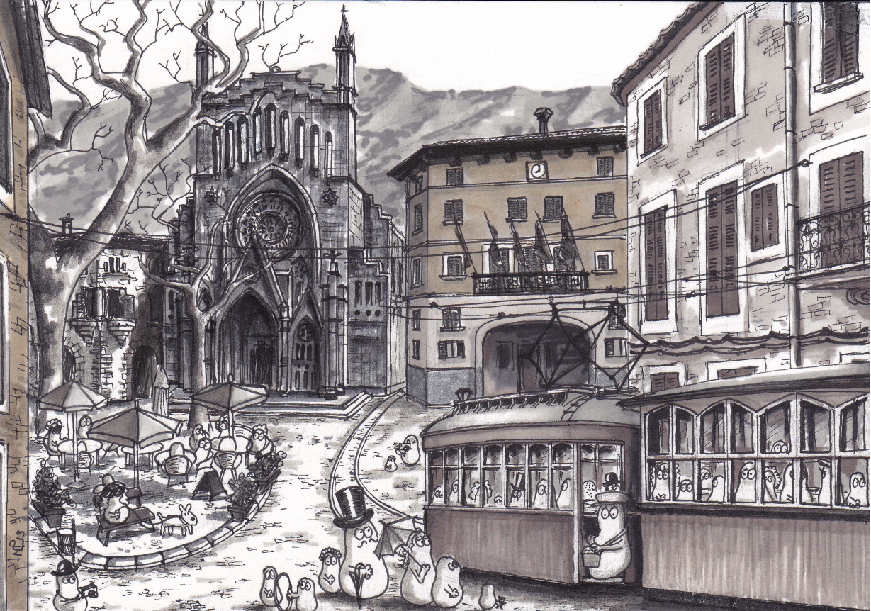
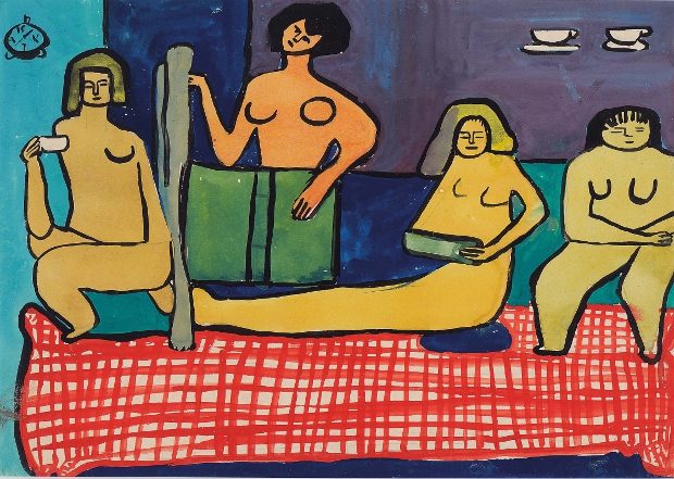
And so, shortly after arriving in Arles and in a moment of rest, so many of these images collected together with such strength that in mere minutes, I had opened up my travel sketch book and mapped out this image, depicting our journey from Avignon to Arles, and accompanied by the hearty breakfast which had so satisfyingly kicked off our day. Over the next few days, I filled in my sketch with vivid colour reflective of the seductive rainbow palette which the Mediterranean light so augments in Provence, using my new favourite medium, gauche, to do so.

Voyage to Arles from Avignon (avec le petit dejeuner) 2013 © Nicholas de Lacy-Brown - gauche on paper

Voyage to Arles from Avignon (avec le petit dejeuner) 2013 © Nicholas de Lacy-Brown – gauche on paper

The result is Voyage to Arles from Avignon (avec le petit dejeuner) – an artistic testament to this next leg in our journey. I hope you enjoy it.

© Nicholas de Lacy-Brown and The Daily Norm, 2001-2013. Unauthorized use and/or duplication of the material, whether written work, photography or artwork, included within The Daily Norm without express and written permission from The Daily Norm’s author and/or owner is strictly prohibited. Excerpts and links may be used, provided that full and clear credit is given to Nicholas de Lacy-Brown and The Daily Norm with appropriate and specific direction to the original content.

Provence Odyssey | My Journey in Paintings: Avignon – A room with a view

That morning. Waking to the waft of pine tree perfume filling the air, the sharp clear light of a Mediterranean blue sky, and warmth – oh the warmth of the clement Southern France climate. How could I not paint it? While some people may consider a room with a view to be a vast vista over coasts and mountains, over city roof tops or wide country landscapes, for me, our little room at the Hotel de L’Horloge overlooking a quite old street with a verdant puissant pine tree thrusting into view, could not be beaten. And as daytime dawned on our first Avignon day, I could not help myself but take out my little watercolour book and recreate the view and our wide open window in paint, capturing that moment as we welcomed, heartily, the exquisite outside in.

Now, far away from Avignon, when I look at my painting, it carries with it the very essence of that view, and the feelings which arose within me when I gazed upon it in a way which no photo ever could. For in the process of its creation, I captured not just the view, but a manifestation of my reaction – my joy at that moment of Provençal awakening.

Avignon: A Room with a View (2013 © Nicholas de Lacy-Brown, watercolour on paper)

Avignon: A Room with a View (2013 © Nicholas de Lacy-Brown, watercolour on paper)

It’s a simple painting, but loaded with our experience of those pure moments of unbridled joy, when a holiday begins, and days of carefree discovery lie in wait.

More on Provence, coming soon.

© Nicholas de Lacy-Brown and The Daily Norm, 2001-2013. Unauthorized use and/or duplication of the material, whether written work, photography or artwork, included within The Daily Norm without express and written permission from The Daily Norm’s author and/or owner is strictly prohibited. Excerpts and links may be used, provided that full and clear credit is given to Nicholas de Lacy-Brown and The Daily Norm with appropriate and specific direction to the original content.

Norms do… Cézanne’s Card Players

Although perhaps best known for his repetitive, almost obsessive landscapes of Le Mont Saint Victoire near his home town of Aix-en-Provence, and his groupings of apples and oranges painted as simplified geometric forms with zealously applied paint strokes, the so called father of cubism, post-impressionist master Paul Cézanne also painted another set of rather astonishing works which in my opinion easily qualify as some of his most captivating works. A gloomy tavern, a waxy dark tablecloth, a set of playing cards and the concentration of two card players, focus furrowed deep into their brows as we look upon them in the midst of a game – I am of course talking about Cézanne’s Card Player series, a series of some 5 paintings and numerous preparatory sketches, in which Cezanne took the tradition 17th century French and Dutch genre painting style of a rowdy tavern scene, and reduced it to a simple card game, full of intensity and, surprisingly for its tavern setting, sobriety.

The Courtauld's Card Players

The Courtauld’s Card Players

This now familiar composition by Cézanne, one of which hangs so happily close to me in London’s Courtauld gallery, made the headlines as recently as last year, when sold to the Qatari royal family for around $275 million, it became the most expensive piece of art work ever sold. While the price may be bonkers, and the painting’s final destination into a private collection lamentable, the art loving public can at least be reassured that four versions of the work remain on public view and as if that wasn’t enough, on top of that, the Norms have now staged their own version too!

Norm Card Players (after Cézanne) (2013 © Nicholas de Lacy-Brown, acrylic on canvas)

Norm Card Players (after Cézanne) (2013 © Nicholas de Lacy-Brown, acrylic on canvas)

Yes, being as, when you read this post, I should be somewhere in the Lavender-scented verdant rolling landscapes of Cézanne’s beloved Provence, and heading to his home town of Aix as my final destination, the Norms thought it only appropriate that before heading off on that trip with me, they would reimagine this renowned Cézanne scene, composed as it is with a rusty authentic depiction of a Provencal tavern complete with what are believed to be two of its local farmers playing cards. The Norm version is based upon the Courtauld’s canvas (above), and consequently the scene concentrates, as Cezanne latterly did, on the two solitary card players rather than two players with spectators such as populate some of the other works from the series. I’m not entirely sure how Norms manage to play cards so well with only one arm, but I suppose they have their ways, as Norms always do…

So without further ado, I leave you to enjoy the Norm Card Players, in this almost still-life, intense moment of concentrated card play. And some of Cezanne’s originals are included too.

Spot the difference…

The d"Orsay Card Players

The d”Orsay Card Players

The Qatari Card Players

The Qatari Card Players

Card Players at the Barnes Foundation, Philadelphia, Pennsylvania

Card Players at the Barnes Foundation, Philadelphia, Pennsylvania

and at the Met, NY

and at the Met, NY

And some studies…

8-Cezanne-Card-Player-Worcester 471px-Paul_Cézanne_102 502px-Paul_Cézanne_103 Cardplayers_study_bloch_collection

A bientot.

© Nicholas de Lacy-Brown and The Daily Norm, 2001-2013. Unauthorized use and/or duplication of the material, whether written work, photography or artwork, included within The Daily Norm without express and written permission from The Daily Norm’s author and/or owner is strictly prohibited. Excerpts and links may be used, provided that full and clear credit is given to Nicholas de Lacy-Brown and The Daily Norm with appropriate and specific direction to the original content.

Composition No. 2 (Los Naranjos)

Last week I introduced a new painting and a very new style: Composition No.1 (squid with patatas a lo pobre), and hot on its heels I am very pleased to present my second Composition, likewise painted with gauche whose introduction into my artistic repertoire was inspired by the colourful enriching abstract works of Saloua Raouda Choucair currently on show at Tate Modern.

My second composition is inspired by those exquisite moments of summer time pleasure, when sat in the dappled Mediterranean light and shade of a ripe green orange-tree (Los Naranjos), you look up through the branches in whose semi transparent leaves the sun has scattered a panoply of greens, to see through those verdant lustres the unbroken clear blue sky beyond.

Composition No. 2 (Los Naranjos) © Nicholas de Lacy-Brown, gauche on paper

Composition No. 2 (Los Naranjos) © Nicholas de Lacy-Brown, gauche on paper

I adore mediterranean trees, basking under their natural canopy both protected from, and yet semi-dappled with the glorious midday sun. I love the unmistakable perfume of orange blossom, and the dry earthy aroma of sun warming the wrinkled bark of these well-weathered trees. And for me, the effect of light bleeding through a shelter of semi-translucent leaves lent itself so well to this abstract style, which has at its heart the idea of multi-layered shapes. The result is a painting which I hope you agree has the essence of a summer’s day, but in a decidedly abstracted mood.

Composition No.3 will surely follow suit. Until then amigos.

© Nicholas de Lacy-Brown and The Daily Norm, 2001-2013. Unauthorized use and/or duplication of the material, whether written work, photography or artwork, included within The Daily Norm without express and written permission from The Daily Norm’s author and/or owner is strictly prohibited. Excerpts and links may be used, provided that full and clear credit is given to Nicholas de Lacy-Brown and The Daily Norm with appropriate and specific direction to the original content.

RA Summer Exhibition – Grayson Perry steals the show

Now in its 245th season, the annual Summer Exhibition at London’s Royal Academy is reputed to be the largest open-submission exhibition in the world, and also one of the oldest. Yet while it is billed as being a show which offers all artists, no matter their qualification, notoriety, nationality or skill, the opportunity to submit work and be hung amongst a who’s who of some of Britain’s most prominent contemporary artists, it is more often the case that those prominent artists more than overshadow those lesser knowns who are lucky enough to have their work selected for the show. In previous years, the non ‘Royal Academician” artists have been crammed into the smallest possible spaces, while the larger galleries have been given over to the same old RA clique, whose submissions never appear to differ from one year to the next.

4576 gallery-1-rasi-13-23776

In that respect, this year’s show, just opened at Picadilly’s Burlington House, is very similar. The same old-same old is prominently hung, including works by the likes of Albert Irvine RA, whose florescent acrylic daubs continue to repel me despite my being consistently exposed to them at each annual Summer Exhibition, and Eileen Cooper RA, whose rather simplistic portraits look more craft fair than art show to my mind. Having said that, the RA appears to have learnt from past grumbles, and has not crammed the non-RA artists into a single small room, rather opting for a “Salon-style” floor to ceiling hang in many of the larger galleries, which, while rather bewildering to look at, at least makes for a more pleasant viewing experience when the large crowds of people, attracted no doubt by the smaller price tags, cluster around these works hoping to invest in the lesser known, affordable artists.

An El Anatsui "sculpture" hangs over the facade of the RA for this year's show

An El Anatsui “sculpture” hangs over the facade of the RA for this year’s show

While the Salon-style hang inevitably means that there are way more pictures on show than anyone can possibly take in on one visit, it does at least mean that there are huge rafts of works on show, and undoubtedly something to suit every taste. In keeping with my positive experience of last year (which resulted in my making two purchases), my favourite gallery of this year’s show was no doubt the print room – a gallery full of prints of all mediums, from etching to relief, screen printing to woodcuts, and I was very happy to see the artist Adam Dant on show at least twice, one of whose encyclopaedic works I had bought last year.

Adam Dant, The Mouth of Italy (Venice) hangs at this year's show © Adam Dant

Adam Dant, The Mouth of Italy (Venice) hangs at this year’s show © Adam Dant

Many of the subsequent galleries flew by in a rush of sculptures, architectural models and so-so paintings. Only a few works really stood out enough for me to remember them subsequently, amongst them Julian Opie’s Maria Teresa I, which I adored, and reminded me of a pop-art Velazquez court-painting.

Julien Opie's Maria Teresa I © Julien Opie

Julien Opie’s Maria Teresa I © Julien Opie

But undoubtedly the real star of this show and the work for which a visit to the exhibition is alone worth a visit, is one Grayson Perry, the witty, perceptive, social-commentating, cross-dressing craftsman and artist. I first estolled the virtues of Perry when I took a trip to his British Museum exhibition one year ago. Now, at the Summer Exhibition, a whole gallery (the last in fact) has been given over to a set of 6 tapestries by Perry which, under the combined title The Vanity of Small Differences, tell the story of one Tom Rakewell, whose rise and fall through life is captured insightfully and comically across these brilliantly detailed, multi-coloured and superbly designed Hogarth-inspired tapestries.

Details from The Vanity of Small Differences © Grayson Perry

tumblr_m7kigl2KaI1r2y5buo3_1280 grayson-perry-masaccio 7592829302_be24f23221_z GraysonPerryTheVanityofSmallDifferencesMugs _68000737_68000736

As is so typical of Perry’s work, these tapestries offer a spot-on insight into what some call Britain’s “tribes”, from stay at home frustrated mother and groups of rowdy clubbing slappers, to our aspiration for the “high life”, a tendency to attack those who the masses perceive as “upper class”, and our obsession with money, gadgets and celebrity culture. There’s so much to take in in these brilliantly conceived tapestries, and even as I write, I am itching to go and see the works again so that I can take in more of the feast of details which Perry offers up for our consumption. In the meantime I include images of all six tapestries to tempt your taste buds, as well as some shots of the wonderful details which are literally stitched into the richly weaved layers of this work.

The Adoration of the Cage Fighters © Grayson Perry

The Adoration of the Cage Fighters © Grayson Perry

The Agony in the Car Park  © Grayson Perry

The Agony in the Car Park © Grayson Perry

Expulsion from Number 8 Eden Close  © Grayson Perry

Expulsion from Number 8 Eden Close © Grayson Perry

The Annunciation of the Virgin Deal  © Grayson Perry

The Annunciation of the Virgin Deal © Grayson Perry

The Upper Class at Bay  © Grayson Perry

The Upper Class at Bay © Grayson Perry

Lamentation  © Grayson Perry

Lamentation © Grayson Perry

The Summer Exhibition is now open at the Royal Academy and runs until 18th August 2013.

Composition No. 1 (squid with patatas a lo pobre)

With Composition No.1 (squid with patatas a lo pobre), my painting has taken something of a new direction. Inspired by the simple abstract forms and “fractional modules” of Saloua Raouda Choucair, and intrigued by the medium of her choice, gauche, I have diverted from the more detailed figurative approach of my normal artwork to cleaner, simpler representational forms.

In this work, I am attempting to convey an atmosphere and an occasion: lunch by a Mediterranean beach – a dish of squid and patatas a lo pobre, the typical unctuous Spanish dish in which simple oil nourished potatoes are served with peppers and onion. I have attempted to convey the swirls of the sea, the curving delicate forms of a squid’s tentacles and the odd burst of red from the colour-rich peppers.

Composition No. 1 (Squid and patatas a lo pobre) 2013 © Nicholas de Lacy-Brown (Gauche on paper)

Composition No. 1 (Squid and patatas a lo pobre) 2013 © Nicholas de Lacy-Brown (Gauche on paper)

As for gouache paint – it’s been something of a revelation. Something of a cross between watercolour and acrylic but drying matt, flowing seamlessly across the paper and easily controllable both with and without water mixed in, I’ve found it an inherently pleasurable medium with which to work. I love the flat finish, the overlapping colours, and the explosion of blues bursting across the picture. I cannot wait to work in gauche again. In fact, composition No.2 is already taking shape.

© Nicholas de Lacy-Brown and The Daily Norm, 2001-2013. Unauthorized use and/or duplication of the material, whether written work, photography or artwork, included within The Daily Norm without express and written permission from The Daily Norm’s author and/or owner is strictly prohibited. Excerpts and links may be used, provided that full and clear credit is given to Nicholas de Lacy-Brown and The Daily Norm with appropriate and specific direction to the original content.

The Daily Sketch: Norms take the tram in Soller

Travelling from Palma de Mallorca to the little town Soller, on the old rickety Ferrocarril railway, is like stepping back into the time of Agatha Christie. You fully expect someone in a trilby hat or a feathered tiara to shout murder! at any second. After making it to the charming little town of Soller, set near the North coast of Mallorca deep in a vast mountainous valley, further rickety old wooden trams, running from the Ferrocarril station down to Soller’s picturesque port, give the town its undoubted charm, taking tourists and locals alike back to the good old days when transportation was slower, yet undoubtedly more reliable.

Norms in Soller (2013, © Nicholas de Lacy-Brown)

Norms in Soller (2013, © Nicholas de Lacy-Brown)

Take a glimpse in Soller today, and you can see the Norms trying the tram out for speed. Queuing in a little group, waiting patiently in the shadow of the imposing facade of Joan Rubio i Bellver’s Sant Bartomeu church, and besides the town’s charming little restaurant-filled square, these Norms are all prepared to take a ride on Soller’s iconic tramline. One Norm has even dressed for the occasion, bedecked in top hat as befits such a classical mode of transportation. There’s really no beating the good old golden age of the trams, as these Norm-packed carriages prove. Happy tramming Norms!

© Nicholas de Lacy-Brown and The Daily Norm, 2001-2013. Unauthorized use and/or duplication of the material, whether written work, photography or artwork, included within The Daily Norm without express and written permission from The Daily Norm’s author and/or owner is strictly prohibited. Excerpts and links may be used, provided that full and clear credit is given to Nicholas de Lacy-Brown and The Daily Norm with appropriate and specific direction to the original content.

Saloua Raouda Choucair – Geometric East meets Abstract Expressionist West

I hadn’t heard of Beirut-born artist Saloua Raouda Choucair before I dropped in, unplanned, to a small retrospective of her work at Tate Modern yesterday. In fact, as the literature accompanying the show rather depressingly tells us, “despite ceaselessly producing work for the best part of five decades, Choucair remains relatively little known internationally [and]… has not yet reached her deserved position in art history”. This is undoubtedly the reason then why our paths have not crossed each other before (and, I suppose in part has something to do with the fact that her name does not exactly spring to mind all that easily). Yet the moment I walked into the four room exhibition at Tate, encouraged to do so by the vivid bright colours of her almost fauvist abstract portrait which graces the posters of the show, I was in love.

Choucair poster

I was in love first and foremost with her paintings, largely gouache abstract compositions, with geometric forms criss crossing over each other in a multi layered colour explosion, to her Les Peintres Celebres collection, a wonderful set of group portraits, where the form of the nude has been flattened and abstracted, and the poses reduced to softened linear forms.

Les Peintes Celebres (1948-9) © Saloua Raouda Choucair Foundation

Les Peintes Celebres (1948-9) © Saloua Raouda Choucair Foundation

Untitled (1948-9) © Saloua Raouda Choucair Foundation

Untitled (1948-9) © Saloua Raouda Choucair Foundation

Paris-Beirut (1948) © Saloua Raouda Choucair Foundation

Paris-Beirut (1948) © Saloua Raouda Choucair Foundation

Choucair’s paintings very clearly demonstrate the influential hand of cubist figurative painter Fernand Léger, under whose influence she came in 1940s Paris, and yet as she moves from figure paintings to her abstract composition, you can see equally clear evidence of the extent to which she was inspired by the geometric forms of Islamic art, which had entranced her when she became acquainted with them in Cairo. These “Fractional Modules” as she calls them, were almost certainly my favourite paintings in the show. Simple shapes interwoven and multi-layered resulted in a wonderfully satisfying overall abstract form, an image so complex in its pictorial language (despite the repeated use of a single shape or form) that it reminds me of the same level of aesthetic satisfaction that can be gleaned from those stunning patterned tiles and plaster work in the great Islamic palaces of Southern Spain.

Composition in Blue Module (1947-51) © Saloua Raouda Choucair Foundation

Composition in Blue Module (1947-51) © Saloua Raouda Choucair Foundation

Fractional Module (1947-51) © Saloua Raouda Choucair Foundation

Fractional Module (1947-51) © Saloua Raouda Choucair Foundation

Rhythmical Composition in Yellow (1952-5) © Saloua Raouda Choucair Foundation

Rhythmical Composition in Yellow (1952-5) © Saloua Raouda Choucair Foundation

Composition with Arcs (1962-5) © Saloua Raouda Choucair Foundation

Composition with Arcs (1962-5) © Saloua Raouda Choucair Foundation

However in addition to the paintings, I also loved Choucair’s sculptures, which became her main preoccupation from the 1950s onwards, and into whose multi-dimensional forms the language of abstract expressionism has translated. Her works often reminded me of British greats Moore and Hepworth, particularly her use of strings strung across her metal sculptures to form rounded ephemeral planes. But I loved in particular her “poem” works – like a pile of bricks but each somehow melting under the tender hands of their mother-sculptor, curving into one another in an organic embrace.

Poem (1963-5) © Saloua Raouda Choucair Foundation

Poem (1963-5) © Saloua Raouda Choucair Foundation

Dual (1978-80) © Saloua Raouda Choucair Foundation

Dual (1978-80) © Saloua Raouda Choucair Foundation

The screw (1975-7) © Saloua Raouda Choucair Foundation

The screw (1975-7) © Saloua Raouda Choucair Foundation

But perhaps the most powerful piece in the exhibition is  Two=One (1947-51), one of Choucair’s painted compositions which had been hanging in her Beirut flat when a bombing raid rained down on the city during the Lebanese civil war in the 1980s, resulting in glass from one of her cabinets smashing and piercing the surface of this abstract painting. Thus the painting bears witness not only to that history, but, as Tate puts it, to the “circumstances through which Choucair not only survived, but continued to work with energy and enthusiasm”. Hopefully, with this superb exhibition  hosted at the very heart of the Britain’s art capital, Choucair’s enthusiasm will finally bear fruit as she becomes recognised as an internationally important abstract artist, under whose skilful guise Eastern islamic geometry met with western Expressionism with stunning results.

Two=One (1947-51) (complete with hole at its centre)  © Saloua Raouda Choucair Foundation

Two=One (1947-51) (complete with hole at its centre) © Saloua Raouda Choucair Foundation

Soloua Raouda Choucair is on at Tate Modern until 20th October 2013.


Life Drawing: my first (presentable) nude

As well as discovering the joy of printmaking, I’ve spent the last few weeks attending once-weekly life drawing evening classes at Chelsea College of Art in London. Because I’m a self-trained artist, I really notice the gaps that exist at the foundations of my artistic ability. This is more noticeable when I attempt to draw or paint scenes of people. Give me a sitter and I can paint their portrait no problem. But ask me to draw a figure out of thin air, and a rounded blobby Norm is the best you’ll get.

So this year I enrolled in a life drawing class to try and fill in the gaps of my basic training. And after 5 weeks in the attempt, I have finally drawn a nude which I don’t want to chuck straight in the bin.

nude

It’s far from accomplished, and very clearly unfinished (our time was limited – this is the stage I got to after about 45 minutes in the attempt). But I am delighted that finally I have been able to draw something which at least resembles the human form.

Which just goes to show, practice makes (closer to) perfect.

Printmaking Progress II: Aquatinting

Being a self-trained artist, and so lacking the basic overview which art college provides of the many mediums which an artist has at his or her disposal, I became so entrenched in the world of painting for so many years that my recent discovery of the world of print has come as a complete revelation. Now over midway through an intermediate course in etching, I have taken to the medium like a duck to water. For not only does the medium transfer all of the skills of draughtsmanship which I have been mastering over the years in painting and more recently sketch, but through the sheer narrowness of the needle upon ground it enables me to pack the kind of detail into my etched images that I love. So, in my now advanced second etching, of a Fortnum and Mason’s hamper balanced upon a craggy rock, I have been able to go to town on the detail of the wicker, the rock texture, the little Norms looking up at the rock and the mountain and sea in the background.

Over the last two weeks, I have developed my etched image from metallic reverse image in black ground, to simple line drawing etched into metal and printed in reverse, to an image now loaded with different tonal variety achieved through the process of aquatinting. I am not sure why the technique has the name it does – I imagined it to involve some sort of watery application, a little like applying watercolours to a finished print. But in fact it involves no water at all. Rather, aquatinting is the process by which tone is added to the etching plate through measured re-exposure to acid. It works a bit like the Benday dots which Lichtenstein made famous – apply thousands of little dots to protect the metal and when exposed to acid, only those areas of the metal not covered by dots will etch and turn darker as a result. Step back and with the light dots and the dark exposed plate combined you get a shade of grey. The longer the exposure to acid, the darker the plate becomes, as the distance between dots increases.

My finished tonal etching after aquatinting

My finished tonal etching after aquatinting

Following this rationale, aquatinting involved first the exposure of the whole plate to a kind of rosin dust which was allowed to settle upon the plate under controlled conditions (it’s very toxic, hence the rather attractive gas mask we were required to wear by way of protection). This was then hardened over a gas fire. Then we had to protect details of the plate which we wanted to remain white, before dipping the plate back in acid, gradually protecting more and more of the plate so that in its final dip into acid, the only part of the plate left exposed was the parts of the image I wanted to print the darkest.

The result is a plate now textured differently depending on the exposure to acid and then, once the ink is reapplied to the plate, an image which comes alive with different tonal shades. Owing to what is a fairly hopeless attempt to explain the aquatinting process above in words, perhaps the process will become clearer by looking at my finished print itself.

DSC00569

You will see that the Norms and the highlights of the basket and rock have remained white – that’s because I covered those with a black “stop-out” before re-exposing the entire plate to acid. The next lightest shade is the sand – this pale grey results from a quick 15 second dip into acid. This was then covered while I re-exposed the plate, allowing the sky to go darker, followed by the basket, the shadows of the rock and so on.

And there you have it, my first finished etching with aquatint applied – I am so, so delighted with the result and thrilled that I have taken so naturally to the etching medium. I have a feeling that this will not be the last.

The etching before aquatinting

The etching before aquatinting

And before that, the initial image drawn into the "ground" layer

And before that, the initial image drawn into the “ground” layer

Related articles