Skip to content

Posts tagged ‘London’

The Daily Sketch London 2012 – Normington v El Normo at Wimbledon

It’s match point and Norm Normington, representing team GB is serving to win gold in the London 2012 Olympic tennis finals. However it’s not easy. Against him is world champion winner of various Norm Tennis grand slams, Norte El Normo, representing Spain. El Normo doesn’t just bounce around like a normal Norm tennis player would do. He can do backflips and high jumps and all sorts of distracting but spectacular moves which make him a real contender for the gold. Despite this, Normington, every the English gentlenorm, polite in his play but devilish in his super-fast serve and quick-fire backhand, is out on top, spurred by the proudest of all home crowds, rousing him to success with their roof-raising cheers and their chants of “Go Normington, Go!”. They’ve even been partial to the odd mexican wave or two during today’s match, which is most unusual for the reserved Englishnorm. Just goes to show how the Olympic spirit is lifting us all, and brining all Norms together as a single Normular nation under the sporting flag. But when it comes to victory, it’s nationality that counts. The question now is will Normington do it for team Great Britain?

Normington v El Normo – Tennis Final, London 2012 (© Nicholas de Lacy-Brown 2012, pen on paper)

London 2012: Infected by Olympic Fever – Tennis at Wimbledon

I’m not a big sports fan. I don’t really know the terminology, and my familiarity with the various sports stars extends as far as those faces who regularly hit the headlines and are splashed across perfume promotions and London buses. However there is something utterly contagious about the Olympic spirit which has swept throughout London and up and down the British isles which just cannot be resisted. The aim of London’s bid was to bring all Britons and people from throughout the world together under the olympic flag, to create a huge party of spectators enjoying the adrenaline rush engendered by sporting achievement and to inspire future generations to enjoy sport and aim for sporting brilliance. They’re all cliches, the stuff of marketing machines, but what the last week has proved to me, is that those objectives have really manifested – I feel inspired by sport, part of the global sporting party and loving every minute of London 2012.

Wimbledon green with the distinctive Olympics purple

The Wimbledon Wenlock

As with many Britons, I found it difficult to get any olympic tickets, despite applying for a good few (and yes, like everyone else, I am secretly seething inside at seeing so many empty seats at the events – a byproduct of the Olympics’ necessary reliance upon corporate sponsorship and IOC executives who then don’t bother to turn up, depriving so many future generations of the opportunity to be inspired). However the one set of tickets I did get was to see men’s semi-finals tennis at Wimbledon. This was a double whammy for me. Not only did it mean I would get to visit the British home of Tennis (tickets for the main Wimbledon tournament are as easy to get your hands on as the holy grail) but it also meant that I would be treated to not one, not two, but three matches played by undisputed tennis royalty.

Read more

Korean Eye at the Saatchi

It wasn’t easy returning to London from Italy. The first week back, and there was rain every day. Grey skies, autumnal temperatures, AND I was expected to be able to work 9-5 every day. Where’s the justice, the cappuccinos on the beach, the Bologna porticos and red-tinted palazzos? Eagerly I worked through the week, each day that passed taking me one day closer to the weekend, when an attempt to relive the Italy experience would commence.

Our efforts were fairly successful. As the grey clouds passed and London finally began to heat up again, we headed to an Italian restaurant, Getti, on Marylebone High Street on the Saturday, where the smells of fresh mozzarella on a crispy thin pizza base were now wonderfully familiar – it was like an Italian homecoming. We even managed to utilise a little of our now polished restaurant Italian.

Kim Byoungho, Soft Crash (2011)

Meanwhile, on the Sunday morning, it was a trip to Chelsea that satisfied all of our holiday yearnings. Sat out having a creamy cappuccino (again, Italian made) in the fashionable Duke of York’s square, in the full uninterrupted summer sunshine, felt just like being back on the Mediterranean. And, as is so often the effect of sunlight and warmth, it got us in the mood to indulge. Sadly for our wallets, this meant for subsequent glasses of prosecco, a large plate of Italian cheese, the undoubtedly unnecessary but practically irresistible purchase of various Olympics merchandise and even a new printer. Whoops.

But with our minds opened by the light summer mood which befalls all of us when seduced by the sun’s rays, it was surely the perfect time to head to the Saatchi gallery, whose frequently changing works of contemporary art usually fail to impress me, if not make me despair. But whether it be the sun which had opened my mind, or just the sheer brilliance of the works on show, Saatchi’s new show, Korean Eye 2012which is the largest survey of contemporary Korean art in the UK to date, is fascinating throughout.

The show started with a trademark Saatchi huge white gallery full of very little. But that little there was on show was actually pretty cool. Yeesookyung’s Translated Vase (2007) aims to transform everyday objects into new contemporary forms. It’s a simple idea, but effective as a piece of contemporary sculpture – and I particularly liked the use of gold grouting which acts as a consistent element bringing the shards from various pots together as a single, newly innovated shape.

Next up, in gallery 2, were the works that got me completely hooked on this show. These were large mixed-media works by Bae Joonsung which looked pretty innocuous at first – until you moved past the canvas and realised that some aspects were moving, and other disappearing. Joonsung brilliantly incorporates painting and photography, executed upon different sheets of transparent acrylic which act almost like a hologram so that, when you view the painting from different angles, the work changes before your very eyes. I’ll let my photos demonstrate as best as they can…

Woman reclining…

…in the nude

Lavish dress one minute…

…and ooh la la the next

Now you see her…

…now you don’t

Also in gallery 2 were the 32 ceramic heads which comprise the work of Debbie Han, The Battle of Conception (2004-10). The heads look identical from a distance, but again, closer viewing betrays different facial features in each one, as the artist attempts to demonstrate with diverse facial features the different racial and ethnic characteristics that exist across the human race. In this respect, the work builds upon racial stereotypes, and explores the significance of human perception as the key to defining ourselves and others.

Read more

My urban balcony garden

When you live in a city, like I do, here in the big smoke of London, every inch of greenery becomes important. When I travelled down to Glyndebourne the other day, surrounded by all of those lush green hills, and the conspicuous silence interrupted only by the occasional sheep cry, it made me realise just how lucky rural dwellers are to be surrounded by that constant beauty and tranquility. Yet it is only human nature not to appreciate what we have when we’ve got it. For all I know, the residents of those sussex country manners probably envy we Londoners who have the whole cultural world right on our doorstep.

I do like to count my blessings however, and I actually think writing a blog, which encourages one to reflect more on one’s life, making the most of occasions, events and opportunities for the sake of sharing and recollecting interesting and unique snapshots of life, makes us bloggers appreciate life with a renewed vitality and a very sharp focus. And one thing that I have always appreciated, albeit perhaps more so as my time living in London grows longer and my hours of work increase, is the green space around me.

The centre of this flower looks like little dancing aliens

My favourite photo – looks like the ant has cottoned on to my presence

I may only have a balcony to exhaust my green fingers, but that balcony, which runs along the front of my entire flat, is my pride and joy. There is much to be said for the urban balcony. Not only does it help to make urban life more bearable, more colourful, and more sensorily enriched, but also helps to give nature a bit of a kickstart – there have, for example, been reports of huge rises in the numbers of urban dwellers keeping beehives, so many in fact that there are now a surplus of bees for the numbers of suitably pollinating flowers available across the city. I don’t have bees, but what I have created on my balcony is my own piece of tropical paradise. I’ve surrounded my small table and chairs and my all important sun lounger with my own little slice of Spain. There I have a large brugmansia (whose flowers are spectacular bell-shaped blooms which smell glorious at night – they’re not out yet but rest assured, I will share on The Daily Norm once they are), a passion flower, an olive tree, grasses and plenty of geraniums. I’ve also encouraged honeysuckle to grow up the wall, and this year, for the first time, introduced some strawberries into the mix.

Because my urban balcony garden is a natural extension of my lounge which has a very contemporary red, black and white colour scheme, I have attempted to continue that out onto the balcony, with modern galvanised steel planters, and plenty of vivid red geraniums, which mark a wonderful contrast against the building’s crisp white washed walls and the black and grey grasses I have planted intermittently amidst blood-red cala lillies and those red-burst strawberries.

So without further ado, here are some focused shots of the plants which are currently thriving on my urban balcony garden.

Whether you’re a city-dweller or otherwise, I strongly recommend you import some plants into your life – even if it’s only a window box hanging out of the window. The introduction of plants always creates a new geometric mix into any design scheme, bringing curves and floral bursts into often boring square buildings, which are enhanced further as day turns into night, and interesting plant-shaped shadows dance across the surfaces of your home. Whats more, as a plant grows and changes with the seasons, your home too will adapt to the altering cycle of the year, and as the plants rise and fall, you will find a great sense of achievement in tracking their story and progress in your home (just remember to water them, occasionally!)

© Nicholas de Lacy-Brown and The Daily Norm, 2001-2012. Unauthorized use and/or duplication of the material, whether written work, photography or artwork, included within The Daily Norm without express and written permission from The Daily Norm’s author and/or owner is strictly prohibited. Excerpts and links may be used, provided that full and clear credit is given to Nicholas de Lacy-Brown and The Daily Norm with appropriate and specific direction to the original content.

Celebrating all things radiant in RED – a photographic homage to Louboutin

It was only yesterday that I was extolling the virtues of all things red. That vibrant, rich colour, instantly attractive to the human eye, seducer of souls, seller of sex, and now the renowned glossy seller of stilettos in the form of Louboutin’s red-soled masterpieces. And it is in homage to that said innovative shoe-maker-to-the-chic that I have taken inspiration from the rosiest, most ravishing reds I could find, scanning through my photos and picking out some of my favourite photos which all have that rich, vibrant colour in common. Welcome to my world of Red…

© Nicholas de Lacy-Brown and The Daily Norm, 2001-2012. Unauthorized use and/or duplication of the material, whether written work, photography or artwork, included within The Daily Norm without express and written permission from The Daily Norm’s author and/or owner is strictly prohibited. Excerpts and links may be used, provided that full and clear credit is given to Nicholas de Lacy-Brown and The Daily Norm with appropriate and specific direction to the original content.

It’s all in the Sole: Christian Louboutin celebrates 25 years at London’s Design Museum

Glossy red lips, emblematic red telephone boxes, and the sumptuous vivid spiraling red of a voluptuous red rose. There is something about red which strikes a devilishly powerful impact. In fact scientists declare that red is the colour most instantaneously attractive to the human eye: and it’s true. Look around a room, survey the rainbow of colours and shades all around you, and the first colour you notice will always be red. No wonder then that throughout the ages, it’s the scarlet woman, the red lights of shady backstreets and the unctuous red-painted lips of Hollywood prima donnas that have become so indubitably emblematic of seduction, attraction and the height of munificent glamour.

No wonder then that when one, previously unknown French Cameroonian son of an ébéniste (ivory wood carver) turned shoe-maker decided to place a seamlessly lacquered vivid red sole on the bottom of his women’s shoes, he became an instant hit. When you see a woman in high polished black stilettos sauntering down the street, and as her shoes lift with each step, you see a hint of glossy red, you know that the woman has taste – instantly glamourous, emblematic of sexy chic and seductive sophistication, that red sole can only mean one thing, and have only one maker – it’s a work of art, and it’s made by Christian Louboutin.

Fetish shoes

Yes, Louboutin, iconic French designer and the man who made red soles his signature, is now celebrating an illustrious 20 years of shoe design, during which time he seized the shoe, and in particular the daringly high stiletto, and lifted it into a new ascendancy of design significance, when, through darlingly innovative designs, and unhindered imaginative genius, he made the shoe the star of the show, as well as the means to make a woman’s legs, and figure, beautiful.  Such is the theatricality of his designs, that it comes as no surprise that in celebrating 20 years of iconic shoe design, London’s Design Museum on the South Bank has put on the show of all shows, like a retreat into the cabaret of 1900s Paris at the Moulin Rouge, as a vast illuminated stage, a playground carrousel, and a garden of delights play host to shoes and only shoes, singled out and exhibited in all their fantastically original glory.

The Dita Von Teese hologram

The exhibition exudes the playfulness of Louboutin. At its centre is a wonderfully raunchy Hologram video of the deliciously sexy Dita Von Teese, herself spectacularly bedazzled in a pair of sparkling diamond-encrusted Louboutin’s, demonstrating just how seductive a woman in these shoes can become. Meanwhile at the back of the show is a den of iniquity, a naughty display of fetish shoes designed to push a woman to the maximum of pain and pleasure and panda to every man (or woman’s) every sexual desire when shoes are their ultimate proclivity. I loved the little garden, when crazy platformed shoes were displayed like fantasy creatures in Alice’s wonderland, and the recreated studio of Louboutin himself, where a vast array of objects, instruments and other paraphernalia provide daily inspirations for his ingenious creations.

But amongst all of this showmanship, let us not forget that the stars of the show are the shoes – and there were so many beautiful designs it’s hard to choose from amongst them. But being something of a magpie, I was instantly attracted to all those which sparkled, while the delicate sophistication of shoes and boots covered in lace held a particular attraction. But amongst all of these design gems, from hugely built-up platform boots, with corset-style laces crisscrossing up to the thigh, to sleek yellow open-toed stilettos bursting with tropical flowers, perhaps one of my favourites was the most understated of all, the simple, sleep shiny black stiletto, albeit with that trademark red sole and a frighteningly high 5 inch heel.

The shoes amazed, the red soles seduced, and the diamonds and studs aplenty dazzled, yet when I left the exhibition, I still came out wondering why and how Louboutin had hit upon the red sole that has become his signature. How did he stumble upon it? What was his inspiration? All of this goes unexplained in the history of Louboutin’s 20 year retrospective, and at £125 a pop, I wasn’t about to put my hands in my pocket and pay for the vast (and admittedly very beautiful) exhibition catalogue to find out. Besides, I was too busy trying to escape from the unnecessarily copious groups of “girly” women, giggling all over the place and drooling over shoes they could barely ever afford, enjoying themselves far too much and occasionally yelping as though on a hen night. This is art darlings, take your window-shopping to Aldo.

So why is Louboutin worthy of my praise? I am after all a man. I’ve never worn a stiletto, let alone owned one, and, unless I undergo some kind of hither unanticipated breakdown in my life, never intend to. Well the answer is simple – it’s because Louboutin has suspended his shoes into a design ascendancy which goes way beyond dress choice. These shoes are art, pure and simple, and best seen encircled by a spot light, up on a little stage or under a glass cloche where they belong, preferably sans foot, sans sweat and definitely sans ground surface to scratch that perfect lacquered red sole.

Christian Louboutin is on at the Design Museum, Shad Thames, London until 9 July.

Summer Exhibition at the RA: How a private view can make the mediocre marvellous

I’ve said it before, and I’ll say it again: When the viewing conditions are right, even the most mediocre of art can appear wonderful. When your mood is carefully massaged by fortuitous circumstances, your mind will be opened, and you’ll look for the positives in everything. Look what happened a few months back with the huge David Hockney exhibition at London’s Royal Academy: On my first visit, the gallery was so packed I came out spitting blood (almost literally as the hustle in the giftshop between usually restrained “Friends” of the RA to grab as much Hockney merchandise as possible almost ended up in fisticuffs). What was all the fuss about Hockney? He can’t even paint, I thought, bitterly. However, when I went back a few weeks later at the behest of my partner, first thing in the morning, tactically skipping the first couple of rooms and emerging, victoriously from the crowds into an empty exhibition beyond, I began to see what all the fuss was about. The paintings were so atmospheric, airy, colourful, pleasing. It was all about the viewing conditions.

The central Matisse-red gallery complete with sculpture by Leonard McComb RA

The same, now, can be said for my experience of the Royal Academy’s most famous annual offering, the Summer Exhibition, which I attended, with my mother, last night. So used to the unseemly crush of packed-in spectators, all vying for space in the Small Weston Room to see the small paintings squeezed unapologetically onto the wall from floor to ceiling, I would always leave the Summer Exhibition feeling resentful. Why had I just spent good money to go along and see a load of same-old mediocre paintings, small canvases of flowers and ovens and animals, not to mention Tracey Emin’s hideous, crass doodles and the repetitive works of the closed-club Royal Academicians? But not this year. Yes, the same old Royal Academicians still dominate, and yes, the ridiculously crap works of Tracey Emin, now named “Prof. Tracey Emin RA” after her recent ascendancy to the role of RA Professor of Drawing (what a joke) are still conspicuous by their unashamed lack of skill (and because of the hundreds of “sold” dots stuck to the frame because people seem to think scrawled depictions of half-vaginas are valuable), but the difference this year was that I attended on a private view. There were literally 80 of us in the entire venue, and those rooms are big. Once the small gathering had dispersed around the place, we frequently found ourselves quite alone in the huge Royal Academy galleries.

The “wave” hanging of small paintings

It was wonderful! Feeling so airy, ephemeral, and almost important, we glided around the galleries in such a good mood that we actually started to point out details of all the paintings, noticing the colours and the skill involved, complementing, and sometimes even tempted to buy and generally loving the whole affair. We were also treated to a talk by the charming Harry Baxter (an “artist educator” at the RA) whose insight into the exhibition made the whole thing instantly accessible and immediately unpretentious. This year’s show, the 244th in the RA’s history was, he explained, a homage to the small and the beautiful, an intentional contrast to the Hockney “Bigger Picture” exhibition where crowds had crammed into the galleries to see vast paintings made up from multiple small canvases. The focus on “small” can only be a good thing – it meant that rather than squeeze into the tiny rooms with hundreds of others to see all the small works, this year the huge central galleries were given over to countless small paintings (some 1,500 in all) which were hung around the walls like a wave of moving art. It wasn’t quite a Salon floor-to-ceiling hang, but it was an all-embracing journey from one artist’s expression to another’s.

So amidst all this good feeling, what were my favourite works? Top of the list has to be Buffalo Grill by Scottish artist Jock McFadyen, not least because I used to eat in one such of the French chain restaurant bang opposite the Moulin Rouge in Paris. This huge green canvas, with an off-centre, almost hazy image of the American-looking chain restaurant made for quite an impact in a gallery in which it easily dominated. It’s almost like the blur of the restaurant viewed from a fast-moving car, and yet the top of the restaurant is crisp and clear, like an after-image of the place stamped onto your retina.

Buffalo Grill (2004) © Jock McFadyen

Top of my list of sculptures, meanwhile, was the super-shiny bronze creation by Leonard McComb RA, Portrait of a Young Man Standing. Only a shame that it has the very modest price tag of £600,000. Against a red painted central gallery (apparently painted as such in homage to Matisse) and reflecting in its polished surface the paintings hung all around it, the sculpture looked truly remarkable. Second place for sculpture had to be given to Professor David Mach RA, whose cheetah made from coathangers, Spike, is an incredible feat of innovation (as was the brilliant recreation of the head of Michelangelo’s David built from the heads of matches, also by David Mach).

Top half of Leonard McComb’s Portrait of a Young Man Standing

David Mach RA, Spike

The architecture gallery was pretty interesting this year, bordering more on the surreal, not least with CJ Lim’s Dream Isle: London, the Victorian Sponge Cake which was a model imagining just that – a city shaped like a sponge cake! Also amongst the architecture were the predictable inclusions of Olympic stadiums and other Olympic buildings, as well as the new King’s Cross station concourse.

C J Lim, Dream Isle: London, the Victorian Sponge Cake

I also loved this by Graham Crowley…

Red Drift No. 3, © Graham Crowley

And this by one of my favourite Royal Academicians, Stephen Chambers RA

Stephen Chambers RA, I Know Trouble (And She’s My Friend)

While this, by Tracey Emin, appalled me…

Upset, by “Prof” Tracey Emin RA

I could go on, and there is of course plenty to look at, and to mention, but hopefully the photos I have included in this post will provide a hint of the wonders on show (except of course for Tracey Emin’s “Upset” which is included purely for the purposes of demonstrating how a totally talentless media novelty can rob some poor talented unknown of a huge amount of wall-space and all the opportunities that go with it).

The Royal Academy don’t always get it right, but with this year’s Summer Exhibition, they really seem to be progressing. Perhaps it’s because of the new president, Christopher Le Brun, or maybe it’s just because of the space all around me, the exclusivity and of course the complementary wine… It’s a question which remains as yet untested, but if you want to have a punt, go and visit the show – as the name suggests, it’s on all summer, and you can find out all of the details here.

BP Portrait Prize – Hyper-photorealism is all very well, but I want to see the Artist’s soul on the canvas

As something of a postscript to my post on Friday about the Queen’s Portrait exhibition is a short note about another exhibition currently showing at the National Portrait Gallery, the BP Portrait Prize (It’s clever marketing that requires an exhibition’s integral name to be precursored by the name of an international petrol conglomerate, although I’m not too sure how happy I am having to represent said marketing on my own blog just by nature of naming the exhibition). Anyway, I digress. The exhibition, which is now in its thirty-thid year, features some 55 works selected from an open submission of 2,187 international entrants. The sole requirement of entry is that the work is a portrait, painted in the last year.

The height of photorealism – Lindsay Lohan © Ben Ashton (2012)

This year, like most years before it, the Judges of the Prize seem to have been unashamedly seduced by the skills of artists painting photorealistically, rather than with soul. It’s now as predicable an aspect of this show as the British summer is full of rain that when you wander into the exhibition, you double-take, wondering whether you have strolled into a photography exhibition rather than a painting one. The artist paints so fantastically well, and plies his craft with such faultless skill, that one cannot see a single brush stroke and one would swear blind, even upon being 10 centimetres distance from the canvas, that this is a photo before you. This is all very well – there is no denying the skill, and absolute kudos needs to be given to these artists for executing the works with such sophistication – but the problem for me is that, if I wanted to see an exhibition of photos, I would be elsewhere. It is also, to my mind, the inherent problem of the annual offerings of the BP Portrait Prize, and what, for me, makes it all a bit boring.

These paintings do not look like paintings, and as such they do not strike me as bursting with the emotional impact that a very paint-plastered canvas exudes. In the manic multitude of Van Gogh’s plentiful brush strokes, you can identify with the bursts of energy expressed by the artist when he went about executing the work, while in the fragmented, abstracted portraits of Picasso, you can identify with an artist bursting with innovation, with a rebellious streak who wants to give more, to change art as we know it, to pioneer new forms of expression.

Swallow, © Alexandra Gardner 2012

By contrast when you look at the works hung in the BP Portrait prize, first you need to challenge your preconception that the work is actually a photograph, and then you spend your time staring at the work wondering how it is painted. But all of this emphasis somewhat takes away from the story of the sitter. The emotion is somehow lost in the perfection. When you can see no sign of an artist’s presence on the canvas, it becomes craftsmanship, and not art. It loses it’s soul. I compare these works to an exquisitely well crafted table – I would glance at the work and admire the virtuosity of the craftsman, but I would not attempt, nor be able to engage with the work in the same way as I can when an artist’s soul is poured onto a canvas.

The Dialects of Silence (Portrait of Michael Longley) © Colin Davidson 2012

There were some exceptions in this year’s show, and it is therefore unsurprising that these were my standout favourites. In Colin Davidson’s The Dialects of Silence (Portrait of Michael Longley), there is a superbly executed focus on his sitter’s melancholy eyes, which are practically photographic, but then as the work spans outwards, it becomes more and more fragmented, as swathes of paint are hastily applied to the canvas, but with no less effect. This work demonstrates both the soul of the sitter, and the passion of the artist, and that is why, for me, it works incredibly well as a portrait worthy of artistic merit. I also liked Alexandra Gardner’s Swallow which had something of the Gauguin about it. Yes it’s just a portrait, but the insertion of the striking yellow wall paper and the presence of a swallow around the sitter’s neck makes you interact with the work, wondering about the significance of the swallow, and no doubt captivated by the use of bold colour, and realism contrasting with the two dimensional black outline which circumnavigates the figure.

Mr Kitazawa’s Noodle Bar, Tokyo
© Carl Randall

However my favourite work of the show was undoubtedly this one, Carl Randall’s Mr Kitazawa’s Noodle Bar, Tokyo. This “group portrait” is startlingly original for a number of reasons: the viewpoint from above, its composition: customers on the right, servers on the left, the slice of city life seen through the window, and the exclusive use of black, white and shades of grey. I love the apathetic, indifferent stares of the customers, minding their own business, indulging in quick dinner in a hostile urban environment, thinking no doubt about work and the pressures around them. On the left we are met with the equally impassive stares of the workers, tired after cooking all day and bored of the relentless monotony of their work. But in the middle of this we have this almost embrace, the only human contact in the whole work, when the worker gives a bowl of food to a customer, or the other way round – because they both hold the bowl with two hands, it is akin to a loving embrace, a fusion of worker and customer, and composition-wise it provides the work with a horizontal variance to otherwise brash vertical lines. Brilliant.

Is that a photo?: Silent Eyes © Antonios Titakis (2012)

If the BP Portrait Prize included more works like this every year, it would be a startlingly interesting show. But as ever with exhibitions judged and chosen by a group of outdated art professionals and even a representative from BP (who clearly knows so much about art) we will continue to be shunned by a group of high-gloss works which, like any photo, reflect the viewer and push him away, rather than a show of works which, because an artist has bared his soul or painted a scene of such dynamic composition and interest, the viewer is captivated and invited in. For me, it’s this relationship between artist and viewer which is not just integral to the power and purpose of art, but central to the very definition of what “art” really is, whether it be triggered by a portrait, a landscape or an abstract clutter. Remove the soul of the artist, and the painting becomes just one more image to add to the ever changing visual landscape of the fast-moving world around us. A fleeting encounter, without a lasting impact.

The Queen: Art and Image – at the National Portrait Gallery

You can’t blame the National Portrait Gallery for cashing in on HRH Queen Elizabeth this year. Since her Diamond Jubilee celebrations at the beginning of this month, the popularity of the Queen has been at an all time high – in fact over  90% of those recently polled stated that they were satisfied with the Queen, figures which represent the significant surge of support which is now felt for the Royals in England. In the meantime, tourist numbers lingering outside Buckingham Palace, visiting Windsor Castle, and pouring into souvenir shops all over London have soared . So adding an exhibition of portraits of the Queen into the mix seems like an obvious choice, not least because, having been the subject of at least one official portrait in every of her reign, as well as the subject of numerous photographs and unofficial tributes, there are so many portraits to choose from!

Queen Elizabeth II (Cecil Beaton, 2 June 1953)

I therefore went along to the NPG’s exhibition, The Queen: Art & Image today expecting 60 official portraits lined up, each recognising a gradual change in the Queen’s image, from glamourous young Queen in her 20s, to the Nation’s favourite grandmother. However to my surprise, the exhibition was a little light on the official portraits. In fact it was a little light on paintings altogether, instead concentrating on the Queen’s image, as masterminded  by officials, and seen through the lens of the paparazzi, captured on camera. That is not to say that the exhibition was not historically narrative and collectively interesting.

Queen Elizabeth II (LIghtness of Being) © Chris Levine (2007)

Queen Elizabeth II (Equanimity) (© Chris Levine, 2007)

The show begins and ends with the masterful 3D works of Chris Levine, Lightness of Being and Equanimity. These have to be amongst my favourite portraits of the Queen. The way they are mastered – a print on a lightbox, multilayered so that the Queen’s posture changes as you move around the work, is startlingly realistic. It has never been so possible to feel as though you are meeting the Queen, when in reality such an opportunity is stored away in a box of other pipe dreams such as the big retirement mansion and everlasting fame. Every wrinkle is there to see, but unlike the horrendous portrait by Lucian Freud, also included in the show, the portrait is truthful and yet still utterly glamorous, not least Lightness of Being which captures the Queen, eyes briefly closed, in white ermine, white pearls, and her glittering crown. Even her hair glimmers with a silver sheen rather than dull grey.

Queen Elizabeth II (Dorothy Wilding, 1952)

From this impressive start, the exhibition heads back to the 1950s and thus begins a chronological exploration of the Queen’s changing image and public portrayal. I suppose thinking about it, a load of official portraits would have always been a little contrived, as artists seek to flatter and do deference in the employ of this almost supernaturally important sitter, while photographs capture the Queen as a real person, a loving mother, happy relaxed tourist and here, in the 1950s section, as a glamourous, almost Hollywood worthy young Monarch, with a perfect figure and natural celebrity smile.

It is from this point that we begin to see the Queen mature from glamorous young starlet into a rounded family woman, but one who had to bare the full weight of the royal responsibility of her solitary role, as many of the portraits demonstrate. Through the 60s and 70s, her posture becomes more official, and her stride seems more confident and self-assured. Still, moments of rare relaxation, such as the Queen laughing on the decks of her beloved Yacht Britannia are captured during this period, which was probably the last decade of uninhibited happiness before the traumas of the future descended upon her.

Queen Elizabeth II by Patrick Lichfield (1971)

Elizabeth I (this is not a typing error btw) by Gerhard Richter 1966

Queen and Prince Philip survey floral tributes after the death of Diana, Princess of Wales © Peter Nichols, 5 September 1997

Moving into the 1980s, you see the Queen fall into the shadow of Princess Diana, the attention of the public transferring to this more volatile of characters. In the meantime the Sex Pistols released a single, God Save the Queen, with controversial lyrics suggesting the Queen belonged to a “fascist regime” (the artwork for which is included in the exhibition), Gilbert and George betrayed the Queen and Prince Philip in the shape of the “cross potent” (a symbol of the Austrian Fascist party) and Andy Warhol hinted at the superficiality of the Queen in his series of lithographs of the Queen painted as part of his fixation on the cult of celebrity. Onto the 90s, when most of the Queen’s children’s marriages fell apart and her beloved Windsor Castle sustained severe fire damage. While who could have predicted the shock of the late 90s, when Princess Diana tragically died, and the Queen fell victim to a media hunt as the papers decried her failure to show her face in the immediate aftermath. The turbulence of the period is captured by the exhibition, and it is perhaps appropriate that Lucian Freud’s portrait, the ugliest of the them all, is hung at the end of this period.

Queen Elizabeth II, Andy Warhol (1985)

Queen Elizabeth II, Lucian Freud (2001)

Onto the new millennium, where things get good again. The popularity of the Queen surges, and the portraits of the Queen become more respectful, portraying the Queen as a genuine person, a consistent and beloved figurehead, and a cherished icon of not only the nation, but the world. Here hangs another of my favourites and one of the most recent portraits by Thomas Struth, commissioned especially for the Diamond Jubilee. The photograph, which features Prince Phillip and the Queen slightly off centre, sat relaxed on a green, rather elaborate sofa, is delightfully accessible, like a family portrait – you can see every vein, every wrinkle of both sitters, suggesting a warm, human aspect, which is always surprising in those who seem so inaccessible. I also love the portrait for demonstrating the bond between Phillip and the Queen, who sit fairly formally, but who are nevertheless the clear support of one another, forming a single union with a bond which is clear for all to see.

Prince Phillip and Queen Elizabeth II, Windsor Castle © Thomas Struth 2011

I loved too this portrait by Annie Leibovitz (2007) which, with its solitary and dramatic background, and with the Queen dressed in a cloak, references the paintings by Annigoni, and photographs by Cecil Beaton placed at the beginning of the show. And thus, as the exhibition ends, the portraits come full circle, as we see a Queen as much loved now, as then, a Queen who inspires in us all a deep sense of reverence and respect, and for we British, is someone of whom we can be resolutely proud.

Queen Elizabeth, Annie Leibovitz (2007)

The Queen: Art & Image is on at the National Portrait Gallery until 21 October 2012.

North Road Restaurant: Another notch in the Danish gastronomic revolution

Denmark, the country that brought us Lego, the Little Mermaid and a whole host of funky, fresh and chic interior design ideas is currently leading the world with its gastronomic innovation. René Redzepi’s two-Michelin starred extravaganza, Noma, has been awarded the ultimate accolade of Best Restaurant in the World for the last three years in a row, stealing the crown from the extended reign of El Bulli long before it closed.

While Noma will soon share its wiles with the best of British when it opens up in Claridge’s during the Olympics (i.e. those who could afford it/ were clever enough to buy a £195/head ticket before they sold out practically as soon as the event was announced), another star of culinary Denmark has drifted over to the British shores and, mercifully for we whose visits to Copenhagen are at best infrequent, is here to stay – I am of course talking about Christoffer Hruskova, whose restaurant, North Road is the bright new star of Smithfield’s market/ St John’s Road and was the location of my dinner on saturday night.

I booked up North Road upon the recommendation of my in-the-know foodie-friend Celia, whose nose for fine-dining is so refined that I would willing follow her blindfolded throughout my life, so long as she gave me plenty of slices of her fantastic Ombre cakes en route. It’s not a cheap option, but as it was the third anniversary of my first date with my partner, we at least had an excuse for a splash. And with the promise of a tree made from candy floss, who on earth could resist?

Just to start…”snacks” of quail eggs, smoking potatoes and pork crackers

Upon entering the restaurant, we were immediately struck by the sophisticated elegance of Denmark which so enthralled me upon visits to the Illum Bolighus department store in Copenhagen. So too were we instantly wooed by the attentive but very friendly welcome of the staff. Soon after being seated, the enticing smell of smoke filled our nostrils as we were treated to some starting snacks – Jersey Royal Potatoes smoked in hay and served with an exquisite mayonnaise, pickled quails’ eggs and pork crackling which was like a giant fluffy prawn cracker. My partner’s eyes met mine across the table and with that knowing look that occurs between couples who have gradually merged in one over the years of their relationship, we knew that this meal was going to be good. Very, very good.

Caramalised butter…to die for

We opted for the 7 course tasting menu – it would be foolish not to, as 7 courses is only £7 more than the 5 course alternative. But before the dishes began rolling out with perfectly timed pauses between each, we were treated to a bag of little bread rolls and – wait for it – caramalised butter and a buttermilk butter. Oh dear god, let me tell you, that caramel butter was so exquisite in my mouth I almost ate the whole ball. It was crystallised and punctuated with occasional shards of salt – a rich sugary caramel which melted upon the palate before suddenly releasing a smooth butteriness. All I can say is that having enthused so fervently about this to the waiter, he told me how to make it, so future guests at my dinner parties – prepare to be wowed.

Razor claims – a masterpiece on a plate

Onto the food. First up was scottish razor clams with coastal herbs, organic cream and parsley. This was art on a plate. The exquisite marbling of the cream and the green parsley reduction was so beautiful, that even when lifted up on a spoon it made multi-marbled pictures worthy of a Turner prize. The clams were incredibly sweet and delicate – flavours of rose petals, the sea, and generalised freshness came flowing into my mouth in a way that shop-bought clams would never provide. And the flavour was perfectly matched by some wonderfully unusual coastal herbs which felt like my mouth was going off on a little adventure to some far off wind-swept seaside.

The lobster symphony

Upon that seaside I found myself engorging upon the next dish – an incredible lobster and buttermilk creation with baby cucumbers and nasturtium leaves.  As its forbearers had been, so too was this dish delicious to every degree. The nasturtium leaves were peppery, and the mini cucumbers refreshing and texturally distinctive from the succulent sweet lobster. Oh how my grandfather would have loved this dish! Once again the visual treat was tantalising, as pink undulations of soft-shelled lobster were punctuated with the star-burst leaves of the nasturtium, the hapless scatter of some sandy deliciousness, the drizzle of oil and the contrast of straight little cucumbers. Goodness, I sound like a Masterchef judge.

White asparagus with that perfect egg yolk pre explosion

Onwards on our trajectory towards gastronomic perfection, and up next was white kent asparagus with some revolutionary method of importing the taste of pine needles without having said needles needlessly slashing ones throat. Oh and spinach too. My goodness this was the dish of summer – a burst of summer garden freshness in every mouthful, and with a whole and masterfully served single egg-yolk at the centre, which looked so solid and yet, upon impact with the knife, burst into a flurry of sunshine yellow sweetness providing a syrupy soup in which the asparaguses floated like pale beautifies taking their first fill of sunshine.

A garden delight

Talking of summer freshness, the next course was the summer garden, placed on a plate in almost literal form. Jersey Royal potatoes, lovage and radishes were “planted” in amongst soil made from burnt butter in some brilliantly molecularly innovated form, while at the base of the dish, a creamy butter foam gave moisture and exquisite salty/creamy balance to the whole dish. The radishes provided a fresh crunch, and one potato was coated in hay ash to brilliant flavour-effect, like a barbecue and a summer potato salad all rolled into one (I note that the chef, Christoffer Hruskova, is quite keen on importing the flavour and smoke from burnt hay into his dishes which gives an incredible depth of flavour and scandinavian savour to the food).

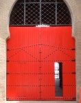
The interior (photo: Sarah Lee)

Next up was the main course which, owing to my gradual state of inebriation by this stage I neglected to photograph. It was no less superb however – a selection of exquisitely tender Herdwick lamb cuts and little sweetbreads which were a revelation. When you think about the little lamb cheeks, tenderised by the sweet suckling of its mother’s milk, it’s a rather off-putting image, until you eat them that is, and the soft creamyness of that milk is reflected in this very soft, very rich little nugget. The dish was served with more seasonal summeryness – sea lettuce, sea blite and more coastal herbs, giving us all hope that despite a decided lack of sun outside, we may at least sample the summer through this bombardment of taste sensation in our mouthes, as well as discover the delicious, albeit slightly surreal symphony of a lamb lost somewhere on an ocean’s edge. Reminds me of that terrible movie scene when a load of lambs fell of a cliff edge – what film was that? Silence of the lambs or something?

Stone and Hay

Who knows, for up next was a plate of delicious vintage cheeses, again, neglectfully unphotographed, followed by the pure theatre of the evening. First “stone and hay” – basically a frozen stone, not to be eaten I might add, and another realistically executed stone resting on top, except this one was edible, flavoured delicately and covered convincingly with that favourite of the chef – hay soot. It wasn’t the most delicious dish of the evening, but made for a welcome palate cleanser and clever piece of gastronomic amusement.

Gorgeous gooseberries

Slightly full up by this point, we almost feared the onset of the dessert in case our dwindling appetite would not do this incredible food justice. But we oughtn’t have worried, as the dessert of english gooseberries with douglas fir and wood sorrel was fresh, bucolic and perfectly balanced between sharp and sweet with a wonderful variety of textures and again a very scandinavian, effortlessly green and glorious look.

The candyfloss tree!!

But finally, what we had all been waiting for. Emerging from the kitchen, in its unmistakable terracotta pot, the branches of a fine, blossomed candyfloss tree headed our way, complete with edible soil (made again from burnt butter which to my mind tasted of cocoa) and little petit fours of strawberry jam shortcake and fudge. Need I say more? My evening was complete. This meal was a twisting triumph with elegance, flavour exuberance and pure gastronomic sophistication throughout. Michelin star? This place deserves a galaxy!

Petit fours

So why is Danish gastronomy on such a high? In my opinion, its because Denmark offers us superb creative innovation without the stuffy anachronistic rulebook of the grand European tradition. It’s cuisine for a modern age – clean, unpretentious but effortlessly chic and fantastically clever. With the overflowing charm of the Scandinavians, you are made to feel welcome, looked after and indulged, rather than made to feel edgy and uncomfortable as is so often the atmosphere given off by the penguin waiters of the old-school. All the while, Danish food is injected with the same vitality and fun in its exploration of molecular gastronomy and thematic presentation that made the equally successful Heston Blumenthal such a star of the culinary world. In this way, Denmark is one step ahead of the rest of the world, soaring into its ascendancy where others must now follow. If they can ever catch up.