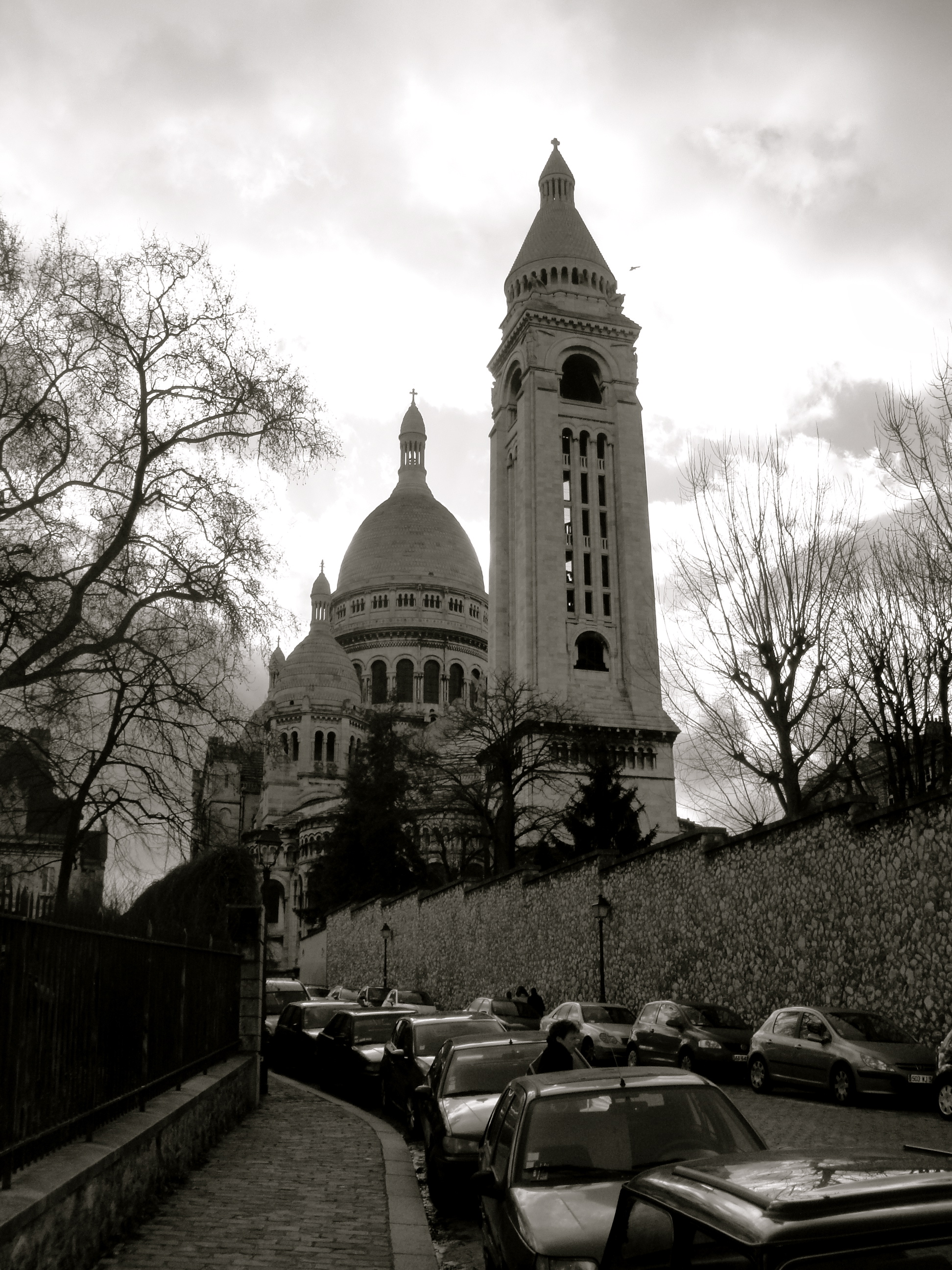
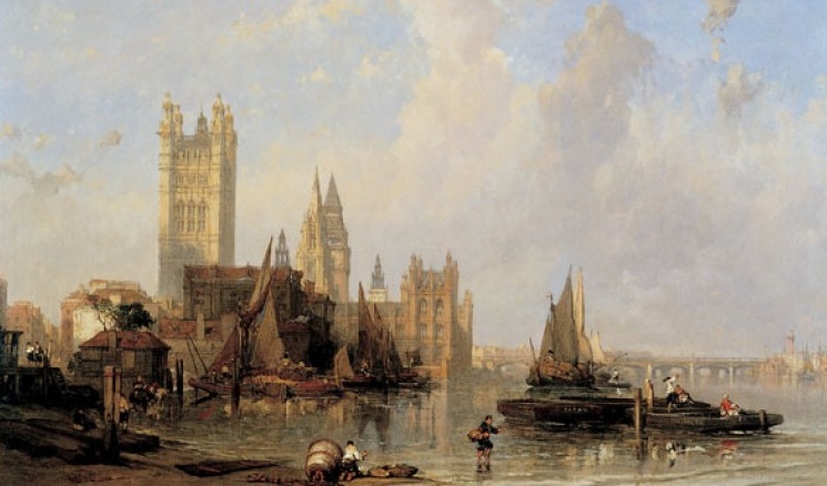
It’s not only an icon of London, recognisable around the world twice over, but it’s also one which I pass every working day. The Houses of Parliament in London is at the beating heart of the city. We set our clocks by the familiar chime of it’s big ben bell, we pass souvenir stalls packed full of paraphernalia containing the image of building, and we can see the soaring bell tower, now named Elizabeth Tower, from far across London. Yet we are all guilty of taking the Palace of Westminster, a.k.a. the Houses of Parliament for granted. When I emerge from the tube every morning, I do so directly opposite the great gothic palace, but never stop to take in its majesty, despite the hundreds of tourists who are always collecting before it with their cameras ready.

The Houses of Parliament from Millbank, David Roberts (1861) © Museum of London
However all this changed when yesterday I headed up Elizabeth Tower to meet the great Big Ben first hand. Suddenly I have found myself looking at Parliament afresh. I even went into the Parliament bookshop and bought myself a souvenir or two (including a chocolate Big Ben – every visitor needs one). And all this had me thinking, the Palace of Westminster is such an impressive, iconic building, a masterpiece of architecture which is all the more perfect for its purposeful lack of symmetry, its miscellany of towers, spires and gothic ornamentation – no wonder then that the building has proved such an inspiration to artists over the years. And we’re not just talking any artists, but two of the greats. British favourite JMW Turner, and someone who, in a way, could be called Turner’s protege or disciple, father of the Impressionists, Claude Monet.
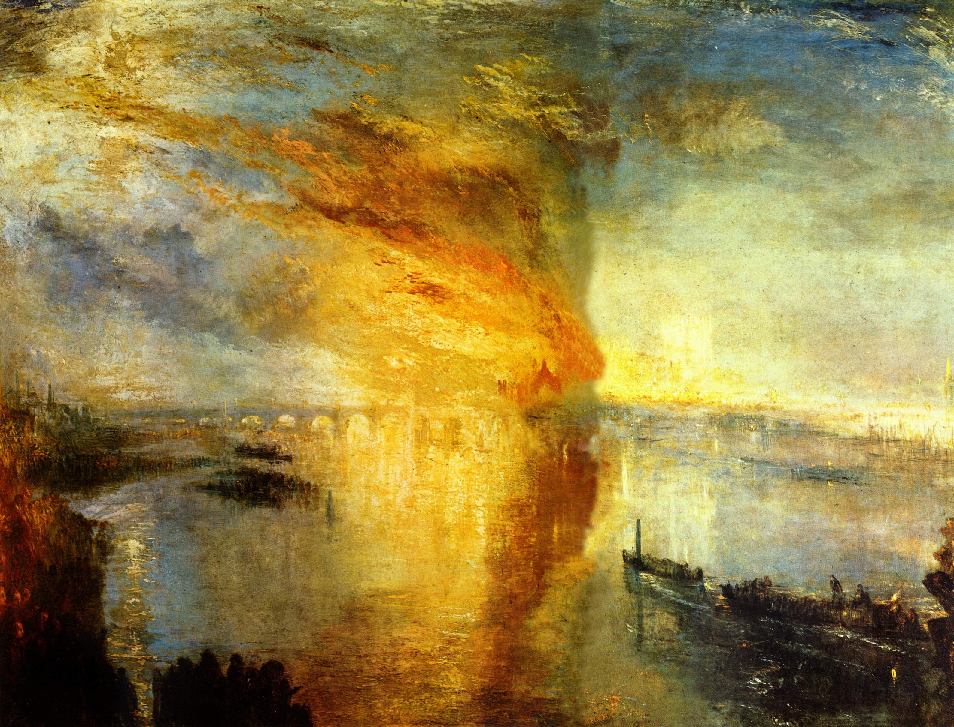
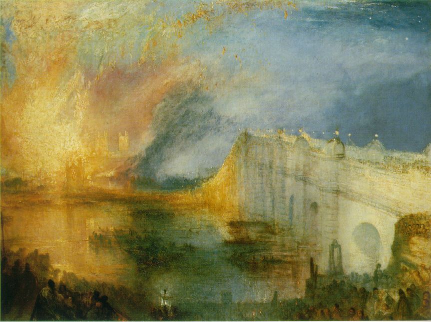
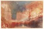
Both artist’s depictions of the Palace of Westminster have become iconic images of Parliament, but are also invaluable depictions of the building’s chequered history. For when Turner painted Parliament, he did so at a crucial point in its history – the day when Parliament was destroyed by fire: 16 October 1834. The fire, which ravaged the palace, gutting almost everything but Westminster Hall, proved inspirational to Turner. Already renowned for capturing the effect of light and smoke, almost impregnable foggy landscapes and turbulent great storms, Turner, who witnessed the great fire raging first hand, was evidently captivated by the gigantic inferno, pouring billowing smoke and red-hot flames high into the sky above the Thames.

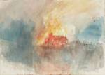
J M W Turner, The Burning of the Houses of Lords and Commons, 16th October, 1834 (1835)

J M W Turner, The Burning of the Houses of Lords and Commons, 16th October, 1834 (1834-5)
The canvases which result (the first held by the Cleveland Museum of Art, and the second by the Philadelphia Museum of Art) are brilliant, dramatic depictions of the fire, demonstrating the devastating extent of the inferno as it climbed high into the sky contrasted with the small shocked witnesses in the lower foreground. I love, in the second, the subtle silhouette of Westminster Cathedral glowing before the flames of its now burning neighbouring palace, and the huge column of fire rising dangerously high in the first.
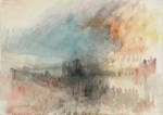
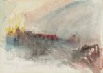
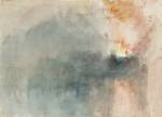
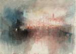
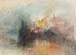
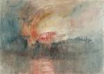
Turner was evidently more than inspired. A series of watercolour sketches (pictured below), which appear to have been sketched roughly at the scene or shortly afterwards, are a striking record of the almost undefinable power of the fire, as the light and heat of the inferno blurs and tempers the city surroundings. These watercolours, which were bequeathed to London’s National Gallery and are now held at Tate, are so instantaneous in their quick creation that they start to look almost abstract in their composition while retaining a powerful contrast between glowing super-hot heat and the foggy smokey surrounds. It’s an effect which is brilliantly executed for such a loose and uncontrollable painting medium as watercolour.
-
-
Turner, The Burning of the Houses of Lords and Commons, watercolour study (Copyright Tate)
-
-
Turner, The Burning of the Houses of Lords and Commons, watercolour study (Copyright Tate)
-
-
Turner, The Burning of the Houses of Lords and Commons, watercolour study (Copyright Tate)
-

-
Turner, The Burning of the Houses of Lords and Commons, watercolour study (Copyright Tate)
-
-
Turner, The Burning of the Houses of Lords and Commons, watercolour study (Copyright Tate)
-
-
Turner, The Burning of the Houses of Lords and Commons, watercolour study (Copyright Tate)
-
-
Turner, The Burning of the Houses of Lords and Commons, watercolour study (Copyright Tate)
-
-
Turner, The Burning of the Houses of Lords and Commons, watercolour study (Copyright Tate)
-
-
Turner, The Burning of the Houses of Lords and Commons, watercolour study (Copyright Tate)
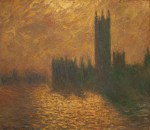
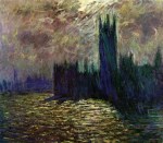
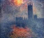
But perhaps the most famous paintings of the Houses of Parliament are those depictions by impressionist master, Claude Monet. Monet, too, was evidently inspired by the elegant gothic structure which, by the time he visited London twice, once seeking safe haven during the Franco-Prussian war in the early 1870s and again at the beginning of the 20th century, had been rebuilt into the structure we know and love today.

Claude Monet, The Thames at Westminster (1871)
But for Monet, who was, by his own admission, greatly inspired by Turner’s expression of light and changing weather, the real inspiration appears to be not so much the Parliament building itself, but the varying effects of weather, light and city smog upon the building. While his first depiction of Parliament (above) is a fairly detailed depiction of the Thames at Westminster, showing the intricacy of the Palace of Westminster, albeit somewhat faded into a smoggy urban background, his later series of Parliament paintings concentrate far more on the changing light of London than on the landscape itself.
The results are a stunning series of works. The quick application of paint, no doubt painted in a great rush to capture the changing light as was Monet’s obsession, is so energetic and alive that the Palace appears to quiver before our very eyes, the effect of the smog and river mist undulating and turning over the surface of the canvas, capturing in turn the light as it filters through the layers of cloud and vapour. It’s hard to choose between these depictions, all of which are equally evocative of another stage in Parliament’s history, when London was almost chocked with poisonous noxious gases and a horrible river stench. But oh what a beautiful effect it had once captured by Monet’s hand.
-

-
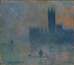
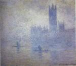
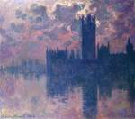
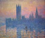
Houses of Parliament, London (1904), Kunsthaus Zurich
-
-
Houses of Parliament, stormy sky (1904), Palais des Beaux-Arts de Lille
-
-
Houses of Parliament, London (1904), Musée Marmottan Monet
-
-
Houses of Parliament, London, Sun Breaking Through the Fog (1904) Musée d’Orsay, Paris
-
-
The Houses of Parliament (Effect of Fog) (1903-4) Metropolitan Museum of Art
-
-
Le Parlement, Effet de Brouillard (1903) Museum of Fine Arts, St Petersburg, Florida
-
-
Parlement, coucher du soleil (sunset) (1902), private collection
-
-
Le Parlement de Londres, soleil couchant (1903) National Gallery of Art Washington DC
-

-
Houses of Parliament Sunlight Effect (1903) Brooklyn Museum
Finally, we turn to the modern day. The Houses of Parliament continues to delight Londoners and tourists alike, stood proudly adjacent to the River Thames, and surrounded not by city smog, but by a thriving bustling capital city and, every 31 December, a firework display to rival all others across the world. Yet still, the character of the building changes, and its mood metamorphoses, as weather and light cast transformative moods upon this spectacular structure.
On one such day, when menacing clouds began to break apart, and blue sky and a winter sun peeked out from behind the cover of cloud directly above the great gothic structure, I, like Monet and Turner before me, was captivated by the stunning view before me, and all the more so for the doubling of the image thanks to the reflective image in the river below it. Some time later, I took out my brushes, oil paints and a canvas and painted that view I had seen – it was in fact one of the first oils I had ever attempted. And here it is. It’s no Turner or Monet admittedly, but it is my own painted homage to the power and glory of London’s Houses of Parliament.

Cityscape I: London (2012 © Nicholas de Lacy-Brown, oil on canvas)