Printmaking Progress III – Editioning El Marinero
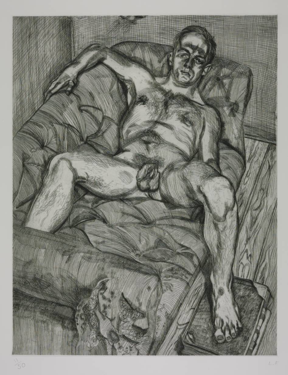
Readers of The Daily Norm may remember that in that optimistic time of Spring, long long ago, I discovered the art of printmaking. Having been inspired to give the medium a go by masters of the craft such as Lucian Freud and the ever dark-minded Spanish great Francisco de Goya, and having dappled at first in a little lino cutting, I very soon fell in love with etching, the technique by which acid is used to “etch” an image into a metal plate, which can then be used to print a whole run of that image (albeit seen back to front – something for which careful planning is required). You’ll be forgiven for thinking that my newfound love of the technique was short lived – after all, I haven’t posted any etchings since May, and have, quite unapologetically, become obsessed with gouache paint on paper which I have pursued relentlessly in the creation of my “Compositions” series.
Well, come the autumn, and with my summer travels, sadly, long behind me, I decided the time was right to re-enter the printmaking studio, not just to start projects afresh, but to finish off the ones I started all those months ago.
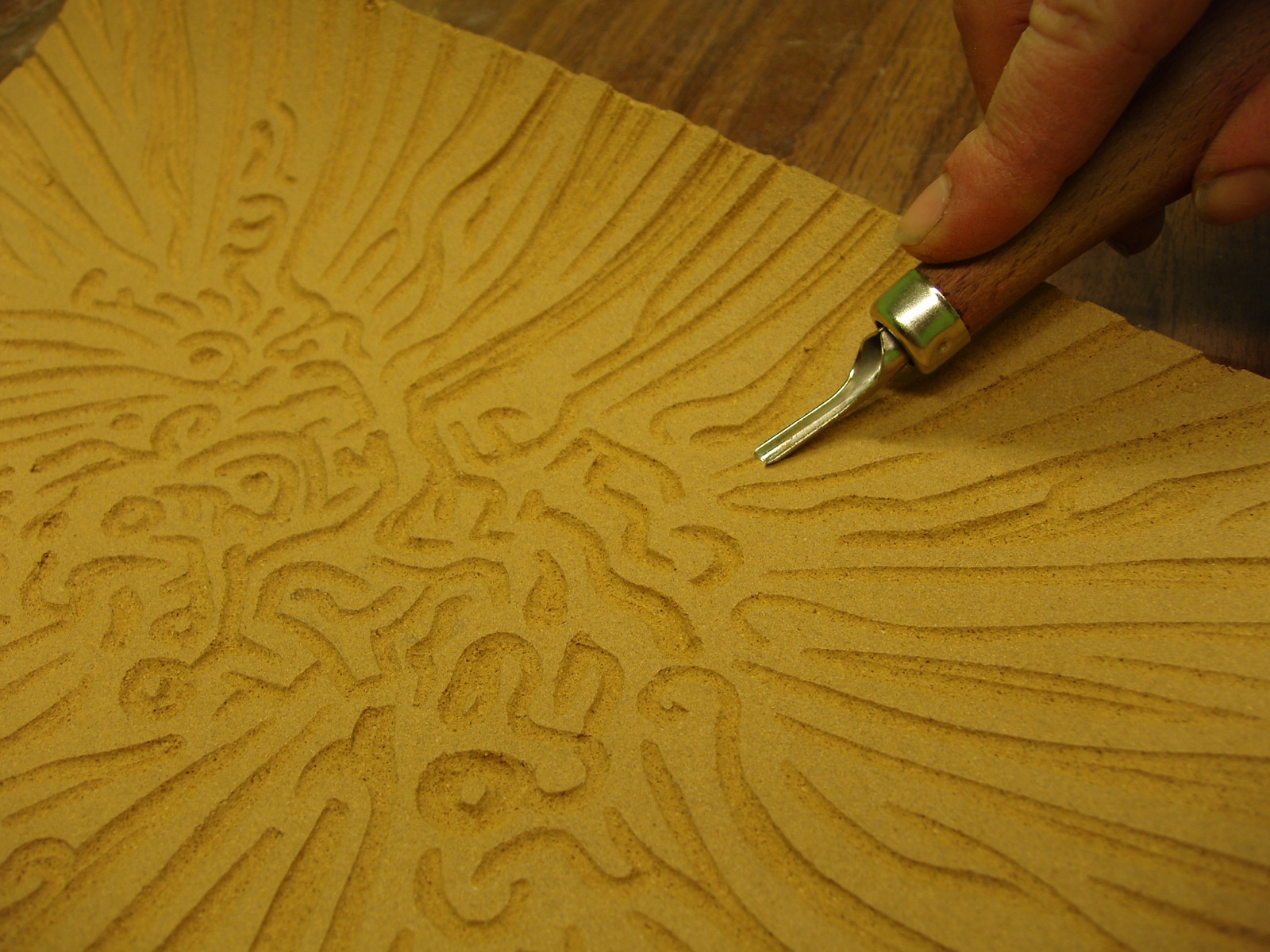
I have previously told you about etching the line image onto the metal plate (I used zinc, but other metals can be used and this will affect the number of prints which can eventually be made from the plate), and also about the aquatint process by which tone is added to the plate. The final stage of printmaking is printing and editioning – making sure that every single print is printed identically, so that a closed “edition” can be made, and sold through the aid of a single exhibited example.
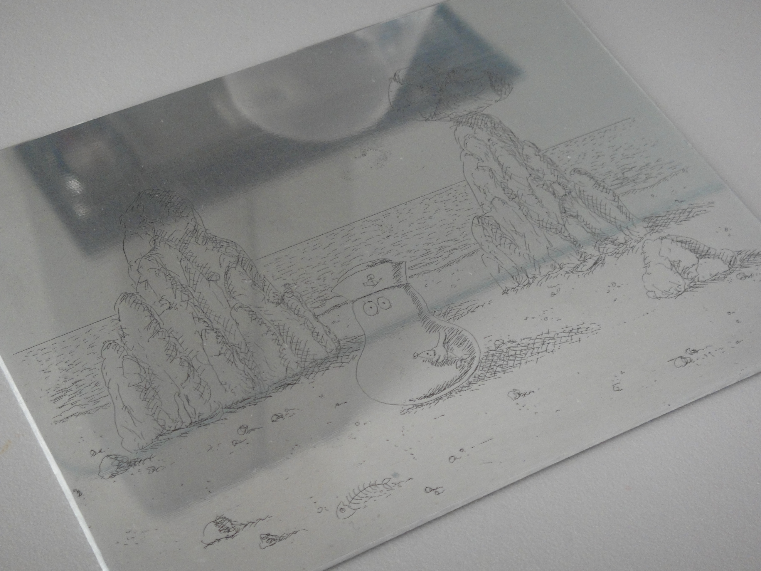
The zinc plate with image etched into it
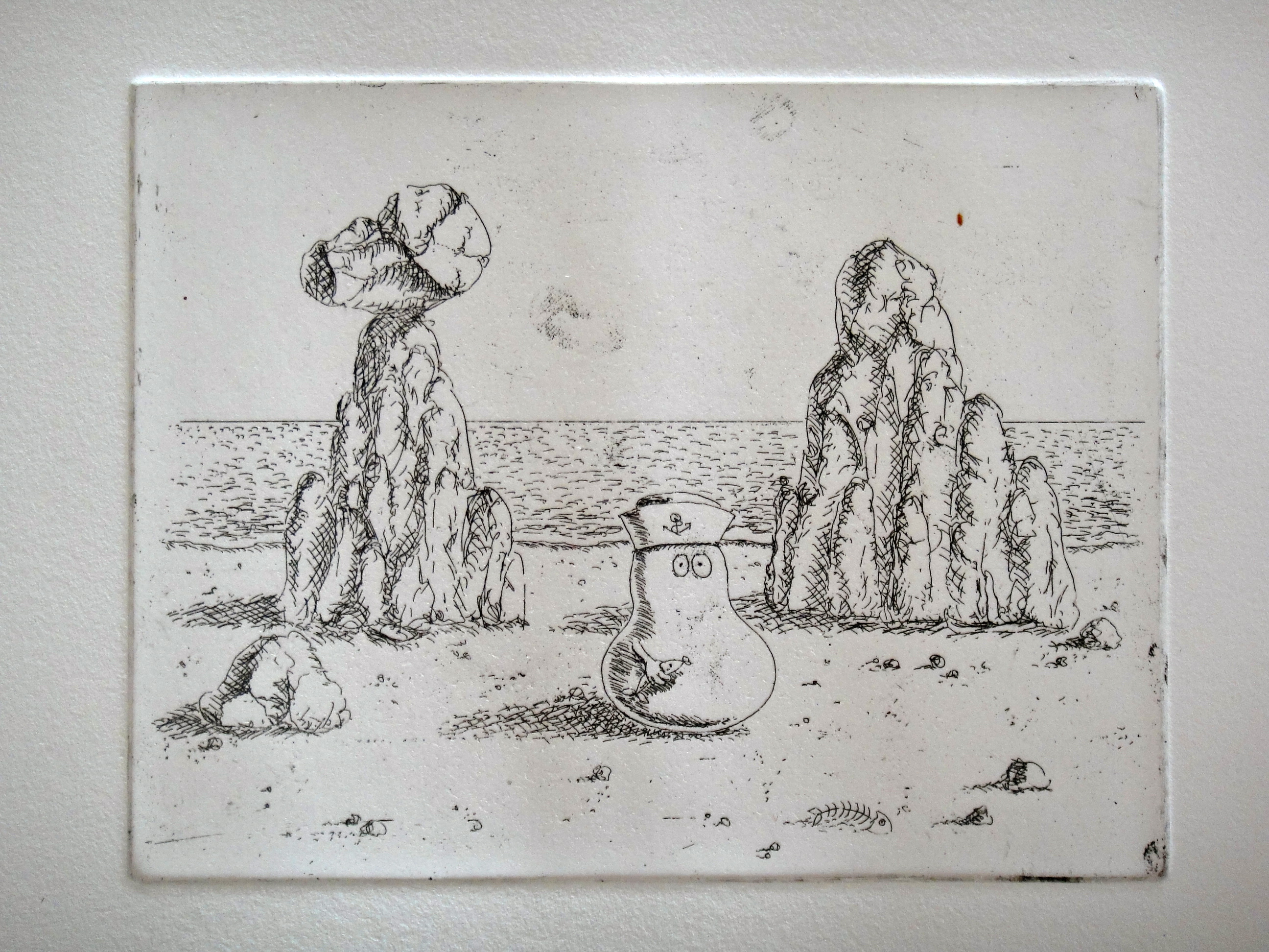
First print – before the aquatint was applied

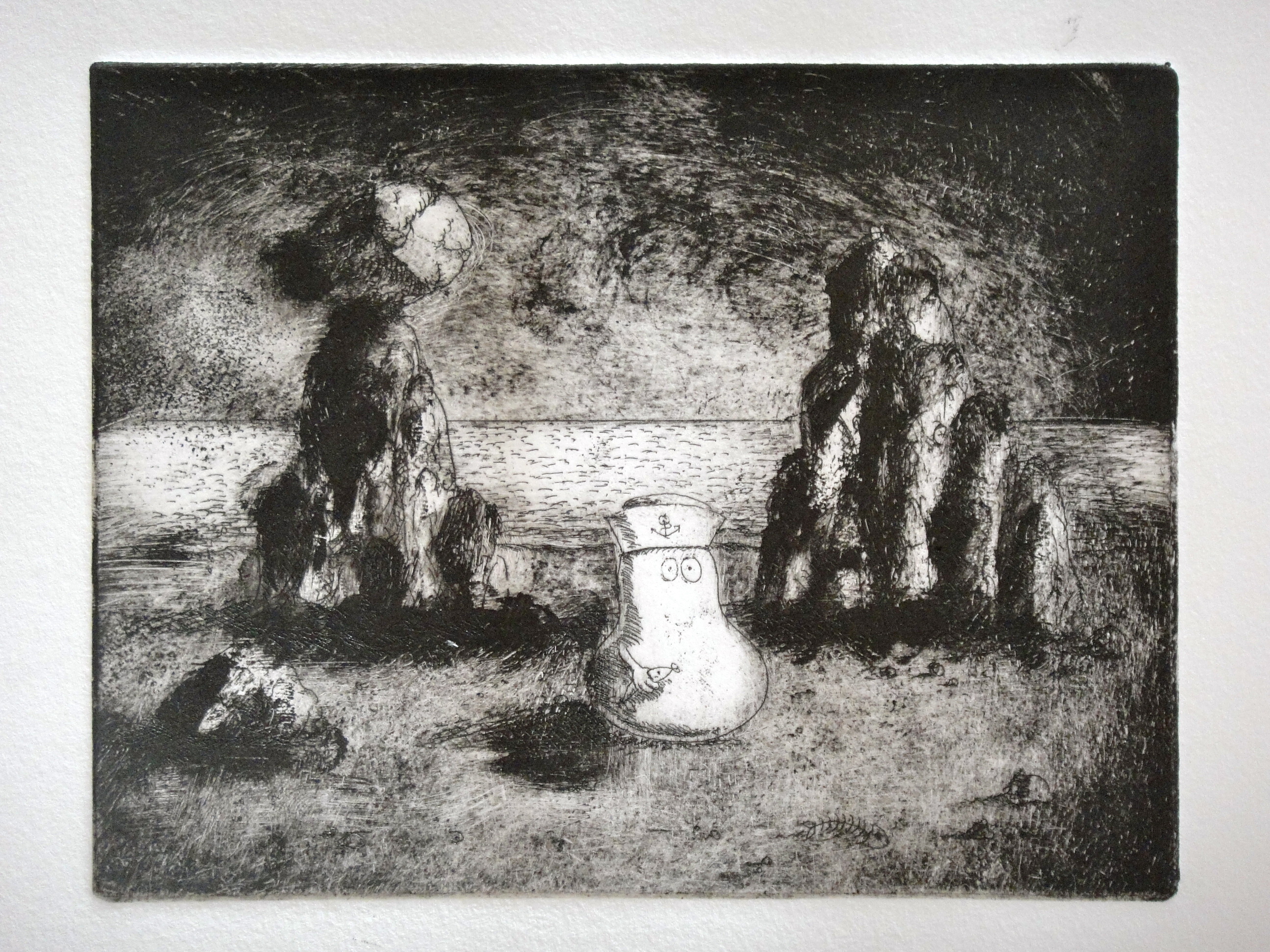
El Marinero during the aquatinting process
Editioning is an intricate and time consuming process. You have to cut yourself paper of an identical size; bathe it in water to ensure the paper takes the ink, but dry it before printing to ensure the ink does not run. You have to smear the plate in filthy oil-based ink, and then gradually wipe it off again, leaving the ink remaining only in the lines. You have to clean the edge of the plate to ensure that the embossment of the paper around the plate is kept pristine. And finally, ensuring you do not dirty your paper with your inky-black hands, you have to run the plate, and the paper through the printing press. All this takes about 15 minutes per print, but once you get a system going, it’s surprising how easily the human body can become like a factory process.
I have now spent several sessions in the studio, making editions of the two zinc etchings I made back in May, and the result I want to share with you today is my first ever plate. When you last saw it, it was a line image only, with no aqua tint adding tone. Now the image is aquatinted and complete, printed as a limited edition set of 15 which, by coincidence, are now available on my online shop to buy.

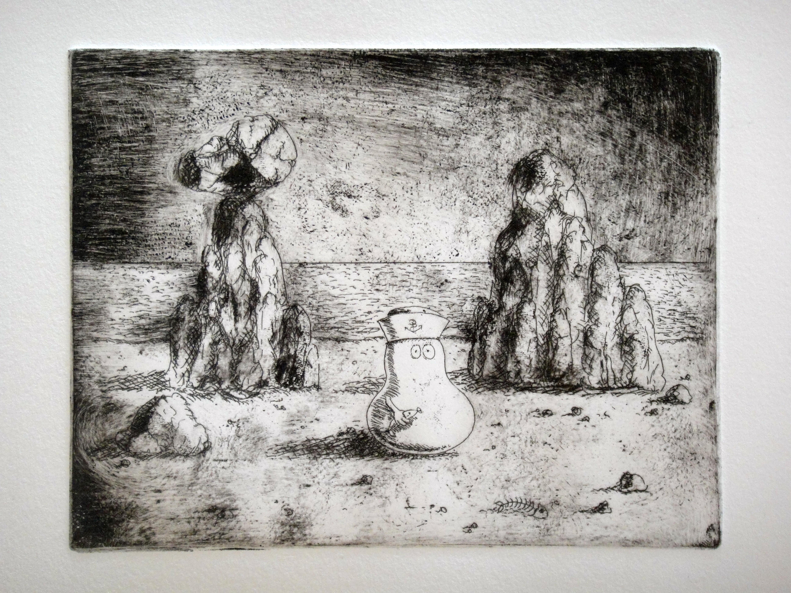
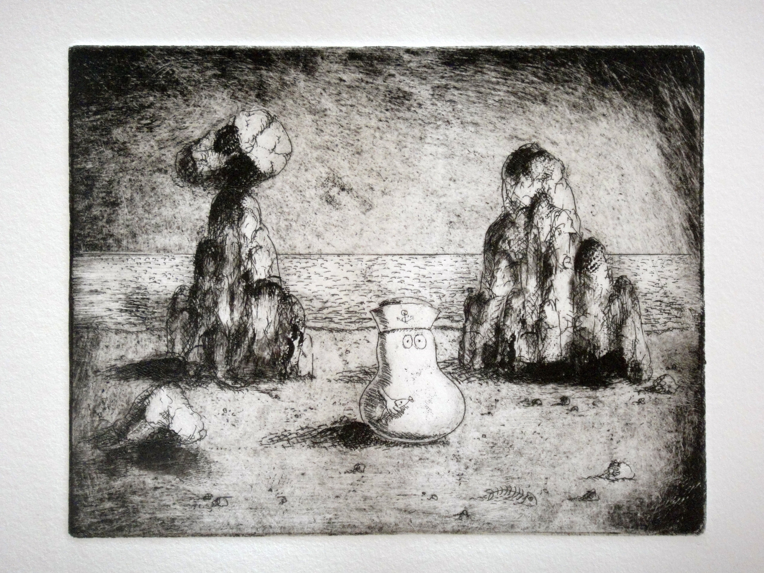
The finished print
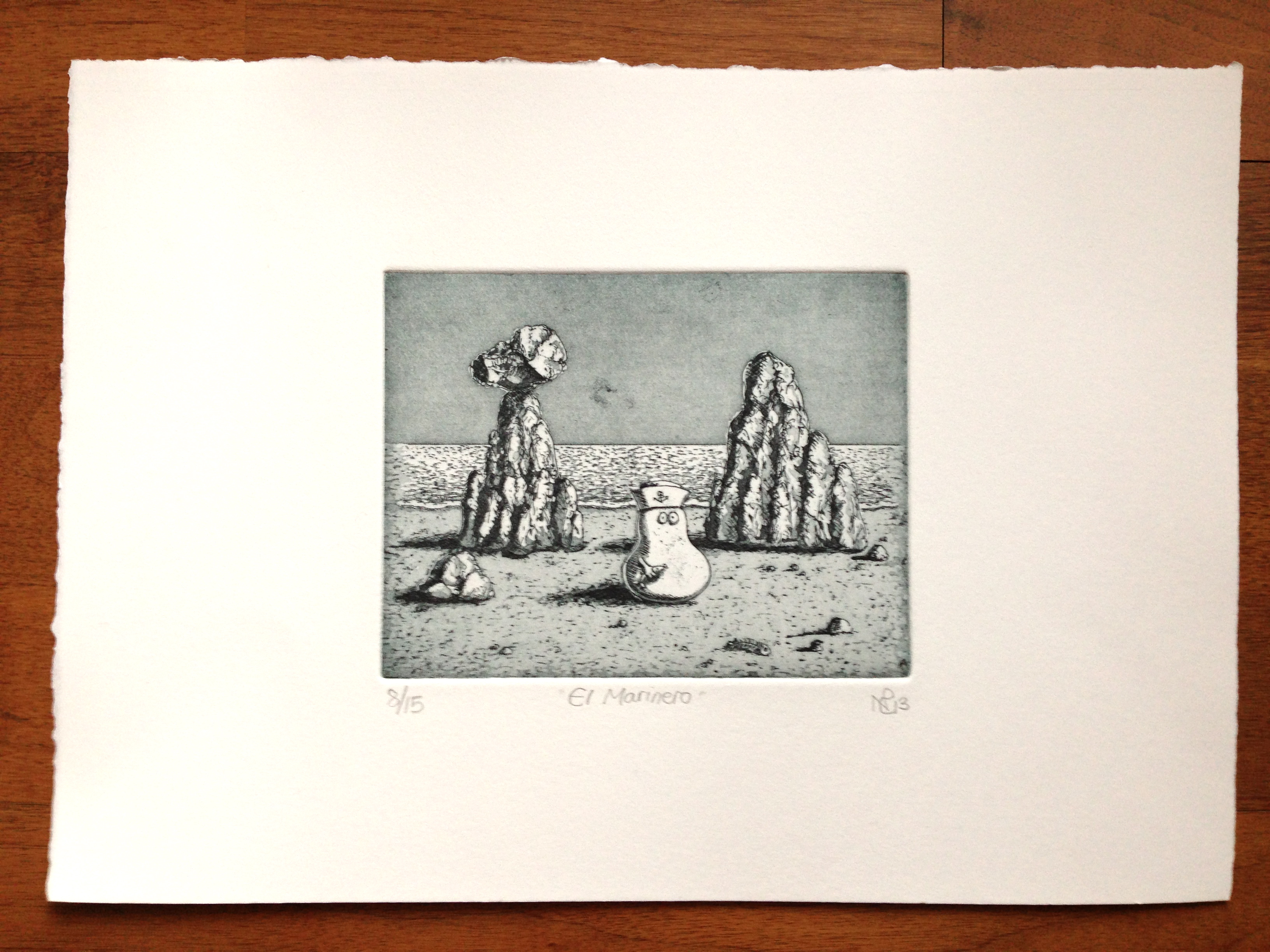
The print, entitled “El Marinero” shows a sailor Norm holding a fish on a mysterious Mallorcan rocky beach. It’s an enigmatic image, with its empty shores and strange rocky forms, but one which I cherish as being my first dalliance into the world of etching, and inspired by the surreally-shaped coves of Mallorca’s stunning coastline. Now I am on my third and fourth etchings respectively (one in zinc, and one in copper) and I cannot wait to complete those and share them on The Daily Norm.
Details of how to purchase your own strictly limited print of El Marinero can be found on my Etsy shop. As a closed edition of 15, it’s an extremely limited set, and hopefully therefore an attractive art investment for your future, as well as a pleasing little gift for another, or of course, for yourself.