8am Wake-up Call
It’s not so much the fact of my brother-in-law’s tragic end that traumatises me as the way I heard the news. It’s the moment that will always haunt me, continues to haunt me even now, 10 months later.
It was the Saturday before Christmas, and there was no more work until after the season itself. I had seen my dear friend Millie the night before, and had gone to bed full of excitement for the season to come. My partner and I had been so enamoured by the romance that comes so easily with the festive season that we fell asleep with Christmas lights still twinkling and the soft choral chants of a cloister monastery singing medieval carols playing quietly on my iPod. And it was to this Elysium of festive tranquility that we awoke that morning, full of happiness for the season to come.
We lay in bed, discussing what we would do that day. How we would finish wrapping presents and go out to savour the spirit of London at Christmas before leaving town. Dominik was checking Facebook, reading my sister’s last message posted online – she too had been wrapping presents till late, waiting for her 3 babies to fall asleep so as not to spoil the surprise.
But 2 minutes later all that was to change. I’ll never forget it. The landline ringing at 8am exactly. It was my family’s number on the caller display. I thought it was a bit early this call, but answered nonetheless, quite innocent of what was to come.
The tone of my mother’s voice told me immediately that something was wrong. Almost gasping for breath, struggling to annunciate between tears, she said the words that have come to haunt me ever since. Nick, she sobbed, something dreadful has happened. Neri was killed in the night.
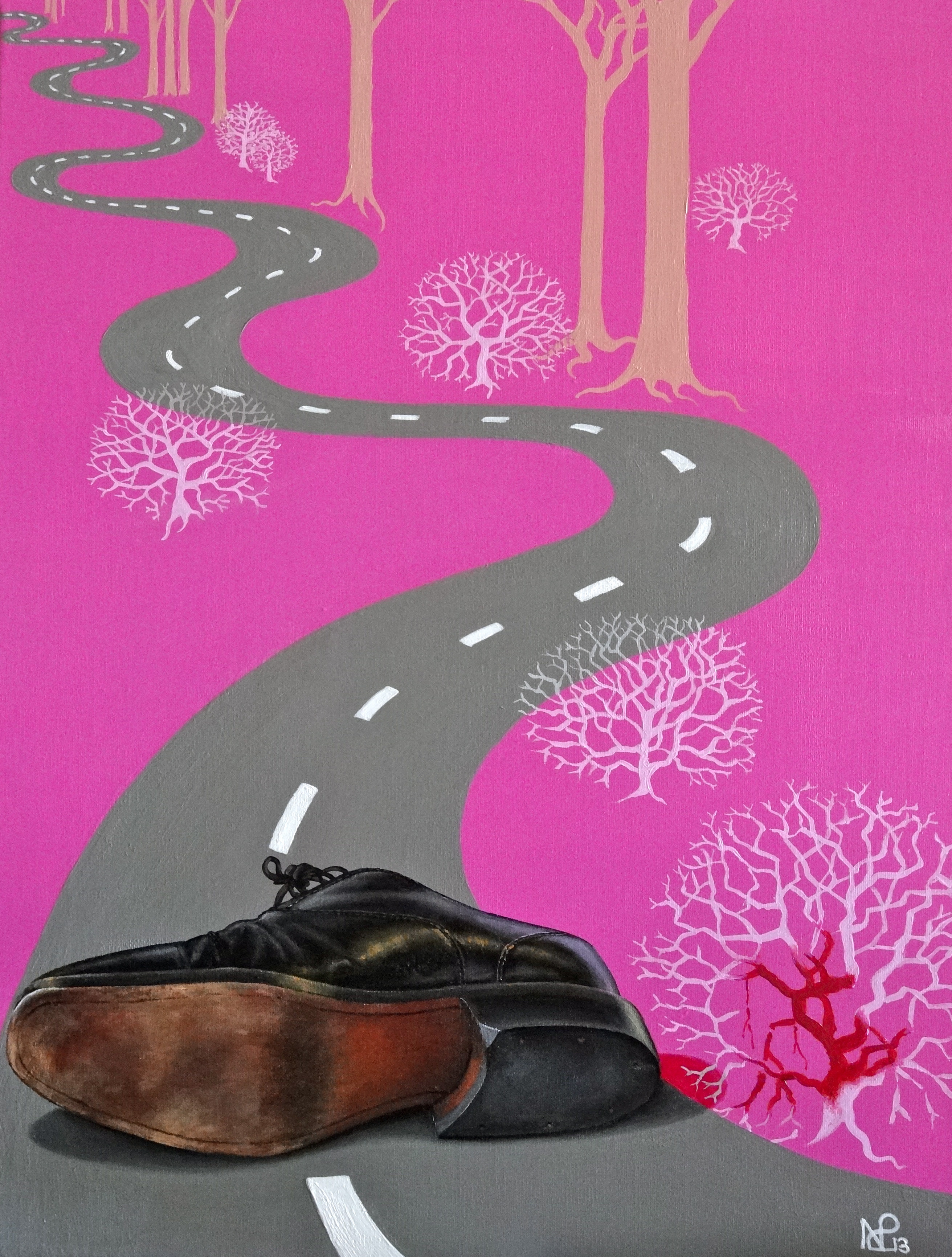
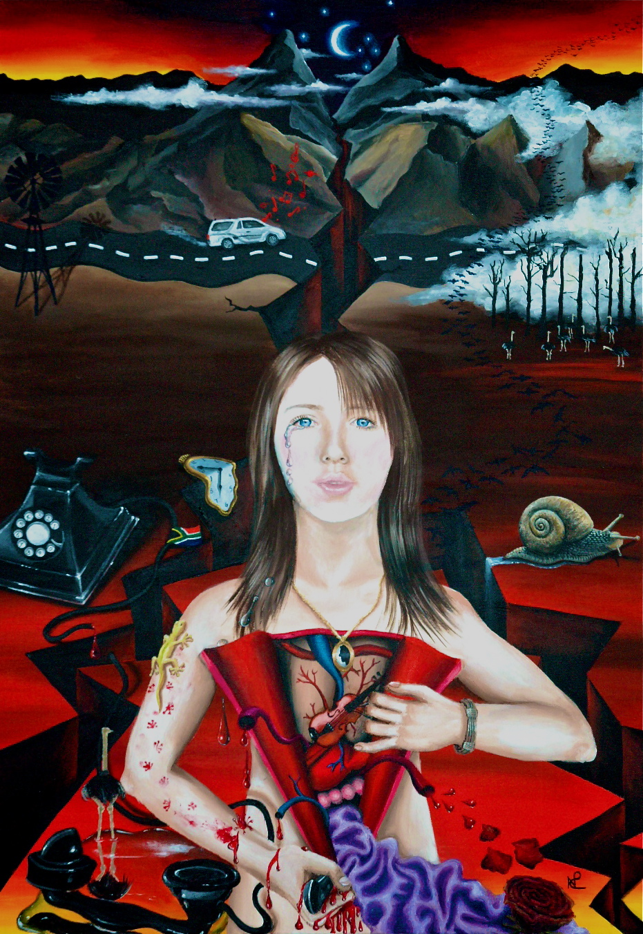
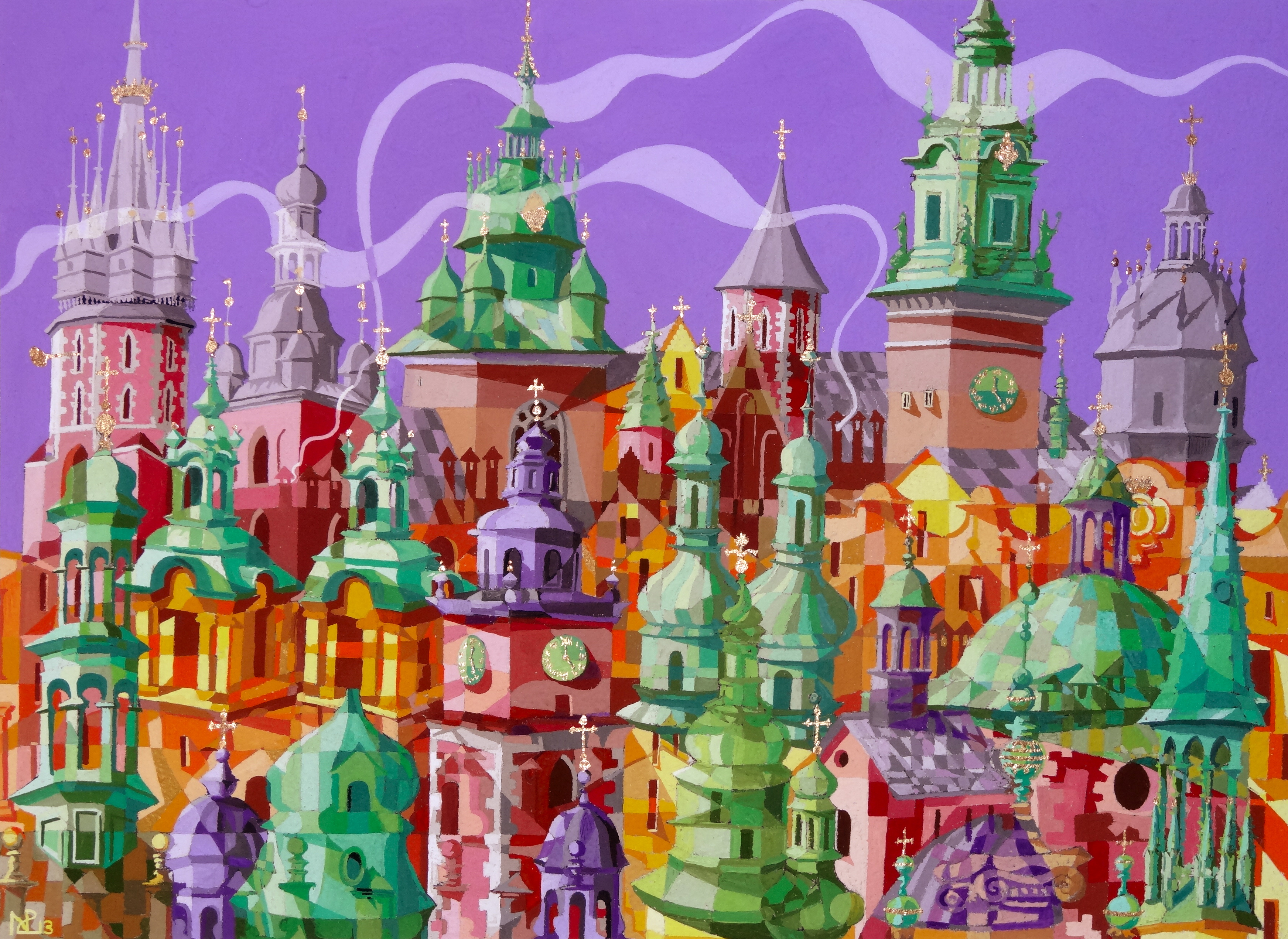
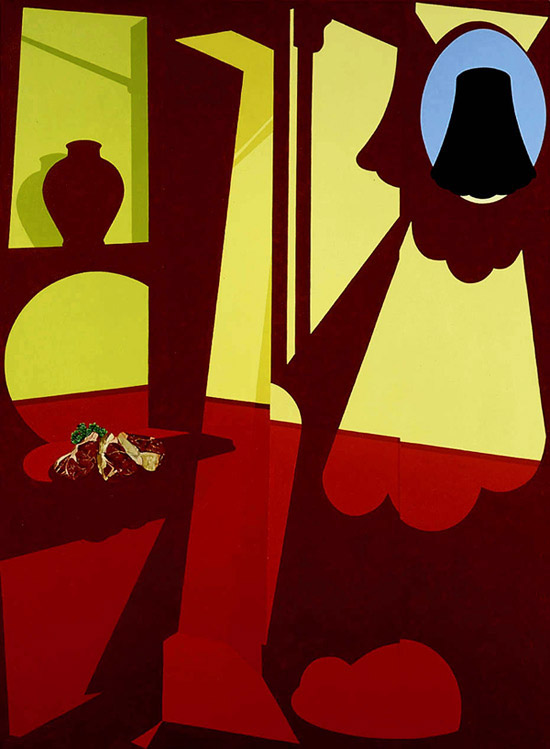
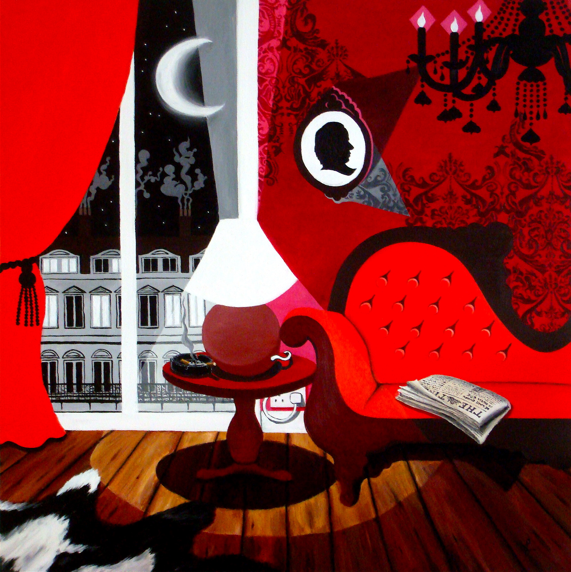
8am Wake-up Call (2013 © Nicholas de Lacy-Brown, acrylic on canvas)
At that moment my world, tangibly, perceptibly, collapsed around me. The hopes and the spirit, the festive joy of Christmas crumbled. All happiness was gone, replaced only by the unquenchable burden of grief.
As the day proceeded and the shock began to take hold, we did not know what to do but to go out. Wandering around the town, London looked the same as it had the days and weeks before. Seeing a city full of the festive spirit, but this time like watching the whole scene unfurl in slow motion. It was as though we were on the outside of a gift shop called Christmas looking in, everyone inside enjoying the warmth and happiness of the season, but our emotions paralysed by the grief which had drowned our souls, as we stood outside in the cold.
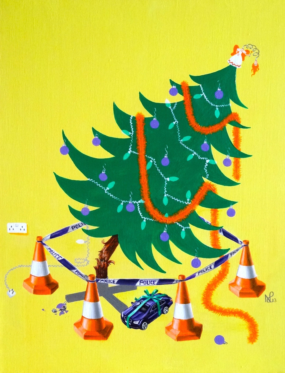
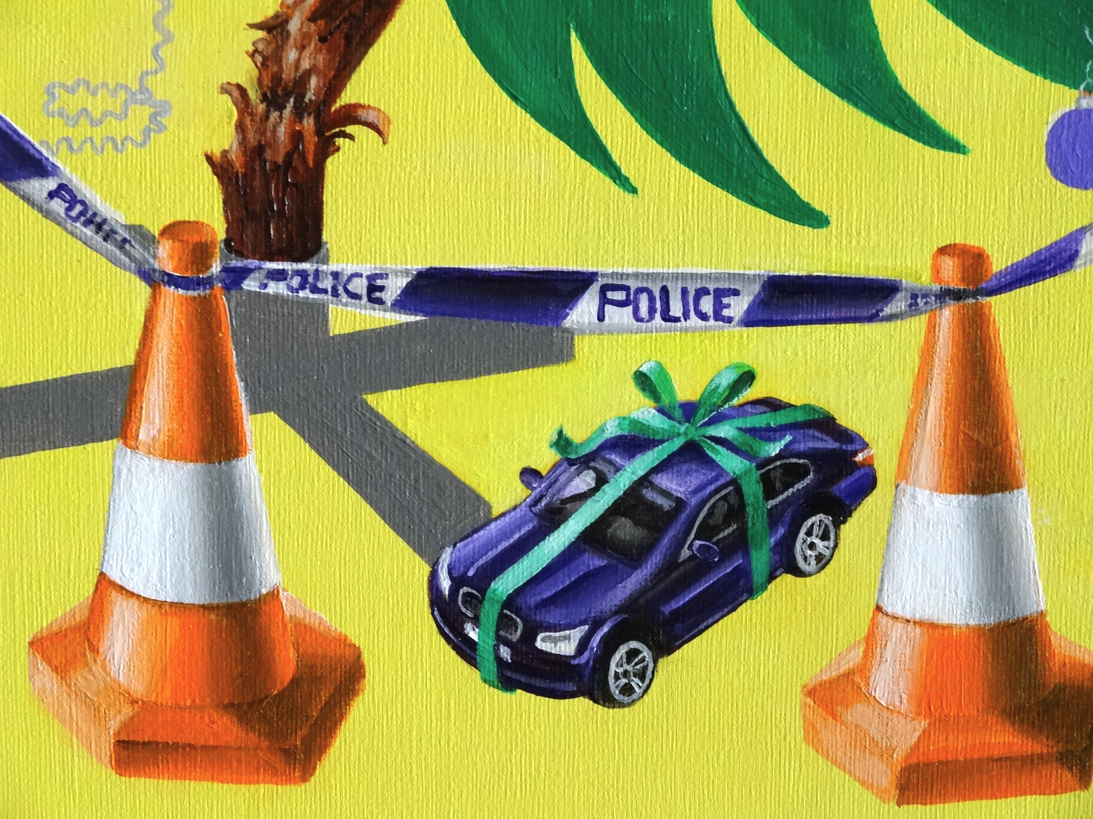
It was the moment when Christmas had ended. Along with so much else. And in this second work, created impulsively in the aftermath of my brother in law’s inquest two weeks ago, I paint the moment when joy, for our family, crumbled before our very eyes. In the simple symbol of a falling Christmas tree, I have attempted to demonstrate how the happiness of Christmas departed us, and our world literally fell apart; the striking colours representing the irony of loss at this, the happiest of all seasons; the only gift under our tree being the ribbon-wrapped car which caused this tragic end. A fate to which we were inescapably tied from that point onwards.
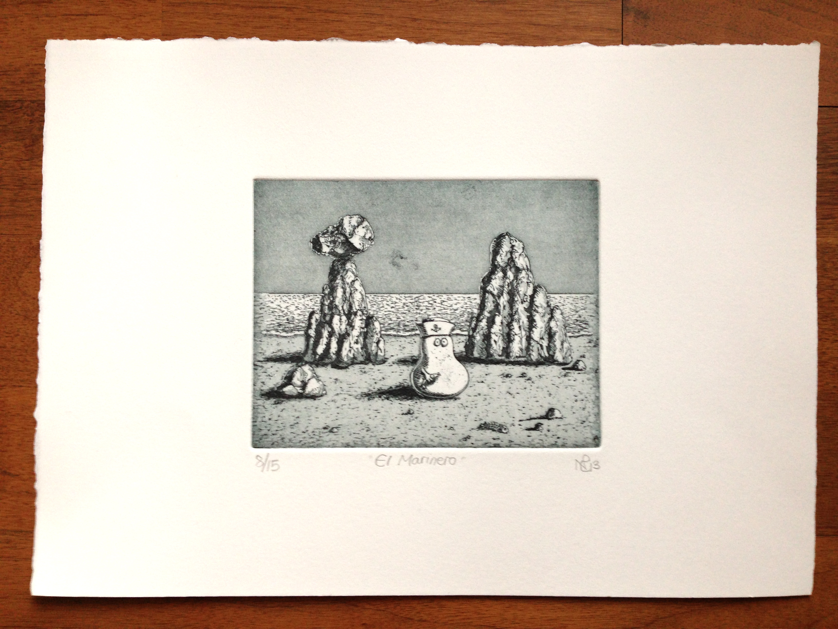
© Nicholas de Lacy-Brown and The Daily Norm, 2001-2013. Unauthorized use and/or duplication of the material, whether written work, photography or artwork, included within The Daily Norm without express and written permission from The Daily Norm’s author and/or owner is strictly prohibited. Excerpts and links may be used, provided that full and clear credit is given to Nicholas de Lacy-Brown and The Daily Norm with appropriate and specific direction to the original content. For more information on the work of Nicholas de Lacy-Brown, head to his art website at www.delacy-brown.com
Related articles
- Return Journey (daily-norm.com)