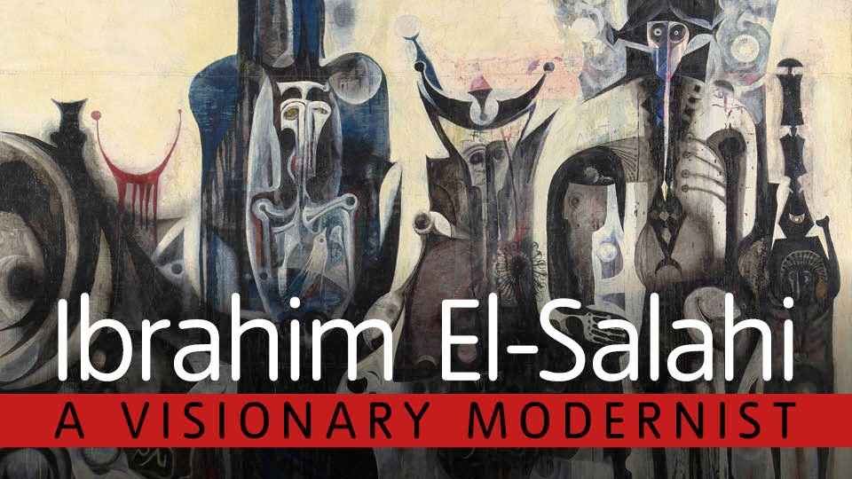
Ibrahim El-Salahi: A Visionary Modernist
Following hot on the heels of Tate’s superb mini-exhibition of Saloua Raouda Choucair, an artist previously unknown to so many art-buffs in the UK (but whose work completely revolutionised my approach to my work, and got me thinking about how I can use gouache in my paintings) comes another retrospective exhibition of a relative unknown as far as big art names go: Ibrahim El-Salahi, whose significant 7-room solo show has recently opened at Tate Modern in London. And what a success it is.
Coming from Sudan (born 1930), El-Salahi’s retrospective is Tate Modern’s first retrospective dedicated to an African modernist. It will also most likely be the first many visitors to the show will have heard of this Modernist artist. Yet El-Salahi’s work is nothing short of stunning – a visual delight of painting, drawing and calligraphy which comes together in a retrospective which exhibits a level of imaginative expression the likes of which I have not seen since discovering the works of Dali. The complexity of some of his drawn black and white images is nothing short of stunning – a mix of figurative and more expressive forms, but culminating to form a visual assault on the viewer whose eyes simply do not know where to begin in the appreciation of these works.

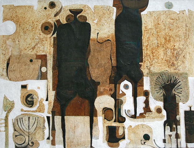
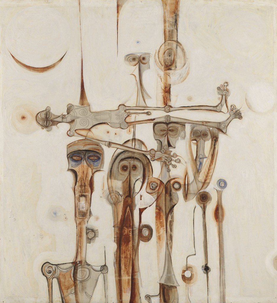
Reborn Sounds of Childhood Dreams I (1962-3) © Ibrahim El-Salahi
Centred on the recent acquisition of Tate Modern, the significant piece entitled Reborn Sounds of Childhood Dreams (1961-5), the exhibition starts off with the artist’s most recent works before delving backing in time to paintings loaded with African earthly brown tones, burnt umbers and yellow ochres representing, as El-Salahi himself says, the African foundations which pervade his work. But asides from the African earthy colours and the occasional tribal mask, El-Salahi’s early work exhibits a complexity of imagery which extends way beyond the continent which has so characterised his work. Islamic imagery, for example, is featured strongly, with Islamic lettering and the crescent moon prominent throughout the show, while perhaps the strongest influence comes from a surprisingly significant immersion in Western culture, an exposure encountered when El-Salahi won a scholarship to London’s Slade School of Art in the 1950s, with particular references to Picasso’s jarred cubist figures showing through from then onwards.
They Always Appear (1966-8) © Ibrahim El-Salahi
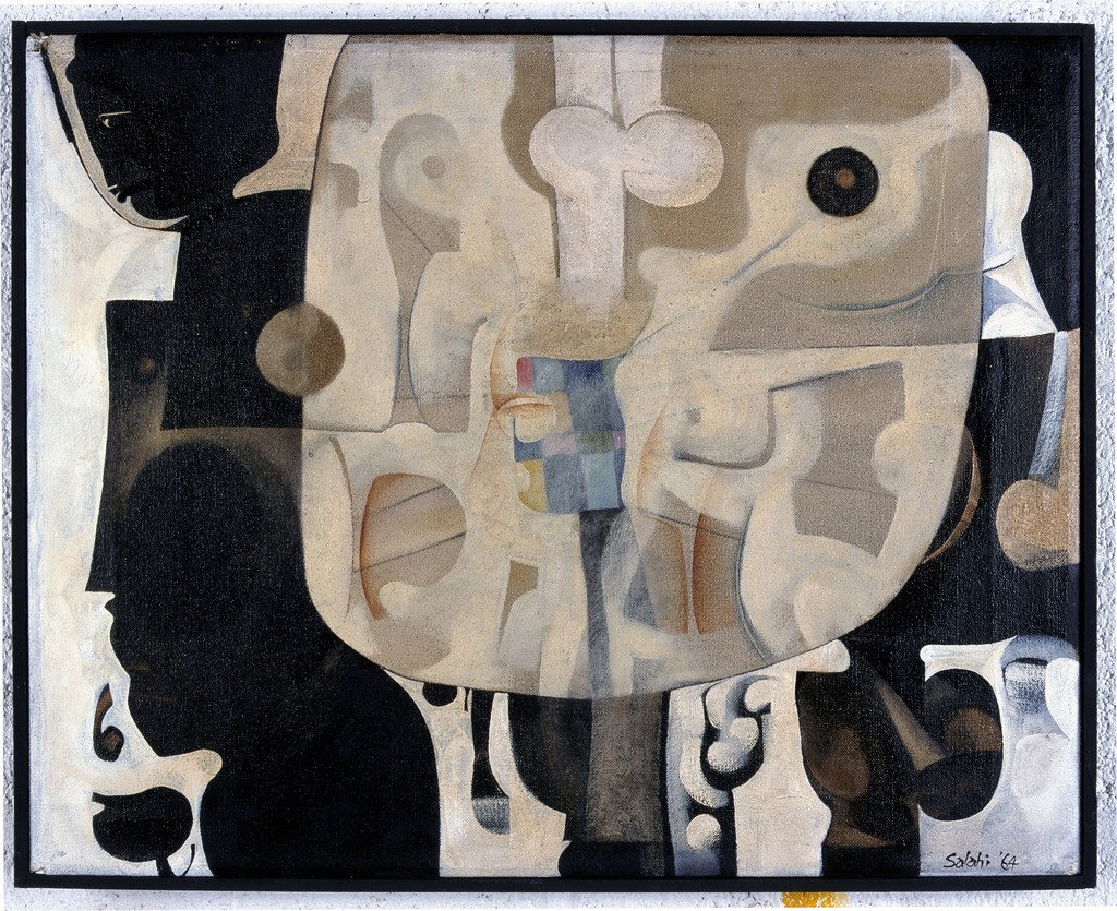
Al-Kas (1964) © Ibrahim El-Salahi

The Last Sound (1964) © Ibrahim El-Salahi
Funeral and the Crescent (1963) © Ibrahim El-Salahi

Vision of the Tomb (1965) © Ibrahim El-Salahi
The exhibition moves to the 1970s, a difficult time for El-Salahi when he was compelled to return from London to Sudan to take up the role of Deputy Undersecretary of Culture at the Sudanese Ministry of Information, under the military dictatorship of General Gaafar Nimeiry. However, his tenure ended abruptly in the mid-70s when, in the aftermath of a failed military coup, El-Salahi was accused of anti-governmental activities and imprisoned for 6 months. The art works which follow are abruptly different from the warm earthy umber works of the previous room. Stripped of colour, these black and white works, generally drawn in ink on paper, appear to reject the warm colours of El-Salahi’s African heritage, but are nevertheless some of the most powerful works in the show, demonstrating incredibly skilled draughtsmanship and imagination which is beyond what most of us are capable of. Apparently El-Salahi would begin these works by drawing a small image, the likes of which would gradually expand outwards as he would add paper to allow the image to spread.

The Inevitable (detail) (1984-4) © Ibrahim El-Salahi


From Visual Diary of Time-Waste Palace (1996-7) © Ibrahim El-Salahi
In the 1990s, El Salahi, now in self-imposed exile from Sudan, moved to Oxford, and there, inspired by the verdant British countryside began a series of tree-inspired images. With these, El Salahi injected colour back into his work, and also dappled in more linear, geometric forms. This in turn led to the present, where El Salahi appears to be returning to the earthier browns of his earlier period, but also dapples again in some of the more detailed black and white ink on paper works. But whether brown, black or white, these works, based on a recent trip to Granada in Spain and largely depicting Flamenco (which of course has its routes in Islamic culture, as does Granada itself) are without a doubt the most stunning works of the exhibition. I was held utterly spellbound by one work depicting Granada in those same umbres and ochres, but with a black and white clustered group of flamenco dancers at its centre, their arms thrust upwards in a burst of energy so reminiscent of that point of duende, their figures perfectly arched into the passionate hold of a flamenco dancer in her final crescendoed cry. Dazzling. Spectacular – one of the best works I have ever seen at Tate. Tragically, I can find no image of this work online, which makes it all the more important that you head along to the show to share in these incredible artworks.
Ibrahim El-Salahi: A Visionary Modernist is on at Tate Modern until 22 September 2013