Intrinsically linked with the school of Pop Art are a series of almost inevitable questions: Is a work which borrows from a pre-existing image original? Does it even matter? Can a painting of a can of soup, for example, the likes of which can be found on every supermarket shelf around the world, be described as having any artistic merit? And just how much creativity is required in order to call a representation of an object “art”?
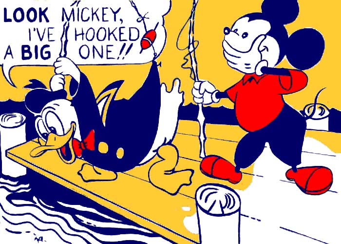
No more so are these questions of relevance than when contemplating the work of American pop art supremo, Roy Lichtenstein (1923-1997), whose retrospective has just opened its doors at London’s Tate Modern gallery. Making it big when, in 1961 he imitated a cartoon of Disney’s Mickey Mouse and Donald Duck, by blowing up a single cartoon frame to life-size proportions and recreating it with oil paint on canvas, Lichtenstein shot to fame as the creator of zany bold paintings which almost exclusively borrowed either from comic books, or images of ordinary life (largely advertisement images in newspapers and magazines). Lichtenstein was unapologetic in taking the work of other cartoon illustrators and, with very few changes except for an increase in size and the occasional simplification of colour, recycling the images as his own (and then selling the canvas for equally increased sums).

Lichtenstein’s first pop-art image: Look Mickey (1961)

Inspired by adverts – Step-on can with leg (1961)

Alka Seltzer (1966)
And yet to describe Lichtenstein’s process in this way is itself a simplification of the facts. For in transferring print images to the realm of oil on canvas, Lichtenstein does something remarkable – he paints the amplified cartoon or advert so perfectly, including the Ben-Day dots (which was a printing process used to create the effect of colour mixing or dilution) and the black outlines, that he manages to remove almost any indication that this is the work of an artist. Contemporary audiences questioned the merit of doing this. In an age when abstract expressionists like Jackson Pollock had ruled the art world, the absence of any indication of the artist at work, whether through brush strokes or drips of paint, appeared devoid of emotional tangibility or expression. And yet in a way, wasn’t Lichtenstein just doing what had been done centuries before, by the great artists of Renaissance, Baroque and Napoleonic art for example, who painted so perfectly that not a single brush stroke was ever evident in their finished canvases?

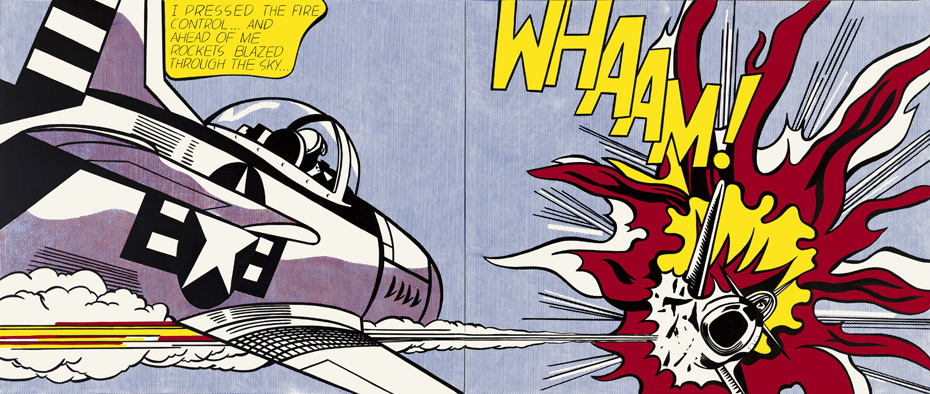
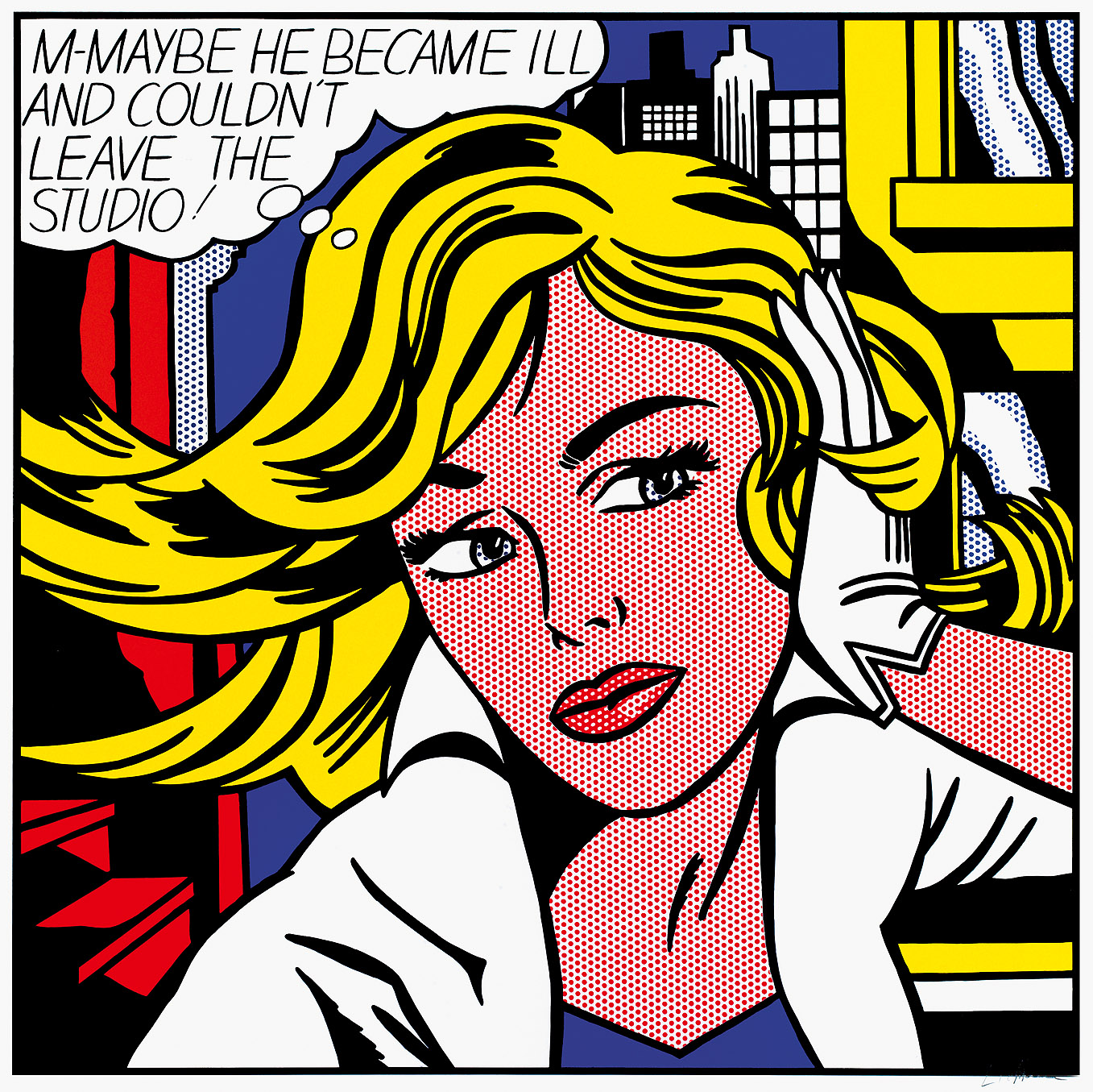
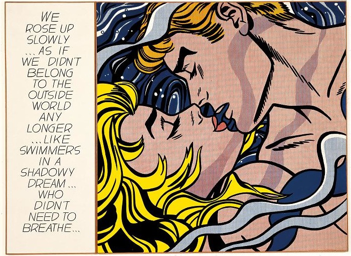
To view Lichtenstein’s work as devoid of expression and artistic wit is to misunderstand his accomplishments as an artist. For even in his early works, which do predominantly borrow from comic strips, we see his humour as an artist choosing, and drawing our attention to, the more absurdly worded or amusing cartoons. In amplifying the macho airmen and apparently helpless, romantic and teary blondes of typical american comic books, Lichtenstein is subtly commenting on the stereotypes of the age, if not challenging them then poking fun at the very formulaic trajectory of a modern commercial society, all buying into the same clichés, and tempted by the same products and advertising.

Whaam (1963)

M-Maybe (1965)

We rose up slowly (1964)

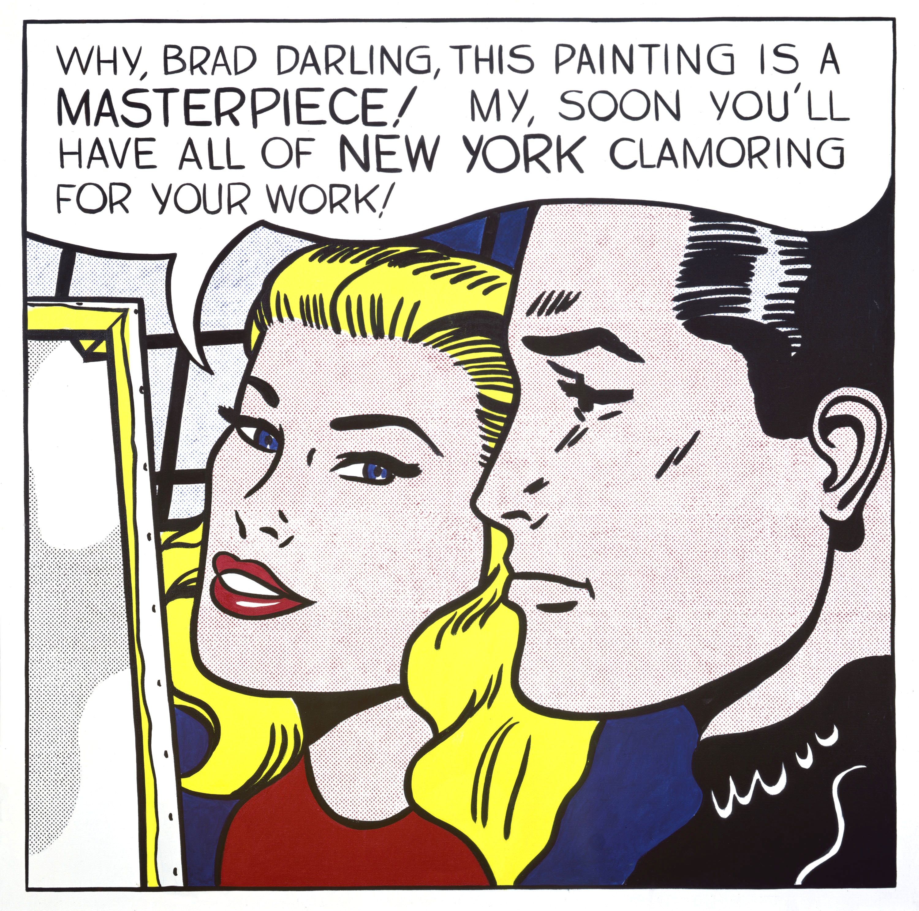
Masterpiece (1962)
Yet there can be no doubting the trajectory of Lichtenstein’s own career as clearly evidenced by the helpfully chronologically curated exhibition. Having found his niche in a new pop art era, and very much made the world of the commercial image an artistic style all of his very own, with all the lines and Ben-Day dots that entailed, we see Lichtenstein go on to develop that style in a number of different contexts, expanding beyond the comic-book and advert to develop his own individual chapter in art history. As the years move on, we see Lichtenstein adopt the simple linear forms and carefully graduating colours of the art deco style, using his dots and lines adeptly to recreate the look and feel of that modernist era. Perhaps most effectively of all, we then see him use his own style to reimagine the work of great artists, like those artists had in turn done with the work of other artists before them. This was definitely my favourite section of the exhibition, as Lichtenstein used his unique pop-art style to reinvent works by Picasso, Mondrian and Matisse, to paint his own still-lifes including a brilliant cubism still life, and most technically brilliant of all, to pay homage to Monet’s various depictions of Rouen Cathedral, doing so with Ben-Day dots alone.

Frolic (1977)


Cubish still life (1974)

Rouen Cathedral (after Monet) (1969)
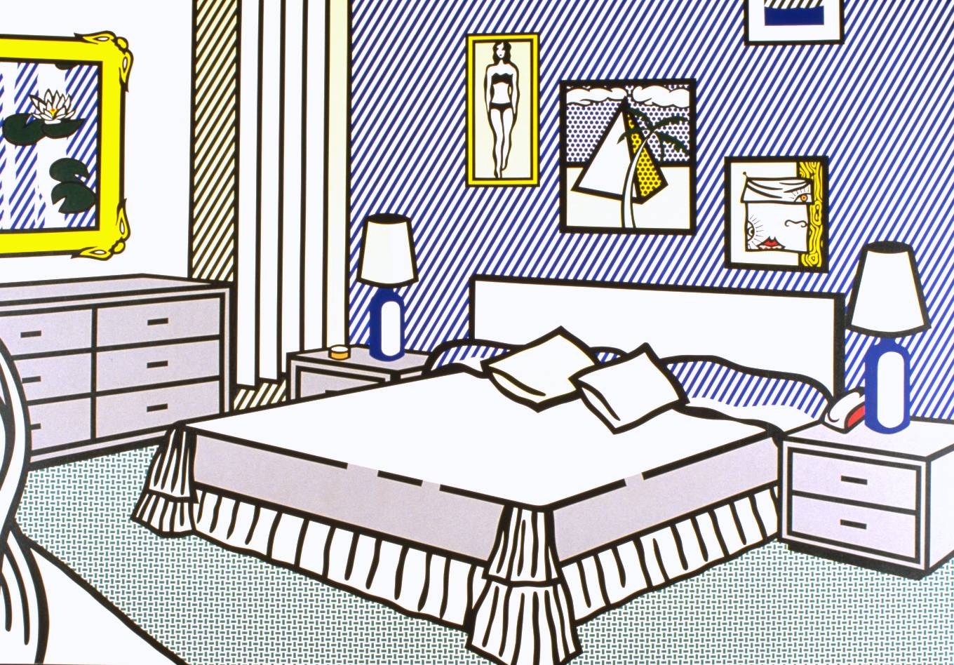
Having tackled art history, Lichtenstein next explores the genre of still-life, as well as depictions of an artist’s studio itself, again something which many artists have done before him. He also paints large scale depictions of rooms, with wonderfully simplified furniture, but always including a number a number of visual clues, generally in the paintings hung in the room, as to a deeper, often more personal tale he is attempting to tell.

Still life with goldfish (1972)

Artist’s Studio “The Dance” (1974)

Interior with Waterlilies (1991)

Reflections on Interior with a Girl Drawing
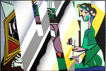
However perhaps the cleverest use of his lines and dots is when Lichtenstein goes on to paint mirrors and reflections. In his “reflections series” he paints recreations of old masterpieces by the likes of Picasso, but then fragments the image with a series of dot-created breaks or fissures interrupting the base depiction. These are intended to replicate the effect of light bouncing off an image when it is framed behind glass. In this way, Lichtenstein focuses not on the painting itself, but the direct effect of imagined environment upon that painting in its exhibited and glazed form.

Mirror no.1 (1969)
He takes this one step further by using dots to replicate the effect of a mirror, with the perhaps obvious irony that while we appear to be looking at a mirror, we see only a blank space rather than a reflection of our face staring back. In this respect Lichtenstein makes further reference to the simplified representation of glass and mirrors in the world of illustration rather than in the world of realistic representation.
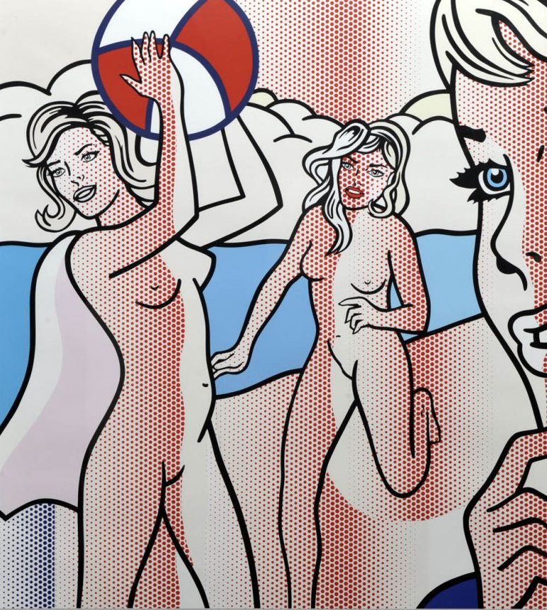
Having taken the Ben-Day dot from its use as a printing technique and replicated it on canvas to suggest a process, rather than a painting, Lichtenstein then used those same dots to suggest light, reflection and shadow. Consequently when he returns to the depiction of cartoon-styled idealistic blonde women some 30 years after he first depicted them in his cartoon-strip canvases, Lichtenstein uses the dots not to suggest a printed colour process, but makes the dots the focus of the image in themselves, painting them now across the image, rather than within the various black lines of the figures illustrated, so the dots almost form a superficial overlay across the painting.

Torpedo…LOS! (1963)

Nudes with beach ball (1978)

Landscape with Philosopher (1996)
The Ben-Day dot was king in Lichtenstein’s work, right up until the end when, in his final years, he used graduating sizes of dots to create the impression of landscapes following traditional chinese depictions. Brilliantly, and through dots alone, he manages to give the impression of mist, of distance, of light, of water. These aren’t his best works by any means, but show just how far Lichtenstein had expanded upon his truly unique style from one end of his career to the other.
So did it matter that Lichtenstein borrowed from the work of illustrators, from supermarket shelves, from art history, from printing processes? Of course not, for in that respect, how was he any different from generations of artists before him? Rather, in seizing upon the depictions of modern life in the rapidly expanding post-war economy of 1960s America, Lichtenstein helped to made pop-culture an artistic phenomenon, while taking what were the incredibly simple artistic ingredients of black lines and benday dots, and making them his own in a career which was experimental, varied, and quite contrary to popular belief, incredibly expressive.
Lichtenstein: A Retrospective, runs at Tate Modern until 27th May 2013.
All images are the © of the Estate of Roy Lictenstein