Autobiographical Mobile: My painting diary – Day 17: Travel/ Gastronomy
After what felt like months of working and reworking the Mallorcan beach background of my latest large-scale painting, my Autobiographical Mobile, I have finally started to complete some of the finer details of the work and find myself galloping into the final stretch (albeit over the hurdles which are inexorably cast into my path by a full-time job working in the law). Those details are, arguably, the most important sections of the painting, as they are the series of symbols and metaphors which hang from a large Calder-style mobile representing a biography of my life. On one side, the mobile balances my great loves and passions, on the other, the black spots and bad experiences I have encountered and, in some cases, which continue to cast their dark shadow over my life.
Over the last few days, I have concentrated on the jocular manifestation of my life’s favourite things, the section of the painting which reads a bit like the song from The Sound of Music. Of the four symbols hanging on the positive side of the mobile, the first I tackled was my symbol of travel and gastronomy. I should start by explaining that each of my symbols have a double meaning, encompassing at least two of my passions (and therefore giving the metaphors more complexity and freeing up space on the canvas). As regular readers of The Daily Norm will have noticed, I am inexcusably fond of both travel, and of food (both cooking, and of course, of eating) and particularly enjoy both pursuits when they have something of a Spanish flavour.
Progress on my travel/ gastronomy metaphor…
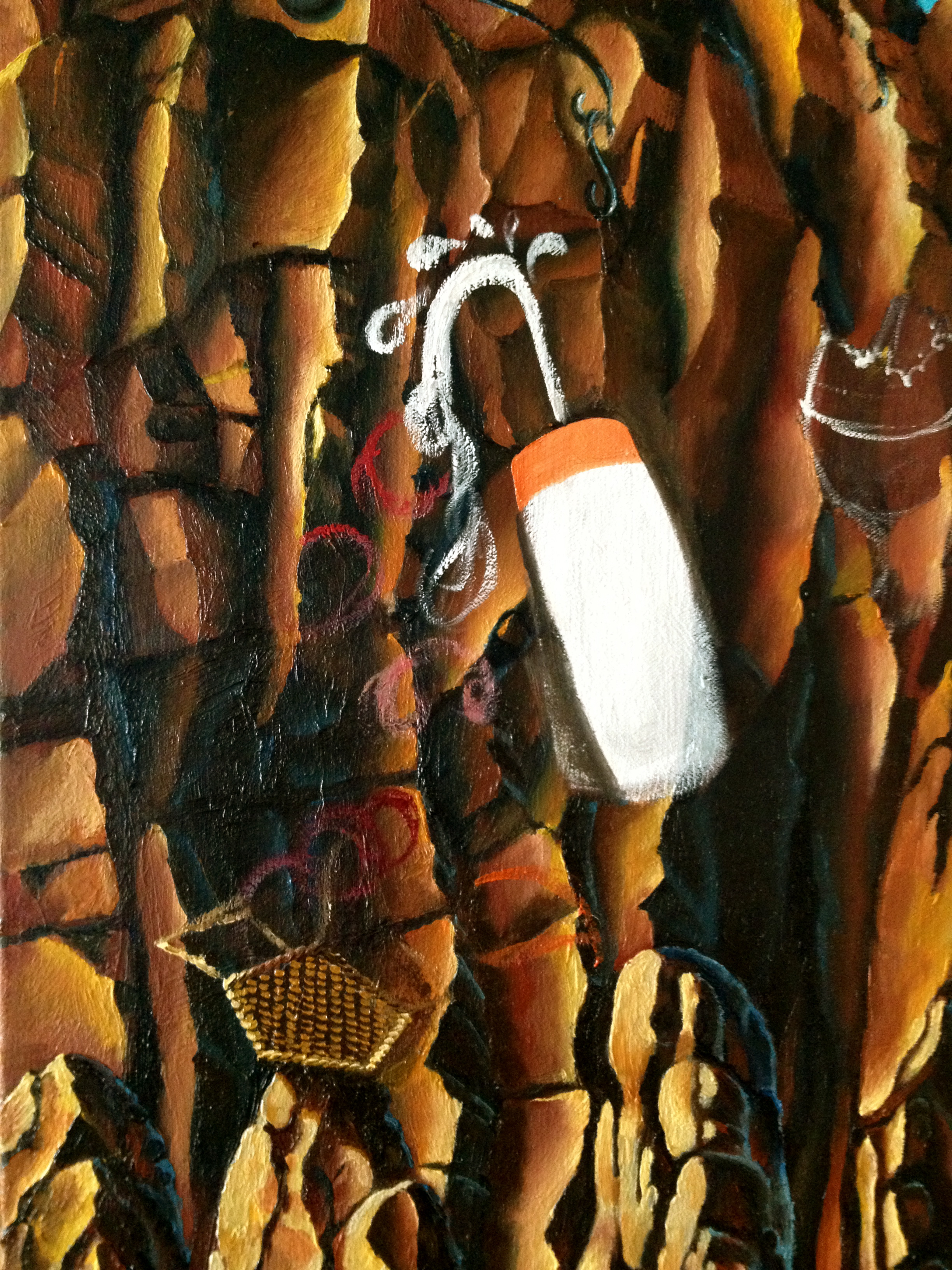
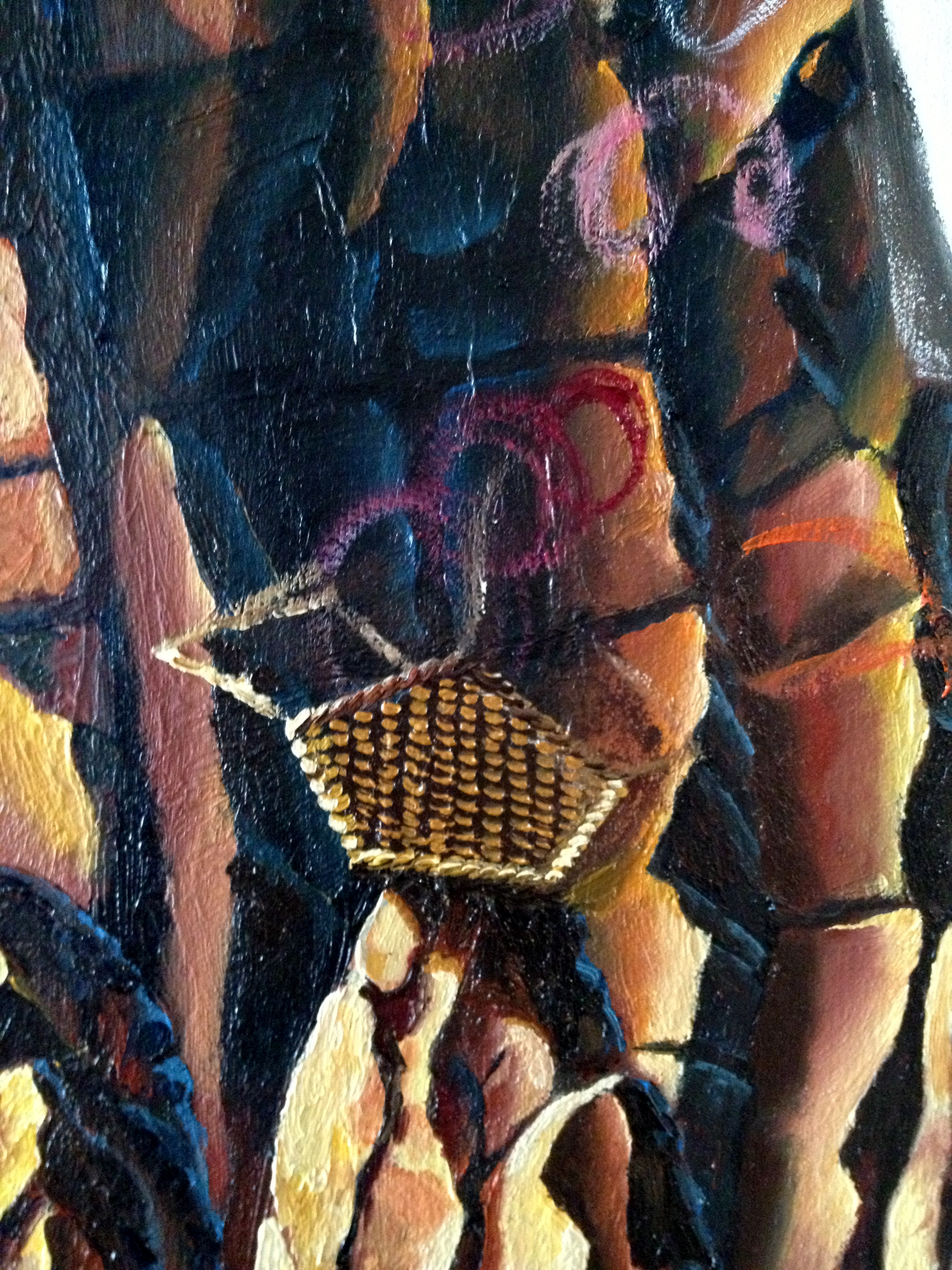
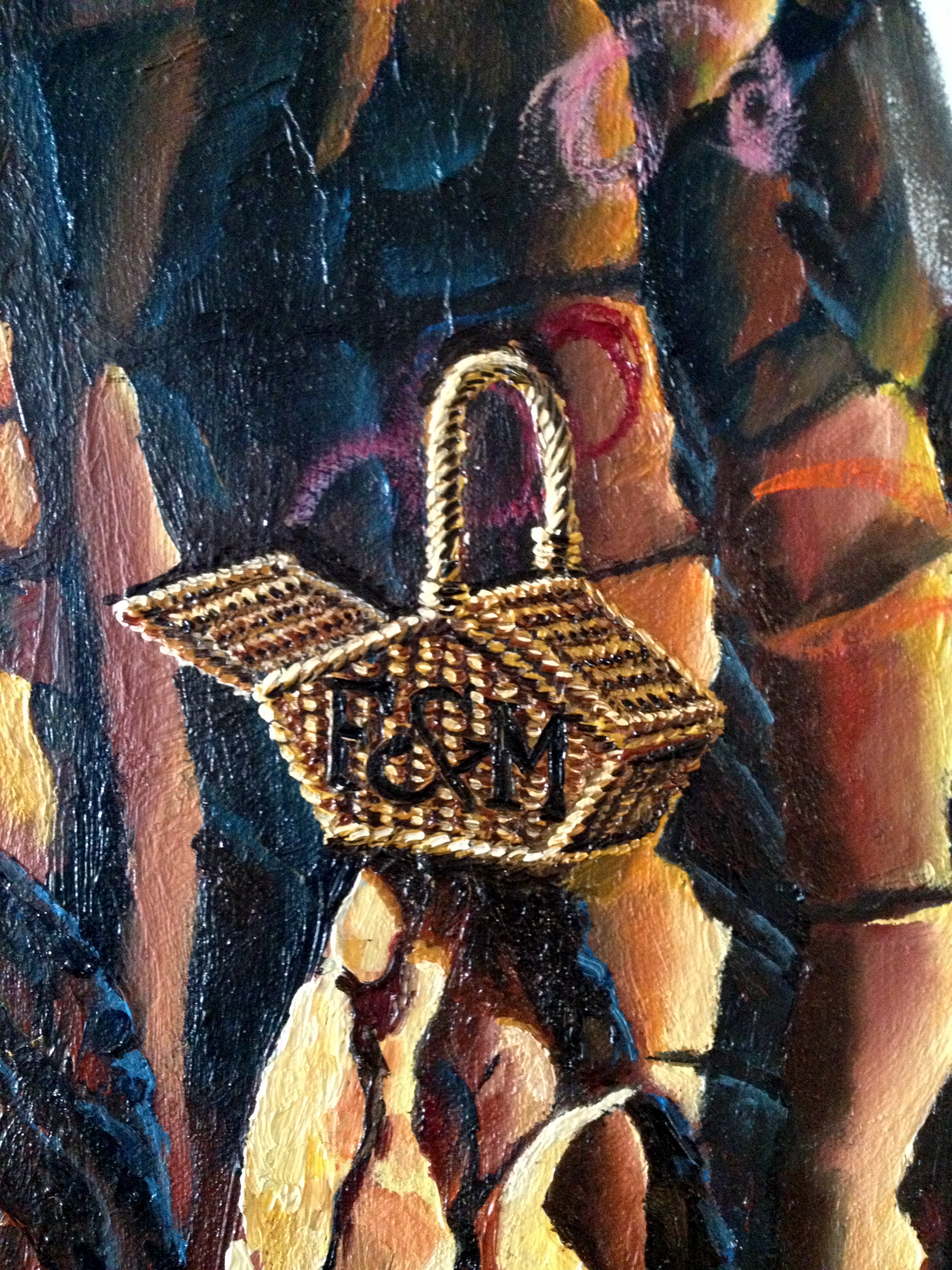
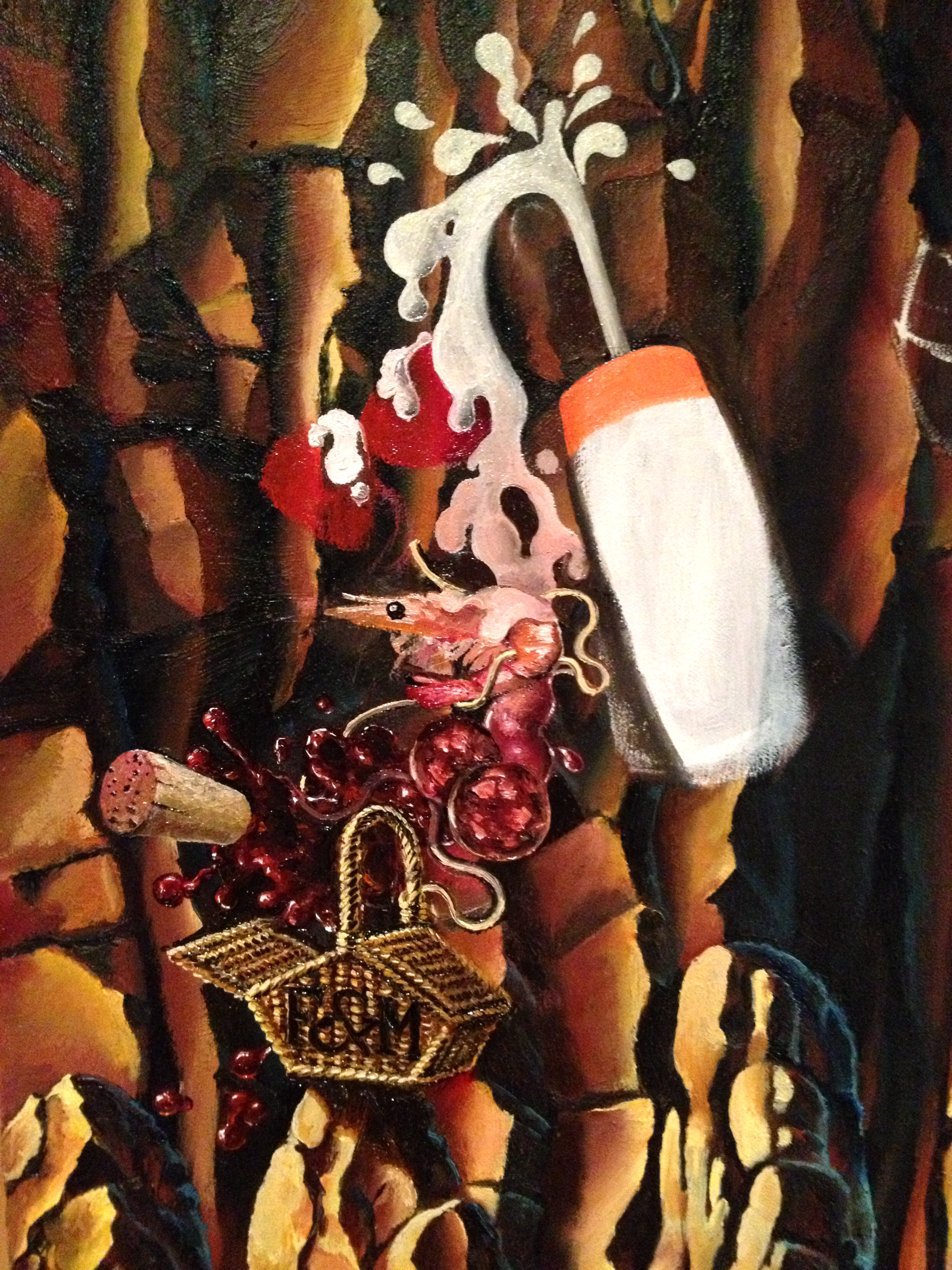


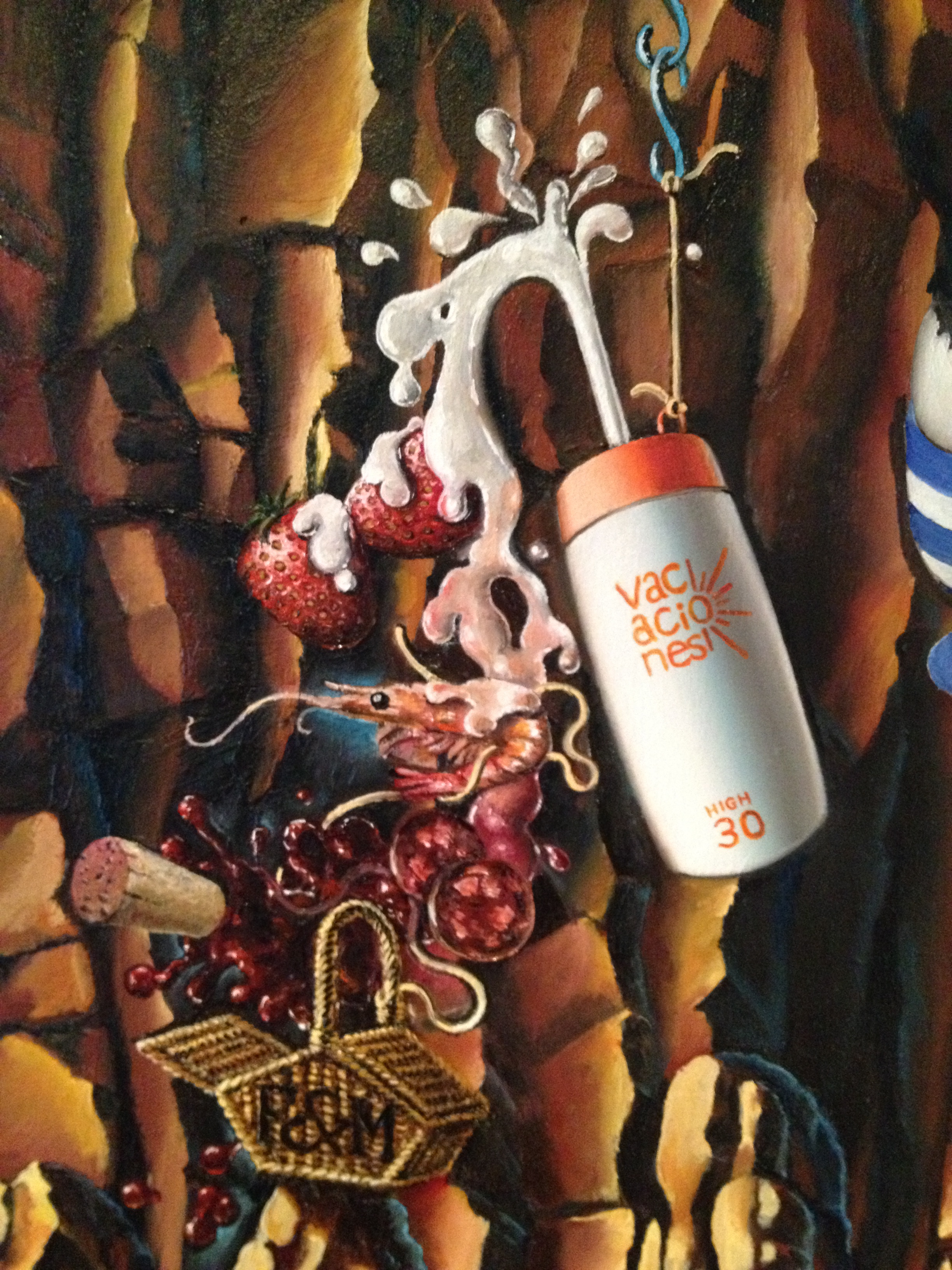
Representing both passions therefore, I have painted a bottle of sun-cream. It has a high protection level (30) which also happens to be my impending next birthday-age. On the bottle, the word “vacaciones” which is Spanish for “holidays” is suitably branded, surrounded by sun-rays (I’m quite pleased with this – I clearly should have been a brand designer!). Squirting from the bottle, the sun-cream becomes edible cream which itself swathes around two juicy strawberries – a representation of fresh, ripe summery food. The cream, graduating downwards, becomes a pinker marie-rose sauce, which in turn accompanies some succulent prawns. These in turn are accompanied by two slices of my favourite of all meats – Spanish chorizo sausage (chorizo and prawns are often to be found together in a great big pan of Spanish paella) and the chorizo is in turn doused in a delicious red wine (thus making the popular tapas dish, Chorizo al Vino) which has metamorphosed out of the marie-rose sauce. The final item on the flurry of food then is wine, as ever a subject of my most tender affection, and represented by an energetic splash and a wine bottle cork. All of this falls into a Fortnum and Mason’s picnic hamper (an icon of my favourite London department store), whose basket twine starts to unravel, curling like a piece of spaghetti around the food suspended above it.
It’s a rather complex image, but I have always had a penchant for images which metamorphose, as one object becomes another, and an image builds in complexity and entendre. Check out the third painting of my 2005 Joie de Vivre series for example. Amongst the metamorphoses there are harbour lights which become pearls which become buoys floating in the water, and rain which becomes snow which becomes ice cream.

Joie de Vivre/ Zest of Life 3: Casino Nights (2005 © Nicholas de Lacy-Brown, acrylic on canvas)
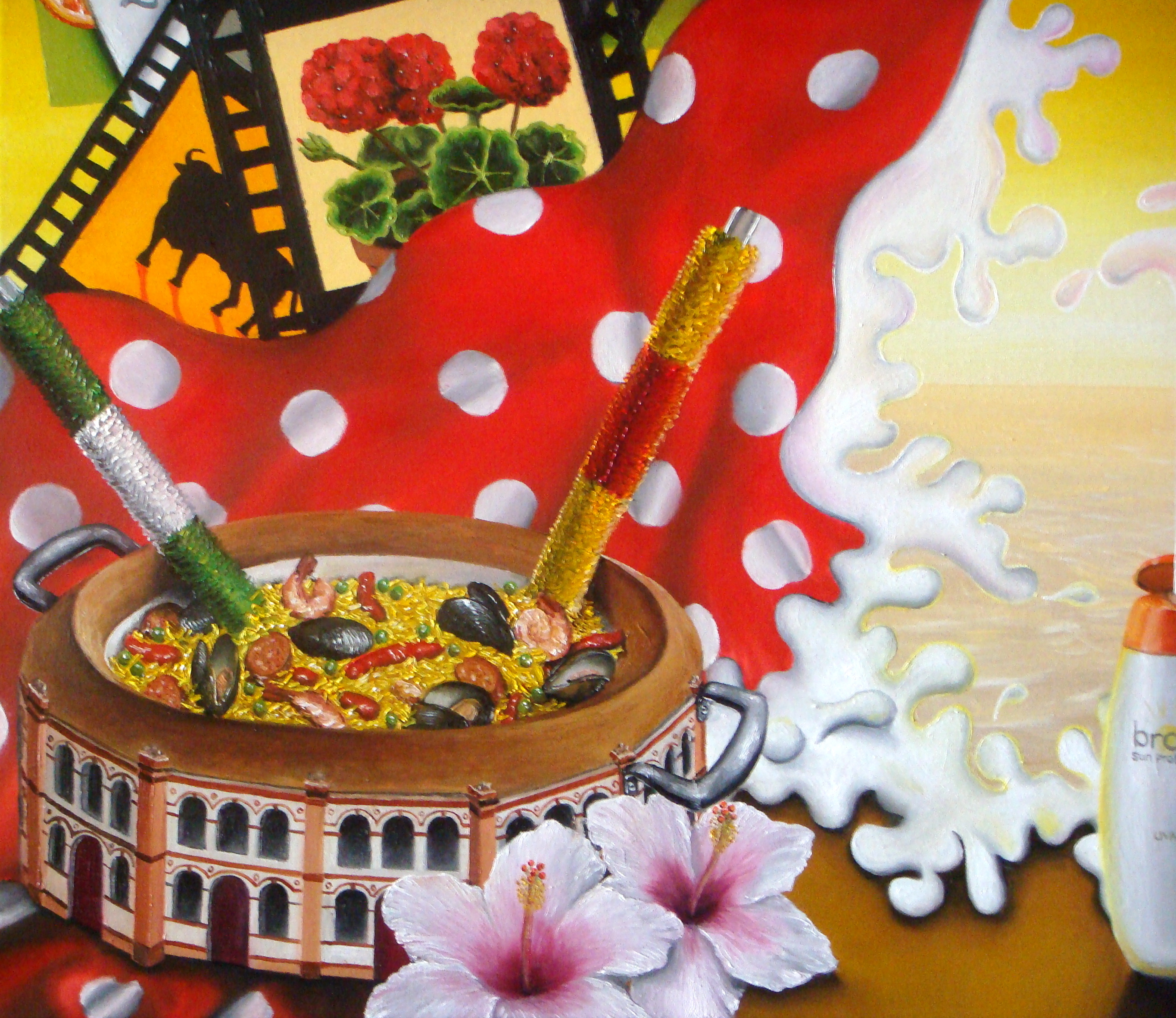
As much of the current painting deals with my life, it’s unsurprising that many of my symbols which make direct reference back to my past body of art work. In painting the sun-cream bottle, for example, I make direct reference to my 2009 painting, Souvenir of Spain, which deals with the tourist stereotypes of my favourite country. Amongst them is the general consensus of the ignorant British tourists that Spain is all about “sea, sand, sex and sangria” hence the symbols of sunbathing which permeate the piece. Here’s that painting and some detailed shots of the work, including, as you will see, my previous depiction of Spanish cuisine, namely the iconic paella, a fodder of Spanish tourist haunts all over the world, and which here is painted inside of a bullfighting ring.
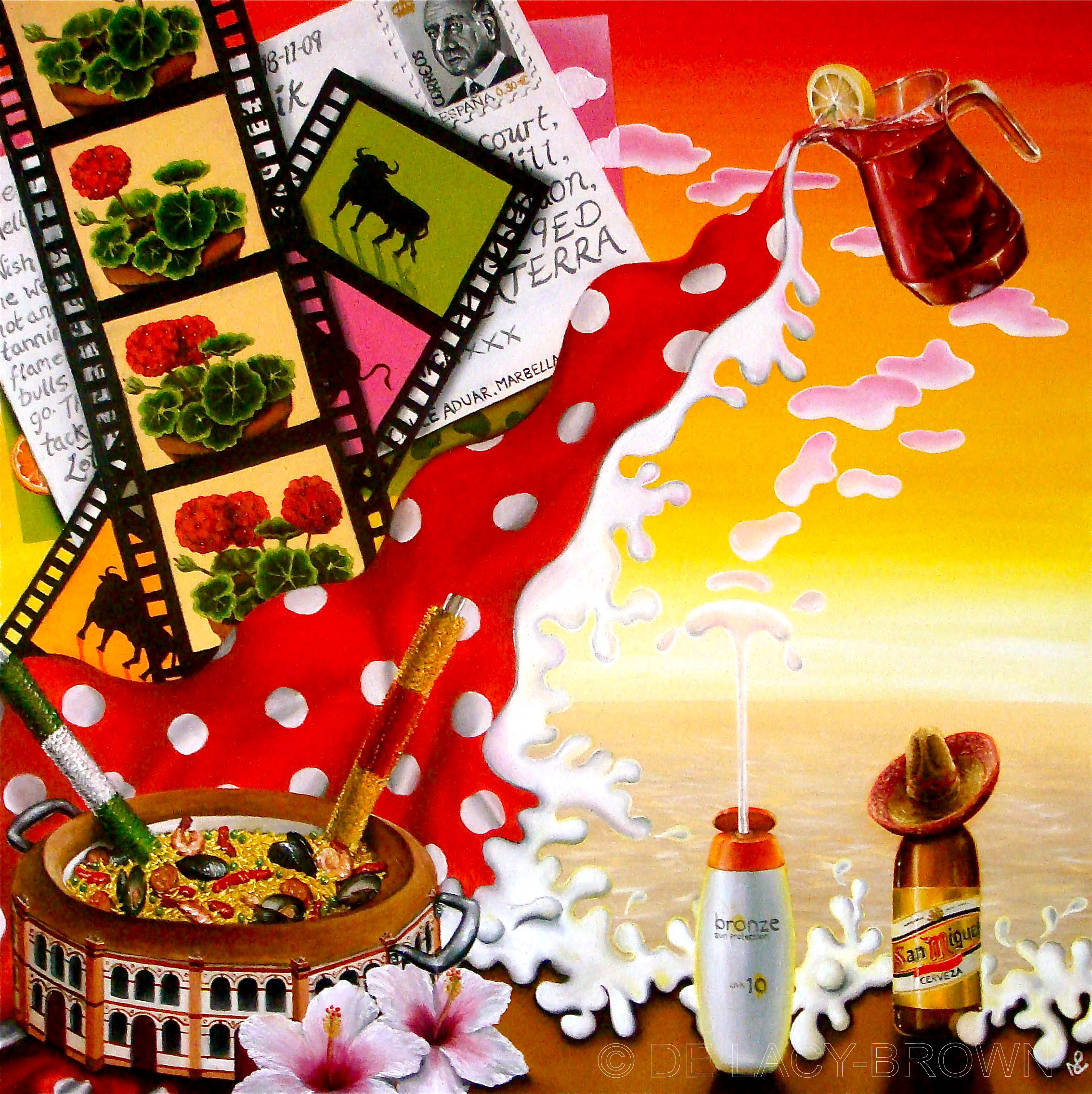
Souvenir of Spain (2009 © Nicholas de Lacy-Brown)


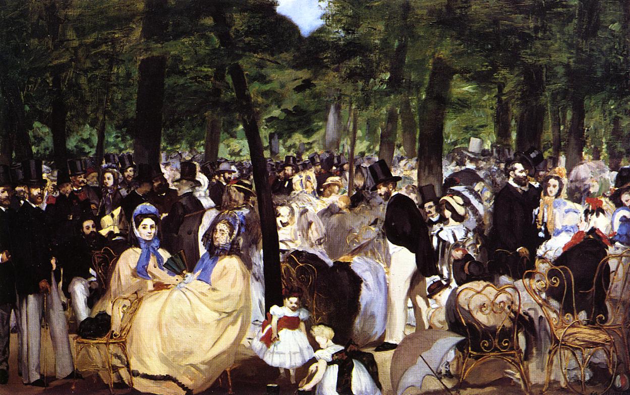
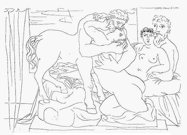
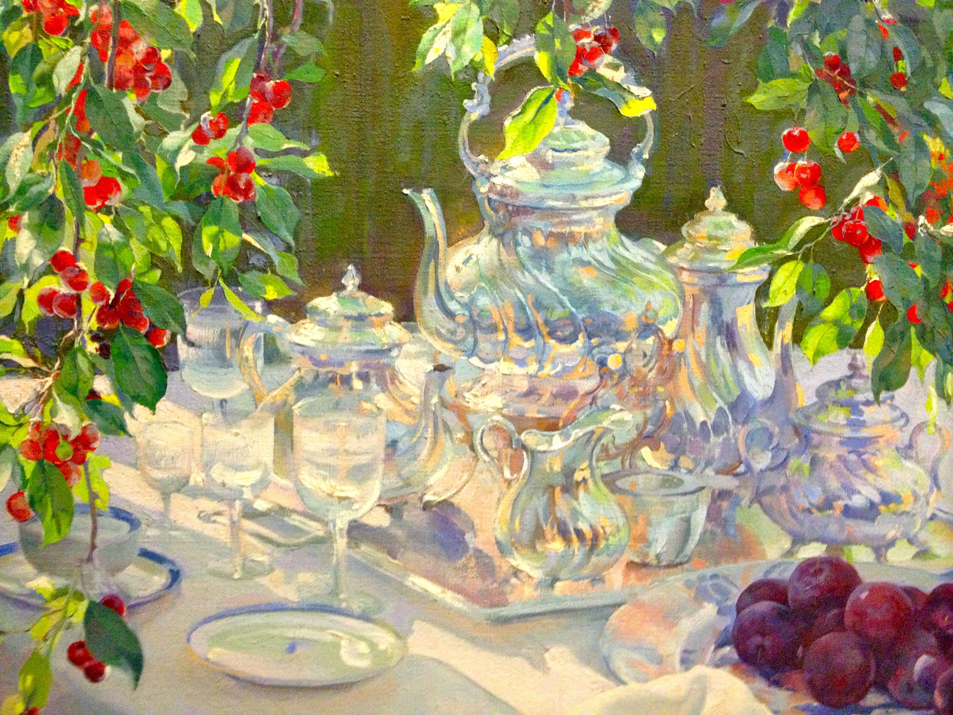
This image also references back to my Norm depiction of Manet’s Le Dejeuner sur l’Herbe, and the two Fortnum and Mason’s hampers I included in that fine picnicking piece. For me the idea of being out in the summer warmth, feasting of the grass out of a decadent Fortnum’s hamper is amongst the most pleasant of all thoughts. Ironically I have never owned a Fortnum’s hamper (they’re not cheap…) but my ambition to get my hands on one (preferably a full one!) lives on. Maybe as a present to myself when this large painting is finally complete?

Le Déjeuner sur l’herbe (after Manet) 2012 © Nicholas de Lacy-Brown, Oil on canvas
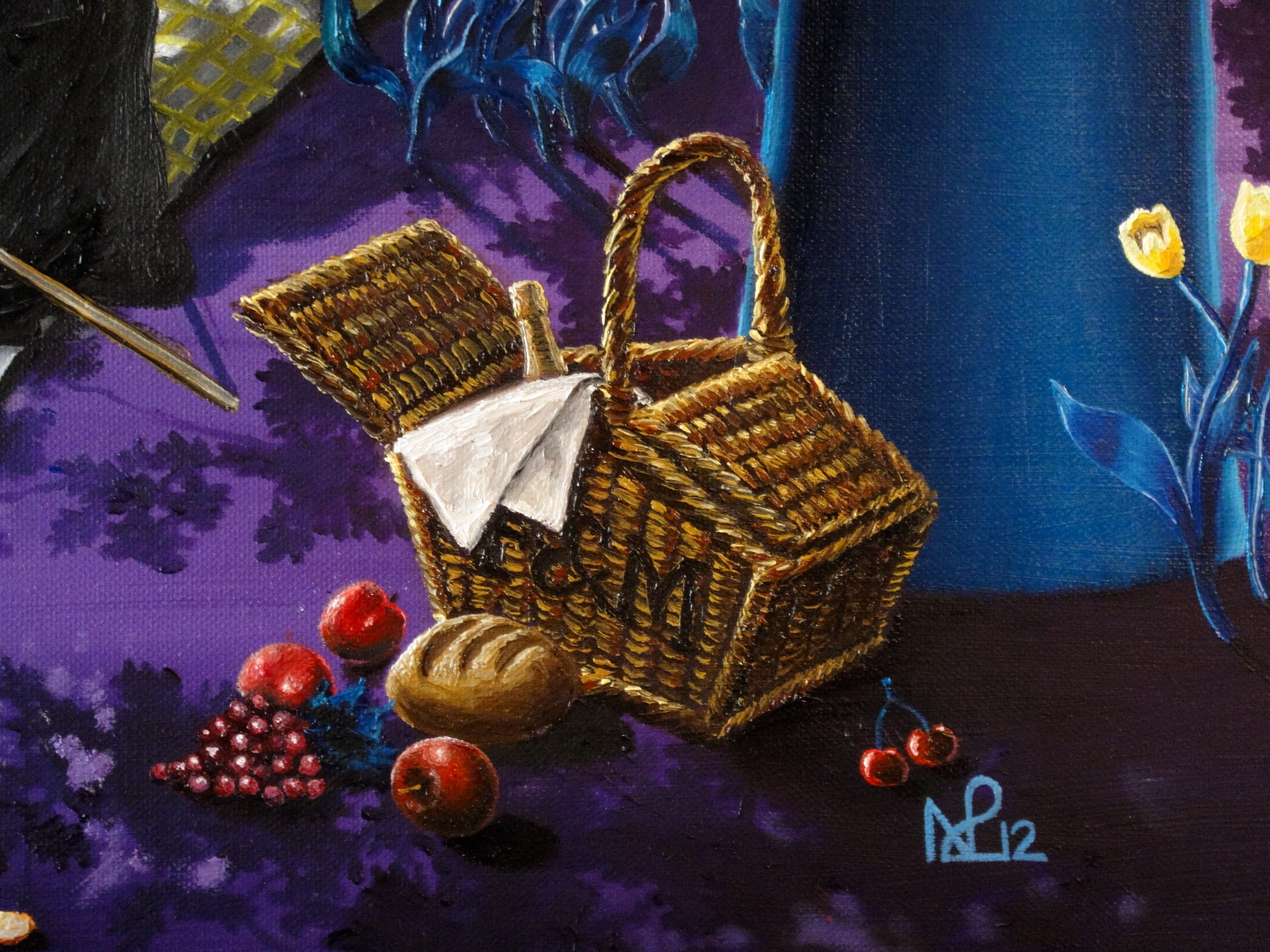
Fortnum and Masons Hamper with bread, grapes, apples and cherries
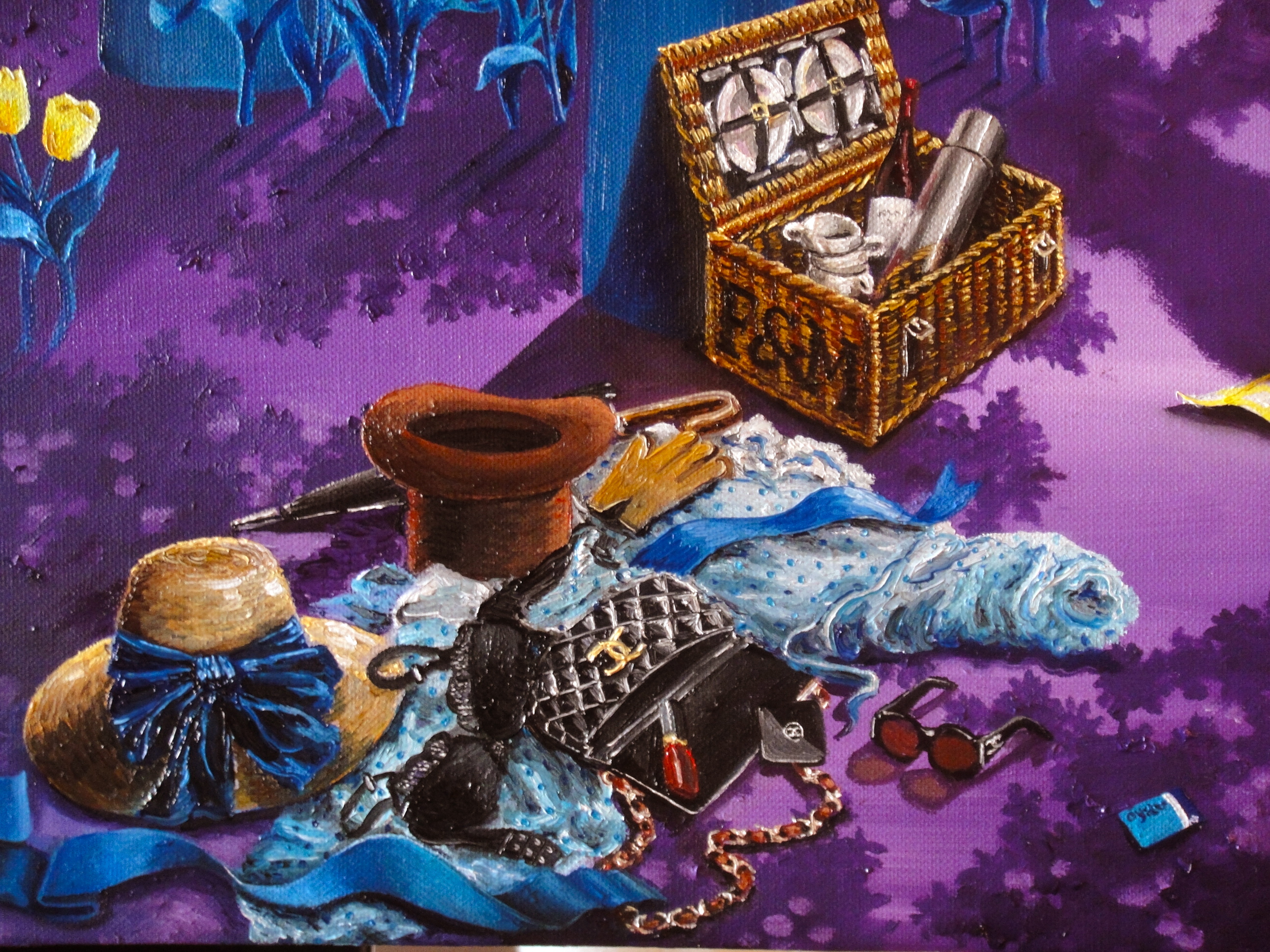
The Norms’ discarded clothes and handbag
Up next time… My art and my adored Paris.
© Nicholas de Lacy-Brown and The Daily Norm, 2001-2013. Unauthorized use and/or duplication of the material, whether written work, photography or artwork, included within The Daily Norm without express and written permission from The Daily Norm’s author and/or owner is strictly prohibited. Excerpts and links may be used, provided that full and clear credit is given to Nicholas de Lacy-Brown and The Daily Norm with appropriate and specific direction to the original content.